- Kivy - Home
- Kivy Basics
- Kivy - Getting Started
- Kivy - Installation
- Kivy - Architecture
- Kivy - File Syntax
- Kivy - Applications
- Kivy - Hello World
- Kivy - App Life Cycle
- Kivy - Events
- Kivy - Properties
- Kivy - Inputs
- Kivy - Behaviors
- Kivy Buttons
- Kivy - Buttons
- Kivy - Button Events
- Kivy - Button Colors
- Kivy - Button Size
- Kivy - Button Position
- Kivy - Round Buttons
- Kivy - Disabled Buttons
- Kivy - Image Button
- Kivy Widgets
- Kivy - Widgets
- Kivy - Label
- Kivy - Text Input
- Kivy - Canvas
- Kivy - Line
- Kivy - Checkbox
- Kivy - Dropdown List
- Kivy - Windows
- Kivy - ScrollView
- Kivy - Carousel
- Kivy - Slider
- Kivy - Images
- Kivy - Popup
- Kivy - Switch
- Kivy - Spinner
- Kivy - Splitter
- Kivy - Progress Bar
- Kivy - Bubble
- Kivy - Tabbed Panel
- Kivy - Scatter
- Kivy - Accordion
- Kivy - File Chooser
- Kivy - Color Picker
- Kivy - Code Input
- Kivy - Modal View
- Kivy - Toggle Button
- Kivy - Camera
- Kivy - Tree View
- Kivy - reStructuredText
- Kivy - Action Bar
- Kivy - Video Player
- Kivy - Stencil View
- Kivy - VKeyboard
- Kivy - Touch Ripple
- Kivy - Audio
- Kivy - Videos
- Kivy - Spelling
- Kivy - Effects
- Kivy - Input Recorder
- Kivy - OpenGL
- Kivy - Text
- Kivy - Text Markup
- Kivy - Settings
- Kivy Layouts
- Kivy - Layouts
- Kivy - Float Layout
- Kivy - Grid Layouts
- Kivy - Box Layouts
- Kivy - Stack Layout
- Kivy - Anchor Layout
- Kivy - Relative Layout
- Kivy - Page Layout
- Kivy - Recycle Layout
- Kivy - Layouts in Layouts
- Kivy Advanced Concepts
- Kivy - Configuration Object
- Kivy - Atlas
- Kivy - Data Loader
- Kivy - Cache Manager
- Kivy - Console
- Kivy - Animation
- Kivy - Multistroke
- Kivy - Clock
- Kivy - SVGs
- Kivy - UrlRequest
- Kivy - Clipboard
- Kivy - Factory
- Kivy - Gesture
- Kivy - Language
- Kivy - Graphics
- Kivy - Drawing
- Kivy - Packaging
- Kivy - Garden
- Kivy - Storage
- Kivy - Vector
- Kivy - Utils
- Kivy - Inspector
- Kivy - Tools
- Kivy - Logger
- Kivy - Framebuffer
- Kivy Applications and Projects
- Kivy - Drawing App
- Kivy - Calculator App
- Kivy - Stopwatch App
- Kivy - Camera Handling
- Kivy - Image Viewer
- Kivy - Bezier
- Kivy - Canvas Stress
- Kivy - Circle Drawing
- Kivy - Widget Animation
- Kivy - Miscellaneous
- Kivy Useful Resources
- Kivy - Quick Guide
- Kivy - Useful Resources
- Kivy - Discussion
Kivy - Quick Guide
Kivy - Getting Started
Kivy is an open-source Python library. It allows you to build multi-touch applications with a natural user interface (NUI). With Kivy, you can develop cross-platform applications. The same code, written once, can be deployed on different various operating system platforms such as Windows, macOS, Linux, Android, and iOS.
Popular GUI Frameworks in Python
Kivy is one of the many GUI frameworks available in the Python ecosystem. Some of the popular Python libraries for building desktop GUI applications are −
Tkinter − Tkinter package is bundled with Python's standard library. It is the standard Python interface to the Tcl/Tk GUI toolkit.
PyQt5 − This library is a Python port for the Qt GUI toolkit. Our extensive tutorial on PyQt5 can be accessed here.
WxPython − WxPython library allows Python programmer to have access to WxWidgets, an open-source GUI toolkit, originally written in C++. To learn more about WxPython, click here.
Kivy − Kivy is a Python library that helps you to build cross-platform GUI applications for Windows, Linux, iOS as well as Android. Kivy supports touch-enabled input. All the widgets in Kivy GUI framework have the capability to handle multi-touch gestures.
Kivy is equipped with powerful graphics and multimedia features. A Kivy app can support audio, video, animations, 2D as well as 3D graphics.
Key Features of Python Kivy
Here are some key features of Python Kivy −
Kivy supports touch-enabled input. All the widgets in Kivy GUI framework have capability to handle multi-touch gestures.
Kivy's comprehensive GUI widgets and robust layout management makes designing attractive interfaces easily possible.
Kivy is equipped with powerful graphics and multimedia features. This makes it possible to incorporate, 2D as well as 3D graphics, animations, audio and video componenets in the application.
Various types of input devices are supported by Kivy. It includes touch, mouse and gestures.
Kivy API can access mobile device hardware components such as camera, GPS, etc.
Kivy uses OpenGL ES 2 graphics library, and is based on Vertex Buffer Object and shaders.
Kivy relies upon Cython for its core implementation, and SDL2 (Simple DirectMedia Layer) for low-level multimedia and input handling.
To deploy the Kivy application on desktops with Windows, Linux or iOS operating systems, the distributable is built with PyInstaller. To build an APK for Android, you need to use Android Studio and Buildozer utility.
The Kivy Language
Kivy uses a special declarative language called Kivy Language (sometimes also called Kv language) to build user interface layouts for Kivy applications. It serves the purpose of separating the design aspect of an app from its programming logic. The design is written in a text file with ".kv" extension. Kivy framework automatically loads the ".kv" file and builds the UI based on the specifications given in it.
The initial version of Kivy library was released in 2011. Currently, Kivy version 2.2 is available, which has been released in May 2023.
Kivy - Installation
To build a Kivy application, you need to have Python installed in your computer. Kivy 2.2.0, the latest stable version, officially supports Python versions 3.7 to 3.11. If Python is not already installed, download the installer of latest Python version, appropriate for your operating system and architecture, from Python's official website − https://www.python.org/downloads/
Python Virtual Environment
Python recommends the use of virtual environment to avoid conflicts with other Python versions and packages.
A virtual environment allows us to create an isolated working copy of Python for a specific project without affecting the outside setup. We shall use the "venv" module in Python's standard library to create virtual environment. PIP is included by default in Python version 3.4 or later.
Creating a Virtual Environment
Use the following command to create a virtual environment in Windows −
C:\users\user\>python -m venv c:\kivyenv
On Ubuntu Linux, update the APT repo and install "venv", if required, before creating a virtual environment.
mvl@GNVBGL3:~ $ sudo apt update && sudo apt upgrade -y
mvl@GNVBGL3:~ $ sudo apt install python3-venv
Then, use the following command to create a virtual environment −
mvl@GNVBGL3:~ $ sudo python3 -m venv kivyenv
Activating a Virtual Environment
You need to activate the virtual environment. On Windows, use the following command −
C:\>cd kivyenv
C:\kivyenv>scripts\activate
(kivyenv) C:\kivyenv>
On Ubuntu Linux, use the following command to activate the virtual environment −
mvl@GNVBGL3:~$ cd kivyenv
mvl@GNVBGL3:~/kivyenv$ source bin/activate
(myenv) mvl@GNVBGL3:~/kivyenv$
Installing Kivy Using the pip Utility
The easiest way to install any Python package is with the use of "pip" utility. Python 3 installation comes with the "pip" installer. After activating the virtual environment, use the following command from the CMD terminal in Windows or Linux terminal −
pip3 install "kivy[base]" kivy_examples
This installs the Kivy package with minimal dependencies. The "kivy_examples" package is optional. Instead of "base", the "full" option enables audio/video support.
Installing the Dependency Libraries for Kivy
SDL2 (Simple DirectMedia Layer) is a major dependency for Kivy. On Windows OS, SDL2 is automatically installed when you use the "pip" utility. However, for Linux and macOS, you need to install SDL2 separately.
On macOS, you can install SDL2 using Homebrew by running the following command in your terminal −
brew install sdl2
If on Linux OS, use the corresponding package manager to install SDL2. For example, it is done with the following command on Ubuntu Linux machine −
sudo apt-get install libsdl2-dev
Additionally, you may have to install other dependencies such as "gstreamer" and "Pillow" for certain specific features of Kivy.
Verifying the Kivy Installation
To verify if Kivy has been properly installed, start the Python interactive shell and import the package. The console shows that the Kivy dependencies are also imported.
>>> import kivy
[INFO] [Logger] Record log in C:\Users\mlath\.kivy\logs\kivy_23-05-26_0.txt
[INFO] [deps] Successfully imported "kivy_deps.gstreamer" 0.3.3
[INFO] [deps] Successfully imported "kivy_deps.angle" 0.3.3
[INFO] [deps] Successfully imported "kivy_deps.glew" 0.3.1
[INFO] [deps] Successfully imported "kivy_deps.sdl2" 0.6.0
[INFO] [Kivy] v2.2.0
[INFO] [Kivy] Installed at "c:\kivyenv\Lib\site-packages\kivy\__init__.py"
[INFO] [Python] v3.11.2 (tags/v3.11.2:878ead1, Feb 7 2023, 16:38:35) [MSC v.1934 64 bit (AMD64)]
[INFO] [Python] Interpreter at "c:\kivyenv\Scripts\python.exe"
[INFO] [Logger] Purge log fired. Processing...
[INFO] [Logger] Purge finished!
You can also obtain the list of all the packages installed using the "pip freeze" command −
(kivyenv) C:\kivyenv>pip3 freeze
certifi==2023.5.7
charset-normalizer==3.1.0
docutils==0.20.1
idna==3.4
Kivy==2.2.0
kivy-deps.angle==0.3.3
kivy-deps.glew==0.3.1
kivy-deps.gstreamer==0.3.3
kivy-deps.sdl2==0.6.0
Kivy-examples==2.2.0
Kivy-Garden==0.1.5
Pillow==9.5.0
Pygments==2.15.1
pypiwin32==223
pywin32==306
requests==2.31.0
urllib3==2.0.2
Kivy - Architecture
Read this chapter to understand the design architecture of Kivy framework. On one end, Kivy provides various widgets that lets the user to interact with the application, and on the other end, it interacts with the various hardware devices such as mouse TUIO, audio and video streams, etc. The middle layer consists of drivers or providers for processing touch inputs, audio and video, graphics instructions and text input.
This is the official architectural diagram of the Kivy framework −

Core Providers
An important feature of Kivy architecture is "modularity" and "abstraction". The actions such as opening a window, reading audio and video stream, loading images, etc., are the core tasks in any graphical application. Kivy abstracts these core tasks by providing easy to implement API to the drivers that control the hardware.
Kivy uses specific providers for operating system on which your app is being run. Each operating system (Windows, Linux, MacOS, etc.) has its own native APIs for the different core tasks. The act as an intermediate communication layer between the operating system on one side and to Kivy on the other. Thus Kivy fully leverages the functionality exposed by the operating system to enhance the efficiency.
Use of platform-specific libraries reduces the size of the Kivy distribution and makes packaging easier. This also makes it easier to port Kivy to other platforms. The Android port benefited greatly from this.
Input Providers
An input provider is a piece of code that adds support for a specific input device. The different input devices having built-in support in Kivy include −
- Android Joystick Input Provider
- Apple's trackpads
- TUIO (Tangible User Interface Objects)
- mouse emulator
- HIDInput
To add support for a new input device, provide a new class that reads your input data from your device and transforms them into Kivy basic events.
Graphics
OpenGL is base of the entire Graphics API of Kivy framework. OpenGL instructions are used by Kivy to issue hardware-accelerated drawing commands. Kivy does away the difficult part of writing OpenGL commands by defining simple-to-use functionality.
Kivy uses OpenGL version 2.0 ES (GLES or OpenGL for embedded systems) with which you can undertake cross-platform development.
Core Library
The high level abstraction is provided by the following constituents of Kivy framework −
Clock − the Clock API helps you to schedule timer events. Both one-shot timers and periodic timers are supported.
Gesture Detection − An important requirement of multitouch interfaces. The gesture recognizer detects various kinds of strokes, such as circles or rectangles. You can even train it to detect your own strokes.
Kivy Language − The kivy language is used to easily and efficiently describe user interfaces. This results in separation of the app design from developing the application logic.
Properties − Kivy's unique concept of property classes (they are different from property as in a Python class) are the ones that link your widget code with the user interface description.
UIX
Kivy's user interface is built with widgets and layouts.
Widgets are the UI elements that you add to your app to provide some kind of functionality. Examples of widget include buttons, sliders, lists and so on. Widgets receive MotionEvents.
More than one widgets are arranged in suitable layouts. Kivy provides layout classes that satisfy the requirement of placement of widgets for every purpose. Examples would be Grid Layouts or Box Layouts. You can also nest layouts.
Event Dispatch
The term "widget" is used for UI elements in almost all graphics toolkits. Any object that receives input events is a widget. One or more widgets are arranged in a tree structure.
The Kivy app window can hold only one root widget, but the root widget can include other widgets in a tree structure. As a result, there is a "parent-children-sibling" relationship amongst the widgets.
Whenever a new input event occurs, the root widget of the widget tree first receives the event. Depending on the state of the touch, the event is propagated down the widget tree.
Each widget in the tree can either process the event or pass it to the next widget in hierarchy. If a widget absorbs and process the event, it should return True so that its propagation down the tree is stopped and no further processing will happen with that event.
def on_touch_down(self, touch):
   for child in self.children[:]:
      if child.dispatch('on_touch_down', touch):
         return True
Since the event propagates through the widget tree, it is often necessary to verify if the event has occurred in the area of a certain widget that is expected to handle it. The collide_point() method can help in ascertaining this fact. This method checks if the touch position falls within the 'watched area' of a certain widget and returns True or False otherwise. By default, this checks the rectangular region on the screen that's described by the widget's pos (for position; x & y) and size (width & height).
Kivy - File Syntax
Kivy framework provides a concise and declarative approach to define the widget structure and appearance, with the use of Kivy Language (also known as Kv language). It is a declarative language, used exclusively for building user interfaces in Kivy applications. Its main advantage is that you can separate the UI design from the application logic written in Python.
The UI design is defined in a text file which must have a ".kv" extension. It contains the hierarchical sequence of widgets in the application window. The file adapts a tree-like structure, showing the parent-child-sibling relationship among the widgets. Below each widget, its properties, events and event handlers are specified.
The kv design language stipulates the following conventions while creating a ".kv" file, so that Python and the Kivy framework can identify and load the appropriate widget structure −
Name of the file must be in lowercase
It must match with the main class in your application. This class is inherited from the App class.
If the name of the class ends with "app" or "App" (for example, HelloApp), the ".kv" file must exclude "app" from its name. It means, for HelloApp class, the name of the ".kv" file must be "hello.kv".
The ".kv" file must be in the same folder in which the Python application file (.py) is present.
While using the ".kv" file, the App class doesn't override the build() method. Declaring a class simply with a pass statement is enough. When the run() method is invoked, Kivy automatically loads the UI from the respective ".kv" file.
Let us first remove the build() method from the HelloApp class −
Example
from kivy.app import App
class HelloApp(App):
   pass
app = HelloApp()
app.run()
The User interface is defined in "hello.kv" file in the same folder. We have a top level BoxLayout with vertical orientation, under which two labels are placed. Save the following script as "hello.kv" file
BoxLayout:
   orientation: 'vertical'
   Label:
      text: 'Python Kivy Tutorial'
      font_size: '30pt'
   Label:
      text: 'From TutorialsPoint'
      font_size: '50'
      color: (1,0,0,1)
Now, if you run the "hello.py" program, it will produce the following output −
Output

In latter chapters, we shall learn how to add event handlers to the widgets in the ".kv" file.
Kivy - Applications
An application written with the Kivy framework is represented by an object of a class that inherits the "kivy.app.App" class. Calling the run() method of this object starts the application, and enters in an infinite event loop.
Application GUI is set up either by overriding the build() method in App class, or by providing a corresponding ".kv" file.
Application Configuration
If you want to provide a customized configuration of one or more parameters, a config.ini file will be created when build_config() method of the App class is invoked.
Here is an example of build_config() method. It stores values for two parameters in "section1" of the "ini" file. The name of "ini" file will be the same as the app class (without "App" suffix if it has). So, if your app class is "HelloApp", then the "ini" file will be created as "hello.ini". The parameters from this file will be loaded when the build() method is invoked.
def build_config(self, config):
   config.setdefaults('section1', {
      'Company': 'TutorialsPoint',
      'year': '2023'
   })
As soon as a section is added, the "hello.ini" file will be created in the same directory which contains the "hello.py" file.
Load and use the configuration settings in the build() method as follows −
def build(self):
   config = self.config
   l1 = Label(text=" {} Year {}".format(
      config.get('section1', 'company'),
      config.getint('section1', 'year')),
      font_size=40)
   return l1
When the application is run, the Label will be populated by reading the "config" file.
Example
Here is the complete program −
from kivy.app import App
from kivy.uix.label import Label
from kivy.core.window import Window

class HelloApp(App):
   Window.size = (720, 300)

   def build_config(self, config):
      config.setdefaults('section1', {
         'Company': 'TutorialsPoint',
         'year': '2023'
      })

   def build(self):
      config = self.config
      l1 = Label(text=" {} Year {}".format(
         config.get('section1', 'company'),
         config.getint('section1', 'year')),
         font_size=40)
      return l1

app = HelloApp()
app.run()
Output
When you run the application, it will produce the following window as the output −
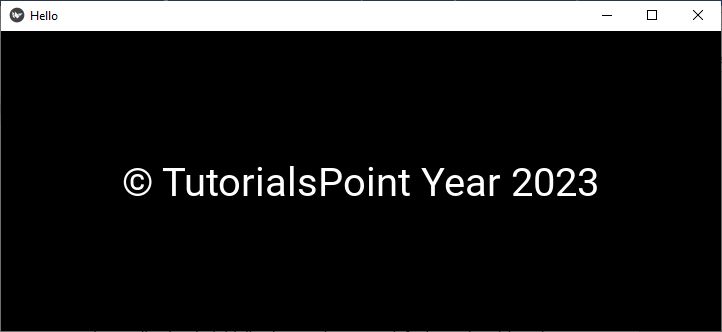
Look for the "hello.ini" file created in the application folder. When opened with a text editor, it shows the following contents −
[section1]
company = TutorialsPoint
year = 2023
Instance Methods in the App Class
The App class defines the following instance methods −
build() − This method initializes the application and is called only once. If this method returns a widget (tree), it will be used as the root widget and added to the window.
build_config() − This method constructs ConfigParser object before the application is initialized. Based on any default section / key / value for your config that you put here, the "ini" file will be created in the local directory.
load_config() − This function returns a ConfigParser with the application configuration.
load_kv() − This method is invoked the first time the app is being run if no widget tree has been constructed before for this app. This method then looks for a matching the "kv" file in the same directory as file that contains the application class.
pause() − This method causes the application to be paused.
run() − When called, this method launches the app in standalone mode.
stop() −This method stops the application.
on_pause() − This is an event handler method that is called when Pause mode is requested. If it returns True, the app can go into Pause mode, otherwise the application will be stopped.
on_resume() − An event handler method which resumes the application from the Pause mode.
on_start() − This method is the event handler for the 'on_start' event. It is fired after initialization (after build() has been called) but before the application has started running.
on_stop() − The 'on_stop' event which is fired when the application has finished running (i.e., the window is about to be closed). This method handles on_stop event.
Kivy - Hello World
Let us start with building a simple "Hello World" application using Kivy. Follow the steps given below −
To develop a Kivy application, you need to import the App class from the "kivy.app" module.
from kivy.app import App
An object of the class that uses App as its base, represents the application. To design the interface, override the build() method, which returns a root widget. For now let us put a pass statement in the build() method.
class HelloApp(App):
   def build(self):
      pass
Next, instantiate the above "HelloApp" class −
app = HelloApp()
The run() method of App class starts an infinite event loop. It displays a blank application window that currently doesn't have any widget.
app.run()
Now let us add a non-editable label with "Hello World" caption to the root widget. For this, we have to import the Label class from the "kivy.uix.label" module. Change the build() method as shown in the following program.
Hello World in Python Kivy
Here is the complete code to print "Hello World" in Kivy −
Example
from kivy.app import App
from kivy.uix.label import Label

class HelloApp(App):
   def build(self):
   l1 = Label(text="Hello World", font_size=50)
   return l1

app = HelloApp()
app.run()
The Label object can be configured with many properties. Here, we are just setting the text and font_size properties.
Run the above code (hello.py) from the command line −
python hello.py
Kivy generates some more log text in the terminal
[INFO ] [Factory] 190 symbols loaded
[INFO ] [Image ] Providers: img_tex, img_dds, img_sdl2, img_pil (img_ffpyplayer ignored)
[INFO ] [Text ] Provider: sdl2
[INFO ] [Window ] Provider: sdl2
[INFO ] [GL ] Using the "OpenGL" graphics system
[INFO ] [GL ] GLEW initialization succeeded
[INFO ] [GL ] Backend used <glew>
[INFO ] [GL ] OpenGL version <b'4.6.0 - Build 31.0.101.3959'>
[INFO ] [GL ] OpenGL vendor <b'Intel'>
[INFO ] [GL ] OpenGL renderer <b'Intel(R) Iris(R) Xe Graphics'>
[INFO ] [GL ] OpenGL parsed version: 4, 6
[INFO ] [GL ] Shading version <b'4.60 - Build 31.0.101.3959'>
[INFO ] [GL ] Texture max size <16384>
[INFO ] [GL ] Texture max units <32>
[INFO ] [Window ] auto add sdl2 input provider
[INFO ] [Window ] virtual keyboard not allowed, single mode, not docked
[INFO ] [Base ] Start application main loop
[INFO ] [GL ] NPOT texture support is available
When you run this application, you get the default Kivy application window with a label having "Hello World" text on it.

You can press the "X" button to close the window and stop the running application.
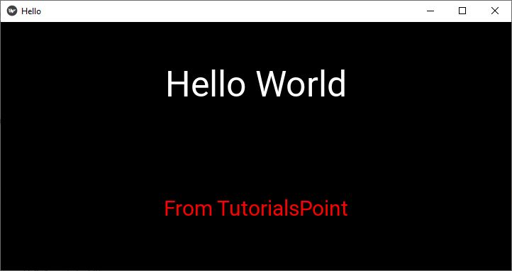
Layouts in Kivy
In the above program, we have used only one widget, i.e., Label, in the root tree of the application. If we want to place more than one widgets, we need to add them in a Layout and then return the Layout object from the build() method. Kivy supports various types of layouts such as BoxLayout, FlowLayout, AnchorLayout and more.
Let us design the interface such that two Labels are added in a vertical BoxLayout object. The labels are added one below the other. The build() method of the HelloApp class will be changed accordingly.
Example
from kivy.app import App
from kivy.uix.label import Label
from kivy.uix.boxlayout import BoxLayout

class HelloApp(App):
   def build(self):
      lo = BoxLayout(orientation='vertical')
      l1 = Label(text="Hello World", font_size=50)
      l2 = Label(text = "From TutorialsPoint",
         font_size=30,
         color = (1,0,0,1))
      lo.add_widget(l1)
      lo.add_widget(l2)
      return lo

app = HelloApp()
app.run()
Output
Run the above program to obtain the following output −
Kivy - App Life Cycle
A Kivy app goes through various stages from the time it is executed and it stops. The following diagram shows the different stages −

Let us now have a detailed discussion about each of these stages −
Initialize UI
The App class in the Kivy framework is the one that represents a Kivy application. Creating an App object is the first step in the app's life cycle.
from kivy.app import App
Declare a subclass of App class, and override build() method.
from kivy.app import App

class MyApp(App):
   def build(self):
      #UI Design
It in builds the application's UI by either calling the build() method or with the help of the ".kv" file. If required, the app's configurations are loaded from the respective ".ini" file.
Event Loop
Once the user interface is loaded, the App object enters in an infinite event loop.
if __name__ == '__main__':
   MyApp().run()
Various widgets assembled in the interface now absorb the user interactions such as button click or text input, and respond according to corresponding event handlers. In response to the user interaction, the state of any widget or app may be modified.
To run the application, execute the following command from the OS terminal −
Python MyApp.py
While you can run your Kivy app this way on Windows or Linux, you may have to take some additional steps for running it on Android. For Android, you should build an APK (Android Package Kit).
You should use Buildozer, a tool that automates the entire build process. It installs all the prerequisites for python-for-android, including the android SDK and NDK, then builds an APK that can be automatically pushed to the device. Buildozer currently works only in Linux and macOS (for Windows, activate WSL on the machine and then use Buildozer from within WSL)
Pause / Resume
While the app is running, it can be made to pause. For example, if the application window is minimized, or the device itself goes in sleep mode, the pause mode helps in conserving the resources.
Kivy has an on_pause() Event handler. It is called when Pause mode is requested. You should return True if your app can go into Pause mode, otherwise return False and your application will be stopped. You cannot control when the application is going to go into this mode. It's determined by the Operating System and mostly used for mobile devices (Android/iOS) and for resizing.
The app can resume running from the point at which it was paused.
Kivy's on_resume() Event handler gets called when your application is resuming from the Pause mode.
When resuming, the OpenGL Context might have been damaged / freed. This is where you can reconstruct some of your OpenGL state.
Stop
It is when the user closes the app by invoking an appropriate method in the app's code. All the cleanup action is undertaken before the termination of application's run.
Kivy - Events
Kivy is a Python library that helps you to build cross-platform GUI applications. Any GUI application is event driven, wherein the flow of the program is not sequential (top to bottom), but is decided by the user interactions with the widgets on the interface. User actions such as clicking a button, "selecting an item from a list" or "choosing an option from available radio buttons", etc. are called events.
A GUI-based program anticipates all possible events that can occur in and around its environment and dispatch them to appropriate handler functions as and when (and if) a certain event occurs.

When the run() method of Kivy's App object is called, the application starts an "event listening" loop and triggers appropriate callback functions, one each for a type of event.
Global Event Dispatcher
The Kivy framework includes the EventDispatcher class. It dispatches the event object to the widget tree and the event is propagated through the widget hierarchy. When a widget that is in a position to process the event, its associated callback handler is triggered. The Widget, Animation and Clock classes are examples of event dispatchers.
Clock is a global event dispatcher that allows you to schedule and trigger events at specific intervals. It defines methods such as 'schedule_once()' and 'schedule_interval()' to register functions or methods to be called after a certain delay or at regular intervals. This mechanism is useful for handling timed events, animation updates, and other recurring tasks in your app.
Example
In the following example, we have put a label and two buttons in the widget tree. The button captioned "Start" schedules an event to occur periodically after every one second. The schedule_interval() function is written with the following syntax −
Clock.schedule_interval(callback, timeout)
On the other hand, the second button captioned as "Stop" calls the unscheduled() method which removes the scheduled event.
from kivy.app import App
from kivy.uix.label import Label
from kivy.uix.button import Button
from kivy.uix.boxlayout import BoxLayout
from kivy.clock import Clock
from kivy.config import Config

# Configuration
Config.set('graphics', 'width', '720')
Config.set('graphics', 'height', '400')
Config.set('graphics', 'resizable', '1')

class DemoApp(App):
   def build(self):
      lo = BoxLayout(orientation='vertical')
      self.l1 = Label(text="0", font_size=100)
      self.b1 = Button(text="start", font_size=100, color=(0, 0, 1, 1))

      self.b1.bind(on_press=self.onstart)
      self.b2 = Button(text="Stop", font_size=100, color=(1, 0, 0, 1))
      self.b2.bind(on_press=self.onstop)
      lo.add_widget(self.l1)
      lo.add_widget(self.b1)
      lo.add_widget(self.b2)
      return lo

   def onstart(self, event):
      print("started")
      Clock.schedule_interval(self.update_label, 1)

   def onstop(self, event):
      Clock.unschedule(self.update_label)

   def update_label(self, event):
      self.l1.text = str(int(self.l1.text) + 1)

if __name__ == '__main__':
   DemoApp().run()
Output
Run the above program. The label initially shows "0". Click the Start button. The label starts incrementing the number on it with each second. Press the "Stop" button to unschedule the event.

Widget Events
Most of the widgets Kivy have built-in event handling capabilities. In fact, each widget is designed to handle specific type of events. For example, the Button widget handles the event caused by clicking it. You can register event handlers for specific events that occur on a widget, such as button clicks, touch events, or keyboard events.
Usually, the event handlers are defined as methods in your widget's class or App class. They generally are prefixed with 'on_' followed by the name of the event. For example, 'on_press' for a button press event.
When an event occurs, Kivy automatically calls the corresponding event handler method, passing relevant information about the event as arguments. Inside the event handler, you can define the desired behavior or actions to perform.
Events Associated with Widgets
Given below is a list of the events associated with some of the most commonly used widgets −
Button
on_press − Triggered when the button is pressed.
on_release − Triggered when the button is released.
on_touch_down − Triggered when a touch event starts on the button.
on_touch_up − Triggered when a touch event ends on the button.
TextInput
on_text_validate − Triggered when the user finishes editing the text input (by pressing Enter or Return).
on_focus − Triggered when the text input receives or loses focus.
on_text − Triggered whenever the text in the input field changes.
CheckBox
on_active − Triggered when the checkbox is checked or unchecked.
Slider
on_value − Triggered when the slider's value changes.
on_touch_down − Triggered when a touch event starts on the slider.
on_touch_up − Triggered when a touch event ends on the slider.
ToggleButton
on_state − Triggered when the toggle button's state changes (toggled on or off).
on_press − Triggered when the toggle button is pressed.
ListView
on_select − Triggered when an item in the list view is selected.
FileChooser
on_selection − Triggered when a file or directory is selected in the file chooser.
Switch
on_active − Triggered when the switch is toggled on or off.
Video
on_load − Triggered when the video finishes loading.
on_play − Triggered when the video starts playing.
on_pause − Triggered when the video is paused.
on_stop − Triggered when the video stops playing.
Spinner
on_text − Triggered when an item is selected from the spinner.
ActionButton
on_press − Triggered when the action button is pressed.
Examples − Event Handling in Kivy
These events will be discussed when we explain each of the widgets in Kivy framework. However, for this chapter, two examples of event handling are given here.
Example 1
The first example shows the "on_press" event of a Button widget. In the code below, we have a Label and a Button widget, arranged in a BoxLayout. To process the on_press event, we bind the button with onstart() method defined in the DemoApp class
from kivy.app import App
from kivy.uix.label import Label
from kivy.uix.button import Button
from kivy.uix.boxlayout import BoxLayout
from kivy.config import Config

# Configuration
Config.set('graphics', 'width', '720')
Config.set('graphics', 'height', '400')
Config.set('graphics', 'resizable', '1')

class DemoApp(App):
   def build(self):
      lo = BoxLayout(orientation='vertical')
      self.l1 = Label(text="0", font_size=100)
      self.b1 = Button(text = "start", font_size = 100, color=(1,0,0,1))
      self.b1.bind(on_press=self.onstart)
      lo.add_widget(self.l1)
      lo.add_widget(self.b1)
      return lo

   def onstart(self, event):
      print ("started")
      self.l1.text = str(int(self.l1.text)+1)

if __name__ == '__main__':
   DemoApp().run()
Output
Save the above code as "demo.py" and run it from command line or a Python IDE. The program starts with the label showing 0 as its caption. Every time the button is clicked, the caption increments by 1.

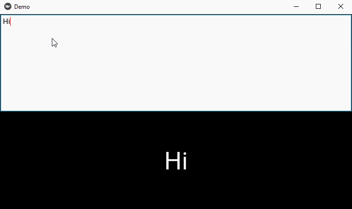
Example 2
In this example, we have a TextInput widget and a Label. The TextInput is bound to a onkey() method. Each keystroke input by the user is reflected on the Label.
from kivy.app import App
from kivy.uix.label import Label
from kivy.uix.textinput import TextInput
from kivy.uix.boxlayout import BoxLayout

from kivy.clock import Clock
from kivy.core.window import Window

Window.size = (720,400)

class DemoApp(App):
   def build(self):
      lo = BoxLayout(orientation='vertical')
      self.t1 = TextInput(multiline=False)
      self.l1 = Label(font_size=50)
      self.t1.bind(text=self.onkey)

      lo.add_widget(self.t1)
      lo.add_widget(self.l1)
      return lo

   def onkey(self, event, value):
      print ("press")
      self.l1.text = value

if __name__ == '__main__':
   DemoApp().run()
Output
Run the program and enter some text in the text box. As you type, the Label caption is updated.
It is also possible to define custom events and event handlers to handle application-specific events. To do so, you need to subclass the 'EventDispatcher' class and define the desired properties and methods.
Custom events can be dispatched and handled using the 'trigger()' and 'on_event_name' pattern similar to widget events.
Kivy - Properties
A Property is a special class in Kivy that allows you to define and manage attributes of a widget or object. Property class is defined in the "kivy.properties" module. You can track changes to these attributes and they allow you to bind callback functions to be executed when the property changes.
Kivy's property classes support the following features −
Value Checking / Validation
Whenever a new value is assigned to a property, it is checked against validation constraints, in order to prevent errors. For example, validation for an OptionProperty will make sure that the value is in a predefined list of possibilities. Validation for a NumericProperty will check that your value is a numeric type.
Observer Pattern
You can specify what should happen when a property's value changes. You can bind your own function as a callback to changes of a Property. If, for example, you want a piece of code to be called when a widget's pos property changes, you can bind a function to it.
Better Memory Management
The same instance of a property is shared across multiple widget instances.
It may be noted that the Property objects are not the same as property() built-in function in Python.
A property object has to be declared at class level, not in any method of the class.
Each property by default provides an "on_<propertyname>" event that is called whenever the property's state/value changes.
Example
Let us study the behavior of Property in Kivy with the following example. The App class has a NumericProperty attribute. The NumericProperty object (value) is bound to on_value_change() method.
class NumPropApp(App):
   value = NumericProperty(0)

   def on_value_change(self, instance, value):
      print(f"Value changed: {value}")
      self.l1.text = str(value)
In the build() method, the app has a Label and a Button assembled in a vertical BoxLayout. The Button invokes onstart() method in response to on_press event and increments value with 1.
   def onstart(self, event):
      print ("started")
      self.value = self.value+1

   def build(self):
      lo = BoxLayout(orientation='vertical')
      self.l1 = Label(text=str(self.value), font_size = 50)
      self.b1 = Button(text = "start", font_size = 50)
      self.b1.bind(on_press=self.onstart)
      self.bind(value=self.on_value_change)
      lo.add_widget(self.l1)
      lo.add_widget(self.b1)
      return lo
Since the "on_value_change()" method is invoked on every change in value, the effect is that on every button press, the label caption shows increasing number from "0" onwards.
Here is the complete code of the example −
from kivy.app import App
from kivy.uix.label import Label
from kivy.uix.button import Button
from kivy.properties import NumericProperty
from kivy.uix.boxlayout import BoxLayout
from kivy.config import Config

# Configuration
Config.set('graphics', 'width', '720')
Config.set('graphics', 'height', '400')
Config.set('graphics', 'resizable', '1')

class NumPropApp(App):
   value = NumericProperty(0)
   def on_value_change(self, instance, value):
      print(f"Value changed: {value}")
      self.l1.text = str(value)
   def onstart(self, event):
      print ("started")
      self.value = self.value+1
   def build(self):
      lo = BoxLayout(orientation='vertical')
      self.l1 = Label(text=str(self.value), font_size = 50)
      self.b1 = Button(text = "start", font_size = 50)
      self.b1.bind(on_press=self.onstart)
      self.bind(value=self.on_value_change)
      lo.add_widget(self.l1)
      lo.add_widget(self.b1)
      return lo

if __name__ == '__main__':
   NumPropApp().run()
Output
Run the program from the command line. Press the button to see that every time the number displayed on the label increases.

Property Types
Kivy provides the following Property types −
NumericProperty − Handles numeric values such as integers and floats. It only accepts the int or float numeric data type or a string that can be converted to a number.
count = NumericProperty(0)
StringProperty − It is used to handle string values. You can initialize it with "defaultvalue" parameter.
text = StringProperty("start")
BoundedNumericProperty − This property is Similar to NumericProperty, but allows you to define minimum and maximum bounds for the value. It also supports get_min() and get_max() methods that return minimum and maximum acceptable values respectively.
a = BoundedNumericProperty(1, min=0, max=100)
BooleanProperty − Handles boolean values (True or False). The defaultvalue parameter can be set to True or False.
active = BooleanProperty(False)
ListProperty − The value of this property is a List object. When assigning a list to a ListProperty, the list stored in the property is a shallow copy of the list and not the original list.
colors = ListProperty([1, 0, 0, 1])
ObjectProperty − Handles a single object instance. If the rebind parameter is set to True, the associated kv rule will be re-evaluated and all the properties will be rebound when any intermediate property changes.
person = ObjectProperty(None)
OptionProperty − Specifies the default value of the property. It should be one from the list given in Options parameter. Example −
state = OptionProperty("None", options=["On", "Off", "None"])
ReferenceListProperty − This property is used to refer to one or more property objects of other types.
   x = NumericProperty(0)
   y = NumericProperty(0)
   z = ReferenceListProperty(x, y)
Changing the value of "z" will automatically change the values of "x" and "y" accordingly. If you read the value of "z", it will return a tuple with the values of "x" and "y".
AliasProperty − Provides an alias or alternative name for an existing property.
   def _get_width(self):
      return self.size
   def _set_width(self, value):
      self.size = value
   width = AliasProperty(_get_width, _set_width)
DictProperty − Used to define the initial value of an object with multiple parameters as the dictionary keys.
   params = DictProperty({
      'xlog': False,
      'xmin': 0,
      'xmax': 100,
      'ylog': False,
      'ymin': 0,
      'ymax': 100,
      'size': (0, 0, 0, 0)
   })
VariableListProperty − list items and to expand them to the desired list size.
obj = VariableListProperty(defaultvalue, length)
The defaultvalue parameter specifies the default values for the list. The length parameter is an int, either 2 or 4.
ConfigParserProperty − ConfigParserProperty lets you automatically listen to and change the values of specified keys based on other kivy properties.
ConfigParserProperty(defaultvalue, section, key, config)
A ConfigParser is composed of sections, where each section has a number of keys and values associated with these keys.
username = ConfigParserProperty('', 'info', 'name', None)
ColorProperty − Handles color values in various formats, such as RGB or hexadecimal. This property may be assigned any of the following values −
a collection of 3 or 4 float values between 0-1 (kivy default)
a string in the format #rrggbb or #rrggbbaa
a string representing color name (e.g., 'red', 'yellow', 'green')
Kivy - Inputs
The Kivy framework is equipped to receive and process different types of inputs from mouse, touchscreen, gyroscope, accelerometer, etc. Most of the times, Kivy automatically detects available hardware. However, if you want to support custom hardware, you will need to configure kivy accordingly.
All the events generated by different input sources are represented by corresponding event classes. The MotionEvent is the base class used for events provided by pointing devices - both touch and non-touch events.
Touch events − a motion event that contains at least an X and Y position. All the touch events are dispatched across the Widget tree.
No-touch events − An example of non-touch event is the accelerometer as it is a continuous event, without position. It never starts or stops. These events are not dispatched across the Widget tree.
Kivy applies post-processing to the input and analyzes it to make meaningful interpretations like −
Is it a Double/triple-tap detection? (according to a distance and time threshold)
Making events more accurate when the hardware is not accurate
Reducing the amount of generated events if the native touch hardware is sending events with nearly the same position
After processing, the motion event is dispatched to the Window. if it's only a motion event, it will be dispatched to on_motion(). On the other hand, if it's a touch event, the (x,y) position of the touch (0-1 range) will be scaled to the Window size (width/height), and dispatched to −
- on_touch_down()
- on_touch_move()
- on_touch_up()
Example
In the following example, we've defined a new class, called widget, which inherits from Widget. We need to import the Widget class with the following statement −
from kivy.uix.widget import Widget
There are three methods in the widget class −
on_touch_down − It is the initial press.
on_touch_move − It is the movement following and while there is a press.
on_touch_up − It is the "release" of a press.
class widget(Widget):
   def on_touch_down(self, touch):
      print("Down:",touch)
   def on_touch_move(self, touch):
      print("Move:",touch)
   def on_touch_up(self, touch):
      print("UP!",touch)
Next, the build() method of App class, returns the widget() object.
class MotionApp(App):
   def build(self):
      return widget()
You can test the code by clicking and dragging on the screen. You should see the mouse's location for all the movement and pressing you do.
Here is the complete code. You can save and run it −
from kivy.app import App
from kivy.uix.widget import Widget
from kivy.config import Config

# Configuration
Config.set('graphics', 'width', '720')
Config.set('graphics', 'height', '400')
Config.set('graphics', 'resizable', '1')

class widget(Widget):
   def on_touch_down(self, touch):
      print("Down:",touch)
   def on_touch_move(self, touch):
      print("Move:",touch)
   def on_touch_up(self, touch):
      print("UP!",touch)

class MotionApp(App):
   def build(self):
      return widget()

if __name__ == '__main__':
   MotionApp().run()
Output
The output is an empty application window without any UI widgets in it.
Click with the mouse anywhere in the window. Both the "on_touch_down" and "on_touch_up" events will be captured, showing the location of the mouse touch as follows −
Down: <MouseMotionEvent spos=(0.4228094575799722, 0.38596491228070173) pos=(304.0, 154.0)>
UP! <MouseMotionEvent spos=(0.4228094575799722, 0.38596491228070173) pos=(304.0, 154.0)>
Down: <MouseMotionEvent spos=(0.5730180806675939, 0.5137844611528822) pos=(412.0, 205.0)>
UP! <MouseMotionEvent spos=(0.5730180806675939, 0.5137844611528822) pos=(412.0, 205.0)>
Down: <MouseMotionEvent spos=(0.2517385257301808, 0.5588972431077694) pos=(181.0, 223.0)>
UP! <MouseMotionEvent spos=(0.2517385257301808, 0.5588972431077694) pos=(181.0, 223.0)>
The spos property of the MouseMotionEvent gives a relative location in the 0-1 coordinate system. The bottom-left corner of the application window corresponds to (0,0) and right-up corner corresponds to (1,1)
The pos property shows the actual coordinates where the mouse was clicked. In the above example, it is 378.85 to right and 281.39 pixels upwards from the (0,0) position.
Keep the mouse pressed and move it across the window, you will get the instantaneously changing values of the spos and pos properties. For example −
Move: <MouseMotionEvent spos=(0.41863699582753827, 0.5338345864661654) pos=(376.3546592489569, 266.38345864661653)>
Move: <MouseMotionEvent spos=(0.4172461752433936, 0.531328320802005) pos=(375.1043115438108, 265.1328320802005)>
Move: <MouseMotionEvent spos=(0.41585535465924894, 0.5288220551378446) pos=(373.8539638386648, 263.88220551378447)>
Event Profiles
Based on the input provider and the type of the hardware being used, the event profile contains more information about the input event. The profile is a device specific property if the MotionEvent object. For example, a touch input has an (x,y) position, but might also have pressure information, blob size, an acceleration vector, etc.
By adding the following statement in the touch_down event handler, we can find out the features supported by the current device.
def on_touch_down(self, touch):
   print(touch.profile)
The output will depend on the type of device. It could be −
['pos', 'button']
Or,
['pos', 'angle']
Profile Values
The following are some of the profile values supported by default.
| Sr.No | Profile value & Description |
|---|---|
| 1 | Angle 2D angle. Accessed via the "a" property. |
| 2 | Button Mouse button ('left', 'right', 'middle', 'scrollup' or 'scrolldown'). Accessed via the button property. |
| 3 | Markerid Marker or Fiducial ID. Accessed via the fid property. |
| 4 | Pos 2D position. Accessed via the x, y or pos properties. |
| 5 | pos3d 3D position. Accessed via the x, y or z properties. |
| 6 | Pressure Pressure of the contact. Accessed via the pressure property. |
| 7 | Shape Contact shape. Accessed via the shape property. |
Touch Shape
In Kivy, the area of interaction during touch event is represented by the term "touch shape". It refers to the geometric shape used to represent a touch or touch event on the screen. If the touch has a shape, it will be reflected in the 'shape' property.
Different touch shapes supported by Kivy are ellipse, rectangle, circle and square.
Double / Triple Tap
In the context of multi-touch devices, a double tap is the action of tapping twice within a stipulated time and a distance. Similarly a device can recognize a "triple tap" action.
The event object has an "is_double_tap" property as well as an "is_triple_tap" property, both evaluating to True or False. You can test if the current touch is one of a double tap or not −
def on_touch_down(self, touch):
   if touch.is_double_tap:
      print('Touch is a double tap!')
      print(' - interval is', touch.double_tap_time)
      print(' - distance between previous is', touch.double_tap_distance)
Press the mouse button twice in quick succession. You may obtain a result similar to the one shown below −
Touch is a double tap!
- interval is 0.17462420463562012
- distance between previous is 0.0
Kivy - Behaviors
In Kivy, the "kivy.uix.behaviors" module defines behavior mixins, which are also called "reusable classes" that provide additional functionality to widgets. They encapsulate common functionality and can be mixed in with multiple widgets to extend their behavior.
Behaviors help in keeping the code modular, reusable, and maintainable. They allow you to define your own implementation for standard kivy widgets that can act as drop-in replacements.
One of the applications of behavior mixins can be the use of an image as a button. We can define a custom class that extends ButtonBehavior to make it respond to events like "on_press" or "on_touch" so that the image itself can behave as a button. Later in this chapter, we shall have a look at the example of converting an image into a button.
The "kivy.uix.behaviors" module defines several mixins. Some of the most frequently used classes are explained below −
ButtonBehavior
This behavior provides button-like functionality to widgets. It adds features such as press/release visual feedback, automatic triggering of the "on_press" and "on_release" events, and handling of touch events.
It is often used with widgets like Button, ToggleButton, or custom widgets that need button-like behavior.
DragBehavior
This behavior class allows widgets to be dragged and moved by touch input. It handles touch events such as on_touch_down, on_touch_move, and on_touch_up to implement dragging functionality.
It is useful for creating draggable widgets in your application.
FocusBehavior
This behavior provides support for managing focus among widgets. It allows widgets to receive keyboard input and handle focus-related events.
It is useful for implementing keyboard navigation and managing focus traversal within your application.
SelectableBehavior
This behavior adds selection functionality to widgets. It allows users to select one or more items from a group of selectable widgets. It handles selection state, visual feedback, and triggering of selection-related events.
It is often used with widgets like ListView, RecycleView, or custom widgets that require selection functionality.
ButtonBehavior Example
We shall now develop a Kivy program to implement ButtonBehavior. We use Kivy's Image object to display an image on Kivy window. However, to add button-like behavior to it, we first define a custom class called imgbtn that extends Image as well as ButtonBehavior classes.
The source property of Image class is assigned a string which is the path to the image file. We then override the on_press() method as shown below −
from kivy.uix.image import Image
from kivy.uix.behaviors import ButtonBehavior

class imgbtn(ButtonBehavior, Image):
   def __init__(self, **kwargs):
      super(imgbtn, self).__init__(**kwargs)
      self.source = 'Logo.jpg'

   def on_press(self):
      print("Button pressed")
After this, the imgbtn class is defined. Let the build() method of the App class return its object.
Here is the ready-to-run code. You can save and run it −
from kivy.app import App
from kivy.uix.image import Image
from kivy.uix.behaviors import ButtonBehavior
from kivy.config import Config

# Configuration
Config.set('graphics', 'width', '720')
Config.set('graphics', 'height', '400')
Config.set('graphics', 'resizable', '1')

class imgbtn(ButtonBehavior, Image):
   def __init__(self, **kwargs):
      super(imgbtn, self).__init__(**kwargs)
      self.source = 'Logo.jpg'

   def on_press(self):
      print("Button pressed")

class ImageApp(App):
   def build(self):
      return imgbtn()

if __name__ == '__main__':
   ImageApp().run()
Output
Run the above program. It will display a Kivy window with the image at its center −

Note that the image itself acts as a button. To test, click the image and it will print the following message on the console −
Button pressed
Kivy - Buttons
A button is one of the most important elements in any GUI library, including Kivy. A button object consists of a label, usually to indicate its purpose (such as one with Start caption, or one with a "folder" icon to indicate "open file action"), and having the ability to respond to certain events such as touch or mouse click.
The Button class is defined in the "kivy.uix.button" module. The appearance of a Button object can be configured by the same set of properties that are defined in the Label class. The Button class also inherits from the ButtonBehavior mixin.
The Button object is instantiated with the following syntax −
b1 = Button(**kwargs)
To configure a button, you can specify its properties as keyword arguments to the constructor −
background_color − The background color of the button is a ColorProperty in the format (r, g, b, a) with default value [1,1,1,1].
background_disabled_down − The background image of the button is a StringProperty, a string containing path to an image file and is used for the default graphical representation when the button is disabled and pressed.
background_disabled_normal − Background image of the button is also an image path, used for the default graphical representation when the button is disabled and not pressed.
background_down − Background image of the button used as the default graphical representation when the button is pressed.
background_normal − Background image of the button used as the default graphical representation when the button is not pressed.
In addition to the above, the Button also inherits properties from Label class, some of them as follows −
bold − Indicates use of the bold version of your font. It is a BooleanProperty and defaults to False.
underline − Adds an underline to the text. This feature requires the SDL2 text provider, it is a BooleanProperty and defaults to False.
strikethrough − Adds a strikethrough line to the text. This feature requires the SDL2 text provider. It is a BooleanProperty and defaults to False.
text − Text of the label. For example −
widget = Button(text='Hello world')
text is a StringProperty and defaults to ''.
color − Text color, in the format (r, g, b, a). It is a ColorProperty ,defaults to [1, 1, 1, 1].
font_size − Font size of the text, in pixels. "font_size" is a NumericProperty and defaults to 15sp.
Button class also inherits state property from ButtonBehavior class.
state − The state of the button, must be one of 'normal' or 'down'. The state is 'down' only when the button is currently touched/clicked, otherwise its 'normal'. It is an OptionProperty and defaults to 'normal'.
Button class also inherits properties such as disabled, height, width and pos, etc., from the Widget class.
If you want to display a Button on a Kivy application window, then you can do it by declaring a Button object in build() method, or use the "kv" language script.
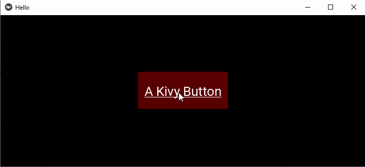
Displaying a Button Using the build() Method
Let us configure the Button with some of the properties explained above −
Example
from kivy.app import App
from kivy.uix.button import Button
from kivy.config import Config

# Configuration
Config.set('graphics', 'width', '720')
Config.set('graphics', 'height', '300')
Config.set('graphics', 'resizable', '1')

class HelloApp(App):
   def build(self):
      b1 = Button(text = "A Kivy Button",
         font_size=50,
         color = [0.8, 0.2, 0.3, 1])
      return b1

app = HelloApp()
app.run()
Output
Run this code and you will get the following output −

Displaying a Button Using the "kv" Language Method
Example
Save the following script as "hello.kv".
Button:
   text: 'A Kivy Button'
   font_size: '20pt'
   underline: True
   background_color: [1,0,0,1]
   size_hint: (.25, .25)
   pos_hint: {'center_x':.5, 'center_y':.5}
Output
Comment out the build() method in the App class and run the application again. You will get the following window as the output −
Kivy - Button Events
A Button, as most of the GUI widgets in Kivy, is programmed to respond to specific types of events. A Button processes the following event types −
on_press − Triggered when the button is pressed.
on_release − Triggered when the button is released.
on_touch_down − Triggered when a touch event starts on the button.
on_touch_up − Triggered when a touch event ends on the button.
Kivy's EventDispatcher class provides a bind() method which is responsible for delegating the event to a certain callback function for processing.
EventDispatcher.bind(self, **kwargs)
Button (as does each Kivy widget) inherits this method. Hence, we can bind a Button object to any callback eventhandler function. You can also bind a property to a callback.
Binding Event
Given below is a typical way to bind the on_press event of a button is bound to a function −
def callback(instance):
   print('The button is being pressed')

btn1 = Button(text='Hello world')
btn1.bind(on_press=callback)
Example
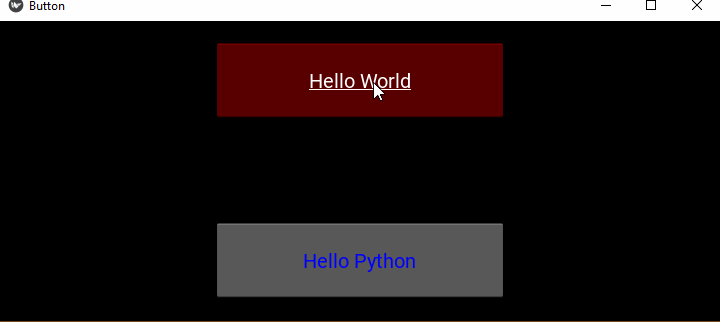
In the following example, we have put two buttons inside FloatLayout. The "on_press" event of each button is bound to the callback() method.
The reference of the button on which the "on_press" event occurred is passed to the callback() method, so that we can identify the caption of the button pressed.
from kivy.app import App
from kivy.uix.button import Button
from kivy.config import Config
from kivy.uix.floatlayout import FloatLayout

# Configuration
Config.set('graphics', 'width', '720')
Config.set('graphics', 'height', '400')
Config.set('graphics', 'resizable', '1')

class ButtonApp(App):
   def on_button_press(self, instance):
      print("{} Button pressed!".format(instance.text))

   def build(self):
      flo = FloatLayout()
      btn1 = Button(text= 'Hello World',
         background_color= [1,0,0,1],
         font_size= 20, underline= True,
         size_hint= (.4, .25),
         pos_hint= {'center_x':.5, 'center_y':.8})
      btn1.bind(on_press = self.on_button_press)

      btn2 = Button(text= 'Hello Python',
         color= [0,0,1,1], font_size= 20,
         size_hint= (.4, .25),
         pos_hint= {'center_x':.5, 'center_y':.2})
      flo.add_widget(btn1)
      btn2.bind(on_press = self.on_button_press)
      flo.add_widget(btn2)
      return flo

if __name__ == '__main__':
   ButtonApp().run()
Output
Run the above code and press the buttons −

On each press, the callback() method is invoked −
Hello World Button pressed!
Hello Python Button pressed!
Binding Property
As mentioned earlier, we can bind a callback to a property of a widget. Every time the value of the property changes, the callback is invoked to notify the change.
btn1.bind(property=callback)
Let us define another method "on_textchanged()" in the App class, and bind it with the text property of btn2. The on_press event on btn1 changes the caption of btn2, and the change invokes the on_textchanged() method immediately.
Example
Change the code for ButtonApp class as below −
from kivy.app import App
from kivy.uix.button import Button
from kivy.config import Config
from kivy.uix.floatlayout import FloatLayout

# Configuration
Config.set('graphics', 'width', '720')
Config.set('graphics', 'height', '400')
Config.set('graphics', 'resizable', '1')

class ButtonApp(App):
   def on_button_press(self, instance):
      print("{} Button pressed!".format(instance.text))
      self.btn2.text="Hello Tutorialspoint"

   def on_textchanged(self, instance, value):
      print ("Text property changed to", instance.text)

   def build(self):
      flo = FloatLayout()
      self.btn1 = Button(text= 'Hello World',
         background_color= [1,0,0,1],
         font_size= 20, underline= True,
         size_hint= (.4, .25),
         pos_hint= {'center_x':.5, 'center_y':.8})

      self.btn1.bind(on_press = self.on_button_press)
      self.btn2 = Button(text= 'Hello Python', color= [0,0,1,1],
         font_size= 20, size_hint= (.4, .25),
         pos_hint= {'center_x':.5, 'center_y':.2})
      flo.add_widget(self.btn1)
      self.btn2.bind(text = self.on_textchanged)
      flo.add_widget(self.btn2)
      return flo

if __name__ == '__main__':
   ButtonApp().run()
Output
Run the code and first press btn1. It changes the caption of btn2 and it in turn calls the "on_textchanged()" method.
Hello World Button pressed!
Text property changed to Hello Tutorialspoint
Here's the output window −
In general, property callbacks are called with two arguments (the object and the property's new value) and "event callbacks" with one argument (the object).
Binding using Lambda Function
Another approach for binding is to use lambda (or anonymous) function. Their advantage is that you can avoid declaring new functions i.e. they offer a concise way to "redirect" callbacks.
Change the statement that binds the "on_press" event of btn1 to −
self.btn1.bind(on_press = lambda btn1: self.on_button_press(btn1))
Using Partial Function
In Python, a Partial function allows us to derive a function with x parameters to a function with fewer parameters and constant values set for the more limited function. It makes a function reusable. The partial() function is defined in functools module of Python's standard library.
Example
We can bind an event to a partial method. In the example below, the Button objects bt1 and btn2 are passed. The function interchanges the text property of the two.
from kivy.app import App
from kivy.uix.button import Button
from kivy.config import Config
from kivy.uix.floatlayout import FloatLayout
from functools import partial

# Configuration
Config.set('graphics', 'width', '720')
Config.set('graphics', 'height', '300')
Config.set('graphics', 'resizable', '1')

class ButtonApp(App):
   def on_textchanged(self, instance, value):
      print ("Text property changed to", instance.text)

   def a_function(self, *args):
      args[0].text, args[1].text = args[1].text, args[0].text

   def build(self):
      flo = FloatLayout()

      self.btn1 = Button(text= 'Hello World',
         background_color= [1,0,0,1],
         font_size= 20, underline= True,
         size_hint= (.4, .25),
         pos_hint= {'center_x':.5, 'center_y':.8})

      self.btn2 = Button(text= 'Hello Python',
         color= [0,0,1,1],
         font_size= 20,
         size_hint= (.4, .25),
         pos_hint= {'center_x':.5, 'center_y':.2})
      flo.add_widget(self.btn1)
      self.btn1.bind(on_press = partial(self.a_function, self.btn1, self.btn2))
      self.btn2.bind(text = self.on_textchanged)
      flo.add_widget(self.btn2)
      return flo

if __name__ == '__main__':
   ButtonApp().run()
Output
Take a look at the following output window and observe how pressing the first button interchanges the text of the two buttons −

Kivy - Button Colors
In any GUI application, button is an important component. Its primary function to respond to click event and invoke a callback. To design attractive GUI, the button color should be chosen appropriately. You can configure a button by specifying the color for its caption, background color in normal as well as disabled state.
In Kivy, the Button class defines the following color-related properties −
- color
- background_color
- disabled_color
- outline_color
- disabled_outline_color
color Property
The Button class inherits this property from Label class, as Button is a Label that responds to click related events. The color property defines the color of the button text, or the button caption.
Since color is of ColorProperty type, it must be specified in (r,g,b,a) format. The colors take the value between "0" to "1". The "a" component is for transparency. For a button, color defaults to [1, 1, 1, 1].
background_color Property
This acts as a multiplier to the texture colour. The default texture is grey, so just setting the background color will give a darker result. The background color of the button is a ColorProperty in the format (r, g, b, a) with default value [1,1,1,1].
disabled_color Property
This property is inherited from the Label class. It defines the color of the button text or caption when it is disabled. It's a ColorProperty and defaults to [1,1,1,3]
outline_color Property
Inherited from the Label class, this property configures the color of text outline. Note that this requires SDL2 text provider. This property is of ColorProperty type and its default value is [0,0,0,1]
disabled_outline_color Property
This property defines the color of the text outline when the widget is disabled, in the (r, g, b) format. It is inherited from Label class. This feature requires the SDL2 text provider. The disabled_outline_color is a ColorProperty and defaults to [0, 0, 0].
Example 1
Let us demonstrate the use of color and disabled_color properties. In the following example, we have placed two buttons in a floatlayout. They are instantiated with different color and disabled_color properties. When clicked, the text color changes.
from kivy.app import App
from kivy.uix.button import Button
from kivy.config import Config
from kivy.uix.floatlayout import FloatLayout

# Configuration
Config.set('graphics', 'width', '720')
Config.set('graphics', 'height', '300')
Config.set('graphics', 'resizable', '1')

class HelloApp(App):
   def on_button_press(self, instance):
      instance.disabled = True

   def build(self):
      flo = FloatLayout()

      btn1 = Button(text= 'Hello Python', color= [1,0,0,1],
         disabled_color = [0,0,1,1],
         font_size= 40, size_hint= (.4, .25),
         pos_hint= {'center_x':.5, 'center_y':.8})
      btn1.bind(on_press = self.on_button_press)
      btn2 = Button(text= 'Hello Kivy', color= [0,0,1,1],
         disabled_color = [1,0,0,1],
         font_size= 40, size_hint= (.4, .25),
         pos_hint= {'center_x':.5, 'center_y':.2})
      flo.add_widget(btn1)
      btn2.bind(on_press = self.on_button_press)
      flo.add_widget(btn2)
      return flo

if __name__ == '__main__':
   HelloApp().run()
Output
Initially, both the buttons are enabled. When you press the buttons, they get disabled (they are unable to receive the "on_press" event) and the text color changes as per the configuration.

Example 2
In the following program, when any button is clicked, its text color and background color is interchanged.
from kivy.app import App
from kivy.uix.button import Button
from kivy.config import Config
from kivy.uix.floatlayout import FloatLayout

# Configuration
Config.set('graphics', 'width', '720')
Config.set('graphics', 'height', '300')
Config.set('graphics', 'resizable', '1')

class HelloApp(App):
   def on_button_press(self, instance):
      print("change color")
      instance.background_color, instance.color = instance.color, instance.background_color

   def build(self):
      flo = FloatLayout()

      self.btn1 = Button(text='Hello Python',
         color=[1, 0, 0, 1],
         background_color=[0, 0, 1, 1],
         font_size=40, size_hint=(.4, .25),
         pos_hint={'center_x': .5, 'center_y': .8})

      self.btn2 = Button(text='Hello Kivy',
         color=[0, 0, 1, 1],
         background_color=[1, 0, 0, 1],
         font_size=40, size_hint=(.4, .25),
         pos_hint={'center_x': .5, 'center_y': .2})
      flo.add_widget(self.btn1)
      self.btn1.bind(on_press=self.on_button_press)
      self.btn2.bind(on_press=self.on_button_press)
      flo.add_widget(self.btn2)
      return flo

if __name__ == '__main__':
   HelloApp().run()
Output
When you click any of the two buttons, their colors get interchanged as shown here −

Kivy - Button Size
It is important that a widget on a Kivy application's user interface should be of an appropriate size. Just as the position property, the size property of the button (any widget for that matter) is governed by the layout in which it is placed.
The button size can be configured by the two properties "size" and "size_hint". The "kivy.uix.button.Button" class inherits these properties from the Widget class.
The "size_hint" property of a button is a tuple of values used by its parent layout to decide the size. It defines the size relative to the layout's size and not absolute size. For example −
btn.size_hint = (w, h)
Both the parameters "w" and "h" are specified as floating point numbers in the range 0 to 1. For example, 0.5 represents 50% and 1 represents 100%.
# This button has width and height of the parent layout
btn.size_hint=(1,1)

# Width of this button will be half of the container's width
btn.size_hint=(0.5, 1)

# This button will be of width and height 20% of the layout
btn.size_hint=(.2,.2)
On the other hand, the "size" property assigns the width and height of the button in absolute terms and expressed in units of pixels.
btn.size=(200,100)
However, for the button to be absolutely sized, you must ask Kivy layout to disregard the size hints. If you don't want to use a size_hint for either the width or height, set the value to None. In other words, you must set "size_hint=(None, None)" before assigning size in absolute measurements.
You can also set the size hints for width or height individually with "size_hint_x" and "size_hint_y" properties.
Let us say you want to make a button that is 250px wide and 30% of the parent's height
btn.size_hint_x = None
btn.size_hint_y= 0.3
widget.width = 250
These properties can also be set in the Button constructor arguments −
btn = Button(text="Hi there!", size_hint=(None, 0.3), width=250)
Example
The following program places various buttons in a FloatLayout of the app window with different combinations of size_hint, size, pos_hint and pos properties −
from kivy.app import App
from kivy.uix.floatlayout import FloatLayout
from kivy.uix.button import Button
from kivy.core.window import Window

Window.size = (720,400)

class DemoApp(App):
   def build(self):
      f = FloatLayout()

      b1 = Button(text="B1", size_hint=(None, None))
      f.add_widget(b1)

      b2 = Button(text="B2", size_hint=(1, None), height=20)
      f.add_widget(b2)

      b3 = Button(text="B3", size_hint=(None, None), pos=(0, 100), size=(400, 100))
      f.add_widget(b3)
      b4 = Button(text='B4', size_hint=(None,.3), width=50, pos_hint={'x':.6, 'y':.2} )
      f.add_widget(b4)

      b5 = Button(text='B5', size_hint=(None,.9), width=50, pos_hint={'x':.5, 'y':.5} )
      f.add_widget(b5)
      return f

if __name__ == '__main__':
   DemoApp().run()
Output
On running this code, you will get the following output window −

Kivy - Button Position
Placing the widgets at their appropriate positions is the key to design an ergonomic user interface. In Kivy, the positioning of buttons (as also the other widgets) is largely controlled by the layouts used. In this chapter, we shall learn how to place a button at a certain position on a Kivy application window.
The first factor that decides the positioning is the layout. In Kivy, layouts are the containers used to arrange widgets in a particular manner. For example −
A BoxLyout places the widgets sequentially, either in vertical or horizontal order.
If you use GridLayout, the widget position is decided by the rows and cols properties.
A FloatLayout puts no restrictions on placement. You can put a button or any other widget at any position by assigning its absolute coordinates.
Window size
To place a button at a certain position, we first define the size of the application window. The "size" property of Window object helps you to set the desired size.
from kivy.core.window import Window
Window.size = (720,400)
Kivy's window coordinate system defines the position of widgets and touch events dispatched to them. It places (0, 0) at the bottom left corner of the window. Obviously, the top-right corner of the window corresponds to (1,1).
The Button class inherits "pos" and "pos_hint" properties from the Widget class. They help in determining the position of button on the window surface.
Position properties
pos − This property is a tuple of coordinate values "x" and "y" along the horizontal and vertical axis, measured from the bottom-left corner of the window. For example −
button = Button(text ='Hello world', pos =(20, 20))
pos_hint − This property provides a hint for the position of a widget. It allows you to set the position of the widget inside its parent layout. The property is a dictionary of upto 8 keys determining the position −
- x
- y
- left
- right
- top
- bottom
- center_x
- center_y
The keys 'x', 'right' and 'center_x' will use the parent width. The keys 'y', 'top' and 'center_y' will use the parent height. For example, if you want to set the top of the button to be at 10% height of its parent layout, you can write −
button = Button(text ='Hello world', pos_hint={'top': 0.1})
"pos_hint" is an ObjectProperty. is not used by all layouts.
Layouts supporting positioning
FloatLayout − Supports "pos_hint" properties. The values are numbers between 0 and 1 indicating a proportion to the window size.
RelativeLayout − The positioning properties (pos, x, center_x, right, y, center_y, and top) are relative to the Layout size and not the window size.
BoxLayout − only the "x" keys (x, center_x, and right) work in the vertical orientation and (y, center_y,top) in horizontal orientation. An same rule applies for the fixed positioning properties (pos, x, center_x, right, y, center_y, and top).
In the code below, we have placed a horizontal BoxLayout and a FloatLayout inside the upper vertical BoxLayout. The upper horizontal box houses four buttons: LEFT, RIGHT, TOP and BOTTOM. Inside the FloatLaout, we have a button placed with "pos" properties.
The App class has one method called movebtn() which identifies the caption of the button pressed and changes the "x" or "y" position of the button
def movebtn(self,instance):
   if instance.text =='RIGHT':
      self.btn.pos[0]=self.btn.pos[0]+10

   if instance.text == 'LEFT':
      self.btn.pos[0] = self.btn.pos[0]-10

   if instance.text == 'UP':
      self.btn.pos[1] = self.btn.pos[1]+10

   if instance.text == 'DOWN':
      self.btn.pos[1] = self.btn.pos[1]-10
The RIGHT and LEFT button press causes the "x" position to be incremented or devremented by 10 pixels. Similarly, TOP and BOTTOM buttons change the "y" value by 10.
Example 1
The complete code is given below −
from kivy.app import App
from kivy.uix.button import Button
from kivy.config import Config
from kivy.uix.floatlayout import FloatLayout
from kivy.uix.boxlayout import BoxLayout

Config.set('graphics', 'width', '720')
Config.set('graphics', 'height', '400')
Config.set('graphics', 'resizable', '1')

class MovableButtonApp(App):
   def movebtn(self,instance):
      if instance.text =='RIGHT':
         self.btn.pos[0]=self.btn.pos[0]+10

      if instance.text == 'LEFT':
         self.btn.pos[0] = self.btn.pos[0]-10

      if instance.text == 'UP':
         self.btn.pos[1] = self.btn.pos[1]+10

      if instance.text == 'DOWN':
         self.btn.pos[1] = self.btn.pos[1]-10

   def build(self):
      mblo = BoxLayout(orientation='vertical')
      blo = BoxLayout(orientation ='horizontal')
      b1 = Button(text='LEFT')
      b1.bind(on_press=self.movebtn)
      b2 = Button(text = 'RIGHT')
      b2.bind(on_press=self.movebtn)
      b3 = Button(text = 'UP')
      b3.bind(on_press=self.movebtn)
      b4 = Button(text = 'DOWN')
      b4.bind(on_press=self.movebtn)
      blo.add_widget(b1)
      blo.add_widget(b2)
      blo.add_widget(b3)
      blo.add_widget(b4)

      mblo.add_widget(blo)
      flo = FloatLayout()
      self.btn = Button(text='Movable Button', size_hint= (.350, .150))
      flo.add_widget(self.btn)
      mblo.add_widget(flo)
      return mblo
MovableButtonApp().run()
Output
When you run the program, you should see four buttons at the top, and a movable button at the left-bottom corner. Press the buttons and see the movable button changing its position.

Here is another example to demonstrate use of button positioning. Let us define a MovableButton class that extends Button class. We define on_touch_down(), on_touch_up() and on_touch_move() methods to process the touch events.
The on_touch_down() method checks if the touch event occurred within the button's bounds, handle the touch event by setting the widget as the current touch target.
def on_touch_down(self, touch):
   if self.collide_point(*touch.pos):
      touch.grab(self)
      return True
   return super().on_touch_down(touch)
If the touch event is being handled by our button, update its position by using the on_button_move() method −
def on_touch_move(self, touch):
   if touch.grab_current == self:
      self.pos = (self.pos[0] + touch.dx, self.pos[1] + touch.dy)
Finally, release the button as the current touch target and handle the touch event.
def on_touch_up(self, touch):
   if touch.grab_current == self:
      touch.ungrab(self)
      return True
   return super().on_touch_up(touch)
The build() method constructs the window with just a button at the left_bottom position
def build(self):
   return MovableButton(text='Drag me', size_hint= (.250, .100))
Example 2
The complete code is given below −
from kivy.app import App
from kivy.uix.button import Button
from kivy.config import Config
from kivy.uix.floatlayout import FloatLayout

Config.set('graphics', 'width', '720')
Config.set('graphics', 'height', '300')
Config.set('graphics', 'resizable', '1')

class MovableButton(Button):
   def on_touch_down(self, touch):
      if self.collide_point(*touch.pos):
         touch.grab(self)
         return True
      return super().on_touch_down(touch)

   def on_touch_move(self, touch):
      if touch.grab_current == self:
         self.pos = (self.pos[0] + touch.dx, self.pos[1] + touch.dy)

   # Override the on_touch_up method to update
   # the widget's position when the touch event ends
   def on_touch_up(self, touch):
      if touch.grab_current == self:
         touch.ungrab(self)
         return True
      return super().on_touch_up(touch)

class TestApp(App):
   def build(self):
      return MovableButton(text='Drag me', size_hint=(.250, .100))

if __name__ == "__main__":
   TestApp().run()
Output
Run the above code. Keep the mouse button pressed and drag the button anywhere across the window.

Kivy - Round Buttons
All the widgets in Kivy framework are rectangular in shape. A button object always has right-angled corners. Hence, creating buttons with rounded corners doesn't have a straightforward solution, however we can achieve it by a couple of tricks.
Using Image as a Button
We can define a class which extends ButtonBehavior mixin and Image class. Using any photo editor, create an elliptical shape looking like a round button, and use it as source property of Image object.
You can override the on_press() method of ButtonBehavior class that lets the image be used as a button.
from kivy.uix.behaviors import ButtonBehavior
from kivy.uix.image import Image
class imgbtn(ButtonBehavior, Image):
   def __init__(self, **kwargs):
      super(imgbtn, self).__init__(**kwargs)
      self.source = 'hello.png'
      self.pos_hint= {'center_x':.5, 'center_y':.6}

   def on_press(self):
      print("Button pressed")
We can now use imgbtn object in a Kivy App.
KivyMD Buttons
Using KivyMD extension, we can design more attractive interfaces. KivyMD is a collection of Material Design widgets, to be used in a Kivy app. The KivyMD library provides different button objects with rounded corners.
- MDRoundFlatButton
- MDRoundFlatIconButton
- MDFillRoundFlatButton
- MDFillRoundFlatIconButton
First, install the KivyMD extension (ensure that Kivy framework is installed earlier)
pip3 install KivyMD
The App class must be a subclass of MDApp class instead of App class. In this example, we will use MDRoundFlatButton class. Most of its properties are the same as Kivy Button.
from kivymd.app import MDApp
from kivymd.uix.button import MDRoundFlatButton

btn = MDRoundFlatButton(
   text= 'Hello Python',
   font_size= 20,
   size_hint= (.3, .1),
   pos_hint= {'center_x':.5, 'center_y':.3},
   line_width=3
)
Example
In the following example, we have a MDApp class. The build() method puts an image button and a MDRoundButton object in the application window.
from kivymd.app import MDApp
from kivy.core.window import Window
from kivy.uix.floatlayout import FloatLayout
from kivy.uix.image import Image
from kivy.uix.behaviors import ButtonBehavior
from kivymd.uix.button import MDRoundFlatButton

Window.size = (720, 300)

class imgbtn(ButtonBehavior, Image):
   def __init__(self, **kwargs):
      super(imgbtn, self).__init__(**kwargs)
      self.source = 'btnnormal.png'
      self.pos_hint= {'center_x':.5, 'center_y':.6}

   def on_press(self):
      print("Button pressed")

class ButtonApp(MDApp):
   def build(self):
      flo = FloatLayout()
      self.btn1 = imgbtn()
      self.btn2 = MDRoundFlatButton(
         text= 'Hello Python',
         font_size= 20, size_hint= (.3, .1),
         pos_hint= {'center_x':.5, 'center_y':.3},
         line_width=3
      )
      flo.add_widget(self.btn1)
      flo.add_widget(self.btn2)
      return flo

if __name__ == '__main__':
   ButtonApp().run()
Output
Run the application. You should get the following output, having rounded buttons.

Using Canvas
In Kivy, canvas is the root object for drawing by a widget. To simulate a Label to work as a circular button, we define a class that extends ButtonBehavior and a Label. The "kv" file defines the structure of this object as −
<RoundCorneredButton>:
   canvas:
      Color:
         rgb: (1, 0, 0, 1) if self.state == 'normal' else (0, 0, 0, 1)
      RoundedRectangle:
         size: (self.size)
         pos: (self.pos)
         radius: [200, ]
   on_release:
      print("This is the button made up by the canvas")
The class definition is as follows −
class RoundCorneredButton(ButtonBehavior, Label):
   pass
Example
We shall use the above class and the kv design in the following App code −
from kivy.app import App
from kivy.uix.label import Label
from kivy.config import Config
from kivy.uix.button import ButtonBehavior
from kivy.graphics import Rectangle, Color

# Configuration
Config.set('graphics', 'width', '720')
Config.set('graphics', 'height', '300')
Config.set('graphics', 'resizable', '1')

from kivy.app import App
class RoundCorneredButton(ButtonBehavior, Label):
   pass

class HelloApp(App):
   def build(self):
      return RoundCorneredButton()

HelloApp().run()
Output
Run the code now. You will get a button with a circular shape, as shown here −

Kivy - Disabled Buttons
The Kivy API has button widgets of different types. The objects of Button, ToggleButton, CheckBox are all buttons with different characteristics. There is one common attribute in all of them. They can accept and propagate the "touch" events on click events. All button objects can raise the button events, as these classes inherit the ButtonBehavior interface.
You can make a button irresponsive to the button events by setting the "disabled" property to True. (The default value of disabled property is False. The disabled property is inherited from the Widget class.)
from kivy.uix.button import Button
b1 = Button(text="OK", disabled=True)
In order to configure the appearance of a disabled button from a normal or enabled button, one can use the following properties −
background_disabled_down − The background image of the button is a StringProperty, a string containing path to an image file and is used for the default graphical representation when the button is disabled and pressed.
background_disabled_normal − Background image of the button is also an image path, used for the default graphical representation when the button is disabled and not pressed.
disabled_color − This property is inherited from the Label class. It defines the color of the button text or caption when it is disabled. It's a ColorProperty and defaults to [1,1,1,3]
disabled_outline_color − This property defines the color of the text outline when the widget is disabled, in the (r, g, b) format. It is inherited from Label class. This feature requires the SDL2 text provider. The disabled_outline_color is a ColorProperty and defaults to [0, 0, 0].
Example
The code given below arranges a ToggleButton and a normal Button in vertical BoxLayout. The toggle button changes the disabled property of the other button to True or False if its state is down or normal.
from kivy.app import App
from kivy.uix.button import Button
from kivy.uix.togglebutton import ToggleButton
from kivy.core.window import Window
from kivy.uix.boxlayout import BoxLayout

Window.size = (720, 350)

class HelloApp(App):
   def on_button_press(self, instance, value):
      if value == 'down':
         self.btn2.disabled = True
         self.btn2.text = 'Disabled'
         instance.text = 'Enable Btn 2'
      if value == 'normal':
         self.btn2.disabled = False
         self.btn2.text = 'Enabled'
         instance.text = 'Disable Btn 2'

   def build(self):
      flo = BoxLayout(orientation='vertical')

      btn1 = ToggleButton(
         text='Disable Btn 2', font_size=40,
         size_hint=(1, .25),
         pos_hint={'center_x': .5, 'center_y': .8}
      )
      btn1.bind(state=self.on_button_press)
      self.btn2 = Button(
         text='Enabled', color=[0, 0, 1, 1],
         disabled_color=[1, 0, 0, 1], font_size=40,
         size_hint=(1, .25),
         pos_hint={'center_x': .5, 'center_y': .2}
      )
      flo.add_widget(btn1)
      flo.add_widget(self.btn2)
      return flo

if __name__ == '__main__':
   HelloApp().run()
Output
When the program is run, it shows the button at the bottom (i.e., btn2) as enabled, with its caption in the Color property.

As the button at the top (btn1) is pressed down, the one below becomes disabled, changing the color specified by the "disabled_color" property.
Kivy - Image Button
The Kivy library doesn't have a ready-to-use image button widget. It does have a normal Button and a ToggleButton widget. You can of course use the image files as their background in the normal state or disabled state −
background_disabled_down − The background image of the button is a StringProperty, a string containing path to an image file and is used for the default graphical representation when the button is disabled and pressed.
background_disabled_normal − Background image of the button is also an image path, used for the default graphical representation when the button is disabled and not pressed.
background_down − Background image of the button used as the default graphical representation when the button is pressed.
background_normal − Background image of the button used as the default graphical representation when the button is not pressed.
For example, you can use −
B1 = Button(background_normal='images/play.png')
However, to make an image widget function as a clickable button, you need to dfine a custom class based on ButtonBehavior mixin and Image class and override the on_press() method.
ButtonBehavior
In Kivy, the "kivy.uix.behaviors" module defines behavior mixins, which are also called "reusable classes" that provide additional functionality to widgets.
To use of an image as a button, we define a custom class that extends the ButtonBehavior to make it respond to events like on_press or on_touch, so that the image itself can behave as a button.
We use Kivy's Image object to display an image on Kivy window. However, to add button-like behavior to it, we first define a custom class called "imgbtn" that extends the Image as well as the ButtonBehavior classes.
The source property of the Image class is assigned a string which is the path to the image file. We then override the on_press() method.
class imgbtn(ButtonBehavior, Image):
   def __init__(self, **kwargs):
      super(imgbtn, self).__init__(**kwargs)
   def on_press(self):
      print("Button pressed", self.source)
      ImgBtnApp.l1.text=self.source
Example
Let's implement this concept and put four images in the app layout and bind them to a callback. The class to provide button-like functionality to an image is first defined as below −
class imgbtn(ButtonBehavior, Image):
   def __init__(self, **kwargs):
      super(imgbtn, self).__init__(**kwargs)
   def on_press(self):
      ImgBtnApp.l1.text=self.source
We shall now use objects of this class on the application layout to display images and they will raise the on_press event. The source property of the clicked image will be displayed on the label as its text.
from kivy.app import App
from kivy.graphics import *
from kivy.uix.floatlayout import FloatLayout
from kivy.uix.gridlayout import GridLayout
from kivy.uix.button import Button
from kivy.uix.label import Label
from kivy.uix.image import Image
from kivy.uix.behaviors import ButtonBehavior
from kivy.core.window import Window

Window.size = (720, 400)

class imgbtn(ButtonBehavior, Image):
   def __init__(self, **kwargs):
      super(imgbtn, self).__init__(**kwargs)

   def on_press(self):
      print("Button pressed", self.source)
      ImgBtnApp.l1.text = self.source

class ImgBtnApp(App):
   def build(self):
      main = GridLayout(cols=1)
      ImgBtnApp.l1 = Label(text='Hello', font_size=32)
      main.add_widget(ImgBtnApp.l1)
      root = FloatLayout(size=(Window.width, 100))
      with root.canvas:
         Color(.2, .7, .1, 1)
         Rectangle(pos=root.pos, size=root.size)

      self.btn1 = imgbtn(
         source='previous.png', size_hint=(None, None),
         pos_hint={'center_x': .2, 'center_y': .25}
      )
      self.btn2 = imgbtn(
         source='play.png', size_hint=(None, None),
         pos_hint={'center_x': .4, 'center_y': .25}
      )
      self.btn3 = imgbtn(
         source='pause.png', size_hint=(None, None),
         pos_hint={'center_x': .6, 'center_y': .25}
      )
      self.btn4 = imgbtn(
         source='stop.png', size_hint=(None, None),
         pos_hint={'center_x': .8, 'center_y': .25}
      )
      root.add_widget(self.btn1)
      root.add_widget(self.btn2)
      root.add_widget(self.btn3)
      root.add_widget(self.btn4)

      main.add_widget(root)
      return main

ImgBtnApp().run()
Output
Run the code and click each of the four buttons one by one.

Kivy - Widgets
The user interface of a Kivy app is designed with various widgets in Kivy library. The "kivy.uix" module includes definitions of classes corresponding to the widget names. These classes provide the properties and functionality of the corresponding widget object.
The various widgets in Kivy library can be classified under following categories −
General Purpose Widgets
These widgets are classical in nature in the sense they are used in the interface design of most applications. The UX widgets like Label, various Button types, input box, Image container, slider and progress indicator etc. belong to this category.
Some of the UX widgets are shown below −

Layouts
The Kivy app window can contain only one widget as its root object. However, if you need to compose the app interface with more than one controls, you have to use the layout widget, and place multiple UX widgets in it and then put the layout as the root widget on the app window.
It may be noted that the layout widgets do not have a visual representation of their own. Kivy provides various layouts such as grid layout, box layout, float layout etc.
Complex UX Widgets
The widgets of this type are the the result of combining multiple classic widgets. They are complex because their assembly and usage are not as generic as the classical widgets.
Examples in the category of complex widgets are Drop-Down List, FileChooser, Spinner, Video player, VKeyboard etc.
Behaviors Widgets
These widgets do not have their own rendering but respond to the graphics instructions or interaction (touch) behavior of their children. Scatter, Stencil View widgets are of this type.
Screen Manager
Manages screens and transitions when switching from one to another.
Widget Class
The Widget class, defined in kivy.uix.widget module is the base for all the widget classes. The common properties such as size, width, height, pos, pos_hint, etc. defined in this Widget class are inherited by other widgets.
The interactivity of any Widget object depends on two aspects: the "event handlers" and the "property callbacks". If a widget is bound to a certain handler in the occurrence of an event of certain type, the corresponding handler function is invoked.
def callback(instance):
   print('Callback handler')

wid = Widget()
wid.bind(on_event=callback)
A callback function is also invoked on the basis of a certain property. If a property changes, the widget can respond to the change in the 'on_<propname>' callback.
def on_pos_change(instance, value):
   print('The widget position changed to ', value)

wid = Widget()
wid.bind(pos=on_pos_change)
Neither the base Widget class nor any of the Widgets have a draw() method. Every widget has its own Canvas that you can use to draw.
widget = Widget()
with widget.canvas:
   Rectangle(pos=widget.pos, size=widget.size)
The graphic instruction such as Color, Rectangle and Line, Scale and Rotate can be added to the Canvas of any widget.
In Kivy, events are propagated upwards from the first child through the other children. If a widget has children, the event is passed through its children before being passed on to the widget after it.
Each widget is added to its parent by the add_widget() method. Each addition is identified by an incrementing index.
box = BoxLayout()
l1=Label(text="a")
l1=Label(text="b")
l1=Label(text="c")
box.add_widget(l1)
box.add_widget(l2)
box.add_widget(l3)
The indices at which the labels are added are 0,1 and 2 for l1, l2, l3 respectively. You can explicitly give the index argument to the add_widget() method.
box.add_widget(l1, index=1)
box.add_widget(l2, index=0)
box.add_widget(l3, index=2)
In case the widget arrangement is nested, the event on the innermost widget is propagated upwards. Suppose that a Button is a child widget, added to the Widget object itself. Hence, the touch_down callback will be invoked for both the objects. To confirm that the touch event has occurred on the button only, use collide_points() method.
def callback(self, touch):
   if instance.collide_point(touch.x, touch.y):
      #consume event
      return True
   else:
      #the upper level widget processes the event
Example
A basic Kivy app shows a simple one line message on a label added to a Widget object with the code below −
from kivy.app import App
from kivy.uix.label import Label
from kivy.uix.widget import Widget
from kivy.core.window import Window

Window.size = (720,300)

class HelloApp(App):
   def build(self):
      w = Widget()
      l1=Label(
         text='Fortune Favours the Brave!',
         font_size=50, size=(200,100),
         pos_hint={'center_x':.5, 'center_y':.5},
         pos=(250,200)
      )
      w.add_widget(l1)
      return w

app = HelloApp()
app.run()
Output
When you run this code, it will produce the following output window −

Kivy - Label
Labels are one of the most often used widgets in any GUI toolkit. Labels display any textual content, which can not be directly edited. A label is used to display the page heading, as a placeholder for the field name along with the input controls like text box, or just to render output message.
In Kivy, the label widget is an object of Label class, defined in the "kivy.uix.label" module.
from kivy.uix.Label import Label
lbl = Label(**kwargs)
To customize the label object, you can use the following properties as keyword arguments for the constructor −
bold − bold is a BooleanProperty and defaults to False. Set it to True for the use of the bold version of your font. Note that depending of your font, the bold attribute may have no impact on your text rendering.
color − Text color, in the format (r, g, b, a). It is a ColorProperty, defaults to [1, 1, 1, 1].
disabled_color − The color of the text when the label is disabled, in the (r, g, b, a) format. It is a ColorProperty and defaults to [1, 1, 1, .3].
font_name − Filename of the font to use. font_name is a StringProperty and defaults to 'Roboto'. This value is taken from Config.
font_size − Font size of the text, in pixels. It is a NumericProperty and defaults to 15sp.
halign − Horizontal alignment of the text. halign is an OptionProperty and defaults to 'auto'. Available options are : auto, left, center, right and justify.
italic − Indicates use of the italic version of your font. italic is a BooleanProperty and defaults to False.
markup − If True, the text will be rendered using the MarkupLabel: you can change the style of the text using tags.
outline_color − The color of the text outline, in the (r, g, b) format. It is a ColorProperty and defaults to [0, 0, 0, 1]
padding − Padding of the text in the format [padding_left, padding_top, padding_right, padding_bottom]. padding also accepts a two argument form [padding_horizontal, padding_vertical] and a one argument form [padding].
strikethrough − Adds a strikethrough line to the text. strikethrough is a BooleanProperty and defaults to False.
text − Text of the label caption. text is a StringProperty and defaults to ''. For example −
lbl = Label(text='Hello world')
text_size − By default, the label is not constrained to any bounding box. You can set the size constraint of the label with this property. The text will autoflow into the constraints. So although the font size will not be reduced, the text will be arranged to fit into the box as best as possible, with any text still outside the box clipped.
Label(text='long text . . . ', text_size=(200, None))
text_size is a ListProperty and defaults to (None, None), meaning no size restriction by default.
texture − Texture object of the text. The text is rendered automatically when a property changes. The texture is an ObjectProperty and defaults to None.
texture_size − Texture size of the text. The size is determined by the font size and text. If text_size is [None, None], the texture will be the size required to fit the text, otherwise it's clipped to fit text_size.
underline − Adds an underline to the text. underline is a BooleanProperty and defaults to False.
valign − Vertical alignment of the text. It is an OptionProperty and defaults to 'bottom'. Available options are : 'bottom', 'middle' (or 'center') and 'top'.
Alignment
Although the Label class has halign and valign properties, the text image (texture) is only large enough so that characters are positioned in the center of the Label.
The valign property will have no effect and halign will only have an effect if your text has newlines; a single line of text will appear to be centered even though halign is set to left (by default).
For the alignment properties to be effective, set the text_size, which is the size of the bounding box within which text is aligned. For instance, the following code binds this size to the size of the Label, so text will be aligned within the widget bounds.
Label:
   text_size: self.size
   halign: 'left'
   valign: 'middle'
Markup
If the markup property of Label is True, the text will be rendered using the Text markup, used for nline text styling. Just like html tags, the Text markup tags have [tag], and should have a corresponding [/tag] closing tag. For example −
[b]Hello [color=ff0000]world[/color][/b]
The following tags can be used to construct the label text −
| Sr.No | Tags & Label Text Description |
|---|---|
| 1 | [b][/b] Activate bold text |
| 2 | [i][/i] Activate italic text |
| 3 | [u][/u] Underlined text |
| 4 | [s][/s] Strikethrough text |
| 5 | [font=<str>][/font] Change the font (note - this refers to a TTF file or registered alias) |
| 6 | [size=<size>][/size] Change the font size. |
| 7 | [color=#<color>][/color] Change the text color |
| 8 | [sub][/sub] Display the text at a subscript position relative to the text before it. |
| 9 | [sup][/sup] Display the text at a superscript position relative to the text before it. |
For example, this creates a label hello world with world in bold
l = Label(text='Hello [b]World[/b]', markup=True)
Sizing
The size of Label is not affected by text content and also the text is not affected by the size. In order to control sizing, you must specify text_size to constrain the text and/or bind size to texture_size to grow with the text.
For example in kv language script, this label's size will be set to the text content (plus padding) −
Label:
   size: self.texture_size
Example
We shall now demonstrate the use of some of the Label properties in the following example. Three labels are placed in a vertical box layout here. Each of the labels is constructed with certain properties of the Label class.
from kivy.app import App
from kivy.uix.boxlayout import BoxLayout
from kivy.uix.label import Label
from kivy.graphics import Color, Rectangle
from kivy.core.window import Window

Window.size = (720, 350)

class LblApp(App):
   def build(self):
      layout = BoxLayout(orientation='vertical')
      self.l1 = Label(
         text='Hello World', color=[1, 0, 0, 1],
         font_size=40, bold=True
   )

   self.l2 = Label(
   text='Hello Python', color=[0, 1, 0, 1],
   font_size=40, italic=True
   )

   self.l3 = Label(
      text='Hello Kivy', color=[0, 0, 1, 1],
      font_size=40, font_name='Arial',
      underline=True
   )
   layout.add_widget(self.l1)
   layout.add_widget(self.l2)
   layout.add_widget(self.l3)
   return layout

if __name__ == '__main__':
   LblApp().run()
Output
When you run the above program, three labels with their caption in corresponding formatting properties as defined in the code will be displayed −
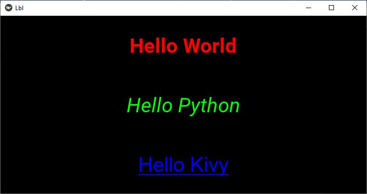
Example with kv file
The above design will now be created with the "kv" file. In addition to the properties used in the above Python code, we apply the background color to each label.
The Label class doesn't support background color properties. To overcome this, we draw a rectangle with desired color as its fill color on the canvas of the button. For example −
Label:
   canvas:
      Color :
         rgba: 0, 1, 0, 0.25
      Rectangle:
         pos:self.pos
         size : self.size
We utilize this feature to apply different colors as background for the three labels.
BoxLayout:
   orientation:'vertical'
   Label:
      text:'Hello World'
      color : [1,0,0,1]
      font_size : 40
      bold : True
      canvas:
         Color :
            rgba: 0, 1, 0, 0.25
         Rectangle:
            pos:self.pos
            size : self.size

   Label:
      text:'Hello Python'
      color:[0,1,0,1]
      font_size:40
      italic:True
      canvas:
         Color :
            rgba: 1, 1, 0, 0.1
         Rectangle:
            pos:self.pos
            size : self.size
   Label:
      text:'Hello Kivy'
      color:[0,0,1,1]
      font_size:40
      font_name:'Arial'
      underline:True
Output
Incorporate this "lbl.kv" file in the Python Kivy app, and run the program. You shuld get the following display, showing three labels with corresponding background color.

Kivy - Text Input
You often see a rectangular box being used in desktop and web applications, meant for the user to enter some text. A textbox is an essential widget in any GUI toolkit. In Kivy, the TextInput provides a control in which the user can enter and edit text.
The TextInput control can be customized to receive a single line or multiline text. A certain part of the text can be selected with mouse. One can also perform full screen editing inside it with the cursor movement.
The TextInput class is defined in kivy.uix.textinput module.
from kivy.uix.textinput import TextInput
textbox = TextInput(**kwargs)
Following properties are defined in the TextInput class −
allow_copy − Decides whether to allow copying the text. allow_copy is a BooleanProperty and defaults to True.
background_color − Current color of the background, in (r, g, b, a) format.It is a ColorProperty and defaults to [1, 1, 1, 1] (white).
border − Border used for BorderImage graphics instruction. Used with background_normal and background_active. Can be used for a custom background. It must be a list of four values: (bottom, right, top, left). border is a ListProperty and defaults to (4, 4, 4, 4).
cursor − Tuple of (col, row) values indicating the current cursor position. You can set a new (col, row) if you want to move the cursor. The scrolling area will be automatically updated to ensure that the cursor is visible inside the viewport. cursor is an AliasProperty.
cursor_color − Current color of the cursor, in (r, g, b, a) format. cursor_color is a ColorProperty and defaults to [1, 0, 0, 1].
cut() − Copy current selection to clipboard then delete it from TextInput.
delete_selection(from_undo=False) − Delete the current text selection (if any).
disabled_foreground_color − Current color of the foreground when disabled, in (r, g, b, a) format. disabled_foreground_color is a ColorProperty and defaults to [0, 0, 0, 5] (50% transparent black).
font_name − Filename of the font to use. The path can be absolute or relative. Relative paths are resolved by the resource_find() function.
font_name − is a StringProperty and defaults to 'Roboto'. This value is taken from Config.
font_size − Font size of the text in pixels. font_size is a NumericProperty and defaults to 15 sp.
foreground_color − Current color of the foreground, in (r, g, b, a) format. oreground_color is a ColorProperty and defaults to [0, 0, 0, 1] (black).
halign − Horizontal alignment of the text. halign is an OptionProperty and defaults to 'auto'. Available options are : auto, left, center and right.
hint_text − Hint text of the widget, shown if text is ''. hint_text a AliasProperty and defaults to ''.
hint_text_color − Current color of the hint_text text, in (r, g, b, a) format, ColorProperty and defaults to [0.5, 0.5, 0.5, 1.0] (grey).
input_filter − Filters the input according to the specified mode, if not None. If None, no filtering is applied. It is an ObjectProperty and defaults to None. Can be one of None, 'int' (string), or 'float' (string), or a callable.
insert_text(substring, from_undo=False) − Insert new text at the current cursor position. Override this function in order to pre-process text for input validation.
line_height − Height of a line. This property is automatically computed from the font_name, font_size. Changing the line_height will have no impact. line_height is a NumericProperty, read-only.
line_spacing − Space taken up between the lines. line_spacing is a NumericProperty and defaults to 0.
minimum_height − Minimum height of the content inside the TextInput. minimum_height is a readonly AliasProperty.
multiline − If True, the widget will be able show multiple lines of text. If False, the "enter" keypress will defocus the textinput instead of adding a new line
on_touch_down(touch) − Receive a touch down event. The touch parameter is object of MotionEvent class. It returns bool If True, the dispatching of the touch event will stop. If False, the event will continue to be dispatched to the rest of the widget tree.
on_touch_move(touch) − Receive a touch move event. The touch is in parent coordinates.
on_touch_up(touch) − Receive a touch up event. The touch is in parent coordinates.
padding − Padding of the text: [padding_left, padding_top, padding_right, padding_bottom]. Padding also accepts a two argument form [padding_horizontal, padding_vertical] and a one argument form [padding]. Padding is a VariableListProperty and defaults to [6, 6, 6, 6].
password − If True, the widget will display its characters as the character set in password_mask.
password_mask − Sets the character used to mask the text when password is True. password_mask is a StringProperty and defaults to '*'.
paste() − Insert text from system Clipboard into the TextInput at current cursor position.
readonly − If True, the user will not be able to change the content of a textinput.
select_all() − Select all of the text displayed in this TextInput.
select_text(start, end) − Select a portion of text displayed in this TextInput. Parameters are start - Index of textinput.text from where to start selection and end - Index of textinput.text till which the selection should be displayed
selection_color − Current color of the selection, in (r, g, b, a) format.
selection_from − If a selection is in progress or complete, this property will represent the cursor index where the selection started.
selection_text − Current content selection. selection_text is a StringProperty and defaults to '', readonly.
tab_width − By default, each tab will be replaced by four spaces on the text input widget. You can set a lower or higher value. tab_width is a NumericProperty and defaults to 4.
text − Text of the widget. It is an AliasProperty.
Usage
To create a simple hello world −
widget = TextInput(text='Hello world')
If you want to create the widget with an unicode string, use −
widget = TextInput(text=u'My unicode string')
When the user enters data inside the TextInput widget, it becomes the value of text property.
You can invoke a callback when the text property of TextInput object changes.
def callback(instance, value):
   print('The widget', instance, 'have:', value)

textinput = TextInput()
textinput.bind(text=callback)
When the multiline property is False, the TextInput accepts a single line input. When the user presses Enter, an on_text_validate event is generated −
def callback(instance, value):
   print('The widget', instance, 'have:', value)

textinput = TextInput(multiline=False)
textinput.bind(on_text_validate=callback)
Example
Let us use some of the properties and methods of TextInput class explained above. In the following example, we have two multiline textboxes and two buttons arranged in a BoxLayout.
The COPY button calls gettext() method which stores the selected text from the upper text box.
def gettext(self, instance):
   mydemoapp.text = self.text1.selection_text
The PASTE button invokes a callback insert() which pastes the selected text at the cursor position.
def insert(self, instance):
   self.text2.insert_text(mydemoapp.text)
These two functions are bound to two buttons −
self.b1=Button(text='COPY')
self.b1.bind(on_press=self.gettext)
self.b2=Button(text='PASTE')
self.b2.bind(on_press=self.insert)
The build() method assembles the text boxes and buttons.
Here is the complete code −
from kivy.app import App
from kivy.uix.boxlayout import BoxLayout
from kivy.uix.textinput import TextInput
from kivy.uix.button import Button
from kivy.config import Config

Config.set('graphics', 'width', '720')
Config.set('graphics', 'height', '300')
Config.set('graphics', 'resizable', '1')

class mydemoapp(App):
   text=''
   def gettext(self, instance):
      mydemoapp.text = self.text1.selection_text
   def insert(self, instance):
      self.text2.insert_text(mydemoapp.text)

   def build(self):
      main= BoxLayout(orientation= 'vertical')
      self.text1 = TextInput(multiline=True, font_size=20)
      btns = BoxLayout(orientation='horizontal')

      self.b1=Button(text='COPY')
      self.b1.bind(on_press=self.gettext)
      self.b2=Button(text='PASTE')
      self.b2.bind(on_press=self.insert)
      self.text2 = TextInput(
         multiline=True, font_size=20,
         foreground_color=[0,0,1,1]
      )

      btns.add_widget(self.b1)
      btns.add_widget(self.b2)
      main.add_widget(self.text1)
      main.add_widget(btns)
      main.add_widget(self.text2)
      return main

mydemoapp().run()
Output

Kivy - Canvas
Unlike some of the other GUI toolkits (such as TKinter for example), Kivy doesn't have an independent Canvas widget. Instead, you need to use the canvas that each Widget in Kivy already has by default. When you create a widget, you can create all the instructions needed for drawing on its canvas.
We need to note that all the widgets have a different canvas but all the canvas draw in exactly the same drawing space, i.e. the coordinate space. Moreover, the drawing space is not limited to the position and size of the widget. The (0,0) of the drawing space is always the bottom-left corner.
The "canvas.before" property particularly useful when you need to manipulate the Color of an instance. On the other hand, canvas.after is used to execute any instructions after the children were added. It is called after traverse all the children.
Canvas in Kivy is a set of drawing instructions. To draw, you will need a Canvas object and Instruction objects. For example, to draw a rectangle on a label's canvas −
from kivy.graphics import *
with label.canvas:
   Color(1., 0, 0)    # Add a red color

   # Add a rectangle
   Rectangle(pos=(10, 10), size=(500, 500))
If you have to do the same by not using Python's context manager −
label.canvas.add(Color(1., 0, 0))
label.canvas.add(Rectangle(size=(500, 500)))
You can draw shapes such as rectangle, ellipse, line and Beizer on any widget's canvas, including the Widget object itself. (Widget class is the base for all the other visual widgets in Kivy)
To draw a rectangle on the canvas, we need to specify the pos and size attributes −
from kivy.graphics import Rectangle
Rectangle(**kwargs)
Parameters
pos − List of X and Y coordinate values specifying Position of the rectangle, in the format (x, y).
size − List specifying the width and height of the rectangle, in the format (width, height).
The following code draws a rectangle on the canvas of a Widget object −
widget=Widget()

with widget.canvas:
   Color(0,0,1,1)
   Rectangle(pos=(50,300), size_hint=(None, None), size=(300,200))
The instructions Color and Rectangle are automatically added to the canvas object and will be used when the window is drawn.
Syntax
You may want to use the "kv" language syntax −
Widget:
   canvas:
      color:
         rgb: 0,0,1
      Rectangle:
         pos: self.pos
         size: self.size
A Label object in Kivy doesn't have a backgound color property. To get around this, you can draw a rectangle fille with the desired color on its canvas to lend background.
lbl = Label(text='Hello World', font_size=24)
   with lbl.canvas.before:
      Color(1,1,0)
      Rectangle(pos=lbl.pos, size=lbl.size)
Or, using the "kv" script −
Label:
   text:'Hello World'
   font_size:24
   canvas.before:
      Color:
         rgb: (1,1,0)
      Rectangle:
         pos:self.pos
         size=:self.size
Syntax
You can draw an ellipse on the canvas using the following syntax −
from kivy.graphics import Ellipse
Ellipse(*args, **kwargs)
Parameters
segments − Defines how many segments are needed for drawing the ellipse. More the segments, drawing will be smoother if you have many segments.
angle_start − float, defaults to 0.0 and Specifies the starting angle, in degrees, of the disk portion.
angle_end − float, defaults to 360.0, specifies the ending angle, in degrees, of the disk portion.
angle_end − End angle of the ellipse in degrees, defaults to 360.
angle_start − Start angle of the ellipse in degrees, defaults to 0.
pos − the position on the canvas coordinate system
size − the X and Y radii of the ellipse. If both are equal, it becomes a circle.
You can also draw an image directly on the canvas, by assigning the image file as the source property of rectangle or ellipse.
Example 1
The following code implements all the drawing instructions explained above to display a rectangle, an ellipse and an image on a widget canvas. It also places a label with a rectangle having background color drawn on its canvas.
from kivy.app import App
from kivy.uix.image import Image
from kivy.uix.widget import Widget
from kivy.uix.label import Label
from kivy.uix.button import Button
from kivy.graphics import *
from kivy.core.window import Window

Window.size = (720,400)

class canvasdemoapp(App):
   def build(self):
      widget=Widget()

      # rectangle on canvas
      with widget.canvas:
         Color(0,0,1,1)
         Rectangle(
            pos=(50,300), size_hint=(None, None),
            size=(300,200)
         )
         Color(0.5, .2, 0.4, 1)
         d = 100

         # ellipse
         Ellipse(pos=(600,100), size=(d+75, d))
         Color(.5,.5,.5)

         # image
         Rectangle(source='kivy-logo.png', pos=(50,100))
         Color(1,1,1)
         Rectangle(source='TPlogo.png', pos=(300, 100))

         # label with background
         lbl = Label(
            text='Hello World', font_size=24,
            pos=(Window.width/2, 300), size =(200,200),
            color=(0,0,1,1)
         )
         with lbl.canvas.before:
            Color(1,1,0)
            Rectangle(pos=lbl.pos, size=lbl.size)
         widget.add_widget(lbl)
         btn=Button(
            text='Button', font_size=24,
            background_color= (.8, .4, .3, 1),
            pos=(500,10)
         )
         widget.add_widget(btn)
      return widget
canvasdemoapp().run()
Output
When you run this code, it will produce the following output −

Example 2
The Widget object responds to all the touch events (such as on_touch_down and on_touch_move, etc.).
In the example below, a callback on the on_touch_down event on a Widget object obtains the coordinates where the touch event occurred and draws a circle (ellipse of equal X and Y radii) with random values of RGB colours.
from kivy.app import App
from kivy.uix.widget import Widget
from kivy.graphics import *
import random
from kivy.core.window import Window

Window.size = (720,300)
class widget(Widget):
   def on_touch_down(self, touch):
      colorR = random.randint(0, 255)
      colorG = random.randint(0, 255)
      colorB = random.randint(0, 255)

      self.canvas.add(Color(
         rgb=(colorR / 255.0, colorG / 255.0, colorB / 255.0)
      ))

      d = 30
      self.canvas.add(Ellipse(
         pos=(touch.x - d / 2, touch.y - d / 2),
         size=(d, d)
      ))

class circlesapp(App):
   def build(self):
      return widget()
circlesapp().run()
Output
Run the program and generate touch_down event at different places. Circles will be painted at locations.

Kivy - Line
In the Kivy library, "Line" is an important vertex instruction in the "kivy.graphics" module. In Kivy, all the drawings are done on the Canvas associated with any of the available widgets. The Line instruction draws a line, or a sequence of lines as well as other shapes like rectangle, ellipse, Bezier, etc.
It must be noted that the Kivy drawing instructions are not automatically relative to the position or size of the widget. On the contrary, the canvases of all the widgets share a common coordinate space.
The Line function requires a list of numeric values. The interpretation of the numbers depends on the parameter to which this list is assigned. The parameters of List function are points, rectangle, ellipse, Bezier, etc.
Draw a Rectangle
Syntax
You can draw a rectangle with Line function with the following syntax −
with self.canvas:
   Line(rectangle=[x, y, w, h], width)
Here, "x" and "y" represent the bottom-left position of the rectangle, and "w" and "h" represent the width and height. The line is automatically closed.
You can also use a rounded_rectangle property to build a rectangle with round corners. The argument must be a tuple of one of the following forms −
(x, y, width, height, corner_radius)
(x, y, width, height, corner_radius, resolution)
(x, y, width, height, corner_radius1, corner_radius2, corner_radius3, corner_radius4)
(x, y, width, height, corner_radius1, corner_radius2, corner_radius3, corner_radius4, resolution)
Example
from kivy.app import App
from kivy.uix.widget import Widget
from kivy.graphics import *
from kivy.core.window import Window

Window.size = (720,300)

class drawRectangle(App):
   def build(self):
      widget = Widget()
      with widget.canvas:
         Color(1, 0, 1, 1)
         Line(
            rectangle=(50, 50, 300, 200),
            width=3
         )
         Line(rounded_rectangle=(500, 200, 300, 200, 20, 20, 20, 20))
      return widget
drawRectangle().run()
Output
It will produce the following output window −
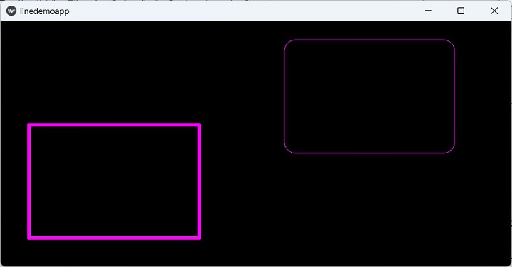
Draw an Ellipse
You need to assign a list of numeric values to the ellipse property of the Line instruction. The value of ellipse argument must be a tuple of
(x, y, width, height, angle_start, angle_end, segments)
Where,
"x" and "y" represent the bottom left of the ellipse
"width" and "height" represent the size of the ellipse. If both these values are same, the result will be a circle
"angle_start" and "angle_end" are in degree. The default value is 0 and 360.
"segments" is the precision of the ellipse. You can use this property to create polygons with 3 or more sides. Values smaller than 3 will not be represented.
Example
In the code below, Line instruction is used to draw ellipse with different arguments −
from kivy.app import App
from kivy.uix.widget import Widget
from kivy.graphics import *
from kivy.core.window import Window

Window.size = (720,400)

class drawEllipse(App):
   def build(self):
      widget = Widget()

      with widget.canvas:
         Color(0.5, .2, 0.4, 1)
         Line(ellipse=(500, 70, 200, 200), width=4)
         Line(ellipse=(100, 200, 100, 200), width=4)
         Color(.2, .8, 0, 1)
         Line(ellipse=(200, 100, 200, 100), width=4)
         Line(ellipse=(500, 300, 250, 90, 45, 270), width=3)

         Color(.1, .8, .3, 1)
         Line(ellipse=(200, 400, 200, 80, 180, 420, 30), width=5)

      return widget

drawEllipse().run()
Output

Draw Bezier Curve
A Bezier curve is weighted by some control points, that we include within the instruction. The Line() function accepts Bezier parameter to which a list of pairs of (x,y) coordinates are passed. The argument must be a list of 2n elements, "n" being the number of points.
with self.canvas:
   Line(bezier=[x1, y1, x2, y2, x5, y3], width)
It may be noted that the points parameter of Line instruction function also receives a similar set of 2n elements. The points property draws a line between successive points.
with self.canvas:
   Line(points=[x1, y1, x2, y2, x5, y3], width)
The point parameter to Line instruction only draws the points corresponding to each x-y coordinate pair, without any line connecting them.
with self.canvas:
   Line(point=[x1, y1, x2, y2, x5, y3], width)
Example
The following code uses the same set of "x" and coordinate pairs to draw only the points, line, and a Bezier line −
from kivy.app import App
from kivy.uix.widget import Widget
from kivy.graphics import *
from kivy.core.window import Window

Window.size = (720, 400)

class drawBezier(App):
   def build(self):
      widget = Widget()

      with widget.canvas:
         Color(0, 1, 1, 1)
         Bezier(
            points=[700, 400, 450, 300, 300, 350, 350, 200, 200, 100, 150, 10],
            segments=20
         )
         Color(1, 1, 0, 1)
         Point(
            points=[700, 400, 450, 300, 300, 350, 350, 200, 200, 100, 150, 10],
            pointsize=5
         )

         Color(.1, .1, .8)
         Line(
            points=[700, 400, 450, 300, 300, 350, 350, 200, 200, 100, 150, 10],
            pointsize=3
         )
      return widget

drawBezier().run()
Output
When you run this code, it will produce an output window like the one shown here −

It may be noted that Kivy provides another set of vertex instructions to draw these shapes with Rectangle, Ellipse, Bezier instructions. These are different from the rectangle, ellipse and bezier parameters to Line instruction.
Note the uppercased first alphabets of instruction itself and parameter (Ellipse instruction vs. ellipse parameter of Line instruction). The Line function draws the shapes without recalculating the points.
Kivy - Checkbox
In any GUI toolkit, a checkbox is used to enable the user to select one or choices from the available options. In Kivy, the CheckBox can be configured to make the choice mutually exclusive (only one of the available options is selectable), or let the user mark any number of choices.
If two or more checkboxes have the same value for group property, they appear as a circular radiobutton; user can choose only one option, as the active property of only one checkbox can be True, for others active property will be automatically False.
For the checkboxes not having the group property, it appears as a rectangular box which when pressed, shows a checkmark with active property becoming True. Click it again and the check marks is removed, the active property becomes False.
The CheckBox class is defined in kivy.uix.checkbox module
from kivy.uix.checkbox import CheckBox
cb = CheckBox(**kwargs)
If the checkbox object is be bound to its active property, a callback can be invoked every time the active property changes.
checkbox = CheckBox()
checkbox.bind(active=callback)
Example
The following Python code shows how to use checkboxes that are mutually exclusive, as well as multi-selectable.
The code uses a vertical BoxLayout with two horizontal layouts and two labels in it. The upper horizontal layout holds two checkboxes with group property of both as 'sex'
self.m = CheckBox(group='sex', color=[1,0,1,1])
self.m.bind(active=self.on_male)
gendergrp.add_widget(self.m)
gendergrp.add_widget(Label(text='Female'))
self.f = CheckBox(active=False, group='sex')
self.f.bind(active=self.on_female)
gendergrp.add_widget(self.f)
Both the checkboxes invoke a callback method that identifies the active property.
The lower horizontal box holds three independent checkboxes −
interests.add_widget(Label(text='Sports'))
self.cb1 = CheckBox()
self.cb1.bind(active=self.on_interest)
interests.add_widget(self.cb1)

self.cb2 = CheckBox()
self.cb2.bind(active=self.on_interest)
interests.add_widget(Label(text='Music'))
interests.add_widget(self.cb2)

self.cb3 = CheckBox()
self.cb3.bind(active=self.on_interest)
interests.add_widget(Label(text='Travel'))
interests.add_widget(self.cb3)
When each of these checkboxes are clicked, a list of selected interests is built and displayed on the label below the horizontal box.
Here is the complete code −
from kivy.app import App
from kivy.uix.label import Label
from kivy.uix.checkbox import CheckBox
from kivy.uix.boxlayout import BoxLayout
from kivy.core.window import Window

Window.size = (720,400)
class CheckBoxApp(App):
   gender=''
   intrst=[]
   def on_male(self, instance, value):
      if value:
         CheckBoxApp.gender='Male'
         self.lbl.text = "Gender selected: "+CheckBoxApp.gender
      else:
         self.lbl.text = "Gender selected: "
   def on_female(self, instance, value):
      if value:
         CheckBoxApp.gender='Female'
         self.lbl.text = "Gender selected: "+CheckBoxApp.gender
      else:
         self.lbl.text = "Gender selected: "
   def on_interest(self, instance, value):
      CheckBoxApp.intrst=[]
      if self.cb1.active:
         CheckBoxApp.intrst.append("Sports")
      if self.cb2.active:
         CheckBoxApp.intrst.append("Music")
      if self.cb3.active:
         CheckBoxApp.intrst.append("Travel")
      self.lbl1.text="Interests Selected: "+" ".join(CheckBoxApp.intrst)

   def build(self):
      main=BoxLayout(orientation='vertical')

      gendergrp=BoxLayout(orientation='horizontal')
      interests = BoxLayout(orientation='horizontal')

      gendergrp.add_widget(Label(text='Gender:'))
      gendergrp.add_widget(Label(text='Male'))
      self.m = CheckBox(group='sex', color=[1,0,1,1])
      self.m.bind(active=self.on_male)
      gendergrp.add_widget(self.m)
      gendergrp.add_widget(Label(text='Female'))
      self.f = CheckBox(active=False, group='sex')
      self.f.bind(active=self.on_female)

      gendergrp.add_widget(self.f)
      main.add_widget(gendergrp)
      self.lbl = Label(text="Gender selected: ", font_size=32)

      main.add_widget(self.lbl)

      interests.add_widget(Label(text='Interests:'))
      interests.add_widget(Label(text='Sports'))
      self.cb1 = CheckBox()
      self.cb1.bind(active=self.on_interest)
      interests.add_widget(self.cb1)

      self.cb2 = CheckBox()
      self.cb2.bind(active=self.on_interest)
      interests.add_widget(Label(text='Music'))
      interests.add_widget(self.cb2)

      self.cb3 = CheckBox()
      self.cb3.bind(active=self.on_interest)
      interests.add_widget(Label(text='Travel'))
      interests.add_widget(self.cb3)

      self.lbl1 = Label(text="Interests selected: ", font_size=32)
      main.add_widget(interests)
      main.add_widget(self.lbl1)

      return main

if __name__ == '__main__':
   CheckBoxApp().run()
Output
When you run this code, it will produce a GUI like the one shown here −

Kivy - Dropdown List
A drop-down widget in Kivy is quite different from similar widgets in other GUI toolkits. Kivy's dropdown shows not only labels, but any other widgets such as buttons, images, etc.
The DropDown class is defined in the "kivy.uix.dropdown" module.
from kivy.uix.dropdown import DropDown
dropdown=DropDown()
Following steps are required to construct a dropdown object −
When adding other widgets in this object, we need to specify the height manually by disabling the size_hint, thereby the dropdown calculates the required area.
For each of the child widgets added in DropDown, you need to attach a callback that will call the select() method on the dropdown. Bind each child and add to the drop down object.
Add the dropdown to a main button and bind it with open() method of dropdown class
Finally, run the app and click the main button. You will see a list of child widgets dropping down. Click on any of them to invoke its associated callback.
Example
In this example, we shall demonstrate how Drop Down widget in Kivy works. We shall add ten buttons to the dropdown with a for loop as shown below −
dropdown = DropDown()

for index in range(1, 11):
   btn = Button(text ='Button '+str(index),
      size_hint_y = None, height = 40)
   btn.bind(on_release = lambda btn: dropdown.select(btn.text))
   dropdown.add_widget(btn)

box.add_widget(dropdown)
We place a main button in the BoxLayout, add the dropdown object to it, and bind the main button with open() method of dropdown object.
box = BoxLayout(orientation='vertical')
mainbutton = Button(text ='Drop Down Button', size_hint=(None, None), size =(250, 75), pos_hint ={'center_x':.5, 'top':1})
box.add_widget(mainbutton)
mainbutton.add_widget(dropdown)
mainbutton.bind(on_release = dropdown.open)
Finally, we need to listen for the selection in the dropdown list and assign the data to the button text.
dropdown.bind(on_select = lambda instance, x: setattr(mainbutton, 'text', x))
All these steps are included in the build() method of App class in the following code −
from kivy.app import App
from kivy.uix.dropdown import DropDown
from kivy.uix.button import Button
from kivy.uix.boxlayout import BoxLayout
from kivy.core.window import Window

Window.size = (720, 400)

class Drop_down_app(App):
   def build(self):
      box = BoxLayout(orientation='vertical')

      mainbutton = Button(
         text='Drop Down Button', size_hint=(None, None),
         size=(250, 75), pos_hint={'center_x': .5, 'top': 1}
      )
      box.add_widget(mainbutton)
      dropdown = DropDown()
      for index in range(1, 11):
         btn = Button(text='Button ' + str(index),
            size_hint_y=None, height=40)
         btn.bind(on_release=lambda btn: dropdown.select(btn.text))
      dropdown.add_widget(btn)
      box.add_widget(dropdown)

      mainbutton.add_widget(dropdown)
      mainbutton.bind(on_release=dropdown.open)

      dropdown.bind(on_select=lambda instance, x: setattr(mainbutton, 'text', x))
      return box

Drop_down_app().run()
Output
When we run the above code, the main button is visible.

Click the button. As a result, the list of buttons drop down. The caption of the main button will change to that of the button from the list when clicked.

Kivy - Windows
The Window class is one of the core classes in the Kivy framework. The application window is constructed with placement of one or more widgets in a certain layout. The build() method normally returns a single root widget, which may be a combination of multiple other widgets arranged in a tree. Instead, the root of the widget tree can be directly added to the application window.
The Window class is defined in the "kivy.core.window" module. It inherits the WindowBase class which is an abstract window widget for any window implementation. A default application window is created with the App object starting its event loop. Note that Kivy supports only one window per application.
Many of the Window properties are read from the Kivy config file ("config.ini" file in KIVY_HOME directory).
The widget dimensions depend upon the size of the default window. The following code in the build() method of App class puts a widget tree in the application window. Note that the root widget is not returned by the build() method. Instead it is added to the Window object's add_widget() method.
box=BoxLayout(orientation='vertical')

l=Label(text='Window Properties', font_size=32)
box.add_widget(l)

b1=ToggleButton(text='Fullscreen')
b2=ToggleButton(text='Border')
b3=ToggleButton(text='Position')

bh=BoxLayout(orientation='horizontal', size_hint=(1, .2))
bh.add_widget(b1)
bh.add_widget(b2)
bh.add_widget(b3)

box.add_widget(bh)
Window.add_widget(box)
Events
The Window object can recognize different type of events −
The on_motion event is fired when a new MotionEvent is dispatched.
Window absorbs the touch events on_touch_down, on_touch_move, on_touch_up etc.
The on_close event is fired when the Window is closed.
The on_request_close event occurs when the user wants to end the event loop by pressing the close button on the title bar.
The on_cursor_enter event is fired when the cursor enters the window.
Similarly, the on_cursor_leave event occurs when the cursor leaves the window.
The on_minimize and on_maximize events are fired when the window is minimized and maximized respectively.
The on_restore event Fires when the window is restored.
Similar to touch events, the key events on_key_down and on_key_up events emit the key, scancode, codepoint, modifier when a key is pressed or released respectively.
For the demonstration example in this chapter, let us bind some of the Window events with callback methods.
Window.bind(on_request_close = self.on_close)
Window.bind(on_cursor_leave=self.on_leave)
Window.bind(on_cursor_enter=self.on_enter)
The on_leave() method is called whenever the mouse pointer leaves the window area.
def on_leave(self, *args):
   print ("leaving the window")
Similarly, when the mouse enters the window area, the on_enter callback is invoked.
def on_enter(self, *args):
   print ("Entering the window")
The on_request_close event is raised when the user chooses to close the event loop. If the user presses X button, the following callback asks the user if he wants to quit. You can also make a popup window to appear.
def on_close(self, instance):
   resp=input("Do you want the window to close?")
   if resp=='y': Window.close()
Properties
The appearance of the application window is decided by many properties defined in the Window class. Their default values are provided by the config.ini file. However, they can be modified in the application code. Some of the Wiindow properties are as below −
borderless − When set to True, this property removes the window border/decoration.
children − returns the List of the children of this window.
clearcolor − Color used to clear the window. The clear() method uses this property with this color value
from kivy.core.window import Window
Window.clearcolor = (1, 0, 0, 1)
Window.clear()
custom_titlebar − When set to True, allows the user to set a widget as a titlebar.
fullscreen − This property sets the fullscreen mode of the window. Available options are: True, False, 'auto' and 'fake'.
left , top − Left and Top position of the window. It's an SDL2 property with [0, 0] in the top-left corner.
size − gets/sets the size of the window.
from kivy.core.window import Window
Window.size = (720,400)
You can also set the size by modifying the config values −
from kivy.config import Config
Config.set('graphics', 'width', '720')
Config.set('graphics', 'height', '400')
Config.set('graphics', 'resizable', '1')
Let us handle some Window properties. On the application window of this program, we have three toggle buttons. We bind them to certain callbacks.
b1.bind(on_press=self.pressed)
b2.bind(on_press=self.bordered)
b3.bind(on_press=self.positioned)
The pressed() method toggles the fullscreen state between full screen and normal.
def pressed(self, instance):
   if instance.state=='down':
      Window.set_title("Kivy Full screen window")
      Window.maximize()
   elif instance.state=='normal':
      Window.set_title('Kivy Restored Window')
      Window.restore()
The bordered() method makes the window borderless when the b2 button is pressed, and back to original bordered window when released.
def bordered(self, instance):
   print (Window.top, Window.left)
   if instance.state=='down':
      Window.borderless=True
   elif instance.state=='normal':
      Window.borderless=False
The positioned() callback moves the window to (0,0) position and back to its earlier position when b3 is pressed/released.
def positioned(self, instance):
   print (Window.top, Window.left)
   if instance.state=='down':
      self.x, self.y=Window.left, Window.top
      Window.left, Window.top=(0,0)
   elif instance.state=='normal':
      Window.left, Window.top=self.x,self.y
The Application window appears as below in the first place. Generate the events (mouse leave, entered on request_close) and see the callbacks in action. Similarly check the action of togglebuttons.

Kivy - ScrollView
The ScrollView widget in Kivy framework encloses any other widget having dimensions larger than the size allocated to it, and provides a scrollable panel to it. This enables the enclosed widget to be panned/scrolled vertically or horizontally.
The ScrollView class is defined in kivy.uix.scrollview module. You normally compose one or more widgets in a layout and add the layout to the ScrollView.
from kivy.uix.scrollview import ScrollView
view = ScrollView()
view.add_widget(layout)
The "scroll_x" and "scroll_y" properties of a ScrollView object control the scrolling behavior of the scroll panel. The ScollView enables scrolling in both directions. You can disable on an axis by setting "do_scroll_x" or "do_scroll_y" to False.
Further, the "scroll_distance" property sets the minimum distance to travel, defaults to 20 pixels. Additionally, the scroll_timeout property specifies the maximum time period which is by default 55 milliseconds.
The significance of "scroll_distance" and "scroll_timeout" is this: If the number of pixels scrolled by the touch gesture is more than or equal to scroll_distance, and it is within the scroll_timeout period, it is recognized as a scrolling gesture and translation (scroll/pan) will begin. If the timeout occurs, the touch down event is propagated to the child instead.
Other properties of ScrollView class are given below −
do_scroll − Allow scroll on X or Y axis.
do_scroll_x − Allow scroll on X axis. This is a BooleanProperty and defaults to True.
do_scroll_y − Allow scroll on Y axis. This is a BooleanProperty and defaults to True.
scroll_distance − Distance to move before scrolling the ScrollView, in pixels. It is a NumericProperty and defaults to 20 pixels.
scroll_timeout − Timeout allowed to trigger the scroll_distance, in milliseconds, default being 55 ms
scroll_to() − Scrolls the viewport to ensure that the given widget is visible, optionally with padding and animation.
scroll_type − Sets the type of scrolling to use for the content of the scrollview. Available options are: ['content'], ['bars'], ['bars', 'content'].
The ScrollView object emits following events −
on_scroll_start − Generic event fired when scrolling starts from touch.
on_scroll_move − Generic event fired when scrolling move from touch.
on_scroll_stop − Generic event fired when scrolling stops from touch.
Example
To be able to understand the working of ScrollView, we need a layout large enough, so that it overflows the dimensions of the main application window. For this purpose, we add 1oo buttons to a one-column gridlayout, and apply scrollview to it.
The operative code in the following example is given below −
layout = GridLayout(cols=1)

for i in range(100):
   btn = Button(text='Button ' + str(i), size_hint_y=None, height=40)
   layout.add_widget(btn)

root = ScrollView()
root.add_widget(layout)
To make sure the height is such that there is something to scroll, bind the layout object's minimum_height property to its setter.
layout.bind(minimum_height=layout.setter('height'))
Here is the complete code for ScrollView demo code −
from kivy.uix.gridlayout import GridLayout
from kivy.uix.button import Button
from kivy.uix.scrollview import ScrollView
from kivy.app import App
from kivy.core.window import Window

Window.size = (720, 350)

class scrollableapp(App):
   def build(self):
      layout = GridLayout(cols=1, spacing=10, size_hint_y=None)
      layout.bind(minimum_height=layout.setter('height'))

      for i in range(100):
         btn = Button(text='Button ' + str(i), size_hint_y=None, height=40)
         layout.add_widget(btn)

      root = ScrollView(
         size_hint=(1, None),
         size=(Window.width, Window.height)
      )
      root.add_widget(layout)
      return root

scrollableapp().run()
Output
Run the above code. To go beyond the buttons visible in the view, scroll vertically with mouse, or fingers if you are working on a touch-enabled device.

Kivy - Carousel
A carousel is a slideshow for cycling through a series of content. The Kivy framework includes a Carousel widget that allows you to easily create a browsable slideshow, particularly useful for touchscreen devices such as smartphones. The pages in a carousel can be moved horizontally or vertically.
The Carousel class is defined in the "kivy.uix.carousel" module.
from kivy.uix.carousel import Carousel
carousel = Carousel(**kwargs)
A Python/Kivy program to create a simple slideshow with carousel is given below −
from kivy.app import App
from kivy.uix.carousel import Carousel
from kivy.uix.image import Image

class CarouselApp(App):
   def build(self):
      carousel = Carousel(direction='right')
      img1=Image(source='1.png')
      carousel.add_widget(img1)
      img2=Image(source='2.png')
      carousel.add_widget(img2)
      img3=Image(source='3.png')
      carousel.add_widget(img3)
      return carousel
CarouselApp().run()
You can also employ a "kv" language script to construct a carousel.
Carousel:
   direction: 'right'
   Image:
      source: '1.png'
   Image:
      source: '2.png'
   Image:
      source: '3.png'
   Image:
      source: '4.png'
The Carousel class defines following properties −
current_slide − The currently shown slide. current_slide is an AliasProperty.
direction − Specifies the direction in which the slides are ordered. This corresponds to the direction from which the user swipes to go from one slide to the next. It can be right, left, top, or bottom.
index − Get/Set the current slide based on the index. index defaults to 0 (the first item).
load_next(mode='next') − Animate to the next slide.
load_previous() − Animate to the previous slide.
load_slide(slide) − Animate to the slide that is passed as the argument.
loop − Allow the Carousel to loop infinitely. If True, when the user tries to swipe beyond last page, it will return to the first. If False, it will remain on the last page.
next_slide − The next slide in the Carousel. It is None if the current slide is the last slide in the Carousel.
previous_slide − The previous slide in the Carousel. It is None if the current slide is the first slide in the Carousel.
scroll_distance − Distance to move before scrolling the Carousel in pixels. Default distance id 20dp.
scroll_timeout − Timeout allowed to trigger the scroll_distance, in milliseconds. Defaults to 200 (milliseconds)
slides − List of slides inside the Carousel.
Example
As an example of Carousel in Kivy, have a look at the following code. The Carousel object is used as the root widget of the app, and we add a label, a button and an image as its slides.
from kivy.app import App
from kivy.uix.button import Button
from kivy.uix.carousel import Carousel
from kivy.uix.image import Image
from kivy.core.window import Window
Window.size = (720,350)

class CarouselApp(App):
   def build(self):
      carousel = Carousel(direction='right')
      carousel.add_widget(Button(text='Button 1', font_size=32))
      src = "ganapati.png"
      image = Image(source=src, fit_mode="contain")
      carousel.add_widget(image)
      carousel.add_widget(Button(text="Button 2", font_size=32))
      return carousel
CarouselApp().run()
Output
This is a simple app to browse a series of slides by swiping across the display of your device. The direction parameter is set to right, which means that the subsequent slides are towards right.

Assembling the Carousel using "kv" Language
Let's use the "kv" language script to assemble the carousel. This time, the direction is set to top, which means you have to swipe up the screen to see the next display.
Example
Carousel:
   direction:'top'
   Button:
      text:'Button 1'
      font_size:32
   Image:
      source:"kivy-logo.png"
      fit_mode:"contain"
   Button:
      text:"Button 2"
      font_size:32
Output
The slides are stacked one above the other.

Kivy - Slider
In the Kivy framework, the Slider widget is an extremely useful control when you want to set value of a continuously variable numeric property. For example, the brightness of TV screen or mobile device or speaker sound.
The appearance of the slider widget is a horizontal or vertical bar with a knob sliding over it to set the value. When the knob is to the left of a horizontal slider, it corresponds to a minimum value; and when it is to the extreme right, it corresponds to the maximum.
The Slider class is defined in the "kivy.uix.slider" class.
from kivy.uix.slider import Slider slider = Slider(**kwargs)
To create a basic slider control in Kivy, we can use the following code −
from kivy.uix.slider import Slider
s = Slider(min=0, max=100, value=25)
The default orientation of the slider control is horizontal. Set orientation='vertical' if needed. You should get a slider as shown below on the Kivy application window.

The knob can be moved along the slider with a mouse or touch (in case of a touchscreen).
To invoke a certain action on the basis of change in slider value, bind the value property to a certain callback.
def on_value_changed(self, instance, val):
   print (val)

s.bind(value = on_value_changed)
Here are some of the important properties of the Slider class −
max − Maximum value allowed for value. max is a NumericProperty and defaults to 100.
min − Minimum value allowed for value. min is a NumericProperty and defaults to 0.
orientation − Orientation of the slider. orientation is an OptionProperty and defaults to 'horizontal'. Can take a value of 'vertical' or 'horizontal'.
padding − Padding of the slider. The padding is used for graphical representation and interaction. It prevents the cursor from going out of the bounds of the slider bounding box. padding is a NumericProperty and defaults to 16sp.
range − Range of the slider in the format (minimum value, maximum value) is a ReferenceListProperty of (min, max) properties.
sensitivity − Whether the touch collides with the whole body of the widget or with the slider handle part only. sensitivity is a OptionProperty and defaults to 'all'. Can take a value of 'all' or 'handle'.
step − Step size of the slider. Determines the size of each interval or step the slider takes between min and max. step is a NumericProperty and defaults to 0.
value − Current value used for the slider. value is a NumericProperty and defaults to 0.
value_track − Decides if slider should draw the line indicating the space between min and value properties values. It is a BooleanProperty and defaults to False.
value_track_color − Color of the value_line in rgba format. value_track_color is a ColorProperty and defaults to [1, 1, 1, 1].
value_track_width − Width of the track line, defaults to 3dp.
Example
In the code below, we use three slider widgets to let the user set RGB value for the desired color. The values of the sliders are used to Change the RGB values. For example, the RED slider change sets the value of 'r' component −
def on_red(self, instance, val):
   self.r = int(val)/255
   self.colour=[self.r, self.g, self.b, self.t]
   self.redValue.text = str(int(val))
Similar callbacks for Green and Blue are also coded. These are assigned the value of colur variable which is of ColorProperty type. It is bound to the color property of a Label widget.
colour = ColorProperty([1,0,0,1])

def on_colour_change(self, instance, value):
   self.ttl.color=self.colour
As a result, setting RGB values by the sliders changes the text color of the Label.
Three slider controls along with the required labels are placed in an inner grid layout with four columns. An upper grid with one column houses a label, whose color is sought to be changed with the slider movement.
The complete code is given below −
from kivy.app import App
from kivy.uix.gridlayout import GridLayout
from kivy.uix.slider import Slider
from kivy.uix.label import Label
from kivy.properties import ColorProperty, NumericProperty
from kivy.core.window import Window

Window.size = (720, 400)

class SliderExample(App):
   r = NumericProperty(0)
   g = NumericProperty(0)
   b = NumericProperty(0)
   t = NumericProperty(1)
   colour = ColorProperty([1, 0, 0, 1])

   def on_colour_change(self, instance, value):
      self.ttl.color = self.colour

   def on_red(self, instance, val):
      self.r = int(val) / 255
      self.colour = [self.r, self.g, self.b, self.t]
      self.redValue.text = str(int(val))

   def on_green(self, instance, val):
      self.g = int(val) / 255
      self.colour = [self.r, self.g, self.b, self.t]
      self.greenValue.text = str(int(val))

   def on_blue(self, instance, val):
      self.b = int(val) / 255
      self.colour = [self.r, self.g, self.b, self.t]
      self.blueValue.text = str(int(val))

   def build(self):
      maingrid = GridLayout(cols=1)
      self.ttl = Label(
         text='Slider Example',
         color=self.colour, font_size=32
      )
      maingrid.add_widget(self.ttl)
      grid = GridLayout(cols=4)
      self.red = Slider(min=0, max=255)
      self.green = Slider(min=0, max=255)
      self.blue = Slider(min=0, max=255)
      grid.add_widget(Label(text='RED'))
      grid.add_widget(self.red)
      grid.add_widget(Label(text='Slider Value'))
      self.redValue = Label(text='0')
      grid.add_widget(self.redValue)
      self.red.bind(value=self.on_red)

      grid.add_widget(Label(text='GREEN'))
      grid.add_widget(self.green)
      grid.add_widget(Label(text='Slider Value'))
      self.greenValue = Label(text='0')
      grid.add_widget(self.greenValue)
      self.green.bind(value=self.on_green)

      grid.add_widget(Label(text='BLUE'))
      grid.add_widget(self.blue)
      grid.add_widget(Label(text='Slider Value'))
      self.blueValue = Label(text='0')
      grid.add_widget(self.blueValue)
      self.blue.bind(value=self.on_blue)
      self.bind(colour=self.on_colour_change)
      maingrid.add_widget(grid)
      return maingrid

root = SliderExample()
root.run()
Output
When you run this code, it will produce an output window like the one shown here −

Kivy - Images
Being able to display images is an essential requirement of any GUI application. Kivy framework includes Image widget as an image container. It is capable of loading the image data from png, jpg and GIF files. For SVG files, you may have to another widget named as Svg itself.
Kivy contains two image widgets − Image and AsyncImage. They are defined in the "kivy.uix.image" module.
The Image widget is used to load an image file available in the local machine.
from kivy.uix.image import Image
img = Image(source = 'logo.png')
To load any image from any external source, you need to use the AsyncImage widget. AsyncImage class is a subclass of the Image class.
from kivy.uix.image import AsyncImage
img = AsyncImage(source = 'http://xyz.com/logo.png')
If you need to display images by retrieving them from URL's, AsyncImage does it in a background thread without blocking your application.
The Image class defines following properties −
source − Filename / source of your image. source is a StringProperty and defaults to None.
fit_mode − If the size of the image is different than the size of the widget, this property determines how the image should be resized to fit inside the widget box.
Available Options
scale-down − For an image bigger than the Image widget dimensions, the image will be scaled down to fit inside the widget box, maintaining its aspect ratio and without stretching. If the size of the image is smaller than the widget, it will be displayed at its original size.
fill − the image is stretched to fill the widget regardless of its aspect ratio or dimensions. This option can lead to distortion of the image, if the image has a different aspect ratio than the widget.
contain − the image is resized to fit inside the widget box, maintaining its aspect ratio. If the image size is larger than the widget size, the behavior will be similar to "scale-down". However, if the size of the image size is smaller than the widget size, unlike "scale-down, the image will be resized to fit inside the widget.
cover − the image will be stretched horizontally or vertically to fill the widget box, maintaining its aspect ratio. If the image has a different aspect ratio than the widget, then the image will be clipped to fit.
texture − Texture object of the image. The texture represents the original, loaded image texture. It is stretched and positioned during rendering according to the fit_mode property.
texture_size − Texture size of the image. This represents the original, loaded image texture size.
color − Image color, in the format (r, g, b, a). This attribute can be used to 'tint' an image. However, if the source image is not gray/white, the color will not really work as expected.
image_ratio − A read-only property that returns Ratio of the image (width / float(height).
reload() − Reload image from disk. This facilitates re-loading of images from disk in case the image content changes.
img = Image(source = '1.jpg')
img.reload()
Example
In the following example code, we mainly try to demonstrate the effect of fit_mode property. Given below is a "kv" language script that displays different images in carousel widget. Each image has a different value of fit_mode property.
The "kv" language script is −
Carousel:
   direction:'top'
   Image:
      source:'1.png'
      fit_mode:"scale-down"
   Image:
      source:"TPlogo.png"
      fit_mode:"contain"
   Image:
      source:"TPlogo.png"
      fit_mode:"fill"
   Image:
      source:"TPlogo.png"
      fit_mode:"cover"
Output
After loading this script in a Kivy App class and running it, different images will be displayed as per the respective fit_mode −
fit_mode = scaled-down
The source is bigger than the Image widget.
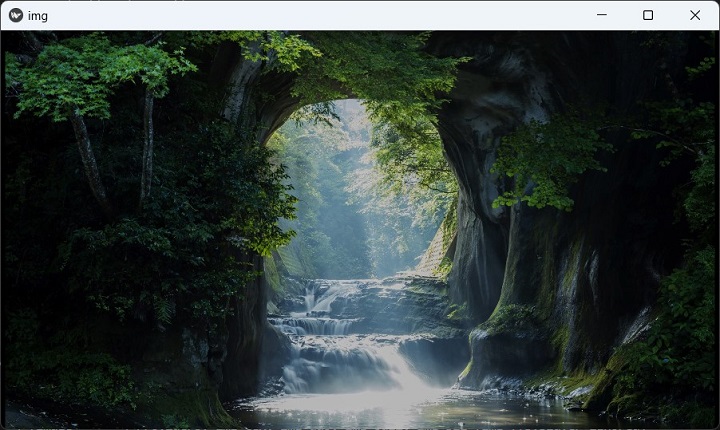
fit_mode=contain
Source image smaller than the Image widget.
fit_mode: fill
Image is resized to fit without losing aspect ratio.
fill_mode=cover
Image is stretched to cover the entire widget area.

Kivy - Popup
A Popup widget in Kivy presents a dialog that appears over the main Prent window, usually in response to a button-click event. A dialog box is used for many purposes, such as displaying a certain message to the user, making the user enter some input, or asking the user to confirm a particular action.
In general, the dialogs in any GUI application are of two types: modal and non-modal. A dialog box that doesn't allow the user to interact with the parent window without interacting with it, is called a modal dialog. On the other hand, if the user can dismiss the dialog box without interacting with it, it is a non-modal dialog.
In Kivy, the popup dialog covers the entire parent window by default. How you can configure its size as required.
The Popup class is defined in the "kivy.uix.popup" module.
from kivy.uix.popup import Popup
popup = Popup(**kwargs)
A Popup object is preconfigured with a layout that has a title and a separation bar. We can customize the layout by adding other widgets to its layout parameter.
The following snippet produces a simple popup over the parent window −
from kivy.uix.popup import Popup
popup = Popup(title='Popup Demo',
   content=Label(text='This is a Popup'),
   size_hint=(None, None), size=(400, 400))
You need to call the open() method of Popup object to display it.
popup.open()
As the pop is displayed, it will be dismissed by any click outside it. To prevent the popup from getting automatically dismissed, set the auto_dismiss property to False. You need to call the popup.dismiss() method explicitly. Usually, this is done by binding it to a button's on_press event.
class popdemo(App):
   def build(self):
      btn = Button(text="Click here")
      btn.bind(on_press=self.onButtonPress)
      return btn

   def onButtonPress(self, button):
      layout = GridLayout(cols=1)
      lbl = Label(text='Hello world')
      closeButton = Button(text="OK")
      layout.add_widget(lbl)
      layout.add_widget(closeButton)
      popup = Popup(
         title='Popup Demo', content=layout,
         auto_dismiss=False, size_hint=(None, None),
         size=(400, 400)
      )
      popup.open()
      closeButton.bind(on_press=self.on_close)

   def on_close(self, event):
      self.popup.dismiss()
When the button captioned "Click here" is clicked, you get a popup dialog as shown below −

Press the OK button on the popup to dismiss it.
The Popup class defines following properties −
content − Content of the popup that is displayed just under the title. content is an ObjectProperty and defaults to None.
title − String that represents the title of the popup. title is a StringProperty and defaults to 'No title'.
A Popup object responds to the following events −
on_open − Fired when the Popup is opened.
on_dismiss − Fired when the Popup is closed. If the callback returns True, the dismiss will be canceled.
Example
The following code gives a good example of Popup dialog in Kivy. First of all, we add a label and a button to the vertical box layout of a parent window. The button click pops up a one-column gridlayout with a text input, asking the user to enter name. As the popup is dismissed, the text is used to change the label of the parent window.
Here is the complete code −
from kivy.app import App
from kivy.uix.button import Button
from kivy.uix.label import Label
from kivy.uix.textinput import TextInput
from kivy.uix.gridlayout import GridLayout
from kivy.uix.popup import Popup
from kivy.core.window import Window

Window.size = (720, 400)

class PopupExample(App):
   def build(self):
      self.layout = GridLayout(cols=1, padding=10)

      self.l1 = Label(
         text='enter your name', font_size=32,
         color=[.8, .6, .4, 1]
      )
      self.layout.add_widget(self.l1)

      self.button = Button(text="Click Here")
      self.layout.add_widget(self.button)
      self.button.bind(on_press=self.onButtonPress)
      return self.layout

   def onButtonPress(self, button):
      layout = GridLayout(cols=1, padding=10)

      popupLabel = Label(text="Enter name")
      self.t1 = TextInput()
      closeButton = Button(text="OK")

      layout.add_widget(popupLabel)
      layout.add_widget(self.t1)
      layout.add_widget(closeButton)

      self.popup = Popup(
         title='Hello', content=layout,
         auto_dismiss=False, size_hint=(None, None),
         size=(200, 200)
      )
      self.popup.open()
      closeButton.bind(on_press=self.on_close)

   def on_close(self, event):
      self.l1.text = 'Thanks ' + self.t1.text
      self.popup.dismiss()
PopupExample().run()
Output
The App window appears like this −

Kivy - Switch
The Switch widget in Kivy framework resembles the electrical switch that we use in our home to put a bulb or a fan ON or OFF. The switch on the app window can be flipped by swiping its active property to True or False.
The Switch class is defined in the "kivy.uix.switch: module.
from kivy.uix.switch import Switch
switch = Switch(**kwargs)
When placed on the application window, a Switch object appears like this −

The Switch class defines a Boolean property named active, which indicates whether the switch is on/off. Generally, this property is attached to a callback function to invoke a desired action when its value changes from True to False or vice versa.
def callback(instance, value):
   if value:
      print('the switch is ON')
   else:
      print ('The switch is OFF')
switch = Switch()
switch.bind(active=callback)
Example
We shall use the Switch widget in the following code to start or stop playing an audio playback. The app design contains a label and a switch placed in a horizontal box layout.
The active property of Switch is bound to a switched() method. When ON, the Sound object is loaded and its play() method is called. On the other hand, when flipped to OFF, the stop() method gets invoked.
from kivy.app import App
from kivy.uix.label import Label
from kivy.uix.boxlayout import BoxLayout
from kivy.core.audio import SoundLoader
from kivy.uix.switch import Switch
from kivy.core.window import Window

Window.size = (720, 250)

class switchdemoapp(App):
   def switched(self, instance, value):
      if value == True:
         self.sound = SoundLoader.load('sample.mp3')
         self.l1.text = 'Playing. . .'
         self.sound.play()
      else:
         self.sound.stop()
         self.l1.text = 'Switch ON to Play'
   def build(self):
      box = BoxLayout(orientation='horizontal')
      self.l1 = Label(
         text = 'Switch ON to Play',
         font_size = 32, color = [.8, .6, .4, 1]
      )
      box.add_widget(self.l1)
      switch = Switch()
      switch.bind(active = self.switched)
      box.add_widget(switch)
      return box

switchdemoapp().run()
Output
The program starts with the label asking the user to swipe the switch to ON. The label caption changes to 'Playing' message. Swipe the switch to OFF to stop the music from playing.

Kivy - Spinner
The Spinner control in Kivy framework is a more conventional type of dropdown control, different from Kivy's DropDown widget. Compared to DropDown, it is easier and convenient to construct and use the Spinner widget.
The main difference between Kivy's dropdown and spinner widgets is that the dropdown widget may consist of any other Kivy widget such as Label, Button, Image etc; while a spinner is simply a list of strings.
The Spinner class is defined in the "kivy.uix.spinner" module
from kivy.uix.spinner import Spinner
spin = Spinner(**kwargs)
A Spinner widget shows a text caption corresponding to the currently selected value. The Spinner object can be constructed with different properties as keyword arguments. However, these two properties are important −
The text property is a string and shows the default value.
The values property is a ListProperty, consisting of all the values to choose from.
To construct a simple spinner, use the following code snippet −
from kivy.base import runTouchApp
from kivy.uix.spinner import Spinner

spinner = Spinner(
   text='English',
   values=('English', 'French', 'German', 'Chinese')
)
The spinner object's text property can be bound to a callback to invoke appropriate action whenever the selection is made.
def value_changed(spinner, text):
   print(You selected', text, 'language')

spinner.bind(text=show_selected_value)
Other properties in the Spinner class are listed below −
dropdown_cls − A class used to display the dropdown list when the Spinner is pressed. It is an ObjectProperty and defaults to DropDown.
is_open − By default, the spinner is not open. Set to True to open it.
option_cls − A class used to display the options within the dropdown list displayed under the Spinner. The text property of the class will be used to represent the value. Its on_release event is used to trigger the option when pressed/touched.
text_autoupdate − This is BooleanProperty. It indicates if the spinner's text should be automatically updated with the first value of the values property. Setting it to True will cause the spinner to update its text property every time values are changed.
values − Values that can be selected by the user. It must be a list of strings. It is a ListProperty and defaults to [].
The code below assembles a Spinner, associated with a label to show the selected value in the horizontal box. The lower horizontal box has a TextInput and a Button. The intention is to provide a callback on this button that adds the string in the textbox to the Spinner values
The program has two callback methods in the App class. One to display the selected value from the spinner, and another to add a new language to the spinner.
The callback to add a new language −
def addvalue(self, instance):
   self.spin1.values.append(self.t1.text)
We shall bind this method to the "Add" button.
To display the selected language on a label −
def on_spinner_select(self, spinner, text):
   self.spinnerSelection.text = "Selected Language is: %s" %self.spin1.text
We shall bind this method to the "text" property of the Spinner widget.
Example
Save and run the code below as "spiinerdemo.py"
from kivy.app import App
from kivy.uix.label import Label
from kivy.uix.spinner import Spinner
from kivy.uix.boxlayout import BoxLayout
from kivy.uix.textinput import TextInput
from kivy.uix.button import Button
from kivy.core.window import Window

Window.size = (720, 400)

class SpinnerExample(App):
   def addvalue(self, instance):
      self.spin1.values.append(self.t1.text)

   def build(self):
      layout = BoxLayout(orientation='vertical')
      lo1 = BoxLayout(orientation='horizontal')
      self.spin1 = Spinner(
         text="Python",
         values=("Python", "Java", "C++", "C", "C#", "PHP"),
         background_color=(0.784, 0.443, 0.216, 1),
         size_hint=(.5, .4), pos_hint={'top': 1}
      )
      lo1.add_widget(self.spin1)
      self.spinnerSelection = Label(
         text="Selected value in spinner is: %s" % self.spin1.text,
         pos_hint={'top': 1, 'x': .4}
      )
      lo1.add_widget(self.spinnerSelection)
      layout.add_widget(lo1)
      lo2 = BoxLayout(orientation='horizontal')
      lo2.add_widget(Label(text="Add Language"))
      self.t1 = TextInput()

      self.b1 = Button(text='add')
      lo2.add_widget(self.t1)
      lo2.add_widget(self.b1)
      layout.add_widget(lo2)
      self.spin1.bind(text=self.on_spinner_select)
      self.b1.bind(on_press=self.addvalue)
      return layout

   def on_spinner_select(self, spinner, text):
      self.spinnerSelection.text = "Selected value in spinner is: %s" % self.spin1.text
      print('The spinner', spinner, 'have text', text)

if __name__ == '__main__':
   SpinnerExample().run()
Output
The button on the top-left is the Spinner. When clicked, the list of languages drops down. You can make a selection. The selected name will be displayed on the label to its right.

To add a new language to the list, type in the text box, and click the "Add" button. The spinner widget will be appended with the new language name at the bottom. If the list is long enough, you can scroll down with mouse.
Kivy - Splitter
The Splitter widget in Kivy puts a draggable boundary around any other widget or a layout contained in it. You can drag the boundary to resize the size of the object enclosed in it. The boundary can be placed to the top or bottom, or to the left or right of the enclosed widget.
The Splitter class is defined in the "kivy.uix.splitter" module.
from kivy.uix.splitter import Splitter
split = Splitter(**kwargs)
One of the important properties required to configure the placement of boundary is 'sizable_from'. It defines Specifies from which direction the widget is resizable. Options are: left, right, top or bottom; the default being 'left'.
The boundary has a grip in the middle. You can drag the boundary with this grip or even by double-clicking it.
Other properties of the Splitter class are as follows −
border − Border used for the BorderImage graphics instruction. This must be a list of four values: (bottom, right, top, left) and default is [4,4,4,4]
keep_within_parent − If True, it will limit the splitter to stay within its parent widget.
max_size − Specifies the maximum size beyond which the widget is not resizable. max_size defaults to 500pt.
min_size − Specifies the minimum size beyond which the widget is not resizable. Defaults to 100 pt.
rescale_with_parent − If True, will automatically change size to take up the same proportion of the parent widget when it is resized, while staying within min_size and max_size.
sizable_from − Specifies whether the widget is resizable. Options are − left, right, top or bottom; defaults to left.

Example
Let us create a simple horizontal box layout and place an Image widget in between two buttons. The Image object however, is placed inside a Splitter, resizable from the left.
from kivy.app import App
from kivy.uix.button import Button
from kivy.uix.image import Image
from kivy.uix.boxlayout import BoxLayout
from kivy.uix.splitter import Splitter
from kivy.core.window import Window

Window.size = (720,350)

class splitterApp(App):
   def build(self):
      layout=BoxLayout(orientation='horizontal')
      b1=Button(
         text='Button1',
         font_size=24, color=(1,0,0,1)
      )
      layout.add_widget(b1)
      spl=Splitter(sizable_from = 'left')
      img=Image(source='Logo.jpg')
      spl.add_widget(img)
      layout.add_widget(spl)
      b2=Button(
         text='Button 2', font_size=24,
         background_color =(.8, .4, .3, 1)
      )
      layout.add_widget(b2)
      return layout

splitterApp().run()
Output
As the program is run, you will see a dragable boundary with grip towards the left of the image. Drag it to resize the image.
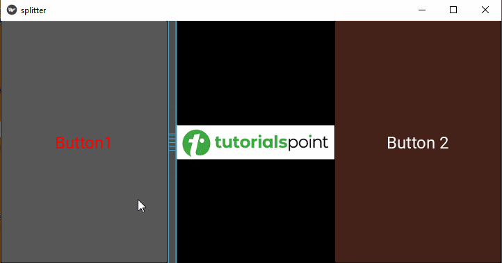
Here is the "kv" script version of program to demonstrate the use of a vertical splitter, sizable from bottom.
BoxLayout:
   orientation:'vertical'
   Button:
      text: 'Button 1'
      font_size:24
      color:(1,0,0,1)
   Splitter:
      sizable_from : 'bottom'
      Image:
         source:'Logo.jpg'
   Button:
      text:'Button 2'
      font_size:24
      background_color: (.8, .4, .3, 1)
The vertically resizable image widget appears as shown below −
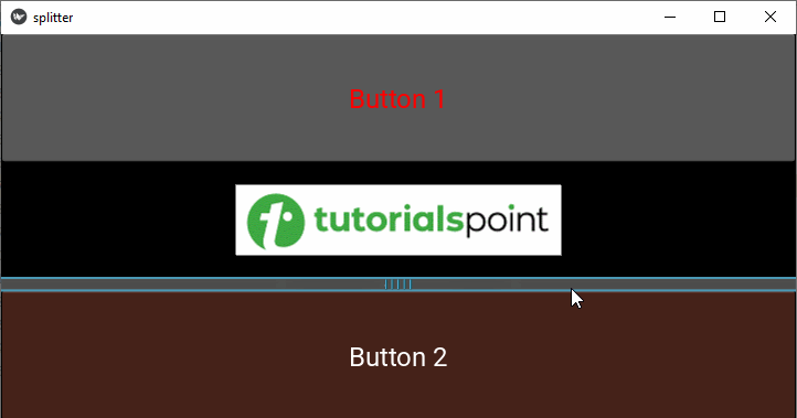
Kivy - Progress Bar
When a GUI application is performing some process that is time consuming, there should be some mechanism to let the user know about its progress. The Progressbar widget in Kivy framework shows a visual representation of the progress of an ongoing task.
Kivy's progress bar widget only supports horizontal mode, and appears on the application window with incremental progress.
The Progressbar class is defined in the "kivy.uix.progressbar" module.
from kivy.uix.progressbar import ProgressBar
pb = Progressbar(**kwargs)
The Progressbar widget is a display-only widget, and doesn't have any interactive elements, as is doesn't raise and propagate any events.
To create an instance of Progressbar, you need to set its max property.
from kivy.uix.progressbar import ProgressBar
pb = ProgressBar(max=1000)
The widget has value property. You can assign it to any number less than its "max" property.
pb.value=100
However, since the progressbar class doesn't have any events and event handlers, we need to manually link the value property to some process.
It can be done by periodically reading the instantaneous value of an attribute of the progressive task, and update the value property of the progress bar.
Let us say we have a long for loop, that takes its next iteration after every one second.
for i in range(1000):
   time.delay(1)
   print (i)
We want to show the increment of I on the progress bar. So, we schedule a clock event that calls a function after every one second.
progev = Clock.schedule_interval(update_progress, 1.0)
After each second, the update_progesss() function updates the value property of the progress bar to the iteration counter i
def update_progress():
   pb.value = i
Example
Let us implement this approach in the following code. The GUI design contains two buttons and a label. When the start button is pressed, it loads a mp3 file into the Sound object. The length of the sound file is used as the max property of the progressbar
self.sound = SoundLoader.load('sample.mp3')
self.length = self.sound.length
As the play() method is invoked, we schedule an progress event as shown above.
self.prog_ev = Clock.schedule_interval(self.update_progress, 1.0)
The update_progress() method reads the pos property of the Sound object and uses it to update the value property of the progressbar
def update_progress(self, dt):
   if self.sound.state=='play':
      if self.prg.value < self.length:
         self.progress += 1 # Update value.
         self.prg.value=self.progress
Here is the complete code −
from kivy.app import App
from kivy.clock import Clock
from kivy.uix.button import Button
from kivy.uix.label import Label
from kivy.uix.boxlayout import BoxLayout
from kivy.uix.gridlayout import GridLayout
from kivy.core.audio import SoundLoader
from kivy.uix.progressbar import ProgressBar
from kivy.properties import NumericProperty
from kivy.core.window import Window

Window.size = (720, 400)

class audiodemoapp(App):
   length = NumericProperty(0.0)
   progress = NumericProperty(0.0)

   def build(self):
      layout = GridLayout(cols=1, padding=10)
      self.prg = ProgressBar()
      layout.add_widget(self.prg)
      self.l1 = Label(
         text='Press Start to Play', font_size=40,
         color=[.8, .6, .4, 1]
      )
      layout.add_widget(self.l1)
      box = BoxLayout(orientation='horizontal')
      self.button1 = Button(text="Start", font_size=32)
      self.button2 = Button(
         text='Pause', font_size=32,
         disabled=True
      )
      box.add_widget(self.button1)
      box.add_widget(self.button2)
      layout.add_widget(box)
      self.button1.bind(on_press=self.start_stop)
      self.button2.bind(on_press=self.pause_resume)

      return layout

   def start_stop(self, event):
      if self.button1.text == 'Start':
         self.l1.text = 'Playing'
         self.button1.text = 'Stop'
         self.sound = SoundLoader.load('sample.mp3')
         self.length = self.sound.length
         self.pos = 0
         self.button2.disabled = False
         self.sound.play()
         self.prog_ev = Clock.schedule_interval(self.update_progress, 1.0)
      else:
         if self.button1.text == 'Stop':
            self.l1.text = 'Press Start to Play'
            self.sound.state = 'stop'
            self.button1.text = 'Start'
            self.sound.unload()
            self.button2.disabled = True
            self.pos = 0

   def pause_resume(self, event):
      if self.button2.text == 'Pause':
         self.button2.text = 'Resume'
         self.l1.text == 'Paused'
         self.pos = self.sound.get_pos()
         self.sound.stop()
      else:
         if self.button2.text == 'Resume':
            self.l1.text = 'Playing'
            self.button2.text = 'Pause'
            print(self.pos)
            self.sound.seek(self.pos)
            self.sound.play()
            self.prog_ev = Clock.schedule_interval(self.update_progress, 1.0)
   def update_progress(self, dt):
      if self.sound.state == 'play':
         if self.prg.value < self.length:
            self.progress += 1 # Update value
            self.prg.value = self.progress
         else: # End case.
            self.progress = 0 # Reset value
            self.prog_ev.cancel() # Stop updating

audiodemoapp().run()
Output
Run the above code. Press the start button. The progress bar on top shows the instantaneous playing position of the the music file.
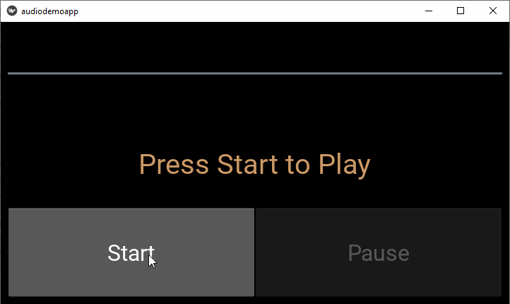
Kivy - Bubble
Kivy framework consists of a Bubble widget that acts as a small popup menu with an arrow on any one side of its contents. The direction of arrow can be configured as required. You can place it by setting its relative position of the "arrow_pos" property.
Contents of the bubble are placed in a "BubbleContent" object, a subclass of BoxLayout. One or more BubbleButtons can be placed either horizontally or vertically. Although it is recommended use BubbleButtons, you can add any widget in the bubble's content.

The classes Bubble, BubbleContent, and BubbleButton are defined in kivy.uix.bubble module.
from from kivy.uix.bubble import Bubble
The following properties of the Bubble class help in customizing the appearance and behaviour of the Bubble menu −
arrow_color − Arrow color, in the format (r, g, b, a). To use it you have to set arrow_image first, defaults to [1, 1, 1, 1].
arrow_image − Image of the arrow pointing to the bubble.
arrow_margin − Automatically computed margin that the arrow widget occupies in x and y direction in pixel.
arrow_pos − Specifies the position of the arrow as per one of the predefined values: left_top, left_mid, left_bottom top_left, top_mid, top_right right_top, right_mid, right_bottom bottom_left, bottom_mid, bottom_right. The default value is 'bottom_mid'.
content − This is the object where the main content of the bubble is held.
show_arrow − Indicates whether to show arrow. Default is True.
BubbleButton − A button intended for use in a BubbleContent widget. Instead of this, you can use a "normal" button, but it will may look good unless the background is changed.
BubbleContent − A styled BoxLayout that can be used as the content widget of a Bubble.
The following schematic "kv" language script is used to build a simple Bubble object −
Bubble:
   BubbleContent:
      BubbleButton:
         text: 'Button 1'
      BubbleButton:
         text: 'Button 2'
Just as in case of a normal Button, we can bind a BubbleButton to a callback for its "on_press" event.
Example
When the following code is executed, it presents a normal button. When clicked, a Bubble menu pops up with three BubbleButtons. Each of these BubbleButtons invoke a pressed() callback method that reads the button's caption and prints it on the console.
We use the following "kv" language script to assemble the Bubble menu. A class named as "Choices" has been defined that subclasses the "kivy.uix.bubble.Bubble" class.
class Choices(Bubble):
   def pressed(self, obj):
      print ("I like ", obj.text)
      self.clear_widgets()
The class has pressed() instance method, invoked by each BubbleButton.
Here is the "kv" script −
<Choices>
   size_hint: (None, None)
   size: (300, 150)
   pos_hint: {'center_x': .5, 'y': .6}
   canvas:
      Color:
         rgb: (1,0,0)
      Rectangle:
         pos:self.pos
         size:self.size
   BubbleContent:
      BubbleButton:
         text: 'Cricket'
         size_hint_y: 1
         on_press:root.pressed(self)
      BubbleButton:
         text: 'Tennis'
         size_hint_y: 1
         on_press:root.pressed(self)
      BubbleButton:
         text: 'Hockey'
         size_hint_y: 1
         on_press:root.pressed(self)
BoxLayout widget acts as the root widget for the main application window and consists of a Button and a label. The "on_press" event invokes the "show_bubble()" method that pops up the bubble.
class BubbleTest(FloatLayout):
   def __init__(self, **temp):
      super(BubbleTestApp, self).__init__(**temp)
      self.bubble_button = Button(
         text ='Your favourite Sport',
         pos_hint={'center_x':.5, 'center_y':.5},
         size_hint=(.3, .1),size=(300, 100)
      )
      self.bubble_button.bind(on_release = self.show_bubble)
      self.add_widget(self.bubble_button)

   def show_bubble(self, *arg):
      self.obj_bub = Choices()
      self.add_widget(self.obj_bub)
The driver App class code is as below −
from kivy.app import App
from kivy.uix.floatlayout import FloatLayout
from kivy.uix.button import Button
from kivy.uix.label import Label
from kivy.uix.bubble import Bubble
from kivy.properties import ObjectProperty
from kivy.core.window import Window

Window.size = (720,400)

class MybubbleApp(App):
   def build(self):
      return BubbleTest()

MybubbleApp().run()
Output
The application shows a button at the center of the main window. When clicked, you should see the bubble menu above it.

Every time you click any of the options in the bubble, the console shows the result, and hides the bubble.
I like Tennis
I like Hockey
Kivy - Tabbed Panel
Many of the GUI toolkits include a tabbed panel, as it is very convenient to display the interface controls in groups instead of a big form, going well beyond the dimensions of the display device. TabbedPanel widget in Kivy makes it possible to display a widget or a layout in different panels, without making the GUI design look clumsy. The controls in different panels can share the data among themselves.
Different tabs are shown as a menu on top with a header area for the actual tab buttons and a content area for showing the current tab content.

The TabbedPanel object is the top level container for one or more panels. Corresponding to each panel, a TabbedPanelItem object is added. Each TabbedPAnelItem in turn, can hold any one widget or a layout that contains multiple widgets (such as GridLayout or BoxLayout etc)
Both these classes are defined in kivy.uix.tabbedpanel module.
from kivy.uix.tabbedpanel import TabbedPanel, TabbedPanelItem
A schematic statement flow to constructed a tabbed panel may be as follows −
main=TabbedPanel()
tab1=TabbedPanelItem(text='Tab 1')
Label=Label(text='Label')
tab1.add_widget(label)
tab2=TabbedPanelItem(text='Tab 2')
btn=Button(text="Button")
tab2.add_widget(btn)
main.add_widget(tab1)
main.add_widget(tab2)
The Tabbed panel can be further customized by tweaking a few properties −
You can choose the position in which the tabs are displayed, by setting the tab_pos property to either of the values - left_top, left_mid, left_bottom, top_left, top_mid, top_right, right_top, right_mid, right_bottom, bottom_left, bottom_mid, bottom_right.
Each tab has a special button TabbedPAnelHeader, containing a content property.
The tabbed panel comes with a default tab, which you can get rid of, by setting do_default_tab to False.
If the default tab is displayed, an on_default_tab event is provided for associating a callback −
tp.bind(default_tab = my_default_tab_callback)
Tabs and content can be removed in several ways −
tp.remove_widget() removes the tab and its content.
tp.clear_widgets() clears all the widgets in the content area.
tp.clear_tabs() removes the TabbedPanelHeaders
Example
In the example below, we use two tabbed panels, first to display a simple registration form, and in the other, a login form.
We shall us the "kv" language script to construct the design.
The default tab is removed.
The first tab holds a 2-column grid layout and contains labels and text input boxes for the user to enter his details, followed by a Submit button.
The second tab also has a two-column grid, with provision to enter email and password by the registered user.
TabbedPanel:
   size_hint: .8, .8
   pos_hint: {'center_x': .5, 'center_y': .5}
   do_default_tab: False
   TabbedPanelItem:
      text:"Register Tab"
      GridLayout:
         cols:2
         Label:
            text:"Name"
            size_hint:(.2, .1)
            pos_hint:{'x':.2, 'y':.75}

         TextInput:
            size_hint:(.4, .1)
            pos_hint:{'x':.3, 'y':.65}

         Label:
            text:"email"
            size_hint:(.2, .1)
            pos_hint:{'x':.2, 'y':.55}

         TextInput:
            size_hint:(.4, .1)
            pos_hint:{'x':.3, 'y':.45}

         Label:
            text:"Password"
            size_hint:(.2, .1)
            pos_hint:{'x':.2, 'y':.35}

         TextInput:
            password:True
            size_hint:(.4, .1)
            pos:(400, 150)
            pos_hint:{'x':.3, 'y':.25}

         Button:
            text:'Submit'
            size_hint : (.2, .1)
            pos_hint : {'center_x':.5, 'center_y':.09}

   TabbedPanelItem:
      text:'Login Tab'
      GridLayout:
         cols:2

      Label:
         text:"email"
         size_hint:(.2, .1)
         pos_hint:{'x':.2, 'y':.55}

      TextInput:
         size_hint:(.4, .1)
         pos_hint:{'x':.3, 'y':.45}

      Label:
         text:"Password"
         size_hint:(.2, .1)
         pos_hint:{'x':.2, 'y':.35}

      TextInput:
         password:True
         size_hint:(.4, .1)
         pos:(400, 150)
         pos_hint:{'x':.3, 'y':.25}

      Button:
         text:'Submit'
         size_hint : (.2, .1)
         pos_hint : {'center_x':.5, 'center_y':.09}
The App code utilizing the above "kv" script design is as follows −
from kivy.app import App
from kivy.core.window import Window

Window.size = (720,300)

class TabDemoApp(App):
   def build(self):
      pass

TabDemoApp().run()
Output
When you run the above code, the app window shows the tabbed panel with the first tab contents exposed. Click the Login Tab to see the contents of the second tab.

Kivy - Scatter
The Scatter widget in Kivy is especially useful for multitouch devices, wherein it is used to rotate and scale up/down the contents of the application window.
The Scatter widget performs matrix transformation by changing the modelview matrix before the children are drawn and the previous matrix is restored when the drawing is finished, so that rotation, scaling and translation can be performed over the entire children tree without changing any widget properties.
By default, the Scatter widget does not have a graphical representation: it is a container only. Other widgets are added to the scatter object. However, it should be noted that the Scatter widget is not a layout. You must manage the size of the children yourself. They are positioned relative to the scatter, similar to a RelativeLayout. That's why dragging the scatter doesn't change the position of the children, only the position of the scatter does. The scatter size has no impact on the size of its children.
The Scatter class is defined in the "kivy.uix.scatter" module. The basic usage of Scatter widget is as follows −
from kivy.uix.scatter import Scatter
scatter=Scatter.add_widget(Image(source='logo.jpg'))
The Scatter object is created with all interactions enabled by default. However, you may want to customize the interactions, for which the properties of Scatter object have to be defined accordingly.
auto_bring_to_front − If True, the widget will be automatically pushed on the top of parent widget list for drawing.
do_rotation − Allow rotation. By default, this property is True.
do_scale − Allow scaling. Defaults to True.
do_translation − Allow translation on the X or Y axis.
scale − The Scale value of the scatter. scale is an AliasProperty and defaults to 1.0.
scale_max − Maximum scaling factor allowed. Default value of maximum scaling allowed is upto 1e20.
scale_min − Minimum scaling factor allowed with default value being 0.01
Example 1
Here is a simple example of how the Scatter widget works. We just have a label added to the Scatter widget in a Kivy app. The application starts with the label text appearing in the bottom-left corner of the application window. Use your mouse to drag it anywhere on the surface of the window.
To simulate multitouch operations on a normal desktop, create two marks on the label area by right-clicking with the mouse and then you can magnify or rotate the label by dragging with the two marks.
If you are working on a multitouch device, you can perform scaling and rotation by two finger touch.
from kivy.app import App
from kivy.uix.label import Label
from kivy.uix.scatter import Scatter
from kivy.uix.boxlayout import BoxLayout
from kivy.uix.textinput import TextInput
from kivy.core.window import Window

Window.size = (720,350)

class scatterdemoapp(App):
   def build(self):
      box=BoxLayout(orientation='vertical')
      scatr=Scatter()
      lbl=Label(text="Hello", font_size=60)
      scatr.add_widget(lbl)
      box.add_widget(scatr)
      return box

scatterdemoapp().run()
Output
Let's check how the output looks like −

Example 2
Alternately, the "kv" language script may also be used to construct the same appearance.
BoxLayout:
   orientation:'vertical'
   Scatter:
      Label:
         text:"Hello"
         font_size:60
Let us add some more interactivity to the above example. Here, we have added a text input box to the vertical boxlayout, above the Scatter widget.
The "text" property is bound to the text property of the label. So, the label text gets updated as you add/remove letters from the text box. All the scatter operations like rotation and scaling can still be performed.
from kivy.app import App
from kivy.uix.label import Label
from kivy.uix.scatter import Scatter
from kivy.uix.boxlayout import BoxLayout
from kivy.uix.textinput import TextInput
from kivy.core.window import Window

Window.size = (720,300)

class scatterdemoapp(App):
   def build(self):
      box = BoxLayout(orientation='vertical')
      text1 = TextInput(
         text='Hello World', height=100,
         size_hint=(Window.width, None)
      )
      box.add_widget(text1)
      scatr = Scatter()
      self.lbl = Label(text="Hello", font_size=60)

      text1.bind(text=self.lbl.setter('text'))
      scatr.add_widget(self.lbl)
      box.add_widget(scatr)
      return box

scatterdemoapp().run()
Output
Now let's check how the output window looks like −

Kivy - Accordion
This GUI widget, because of its resemblance with a musical instrument of the same name, is called the "accordion". In Kivy, an Accordion is a graphical control element comprising a vertically or horizontally stacked list of items, such as labels or buttons or images.
Just as in a musical accordion in which sections of the bellows can be expanded by pulling outward, each item can be "expanded" or "collapsed" to reveal the content associated with that item. There can be zero expanded items, exactly one, or more than one item expanded at a time, depending on the configuration.
An accordion is similar in purpose to a tabbed panel, a list of items where exactly one item is expanded into a panel.
There are two important classes - "Accordion" and "AccordionItem" - in the "kivy.uix.accordion" module. Each AccordianItem object holds any one Kivy widget such as a label, a button an image or even other layout object. Multiple AccordioItems are then added to the main Accordion object.
Following properties/methods are supported by Accordion class −
title − Title string of the AccordionItem.
min_space − Minimum space to use for the title of each item. This value is automatically set for each child every time the layout event occurs. It is a NumericProperty and defaults to 44 (px).
orientation − Orientation of the Accordion layout. Can be either vertical or horizontal.
collapse − Boolean property to indicate if the current item is collapsed or not.
Example 1
In the following code, an Accordion object is used as the root widget of the Application window. A label, a button and an Image widget is respectively added to each of its AccordionItem widgets.
The complete code is given below −
from kivy.app import App
from kivy.uix.boxlayout import BoxLayout
from kivy.uix.button import Button
from kivy.uix.label import Label
from kivy.uix.image import Image
from kivy.uix.accordion import Accordion, AccordionItem
from kivy.core.window import Window

Window.size = (720,400)

class accordiandemoapp(App):
   def build(self):
      acc=Accordion(orientation='horizontal')
      item1=AccordionItem(title='Text Panel')
      item1.add_widget(Label(text='Hello World'))

      item2=AccordionItem(title='Button Panel')
      self.btn=Button(text='ok')
      item2.add_widget(self.btn)

      item3=AccordionItem(title='Image Panel')
      img = Image()
      img.source='kivy-logo.png'

      item3.add_widget(img)
      acc.add_widget(item1)
      acc.add_widget(item2)
      acc.add_widget(item3)

      return acc

accordiandemoapp().run()
Output
Run the above program and click the Image Panel, to unveil its contents, it being the Kivy logo.

You can further expand the other panels by clicking them.
Example 2 (using "kv" script)
We remove all the statements in build() method, replace it by a pass statement, and then save the following script as accordiondemo.kv file. This time the default orientation of Accordion is changed to vertical.
BoxLayout:
   orientation: "vertical"
   size: root.width, root.height

   Accordion:
      orientation: 'vertical'

      AccordionItem:
         title: "Button Panel"
         Button:
            text: 'OK'

      AccordionItem:
         title: "Text Panel"
         Label:
            text: "Hello World"
            font_size: 32
      AccordionItem:
         title: "Image Panel"
         Image:
            source: 'kivy-logo.png'
Output
The button panel is expanded after running the program −

Kivy - File Chooser
In a GUI application, you are often required to choose a required file from the local filesystem. Kivy framework presents the "kivy.uix.filechooser" module that provides various classes for describing, displaying and browsing file systems.
The classes in filechooser module adopt a MVC design. They can be categorized as follows −
Models are represented by concrete implementations of the FileSystemAbstract class, such as the FileSystemLocal.
Views are represented by the FileChooserListLayout and FileChooserIconLayout classes. These are used by the FileChooserListView and FileChooserIconView widgets respectively.
Controllers are represented by concrete implementations of the FileChooserController, namely the FileChooser, FileChooserIconView and FileChooserListView classes.
The FileChooserIconView and FileChooserListView classes provide very-simple-to-use widgets that provide access to the file system with two different visual representations, as the names suggest.
The FileChooserListView widget displays files and folders as text items in a vertical list. A folder is identified by a ">" sign to the left of its name, and a click expands or collapses its files and subfolders.

The FileChooserIconView widget displays a folder icon with the name below it, and a file icon with its name.

If the number of files/folders exceeds the height and width of the widget, the vertical and horizontal scrollbars are attached to it.
The FileChooser views have following properties −
files − The list of files in the directory specified by path after applying the filters. files is a read-only ListProperty.
filter_dirs − Indicates whether filters should also apply to directories. filter_dirs is a BooleanProperty and defaults to False.
filters − filters specifies the filters to be applied to the files in the directory. filters is a ListProperty and defaults to []. If empty, it is equivalent to '*' indicating that no file has been filtered out of the list. The filters are not reset when the path changes. You need to do that yourself if desired.
You can specify one or more of the following patterns in the list −
| Sr.No | Patterns List & Description |
|---|---|
| 1 | * matches everything |
| 2 | ? matches any single character |
| 3 | [seq] matches any character in seq |
| 4 | [!seq] matches any character not in seq |
Both the views raise the on_selection event to which a callback can be bound. When this event is generated, if a folder is selected, it will expand or collapse it. If a file is selected, its name is passed to the callback.
ListView Example
In the first example, we construct the App window with a FileChhoserListView widget and a label in a vertical box layout.
Use the following "kv" file script for the purpose. The select() method is bound to the view's "on_selection" event.
<Filechooser>:
   label: label
   orientation: 'vertical'
   BoxLayout:
      FileChooserListView:
         canvas.before:
            Color:
               rgb: .4, .5, .5
            Rectangle:
               pos: self.pos
               size: self.size
         on_selection: root.select(*args)

   Label:
      id: label
      size_hint_y: .1
      canvas.before:
         Color:
            rgb: .5, .5, .4
         Rectangle:
            pos: self.pos
            size: self.size
Note the use of canvas object of FileChooseListView and Label widgets to provide background color.
The Kivy Application class code is given below −
from kivy.app import App
from kivy.uix.boxlayout import BoxLayout
from kivy.core.window import Window

Window.size = (720,400)

class Filechooser(BoxLayout):
   def select(self, *args):
      try: self.label.text = args[1][0]
      except: pass

class FileDemoApp(App):
   def build(self):
      return Filechooser()
if __name__ == '__main__':
   FileDemoApp().run()
Output
When the above code is run, you get the list of files/folders. The name of the file with its full path is displayed on the label.

IconView Example
We now show the use of FileChooserIconView. It is placed in a horizontal box, along with an Image widget by its side. While most of the configuration of FileChooserIconView is same as in previous example, we add the filters property to restrict the display of files to png files only.
<Filechooser>:
   img: img
   orientation: 'horizontal'
   BoxLayout:
      FileChooserIconView:
      filters: ['*.png']
         canvas.before:
            Color:
               rgb: .5, .4, .5
            Rectangle:
               pos: self.pos
               size: self.size
         on_selection: root.select(*args)

   Image:
      id: img
      source:""
Since we intend to display the selected image, the select() method is changed so that the source property of Image object is assigned with the selected file.
class Filechooser(BoxLayout):
   def select(self, *args):
      try:
         self.img.source = args[1][0]
      except:
         print ('error')

class FileIconApp(App):
   def build(self):
      return Filechooser()

# run the App
if __name__ == '__main__':
   FileIconApp().run()
Output
Run the program and browse to the desired image file. The selected image will be displayed on the right.

Kivy - Color Picker
Kivy's ColorPicker widget is an inbuilt dialog box that lets you choose a color in more than one ways. It provides a chromatic color wheel from which to choose the required color. It also has slider controls, which can adjust to get the desired color value. Sliders are also available for transparency and color values in HSV scheme.
Each of these color attributes have a text box in which you can directly enter a numeric color value ranging between 0 and 255.
The ColorPicker widget appears like this −

The ColorPicker class is defined in the "kivy.uix.colorpicker" module.
from kivy.uix.colorpicker import ColorPicker
colour = ColorPicker(**kwargs)
To render the above color dialog, just add the ColorPicker object to the parent window. If its color property is bound to an event handler, the color value can be used for further processing like changing the color of a certain object with the chosen color.
In addition to color, the ColorPicker object has hsv and hex_color properties. In the following snippet, the color, hsv and hex_color values are printed on the console when a color is chosen.
For a color selected from the wheel, the RGB, HSV, A and hex values are displayed in the text boxes as well as indicated by the slider positions.

The callback method prints the values on the console −
RGBA = [1, 0.5, 0.5, 1]
HSV = (0.0, 0.5, 1)
HEX = #ff7f7fff
ColorPicker Properties
r − The Red value of the color currently selected. It is a BoundedNumericProperty and can be a value from 0 to 1. It defaults to 0.
g − The Green value of the color currently selected. "g" is a BoundedNumericProperty and can be a value from 0 to 1.
b − The Blue value of the color currently selected. "b" is a BoundedNumericProperty and can be a value from 0 to 1.
a − The Alpha value of the color currently selected. "a" is a BoundedNumericProperty and can be a value from 0 to 1.
hsv − The hsv holds the color currently selected in hsv format. hsv is a ListProperty and defaults to (1, 1, 1).
hex_color − The hex_color holds the currently selected color in hex. hex_color is an AliasProperty and defaults to #ffffffff.
color − The color holds the color currently selected in rgba format. color is a ListProperty and defaults to (1, 1, 1, 1).
font_name − Specifies the font used on the ColorPicker. font_name is a StringProperty.
wheel − The wheel holds the color wheel. wheel is an ObjectProperty and defaults to None.
Example
Let us the ColorPicker widget to select any desired color, either from the wheel or from the sliders, or by directly entering the color values; and apply it to the label on the parent window.
The Kivy application window contains a label and a button placed in a grid layout. On the on_press event of the button a popup is displayed.
The popup is designed with a ColorPicker and a button in another grid layout. The popup button applies the chosen color to the label on application window before dismissing the popup.
from kivy.app import App
from kivy.uix.button import Button
from kivy.uix.label import Label
from kivy.uix.gridlayout import GridLayout
from kivy.uix.popup import Popup
from kivy.uix.colorpicker import ColorPicker
from kivy.core.window import Window

Window.size = (720, 350)

class ColorPickApp(App):
   def build(self):
      self.layout = GridLayout(cols=1, padding=10)
      self.l1 = Label(
         text='www.tutorialspoint.com',
         font_size=32, color=[.8, .6, .4, 1]
      )
      self.layout.add_widget(self.l1)
      self.button = Button(text="Click Here")
      self.layout.add_widget(self.button)
      self.button.bind(on_press=self.onButtonPress)
      return self.layout

   def onButtonPress(self, button):
      layout = GridLayout(cols=1, padding=10)

      self.clr = ColorPicker()
      closeButton = Button(text="OK", size_hint=(.1, .05))

      layout.add_widget(self.clr)
      layout.add_widget(closeButton)

      self.popup = Popup(
         title='Hello', content=layout, auto_dismiss=False
      )
      self.popup.open()

      closeButton.bind(on_press=self.on_close)
   def on_close(self, event):
      self.l1.color = self.clr.hex_color
      self.popup.dismiss()

ColorPickApp().run()
Output
The initial display of this Kivy app would show a label and a button. When you click the button, the ColorPicker widget will popup.
Select the desired color and press OK. You will see the Label text changing its color accordingy.

Kivy - Code Input
The CodeInput widget in the Kivy framework is a specialized TextInput box, capable of displaying editable text that is highlighted as per the syntax of the language lexer chosen.
The CodeInput widget requires the pygments package to be installed.
The pygments package is a Python syntax highlighter.
It is used in applications that need to prettify source code.
Pygments supports almost all the languages, including programming, scripting languages and even capable of providing syntax highlighting as per the framework and library syntax.
The support comes in the form of Lexer classes. For example, to pickup Python syntax for highlighting the language elements, we need to import Python3Lexer, for C++ code, the CppLexer class needs to be imported. Specifically the Kivy code is highlighted with KivyLexer.
If your current working environment doesn't have pygments installed, run the following command −
pip3 install pygments
The CodeInput class is defined in the "kivy.uix.codeinput" module.
from kivy.uix.codeinput import CodeInput
codewidget = CodeInput(**kwargs)
The CodeInput class inherits the TextInput class, as well as CodeNavigationBehaviou mixin. Just as a TextInput object, the CodeInput widget is a multiline text box, which can be added to other layout classes. It can be instantiated by specifying following properties −
lexer − This holds the selected Lexer used by pygments to highlight the code. It is an ObjectProperty and defaults to PythonLexer.
style − The pygments style object to use for formatting. When style_name is set, this will be changed to the corresponding style object.
style_name − Name of the pygments style to use for formatting. style_name is an OptionProperty and defaults to 'default'. There are a number of styles available in pygments. Some of the examples are emacs, xcode, vs, bw, colorful and many more.
In addition to these, the properties are also inherited from TextInput class. The CodeNavigationBehavior mixin modifies navigation behavior in the TextInput, making it work like an IDE instead of a word processor.
Example
In the following code, the CodeInput widget uses PythonLexer to perform syntax highlighting of a Python source code. A "code.py" file is read using Python's file object and the data is assigned to the text property of CodeInput object.
from kivy.app import App
from kivy.uix.gridlayout import GridLayout
from kivy.uix.codeinput import CodeInput
from pygments.lexers.python import Python3Lexer
from kivy.uix.scrollview import ScrollView
from kivy.uix.codeinput import CodeInput
from kivy.core.window import Window

Window.size = (720,400)

class codeinputdemoapp(App):
   def build(self):
      scr = ScrollView(size=Window.size)
      codinp = CodeInput(style='emacs')
      codinp.height = max(codinp.minimum_height, scr.height)
      file=open('code.py')
      text=file.read()
      codinp.text=text
      scr.add_widget(codinp)
      return scrx

codeinputdemoapp().run()

To highlight the code which uses Kivy related keywords and functions, load the KivyLexer. You can also experiment with the "pigment" style, changing it to "colorful" or any of the available styles.
from kivy.extras.highlight import KivyLexer
Read the "kivycode.py" file and load it in the CodeInput box.
file=open('kivycode.py')
text=file.read()
codinp.text=text
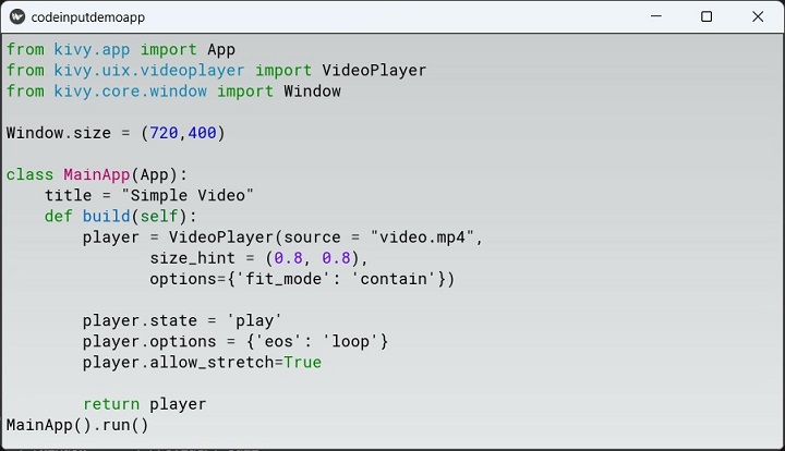
You can also try and display a C++ code with CppLexer −
from pygments.lexers.c_cpp import CppLexer
This time, change the style to "friendly".
file=open('test.cpp')
text=file.read()
codinp.text=text

Kivy - Modal View
The ModalView widget in the Kivy framework is used to pop up a dialog box on top of the parent window. The behaviour of ModalView widget is similar to Kivy's Popup widget. In fact, the Popup class itself is a subclass of ModalView class, with a certain additional functionality, such as having a title and a separator.
By default, the size of Modalview is equal to that of "main" window. A widget's size_hint=(1, 1) by default. If you don't want your view to be fullscreen, either use size hints with values lower than 1 (for instance size_hint=(.8, .8)) or set the size_hint to None and use fixed size attributes.
The ModalView class is defined in kivy.uix.modalview import ModalView module. The following statements will produce a ModalView dialog −
from kivy.uix.modalview import ModalView
view = ModalView(size_hint=(None, None), size=(300, 200))
view.add_widget(Label(text='ModalView Dialog'))
As in case of a Popup, the ModalView dialog is dismissed as you click outside it. To prevent this behavior, set auto-dismiss to False.
To make the ModalView dialog appear, you need to call its open() method.
view.open()
If auto_dismiss is False, you need to call its dismiss() method to close it.
view.dismiss()
Normally, both the open() and dismiss() method are invoked on a certain event such as on_press event of a button. You generally open a ModalView when a button on parent window is clicked, and dismissed when a buuton in ModalView layout is clicked.
ModalView Events
The ModalView emits events, before view is opened and dismissed, as well as when a view is opened and closed.
on_pre_open − Fired before the ModalView is opened. When this event is fired ModalView is not yet added to window.
on_open − Fired when the ModalView is opened.
on_pre_dismiss − Fired before the ModalView is closed.
on_dismiss − Fired when the ModalView is closed. If the callback returns True, the dismiss will be canceled.
Example
The following code presents an easy to implement example of ModalView dialog. The main application window displays a button caption as Click here. When clicked, a modal dialog pops up.
The ModalView is constructed by putting a label and a button inside a gridlayout. On the popup, we have a button with Ok as its caption. Its on_press event is bound to the dismiss() method of the ModalView object, causing it to disappear.
The complete code for the example is given below −
from kivy.app import App
from kivy.uix.label import Label
from kivy.uix.button import Button
from kivy.uix.modalview import ModalView
from kivy.uix.floatlayout import FloatLayout
from kivy.uix.gridlayout import GridLayout
from kivy.core.window import Window

Window.size = (720, 300)

class ModalViewDemoApp(App):
   def showmodal(self, obj):
      view = ModalView(
         auto_dismiss=False, size_hint=(None, None),
         size=(400, 100)
      )
      grid = GridLayout(cols=1, padding=10)
      grid.add_widget(Label(
         text='ModalView Popup', font_size=32,
         color=[1, 0, 0, 1]
      ))
      btn = Button(
         text='ok', font_size=32,
         on_press=view.dismiss
      )
      grid.add_widget(btn)
      view.add_widget(grid)
      view.open()

   def build(self):
      btn = Button(
         text='click here', font_size=32,
         on_press=self.showmodal,
         pos_hint={'center_x': .5, 'center_y': .1},
         size_hint=(.3, None), size=(200, 100)
      )
      return btn
ModalViewDemoApp().run()
Output
The ModalView dialog will pop up when the button on the main app window is clicked.

Kivy - Toggle Button
The ToggleButton widget in the Kivy framework behaves somewhat like a Checkbox widget. It also has a binary property called state which has two possible values − normal or down.
The ToggleButton is a button with the difference that when a button is pressed, the pressed and released events occur almost simultaneously; whereas when a toggle button is pressed, the down state persists till it is again pressed to bring to normal state.

The two states of a ToggleButton have a distinct background color for each state, which may be customized by assigning value to "background_normal" and "background_down" properties.
The ToggleButton class inherits Button class and the ToggleButtonBehavior mixin. It is defined in kivy.uix.togglebutton module
from kivy.uix.togglebutton import ToggleButton
toggle = ToggleButton(**kwargs)
Just like the Checkbox, multiple ToggleButton objects can be grouped together. By default, each toggle button can be used to represent two states (such as ON/OFF in Switch widget). But, if multiple toggle buttons have the same value for group property, only one in the group will have down state. When one of the grouped buttons is down, the rest will be automatically set to normal.
btn1 = ToggleButton(text='Male', group='sex',)
btn2 = ToggleButton(text='Female', group='sex', state='down')
In this case, the two buttons belong to the same group, and hence only one of them can be in down state at a time.
Since it inherits Button class, we can process the on_press event on a toggle button. Additionally, the "on_state" event can be bound to its state property.
Example 1
The following code puts three Toggle Buttons that are not grouped. Hence, each of them can be put to normal or down state. In the example below, these toggle buttons represent the subjects of interest to be chosen by the user.
self.button1 = ToggleButton(text ="Sports", font_size=32)
self.button2 = ToggleButton(text='Music', font_size=32)
self.button3 = ToggleButton(text='Travel', font_size=32)
They are bound to callbacks to identify the state of each button
self.button1.bind(on_press=self.btn1pressed)
self.button2.bind(on_press=self.btn2pressed)
self.button3.bind(on_press=self.btn3pressed)
Each callback method checks if the state is down, and accordingly updates the label text.
def btn1pressed(self, instance):
   if instance.state=='down':
      self.sports='Sports'
   else:
      self.sports=''
   self.l1.text="{} {} {}".format(self.sports, self.music, self.travel)
The complete code for this exercise is given below −
from kivy.app import App
from kivy.uix.togglebutton import ToggleButton
from kivy.uix.label import Label
from kivy.uix.boxlayout import BoxLayout
from kivy.uix.gridlayout import GridLayout
from kivy.core.window import Window
Window.size = (720, 350)
class toggledemoapp(App):
def build(self):
self.sports = self.music = self.travel = ''
layout = GridLayout(cols=1, padding=10)
box = BoxLayout(orientation='horizontal')
lbl = Label(text="My Interests", font_size=40)
layout.add_widget(lbl)
self.l1 = Label(
text='Choose One or More', font_size=32,
color=[.8, .6, .4, 1]
)
layout.add_widget(self.l1)
self.button1 = ToggleButton(text="Sports", font_size=32)
self.button2 = ToggleButton(text='Music', font_size=32)
self.button3 = ToggleButton(text='Travel', font_size=32)
self.button1.bind(on_press=self.btn1pressed)
self.button2.bind(on_press=self.btn2pressed)
self.button3.bind(on_press=self.btn3pressed)
box.add_widget(self.button1)
box.add_widget(self.button2)
box.add_widget(self.button3)
layout.add_widget(box)
return layout
def btn1pressed(self, instance):
if instance.state == 'down':
self.sports = 'Sports'
else:
self.sports = ''
self.l1.text = "{} {} {}".format(self.sports, self.music, self.travel)
def btn2pressed(self, instance):
if instance.state == 'down':
self.music = 'Music'
else:
self.music = ''
self.l1.text = "{} {} {}".format(self.sports, self.music, self.travel)
def btn3pressed(self, instance):
if instance.state == 'down':
self.travel = 'Travel'
else:
self.travel = ''
self.l1.text = "{} {} {}".format(self.sports, self.music, self.travel)
toggledemoapp().run()
Output
The application opens with all the buttons in normal state. Try and put any of them in "down".

Example 2
The following example assembles the labels and toggle buttons in similar layout as the above image shows, except that the toggle buttons are now grouped together.
We shall use a "kv" script to design the app layout. The Mylayout class is used as the root of the app, and uses GridLayout as its base.
class Mylayout(GridLayout):
def callback(self, *args):
print (args[0].text)
self.ids.l1.text=args[0].text
class togglegroupapp(App):
def build(self):
return Mylayout()
togglegroupapp().run()
Here is the "kv" language script. It puts three toggle buttons in a horizontal box, which in tur is a part of the one-column grid layout. All the buttons have same value 'branch' of group property, and are bound to the callback() method of MyLayout class above. The callback() method puts the caption of the button that caused the on_press event, on the label to show which branch has the user chosen.
<Mylayout>:
size: root.width, root.height
cols:1
Label:
text:"Which is your Engineering branch?"
font_size:40
Label:
id:l1
text: 'Choose Any One'
font_size:32
color:[.8,.6,.4,1]
BoxLayout:
orientation:'horizontal'
ToggleButton:
text : "Electronics"
font_size : 32
group:'branch'
on_press:root.callback(*args)
ToggleButton:
text:'Mechanical'
font_size:32
group:'branch'
on_press:root.callback(*args)
ToggleButton:
text:'Comp.Sci'
font_size:32
group:'branch'
on_press:root.callback(*args)
Output
Run the program and experiment with the button states as shown below −
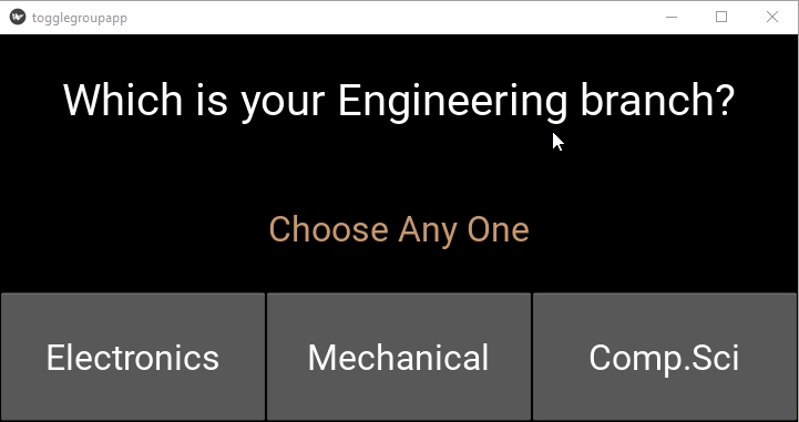
Kivy - Camera
With the Camera widget in Kivy, it is possible to display the video stream from a camera device. Kivy may take some time to initialize the camera device, and update the widget texture afterwards.
The Camera class is defined in the "kivy.uix.camera: module.
from kivy.uix.camera import Camera cam = Camera(**kwargs)
If the system finds multiple camera devices, you need to specify the camera to be used by its index.
cam = Camera(index=1)
You can also specify the camera resolution with the resolution argument −
cam = Camera(index=1, resolution=(640, 480))
The kivy.uix.camera.Camera class is a concrete implementation of the core Camera class from the "kivy.core.camera" module, and performs the initialization and frame capture functions.
Kivy needs to find an appropriate camera provider to be able to detect the hardware. For this purpose, install the latest version of opencv-python package, which also installs its dependency packages including NumPy.
pip install opencv-python
To start streaming the feed from your camera on the app window, set the play property of the Camera object to True, and set it to False to stop the feed.
cam.play = True
To capture the snapshot of the camera stream to an image, use the export_to_png() method. Specify the filename to save to.
The Camera class defines following attributes −
index − Index of the used camera, starting from 0. Setting it to -1 to allow auto selection.
play − Boolean indicating whether the camera is playing or not. You can start/stop the camera by setting this property −
# create the camera, and start later (default) cam = Camera() # and later cam.play = True # to sop cam.play = False
resolution − Preferred resolution to use when invoking the camera. If you are using [-1, -1], the resolution will be the default one. To set the desired resolution, provided it is supported by the device −
cam = Camera(resolution=(640, 480))
Example
The following example code adds a Camera widget and a ToggleButton inside a vertical BoxLayout. The callback bound to the toggle button sets the camera object's play property to True when the button is down, and otherwise the video is stopped.
from kivy.app import App
from kivy.uix.boxlayout import BoxLayout
from kivy.uix.togglebutton import ToggleButton
from kivy.uix.camera import Camera
from kivy.core.window import Window
Window.size = (720,350)
class TestCameraApp(App):
def build(self):
box=BoxLayout(orientation='vertical')
self.mycam=Camera(play=False, resolution= (640, 480))
box.add_widget(self.mycam)
tb=ToggleButton(text='Play', size_hint_y= None, height= '48dp')
tb.bind(on_press=self.play)
box.add_widget(tb)
return box
def play(self, instance):
if instance.state=='down':
self.mycam.play=True
instance.text='Stop'
else:
self.mycam.play=False
instance.text='Play'
TestCameraApp().run()
Output
Run the code and check the output −

You can also use the "kv" language script to design the application window layout. Save the following script as "TestCamera.kv", comment out the code in the build() method, and just place a "pass" statement in it.
BoxLayout:
orientation: 'vertical'
Camera:
id: camera
resolution: (640, 480)
play: False
ToggleButton:
text: 'Play'
on_press: camera.play = not camera.play
size_hint_y: None
height: '48dp'
Kivy - Tree View
Most of the GUI toolkits, including Kivy, provide a TreeView widget with which a user can navigate and interact with hierarchical data presented as nodes in a tree-like format. The file and directory structure shown in the file explorer of an operating system is a typical example of TreeView.
The "kivy.uix.treeview" module includes the definitions of three important classes: TreeView, TreeViewNode, and TreeViewLabel. Objects of these classes constitute the tree view widget.
A TreeView is populated by the instances of TreeViewNode instances. Any widget from the library such as a label or a button, or a user-defined widget object is combined with TreeViewNode.
The root of the tree view is the TreeView object itself.
from kivy.uix.treeview import TreeView tv = TreeView()
One or more nodes can be directly added below this root. A TreeViewLabel is used as argument for add_node method
from kivy.uix.treeview import TreeViewLabel n1 = tv.add_node(TreeViewLabel(text='node 1'))
Instead of adding a node to the root of the tree, you can add it to a node itself. Provide the instance of the parent node as the second argument to the add_node() method −
n2 = tv.add_node(TreeViewLabel(text='Political Sci'), n1)
The root widget of the tree view is opened by default and its default caption is 'Root'. To change that, you can use the TreeView.root_options property. This will pass options to the root widget −
tv = TreeView(root_options=dict(text='My root'))
The TreeViewLabel itself is a label, and hence cannot generate any event as on_press. For that you should define a class that inherits TreeView and a Button.
class TreeViewButton(Button, TreeViewNode): pass
You can then process different events such as −
on_node_expand − Fired when a node is being expanded
on_node_collapse − Fired when a node is being collapsed
Example
The code given below composes a simple tree view of subjects available in each faculty of a college. A vertical box layout houses a treeview widget and a button. The root of the tree view is open.
To expand a node, click the ">" button to its left. It turns to a downward arrow. If clicked again, the node is collapsed.
from kivy.app import App
from kivy.uix.treeview import TreeView, TreeViewLabel
from kivy.uix.button import Button
from kivy.uix.boxlayout import BoxLayout
from kivy.core.window import Window
Window.size = (720, 350)
class DemoApp(App):
def build(self):
lo = BoxLayout(orientation='vertical')
self.tv = TreeView(root_options={
'text': 'Faculty-wise Subjects',
'font_size': 20}
)
self.n1 = self.tv.add_node(TreeViewLabel(text='Arts'))
self.n2 = self.tv.add_node(TreeViewLabel(text='Commerce'))
self.n3 = self.tv.add_node(TreeViewLabel(text='Science'))
self.n4 = self.tv.add_node(
TreeViewLabel(text='Sociology'), self.n1
)
self.n5 = self.tv.add_node(
TreeViewLabel(text='History'), self.n1
)
self.n6 = self.tv.add_node(
TreeViewLabel(text='Political Sci'), self.n1
)
self.n7 = self.tv.add_node(
TreeViewLabel(text='Accountancy'), self.n2
)
self.n8 = self.tv.add_node(
TreeViewLabel(text='Secretarial Practice'), self.n2
)
self.n9 = self.tv.add_node(
TreeViewLabel(text='Economics'), self.n2
)
self.n10 = self.tv.add_node(
TreeViewLabel(text='Physics'), self.n3
)
self.n11 = self.tv.add_node(
TreeViewLabel(text='Mathematics'), self.n3
)
self.n12 = self.tv.add_node(
TreeViewLabel(text='Chemistry'), self.n3
)
lo.add_widget(self.tv)
return lo
DemoApp().run()
Output

Kivy - reStructuredText
reStructuredText is a file format for a text file containing data used primarily in the Python for technical documentation. The file usually has a ".rst" extension.
reStructuredText is a part of the DocUtils project, and its main purpose is to provide a set of tools for Python that are similar to Javadoc for Java. Written by David Goodger, its earliest version was released in 2001, the latest being in 2019.
reStructuredText can be considered as a lightweight markup language, with lot of similarities with MarkDown syntax. It is being used as a core component of Python's Sphinx document generation system.
Kivy provides reStructuredText document renderer in the form of RstDocument class defined in the "kivy.uix.rst" module.
from kivy.uix.rst import RstDocument doc = RstDocument(**kwargs)
Formatting reStructuredText
Paragraph − A chunk of text that is separated by blank lines (one is enough). Paragraphs must have the same indentation.
Bold − Characters between two asterisks (example:**Hello**)
Italics − characters between single asterisks(ex: *world*)
Enumerated list − Start a line off with a number or letter followed by a period ".", right bracket ")" or surrounded by brackets "( )". For example −
1. Python 2. Java 3. C++
Bulleted list − start the line off with a bullet point character - either "-", "+" or "*"
Sections − These are a single line of text (one or more words) with adornment: an underline alone, or an underline and an overline together, in dashes "-----", equals "======"
Images − To include an image in your document, you use the the image directive. For example −
.. image:: kivi-logo.png
Example
Following text is formatted as per the reStructuredText syntax. Save the following text as index.rst −
================ Welcome to Kivy ================ Welcome to Kivy's documentation. **Kivy** is an open source software library for the rapid development of applications equipped with novel user interfaces, such as multi-touch apps. With Kivy, you can create apps that run on: * Desktop computers: macOS, Linux, *BSD Unix, Windows. * iOS devices: iPad, iPhone. * Android devices: tablets, phones. ------------------- Virtual environment ------------------- Create the virtual environment named kivy_venv in your current directory_:: python -m virtualenv kivy_venv Activate the *virtual environment*. For Windows default CMD, in the command line do_:: kivy_venv\Scripts\activate Your terminal should now preface the path with something like (kivy_venv), indicating that the kivy_venv environment is active. If it doesn't say that, the virtual environment is not active and the following won't work. Install Kivy ------------ The simplest is to install the current stable version of kivy is to use pip_:: python -m pip install "kivy[base]" kivy_examples
Let us write a program to render this reStructuredText document in Kivy application. We put a RstDocument widget in a grid layout with a single column. Set the source property of this object to the RST file that we have created.
from kivy.app import App
from kivy.uix.rst import RstDocument
from kivy.uix.gridlayout import GridLayout
from kivy.core.window import Window
Window.size = (720,400)
class rstdemoapp(App):
def build(self):
grid=GridLayout(cols=1)
doc = RstDocument(source="index.rst")
grid.add_widget(doc)
return grid
rstdemoapp().run()
Output
Run the above code. The RST document will be displayed as per the formatting syntax explained above.

Kivy - Action Bar
Kivy framework provides ActionBar widget, which acts as an easy to access menu, usually towards top or bottom of the application window, somewhat similar to ActionBar in Android.
The ActionBar class is defined in kivy.uix.actionbar module. The appearance of an action bar depends on the composition of ActionView inside it. The ActionView holds one or more ActionButtons, represented by appropriate text caption and/or icon.

The ActionView contains ActionButtons, separators, or ActionGroup. ActionGroup is a collection of ActionButtons. When you click the ActionGroup caption, the buttons are shown in a dropdown.
When the ActionBar area becomes too small to accommodate all the contents, widgets are moved into the ActionOverflow area.
You may want to display some ActionItems always on the ActionBar, irrespective of the number of items present. If you set the Important property of the ActionButton to True, it will get a priority placement on the bar.
Example
The code given below puts a label and an ActionBar at the bottom of the app window. The ActionBar displays a couple of ActionButtons, the "on_press" event of each updates the label caption to its own text property.
The App code consists of the myActionApp class, whose build method constructs the appearance of the window by loading the associated kv file script.
The Python code is shown below −
from kivy.app import App
from kivy.uix.widget import Widget
from kivy.core.window import Window
Window.size = (720,400)
class mywidget(Widget):
def pressed(self, obj):
self.ids.l1.text=obj.text
class myActionApp(App):
def build(self):
return mywidget()
myActionApp().run()
Here, mywidget class subclasses Widget class. Following kv language script, to be saved as myAaction.kv, composes the ActionBar with two buttons. It also places a label to show the caption of the ActionButton pressed.
<mywidget>
Label:
id:l1
text:'Hello'
pos_hint:{'center_x':.5, 'center_y':1}
pos:(root.width/2-150, root.height/2-50)
font_size:48
size:(300,100)
ActionBar:
size:root.width, 50
pos_hint: {'top':1}
background_color: .6, 4, .2, .6
ActionView:
use_separator: True
ActionPrevious:
title: 'Action Bar'
with_previous: False
ActionOverflow:
ActionButton:
icon: 'atlas://data/images/defaulttheme/audio-volume-high'
ActionButton:
important: True
text: 'Important'
on_press:root.pressed(self)
ActionButton:
text: 'Btn1'
on_press:root.pressed(self)
Output

Kivy - Video Player
The VideoPlayer widget in Kivy library is a ready to use control to play a video file and control its playback and sound. It is a predefined layout with the playing area and buttons to play/stop and pause/resume playback. It also has a seekbar with which the play position can be moved to a desired place.
The VideoPlayer class is defined in the "kivy.uix.videoplayer" module.
from kivy.uix.videoplayer import VideoPlayer player = VideoPlayer(**kwargs)
You need to assign the source property of a VideoPlayer object with a String representing the video file to be played. Kivy supports different video formats including "mp4", "avi" and "mpg".
To start the video, you should set the state property to 'play'
from kivy.uix.videoplayer import VideoPlayer player = VideoPlayer(source = "test.mp4") player.state = 'play'
One of the important features of Kivy's VideoPlayer is its ability to display text annotations at specific position in the video and for a certain duration. The annotations are provided in a file with ".jsa" extension, and with the same name as that of the video file.
The .jsa file is a JSON based file format. It contains the values for start position of the annotation, the duration in seconds for which it is displayed on the screen, and the annotation text.
[
{"start": 0, "duration": 2,
"text": "Introduction"},
{"start": 10, "duration": 5,
"text": "Hello World"},
]
To keep the video playing in a loop, set the eos option to loop −
options={'eos': 'loop'}
The VideoPlayer class defines the following properties −
source − The source of the video to read. source is a StringProperty representing the path of the video file to be played
state − A string, indicates whether to play, pause, or stop the video. state is an OptionProperty and defaults to 'stop'.
allow_fullscreen − By default, you can double-tap on the video to make it fullscreen. Set this property to False to prevent this behavior.
position − Position of the video between 0 and duration. The position defaults to -1 and is set to the real position when the video is loaded.
seek(percent, precise=True) − Change the position to a percentage (strictly, a proportion) of duration. The percent value should be a float or int and between 0-1. The precise parameter is a bool, defaults to True where precise seeking is slower, but seeks to exact requested percent.
thumbnail − Thumbnail of the video to show. If None, VideoPlayer will try to find the thumbnail from the source + '.png'.
volume − Volume of the video in the range 0-1. 1 means full volume and 0 means mute.
annotation − The VideoPlayer uses a VideoPlayerAnnotation object to construct annotations, based on the JSON data stored in a JSA file.
Following keys are allowed to be used in JSA file −
start − The position at which the annotation is to be displayed
duration − Time for which the annotation label is displayed on the player window.
text − The text to be displayed as annotation.
bgcolor − [r, g, b, a] - background color of the text box
bgsource − 'filename' - background image used for the background text box
border − (n, e, s, w) - border used for the background image
Example
Th following code renders a video player widget on the application window −
from kivy.app import App
from kivy.uix.videoplayer import VideoPlayer
from kivy.core.window import Window
Window.size = (720, 350)
class MainApp(App):
title = "Simple Video"
def build(self):
player = VideoPlayer(
source="video.mp4",
size_hint=(0.8, 0.8),
options={'fit_mode': 'contain'}
)
player.state = 'play'
player.options = {'eos': 'loop'}
player.allow_stretch = True
return player
MainApp().run()
Output
Run the code and check the output −

Kivy - Stencil View
The StencilView widget in Kivy library limits the canvas area of other children widgets added to it. Any instructions trying to draw outside the stencil view area will be clipped.
Stencil graphics instructions are used under the hood by the StencilView widget. It provides an efficient way to clip the drawing area of children.
The StencilView class is defined in the "kivy.uix.stencilview" module.
from kivy.uix.stencilview import StencilView
It may be noted that StencilView is not a layout. Hence, to add widgets to StencilView, you have to combine a StencilView and a Layout in order to achieve a layout's behavior. Further, you cannot add more than 128 stencil-aware widgets to the StencilView.
The general usage of StencilView is as follows −
st = StencilView(size=(x,y)) w = Widget() st.add_widget(w)
To understand how exactly StencilView limits the drawable area of a widget, let us first execute certain graphics drawing instructions, and then impose StencilView to see the difference.
Example
In the following code, a mywidget class extends the Widget class, and draws 200 circles at random positions and with random RGB values. (This doesn't use StencilView yet)
from kivy.app import App
from kivy.uix.widget import Widget
from kivy.graphics import *
import random
from kivy.core.window import Window
Window.size = (720, 350)
class mywidget(Widget):
def __init__(self, *args):
super().__init__(*args)
for i in range(200):
colorR = random.randint(0, 255)
colorG = random.randint(0, 255)
colorB = random.randint(0, 255)
posx = random.randint(0, Window.width)
posy = random.randint(0, Window.height)
self.canvas.add(Color(rgb=(colorR / 255.0, colorG / 255.0, colorB / 255.0)))
d = 30
self.canvas.add(Ellipse(pos=(posx, posy), size=(d, d)))
class circlesapp(App):
def build(self):
w = mywidget()
return w
circlesapp().run()
Output
As you can see, the circles are drawn at random positions all over the app window area.
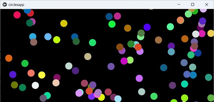
Now we chall apply the StencilView, and restrict the drawing area to 400300 pixels in the center of the main window.
The StencilView object is created and we add a Widget object to it. The drawing loop remains the same.
class circlesapp(App):
def build(self):
st = StencilView(
size_hint=(None, None), size=(400, 300),
pos_hint={'center_x':.5, 'center_y':.5}
)
w=widget()
st.add_widget(w)
return st
If we now run the app, we should see the random circles appearing inside the stencil area, for all the positions outside it the drawing instructions are restricted.

Kivy - VKeyboard
The VKeyboard widget in Kivy library is especially useful for applications running on multitouch devices such as smartphones and tablets. VKeyboard is an on-screen keyboard. Its operation is intended to be transparent to the user.
The VKeyboard is used in two modes − docked and free mode. The free mode is suitable for multitouch devices, whereas the docked mode is enabled while using a computer like a tablet.
The VKeyboard class is defined in kivy.uix.vkeyboard module.
from kivy.uix.vkeyboard import VKeyboard kb = VKeyboard(**kwargs)
A virtual keyboard is never used directly. Instead, it is controlled by the configuration. If the application has any widget (such as TextInput) that requires a keyboard, do not use the virtual keyboard directly, but prefer to use the best method available on the platform.
The VKeyboard class inherits the ScatterLayout. A button in the bottom right of the virtual keyboard widget lets you switch between available layouts.
The VKeyboard object has the following properties −
available_layouts − Dictionary of all available layouts. Keys are the layout ID, and the value is the JSON, defaults to {}.
callback − Callback can be set to a function that will be called if the VKeyboard is closed by the user.
docked − Indicate whether the VKeyboard is docked on the screen or not. If you change it, you must manually call setup_mode() otherwise it will have no impact.
key_margin − Key margin, used to create space between keys. The margin is composed of four values, in pixels −
key_margin = [top, right, bottom, left]
key_margin defaults to [2, 2, 2, 2]
target − Target widget associated with the VKeyboard. If set, it will be used to send keyboard events.
Example
In the following example, the initial constitution of a one-column grid layout shows a label and a TextInput widget. As the user generates a touch_down event by clicking inside the text box, a VKeyboard widget is added to the layout.
def ontouch(self, instance, value):
self.kb = VKeyboard(
on_key_up = self.vkbinput,
pos_hint={'center_x':.5},
size_hint=(.8, None)
)
self.layout.add_widget(self.kb)
When any key on the keyboard is pressed, it generates on_key_up event. It is bound to a vkbinput() method. This method reads the keycode of the depressed key and updates the contents of the text box.
def vkbinput(self, keyboard, keycode, *args):
text = self.text1.text
if keycode == '~':
self.layout.remove_widget(self.kb)
return
self.text1.text = f'{text}{keycode}'
Whenever the user presses the "~" key, the keyboard widget is removed from the layout.
The complete code is given below −
from kivy.app import App
from kivy.uix.vkeyboard import VKeyboard
from kivy.uix.textinput import TextInput
from kivy.uix.label import Label
from kivy.uix.gridlayout import GridLayout
from kivy.core.window import Window
Window.size = (720, 400)
class MainApp(App):
def build(self):
self.layout = GridLayout(cols=1)
self.text1 = TextInput(
font_size=32,
on_touch_down=self.ontouch
)
self.label = Label(
text="Enter Text....",
font_size=32,
color=[.8, .6, .1]
)
self.layout.add_widget(self.label)
self.layout.add_widget(self.text1)
return self.layout
def ontouch(self, instance, value):
self.kb = VKeyboard(
on_key_up=self.vkbinput,
pos_hint={'center_x': .5},
size_hint=(.8, None)
)
self.layout.add_widget(self.kb)
def vkbinput(self, keyboard, keycode, *args):
text = self.text1.text
if keycode == '~':
self.layout.remove_widget(self.kb)
return
self.text1.text = f'{text}{keycode}'
MainApp().run()
Output
When the above code runs, the initial display of the app window is like this −

Click inside the textbox, and the virtual keyboard appears below it −

You can now enter the text. Press "~" to remove the keyboard.
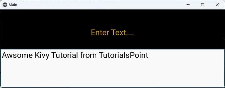
Kivy - Touch Ripple
In the Kivy framework, the "Touch Ripple" is not really a widget or any concrete class. Instead, the TouchRippleBehavior mixin adds a touch ripple visual effect to a layout or an individual widget. Normally, Kivy has a default press/release visualization. This class adds the ripple effect from Google Material Design.
This mixin class is defined in the "kivy.uix.behaviors.touchripple" module.
from kivy.uix.behaviors.touchripple import TouchRippleBehavior
The Ripple behavior does not trigger automatically. A concrete class needs to implement this behavior mixin and explicitly call ripple_show() respective ripple_fade() methods manually.
To customize the ripple effects, use the following properties −
ripple_duration_in − Animation duration taken to show the overlay. It's a NumericProperty and defaults to 0.5.
ripple_duration_out − A NumericProperty defaulting to 0.2 sets the animation duration taken to fade the overlay.
ripple_fade_from_alpha − Alpha channel for ripple color the animation starts with. Default value is 0.5.
ripple_fade_to_alpha − Alpha channel for ripple color the animation targets to, defaults to 0.8.
ripple_rad_default − Default radius the animation starts from. It is a NumericProperty and defaults to 10.
ripple_scale − Max scale of the animation overlay calculated from max(width/height) of the decorated widget.
The ripple_show() method begins ripple animation on current widget. You need to pass a touch event as argument.
The ripple_fade() method is called to finish ripple animation on current widget.
The ripple_func_in and ripple_funcion_out are animation callbacks for showing and hiding the overlay.
Example
In the following example, we have used kv script that puts a label inside a grid layout, and processes the touch_down and touch_up events.
The on_touch_down() method calls the ripple_show() method to generate ripple effect with a duration of 3 seconds.
The on_touch_up() methods finishes the ripple effect by calling the ripple_fade() method.
from kivy.app import App
from kivy.uix.gridlayout import GridLayout
from kivy.uix.behaviors.touchripple import TouchRippleBehavior
from kivy.core.window import Window
Window.size = (720,300)
class RippleLabel(TouchRippleBehavior, GridLayout):
def __init__(self, **kwargs):
super(RippleLabel, self).__init__(**kwargs)
def on_touch_down(self, touch):
collide_point = self.collide_point(touch.x, touch.y)
if collide_point:
touch.grab(self)
self.ripple_duration_in=3
self.ripple_show(touch)
return True
return False
def on_touch_up(self, touch):
if touch.grab_current is self:
touch.ungrab(self)
self.ripple_duration_out=3
self.ripple_fade()
return True
return False
class MyRippleApp(App):
def build(self):
return RippleLabel(cols=1)
MyRippleApp().run()
The "kv" script −
<RippleLabel>:
GridLayout:
cols:1
Label:
size:(root.width, root.height)
pos_hint:{'center_x':.5, 'center_y':.5}
text:'OK'
font_size:100
color:(1,0,0,1)
Output
Run the program and click the "OK" label. It will produce ripple waves on the window surface. Increase the duration to see the effect.

Kivy Audio
Kivy framework provides the Sound class that handles functions like loading audio files, playing and stopping the playback. Sound class is one of the core classes, defined in the "kivy.core.audio" module.
It is not advised to instantiate the Sound object directly. Instead, use the SoundLoader function as shown below −
from kivy.core.audio import SoundLoader
sound = SoundLoader.load('test.mp3')
Audio playback is handled by Gstreamer implementations: using Gi/Gst and PyGST. Gi/GST works for both Python 2+3 with Gstreamer 1.0, while PyGST working only for Python 2 + Gstreamer 0.10.
Note that the core audio library does not support recording audio. If you require this functionality, please refer to the audiostream extension.
The Sound object has the following important properties/methods −
| Sr.No | Properties/Methods & Description |
|---|---|
| 1 | load() Load the file into memory. |
| 2 | play() Play the file. |
| 3 | stop() Stop playback. |
| 4 | unload() Unload the file from memory. |
| 5 | seek(position) Go to the <position> (in seconds). |
| 6 | get_pos() Returns the current position of the audio file. Returns 0 if not playing. |
| 7 | length Get length of the sound (in seconds). |
| 8 | loop Set to True if the sound should automatically loop when it finishes. |
| 9 | source Filename / source of your audio file. |
| 10 | state State of the sound, one of 'stop' or 'play'. |
Let us use the Sound object and build a simple audio player in Kivy. The application window houses a label that shows the present status of the player, i.e., whether it is playing or stopped, and two buttons to control the playback. A button on the left is captioned 'Play' to start with.

When clicked, it loads the sound object from a mp3 file, calls play() method, changes label caption to 'Playing' and enables the pause button, and its caption changes to 'Stop'.
When the left button is clicked while its caption is 'Stop', the playback is stopped, restores the label caption and disables the pause button.
When you hit the Pause button, the current position of audio file is stored in pos variable, the button caption changes to Resume. When it is clicked, the play position is retrieved by calling seek() method.
Example
Here is the complete code −
from kivy.app import App
from kivy.uix.button import Button
from kivy.uix.label import Label
from kivy.uix.boxlayout import BoxLayout
from kivy.uix.gridlayout import GridLayout
from kivy.core.audio import SoundLoader
from kivy.core.window import Window
Window.size = (720, 350)
class audiodemoapp(App):
def build(self):
layout = GridLayout(cols=1, padding=10)
self.l1 = Label(
text='Press Start to Play',
font_size=40, color=[.8, .6, .4, 1]
)
layout.add_widget(self.l1)
box = BoxLayout(orientation='horizontal')
self.button1 = Button(text="Play", font_size=32)
self.button2 = Button(
text='Pause', font_size=32, disabled=True
)
box.add_widget(self.button1)
box.add_widget(self.button2)
layout.add_widget(box)
self.button1.bind(on_press=self.start_stop)
self.button2.bind(on_press=self.pause_resume)
return layout
def start_stop(self, event):
if self.button1.text == 'Play':
self.l1.text = 'Playing'
self.button1.text = 'Stop'
self.sound = SoundLoader.load('sample.mp3')
self.pos = 0
self.button2.disabled = False
self.sound.play()
else:
if self.button1.text == 'Stop':
self.l1.text = 'Press to Play'
self.button1.text = 'Play'
self.sound.unload()
self.button2.disabled = True
self.pos = 0
def pause_resume(self, event):
if self.button2.text == 'Pause':
self.button2.text = 'Resume'
self.l1.text == 'Paused'
self.pos = self.sound.get_pos()
print(self.pos)
self.sound.stop()
else:
if self.button2.text == 'Resume':
self.l1.text = 'Playing'
self.button2.text = 'Pause'
print(self.pos)
self.sound.seek(self.pos)
self.sound.play()
audiodemoapp().run()
Output
The following figure shows the status caption set to 'Playing' and pause button is enabled. The Pause button toggles between Pause and Resume states.

Kivy - Videos
The Video widget in Kivy framework capable of displaying video files and streams. The video formats you can play with Video widget depend on the operating system, video provider installed along with plugins required if any. The GStreamer provider is capable of handling almost any video codecs such as mpg, avi, mp4, mov, etc.
The Video class is defined in the "kivy.uix.video" module.
from kivy.uix.video import Video vid = Video(**args)
The only mandatory parameter required to the constructor is the source property - a string representing the path to a video file.
vid = Video(source = "test.mp4")
In order to start the video playback, you need to set its play property to True. You can pass this parameter in the constructor to start the video as soon as it is loaded, or set it to True/False as and when required.
# start playing the video at creation video = Video(source='test.mp4', play=True) # create the video, and start later video = Video(source='test.mp4') # and later video.play = True
Other properties of Video class are listed below −
duration − Duration of the video. The duration defaults to "-1", and is set to a real duration when the video is loaded.
eos − Stands for "end of stream". A Boolean property indicates whether the video has finished playing or not (reached the end of the stream).
play − Indicates whether the video is playing or not. You can start/stop the video by setting this property to True or False.
position − Position of the video between 0 and duration. The position defaults to -1 and is set to a real position when the video is loaded.
seek() − Change the position to seek as a proportion of the total duration, must be between 0-1.
state − A string, indicating whether to play, pause, or stop the video −
# start playing the video at creation video = Video(source='test.mp4', state='play') # create the video, and start later video = Video(source='test.mp4') # and later video.state = 'play'
volume − Volume of the video, in the range 0-1. 1 means full volume, 0 means mute.
Example
from kivy.app import App
from kivy.uix.videoplayer import VideoPlayer
from kivy.uix.video import Video
from kivy.core.window import Window
Window.size = (720,400)
class MainApp(App):
title = "Simple Video"
def build(self):
player = Video(source = "earth.mp4",
size_hint = (1,1),
options={'fit_mode': 'contain'})
player.state = 'play'
player.options = {'eos': 'loop'}
player.allow_stretch=True
return player
MainApp().run()
Output
The video playback starts as you run the above code −

Kivy - Spelling
Kivy library comes with a spelling module in its "kivy.core" package. It provides abstracted access to a range of spellchecking backends as well as word suggestions. The API is inspired by the "python-enchant" library.
You need to install enchant to be able to use this feature.
pip3 install pyenchant
Example
Create an object of Spelling class (defined in "kivy.core.spelling" module) to call its various methods. For instance, the list_languages() method returns a list of supported languages.
from kivy.core.spelling import Spelling s = Spelling() s.list_languages()
Output
It will list down all the supported languages −
['en_BW', 'en_AU', 'en_BZ', 'en_GB', 'en_JM', 'en_DK', 'en_HK', 'en_GH', 'en_US', 'en_ZA', 'en_ZW', 'en_SG', 'en_NZ', 'en_BS', 'en_AG', 'en_PH', 'en_IE', 'en_NA', 'en_TT', 'en_IN', 'en_NG', 'en_CA']
You can select a specific language from the list for subsequent use.
s.select_language('en_US')
The check() method in the Spelling class checks if a given word is valid in the currently active language. If yes, it returns True. If the word shouldn't be checked, returns None (e.g. for ''). If it is not a valid word in self._language, then it returns False.
>>> s.check('this')
True
>>> s.check('thes')
False
You can obtain suggestions from the Spelling class for a given word.
s.suggest('wold')
['wild', 'wolf', 'old', 'wolds', 'woald', 'world', 'would',
'weld', 'sold', 'woad', 'word', 'told', 'wood', 'cold', 'gold']
If you try to select a language which is not present in the list of supported language, Kivy raises the following NoSuchLangError exception −
s.select_language('Hindi')
kivy.core.spelling.NoSuchLangError: Enchant Backend: No
language for "Hindi"
When a language-using method is called but no language was selected prior to the call, Kivy raises "NoLanguageSelectedError".
Kivy - Effects
The Kivy library provides the "kivy.effects" subpackage to control the overscroll effects when using the ScrollView widget in a Kivy app. The Effect classes can perform actions like bouncing back, changing opacity, or prevent scrolling beyond the normal boundaries.
There are three Effect classes −
ScrollEffect − Base class used for implementing an effect. It only calculates the scrolling and the overscroll. This class is defined in kivy.effects.scroll module
DampedScrollEffect − Uses the overscroll information to allow the user to drag more than expected. Once the user stops the drag, the position is returned to one of the bounds. The definition of this class is in kivy.effects.dampedscroll module.
OpacityScrollEffect − Uses the overscroll information to reduce the opacity of the scrollview widget. When the user stops the drag, the opacity is set back to 1. The class definition is available in kivy.effects.opacityscroll module.
These classes use the KineticEffect as the base class for computing velocity out of a movement.
To apply the effect of any of these classes on the scrolling behavior of ScrollView, set one of these classes as the value of effect_cls property of ScrollView widget.
scr = ScrollView(size=Window.size) scr.eefect_cls=ScrollEffect
Example
The following "kv" language script constructs a ScrollView with a hundred buttons added to a GridLayout. The "effect_cls" property is set to ScrollEffect class.
#:import ScrollEffect kivy.effects.scroll.ScrollEffect
#:import Button kivy.uix.button.Button
<RootWidget>
effect_cls: ScrollEffect
GridLayout:
size_hint_y: None
height: self.minimum_height
cols: 1
on_parent:
for i in range(100):
self.add_widget(Button(text=str(i), size_hint_y=None))
The above "kv" code uses a class rule by the name RootWidget. The build() method of the App class in the following Python code returns an object of RootWidget class.
from kivy.uix.gridlayout import GridLayout
from kivy.uix.button import Button
from kivy.uix.scrollview import ScrollView
from kivy.effects.dampedscroll import DampedScrollEffect
from kivy.core.window import Window
from kivy.app import App
from kivy.core.window import Window
Window.size = (720,350)
class RootWidget(ScrollView):
pass
class scrollableapp(App):
def build(self):
return RootWidget()
scrollableapp().run()
Output
Execute the above Python program from command line. You get the app window with a scrollview, showing a snapshot of buttons. You can scroll up or down with the ScrollEffect activated.

You can customize the Effect class by specifying the attributes in the RootWidget class and use it as the "effect_cls" property.
For example, you can set the max and min boundaries to be used for scrolling. The overscroll property is the computed value when the user overscrolls, i.e., goes out of the bounds.
Kivy - Input Recorder
The functionality of Recorder class in Kivy framework is still under development, and is still at experimental stage. The Recorder object records the input events such as touch events, key events and click events. They are recorded in a file with a ".kvi" extension. Kivy uses this file and replays the events by generating equivalent fake events and dispatches them to the event loop.
The Recorder class is defined in the "kivy.input.recorder" module −
from kivy.input.recorder import Recorder rec = Recorder(**kwargs)
To start recording, press F8 after the Recorder object is instantiated. The event data is recorded in the "recorder.kvi" file in the current folder. You can specify any other filename to the file attribute.
rec = Recorder(filename='myrecorder.kvi')
Press F7 to replay the events.
To control the recording and replay manually, use the record and play properties of the Recorder object.
To start recording −
rec = Recorder(filename='myrecorder.kvi') rec.record = True rec.start()
To stop recording −
rec.record = False rec.stop()
Similarly, to start replay −
rec.play = True rec.start()
and, to stop playback −
rec.play = False rec.stop()
You can make the replay go on in a loop −
def playloop(instance, value):
if value is False:
instance.play = True
rec = Recorder(filename='myrecorder.kvi')
rec.bind(play=playloop)
rec.play = True
Example
In the code given below, a Label is added to a Scatter widget, so that you can perform rotation, zooming and transformation. Further, the text property of the label updates as the user changes the contents of the TextInput box.
The recording and replay of events is defined on the on_press event of two buttons.
Here's the complete code −
from kivy.app import App
from kivy.uix.label import Label
from kivy.uix.scatter import Scatter
from kivy.uix.boxlayout import BoxLayout
from kivy.uix.textinput import TextInput
from kivy.uix.togglebutton import ToggleButton
from kivy.input.recorder import Recorder
from kivy.core.window import Window
Window.size = (720,400)
class scatterdemoapp(App):
def build(self):
self.rec = Recorder(filename='myrecorder.kvi')
box=BoxLayout(orientation='vertical')
box1=BoxLayout(orientation='horizontal')
text1=TextInput(text='Hi', pos_hint={'top':1},height=100, size_hint=(.5, None))
b1=ToggleButton(text='record',pos_hint={'top':1}, height=100, size_hint=(.25, None))
b1.bind(on_press=self.on_recording)
b2=ToggleButton(text='play', pos_hint={'top':1},height=100, size_hint=(.25, None))
b2.bind(on_press=self.on_playing)
box1.add_widget(text1)
box1.add_widget(b1)
box1.add_widget(b2)
box.add_widget(box1)
scatr=Scatter()
self.lbl=Label(text="Hi", font_size=60, pos=(Window.width/2-100,200 ))
text1.bind(text=self.lbl.setter('text'))
scatr.add_widget(self.lbl)
box.add_widget(scatr)
return box
def on_recording(self, obj):
if obj.state=='down':
self.rec.record=True
self.rec.start()
else:
self.rec.record=False
self.rec.stop()
def on_playing(self, obj):
if obj.state=='down':
self.rec.play=True
self.rec.start()
else:
self.rec.play=False
self.rec.stop()
scatterdemoapp().run()
Output
The App window appears as shown here −

Hit the record button and all the screen activities including the key_down events are recorded in the ".kvi" file. The console window shows that inputs have been recorded.
[INFO ] [Recorder ] Recording inputs to 'myrecorder.kvi' [INFO ] [Recorder ] Recorded 901 events in 'myrecorder.kvi'
On pressing the play button to replay the recorded events. Accordingly the console echoes the corresponding log.
[INFO ] [Recorder ] Start playing 901 events from 'myrecorder.kvi'
Kivy - OpenGL
The Kivy framework is equipped with powerful graphics capabilities built on top of OpenGL and SDL instructions. Kivy uses OpenGL ES 2 graphics library, and is based on Vertex Buffer Object and shaders. The "kivy.graphics.opengl" module is a Python wrapper around OpenGL commands.
A shader is a user-defined program designed to run on some stage of a graphics processor. Shaders are written in OpenGL Shading Language (GLSL), which is a high-level shading language with a syntax based on the C programming language.
The two commonly used shaders to create graphics on the web are Vertex Shaders and Fragment (Pixel) Shaders.
Vertex shaders − They take the input from the previous pipeline stage (e.g. vertex positions, colors, and rasterized pixels) and customize the output to the next stage.
Fragment shaders − They take 2D position of all pixels as input and customize the output color of each pixel.
A detailed discussion on the features and syntax of GLSL is beyond the scope of this tutorial. We shall use an open-source shader file (kaleidoscope.glsl) in this chapter.
#ifdef GL_ES
precision highp float;
#endif
uniform vec2 resolution;
uniform float time;
uniform sampler2D tex0;
uniform sampler2D tex1;
void main(void){
vec2 p = -1.0 + 2.0 * gl_FragCoord.xy / resolution.xy;
vec2 uv;
float a = atan(p.y,p.x);
float r = sqrt(dot(p,p));
uv.x = 7.0*a/3.1416;
uv.y = -time+ sin(7.0*r+time) + .7*cos(time+7.0*a);
float w = .5+.5*(sin(time+7.0*r)+ .7*cos(time+7.0*a));
vec3 col = texture2D(tex0,uv*.5).xyz;
gl_FragColor = vec4(col*w,1.0);
}
In our Kivy application code, we use a .kv file that simply draws a rectangle on the canvas of a FloatLayout widget.
<ShaderWidget>:
canvas:
Color:
rgb: 1, 0, 0
Rectangle:
pos: self.pos
size: self.size
The ShaderWidget rule of this "kv" file corresponds to the ShaderWidget class. It schedules a clock interval to be fired after each second to update the glsl variables in the shader definition.
class ShaderWidget(FloatLayout):
fs = StringProperty(None)
def __init__(self, **kwargs):
self.canvas = RenderContext()
super(ShaderWidget, self).__init__(**kwargs)
Clock.schedule_interval(self.update_glsl, 1 / 60.)
The "fs" class variable stores the code from glsl file. The RenderContext() method from kivy.graphics module stores all the necessary information for drawing, i.e., the vertex shader and the fragment shader, etc.
The "fs" StringProperty is bound to the "on_fs()" method which will set the shader.
def on_fs(self, instance, value):
shader = self.canvas.shader
old_value = shader.fs
shader.fs = value
if not shader.success:
shader.fs = old_value
raise Exception('failed')
The update_glsl() method will be called each time the scheduled clock event occurs. It basically updates the fragment color of each pixel on the application window.
def update_glsl(self, *largs): self.canvas['time'] = Clock.get_boottime() self.canvas['resolution'] = list(map(float, self.size)) win_rc = Window.render_context self.canvas['projection_mat'] = win_rc['projection_mat'] self.canvas['modelview_mat'] = win_rc['modelview_mat'] self.canvas['frag_modelview_mat'] = win_rc['frag_modelview_mat']
The App class simple loads the ShaderWidget from the kv file and class definition.
Example
The complete code is given below −
from kivy.clock import Clock
from kivy.app import App
from kivy.uix.floatlayout import FloatLayout
from kivy.core.window import Window
from kivy.graphics import RenderContext
from kivy.properties import StringProperty
from kivy.core.window import Window
Window.size=(720,400)
file=open('kaleidoscope.glsl')
shader=file.read()
class ShaderWidget(FloatLayout):
fs = StringProperty(None)
def __init__(self, **kwargs):
self.canvas = RenderContext()
super(ShaderWidget, self).__init__(**kwargs)
Clock.schedule_interval(self.update_glsl, 1 / 60.)
def on_fs(self, instance, value):
shader = self.canvas.shader
old_value = shader.fs
shader.fs = value
if not shader.success:
shader.fs = old_value
raise Exception('failed')
def update_glsl(self, *largs):
self.canvas['time'] = Clock.get_boottime()
self.canvas['resolution'] = list(map(float, self.size)).
win_rc = Window.render_context
self.canvas['projection_mat'] = win_rc['projection_mat']
self.canvas['modelview_mat'] = win_rc['modelview_mat']
self.canvas['frag_modelview_mat'] = win_rc['frag_modelview_mat']
class 'kaleidoscopeApp(App):
title='kaleidoscope'
def build(self):
return ShaderWidget(fs=shader)
'kaleidoscopeApp().run()
Output
Run this code and check the output −

Kivy - Text
The "kivy.core.text" module in Kivy library acts as a backend layer for rendering text. However, it should be used only if the "kivy.uix.label.Label" widget is not giving satisfactory result.
This module has two important uses: one is to derive the texture from the core Label object and apply it to any widget in the application, and second is apply custom fonts to the text property of widgets like label, button or Text input (or any widget with text property)
Using Texture
The Label widget (in "kivy.uix.label" module) is often not efficient in loading in the memory. To overcome this, the approach is to have an object of core.label class, and use its texture with the conventional widget.
First import the Label class from "kivy.core.label" (to avoid confusion, name it as CoreLabel).
from kivy.core.text import Label as CoreLabel cl=CoreLabel(text="Hi there!", font_size=50, color=(1, 0, 0, 1))
Call the refresh() method on this object to compute things and generate the texture.
cl.refresh()
Obtain the texture and the texture size.
texture = cl.texture texture_size = list(texture.size)
This can now be used with any widget now.
Example
In the following code, we add a label widget to a vertical box layout and use the texture of a core level object with it.
from kivy.app import App
from kivy.uix.boxlayout import BoxLayout
from kivy.graphics import *
from kivy.core.text import Label as CoreLabel
from kivy.uix.label import Label
from kivy.uix.widget import Widget
from kivy.core.window import Window
Window.size = (720,400)
class CoreLabelApp(App):
def build(self):
cl=CoreLabel(text="Hi there!", font_size=50, color=(1, 0, 0, 1))
cl.refresh()
texture = cl.texture
main=BoxLayout(orientation='vertical')
l=Label()
texture_size = list(texture.size)
l.canvas.add(Rectangle(texture=texture, size=texture_size))
main.add_widget(l)
return main
CoreLabelApp().run()
Output
It will produce the following output −

Custom Fonts
All the widgets that have a text property are rendered with a default set of fonts as per the settings in the config.ini file of Kivy installation.
default_font = ['Roboto', 'data/fonts/Roboto-Regular.ttf', 'data/fonts/Roboto-Italic.ttf', 'data/fonts/Roboto-Bold.ttf', 'data/fonts/Roboto-BoldItalic.ttf']
However, you may want to use a specific font in which a text on any widget, it may be a label, or a TextInput box or a button. To do that, you need to download the relevant font file (The True Type Fonts are represented by .ttf files) and place it in the application folder.
To make these fonts available for our application, they must be registered with the application. The register() method of the LabelBase class is invoked for the purpose. LabelBase is an abstract class used by the specific font renderer used by your operating system.
The register() is a static method with following parameters −
register(name, fn_regular, fn_italic=None, fn_bold=None, fn_bolditalic=None)
where "name" is the font name with which you will refer the font in your program, and "fn_regular" parameter is the TTF file of the font.
Download the TTF files for Consolas font and Monotype Corsiva font and store them in the application folder.
Example
In the following program, we are showing the same string in three text input boxes. The first box renders the text in the default font. The second box uses Monotype Corsiva and the third box applies the Consolas font.
from kivy.app import App
from kivy.uix.gridlayout import GridLayout
from kivy.uix.textinput import TextInput
from kivy.core.text import LabelBase
from kivy.core.window import Window
Window.size = (720,400)
class CustomFontApp(App):
def build(self):
main=GridLayout(cols=1)
LabelBase.register(name='font1', fn_regular='consolas.ttf')
LabelBase.register(name='font2', fn_regular='MonotypeCorsivaFont.ttf')
txt='Simple Is Better Than Complicated'
t1=TextInput(text=txt, halign='center', font_size=48)
t2=TextInput(
text=txt, halign='center',
font_name='font2', font_size=48
)
t3=TextInput(
text=txt, halign='center',
font_name='font1', font_size=48
)
main.add_widget(t1)
main.add_widget(t2)
main.add_widget(t3)
return main
CustomFontApp().run()
Output
It will produce the following output window −

Kivy - Text Markup
Although Kivy's Label object has properties such as bold, italics and color, etc., it also provides markup facility to decorate the label text using a syntax similar to HTML tags. For the markup to show effect, you need to set the markup property of the label to True.
l = Label(text='Hello [b]World[/b]', markup=True)
Note that the kivy markup can be used only for inline styling. Instead of the tags with angular brackets as in HTML (as <b>Hello</b>), square brackets are used here (example: [b]Hello</b])
The text with this markup syntax is very much similar to the HTML syntax, as the following table shows −
| HTML | Kivy Markup |
|---|---|
| <b>bolded text</b> | [b]bolded text[/b] |
| <i>italicized text</i> | [i]italicized text[/i] |
| <u>underlined text</u> | [u]underlined text[/u] |
The following tags can be used for inline styling of the text property of label widget −
| Sr.No | Text Property & Description |
|---|---|
| 1 | [b][/b] Activate bold text |
| 2 | [i][/i] Activate italic text |
| 3 | [u][/u] Underlined text |
| 4 | [s][/s] Strikethrough text |
| 5 | [font=<str>][/font] Change the font (str should be name of TTF file) |
| 6 | [font_family=<str>][/font_family] Font family to request for drawing. |
| 7 | [size=<size>][/size] Change the font size. <size> should be an integer. |
| 8 | [color=#<color>][/color] Change the text color |
| 9 | [anchor=<str>] Put an anchor in the text. |
| 10 | [sub][/sub] Display the text at a subscript position relative to the text before it. |
| 11 | [sup][/sup] Display the text at a superscript position relative to the text before it. |
If you need to escape the markup from the current text, use kivy.utils.escape_markup().
Kivy - Settings
The "kivy.uix.settings" module includes a very useful feature that lets you to handle the setting parameters of your Kivy installation environment. You can open the Settings panel on the application window and modify any of the configuration tokens.
When Kivy software is installed, it creates a configuration file that contains various parameter tokens with their default values. The file, named as "config.ini", is stored in a directory identified by KIVY_HOME environment variable.
On a Windows machine − The file is stored at C:\Users\user\.kivy\config.ini.
On Linux − /home/user/.kivy/config.ini.
On macOS − /Users/user/.kivy/config.ini.
On Android − /data/data/org.kivy.launcher/files/.kivy/config.ini.
On iOS − <HOME_DIRECTORY>/Documents/.kivy/config.ini.
To open the settings panel, call the open_settings() method of the App class, usually in response to an on_press event (or any other event) on the GUI.
def onpress(self, instance): app.open_settings()
We start with a simple Kivy app with a Button mounted on the window. When the button is presses, it calls the onpress() method to display the Kivy settings panel.
class HelloApp(App):
def onpress(self, instance):
app.open_settings()
def build(self):
b1=Button(
text='Click Here', font_size=50,
on_press=self.onpress
)
return b1
app = HelloApp()
app.run()
After the application is run, click the button to enter into the settings panel.

The settings shown here are the same that you see in the config.ini file. Try changing value of any of the config tokens, and you will see the changes done to the config file.
There are several setting panel layouts available.
Settings − Displays settings with a sidebar at the left to switch between json panels.
SettingsWithSidebar − A trivial subclass of Settings.
SettingsWithSpinner − Displays settings with a spinner at the top, which can be used to switch between json panels. This is the default.
SettingsWithTabbedPanel − Displays json panels as individual tabs in a TabbedPanel.
SettingsWithNoMenu − Displays a single json panel, with no way to switch to other panels and no close button.
To use the SeetingsWithSidebar layout, import it from the kivy.uix.settings module and assign it as the value for settings_cls parameter of the App class.
from kivy.uix.settings import SettingsWithSidebar
class HelloApp(App):
def onpress(self, instance):
app.open_settings()
def build(self):
self.settings_cls = SettingsWithSidebar
b1=Button(text='Click Here', font_size=50, on_press=self.onpress)
return b1
The window now provides a sidebar to switch between settings panels.

Create a New Panel
Right now, you have only a panel titled Kivy that diaplays the default settings of Kivy's configuration. You can add a new panel to define the settings for your app. You need two things −
a ConfigParser instance with default values.
a JSON object.
You must create and handle the ConfigParser object to tell kivy's configparser what settings to store in a config file.. SettingsPanel will read the values from it. The default values of these settings are specified with setdefaults for all the sections/keys in your JSON object.
Let us add build_config method that gives the default values for button' text and font_size properties.
def build_config(self, config):
config.setdefaults('My Button', {'text': 'Hello Kivy, 'font_size': 20})
The build_settings() method builds a new panel in the configuration from the JSON object in the code.
The JSON object used in this example is −
json = '''
[
{
"type": "string",
"title": "Button text",
"desc": "text on the button",
"section": "My Button",
"key": "text"
},
{
"type": "numeric",
"title": "Button font size",
"desc": "font size",
"section": "My Button",
"key": "font_size"
}
]
To add a new panel based on the definition of this JSON object define build_settings() method −
def build_settings(self, settings):
settings.add_json_panel('My Button', self.config, data=json)
And that's all. When you open the settings, you should see a new My Button panel added.
Example
The complete code is given below −
from kivy.app import App
from kivy.uix.button import Button
from kivy.core.window import Window
from kivy.uix.settings import SettingsWithSidebar
Window.size = (720,350)
json = '''
[
{
"type": "string",
"title": "Button text",
"desc": "text on the button",
"section": "My Button",
"key": "text"
},
{
"type": "numeric",
"title": "Button font size",
"desc": "font size",
"section": "My Button",
"key": "font_size"
}
]
'''
class MyApp(App):
def onpress(self, instance):
app.open_settings()
def build(self):
self.settings_cls = SettingsWithSidebar
self.btn = Button(on_press=self.onpress)
self.btn.text = self.config.get('My Button', 'text')
self.btn.font_size = float(self.config.get('My Button', 'font_size'))
return self.btn
def build_config(self, config):
config.setdefaults(
'My Button', {'text': 'Hello Python', 'font_size': 20}
)
def build_settings(self, settings):
settings.add_json_panel('My Button', self.config, data=json)
def on_config_change(self, config, section, key, value):
if section == "My Button":
if key == "text":
self.btn.text = value
elif key == 'font_size':
self.btn.font_size = float(value)
app=MyApp()
app.run()
Output
When you open the settings panel, you now see the My Button Panel with two settings. Modify the values as required. Finally, close the settings dialog and go back to see the changes.

Kivy - Layouts
The Kivy application window holds one widget at a time. Hence, if you try to add two buttons, only the second will be displayed. On the other hand, a good GUI needs different widgets i.e. labels, text input boxes, buttons etc. to be ergonomically placed. For this purpose, Kivy framework provides layouts. Layout itself is a widget capable of holding other widgets inside it. Layout therefore is called as a container widget
In Kivy, different types of layout containers are available. All of them implement Layout interface, defined in the "kivy.uix.layout" module. The Layout interface itself inherits the Widget class.
Two of the most important methods of this interface are −
add_widget()
remove_widget()
add_widget()
This method is used to Add a new widget as a child of this layout. Its syntax is like this −
add_widget(self, widget, *args, **kwargs)
Parameters
widget − Widget to add to our list of children.
index − index to insert the widget in the list. Notice that the default of 0 means the widget is inserted at the beginning of the list and will thus be drawn on top of other sibling widgets.
canvas − Canvas to add widget's canvas to. Can be 'before', 'after' or None for the default canvas.
remove_widget
This method is used to remove a widget from the children of this widget. Here is its syntax −
remove_widget(self, widget, *args, **kwargs)
Where, the parameter "widget" stands for the widget that is to be removed from the children list.
Note that Layout is an interface, and hence it can not be used directly. The Layout classes that implement these methods are the concrete classes as in the following list −
| Sr.No | Methods & Description |
|---|---|
| 1 | AnchorLayout Widgets can be anchored to the 'top', 'bottom', 'left', 'right' or 'center'. |
| 2 | BoxLayout Widgets are arranged sequentially, in either a 'vertical' or a 'horizontal' orientation. |
| 3 | FloatLayout Widgets are essentially unrestricted. |
| 4 | RelativeLayout Child widgets are positioned relative to the layout. |
| 5 | GridLayout Widgets are arranged in a grid defined by the rows and cols properties. |
| 6 | PageLayout Used to create simple multi-page layouts, in a way that allows easy flipping from one page to another using borders. |
| 7 | ScatterLayout Widgets are positioned similarly to a RelativeLayout, but they can be translated, rotated and scaled. |
| 8 | StackLayout Widgets are stacked in a lr-tb (left to right then top to bottom) or tb-lr order. |
In the subsequent chapters, we shall discuss each of these layouts in detail with relevant examples.
Kivy - Float Layout
In Kivy, FloatLayout gives you complete control over the placement of widgets. It enforces no restrictions on how a widget is positioned and how it is sized. FloatLayout honors the "pos_hint" and the "size_hint" properties of its children.
The FloatLayout class is defined in the "kivy.uix.floatlayout" module.
from kivy.uix.floatlayout import FloatLayout layout = FloatLayout(**kwargs)
You can specify the layout size with size parameter. It is a tuple of width and height in pixels.
layout = FloatLayout(size=(300, 300))
When a widget is placed in a FloatLayout object with add_widget() method, will adopt the same size as the layout.
You can specify "size_hint", "pos_hint", "pos" and "size" properties to define the size and position of a widget in FloatLayout.
button = Button( text='TutorialsPoint', size_hint=(.4, .3), pos=(100, 100))
This will position a button at 100,100 coordinates (measured from bottomleft) and of size 40% of the layout width, 30% of layout height.
FloatLayout supports the two main methods, inherited from the Widget class: add_widget() and remove_widget().
The basic usage of FloatLayout is shown below −
class FloatApp(App):
def build(self):
flo = FloatLayout()
l1 = Label(text="TutorialsPoint")
flo.add_widget(l1)
return flo
You can also use the "kv" file to populate the application window as shown below −
FloatLayout:
Label:
text : 'TutorialsPoint'
Example
Let us design a form with three labels, three text input boxes − one which is a multiline text box, and a submit button.
A FloatLayout object is used for the purpose. The labels are placed at 200 px as x-coordinate value, the text boxes at 400 px as x coordinate value. Labels and text boxes have width that is 10% of the layout. The single button is placed horizontally in the center.
from kivy.app import App
from kivy.uix.label import Label
from kivy.uix.button import Button
from kivy.uix.textinput import TextInput
from kivy.uix.floatlayout import FloatLayout
from kivy.graphics import Color, Rectangle
from kivy.core.window import Window
Window.size = (720,350)
class FloatApp(App):
def build(self):
flo = FloatLayout()
l1 = Label(
text="Name", size_hint=(.2, .1),
pos=(200, 350), color = [1,1,1,1]
)
with l1.canvas:
Color(0, 1, 0, 0.25)
Rectangle(pos=l1.pos, size=(350, 50))
flo.add_widget(l1)
t1 = TextInput(size_hint=(.4, .1), pos=(400, 350))
flo.add_widget(t1)
l2 = Label(
text="Address", size_hint=(.2, .1),
pos=(200, 250),color = [1,1,1,1]
)
with l2.canvas:
Color(0, 1, 0, 0.25)
Rectangle(pos=l2.pos, size=(350, 50))
flo.add_widget(l2)
t2 = TextInput(
multiline=True, size_hint=(.4, .1), pos=(400, 250)
)
flo.add_widget(t2)
l3 = Label(
text="College", size_hint=(.2, .1),
pos=(200, 150), color = [1,1,1,1]
)
with l3.canvas:
Color(0, 1, 0, 0.25)
Rectangle(pos=l3.pos, size=(350, 50))
flo.add_widget(l3)
t3 = TextInput(size_hint=(.4, .1), pos=(400, 150))
flo.add_widget(t3)
b1 = Button(
text='Submit', size_hint = (.2, .1),
pos_hint = {'center_x':.5, 'center_y':.09}
)
flo.add_widget(b1)
return flo
FloatApp().run()
Output
When you run this code, it will produce an output window like this one −

Note that the labels are given background color by drawing a rectangle on the label canvas with RGBA color value (0, 1, 0, 0.25).
If you wish to use a "kv" file instead of designing the UI in the build() method, here is the "kv" language script −
FloatLayout:
Label:
id:l1
text:"Name"
size_hint:(.2, .1)
pos:(200, 350)
color : [1,1,1,1]
canvas:
Color :
rgba: 0, 1, 0, 0.25
Rectangle:
pos:self.pos
size : (350, 50)
Label:
id:l2
text:"Address"
size_hint:(.2, .1)
pos:(200, 250)
color : [1,1,1,1]
canvas:
Color :
rgba: 0, 1, 0, 0.25
Rectangle:
pos:self.pos
size : (350, 50)
Label:
id:l3
text:"College"
size_hint:(.2, .1)
pos:(200, 150)
color : [1,1,1,1]
canvas:
Color :
rgba: 0, 1, 0, 0.25
Rectangle:
pos:self.pos
size : (350, 50)
TextInput:
id:t1
size_hint:(.4, .1)
pos:(400, 350)
TextInput:
id:t2
multiline:True
size_hint:(.4, .1)
pos:(400, 250)
TextInput:
id:t3
size_hint:(.4, .1)
pos:(400, 150)
Button:
id:b1
text:'Submit'
size_hint : (.2, .1)
pos_hint : {'center_x':.5, 'center_y':.09}
Kivy - Grid Layouts
GridLayout is one of the commonly used layout types in Kivy. A GridLayout object acts as a container grid. It divides the window area in specified number of rows and columns and puts other widgets in the cells.
GridLayout class is defined in kivy.uix.gridlayout module. The object must have at least one of the properties - rows and cols - defined. If you do not specify any of these two, Kivy throws GridLayoutException.
from kivy.uix.gridlayout import GridLayout grid = GridLayout(**kwargs)
The properties of GridLayout object are as follows −
cols − Number of columns in the grid. You can no longer set this to a negative value. cols is a NumericProperty and defaults to None.
rows − Number of rows in the grid. You can no longer set this to a negative value. rows is a NumericProperty and defaults to None.
cols_minimum − Dict of minimum width for each column. The dictionary keys are the column numbers, (e.g. 0, 1, 2).It is a DictProperty and defaults to {}.
rows_minimum − Dict of minimum height for each row. The dictionary keys are the row numbers, (e.g. 0, 1, 2). It is a DictProperty and defaults to {}.
minimum_width − Automatically computed minimum width needed to contain all children. It is a NumericProperty and defaults to 0. It is read only.
minimum_height − Automatically computed minimum height needed to contain all children. It is a NumericProperty and defaults to 0. It is read only.
orientation − Orientation of the layout. This property determines how the widgets are placed in successive cells in the grid. "orientation" is an OptionProperty. Its valid values are −
'lr-tb' − cells filled in left to right and top to bottom order.
'tb-lr' − cells filled in top to bottom and left to right order.
'rl-tb' − cells filled in right to left and top to bottom order.
'tb-rl' − cells filled in top to bottom and right to left order.
'lr-bt' − cells filled in left to right and bottom to top order.
'bt-lr' − cells filled in bottom to top and left to right order.
'rl-bt' − cells filled in right to left and bottom to top order.
'bt-rl' − cells filled in bottom to top and right to left order.
Default value of orientation property is 'lr-tb'.
row_default_height − Default minimum size to use for row. row_default_height is a NumericProperty and defaults to 0.
row_force_default − If True, ignore the height and size_hint_y of the child and use the default row height. row_force_default is a BooleanProperty and defaults to False.
spacing −: Spacing between children: [spacing_horizontal, spacing_vertical]. spacing is a VariableListProperty and defaults to [0, 0].
padding − Padding between the layout box and its children: [padding_left, padding_top, padding_right, padding_bottom]. padding is a VariableListProperty and defaults to [0, 0, 0, 0].
By default, all the widgets have the same size. This is because the default size_hint is (1,1).
def build(self): self.lo = GridLayout(cols=2) self.b1 = Button(text='Button 1', font_size=20) self.b2 = Button(text='Button 2', font_size=20) self.b3 = Button(text='Button 3', font_size=20) self.b4 = Button(text='Button 4', font_size=20) self.lo.add_widget(self.b1) self.lo.add_widget(self.b2) self.lo.add_widget(self.b3) self.lo.add_widget(self.b4) return self.lo
With this code, you will get the following layout −
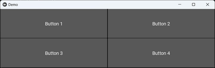
Now, let's fix the size of Hello buttons to 250px instead of using "size_hint_x=None".
self.lo = GridLayout(cols = 2) self.b1 = Button( text='Button 1', font_size=20, size_hint_x=None, width=250 ) self.b2 = Button(text='Button 2', font_size=20) self.b3 = Button( text='Button 3', font_size=20, size_hint_x=None, width=250 ) self.b4 = Button(text='Button 4', font_size=20
The App window appears as below −
If we define row_default_height to 100 and set "row_force_default=True" −
self.lo = GridLayout( cols=2, row_force_default=True, row_default_height=100 ) self.b1 = Button( text='Button 1', font_size=20, size_hint_x=None, width=250 ) self.b2 = Button(text='Button 2', font_size=20) self.b3 = Button( text='Button 3', font_size=20, size_hint_x=None, width=250 ) self.b4 = Button(text='Button 4', font_size=20)
Now the window appears like this −

Example 1
In this program, we add 15 buttons in a grid layout with four columns. The caption of each button is a unique but randomly generated number between 1 to 15. The randint() function in random module is used for this purpose.
from kivy.app import App
from kivy.uix.button import Button
from kivy.uix.gridlayout import GridLayout
from kivy.config import Config
import random
Config.set('graphics', 'width', '720')
Config.set('graphics', 'height', '400')
Config.set('graphics', 'resizable', '1')
class MyApp(App):
def build(self):
self.grid = GridLayout(cols = 4)
nums=[]
for i in range(1,16):
while True:
num = random.randint(1,15)
if num not in nums:
nums.append(num)
self.grid.add_widget(Button(text = str(num)))
break
return self.grid
if __name__ == '__main__':
MyApp().run()
Output
When you run this code, it will produce the following output window −

Example 2
The GridLayout in Kivy doesn't have the provision to span a widget across rows and/or columns. It is also not possible to place a widget by its row and column numbers.
It is required to arrange a few labels and text input boxes in a two column grid, but the submit button below should span across two columns. To achieve this, we place a 2 column grid inside a on column grid, and a button below it.
from kivy.app import App
from kivy.uix.label import Label
from kivy.uix.button import Button
from kivy.uix.textinput import TextInput
from kivy.uix.gridlayout import GridLayout
from kivy.core.window import Window
Window.size = (720, 400)
class DemoApp(App):
def build(self):
self.grid = GridLayout(rows=2)
self.top_grid = GridLayout(
cols=2, row_force_default=True,
row_default_height=100
)
self.top_grid.cols = 2
self.top_grid.add_widget(
Label(text="Name: ", size_hint_x=None, width=250)
)
self.fname = TextInput(
multiline=False, size_hint_x=None, width=650
)
self.top_grid.add_widget(self.fname)
self.top_grid.add_widget(Label(text="Address: "))
self.address = TextInput(multiline=True)
self.top_grid.add_widget(self.address)
self.top_grid.add_widget(Label(text="College: "))
self.college = TextInput(multiline=False)
self.top_grid.add_widget(self.college)
self.grid.add_widget(self.top_grid)
self.b1 = Button(text='Submit', size_hint_y=None, height=200)
self.grid.add_widget(self.b1)
return self.grid
if __name__ == '__main__':
DemoApp().run()
Output
When you run this code, it will produce the following output window −

Kivy - Box Layouts
Kivy framework provides BoxLayout class with which we can arrange the widgets sequentially. The sequence is determined by the orientation property of BoxLayout object and can be a string: either 'vertical' or 'horizontal'.
The BoxLayout class is defined in the "kivy.uix.boxlayout" module. To declare a BoxLayout object, use.
from kivy.uix.boxlayout import BoxLayout blo = BoxLayout(**kwargs)
Properties
orientation − Orientation of the layout. orientation is an OptionProperty and defaults to 'horizontal'. Can be 'vertical' or 'horizontal'.
padding − Padding between layout box and children: [padding_left, padding_top, padding_right, padding_bottom]. padding also accepts a two argument form [padding_horizontal, padding_vertical] and a one argument form [padding].
minimum_height − Automatically computed minimum height needed to contain all children. The minimum_height is a NumericProperty and defaults to 0. It is read only.
minimum_size − Automatically computed minimum size needed to contain all children.minimum_size is a ReferenceListProperty of (minimum_width, minimum_height) properties. It is read only.
minimum_width − Automatically computed minimum width needed to contain all children. minimum_width is a NumericProperty and defaults to 0. It is read only.


The BoxLayout class also inherits the add_widget() and remove_widget() methods, which we have already discussed earlier.
Vertical BoxLayout
Typical use of BoxLayout is shown here. We add a label, a text input and a button in a vertical box layout.
Example
from kivy.app import App
from kivy.uix.label import Label
from kivy.uix.button import Button
from kivy.uix.textinput import TextInput
from kivy.uix.boxlayout import BoxLayout
from kivy.core.window import Window
Window.size = (720,200)
class DemoApp(App):
def build(self):
lo = BoxLayout(orientation = 'vertical')
self.l1 = Label(text='Enter your name', font_size=20)
self.t1 = TextInput(font_size = 30)
self.b1 = Button(text = 'Submit', size_hint = (None, None),pos_hint={'x':.4, 'y':.2}, size = (200,75))
lo.add_widget(self.l1)
lo.add_widget(self.t1)
lo.add_widget(self.b1)
return lo
if __name__ == '__main__':
DemoApp().run()
Output
It will produce the following output −

You can use the following "Demo.kv" file to construct the above GUI −
BoxLayout:
orientation : 'vertical'
Label:
id : l1
text : 'Enter your name'
font_size : '20pt'
TextInput:
id : t1
font_size : 30
Button:
id : b1
text : 'Submit'
size_hint : (None, None)
pos_hint : {'x':.4, 'y':.2}
size : (200,75)
Horizontal BoxLayout
In the following program, we have placed a label, a text input box and a button in Box layout with horizontal orientation.
Example
from kivy.app import App
from kivy.uix.label import Label
from kivy.uix.button import Button
from kivy.uix.textinput import TextInput
from kivy.uix.boxlayout import BoxLayout
from kivy.clock import Clock
from kivy.core.window import Window
Window.size = (720,200)
class DemoApp(App):
def build(self):
self.lo = BoxLayout(orientation = 'horizontal')
self.l1 = Label(text='Enter your name', font_size=20)
self.t1 = TextInput(font_size = 30, pos_hint={'y':0.25}, pos = (0,100), size_hint = (None, None), size = (650,100))
self.b1 = Button(text = 'Submit', size_hint = (None, None),pos_hint={'x':.4, 'y':.35}, size = (75, 40))
self.lo.add_widget(self.l1)
self.lo.add_widget(self.t1)
self.lo.add_widget(self.b1)
return self.lo
if __name__ == '__main__':
DemoApp().run()
Output
It will produce the following output −

You can obtain the same GUI design with the following "Demo.kv" file −
BoxLayout:
orientation : 'horizontal'
Label:
text : 'Enter your name'
font_size : '20pt'
TextInput :
font_size : '30pt'
pos_hint : {'y':0.25}
pos : (0,100)
size_hint : (None, None)
size : (650,100)
Button :
text : 'Submit'
size_hint : (None, None)
pos_hint : {'x':.4, 'y':.35}
size : (75, 40)
Kivy - Stack Layout
An object of StackLayout class acts as a widget container, wherein the children widgets are placed one besides other, either horizontally or vertically, depending upon the orientation property. As many widgets are accommodated as the layout dimensions can fit. The dimensions of each widget can be varying.
Let us assume that the StackLayout object is configured to hold the widgets from left to right and from top to bottom. After putting "x" widgets horizontally, if it is not possible to put the widget "x+1" in the same row, it is pushed to the next row, and so on till the height of the layout exhausts.
The StackLayout class is defined in the "kivy.uix.stacklayout" module.
from kivy.uix.stacklayout import StackLayout stack = StackLayout(**kwargs)
The StackLayout object is customized by defining following properties −
minimum_width − Automatically computed minimum width needed to contain all children. It is a NumericProperty and defaults to 0. It is read only.
minimum_height − Automatically computed minimum height needed to contain all children. It is a NumericProperty and defaults to 0. It is read only.
minimum_height − Automatically computed minimum height needed to contain all children. The minimum_height is a NumericProperty and defaults to 0. It is read only.
minimum_size − Automatically computed minimum size needed to contain all children.minimum_size is a ReferenceListProperty of (minimum_width, minimum_height) properties. It is read only.
minimum_width − Automatically computed minimum width needed to contain all children. minimum_width is a NumericProperty and defaults to 0. It is read only.
orientation − Orientation of the layout. This property determines how the widgets are placed in successive cells in the grid. orientation is an OptionProperty. Its valid values are −
'lr-tb' − cells filled in left to right and top to bottom order.
'tb-lr' − cells filled in top to bottom and left to right order.
'rl-tb' − cells filled in right to left and top to bottom order.
'tb-rl' − cells filled in top to bottom and right to left order.
'lr-bt' − cells filled in left to right and bottom to top order.
'bt-lr' − cells filled in bottom to top and left to right order.
'rl-bt' − cells filled in right to left and bottom to top order.
'bt-rl' − cells filled in bottom to top and right to left order.
Default value of orientation property is 'lr-tb'.
Example
The following program demonstrates the use of StackLayout. As mentioned earlier, the default orientation is 'lr-tb'. Buttons of progressively increasing width but same height are placed from left to right and then top to bottom order.
As and when the next button can not fit in current row, it is pushed down. Each button is captioned with a randomly generated unique number between 1 to 50.
from kivy.app import App
from kivy.uix.button import Button
from kivy.config import Config
from kivy.uix.stacklayout import StackLayout
import random
Config.set('graphics', 'width', '720')
Config.set('graphics', 'height', '400')
Config.set('graphics', 'resizable', '1')
class StackApp(App):
def build(self):
stack = StackLayout()
width=100
nums=[]
for i in range(1, 25):
while True:
num = random.randint(1,25)
if num not in nums:
nums.append(num)
btn = Button(
text = str(num), width=width,
size_hint=(None, 0.15)
)
width = width+num*2
stack.add_widget(btn)
break
return stack
StackApp().run()
Output
It will produce a stack layout like the one shown below −

If you try to resize the window, the position of the buttons will change accordingly and they are either be accommodated in the row above, or pushed down.
Let us change the orientation of the layout to 'tb-lr'.
stack = StackLayout(orientation='tb-lr')
Run the program again and see the change −

Again, change the orientation property to 'rl-bt' and run the program −
stack = StackLayout(orientation='rl-bt')
The layout starts populating buttons from right to left and bottom to right. As a result, the resulting window appears as below −

Kivy - Anchor Layout
When this layout is used, we can arrange a widget inside it in such a way that it is anchored to a certain position of the layout's dimensions. The AnchorLayout class is defined in the "kivy.uix.anchorlayout" module.
from kivy.uix.anchorlayout import AnchorLayout lo = AnchorLayout(**kwargs)
Keyword Parameters
anchor_x − Defines the horizontal anchor for the widget to be placed. It is an OptionProperty, whose value must be from 'left', 'center' or 'right'. Default is 'center'.
anchor_y − Defines the vertical anchor for the widget to be placed. It is an OptionProperty, whose value must be from 'top', 'center' or 'bottom'. Default is 'center'.
padding − Padding between the widget box and its children, in pixels: [padding_left, padding_top, padding_right, padding_bottom]. It also accepts a two-argument form [padding_horizontal, padding_vertical] and a one argument form [padding]. padding is a VariableListProperty and defaults to [0, 0, 0, 0].
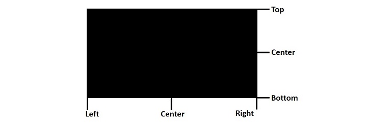
The AnchorLayout class inherits the two methods "add_widget()" and "remove_widget()" which we have already covered in the earlier chapters.
Example 1
The following example shows a typical use of AnchorLayout −
from kivy.app import App
from kivy.uix.label import Label
from kivy.uix.anchorlayout import AnchorLayout
from kivy.core.window import Window
Window.size = (720, 400)
class DemoApp(App):
def build(self):
lo = AnchorLayout(
anchor_x='left', anchor_y='bottom'
)
self.l1 = Label(
text='Hello World', font_size=20,
size_hint=(None, None), size=(200, 75)
)
lo.add_widget(self.l1)
return lo
if __name__ == '__main__':
DemoApp().run()
Output
It can be seen that the label has been anchored to the left-bottom corner of the layout.

The Kivy application with AnchorLayout can also be built with the "kv" language script −
AnchorLayout:
anchor_x : 'left'
anchor_y : 'bottom'
Label:
id:l1
text: 'Hello World'
font_size: '20pt'
size_hint : (None, None)
size : (200, 75)
Example 2
In the example below, the application window has a top level GridLayout with widgets to be arranged in 3 rows. In each row, we put three AnchorLayouts such that the window contains nine anchor layouts with lefttop, left-center, left-bottom, center-top, center-center, center-bottom, right-top, right-center and right-bottom anchor-x and anchor-y properties.
In each layout, a button widget is placed as per the anchor configuration.
from kivy.app import App
from kivy.uix.button import Button
from kivy.config import Config
from kivy.uix.anchorlayout import AnchorLayout
from kivy.uix.gridlayout import GridLayout
Config.set('graphics', 'width', '720')
Config.set('graphics', 'height', '400')
Config.set('graphics', 'resizable', '1')
class AnchorApp(App):
def build(self):
lo = GridLayout(rows=3)
ax = ['left', 'center', 'right']
ay = ['top', 'center', 'bottom']
c = 0
# 3X3 grid with anchor layout in each
for i in range(3):
for j in range(3):
print(ax[i], ay[j])
anchrlo = AnchorLayout(
anchor_x=ax[i], anchor_y=ay[j]
)
b = Button(
text=ax[i] + "-" + ay[j],
size_hint=(None, None),
size=(200, 75), halign=ax[i]
)
# red text color for top row,
# green for middle row,
# blue for bottom row
if i == 0: b.color = [1, 0, 0, 1]
if i == 1: b.color = [0, 1, 0, 1]
if i == 2: b.color = [0, 0, 1, 1]
anchrlo.add_widget(b)
lo.add_widget(anchrlo)
return lo
AnchorApp().run()
Output
When you run this code, it will produce the following output window −

Kivy - Relative Layout
The behavior of Relative Layout is very similar to that of FloatLayout. The main difference between the two is that positioning coordinates of child widgets in a relative layout are relative to the layout size and not the window size as is the case of float layout.
To understand what it means, consider the following UI designed with FloatLayout.

When you resize the window, because of the absolute positioning in float layout, the placement of widgets is not proportional to the resized window. As a result, the interface design is not consistent.

The relative layout doesn't have such effect because the size and position of widgets is relative to the layout.
When a widget with position (0,0) is added to a RelativeLayout, the child widget will also move when the position of the RelativeLayout is changed. Coordinates of the child widgets are always relative to the parent layout.
The RelativeLayout class is defined in the "kivy.uix.relativelayout" module.
from kivy.uix.relativelayout import RelativeLayout rlo = RelativeLayout(**kwargs)
Example
The following code assembles labels, text boxes and a submit button in RelativeLayout.
from kivy.app import App
from kivy.uix.label import Label
from kivy.uix.button import Button
from kivy.uix.textinput import TextInput
from kivy.uix.relativelayout import RelativeLayout
from kivy.core.window import Window
Window.size = (720, 400)
class RelDemoApp(App):
def build(self):
rlo = RelativeLayout()
l1 = Label(
text="Name", size_hint=(.2, .1),
pos_hint={'x': .2, 'y': .75}
)
rlo.add_widget(l1)
t1 = TextInput(
size_hint=(.4, .1), pos_hint={'x': .3, 'y': .65}
)
rlo.add_widget(t1)
l2 = Label(
text="Address", size_hint=(.2, .1),
pos_hint={'x': .2, 'y': .55}
)
rlo.add_widget(l2)
t2 = TextInput(
multiline=True, size_hint=(.4, .1),
pos_hint={'x': .3, 'y': .45}
)
rlo.add_widget(t2)
l3 = Label(
text="College", size_hint=(.2, .1),
pos_hint={'x': .2, 'y': .35}
)
rlo.add_widget(l3)
t3 = TextInput(
size_hint=(.4, .1), pos=(400, 150),
pos_hint={'x': .3, 'y': .25}
)
rlo.add_widget(t3)
b1 = Button(
text='Submit', size_hint=(.2, .1),
pos_hint={'center_x': .5, 'center_y': .09}
)
rlo.add_widget(b1)
return rlo
RelDemoApp().run()
Output
When the above code is executed, the application window shows the UI as follows −
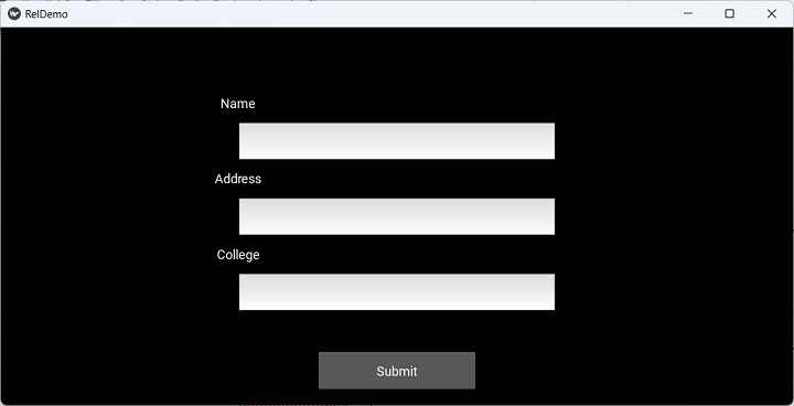
Note that unlike in the case of FloatLayout, resizing the window doesn't alter the proportional sizing and positioning of the widgets.

"kv" design language script
The "kv" file for producing the above UI instead of build() method in the App class is as follows −
RelativeLayout:
Label:
text:"Name"
size_hint:(.2, .1)
pos_hint:{'x':.2, 'y':.75}
TextInput:
size_hint:(.4, .1)
pos_hint:{'x':.3, 'y':.65}
Label:
text:"Address"
size_hint:(.2, .1)
pos_hint:{'x':.2, 'y':.55}
TextInput:
multiline:True
size_hint:(.4, .1)
pos_hint:{'x':.3, 'y':.45}
Label:
text:"College"
size_hint:(.2, .1)
pos_hint:{'x':.2, 'y':.35}
TextInput:
size_hint:(.4, .1)
pos:(400, 150)
pos_hint:{'x':.3, 'y':.25}
Button:
text:'Submit'
size_hint : (.2, .1)
pos_hint : {'center_x':.5, 'center_y':.09}
Kivy - Page Layout
The PageLayout class in Kivy is a little different from the other container widgets in Kivy. With PageLayout, you can create a simple multi-page layout so that it allows easy flipping from one page to another using borders.
Transitions from one page to the next are made by swiping in from the border areas on the right or left hand side. As PageLayout does not support the size_hint, size_hint_min, size_hint_max, or pos_hint properties, only one widget per page can be displayed. However, you can put multiple widgets in a page by putting a compound layout object such as box layout, grid layout or float layout in a single page.
The PageLayout class is defined in the "kivy.uix.pagelayout" module.
from kivy.uix.pagelayout import PageLayout pg = PageLayout(**kwargs)
You can define following properties as keyword arguments for the PageLayout constructor −
anim_kwargs − The animation kwargs used to construct the animation. It is a DictProperty and defaults to {'d': .5, 't': 'in_quad'}.
border − The width of the border around the current page used to display the previous/next page swipe areas when needed. It is a NumericProperty and defaults to 50dp.
page − The currently displayed page, which is a NumericProperty and defaults to 0.
swipe_threshold − The threshold used to trigger swipes as ratio of the widget size. swipe_threshold is a NumericProperty and defaults to 0.5.
PageLayout recognizes the touch events and you can override the following event handlers −
on_touch_down(touch) − Receive a touch down event with touch parameter as MotionEvent class. It returns a bool. If True, the dispatching of the touch event will stop. If False, the event will continue to be dispatched to the rest of the widget tree.
on_touch_move(touch) − Receive a touch move event. The touch is in parent coordinates.
n_touch_up(touch) − Receive a touch up event. The touch is in parent coordinates.
Here is a simple PageLayout example. We place three buttons, each as a separate page.
class PageApp(App):
def build(self):
pg = PageLayout()
btn1 = Button(text ='Page 1')
btn2 = Button(text ='Page 2')
btn3 = Button(text ='Page 3')
pg.add_widget(btn1)
pg.add_widget(btn2)
pg.add_widget(btn3)
return pg
When run, the Button with page 1 caption displays. Swipe from right to left with the mouse pressed, to display the second and third pages. Swiping from left to right brings the previous pages in focus.

Example
In the following example, we add two float layouts in the PageLayout. The "kv" file is used to design the UI.
First, the Python code to run the PageLayout app −
from kivy.app import App
from kivy.uix.label import Label
from kivy.uix.button import Button
from kivy.uix.textinput import TextInput
from kivy.uix.floatlayout import FloatLayout
from kivy.uix.pagelayout import PageLayout
from kivy.config import Config
Config.set('graphics', 'width', '720')
Config.set('graphics', 'height', '400')
Config.set('graphics', 'resizable', '1')
class PageDemoApp(App):
def build(self):
pass
if __name__ == '__main__':
PageDemoApp().run()
Given below is the "PageDemo.kv" file script. The PageLayout embeds to FloatLayout objects. Upper float layout is the design of a registration page, and the bottom float layout is the second page consisting of login screen.
PageLayout:
FloatLayout:
orientation:'vertical'
Label:
text:'Register'
font_size:'20pt'
pos_hint:{'center_x': .5, 'center_y': .9}
Label:
text:"Name"
size_hint:(.2, .1)
pos_hint:{'x':.2, 'y':.75}
TextInput:
size_hint:(.4, .1)
pos_hint:{'x':.3, 'y':.65}
Label:
text:"email"
size_hint:(.2, .1)
pos_hint:{'x':.2, 'y':.55}
TextInput:
size_hint:(.4, .1)
pos_hint:{'x':.3, 'y':.45}
Label:
text:"Password"
size_hint:(.2, .1)
pos_hint:{'x':.2, 'y':.35}
TextInput:
password:True
size_hint:(.4, .1)
pos:(400, 150)
pos_hint:{'x':.3, 'y':.25}
Button:
text:'Submit'
size_hint : (.2, .1)
pos_hint : {'center_x':.5, 'center_y':.09}
FloatLayout:
orientation:'vertical'
size:(720,400)
canvas.before:
Color:
rgba: 0,0,0, 1
Rectangle:
pos: self.pos
size: self.size
Label:
text:"Login"
font_size: '30pt'
pos_hint:{'center_x': .5, 'center_y': .75}
Label:
text:"email"
size_hint:(.2, .1)
pos_hint:{'x':.2, 'y':.55}
TextInput:
size_hint:(.4, .1)
pos_hint:{'x':.3, 'y':.45}
Label:
text:"Password"
size_hint:(.2, .1)
pos_hint:{'x':.2, 'y':.35}
TextInput:
password:True
size_hint:(.4, .1)
pos:(400, 150)
pos_hint:{'x':.3, 'y':.25}
Button:
text:'Submit'
size_hint : (.2, .1)
pos_hint : {'center_x':.5, 'center_y':.09}
Output
Save both the "PageDemoApp.py" and "PageDemo.kv" files, and run the Python script. You should first get the registration page.

Now, swipe the screen from right to left to make the login page appear in the application window −

Kivy - Recycle Layout
Very often, if an application interface requires a large number of widgets to display data items, its performance declines. The RecycleView widget in Kivy provides a flexible alternative. With the RecycleView, it is possible to view only a selected section of a large data set. It has the ability to reuse the widgets to show a list of scrollable data items. This feature is very useful for letting the user scroll through list of products, images, etc.
The mechanism of recycle layout is based on MVC (Model-View-Controller) architecture.
The RecycleView.data property forms the model layer.
The RecycleDataModel class implements the View layer. The View is split across layout and views and implemented using adapters. It is defined in the RecycleLayout, which is an abstract class.
For the third component - Controller - the RecycleViewBehavior class and defines the logical interaction. The RecycleView class implements the logic. It is defined in the "kivy.uix.recycleview" module.
You need to instantiate a RecycleView object, it automatically creates the views and data classes. Two important properties of the RecycleView that must be set are viewclass and data.
viewclass − Set this property to the name of a widget class. The recyclable view will consist of objects of this class. For example, if viewclass is a Button, the recycle view will be a scrollable list of buttons. Any widget can be used as the value of this property.
data − data is essentially a list of dicts, and uses these dicts to generate instances of the viewclass as required. This is a list of dicts whose keys map to the corresponding property names of the viewclass. For example, if the viewclass is set to Button, the data can be a list of dict items, in each dictionary, the key should be one of the properties of the Button class.
The RecycleView widget tree must also include a certain layout manager so that the view port can be found. There are two layouts to be used with RecycleView. One is RecycleBoxLayout (available in "kivy.uix.recycleboxlayout" module) and the other is RecycleGridLayout (in "kivy.uix.recyclegridlayout" module). Both the layout classes inherit BoxLayout and GridLayout classes.
Example
Let us load a hundred buttons in the RecycleView widget. The are added to RecycleBoxLayout.
To use buttons as elements in the recycle view, set its viewclass to Button.
Its data property is a list of dicts. Each dict has 'text' key and the value of each key is the button caption as BTN 1, BTN 2, etc. The following list comprehension statement composes the dict as −
data=[{'text': 'BTN {}'.format(str(x))} for x in range(20)]
[{'text': 'BTN 0'}, {'text': 'BTN 1'}, {'text': 'BTN 2'},
{'text': 'BTN 3'}, {'text': 'BTN 4'}, {'text': 'BTN 5'},
{'text': 'BTN 6'}, {'text': 'BTN 7'}, {'text': 'BTN 8'},
{'text': 'BTN 9'}, {'text': 'BTN 10'}, {'text': 'BTN 11'},
{'text': 'BTN 12'}, {'text': 'BTN 13'}, {'text': 'BTN 14'},
{'text': 'BTN 15'}, {'text': 'BTN 16'}, {'text': 'BTN 17'},
{'text': 'BTN 18'}, {'text': 'BTN 19'}]
Here is the "kv" language script for the RecycleView app −
RecycleView:
viewclass: 'Button'
data: [{'text': 'BTN {}'.format(str(x))} for x in range(20)]
RecycleBoxLayout:
default_size: None, dp(56)
default_size_hint: 1, None
size_hint_y: None
height: self.minimum_height
orientation: 'vertical'
The App class simply has to load this "kv" file, just keep the build() method with a pass statement.
from kivy.app import App
from kivy.uix.button import Button
from kivy.core.window import Window
Window.size = (720,400)
class recycled(App):
def build(self):
pass
recycled().run()
Output
Test the output of the code by running the above Python script. You should get a scrollable view of the buttons as shown below −

Kivy - Layouts in Layouts
A Layout in Kivy is a container widget. It provides an effective mechanism to construct a GUI having different widgets. Kivy library includes different Layout widgets such as GridLayout, BoxLayout, AnchorLayout, etc.
A layout itself is a subclass of Widget class. Hence, we can strategically place one or more layouts inside a layout. In this way, a hierarchy of widget structure can be constructed to design an effective GUI for the app. Any Layout can be enclosed in any other layout. It all depends upon how the app design is envisaged by the developer.
Let us plan our app interface layout as per the following schematic figure −
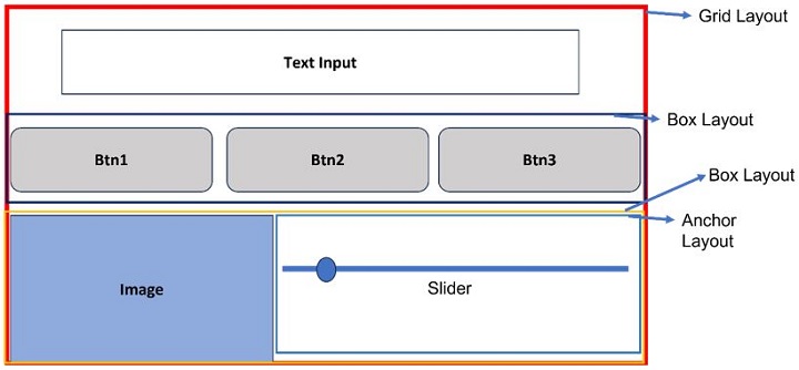
Here, we need an uppermost one-column grid layout. Inside it, we want to put a TextInput and two more horizontal box layouts.
The first box contains three buttons. The one below it has an Image control and an AnchorLayout widget that has a slider control in it.
Example
The following "kv" language script uses this planned structure −
GridLayout:
cols: 1
size: root.width, root.height
TextInput:
text: "Hello World!"
font_size: 32
size_hint: (1, .2)
BoxLayout:
orientation:'horizontal'
size_hint: (1, .2)
Button:
text:"Btn 1"
font_size:32
Button:
text:"Btn 2"
font_size:32
Button:
text:"Btn 3"
font_size:32
FloatLayout:
Image:
source: "kivy-logo.png.png"
size_hint: .5, .75
pos_hint: {"center_x": 0.25}
AnchorLayout:
anchor_x : 'center'
anchor_y : 'top'
size_hint: .5, .75
pos_hint: {"center_x": 0.75}
Slider:
min:0
max:100
value:25
You can load this "kv" script in the following App class −
from kivy.app import App
from kivy.uix.widget import Widget
from kivy.animation import Animation
from kivy.core.window import Window
Window.size = (720,400)
class MyLayoutApp(App):
def build(self):
pass
if __name__ == '__main__':
MyLayoutApp().run()
Output
When you run this code, it will produce the following output window −

The final appearance of the app window is similar to the initial plan, which uses "layouts in a layout".
Kivy - Configuration Object
When Kivy software is installed, it creates a configuration file that contains various parameter with their default values. The file, named as "config.ini", is stored in a directory identified by KIVY_HOME environment variable.
On Windows: The file is stored at C:\Users\user\.kivy\config.ini.
On Linux: /home/user/.kivy/config.ini.
On macOS: /Users/user/.kivy/config.ini.
On Android: /data/data/org.kivy.launcher/files/.kivy/config.ini.
On iOS: <HOME_DIRECTORY>/Documents/.kivy/config.ini.
In order to change the default settings, you can alter this file manually or use the Config object. The Config object's read(), set() and write() methods are provided to read the value of a setting, assign a new value and write the changes to the configuration file.
from kivy.config import Config Config.read(<file>) Config.write() # set config
You can also assign a value to any configuration parameter (called token) in effect only for the current session, by setting environment variable - either programmatically or from the OS terminal.
To set an environment variable from Python −
import os os.environ['KIVY_LOG_MODE'] = MIXED'
You can also set an environment variable from OS terminal. In Windows command prompt terminal −
set KIVY_LOG_MODE = MIXED'
On Linux/MacOS −
export KIVY_LOG_MODE = MIXED'
The configuration file config.ini consists of one or more sections, and each section consists of parameters called tokens. A typical "config.ini" file for KIvy installation consists of secions such as Kivy, Graphics, widgets, etc.

To change a certain configuration setting with the environment variable, use the following instruction format −
KCFG_<section>_<key> = <value>
For example, to set the log level −
KCFG_KIVY_LOG_LEVEL= "warning"
The same can be done programmatically with following syntax −
os.environ["KCFG_KIVY_LOG_LEVEL"] = " warning"
Configuration Tokens
The configuration file is divided in several sections, and each section consists of tokens or parameters. Here are some important tokens given in section-wise order −
Section - [Kivy]
default_font − Default fonts used for widgets displaying any text.
desktop − int, 0 or 1. This option controls features, such as enabling or disabling drag-able scroll-bar in scroll views, disabling of bubbles in TextInput, etc.
log_dir − Path of log directory.
log_level − string, one of 'trace', 'debug', 'info', 'warning', 'error' or 'critical'. Set the minimum log level to use.
Section - [postproc]
double_tap_distance − Maximum distance allowed for a double tap, normalized inside the range 0 - 1000.
double_tap_time − Time allowed for the detection of double tap, in milliseconds.
triple_tap_distance − fMaximum distance allowed for a triple tap, normalized inside the range 0 - 1000.
triple_tap_time − Time allowed for the detection of triple tap, in milliseconds.
Section [graphics]
fullscreen − one of 0, 1, 'fake' or 'auto'.
height − Height of the Window, not used if fullscreen is set to auto.
left − Left position of the Window.
top − Top position of the Window.
resizable − one of 0 or 1 - 0 for fixed size and 1 for resizable.
width − Width of the Window, not used if fullscreen is set to auto.
Section [widgets]
scroll_distance − Default value of the scroll_distance property used by the ScrollView widget.
scroll_timeout − Default value of the scroll_timeout property used by the ScrollView widget.
Methods of Config Object
add_section() − Add a section to the configuration if the section is missing. For example −
Config.add_section('newsection')
get() − Get an option value for a given section. For example −
Config.get('graphics', 'width')
set() − assign value to a configuration token. Example −
Config.set('graphics', 'width', 720)
write() − Write the configuration to the last file opened using the read() method. It returns True if the write finished successfully, False otherwise.
Kivy - Atlas
If your app is expected to work with many images, especially on a remote server, their loading time needs to be optimized. Atlas in Kivy framework helps in reducing the loading time. With Kivy Atlas, the app needs to load just one image file, which is less error prone, and also uses lesser resources than loading several images. The Atlas is often used in Kivy games apps for rendering images.
The Atlas class is available in the "kivy.atlas" module. This module can be used to construct an Atlas object programmatically, as well as with its command-line interface.
To be able to use Atlas, the current Kivy environment must have the pillow package - an image library for Python. If not available, install it using −
pip3 install pillow
An Atlas is made up of two files −
A json file (it has ".atlas" extension) that contains the image file names and texture locations of the atlas.
The image files containing textures referenced by the ".atlas" file.
Assuming that the following images are in a directory called imges −
Directory of C:\kivyenv\images
forward.png pause.png play.png previous.png
Each of these images is of 6464 pixels dimension. Hence, we designate an atlas file 0f 256256 pixels size to accommodate all the four files. Open the command terminal of your OS and run the command −
python -m kivy.atlas myatlas 256x256 *.png
The terminal shows following log information, at the end of which the two files will be created in the images folder.
(kivyenv) C:\kivyenv\images>python -m kivy.atlas myatlas 256x256 *.png [INFO ] [Logger ] Record log in C:\Users\mlath\.kivy\logs\kivy_23-07-20_33.txt [INFO ] [deps ] Successfully imported "kivy_deps.gstreamer" 0.3.3 [INFO ] [deps ] Successfully imported "kivy_deps.angle" 0.3.3 [INFO ] [deps ] Successfully imported "kivy_deps.glew" 0.3.1 [INFO ] [deps ] Successfully imported "kivy_deps.sdl2" 0.6.0 [INFO ] [Kivy ] v2.2.0 [INFO ] [Kivy ] Installed at "c:\kivyenv\Lib\sitepackages\kivy\__init__.py" [INFO ] [Python ] v3.11.2 (tags/v3.11.2:878ead1, Feb 7 2023, 16:38:35) [MSC v.1934 64 bit (AMD64)] [INFO ] [Python ] Interpreter at "c:\kivyenv\Scripts\python.exe" [INFO ] [Logger ] Purge log fired. Processing... [INFO ] [Logger ] Purge finished! [DEBUG ] STREAM b'IHDR' 16 13 [DEBUG ] STREAM b'sRGB' 41 1 [DEBUG ] STREAM b'gAMA' 54 4 [DEBUG ] STREAM b'pHYs' 70 9 [DEBUG ] STREAM b'IDAT' 91 1115 [DEBUG ] STREAM b'IHDR' 16 13 [DEBUG ] STREAM b'sRGB' 41 1 [DEBUG ] STREAM b'gAMA' 54 4 [DEBUG ] STREAM b'pHYs' 70 9 [DEBUG ] STREAM b'IDAT' 91 990 [DEBUG ] STREAM b'IHDR' 16 13 [DEBUG ] STREAM b'sRGB' 41 1 [DEBUG ] STREAM b'gAMA' 54 4 [DEBUG ] STREAM b'pHYs' 70 9 [DEBUG ] STREAM b'IDAT' 91 1230 [INFO ] [Atlas ] create an 256x256 rgba image Atlas created at myatlas.atlas 1 image has been created
You can see that two additional files created are myatlas-0.png, which is a 256256 file comprising of all the images, and an atlas file.
forward.png myatlas-0.png myatlas.atlas pause.png play.png previous.png
The ".atlas" file is a JSON file containing the information of texture locations of constituent files.
{"myatlas-0.png": {"forward": [2, 190, 64, 64], "pause": [68, 190, 64, 64], "play": [134, 190, 64, 64], "previous": [2, 124, 64, 64]}}
In order to use the Atlas in the Kivy language, we have to use the following format −
atlas://path/to/atlas/atlas_name/id.
The "id" file refers to the image filename without the extension.
For example, if you want to use an image file as a button background in normal state, you would do it as follows −
B1 = Button(background_normal='images/play.png')
Now, aAfter generating the Atlas, you can use the URL 'atlas://images/myatlas/play' as the value.
B1=Button(background_normal='atlas://images/myatlas/play')
Note that in the atlas url, there is no need to add the .atlas extension. It will be automatically appended to the filename.
Example
Let us the image URLs from the Atlas to set the normal backgrounds for the four buttons - play, pause, forward and previous - on the app window.
The atlas files must be created as shown above before running the following code −
from kivy.app import App
from kivy.graphics import *
from kivy.uix.floatlayout import FloatLayout
from kivy.uix.gridlayout import GridLayout
from kivy.uix.button import Button
from kivy.uix.label import Label
from kivy.core.window import Window
Window.size = (720, 400)
class AtlasApp(App):
def build(self):
main = GridLayout(cols=1)
self.l1 = Label(text='Using Atlas', font_size=32)
main.add_widget(self.l1)
root = FloatLayout(size=(Window.width, 100))
with root.canvas:
Color(.2, .7, .1, 1)
Rectangle(pos=root.pos, size=root.size)
self.btn1 = Button(
size_hint=(None, None),
pos_hint={'center_x': .2, 'center_y': .2}
)
self.btn2 = Button(
size_hint=(None, None),
pos_hint={'center_x': .4, 'center_y': .2}
)
self.btn3 = Button(
size_hint=(None, None),
pos_hint={'center_x': .6, 'center_y': .2}
)
self.btn4 = Button(
size_hint=(None, None),
pos_hint={'center_x': .8, 'center_y': .2}
)
self.btn1.background_normal = 'atlas://images/myatlas/forward'
self.btn2.background_normal = 'atlas://images/myatlas/play'
self.btn3.background_normal = 'atlas://images/myatlas/pause'
self.btn4.background_normal = 'atlas://images/myatlas/previous'
root.add_widget(self.btn1)
root.add_widget(self.btn2)
root.add_widget(self.btn3)
root.add_widget(self.btn4)
main.add_widget(root)
return main
AtlasApp().run()
Output
When you run this code, it will produce the following output window −

Kivy - Data Loader
A Loader class in Kivy framework is an asynchronous data loader that makes it possible to load an image even if its data is not yet available. This feature is of particular use when you want to load image from an internet URL.
The Loader class is defined in kivy.loader module. Typical use of Loader class is like this −
from kivy.loader import Loader
image = Loader.image('http://mysite.com/test.png')
Use the loading_image property to specify a default image.
Loader.loading_image = Image(default.png')
The Loader class is equipped with the following properties −
error_image − Image used for error. For example −
Loader.error_image = 'error.png'
image(filename) − Load a image using the Loader. A ProxyImage is returned with a loading image.
loading_image − Image used for loading. For example −
Loader.loading_image = 'loading.png'
max_upload_per_frame − The number of images to upload per frame. By default, we'll upload only 2 images to the GPU per frame.
num_workers − Number of workers to use while loading. This setting impacts the loader only on initialization. Once the loader is started, the setting has no impact.
from kivy.loader import Loader Loader.num_workers = 4
The default value is "2" for giving a smooth user experience.
ProxyImage() − Image returned by the Loader.image() function.
proxyImage = Loader.image("test.jpg")
pause() − Pause the loader.
resume() − Resume the loader, after a pause().
run() − Main loop for the loader.
start() − Start the loader thread/process.
stop() − Stop the loader thread/process.
The "on_load" event is fired when the image is loaded or changed. Similarly, the "on_error" is fired when the image cannot be loaded. "error: Exception data that occurred".
Example
In the code given below, the Loader object loads an image from an internet URL. The ProxyImage object returned by the Loader binds to a method on its on_load event. The callback method uses its texture as the texture property of the Image object.
from kivy.app import App
from kivy.uix.image import Image
from kivy.loader import Loader
from kivy.core.window import Window
Window.size = (720,400)
class MyApp(App):
title='Loader'
def _image_loaded(self, proxyImage):
if proxyImage.image.texture:
self.image.texture = proxyImage.image.texture
def build(self):
proxyImage = Loader.image('https://source.unsplash.com/user/c_v_r/640x480')
proxyImage.bind(on_load=self._image_loaded)
self.image = Image()
return self.image
MyApp().run()
Output
On execution, it will produce the following output −

Kivy - Cache Manager
In Kivy framework, the Cache class stores one or more Python objects by assigning them as value of a unique key. Kivy's Cache manager controls the objects in it by either imposing a limit to the number of objects in it, or keeping a timeout limit to their access.
The Cache class is defined in the "kivy.cache" module. It includes the static methods: register(), append(), get(), etc.
To start with, you need to register a Category in the Cache manager by setting the maximum number of objects and the timeout.
from kivy.cache import Cache Cache.register(category='mycache', limit=10, timeout=5)
You can now add upto 10 Python objects, each with a unique key.
key = 'objectid'
instance = Label(text=text)
Cache.append('mycache', key, instance)
The get() method retrieves an object from the cache.
instance = Cache.get('mycache', key)
The Cache class defines the following methods and properties −
register() Method
This method registers a new category in the cache with the specified limit. It has the following parameters −
category − A string identifier of the category.
limit − Maximum number of objects allowed in the cache. If None, no limit is applied.
timeout − Time after which the object will be removed from cache.
append() Method
This method add a new object to the cache. Following parameters are defined −
category − string identifier of the category.
key − Unique identifier of the object to store.
obj − Object to store in cache.
timeout − Time after which to object will be deleted if it has not been used. This raises ValueError if None is used as key.
get() Method
This method is used to get a object from the cache, with the following parameters −
category − string identifier of the category..
key − Unique identifier of the object in the store..
default − Default value to be returned if the key is not found.
Example
Take a look at the following example −
from kivy.cache import Cache
from kivy.uix.button import Button
from kivy.uix.label import Label
Cache.register(category='CacheTest', limit=5, timeout=15)
b1 = Button(text='Button Cache Test')
Cache.append(category='CacheTest', key='Button', obj=b1)
l1 = Label(text='Label Cache Test')
Cache.append(category='CacheTest', key='Label', obj=l1)
ret = (Cache.get('CacheTest', 'Label').text)
print (ret)
Output
It will produce the following output −
Label Cache Test
Kivy - Console
The Console tool in Kivy is similar to Inspector tool, with an additional featureprovision to add buttons and panels with the help of its addon architecture. Like the Inspector, the "kivy.modules.console" module has a command-line interface, as also an API for the tool to be used programmatically.
In the command line usage, load the module with "-m" option of Python executable.
python main.py -m console
To activate the Kivy Console, call the create_console() function from the console module with the Window and the App object as arguments. You need to place the following statement in the build() method of the App class.
from kivy.modules import console
class Demo(App):
def build(self):
button = Button(text="Test")
console.create_console(Window, self)
return button
Assume that you have developed a Kivy application with "slider.py" program that has the following interface.

The app has three slider controls that help in changing the color of the text above. Add the call to the create_console() function (as described above) in the build() method of slider.py file and run it. To start with the above interface will be visible. Press ctrl+E to activate the Console tool.
Following key combinations are defined −
"Ctrl + e" − toggle console
"Escape" − cancel widget lookup, then hide inspector view
"Up" − select the parent widget
"Down" − select the first child of the currently selected widget
"Left" − select the previous sibling
"Right" − select the next sibling
When the console tool is activated, it shows a bar in the middle with Select, Properties and Tree buttons on left and a FPS button on the right.

Click on the "Tree" button and you get a widget tree of the interface. Select the Slider control from the tree.

Now press the Properties button. A scrollable list of all the properties of Slider widget will be available.

Scroll down to the value property, and double click to get an editable box in which the current value is displayed, which you can change.

Press escape to remove the console. You should see the Slider at the value set by you from the console.
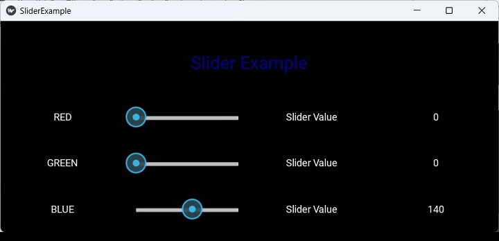
Addons
One of the important features of the Console tool is the addon architecture which allows you to add buttons and panels to it. The addons activated by default are −
ConsoleAddonFps − display the FPS at the top-right.
ConsoleAddonSelect − activate the selection mode.
ConsoleAddonBreadcrumb − display the hierarchy of the current widget at the bottom.
ConsoleAddonWidgetTree − panel to display the widget tree of the application.
ConsoleAddonWidgetPanel − panel to display the properties of the selected widget.
To activate an addon, it must be added to Console.addons before the create_console is called.
About Addon
Let us add a About button the Console tool. It displays the object description including its ID in the console tool workspace in the middle.
Add the following code in slider.py, before the definition of the App class −
from kivy.modules.console import Console, ConsoleAddon, ConsoleLabel
class ConsoleAddonAbout(ConsoleAddon):
def init(self):
self.console.add_panel(
"About", self.panel_activate,
self.panel_deactivate
)
def panel_activate(self):
self.console.bind(widget=self.update_content)
self.update_content()
def panel_deactivate(self):
self.console.unbind(widget=self.update_content)
def deactivate(self):
self.panel_deactivate()
def update_content(self, *args):
widget = self.console.widget
if not widget:
return
text = "Selected widget is: {!r}".format(widget)
lbl = ConsoleLabel(text=text)
self.console.set_content(lbl)
Console.register_addon(ConsoleAddonAbout)
If you run the slider.py script again, you get the About button added next to the Tree button. Locate the Slider from the widget tree and click on About button to show the object ID of the slider widget.
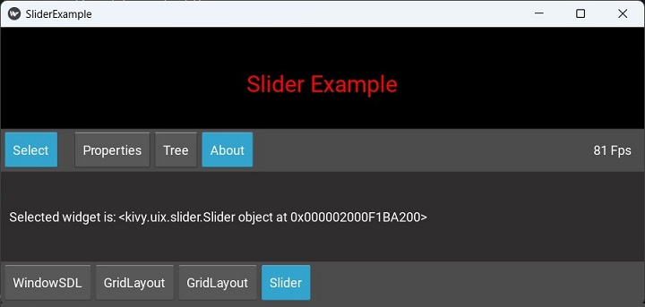
Kivy - Animation
Applying animation effects to a widget is one of the most attractive features of Kivy framework. In Kivy, the animation functionality is defined in Animation class included in kivy.animation module. The same module also includes AnimationTransition class. It is a collection of functions to apply animation transition effects.
To use animation effect, the Kivy application should −
First decide on which property of a widget to animate,
Set up an object of Animation class,
Set the final value of the property,
Call the start() method of Animation object, passing the widget as an argument.
To animate a Widget's x or y position, simply specify the target x/y values where you want the widget positioned at the end of the animation −
rom kivy.animation import Animation anim = Animation(x=100, y=100) anim.start(widget)
This will animate the x and y positions of the widget from its original position to 100,100 taking by default a duration one second.
You can ask for animating multiple properties. For example, to animate the position and size use −
anim = Animation(x=50, size=(80, 80)) anim.start(widget)
You can also specify a transition (or t) property of the Animation object to apply transition effects.
Using the '+' operator between two Animation objects joins the animations sequentially.
anim = Animation(x=50) + Animation(size=(80, 80), duration=2)
This will animate the widget to x=50 over 1 second, then animate the size to (80, 80) over the next two seconds.
On the other hand, the '&' operator joins animations in parallel. The following example will perform simultaneous animation of the position to (80, 10) over 1 second, the size to (800, 800) −
anim = Animation(pos=(80, 10)) anim &= Animation(size=(800, 800), duration=2.)
If the program is implementing 'sequence' animations, the animation can be set to be repeated in a loop by setting anim.repeat = True.
The Animation class has the following properties and methods −
duration or d − Duration of the animation, in seconds, defaults to 1.
transition or t − Transition function for animate properties. It can be the name of a method from AnimationTransition.
step or s − float. Step in milliseconds of the animation. Defaults to 0, which means the animation is updated for every frame. If you want to animate at 30 FPS, use s=1/30.
cancel() − Cancel the animation previously applied to a widget.
cancel_all() − Cancel all animations that concern a specific widget / list of properties.
start() − Start the animation on a widget.
stop() − Stop the animation previously applied to a widget, triggering the on_complete event.
stop_all() − Stop all animations that concern a specific widget / list of properties.
Example
With the help of the following "kv" script, a button and a label are placed in a vertical box layout. The button is bound to animating() method.
<MyLayout>
BoxLayout:
orientation: "vertical"
size: root.width, root.height
padding: 50
spacing: 20
Label:
id: my_label
text: "Hello World!"
font_size: 32
Button:
text: "Start"
font_size: 32
size_hint: .5, .5
pos_hint: {"center_x": 0.5}
on_release: root.animating(self)
This "kv" script is loaded in the App class. The animating() method applies position, background color and size animation effects on the button when clicked.
from kivy.app import App
from kivy.uix.widget import Widget
from kivy.lang import Builder
from kivy.animation import Animation
from kivy.core.window import Window
Window.size = (720, 400)
class MyLayout(Widget):
def animating(self, widget, *args):
animate = Animation(
pos=(widget.pos[0], Window.height - 50)
)
animate += Animation(pos=(widget.pos[0], 0))
animate += Animation(
background_color=(0, 0, 1, 1),
duration=1
)
animate += Animation(size_hint=(1, 1))
animate += Animation(size_hint=(.5, .5))
animate += Animation(pos_hint={"center_x": 0.1})
animate += Animation(pos_hint={"center_x": 0.5})
animate.start(widget)
# Create a callback
animate.bind(on_complete=self.my_callback)
def my_callback(self, *args):
self.ids.my_label.text = "Hello Kivy"
class AwesomeApp(App):
def build(self):
return MyLayout()
if __name__ == '__main__':
AwesomeApp().run()
Output
Run the above program. You should see a label and a button below it.

Click the button to start the animation effects. The button moves up and down, left and right, grows and shrinks in size, and changes color.

Kivy - Multistroke
A MultiStroke Gesture in Kivy is a set of more than one Gesture objects. A Gesture constitutes a single stroke constructed out of a list of touch points between the "touch_down" and "touch_up" events. A MultiStrokeGesture is a collection of such strokes.
The "kivy.multistroke" module implements the Protractor gesture recognition algorithm. The two important classes defined in this module are MultistrokeGesture and Recognizer.
The MultiStrokeGesture class maintains a set of strokes and generates unistroke (i.e., UnistrokeTemplate) permutations that are used for evaluating candidates against this gesture later.
A MultriStroke object is obtained with the help of the following syntax −
from kivy.vector import Vector
from kivy.multistroke import MultistrokeGesture
gesture = MultistrokeGesture('my_gesture', strokes=[
[Vector(x1, y1), Vector(x2, y2), ...... ], # stroke 1
[Vector(), Vector(), Vector(), Vector() ] # stroke 2
#, [stroke 3], [stroke 4], ...
])
Even though all the strokes are combined to a single list (unistroke), you should still specify the strokes individually, and set stroke_sensitive property to True.
Recognizer stores the list of MultistrokeGesture objects. It is the search/database API similar to GestureDatabase. It maintains a list of and allows you to search for a user-input gestures among them.
The Recognizer database is a a container for UnistrokeTemplate objects, and implements the heap permute algorithm to automatically generate all possible stroke orders.
An object of Candidate class represents a set of unistroke paths of user input. This object instantiated automatically by calling Recognizer.recognize().
from kivy.vector import Vector from kivy.multistroke import Recognizer gdb = Recognizer() gdb.recognize([ [Vector(x1, y1), Vector(x2, y2)], [Vector(x3, y3), Vector(x4, y4)]])
The Recognizer object is able to generate these events −
on_search_start − Fired when a new search is started using this Recognizer.
on_search_complete − Fired when a running search ends, for whatever reason.
These events can be mapped to callbacks to track the progress of search operation done by the Recognizer.recognize() method.
gdb.bind(on_search_start=search_start) gdb.bind(on_search_complete=search_stop)
The examples of callback methods are as follows −
def search_start(gdb, pt):
print("A search is starting with {} tasks".format(pt.tasks))
def search_stop(gdb, pt):
best = pt.best
print("Search ended {}. Best is {} (score {}, distance {})".format(
pt.status, best['name'], best['score'], best['dist'] ))
Lastly, the "kivy.multistroke" module also provides a ProgressTracker class. It represents an ongoing (or completed) search operation.
The tracker object is instantiated automatically and returned by the Recognizer.recognize() method when it is called. The results attribute is a dictionary that is updated as the recognition operation progresses.
progress = gdb.recognize([ [Vector(x1, y1), Vector(x2, y2)], [Vector(x3, y3), Vector(x4, y4)]]) progress.bind(on_progress=my_other_callback) print(progress.progress) # = 0 print(result.progress) # = 1
You can save the multistroke gestures to a file with export_gesture() function.
export_gesture(filename=None) − It exports a list of MultistrokeGesture objects to a base64-encoded string that can be decoded to a Python list with the parse_gesture() function. It can also be imported directly to the database using Recognizer.import_gesture(). If filename is specified, the output is written to disk.
import_gesture(data=None,filename=None) − The import_gesture() function brings the gesture in a Recognizer database. Use this function to import a list of gestures as formatted by export_gesture(). Either data or filename parameter must be specified. This method accepts optional Recognizer.filter() arguments, if none are specified then all gestures in specified data are imported.
Kivy - Clock
The Clock object in Kivy framework is a global event dispatcher. It is used to schedule and trigger events at specific intervals. To schedule an event for repeated or one-time occurrence, it is bound to a callback function. You can get the time elapsed between the scheduling and the calling of the callback via the "dt" argument, which is the delta-time.
The Clock object is defined in the "kivy.clock" module. It consists of methods such as "schedule_once()" and "schedule_interval()" to register functions or methods to be called after a certain delay or at regular intervals. This mechanism is useful for handling timed events, animation updates, and other recurring tasks in your app.
Both the functions "schedule_interval()" and "schedule_once()" have two arguments; a callback and the time interval in seconds.
from kivy.clock import Clock def clock_callback(dt): "Clock event occurred" # call clock_callback every 2 seconds Clock.schedule_interval(clock_callback, 2) # call clock_callback in 5 seconds Clock.schedule_once(clock_callback, 5)
The default value of timeout dt argument is 0. Hence, to call the callback function as early as possible, set the second argument to schedule events to 0 or let the default value be used by not giving using the argument.
Clock.schedule_once(my_callback)
Using a timeout of "-1" causes the event to occur before the next frame, and setting it to 0 causes the event to occur after the next frame.
Triggered Events
The Clock object can trigger a clock event with the use of the following functions −
schedule_interval(callback, timeout) − This function schedules an event to be called every specified seconds. The function returns a ClockEvent object. Call ClockEvent.cancel() on the returned event to unscheduled the event.
schedule_once(callback, timeout=0) − This function schedules an event for one-time execution in specified seconds, and returns ClockEvent object. If timeout is unspecified or 0, the callback will be called after the next frame is rendered. To cancel the event, call ClockEvent.cancel() on the returned event.
create_trigger(callback, timeout=0) − This function creates a Trigger event. Unlike the other two functions, the event is not scheduled automatically, you need to call it. Like the other two, cancel the event before it is executed, by calling ClockEvent.cancel(). To schedule it again, simply call the event (event()).
The create_trigger() function has the following Parameters −
callback − A callback to be executed. from kivy. It takes a timeout parameter to specify how long to wait before calling the callback.
interval − a bool parameter indicates whether the callback should be called once (False) or repeatedly.
from kivy.clock import Clock def clock_callback(dt): "Clock event occurred" triggerevent = Clock.create_trigger(clock_callback, 5) triggerevent()
To unscheduled an event created by either of these ways, use event.cancel() or event.unschedule() methods.
Example
The code given below runs a countdown timer on the Kivy application window. The "kv" script puts a TextInput box, a label and a button in onecolumn gridlayout.
<clockwidget>:
GridLayout:
cols:1
size:root.size
TextInput :
font_size : '30pt'
id:t1
halign:'center'
valign:'center'
Label:
id: l1
text : 'Current Value: '
font_size : '20pt'
Button :
id:b1
text : 'Start Countdown'
font_size:20
The layout class clockwidget inherits GridLayout and binds the command button to a method that schedules a periodic event to occur after every one second.
Each time the callback is invoked, the label shows decrementing number, starting from the value entered by the user in the text box. As it reaches 0, the event is unscheduled by its cancel() method.
class clockwidget(GridLayout):
def __init__(self, *args):
super(*args).__init__()
self.ids.b1.bind(on_press=self.showtime)
def countdown(self, dt):
if self.val==0:
self.ids.l1.text="Countdown Stopped"
self.ids.l1.color=[1,0,0]
self.ev.cancel()
self.ids.b1.disabled=False
else:
self.ids.l1.text="Current Value: {}".format(self.val)
self.ids.l1.color=[1,1,1]
self.val=self.val-1
def showtime(self, *args):
self.val=int(self.ids.t1.text)
self.ev=Clock.schedule_interval(self.countdown, 1)
self.ids.b1.disabled=True
The complete code for this exercise is given below −
from kivy.app import App
from kivy.uix.gridlayout import GridLayout
from kivy.clock import Clock
from kivy.core.window import Window
Window.size = (720, 400)
class clockwidget(GridLayout):
def __init__(self, *args):
super(*args).__init__()
self.ids.b1.bind(on_press=self.showtime)
def countdown(self, dt):
if self.val == 0:
self.ids.l1.text = "Countdown Stopped"
self.ids.l1.color = [1, 0, 0]
self.ev.cancel()
self.ids.b1.disabled = False
else:
self.ids.l1.text = "Current Value: {}".format(self.val)
self.ids.l1.color = [1, 1, 1]
self.val = self.val - 1
def showtime(self, *args):
self.val = int(self.ids.t1.text)
self.ev = Clock.schedule_interval(self.countdown, 1)
self.ids.b1.disabled = True
class clockdemoapp(App):
def build(self):
w = clockwidget()
w.cols = 1
return w
clockdemoapp().run()
Output
When you run this program, it will show the following app window. Enter the value for the countdown timer and click the "start" button.

The label starts updating, decrementing the number of countdown value.

As it reaches "0", the button is enabled again.

Kivy - SVGs
The Kivy framework supports displaying the SVG files, although it is still highly experimental at this stage. In computer graphics, SVG stands for Scalable Vector Graphics, a standard defined by W3 Consortium, for encoding the image data.
The image formats such as PNG and JPG are based upon raster graphics, in which the image data is stored in the form of a bitmap, which is a grid of color and location of pixels. The downside of this format is that if the image is magnified, the image starts blurring after a certain point.
On the other hand, a vector graphics image is stored mathematically as a series of XML instructions, with which the image is drawn on the screen. that tell a viewing program how to "draw" the image on your screen. The drawing can take place at any size because SVG files are resolution independent. They can be scaled up or down without any drop in quality or sharpness.
Kivy library defines Svg class in the "kivy.graphics.svg" module. To draw a SVG image on the canvas of any widget we can use following syntax −
from kivy.graphics.svg import Svg
with widget.canvas:
svg = Svg("test.svg")
The Svg class has the following properties −
anchor_x − Horizontal anchor position for scaling and rotations. Defaults to 0. Values 0,1, and 2 correspond to 'left', 'center' and 'right'.
anchor_y − Vertical anchor position for scaling and rotations. Defaults to 0. Values 0,1, and 2 correspond to 'left', 'center' and 'right'.
color − The default color used for SvgElements that specify "currentColor"
height − 'double'
source − SVG Filename / source to load.
width − 'double'
Example
The following program uses a "kv" script to load a Scatter widget. An "svg" object is placed in a GridLayout. Give the name of the file as its source property. Here is the "kv" file −
<SvgWidget>:
do_rotation: True
<FloatLayout>:
canvas.before:
Color:
rgb: (1, 1, 1)
Rectangle:
pos: self.pos
size: self.size
Python code for Kivy App class −
from kivy.uix.scatter import Scatter
from kivy.app import App
from kivy.graphics.svg import Svg
from kivy.uix.gridlayout import GridLayout
from kivy.lang import Builder
from kivy.core.window import Window
Window.size = (720,400)
class SvgWidget(Scatter):
def __init__(self, filename):
super(SvgWidget, self).__init__()
with self.canvas:
svg = Svg(source=filename)
self.size = Window.width, Window.height
class SvgDemoApp(App):
def build(self):
self.root = GridLayout(cols=1)
filename = "ship.svg"
svg = SvgWidget(filename)
self.root.add_widget(svg)
svg.scale = 4
SvgDemoApp().run()
Output
When you run this program, it will produce the following output window −

Kivy - UrlRequest
The UrlRequest class in Kivy framework lets you make asynchronous requests on the web and get the result when the request is completed. Its functionality is same as the XHR object in JavaScript.
The UrlRequest class is defined in the "kivy.network.urlrequest" module. The constructor needs only one mandatory argument named as "url". The class inherits Thread class in Python's threading module.
The parameters of UrlRequest constructor are −
url − string representing the complete url string to call.
on_success − A Callback function to call when the result has been fetched.
on_redirect − A Callback function to call if the server returns a Redirect.
on_failure − A Callback function to call if the server returns a Client or Server Error.
on_error − A Callback function to call if an error occurs.
on_progress − A Callback function that will be called to report progression of the download.
on_cancel − A Callback function to call if user requested to cancel the download operation via the .cancel() method.
on_finish − An additional callback function to call if request is done.
req_body − string representing data to be sent along with the request. If this parameter is included, a POST will be done. If not, GET request is sent.
req_headers − dict, defaults to None Custom headers to add to the request.
chunk_size − Size of each chunk to read, used only when on_progress callback has been set.
timeout − An integer, if set, blocking operations will timeout after this many seconds.
method − The HTTP method to use, defaults to 'GET' (or 'POST' if body is specified)
decode − bool, defaults to True. If False, skip decoding of the response.
debug − bool, defaults to False.
auth − HTTPBasicAuth, defaults to None. If set, request will use basicauth to authenticate.
The cancel() method of UrlRequest object cancels the current request and the callback on_cancel will be called.
Example
First, we design a user interface consisting of a spinner holding URLs of httpbin.org with variable parameters, two readonly textboxes - one displays the result of URL fetched and second, the JSON string of the response headers. In between, an Image widget is placed. It displays an image if the content_type is of image type. These widgets are placed ina vertical bo layout.
The layout is built with the following kv language script.
#:import json json
BoxLayout:
orientation: 'vertical'
TextInput:
id: ti
hint_text: 'type url or select from dropdown'
size_hint_y: None
height: 48
multiline: False
BoxLayout:
size_hint_y: None
height: 48
Spinner:
id: spinner
text: 'select'
values:
[
'http://httpbin.org/ip',
'http://httpbin.org/headers',
'http://httpbin.org/delay/3',
'https://httpbin.org/image/png',
]
on_text: ti.text = self.text
Button:
text: 'GET'
on_press: app.fetch_content(ti.text)
size_hint_x: None
width: 50
TextInput:
readonly: True
text: app.result_text
Image:
source: app.result_image
nocache: True
TextInput
readonly: True
text: json.dumps(app.headers, indent=2)
The Kivy App class code is as given below. It basically sends different HTTP requests to httpbin.org. httpbin.org is a simple HTTP Request & Response Service. The application stores the result of UrlRequest in three string variables and displays in the widgets.
When a URL is selected from the dropdown and the GET button is pressed, it invokes the fetch_content() method and collects the responses.
If the repose header contains a content_type with image, the Image widget loads the image.
from kivy.lang import Builder
from kivy.app import App
from kivy.network.urlrequest import UrlRequest
from kivy.properties import NumericProperty, StringProperty, DictProperty
import json
from kivy.core.window import Window
Window.size = (720,400)
class UrlExample(App):
status = NumericProperty()
result_text = StringProperty()
result_image = StringProperty()
headers = DictProperty()
def build(self):
pass
def fetch_content(self, url):
self.cleanup()
UrlRequest(
url,
on_success=self.on_success,
on_failure=self.on_failure,
on_error=self.on_error
)
def cleanup(self):
self.result_text = ''
self.result_image = ''
self.status = 0
self.headers = {}
def on_success(self, req, result):
self.cleanup()
headers = req.resp_headers
content_type = headers.get('content-type', headers.get('Content-Type'))
if content_type.startswith('image/'):
fn = 'tmpfile.{}'.format(content_type.split('/')[1])
with open(fn, 'wb') as f:
f.write(result)
self.result_image = fn
else:
if isinstance(result, dict):
self.result_text = json.dumps(result, indent=2)
else:
self.result_text = result
self.status = req.resp_status
self.headers = headers
def on_failure(self, req, result):
self.cleanup()
self.result_text = result
self.status = req.resp_status
self.headers = req.resp_headers
def on_error(self, req, result):
self.cleanup()
self.result_text = str(result)
UrlExample().run()
Output
Run the above code. Select the 'http://httpbin.org/headers' from the spinner dropdown and press the GET button. You should see the response header in the text boxes.

Choose 'https://httpbin.org/image/png' URL. The image will be displayed as shown.

One of the options in the spinner dropdown is a URL pointing to the IPaddress of the client. Select 'http://httpbin.org/ip' from the list. The IP address will be displayed as shown below −

Kivy - Clipboard
The Clipboard object in Kivy framework gives access to the clipboard of the operating system being used. With the help of Kivy's Clipboard object, one can perform programmatically the cut, copy and paste operations.
The clipboard is a temporary buffer in computer's RAM that most operating systems provide for short-term storage and transfer within and between application programs. In the operating system, this clipboard is a global object. Most operating systems use conventional keyboard shortcuts for carrying out cut, copy and paste data between applications.
Normally, the explicit use of the cut-copy-paste operations through the Clipboard is not necessary. However, in some cases it may be useful.
The Clipboard object is defined in the "kivy.core.clipboard" module. The following methods are available for Clipboard object −
copy() − Copy the value provided in argument data into current clipboard. If data is not of type string it will be converted to string.
get() − Get the current data in clipboard, using the mimetype if possible. You not use this method directly. Use paste method instead.
get_types() − Return a list of supported mimetypes.
paste() − Get text from the system clipboard and return it a usable string.
put() − Put data on the clipboard, and attach a mimetype. You should not use this method directly. Use copy method instead.
Example
In the following example, we have two multiline textboxes and two buttons arranged in a BoxLayout. The COPY button calls gettext() method which copies the selected text from the upper text box to the clipboard.
def gettext(self, instance): Clipboard.copy(data=self.text1.selection_text)
The PASTE button invokes a callback insert() which pastes the selected text at the cursor position.
def insert(self, instance): txt = Clipboard.paste() print (txt) self.text2.insert_text(txt)
These two functions are bound to two buttons −
self.b1=Button(text='COPY') self.b1.bind(on_press=self.gettext) self.b2=Button(text='PASTE') self.b2.bind(on_press=self.insert)
The build() method assembles the text boxes and buttons.
Here is the complete code for this exercise −
from kivy.app import App
from kivy.uix.boxlayout import BoxLayout
from kivy.uix.textinput import TextInput
from kivy.uix.button import Button
from kivy.core.clipboard import Clipboard
from kivy.core.window import Window
Window.size = (720, 400)
class mydemoapp(App):
def gettext(self, instance):
Clipboard.copy(data=self.text1.selection_text)
def insert(self, instance):
txt = Clipboard.paste()
print(txt)
self.text2.insert_text(txt)
def build(self):
main = BoxLayout(orientation='vertical')
self.text1 = TextInput(multiline=True, font_size=32)
btns = BoxLayout(orientation='horizontal')
self.b1 = Button(text='COPY')
self.b1.bind(on_press=self.gettext)
self.b2 = Button(text='PASTE')
self.b2.bind(on_press=self.insert)
self.text2 = TextInput(
multiline=True, font_size=32,
foreground_color=[0, 0, 1, 1]
)
btns.add_widget(self.b1)
btns.add_widget(self.b2)
main.add_widget(self.text1)
main.add_widget(btns)
main.add_widget(self.text2)
return main
mydemoapp().run()
Output
When the program is run, you will observe two textboxes. Enter Simple is better than Complex in the upper box, and Complex is Complicated in the lower box.
Then, select the substring better than, and click the COPY button to store it on the clipboard. Click besides the word Complicated in the lower box, and click the PASTE button. The text on the clipboard will be inserted.
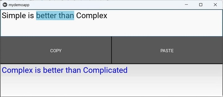
Kivy - Factory
The factory class in Kivy is used to automatically register any class or module and instantiate classes from it anywhere in your project. The Factory class is defined in the "kivy.factory" module.
Factory Pattern is a software architecture pattern in object-oriented programming. A factory is an object for creating other objects. It is a function or method that returns objects or class from some method call that returns a "new" object may be referred to as a "factory", as in factory method or factory function.
The "kivy.factory.Factory" class creates instances of classes and adds them to the widget tree. The widget tree controls elements on a user interface.
Here is an example of creating a custom button class registered with Factory.
from kivy.factory import Factory
from kivy.uix.button import Button
Factory.register('MyCustomButton', cls=Button)
btn = MyCustomButton( text: "Click me")
Similarly, you can create a class with Factory −
from kivy.factory import Factory
from kivy.uix.label import Label
class MyLabel(Label):
pass
Factory.register('MyLabel', cls=MyLabel)
lbl = MyLabel(text: "Hello world")
By default, the first classname you register via the factory is permanent. If you wish to change the registered class, you need to unregister the classname before you re-assign it.
from kivy.factory import Factory
Factory.register('NewWidget', cls=NewWidget)
widget = Factory.NewWidget()
Factory.unregister('NewWidget')
Factory.register('NewWidget', cls=CustomWidget)
customWidget = Factory.NewWidget()
Example
The following Kivy application uses Factory to register a MyPopup class which is a Popup widget in Kivy library.
The Kivy App class code is as follows −
from kivy.app import App
from kivy.uix.widget import Widget
from kivy.lang import Builder
from kivy.core.window import Window
Window.size = (720,400)
Builder.load_file('popup.kv')
class MyLayout(Widget):
pass
class FactorydemoApp(App):
def build(self):
return MyLayout()
FactorydemoApp().run()
In order to populate the app window, use the following "kv" script (popup.kv)
#:import Factory kivy.factory.Factory
<MyPopup@Popup>
auto_dismiss: False
size_hint: 0.6, 0.4
pos_hint: {"x":0.2, "top": 0.9}
title: "Popup Box"
BoxLayout:
orientation: "vertical"
size: root.width, root.height
Label:
text: "Hello Kivy"
font_size: 24
Button:
text: "Close"
font_size: 24
on_release: root.dismiss()
<MyLayout>
BoxLayout:
orientation: "vertical"
size: root.width, root.height
Label:
text: "Factory Example"
font_size: 32
Button:
text: "Click here"
font_size: 32
on_release: Factory.MyPopup().open()
As you can see, the MyPopup class is registered in the Factory and its open() method is called when the button is clicked
Output
Run the program to display the window with the "Click here" button. On clicking it, the popup appears on the application window.

Kivy - Gesture
The Kivy framework is capable of recording and identifying the gestures. Gesture is a sequence of touches generated by mouse pointer or fingers on a multitouch device. The kivy.gesture module defines Gesture class whose object is obtained by the (x,y) coordinated of the successive touch events captured on Kivy canvas. Gesture in Kicy is a python implementation of a gesture recognition algorithm by Oleg Dopertchouk.
The same module also has GestureDatabase class. You can store one more Gesture objects in the gesture database, and find out if a certain gesture matches with any of the gestures already stored in the database.
To create a Gesture object, you need a list of x,y coordinates. For example −
from kivy.gesture import Gesture g = Gesture() g.add_stroke(point_list=[(1,1), (3,4), (2,1)]) g.normalize()
The add_stroke() method constructs a gesture object from the pairs of coordinates. The normalize() method is needed to run the gesture normalization algorithm and calculates the dot product with self.
Such Gesture objects are stored in GestureDatabase.
from kivy.gesture import Gesture, GestureDatabase # Create a gesture gdb = GestureDatabase() gdb.add_gesture(g)
Against the objects stored in this database, you can compare a certain other object and find if any of the gestures in the database match.
g2 = Gesture() # ... gdb.find(g2)
The kivy.gesture module defines following methods in Gesture class −
add_stroke() − constructs a stroke from a list of touch points to the gesture and returns the Stroke instance.
normalize() − Runs the gesture normalization algorithm and calculates the dot product with self.
get_score() − When a gesture is matched with another, this method returns the matching score.
The GestureDatabase class has following important methods −
add_gesture() − Add a new gesture to the database.
find() − Find a matching gesture in the database. You can define the precision of find with min_score parameter. It should be between 0 to 1.
gesture_to_str(gesture) − Convert a gesture into a unique string.
str_to_gesture(data) − Convert a unique string to a gesture.
Example
We define the touch_down(), touch_move() and touch_up() handlers to capture the touch points and draw a pattern from them. All the points with their (touch.x and touch.y) coordinates are collected in a List.
When the Add button is pressed, the points List is used to construct a Gesture. The gesture_to_string() method returns a binary string.
if instance.text=='Add': g = Gesture() g.add_stroke(point_list=Drawgesture.points) g.normalize() print (self.d.gdb.gesture_to_str(g)) self.d.gdb.add_gesture(g) print (str(g))
An example of the gesture string might look like this −
b'eNprYJmayc4ABj082ZlllXrpqcUlpUWpU3rY3aGsyVM0G6fUTtHoYS3PTCnJmOLuYO9kuU766IwetozUzPSMEqCIC9NEhiUOGj38UO3xBUX5KaXJICmhWZ/F3Pse9LAXlxTlZ6cWT4mdksHQwws1PRgsiLCDrSA/M68EpEgDqIoHqioAJIhQxFgxxX3/LdkuHrnEhh7Gyinu9g9vmvlOTnlRmpQhCFGTIQJXkSHqbn9/U85stZMXcMrfxiZ/TfZI/b2QH8TIXydH/pLsv8/zPDJA8pfJkT9jU3RuT/kBYuTPp4ACaAGq/AmbtU412Qo45Q/YKmn+CRIAyR+nUP4wWD4BVX5DtZ7Sj8IHIPltJ4EeUHdAlY9n/VPH/4ABJL92MtAAvwaS5O3n8Z6ZJZ8Gkt9fDLK/hwGn/CJQ8G1E078eZP5TB5D8RlDyunEAp/xOkPxNNPO3N3WGd3CD/Lf/AND4TTlo5u9vEingUAHLnwDLo4aP/eED54+4yH3AKX/8wNSAFu0JIPkzYHnU8Lc/fSDqzhELUPzuvwBynpkBqvz5AwqZLC4LQPJXwPKo4W9/8f6nX4s0iJK/hk3+6v0dbY9MNUDyNyiUvwNzf2oPT3FyUWpqHqKccHdIcNSwvsgQ4+5QGrZn4XqNnLYpyGJOuwTWtWijiultr197/w2qGNum2DXTs8FiE3XfGfUrYRcrubfWerXfa7DYQ+MFU2RfAsW2rZBcxQZWl2hoGfR1zXocYn2Lvq/Y+wosFmmjo1YijCq20vFeB9NNoFja3KvLS7NQxYJmuyy7qAkWu+iyfccpW6CY3YzNy3Qgen+6T3g5cQFQTGua0tKOVSCxJE9fZ2+FdKCY2OSJS55kgsUKA2Sqn59ydyh+15e/ePZLVLFb3fcWfV8JFpsJcrIuUOxYp++i4ExUsU1toIAGix0MPXe3bCJQbF6L9kKuF2CxlxEr+Gy/AMXK6jnnH8oAiSULRjfas4ajilnGReWf2Q0US6qpmC+nDhZLTAQGqhxQzK/y+bzKF6hiVuVhc6+uAIt1pvBcjG4EiqmVHJ1rmA4W25j2jEnpKQ4xoSKTOb3qKGJF/4BB8OI5SCyFMWdG8sbVOMRe5QrNdlmOKnYtq3HWArAdKZr5hVMq+ZHEUkuTEns4S/JzUosS85JTgTXUzpkgMKs0SQ8Ayq8zuw=='
You can add as many gestures as you want.

Then, draw a pattern on the canvas and try to find out if any of the gestures matches with this one. The find() method does this work when the Find button is pressed.
if instance.text=='Find': g=Gesture() g.add_stroke(point_list=Drawgesture.points) g.normalize() g1=self.d.gdb.find(g, 0.65) print (g1)
Here is the complete code for gesture recognition exercise −
from kivy.app import App
from kivy.graphics import *
from kivy.uix.floatlayout import FloatLayout
from kivy.gesture import Gesture, GestureDatabase
from kivy.uix.button import Button
from kivy.uix.widget import Widget
from random import random
from kivy.core.window import Window
Window.size = (720, 400)
class Drawgesture(Widget):
points = []
def __init__(self, *args, **kwargs):
super(Drawgesture, self).__init__()
self.gdb = GestureDatabase()
def on_touch_down(self, touch):
with self.canvas:
self.col = (random(), random(), random())
Color(self.col)
touch.ud["line"] = Line(points=(touch.x, touch.y), width=3)
Drawgesture.points.append((touch.x, touch.y))
def on_touch_move(self, touch):
with self.canvas:
Color(self.col)
touch.ud["line"].points += (touch.x, touch.y)
Drawgesture.points.append((touch.x, touch.y))
def on_touch_up(self, touch):
print('touch up')
class gestureApp(App):
def pressed(self, instance):
if instance.text == 'Add':
g = Gesture()
g.add_stroke(point_list=Drawgesture.points)
g.normalize()
print(self.d.gdb.gesture_to_str(g))
self.d.gdb.add_gesture(g)
print(str(g))
if instance.text == 'Find':
g = Gesture()
g.add_stroke(point_list=Drawgesture.points)
g.normalize()
g1 = self.d.gdb.find(g, 0.65)
print(g1)
if instance.text == 'Clear':
self.d.canvas.clear()
def build(self):
f = FloatLayout()
self.d = Drawgesture()
f.add_widget(self.d)
b1 = Button(
text='Add', pos_hint={'x': 0, 'y': 0},
size_hint=(None, None)
)
f.add_widget(b1)
b2 = Button(
text='Find', pos_hint={'x': .2, 'y': 0},
size_hint=(None, None)
)
f.add_widget(b2)
b3 = Button(
text='Clear', pos_hint={'x': .4, 'y': 0},
size_hint=(None, None)
)
f.add_widget(b3)
b1.bind(on_press=self.pressed)
b2.bind(on_press=self.pressed)
b3.bind(on_press=self.pressed)
return f
gestureApp().run()
Output
If the match store is greater than or equal to the min_score parameter, you get the following result −
(0.7093289348205829, <kivy.gesture.Gesture object at 0x000001B817C70490>)
Kivy - Language
This chapter explains the important features, syntax and the usage of Kivy's Design Language. The Kivy language (also know as "kv" Language) mainly describes the user interface of a Kivy app. It is similar to Qt's QML. The rule definitions in the "kv" language are similar to CSS rules.
Purpose
The layout and placement of widgets in a Kivy app are coded into the build() method of Kivy's App class. For applications with simpler user interface, this may work well. However, with the increasing complexity of the layout design, it quickly becomes too verbose and too difficult to maintain. Hence there is a need to separate the design part of the application from the processing logic. The "kv" language helps in achieving this separation of concerns.
With the "kv" language script, you can create your widget tree in a declarative way and bind the widget properties to callbacks in a much more natural manner. One of the drawbacks of programmatically designing the interface is that the appearance cannot be viewed until the application is executed. On the other hand, the kviewer utility provides an interactive view of the design and placement of widgets, without having to load the script in the application.
Loading the "kv" Script
Once the design of widgets is finalized, it is loaded in the App class. This can be done in two ways.
Using the Naming Convention
Save the "kv" script with a ".kv" extension and its name corresponding to the name of App class. If the App class name ends with app keyword, it must be omitted. For example, if the App class is named as DemoApp as below,
Class DemoApp(App): ... ...
Then the kv file should be named as demo.kv. Kivy automatically loads the design into the build() method of the App class. If the kv file defines a root Widget, it will be attached to the App's root attribute and used as the base of the application widget tree.
Using the Builder Class
If the name of the "kv" file doesn't follow the above convention, the script can be loaded into the app with load_file() method of Loader class, which is available in the "kivy.lang" module.
from kivy.app import App
from kivy.lang import Builder
Builder.load_file('mykv.kv')
MydemoApp(App):
def build(self):
pass
MydemoApp().run()
You may also embed the entire "kv" language script as a string into the Python code and load it in the App class with Builder.load_string() method.
from kivy.app import App
from kivy.lang import Builder
kv="""
#kv script goes here
"""
MydemoApp(App):
def build(self):
Builder.load_string(kv)
MydemoApp().run()
The "kv" language has the following important elements −
Rules − A rule in "kv" is similar to a CSS rule. It applies to specific widgets or classes inheriting the specified widget class. A "kv" rule can specify interactive behaviour or use them to add graphical representations of the widgets they apply to.
root Widget − You can use the language to create your entire user interface. A "kv" file must contain only one root widget at most.
Dynamic Classes − Dynamic classes let you create new widgets and rules on-the-fly, without any Python declaration.
A kv script describes the content of a Widget. You can have one root rule, and any number of class or template rules. The root rule is declared by declaring the class of your root widget, without any indentation and followed by the ":" symbol. It sets the root attribute of the App instance.
Widget:
To declare a class rule, put the name of a widget class between "< >" and followed by the ":" symbol. It defines the appearance and behavior of any instance of that class −
<MyWidget>:
Kv language rules use indentation for delimitation, same as a Python source code. The thumb rule to remember is that with the angular brackets it's a rule and without them, it's a root widget.
A schematic example −
<MyClass>:
prop1: value1
prop2: value2
canvas:
CanvasInstruction1:
canvasprop1: value1
CanvasInstruction2:
canvasprop2: value2
AnotherClass:
prop3: value1
There are three keywords specific to the "kv" language −
self − always refer to the current widget.
Button: text: 'My state is %s' % self.state
root − refers to the base widget in the current rule and represents the root widget of the rule (the first instance of the rule) −
<MyWidget>:
custom: 'Hello world'
Button:
text: root.custom
app − always refers to the instance of your application.
Label: text: app.name
The Kivy app window can contain only one widget as its root object. However, if you need to compose the app interface with more than one controls, you have to use the layout widget, and place multiple UX widgets in it and then put the layout as the root widget on the app window.
The following "kv" file script defines a grid layout which can then be used with the App class −
GridLayout:
cols:1
Label:
text:'Hello'
font_size:100
color:(1,0,0,1)
Button:
text='Ok'
font_size:100
In the above case, the Label widget and a Button are placed in a one-column GridLayout. However, the objects and their properties cannot be accessed from within the Python code. To be able to do so, define the id property in the "kv" script.
GridLayout:
cols:1
Label:
id:l1
text:'Hello'
font_size:60
color:(1,0,0,1)
Button:
id:b1
text='Ok'
font_size:60
When this layout is loaded into the build() method, the App class can access the widget properties through this id. IT has a ids property which is a dictionary with id:value key-value pairs.
print (self.ids.l1.text)
Let us start with the kv script as follows, consisting of a label and a button in grid layout.
GridLayout:
cols:1
Label:
text:'Hello'
font_size:60
color:(1,0,0,1)
TextInput:
text:'Hello'
font_size:60
Button:
text:'Ok'
font_size:60
The Kivy application code loads the above "kvdemo.kv" script −
from kivy.app import App
from kivy.core.window import Window
Window.size = (720,400)
class KvDemoApp(App):
def build(self):
pass
KvDemoApp().run()
Let us add an event handler in the Kivy application. To access the widget properties, we define id properties to label, textinput and button. We define a class rule in the "kv" script and put MyWidget in angular bracket on top.
<MyWidget>:
cols:1
size:root.size
Label:
id:l1
text:'Hello'
font_size:60
color:(1,0,0,1)
TextInput:
id:t1
text:'Hello'
font_size:60
Button:
id:b1
text:'Ok'
font_size:60
on_press:root.callback(*args)
Note that the on_press property of button is bound to the callback() method that we will write in the root class, i.e., MyWidget class.
The MyWidget class inherits the GridLayout widget. Inside the class, a callback() method has been provided. It updates the label caption to the text entered in the text box when the button is pressed.
Add the following class in the "kvdemoapp.py" code −
from kivy.uix.gridlayout import GridLayout
class MyWidget(GridLayout):
def callback(self, *args):
print ("hello")
self.ids.l1.text=self.ids.t1.text
After running the program, type some text in the text box, and press the button. The text on the label will change accordingly.

We can also provide the entire logic in the "kv" script only. We need no define the callback in Python class. Use the id property of label and textinput from within the "kv" code.
<MyWidget>:
cols:1
size:root.size
Label:
id:l1
text:'Hello'
font_size:60
color:(1,0,0,1)
TextInput:
id:t1
text:'Hello'
font_size:60
Button:
id:b1
text:'Ok'
font_size:60
on_press: l1.text=t1.text
Here, the on_press event sets the label (id is l1) text to the text in the textbox with id as "t1". On the Python code side, the MyWidget class will just have a pass statement.
Thus, we can see that the use of "kv" design language makes the app development very convenient as the programming part and design part are isolated.
Kivy - Graphics
The Kivy framework is equipped with powerful graphics capabilities built on top of OpenGL and SDL instructions. Kivy, like many of the graphics toolkits, provides a canvas to render graphics. However, Kivy's canvas is different from Canvas object found in other frameworks, for example the Canvas in HTML5, or even the Canvas in Python's TKinter library. Let us try to understand how using graphics in Kivy is different.
In Kivy a Graphics Canvas is a set of drawing instructions that define the graphical representation of a widget, which you can see as an unlimited drawing board. Although each GUI widget in Kivy library has a Canvas, all the Kivy widgets share the same coordinate space, which is where you can draw. The coordinate space is not restricted to the size of the window or the application window, so that we can even draw outside of the visible area.
There are two types of graphic instructions in Kivy −
Vertex instructions − Instructions used to draw basic geometric shapes like lines, rectangles, ellipses etc. are called vertex instructions.
Context instructions − These instructions don't draw anything but manipulate the whole coordinate space, so to add colors to it, rotate, translate and scale it.
The effect of a certain context instruction on a canvas object − for example if we apply rotate instruction to a button's canvas − will be visible in all the subsequent graphics instructions because all widgets share in the coordinate space.
Vertex Instructions
OpenGL uses vertices to describe its graphic objects. Vertex instructions are instructions that draw graphics. Common vertex instructions include Point, Line, Triangle, Rectangle, Ellipse, Mesh, Bezier, etc. The chapter Kivy - Drawing explains the use of drawing instructions in detail.
Context Instructions
Kivy's Graphics instructions include Rotate, Translate, and Scale instructions. They are context instructions that are applied to the vertex instructions, which are displayed in the coordinate space
Rotate
The Rotate instruction works in the context of an object's canvas. The object is rotated in given angle and along given axis.
with self.canvas: rotate = Rotate(angle=45)
The rotation is performed as per the parameters passed to it.
angle − Property for getting/setting the angle of the rotation. Ranes between 0 to 360
axis − Property for getting/setting the axis of the rotation. The format of axis is (x, y, z).
origin − Origin of the rotation. The format of the origin can be either (x, y) or (x, y, z).
set(float angle, float ax, float ay, float az) − This function sets the angle and axis of rotation.
Scale
The Scale instruction works in the context of an object's canvas. It changes the size of the object along the given axes as per the scale ratio.
with self.canvas: s=Scale(2,2,1)
A Scale instruction Create using one or three arguments −
Scale(x, y, z)
Following parameters are accepted by Scale instruction −
origin − Origin of the scale. The format of the origin can be either (x, y) or (x, y, z).
x − Property for getting/setting the scale on the X axis.
y − Property for getting/setting the scale on the Y axis.
z − Property for getting/setting the scale on Z axis.
xyz − 3 tuple scale vector in 3D in x, y, and z axis.
The scaling and rotation instructions under the canvas of a particular object causes the entire canvas to change because the canvases share the same coordinate space. Therefore, to retrieve the position and state of the other widgets, there are PushMatrix and PopMatrix instructions.
PushMatrix saves the current coordinate space context and.
PopMatrix retrieves the last saved coordinate space context.
Therefore, the transformation instructions (Scale, Rotate, and Translate) surrounded by PushMatrix and PopMatrix won't affect the rest of the interface.
Example
We start with placing a label and two buttons on the app window. We use a FloatLAyout that gives us a freedom to place the widgets at the specific coordinates and of specified size.
The Label is provided with a background color by drawing a colored rectangle on its canvas −
self.lbl = Label( text= 'Hello World', font_size=24, halign='center',size_hint=(.2, .1), pos=(300, 250) ) with self.lbl.canvas: Color(0, 1, 0, 0.25) Rectangle(pos=self.lbl.pos, size=(200,50))
The button caption Rotate is bound to the update_rotate() method that applies a 45 degree rotation. Note that the PushMatrix stores the coordinates space before rotation and PopMatrix is called after the rotation.
def update_rotate(self, instance):
with self.lbl.canvas.before:
PushMatrix()
rotate = Rotate(angle=45)
with self.lbl.canvas.after:
PopMatrix()
rotate.origin = self.lbl.center
The Scale button when pressed, causes the Rotate button to be scaled along the X and Y axis. The update_scale() method for the purpose is as below −
def update_scale(self, instance):
with self.btn.canvas.before:
PushMatrix()
s = Scale(2, 2, 1)
with self.btn.canvas.after:
PopMatrix()
s.origin = self.btn.center
The complete example code is as follows −
from kivy.app import App
from kivy.graphics import *
from kivy.uix.floatlayout import FloatLayout
from kivy.uix.button import Button
from kivy.uix.label import Label
from kivy.core.window import Window
Window.size = (720, 400)
class RotationApp(App):
def update_rotate(self, instance):
with self.lbl.canvas.before:
PushMatrix()
rotate = Rotate(angle=45)
with self.lbl.canvas.after:
PopMatrix()
rotate.origin = self.lbl.center
def update_scale(self, instance):
with self.btn.canvas.before:
PushMatrix()
s = Scale(2, 2, 1)
with self.btn.canvas.after:
PopMatrix()
s.origin = self.btn.center
def build(self):
root = FloatLayout()
self.lbl = Label(
text='Hello World', font_size=24,
halign='center', size_hint=(.2, .1),
pos=(300, 250)
)
with self.lbl.canvas:
Color(0, 1, 0, 0.25)
Rectangle(pos=self.lbl.pos, size=(200, 50))
self.btn = Button(
text='Rotate', size_hint=(None, None),
pos_hint={'center_x': .3, 'center_y': .1}
)
root.add_widget(self.lbl)
self.btn1 = Button(
text='Scale', size_hint=(None, None),
pos_hint={'center_x': .6, 'center_y': .1}
)
self.btn.bind(on_press=self.update_rotate)
self.btn1.bind(on_press=self.update_scale)
root.add_widget(self.btn)
root.add_widget(self.btn1)
return root
RotationApp().run()
Output
Run the above code. When you click the "Rotate" button, the label "Hello World" will rotate by 45 degrees.

Click the Scale button. It will change the dimension of Rotate button along the X and Y axes.

Kivy - Drawing
All the GUI widgets in Kivy library have a Canvas property. Canvas is a place used for drawing various objects such as rectangle, ellipse, etc. It must be noted that Kivy doesn't have a separate Canvas widget for drawing shapes. Canvases of all widgets share a common coordinate space.
In Kivy, drawing is done on a Canvas related to any widget, with vertex instructions and context instructions.
Vertex instructions − Instructions used to draw basic geometric shapes like lines, rectangles, ellipses, etc. are called vertex instructions.
Context instructions − These instructions don't draw anything but manipulate the whole coordinate space, so to add colors to it, rotate, translate and scale it.
Vertex Instructions
These instructions are added to the Canvas in the form of different vertex objects. The vertex classes are defined in kivy.graphics.vertex_instructions module. As mentioned above, the drawing instructions are added to the context of a Canvas.
with self.canvas: vertex(**args)
The vertex_instructions module includes the following classes −
Bezier
BorderImage
Ellipse
Line
Mesh
Point
Quad
Rectangle
RoundedRectangle
SmoothLine
Triangle
Bezier
A Bezier curve is weighted by some control points, that we include within the instruction. In Kivy, Bezier is a vertex canvas instruction that draws this curve from a set of points given to the Beizer constructor as a parameter.
from kivy.graphics import Beizer with self.canvas: Beizer(**args)
Parameters
Following parameters are defined in the Beizer class −
points − List of points in the format (x1, y1, x2, y2)
loop − bool, defaults to False, Set the bezier curve to join the last point to the first.
segments − int, defaults to 180. Define how many segments are needed for drawing the curve. More number of segments results in smoother drawing.
dash_length − Length of a segment (if dashed), defaults to 1.
dash_offset − Distance between the end of a segment and the start of the next one, defaults to 0. Changing this makes it dashed.
Example
self.w=Widget()
with self.w.canvas:
Color(0,1,1,1)
Bezier(
points=[700,400,450,300,300,350,350, 200,200,100,150,10],
segments=20
)
Color(1,1,0,1)
Point(
points =[700,400,450,300,300,350,350, 200,200,100,150,10],
pointsize= 3
)
Output
It will produce the following output window −

The points are shown here for reference.
Ellipse
In Kivy framework, Ellipse is a vertex instruction. Depending on the segments required, it can display a polygon, a rectangle or an arc. If the width and height parameters are equal, the result is a circle.
from kivy.graphics import Ellipse with self.canvas: Ellipse(**args)
Parameters
Following parameters are defined in the Ellipse class −
pos − the two element tuple giving the X and Y coordinate values of the center of the ellipse.
size − the two element tuple defining the width and height of ellipse in pixels.
angle_start − float, defaults to 0.0 specifies the starting angle, in degrees.
angle_end − float, defaults to 360.0 specifies the ending angle, in degrees.
segments − The number of segments of the ellipse. The ellipse drawing will be smoother if you have many segments. Use this property to create polygons with 3 or more sides. Values smaller than 3 will not be represented.
Example
self.w=Widget() with self.w.canvas: Color(0.5, .2, 0.4, 1) d = 250 Ellipse(pos=(360,200), size=(d+75, d))
Output
It will produce the following output window −

Rectangle
This vertex instruction draws a rectangle on the canvas, based on the position and dimensions given as parameters.
from kivy.graphics import Rectangle with self.canvas: Rectangle(**args)
Parameters
Following parameters are defined in the Rectangle class −
pos − list of integers, specifying Position of the rectangle, in the format (x, y).
size − list of integers, Size of the rectangle, in the format (width, height).
Drawing a rectangle filled with a certain color is the recommended way of providing background to a label.
Example
def build(self):
widget = Widget()
with widget.canvas:
Color(0, 0, 1, 1)
Rectangle(
pos=(50, 300), size_hint=(None, None),
size=(300, 200)
)
lbl = Label(
text='Hello World', font_size=24,
pos=(Window.width / 2, 300), size=(200, 200),
color=(0, 0, 1, 1)
)
with lbl.canvas.before:
Color(1, 1, 0)
Rectangle(pos=lbl.pos, size=lbl.size)
widget.add_widget(lbl)
return widget
Output
It will produce the following output window −

It may be noted that a Quad is a quadrilateral, a polygon with four vertices and need not be a rectangle. Similarly, a round rectangle is a rectangle with rounded vertices.
Line
In Kivy graphics, Line is a basic vertex instruction. The points property of Line object constructor has x and y coordinates of successive points. Kivy draws a line connecting the points successively.
from kivy.graphics import Line with self.canvas: Line(**args)
Parameters
Following parameters are defined in the Line class −
points − list of points in the format (x1, y1, x2, y2)
dash_length − int Length of a segment (if dashed), defaults to 1.
dash_offset − Offset between the end of a segment and the beginning of the next one, defaults to 0. Changing this makes it dashed.
dashes − list of ints in the format [ON length, offset, ON length, offset, ]. E.g. [2,4,1,6,8,2] would create a line with the first dash length 2 then an offset of 4 then a dash length of 1 then an offset of 6 and so on.
width − float - defines the Width of the line, defaults to 1.0.
Example
def build(self):
box = BoxLayout(orientation='vertical')
self.w = Widget()
with self.w.canvas:
Color(1, 0, 0, 1)
Line(
points=[700, 400, 450, 300, 300, 350, 350, 200, 200, 100, 150, 10],
width=4
)
box.add_widget(self.w)
return box
Output
It will produce the following output window −

The Line class also has the properties bezier, ellipse, circle, rectangle with which the line points are used to draw respective shapes.
Triangle
With this vertex instruction, Kivy uses the points list to draw a triangle.
from kivy.graphics import Triangle with self.canvas: Triangle(**args)
The points property is a list of x an y coordinates of three vertices of the triangle in the format (x1, y1, x2, y2, x3, y3).
Example
self.w=Widget() with self.w.canvas: Color(1,1,1,1) self.triangle = Triangle(points=[100,100, 300,300, 500,100])
Output
It will produce the following output window −

Updating a Drawing
It must be noted that the list attributes of all the graphics instruction classes (e.g. Triangle.points, Mesh.indices etc.) are not Kivy properties but Python properties. so, modifying this list won't update the drawing. It will be updated only when the list object itself is changed and not when list values are modified.
Let us change the vertex of the above rectangle by changing the point (300,300) to (400,300). We add a button to the above layout and bind it with a update method.
Example
Here is the complete code −
from kivy.app import App
from kivy.uix.button import Button
from kivy.uix.widget import Widget
from kivy.uix.boxlayout import BoxLayout
from kivy.graphics import *
from kivy.properties import ObjectProperty
from kivy.core.window import Window
Window.size = (720, 400)
class mytriangleapp(App):
triangle = ObjectProperty(None)
title = "Drawing app"
def updating(self, *args):
self.triangle.points[3] = 400
self.triangle.points = self.triangle.points
def build(self):
box = BoxLayout(orientation='vertical')
self.w = Widget()
with self.w.canvas:
Color(1, 1, 1, 1)
self.triangle = Triangle(points=[100, 100, 300, 300, 500, 100])
self.b1 = Button(
text='update', on_press=self.updating,
size_hint=(None, .1)
)
box.add_widget(self.w)
box.add_widget(self.b1)
return box
mytriangleapp().run()
Output
When the above program is executed, we see a triangle and a button. When the button is clicked, the "triangle.points" list is updated also updating the triangle drawing.

Kivy - Packaging
The term "packaging" refers to creating a single package of the source code of the application along with all the dependencies which includes the libraries, data files configuration files, etc.
When you develop a Kivy app, it needs various resources. For example, the common requirement is sdl2 package, or glew package. When you install Kivy, these dependencies are also installed.
kivy-deps.glew kivy-deps.gstreamer kivy-deps.sdl2
So far, you have been running the Kivy app from your machine which has Python runtime already installed. Hoewever, when it comes to porting this application to another machine that doesn't have Python installed, you need to build a package which consists of the program along with the Python runtime as well as the dependencies.
PyInstaller package helps you to build a redistributable package of your app. The user need not install Python, Kivy or any other library to run the app.
To build such a distributable package, you should first install PyInstaller in your current Kivy environment with the PIP command.
pip3 install -U pyinstaller
The next step is to collect one or more Python source files (with .py extension), along with other resources such as image files etc. in a separate folder.
For this exercise, we shall be building a package for ImageButton app. The files for this app are stored in imgbtn folder.
Directory of C:\kivyenv\imgbtn forward.png main.py pause.png play.png previous.png
Create another folder ImangBtnApp that will eventually store the distributable package. From within the folder, execute the following command −
(kivyenv) C:\kivyenv\ImageBtnApp>pyinstaller -n ImageBtnApp c:\kivyenv\imgbtn\main.py
A Kivy app has a lot of dependencies. Hence, it might take a while to collect all of them. Eventually, the ImageButtonApp folder will populate with −
Directory of C:\kivyenv\ImageBtnApp 27-07-2023 21:25 <DIR> . 27-07-2023 21:07 <DIR> .. 27-07-2023 21:25 <DIR> build 27-07-2023 21:28 <DIR> dist 27-07-2023 21:25 970 ImageBtnApp.spec
The dist folder is the distributable folder in which you will find the EXE file "ImageBtnApp.exe", along with the DLL libraries required such as sdl2 etc.
There is a spec file of the name of the app. we need to edit the spec file to add the dependencies hooks to correctly build the exe.
Open the spec file with your favorite editor and add these lines at the beginning of the spec −
from kivy_deps import sdl2, glew
Scroll down the spec file to locate COLLECT section and add a Tree object for every path of the dependencies. E.g. *[Tree(p) for p in (sdl2.dep_bins + glew.dep_bins)].
coll = COLLECT(
exe, Tree('c:\\kivyenv\\imgbtn\\'),
a.binaries,
a.zipfiles,
a.datas,
*[Tree(p) for p in (sdl2.dep_bins + glew.dep_bins)],
strip=False,
upx=True,
upx_exclude=[],
name='ImageBtnApp',
)
Now we build the spec file in ImageBtnApp with −
python -m PyInstaller ImageBtnApp.spec
The compiled package will be in the ImageBtnApp\dist\ImageBtnApp directory.
You can also put the runtime, application code and the dependencies in a single file (instead of the distributable package) with -onetime switch of the Pyinstaller commandline syntax −
pyinstaller --onefile -n ImageBtnApp
To build a distributable package targeted for Android, you need to use Buildozer tool. It downloads and sets up all the prerequisites for pythonfor-android, including the android SDK and NDK, then builds an apk that can be automatically pushed to the device.
Navigate to your project directory and run −
buildozer init
This creates a buildozer.spec file controlling your build configuration. Edit the file with your app name etc. You can set variables to control most or all of the parameters passed to python-for-android. Finally, plug in your android device and run −
buildozer android debug deploy run
to build, push and automatically run the APK on your device.
Kivy - Garden
Kivy Garden is a repository of Kivy widgets developed by individual users. It is a project maintained by the users and its aim is to centralize the addons for Kivy. The user contributed Kivy packages are hosted on Kivy Garden repository https://github.com/kivy-garden.
The widgets developed by users and uploaded to the Garden repository are called Flowers. The flowers in Kivy Garden are of two types. Those before Kivy version 1.11.0 are the legacy flowers. To install the legacy flower widgets you need to use the command −
garden install flower-name
The legacy flowers are not the proper Python packages, and are named with garden prefix attached to it. For example, a widget used as a Matplotlib backend for Kivy is garden.matplotlib.
On the other hand, the new flowers are Python packages which are hosted on PyPI repository and therefore installed with the regular pip utility.
pip install flower
The modern Kivy flowers are not having the garden prefix. For example the mapview widget provides a container for displaying interactive maps in a Kivy app.
pip install mapview
You can install master directly from github. For example, the following command installs the graph flower −
python -m pip install
https://github.com/kivy-garden/graph/archive/master.zip
Example
Let us use the mapview flower in a Kivy application −
from kivy_garden.mapview import MapView
from kivy.app import App
from kivy.core.window import Window
Window.size = (720,400)
class MapViewApp(App):
def build(self):
mapview = MapView(zoom=11, lat=50.6394, lon=3.057)
return mapview
MapViewApp().run()
Output
When you run this code, it will produce the following output window −

Kivy - Storage
The Storage class in Kivy framework is provided to load and store any number of key-value pairs via an indexed entry. The "kivy.storage" module defines the AbstractStore class. Its implementations − DictStore, JsonStore and RedisStore − provide the concrete classes.
kivy.storage.dictstore.DictStore: use a python dict as a store.
kivy.storage.jsonstore.JsonStore: use a JSON file as a store.
kivy.storage.redisstore.RedisStore: use a Redis database with redis-py.
To use any of the above storage classes, import the relevant class, declare an object and call its put() method to store the k-v pairs. For JsonStore −
from kivy.storage.jsonstore import JsonStore
store = JsonStore('hello.json')
# put some values
store.put(name, key1=val1, key2=val2)
This will create hello.json file in the current directory. You can retrieve the information with get() method.
print (store.get(name)[key])
Following methods are defined in AbstractStore class, which need to be overridden by the concrete implementations like DictStore −
clear() − Wipe the whole storage.
count() − Return the number of entries in the storage.
delete(key) − Delete a key from the storage. If the key is not found, a KeyError exception will be thrown.
exists(key) − Check if a key exists in the store.
find(**filters) − Return all the entries matching the filters. The entries are returned through a generator as a list of (key, entry) pairs where entry is a dict of key-value pairs.
get(key) − Get the key-value pairs stored at key. If the key is not found, a KeyError exception will be thrown.
keys() − Return a list of all the keys in the storage.
put(key, **values) − Put new key-value pairs (given in values) into the storage. Any existing key-value pairs will be removed.
The methods (get(), put() , exists(), delete(), find()) have an asynchronous version. These methods can be called with or without a callback parameter. If given, the callback returns the result to the user when available, as the request will be asynchronous. If the callback is None, then the request will be synchronous and the result will be returned directly.
Example
Here is the example −
# synchronous res=store.get(key) print (res) # asynchronous def my_callback(store, key, result): print (result) store.get(key)
The callback function should have these following parameters −
store − the 'Store' instance currently used.
key − the key sought for.
result − the result of the lookup for the key.
Example
from kivy.storage.jsonstore import JsonStore
from kivy.storage.dictstore import DictStore
store = JsonStore('store.json')
# put some values
store.put('state', name='Maharashtra', capital='Mumbai',
population='Eleven Cr')
store.put('os', name='Windows', version=11, released=2021)
store.put('shape', type='circle', radius=5)
# using the same index key erases all previously added k-v pairs
# get a value using a index key and key
print('Population of ', store.get('state')['name'], 'is ',
store.get('state')['population'])
print (store.get('state').keys())
for k,v in store.get('state').items():
print (k,":",v)
# or guess the key/entry for a part of the key
for item in store.find(type='circle'):
print('Store:',item[0])
print('K-V pairs: ',str(item[1]))
Output
It will produce the following output −
Population of Maharashtra is Eleven Cr
dict_keys(['name', 'capital', 'population'])
name : Maharashtra
capital : Mumbai
population : Eleven Cr
Store: shape
K-V pairs: {'type': 'circle', 'radius': 5}
Kivy - Vector
In Euclidean geometry, a vector is an object that represents a physical quantity that has both the magnitude and direction. Kivy library includes Vector class and provides functionality to perform 2D vector operations.
The Vector class is defined in kivy.vector module. Kivy's Vector class inherits Python's builtin list class. A Vector object is instantiated by passing x and y coordinate values in a cartesian coordinate system.
from kivy.vector import Vector v=vector(10,10)
The two parameters are accessible either by the subscript operator. First parameter is v[0], and second parameter is v[1].
print (v[0], v[1])
They are also identified as x and y properties of a Vector object.
print (v.x, v.y)
You can also initialize a vector by passing a two value list or a tuple to the constructor.
vals = [10,10] v = Vector(vals)
Example
The Vector class in Kivy supports vector operations represented by the usual arithmetic operations +, , /
The addition of two vectors (a,b)+(c,d) results in a vector (a+c, b+d). Similarly, "(a,b) - (c,d)" is equal to "(a c, b d)".
from kivy.vector import Vector
a = (10, 10)
b = (87, 34)
print ("addition:",Vector(1, 1) + Vector(9, 5))
print ("Subtraction:",Vector(9, 5) - Vector(5, 5))
print ("Division:",Vector(10, 10) / Vector(2., 4.))
print ("division:",Vector(10, 10) / 5.)
Output
addition: [10, 6] Subtraction: [4, 0] Division: [5.0, 2.5] division: [2.0, 2.0]
Methods in Vector Class
Following methods are defined in Kivy's Vector class −
angle()
It computes the angle between a vector and an argument vector, and returns the angle in degrees.
Mathematically, the angle between vectors is calculated by the formula −
$$\theta =cos^{-1}\left [ \frac{x\cdot y}{\left| x\right|\left|y \right|} \right ]$$
The Kivy code to find angle is −
Example
a=Vector(100, 0)
b=(0, 100)
print ("angle:",a.angle(b))
Output
angle: -90.0
distance()
It returns the distance between two points. The Euclidean distance between two vectors is computed by the formula −
$$d\left ( p,q \right )=\sqrt{\left ( q_{1}-p_{1} \right )^{2}+\left ( q_{2}-p_{2} \right )^{2}}$$
The distance() method is easier to use.
Example
a = Vector(90, 33)
b = Vector(76, 34)
print ("Distance:",a.distance(b))
Output
Distance: 14.035668847618199
distance2()
It returns the distance between two points squared. The squared distance between two vectors x = [ x1, x2 ] and y = [ y1, y2 ] is the sum of squared differences in their coordinates.
Example
a = (10, 10)
b = (5,10)
print ("Squared distance:",Vector(a).distance2(b))
Output
Squared distance: 25
dot(a)
Computes the dot product of "a" and "b". The dot product (also called the scalar product) is the magnitude of vector b multiplied by the size of the projection of "a" onto "b". The size of the projection is $cos\theta $(where $\theta$ is the angle between the 2 vectors).
Example
print ("dot product:",Vector(2, 4).dot((2, 2)))
Output
dot product: 12
length()
It returns the length of a vector. length2() method Returns the length of a vector squared.
Example
pos = (10, 10)
print ("length:",Vector(pos).length())
print ("length2:",Vector(pos).length2())
Output
length: 14.142135623730951 length2: 200
rotate(angle)
Rotate the vector with an angle in degrees.
Example
v = Vector(100, 0)
print ("rotate:",v.rotate(45))
Output
rotate: [70.71067811865476, 70.71067811865476]
Kivy - Utils
The "kivy.utils" module in Kivy library is a collection of general utility functions in various categories such as maths, color, algebraic function etc.
QueryDict
The object of QueryDict class is similar to Python's built-in dict class. Additionally it has a provision to query the object with dot ( . ) operator.
To construct QueryDict, you can either pass a list of two element tuples, or a dict object itself.
# list of tuples
qd = QueryDict([('a',1), ('b',2)])
print (qd)
Each tuple element of the list should have two items. First item is the key, and the second item is its value.
{'a': 1, 'b': 2}
On the other hand, you can pass a dict object itself to QueryDict constructor.
qd=QueryDict({'a':1, 'b':2})
While the value belonging to a certain key can be fetched with the [] operator defined in the standard dict, the QueryDict provides a dot operator. Hence, "qd.k" is same as "qd['k']". Note that the get() method od dict class can also be used with QueryDict.
You can update the value of a key using the conventional slice operator assignment or the dot operator.
qd.a=100 qd['b']=200
Try out the example below −
from kivy.utils import *
# list of tuples
qd=QueryDict([('a',1), ('b',2)])
print (qd)
print (qd.a, qd['a'])
qd=QueryDict({'a':1, 'b':2})
print (qd)
print (qd.b, qd['b'])
print (qd.get('a'))
qd.a=100
qd['b']=200
print (qd)
SafeList
The SafeList class in Kivy inherits the built-in list class. In addition to the methods inherited from list, a new method − clear() is defined in SafeList class. It removes all items in the list.
You can pass a mutable sequence (list) to the constructor to create a SafeList object. If no argument is passed, it creates an empty list. Calling clear() method removes all items.
Example
from kivy.utils import *
sl = SafeList([1,2,3,4])
print ("SafeList:",sl)
l = [1,2,3,4]
sl = SafeList(l)
print ("SafeList:",sl)
sl.clear()
print ("SafeList:",sl)
Output
SafeList: [1, 2, 3, 4] SafeList: [1, 2, 3, 4] SafeList: []
difference()
This function returns the difference between two lists. More specifically, it removes those items from the first list that are found in the second list.
Example
from kivy.utils import *
l1=[1,2,3,4]
l2=[3,4,5,6]
print (l1, l2)
print ("l1-l2:",difference(l1,l2))
print ("l2-l1:",difference(l2,l1))
Output
[1, 2, 3, 4] [3, 4, 5, 6] l1-l2: [1, 2] l2-l1: [5, 6]
escape_markup()
A Label on Kivy app window is capable of displaying a markup text. However, if you want effect of the markup symbols not to take effect, you can escape markup characters found in the text. This is intended to be used when markup text is activated on the Label.
In the example below, the text to be displayed on the label contains [b] and [/b] markup tags, which would convert the test to bold. However, to ignore this effect, the text is passed to escape_markup() function.
Example
from kivy.app import App
from kivy.uix.label import Label
from kivy.utils import escape_markup
from kivy.core.window import Window
Window.size = (720,400)
class HelloApp(App):
def build(self):
text = 'This is an [b]important[/b] message'
text = '[color=ff0000]' + escape_markup(text) + '[/color]'
lbl=Label(text=text, font_size=40, markup=True)
return lbl
HelloApp().run()
Output

get_color_from_hex()
Transform a hex string color to a kivy Color. The RGBA values for color property are given to be between 0 to 1. Since RGB values range from 0 to 255, the Kivy Color values divide the number by 255. Hence RGB values 50, 100, 200 are represented as 50/255, 100/255 and 200/255 respectively.
The hex color values are given as a string with 2 hexadecimal numbers each for RGB and prefixed by the "#" symbol. The get_color_from_hex() function converts a Hex string to Kivy color values.
Example
from kivy.utils import *
c = get_color_from_hex("#00ff00")
print (c)
Output
[0.0, 1.0, 0.0, 1.0]
get_hex_from_color(color)
Transform a kivy Color to a hex value −
Example
from kivy.utils import * c = get_hex_from_color([0,1,0,1]) print (c)
Output
#00ff00ff
rgba()
returns a Kivy color (4 value from 0-1 range) from either a hex string or a list of 0-255 values.
Example
from kivy.utils import *
# from RGBA color values
c = rgba([100,150,200, 255])
print ("from RGBA:",c)
# from hex string
c = rgba('#3fc4e57f')
print ("from hex string:",c)
Output
from RGBA: [0.39215686274509803, 0.5882352941176471, 0.7843137254901961, 1.0] from hex string: [0.24705882352941178, 0.7686274509803922, 0.8980392156862745, 0.4980392156862745]
Kivy - Inspector
Kivy provides a very useful tool called Inspector, which helps you in rectifying the problems encountered when implementing the interface designed with the "kv" script or programmatically. The Inspector tool has a command-line interface, and it can also be used from within the code.
The command-line usage is −
python main.py -m inspector
To use it programmatically, call the create_inspector() function in the "kivy.modules.inspector" module.
from kivy.modules import inspector
class Demo(App):
def build(self):
button = Button(text="Test")
inspector.create_inspector(Window, button)
return button
Obviously, the command-line usage is more convenient. Let us find out the utility of this tool.
Assume that you have developed a Kivy application with slider.py program that has the following interface.

The app has three slider controls that help in changing the color of the text above.
Start the program from the command prompt with the following command −
python sliderdemo.py -m inspector
The above screen will be displayed. Press ctrl+E keys to display the Inspector bar.

The bar can be moved to top or bottom for convenience. Click on any of the components on the window. The wide button displays the Object ID of the clicked widget. Now press the Parent button. The Parent widget of the select widget will be highlighted.

Double click on the wide button. It will now show three panes with splitters to adjust the sizes. The left pane shows the widget tree, the middle pane shows all the properties of the selected widget and the one on the right shows the value of selected property.
The following figure shows that the BLUE slider is selected from the widget tree, its properties are displayed in the middle pane, and the max property value is seen in the right pane.

You can also change the property value from the inspector tool. Scroll down the middle pane to locate the value property and change its value in the right pane text box.

The Inspector tool can be very useful in troubleshooting the user interfaces.
Kivy - Tools
The "kivy.tools" module consists of some very useful scripts, command-line utilities and examples.
KV Viewer
Kivy doesn't have any official visual GUI designer. Therefore, the layout design for a Kivy application becomes tedious, as the placement of widget as planned while creating the "kv" file doesn't often give the desired result when loaded in the application.
This Kv-viewer utility allows you to dynamically display a "kv" file, taking its changes into account. One of the advantages of this utility is that you can load this "kv" script only when you are satisfied with this layout.
KViewer is a command-line utility that requires a ".kv" file as an argument.
python kviewer.py demo.kv
Example
The following "kv" file contains the design of a Demo app −
TabbedPanel:
size_hint: .8, .8
pos_hint: {'center_x': .5, 'center_y': .5}
do_default_tab: False
TabbedPanelItem:
text:"Register Tab"
GridLayout:
cols:2
Label:
text:"Name"
size_hint:(.2, .1)
pos_hint:{'x':.2, 'y':.75}
TextInput:
size_hint:(.4, .1)
pos_hint:{'x':.3, 'y':.65}
Label:
text:"email"
size_hint:(.2, .1)
pos_hint:{'x':.2, 'y':.55}
TextInput:
size_hint:(.4, .1)
pos_hint:{'x':.3, 'y':.45}
Label:
text:"Password"
size_hint:(.2, .1)
pos_hint:{'x':.2, 'y':.35}
TextInput:
password:True
size_hint:(.4, .1)
pos:(400, 150)
pos_hint:{'x':.3, 'y':.25}
Button:
text:'Submit'
size_hint : (.2, .1)
pos_hint : {'center_x':.5, 'center_y':.09}
TabbedPanelItem:
text:'Login Tab'
GridLayout:
cols:2
Label:
text:"email"
size_hint:(.2, .1)
pos_hint:{'x':.2, 'y':.55}
TextInput:
size_hint:(.4, .1)
pos_hint:{'x':.3, 'y':.45}
Label:
text:"Password"
size_hint:(.2, .1)
pos_hint:{'x':.2, 'y':.35}
TextInput:
password:True
size_hint:(.4, .1)
pos:(400, 150)
pos_hint:{'x':.3, 'y':.25}
Button:
text:'Submit'
size_hint : (.2, .1)
pos_hint : {'center_x':.5, 'center_y':.09}
Output
Let us view the design with the kviewer utility −
python kviewer.py demo.kv
It will produce the following output window −

Benchmark
This script performs and displays the results of a set of benchmarks. These provide a set of metrics mainly aimed at gauging the OpenGL performance of your system.
To run the utility, use the following command −
Python benchmark.py
You will get the following output −
GL Vendor: b'Intel' GL Renderer: b'Intel(R) Iris(R) Xe Graphics' GL Version: b'4.6.0 - Build 31.0.101.3959' Benchmark --------- 1/8 Core: button creation (10000 * 10 a-z) 4.246505 2/8 Core: button creation (10000 * 10 a-z), with Clock.tick [INFO ] [GL ] NPOT texture support is available 6.612230 3/8 Core: label creation (10000 * 10 a-z) 4.543708 4/8 Core: label creation (10000 * 10 a-z), with Clock.tick 9.790683 5/8 Widget: creation (10000 Widget) 0.308506 6/8 Widget: creation (10000 Widget + 1 root) 1.734984 7/8 Widget: event dispatch (1000 on_update in 10*1000 Widget) 0.088639 8/8 Widget: empty drawing (10000 Widget + 1 root) 0.000706 Result: 27.325960 Do you want to send benchmark to gist.github.com (Y/n) : n No benchmark posted.
Generate Icons
This tool will help you to generate all the icons wanted for Google Play Store, App Store, Amazon store.
You need to give the name of the image file you want to generate the icons from, as the argument to generate-icons.py script found in the tools subdirectory.
python GPIcon.png
You will get the following output −
Generate App store high resolution: 1024x1024 Generate App store normal resolution: 512x512 Generate iPhone (iOS 7): 120x120 Generate iPhone @2 (iOS 7): 120x120 Generate iPad (iOS 7): 76x76 Generate iPad @2 (iOS 7): 152x152 Generate iPhone (iOS >= 6.1): 57x57 Generate iPhone @2 (iOS >= 6.1): 114x114 Generate iPad (iOS >= 6.1): 72x72 Generate iPad @2 (iOS >= 6.1): 114x114 Generate iTunes Artwork (ad-hoc): 512x512 Generate iTunes Artwork @2 (ad-hoc): 1024x1024 Generate Google Play icon: 512x512 Generate Launcher icon MDPI: 48x48 Generate Launcher icon HDPI: 72x72 Generate Launcher icon XHDPI: 96x96 Generate Launcher icon XXHDPI: 48x48 Generate Launcher icon XXXHDPI: 192x192 Generate Small icon: 114x114 Generate Large icon: 512x512
The icons generated by this utility are stored in the respective folders −

Report Tool
This tool is a helper for users. It generates a dump information that is useful during the debugging process.
Python report.py
Partial output is shown below −
==============================================================
Options
==============================================================
window = ('egl_rpi', 'sdl2', 'pygame', 'sdl', 'x11')
text = ('pil', 'sdl2', 'pygame', 'sdlttf')
video = ('gstplayer', 'ffmpeg', 'ffpyplayer', 'null')
audio = ('gstplayer', 'pygame', 'ffpyplayer', 'sdl2', 'avplayer')
image = ('tex', 'imageio', 'dds', 'sdl2', 'pygame', 'pil', 'ffpy', 'gif')
camera = ('opencv', 'gi', 'avfoundation', 'android', 'picamera')
spelling = ('enchant', 'osxappkit')
clipboard = ('android', 'winctypes', 'xsel', 'xclip',
'dbusklipper', 'nspaste', 'sdl2', 'pygame', 'dummy', 'gtk3')
The report will be sent as an anonymous gist.
Do you accept to send report to https://gist.github.com/
(Y/n) : n
No report posted.
Enter any key to leave.
Kivy - Logger
Python's standard library includes logging module that helps in implementing a robust event logging system in Python applications. The logging mechanism of Kivy builds upon it with certain additional features such as color-coded output on supported terminals, message categorization etc.
Each time you run a Kivy application, you get to see a log being displayed in the console window. It appears like this −
[INFO ] [Logger ] Record log in C:\Users\user\.kivy\logs\kivy_23-07-10_67.txt [INFO ] [deps ] Successfully imported "kivy_deps.gstreamer" 0.3.3 [INFO ] [deps ] Successfully imported "kivy_deps.angle" 0.3.3 [INFO ] [deps ] Successfully imported "kivy_deps.glew" 0.3.1 [INFO ] [deps ] Successfully imported "kivy_deps.sdl2" 0.6.0 [INFO ] [Kivy ] v2.2.0 [INFO ] [Kivy ] Installed at "c:\kivyenv\Lib\sitepackages\kivy\__init__.py" [INFO ] [Python ] v3.11.2 (tags/v3.11.2:878ead1, Feb 7 2023, 16:38:35) [MSC v.1934 64 bit (AMD64)] [INFO ] [Python ] Interpreter at "c:\kivyenv\Scripts\python.exe" [INFO ] [Logger ] Purge log fired. Processing... [INFO ] [Logger ] Purge finished! [INFO ] [Factory ] 190 symbols loaded [INFO ] [Image ] Providers: img_tex, img_dds, img_sdl2, img_pil (img_ffpyplayer ignored) [INFO ] [Window ] Provider: sdl2 [INFO ] [GL ] Using the "OpenGL" graphics system [INFO ] [GL ] GLEW initialization succeeded [INFO ] [GL ] Backend used <glew> [INFO ] [GL ] OpenGL version <b'4.6.0 - Build 31.0.101.3959'> [INFO ] [GL ] OpenGL vendor <b'Intel'> [INFO ] [GL ] OpenGL renderer <b'Intel(R) Iris(R) Xe Graphics'> [INFO ] [GL ] OpenGL parsed version: 4, 6 [INFO ] [GL ] Shading version <b'4.60 - Build 31.0.101.3959'> [INFO ] [GL ] Texture max size <16384> [INFO ] [GL ] Texture max units <32> [INFO ] [Window ] auto add sdl2 input provider [INFO ] [Window ] virtual keyboard not allowed, single mode, not docked [INFO ] [Text ] Provider: sdl2 [INFO ] [Base ] Start application main loop [INFO ] [GL ] NPOT texture support is available
These messages tell you which hardware and drivers have been detected and initialized, and which could not be done so.
The Logger class in Kivy library provides a singleton instance, and is defined in kivy.logger module. In addition to the logging levels in Python's logging module (debug, info, warning, error and critical), Kivy has an additional trace level.
The Logger object has the methods corresponding to the above logging levels. Each of these methods accept a string argument - message - split in two parts separated by colon ( : ) symbol. The first part is used as a title and the string after colon is the logging message.
from kivy.logger import Logger
Logger.info('title: This is a info message.')
Logger.debug('title: This is a debug message.')
The default logging level is set to info in Kivy's configuration file. Hence, you get to see such a long logging output. You can set it to any desired logging level by setlevel() method of the Logger object.
from kivy.logger import Logger, LOG_LEVELS Logger.setLevel(LOG_LEVELS["debug"])
Kivy's logging mechanism is controlled by an environment variable KIVY_LOG_MODE with three possible values: KIVY, PYTHON, MIXED.
The default KIVY_LOG_MODE is KIVY, because of which all log messages in the system are output to the Kivy log files and to the console.
If you set it to PYTHON mode, no handlers are added, and sys.stderr output is not captured. It is left to the client to add appropriate handlers.
In MIXED mode, handlers are added to the Kivy's Logger object directly, and propagation is turned off. sys.stderr is not redirected.
All the logging related configuration parameters are found in the [Kivy] section of the config.ini file. The parameters and their default values are −
log_dir = logs log_enable = 1 log_level = info log_name = kivy_%y-%m-%d_%_.txt log_maxfiles = 100
Note that, you can access to the last 100 LogRecords even if the logger is not enabled.
from kivy.logger import LoggerHistory print(LoggerHistory.history)
Kivy - Framebuffer
Kivy library provides an "Fbo" class which stands for Framebuffer offscreen. It is an off-screen window on which you can draw any graphics instructions and then use it as a texture for the canvas of a certain Kivy widget.
The Fbo class is defined in kivy.graphics,fbo module. The first step is to create the fbo and use the fbo texture on other rectangle.
from kivy.graphics import Fbo, Color, Rectangle with self.canvas: self.fbo = Fbo(size=self.size)
Next, add graphics instructions such as Rectangle to the Fbo object. For example −
with self.fbo: Color(1, 0, 0, .8) Rectangle(size=(256, 64)) Color(0, 1, 0, .8) Rectangle(size=(64, 256))
Finally, apply the Fbo texture to the canvas.
self.texture = self.fbo.texture
Note that the FBO is lost if the OpenGL context is lost. In such a case, you need to reupload data using the Fbo.add_reload_observer() method..
add_reload_observer(callback) − Add a callback to be called after the whole graphics context has been reloaded. The callback parameter will be the context itself.
The bind() method binds the FBO object to the current opengl context. This way all the drawing operations will act inside the Framebuffer, until release() is called. The release() method releases or unbinds the Framebuffer.
self.fbo = FBO() self.fbo.bind() # do any drawing command self.fbo.release() self.canvas = self.fbo.texture
There is also a remove_reload_observer(callback) method that removes a callback from the observer list, previously added by add_reload_observer().
The clear_buffer() and clear_color methods clear the framebuffer and clear color in (red, green, blue, alpha) format.
Example
The following code demonstrates the use of Framebuffer in a Kivy application. The important part of the code is a class named as FboFloatLayout which inherits Kivy's FloatLayout class.
The constructor (__init__() method) creates a Fbo object on the canvase of float layout, draws a rectangle on it and sets its texture as the texture of the canvas.
def __init__(self, **kwargs):
self.canvas = Canvas()
with self.canvas:
self.fbo = Fbo(size=self.size)
self.fbo_color = Color(1, 1, 1, 1)
self.fbo_rect = Rectangle()
with self.fbo:
ClearColor(0, 0, 0, 0)
ClearBuffers()
self.texture = self.fbo.texture
super(FboFloatLayout, self).__init__(**kwargs)
we are going to add a button to this FloatLayout class, but before that the add_widget() method is overridden so as to add the graphics instruction to the fbo and then add it to the canvas.
def add_widget(self, *args, **kwargs): canvas = self.canvas self.canvas = self.fbo ret = super(FboFloatLayout, self).add_widget(*args, **kwargs) self.canvas = canvas return ret
The FboFloatLayout class also has the callbacks that respond to the changes in the size, pos and texture.
def on_size(self, instance, value): self.fbo.size = value self.texture = self.fbo.texture self.fbo_rect.size = value def on_pos(self, instance, value): self.fbo_rect.pos = value def on_texture(self, instance, value): self.fbo_rect.texture = value
Now to the App class. The build() method adds a button and applies a series of animation effects that change the button position up to down and from right to left, repeatedly.
def anim_btn(*args):
animate = Animation(pos=(b.pos[0], Window.height - 50))
animate += Animation(pos=(b.pos[0], 0))
animate += Animation(pos_hint={'center_x': 1})
animate += Animation(pos_hint={'center_x': 0})
animate += Animation(pos_hint={'center_x': .5})
animate.start(b)
animate.repeat = True
b.bind(on_press=anim_btn)
These code fragments are put together in the complete code listing for the sake of convenience −
from kivy.graphics import Color, Rectangle, Canvas,
ClearBuffers, ClearColor
from kivy.graphics.fbo import Fbo
from kivy.uix.floatlayout import FloatLayout
from kivy.uix.button import Button
from kivy.properties import ObjectProperty, NumericProperty
from kivy.app import App
from kivy.animation import Animation
from kivy.core.window import Window
Window.size = (720, 400)
class FboFloatLayout(FloatLayout):
texture = ObjectProperty(None, allownone=True)
def __init__(self, **kwargs):
self.canvas = Canvas()
with self.canvas:
self.fbo = Fbo(size=self.size)
self.fbo_color = Color(1, 1, 1, 1)
self.fbo_rect = Rectangle()
with self.fbo:
ClearColor(0, 0, 0, 0)
ClearBuffers()
self.texture = self.fbo.texture
super(FboFloatLayout, self).__init__(**kwargs)
def add_widget(self, *args, **kwargs):
canvas = self.canvas
self.canvas = self.fbo
ret = super(FboFloatLayout, self).add_widget(*args, **kwargs)
self.canvas = canvas
return ret
def on_size(self, instance, value):
self.fbo.size = value
self.texture = self.fbo.texture
self.fbo_rect.size = value
def on_pos(self, instance, value):
self.fbo_rect.pos = value
def on_texture(self, instance, value):
self.fbo_rect.texture = value
class FBOdemoApp(App):
def build(self):
f = FboFloatLayout()
b = Button(text="FBO", size_hint=(None, None), pos_hint={'center_x': .5})
f.add_widget(b)
def anim_btn(*args):
animate = Animation(pos=(b.pos[0], Window.height - 50))
animate += Animation(pos=(b.pos[0], 0))
animate += Animation(pos_hint={'center_x': 1})
animate += Animation(pos_hint={'center_x': 0})
animate += Animation(pos_hint={'center_x': .5})
animate.start(b)
animate.repeat = True
b.bind(on_press=anim_btn)
return f
FBOdemoApp().run()
Output
The application starts with a button captioned FBO at the bottom. When clicked, it starts its animation effects as defined.

Kivy - Drawing App
In this chapter, we shall learn to develop a simple Kivy app that lets the user draw filled rectangles and circles (ellipses) of different dimensions and colors by dragging the mouse button.
The user drags the mouse pointer from the top-left corner to the bottomdown corner of the intended rectangle/ellipse. The approach used in the development of the following code is to capture the mouse coordinates at the touch_down event and touch_up event. Hence we start the program with this code in the build() method of App class −
def build(self): self.w= Widget() self.w.bind(on_touch_down=self.on_touch_down) self.w.bind(on_touch_up=self.on_touch_up) return(self.w)
We want to let the user choose to draw a rectangle or a circle. Three toggle buttons for choosing to draw either, or clear the canvas have to be added. Hence, we change the layout of App window to box layout, adding the Widget object on top, and three buttons placed below it.
lo = BoxLayout(orientation='vertical') self.w = Widget() self.w.bind(on_touch_down=self.on_touch_down) self.w.bind(on_touch_up=self.on_touch_up) lo.add_widget(self.w) hlo = BoxLayout(orientation='horizontal', size_hint=(1, .1)) self.b2 = ToggleButton(text='Circle', group='mode') self.b1 = ToggleButton(text='Rectangle', state='down', group='mode') self.b3 = ToggleButton(text='Clear', group='mode') hlo.add_widget(self.b1) hlo.add_widget(self.b2) hlo.add_widget(self.b3) lo.add_widget(hlo) return lo
To draw the desired shape, we need to capture the mouse positions on touch down, and touch up.
The on_touch_down() method is simple −
def on_touch_down(self, *args): self.td = args[1].pos
All the processing happens in on_touch_up() method. The captured coordinates of down event and up event are used to calculate the dimensionsof rectangle or circle.
For circle, the x-radius, y-radius and the center are computed as follows −
self.tu=args[1].pos xr = (self.tu[0]-self.td[0])/2 yr = (self.td[1]-self.tu[1])/2 c=(self.td[0]+xr, self.td[1]-yr)
We need the width and height as well as the top-left corner coordinates for drawing rectangle. The self.td tuple gives top-left point, xr*2 gives the width and yr*2 gives the height.
The shapes are drawn on the widget canvas. We choose a random color for drawing. The text property of the pressed button gives us the shape to be drawn −
color = (random(), random(), random())
with self.w.canvas:
Color(*color)
if self.btn=='Rectangle':
Rectangle(pos=self.td, size=(xr*2,yr*2))
if self.btn=='Circle':
Ellipse(pos=(c), size=(xr,yr))
Three toggle buttons are bound to a method. If the caption is Clear, the widget canvas is cleared.
def clear_canvas(self, instance, value):
self.btn = instance.text
self.press = True
if value == 'down' and self.btn == 'Clear':
self.w.canvas.clear()
return True
Example
The complete code for the app is given below −
from random import random
from kivy.app import App
from kivy.uix.widget import Widget
from kivy.graphics import Color, Ellipse, Line, Rectangle
from kivy.uix.togglebutton import ToggleButton
from kivy.uix.boxlayout import BoxLayout
from kivy.core.window import Window
Window.size = (720, 400)
class MyPaintApp(App):
def clear_canvas(self, instance, value):
self.btn = instance.text
self.press = True
if value == 'down' and self.btn == 'Clear':
self.w.canvas.clear()
return True
def on_touch_down(self, *args):
self.td = args[1].pos
def on_touch_up(self, *args):
if self.press == True:
self.press = False
return True
self.tu = args[1].pos
xr = (self.tu[0] - self.td[0]) / 2
yr = (self.td[1] - self.tu[1]) / 2
c = (self.td[0] + xr, self.td[1] - yr)
color = (random(), random(), random())
with self.w.canvas:
Color(*color)
if self.btn == 'Rectangle':
Rectangle(pos=self.td, size=(xr * 2, yr * 2))
if self.btn == 'Circle':
Ellipse(pos=(c), size=(xr, yr))
def build(self):
self.press = False
self.btn = 'Rectangle'
lo = BoxLayout(orientation='vertical')
self.w = Widget()
self.w.bind(on_touch_down=self.on_touch_down)
self.w.bind(on_touch_up=self.on_touch_up)
lo.add_widget(self.w)
hlo = BoxLayout(orientation='horizontal', size_hint=(1, .1))
self.b2 = ToggleButton(text='Circle', group='mode')
self.b1 = ToggleButton(text='Rectangle', state='down', group='mode')
self.b3 = ToggleButton(text='Clear', group='mode')
self.b1.bind(state=self.clear_canvas)
self.b2.bind(state=self.clear_canvas)
self.b3.bind(state=self.clear_canvas)
hlo.add_widget(self.b1)
hlo.add_widget(self.b2)
hlo.add_widget(self.b3)
lo.add_widget(hlo)
return lo
MyPaintApp().run()
Output
Run the above code. Choose the shape you want to draw. Drag the mouse from top-left to bottom-right. The rectangles/circles are drawn at drawn at different positions with random colors.

Click the Clear button to clear the drawings on the canvas.
Kivy - Calculator App
In this chapter, we shall learn to build a calculator app using the Kivy library. A calculator consists of buttons for each digit and operators. It should have a button with "=" caption that computes the operation, and a button to clear the result.
Let us start with the following design in mind −

The above layout shows a input box at the top, followed by a 3-column layout for buttons, besides which the four operator buttons are arranged in one column.
We shall use a top grid layout with one column, and add the right-aligned TextInput below which we shall put another 2-column grid. The left cell of this grid houses digit, = and C buttons in three columns. The second column is another one-column grid for all the arithmetic operators.
The following "kv" file adapts this logic −
<calcy>:
GridLayout:
cols:1
TextInput:
id:t1
halign:'right'
size_hint:1,.2
font_size:60
GridLayout:
cols:2
GridLayout:
cols:3
size:root.width, root.height
Button:
id:one
text:'1'
on_press:root.onpress(*args)
Button:
id:two
text:'2'
on_press:root.onpress(*args)
Button:
id:thee
text:'3'
on_press:root.onpress(*args)
Button:
id:four
text:'4'
on_press:root.onpress(*args)
Button:
id:five
text:'5'
on_press:root.onpress(*args)
Button:
id:six
text:'6'
on_press:root.onpress(*args)
Button:
id:seven
text:'7'
on_press:root.onpress(*args)
Button:
id:eight
text:'8'
on_press:root.onpress(*args)
Button:
id:nine
text:'9'
on_press:root.onpress(*args)
Button:
id:zero
text:'0'
on_press:root.onpress(*args)
Button:
id:eq
text:'='
on_press:root.onpress(*args)
Button:
id:clr
text:'C'
on_press:root.onpress(*args)
GridLayout:
cols:1
size_hint:(.25, root.height)
Button:
id:plus
text:'+'
on_press:root.onpress(*args)
Button:
id:minus
text:'-'
on_press:root.onpress(*args)
Button:
id:mult
text:'*'
on_press:root.onpress(*args)
Button:
id:divide
text:'/'
on_press:root.onpress(*args)
Note that each button is bound with onpress() method on its on_press event.
The onpress() method basically reads the button caption (its text property) and decides the course of action.
If the button has a digit as its caption, it is appended to the text property of the TextInput box.
self.ids.t1.text=self.ids.t1.text+instance.text
If the button represents any arithmetic operator (+, -, *, /) the number in the textbox at that time is stored in a variable for further operation and the textbox is cleared.
if instance.text in "+-*/": self.first=int(self.ids.t1.text) self.ids.t1.text='0' self.op=instance.text
If the button's text property is '=', the number in the text box at that time is the second operand. Appropriate arithmetic operation is done and the result is displayed in the text box.
if instance.text=='=': if self.first==0: return self.second=int(self.ids.t1.text) if self.op=='+': result=self.first+self.second if self.op=='-': result=self.first-self.second if self.op=='*': result=self.first*self.second if self.op=='/': result=self.first/self.second self.ids.t1.text=str(result) self.first=self.second=0
Finally, if the button has C as the caption, the text box is set to empty.
if instance.text=='C': self.ids.t1.text='' self.first=self.second=0
Example
The above "kv" file is loaded inside the build() method of the App class. Here is the complete code −
from kivy.app import App
from kivy.uix.button import Button
from kivy.uix.gridlayout import GridLayout
from kivy.core.window import Window
Window.size = (720,400)
class calcy(GridLayout):
def __init__(self, **kwargs):
super(calcy, self).__init__(**kwargs)
self.first=self.second=0
def onpress(self, instance):
if instance.text=='C':
self.ids.t1.text=''
self.first=self.second=0
elif instance.text in "+-*/":
self.first=int(self.ids.t1.text)
self.ids.t1.text='0'
self.op=instance.text
elif instance.text=='=':
if self.first==0: return
self.second=int(self.ids.t1.text)
if self.op=='+': result=self.first+self.second
if self.op=='-': result=self.first-self.second
if self.op=='*': result=self.first*self.second
if self.op=='/': result=self.first/self.second
self.ids.t1.text=str(result)
self.first=self.second=0
else:
self.ids.t1.text=self.ids.t1.text+instance.text
class calculatorapp(App):
def build(self):
return calcy(cols=3)
calculatorapp().run()
Output
Run the above program and perform all the basic arithmetic calculations with this app.

Kivy - Stopwatch App
In this chapter, we shall build a Stopwatch app using Python's Kivy GUI framework. A stopwatch measures the time elapsed between the instances of starting an event and stopping it. For example, the stopwatch used to measure the time taken by an athlete to complete a 100-meter run.
The GUI design for the app should resemble the following figure −

The following "kv" script is used to place two labels and two buttons as shown in the above figure. The top label will be used to display the current time, and the label at the bottom will display the time elapsed after the timer is started. The left button is used to start/stop the stopwatch. The one on right resets the timer to 0.
BoxLayout:
orientation: 'vertical'
Label:
id: time
font_size:40
markup:True
text: '[b]00[/b]:00:00'
BoxLayout:
orientation: 'horizontal'
padding: 20
spacing: 20
height: 90
size_hint: (1, None)
Button:
text: 'Start'
id: start_stop
on_press : app.start_stop()
Button:
id: reset
text: 'Reset'
on_press: app.reset()
Label:
id: stopwatch
font_size:40
markup:True
text:'00:00.[size=40]00[/size]'
In the application code, we define an on_stop() event handler that is invoke as soon as the GUI is populated. It schedules a time event handler which updates the label with current time after each second.
def on_start(self): Clock.schedule_interval(self.update_time, 0)
The update_time() method updates the current time displayed on the upper label (with id as time), and time elapsed on the lower label (with id as stopwatch) - if the timer has been started.
def update_time(self, t):
if self.sw_started:
self.sw_seconds += t
minutes, seconds = divmod(self.sw_seconds, 60)
part_seconds = seconds * 100 % 100
self.root.ids.stopwatch.text = "{:2d} : {:2d}.{:2d}".format(int(minutes), int(seconds), int(part_seconds))
self.root.ids.time.text = strftime('[b]%H[/b]:%M:%S')
The Button with id=start is bound to start_stop() method which stores the status of the stopwatch whether it has started or stopped and accordingly updates the caption of the start button (with id as start_stop).
def start_stop(self): self.root.ids.start_stop.text = 'Start' if self.sw_started else 'Stop' self.sw_started = not self.sw_started
The button on right resets the time counter to 0, sets the caption of the other button to start and also resets the caption of the bottom label to 0:0.0.
def reset(self):
if self.sw_started:
self.root.ids.start_stop.text = 'Start'
self.sw_started = False
self.sw_seconds = 0
Example
The entire coding logic is gien in the code below −
from time import strftime
from kivy.clock import Clock
from kivy.app import App
from kivy.core.window import Window
Window.size = (720, 400)
class StopWatchApp(App):
sw_seconds = 0
sw_started = False
def update_time(self, t):
if self.sw_started:
self.sw_seconds += t
minutes, seconds = divmod(self.sw_seconds, 60)
part_seconds = seconds * 100 % 100
self.root.ids.stopwatch.text = "{:2d} : {:2d}.{:2d}".format(int(minutes), int(seconds), int(part_seconds))
self.root.ids.time.text = strftime('[b]%H[/b]:%M:%S')
def on_start(self):
Clock.schedule_interval(self.update_time, 0)
def start_stop(self):
self.root.ids.start_stop.text = 'Start' if self.sw_started else 'Stop'
self.sw_started = not self.sw_started
def reset(self):
if self.sw_started:
self.root.ids.start_stop.text = 'Start'
self.sw_started = False
self.sw_seconds = 0
StopWatchApp().run()
Output
Since the name of the App class in the above code is StopWatchApp, its "kv" language design script must be named as "StopWatch.kv" and run the program.
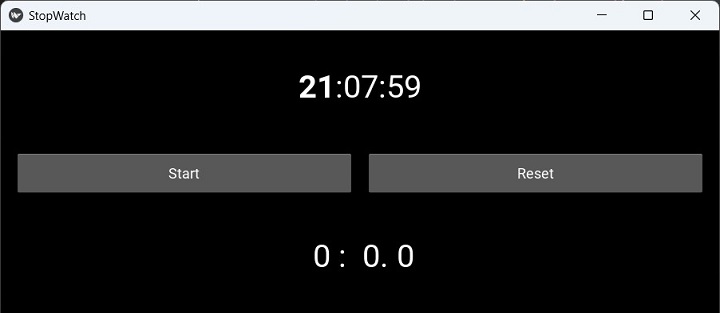
Press the Start button. The counter will start, showing the time elapsed on the bottom label. The caption changes to Stop. Press it again to stop the clock from running. Clicking the Reset button brings the label to "0".

Kivy - Camera Handling
The Kivy framework supports Camera hardware through platform-specific providers. The "opncv-python" package enables camera support for Kivy on most operating systems. Hence it is recommended that the opencv-python package should be installed in Kivy's working environment.
In this chapter, we shall build a Camera app with Kivy library's Camera class. A Camera widget along with a ToggleButton and a normal Button are placed in a vertical box layout to construct the app interface.
The Camera instance starts with the initial play state as True, which means the app window will start the video stream from the camera as soon as it is loaded. The Toggle button stops the camera when it is down. It is bound to play() method. The Capture button will be in enabled state only when the camera is playing.
def play(self, instance):
if instance.state=='down':
self.mycam.play=False
instance.text='Play'
self.cb.disabled=True
else:
self.mycam.play=True
instance.text='Stop'
self.cb.disabled=False
The Capture button saves the current frame to a PNG file by calling export_to_png() method of the Camera object.
As the image is captured, Kivy pops up a message box with a title as Image Captured.
def capture(self, instance):
if self.tb.text == 'Stop':
self.mycam.export_to_png("IMG.png")
layout = GridLayout(cols=1)
popup = Popup(
title='Image Captured', title_size=24,
content=layout, auto_dismiss=True,
size_hint=(None, None), size=(300, 100)
)
popup.open()
The rest of the code involves the composition of the app interface inside the build() method.
Example
The complete code is given below −
from kivy.app import App
from kivy.lang import Builder
from kivy.uix.boxlayout import BoxLayout
from kivy.uix.togglebutton import ToggleButton
from kivy.uix.button import Button
from kivy.uix.popup import Popup
from kivy.uix.camera import Camera
from kivy.core.window import Window
Window.size = (720, 400)
class TestCamera(App):
def build(self):
box = BoxLayout(orientation='vertical')
self.mycam = Camera(play=True, resolution=(640, 480))
box.add_widget(self.mycam)
self.tb = ToggleButton(
text='Stop', size_hint_y=None,
height='48dp', on_press=self.play
)
box.add_widget(self.tb)
self.cb = Button(
text='Capture', size_hint_y=None, height='48dp',
disabled=False, on_press=self.capture
)
box.add_widget(self.cb)
return box
def play(self, instance):
if instance.state == 'down':
self.mycam.play = False
instance.text = 'Play'
self.cb.disabled = True
else:
self.mycam.play = True
instance.text = 'Stop'
self.cb.disabled = False
def capture(self, instance):
if self.tb.text == 'Stop':
self.mycam.export_to_png("IMG.png")
layout = GridLayout(cols=1)
popup = Popup(
title='Image Captured', title_size=24,
content=layout, auto_dismiss=True,
size_hint=(None, None), size=(300, 100)
)
popup.open()
TestCamera().run()
Output
The camera instance loads as the application starts. Note that depending on the system and the camera device, it may take a few seconds to start. The toggle button's caption is stop and the capture button is enabled.

If you press the Stop button down, the capture button gets disabled. When in enabled state, press the Capture button. The current frame will be saved as "img.png" with a popup box coming up.

Kivy - Image Viewer
In this chapter, we shall build a simple Image Viewer app in Kivy. The code below uses Kivy's Image widget and buttons for navigation through the list of images in the selected folder. There is also a button which opens a FileChooser to let the user select different folder to view the images in.
First, we need to build a list of all the image files in the currently selected folder. We use the os.listdir() method for this purpose.
import os
self.idx=0
self.fillist=[]
dir_path = '.'
for file in os.listdir(dir_path):
if file.endswith('.png'):
self.fillist.append(file)
The construction of app interface involves a vertical box layout, in which the Image object is placed on top and another horizontal box layout holding three buttons.
lo=BoxLayout(orientation='vertical') self.img= Image(source=self.fillist[self.idx]) lo.add_widget(self.img) hlo=BoxLayout(orientation='horizontal', size_hint=(1, .1)) self.b1 = Button(text = 'Dir', on_press=self.onButtonPress) self.b2 = Button(text = 'Prev', on_press=self.previmg) self.b3 = Button(text = 'Next', on_press=self.nextimg) hlo.add_widget(self.b1) hlo.add_widget(self.b2) hlo.add_widget(self.b3) lo.add_widget(hlo)
The Image widget displays the first available image to start with. When the button captioned "Next" is clicked, the index pointing to the filelist is incremented; and when the "Previous" button is clicked, it is decremented, loading the indexed image file in the Image object.
def previmg(self, instance): self.idx-=1 if self.idx<0: self.idx=0 self.img.source=self.fillist[self.idx] def nextimg(self, instance): self.idx+=1 if self.idx>=len(self.fillist): self.idx=len(self.fillist)-1 self.img.source=self.fillist[self.idx]
The third button (captioned Dir) pops up a FileChooser dialog. You can choose the required folder to view.
def onButtonPress(self, button):
layout=GridLayout(cols=1)
fw=FileChooserListView(dirselect=True, filters=["!*.sys"])
fw.bind(on_selection=self.onselect)
closeButton = Button(
text = "OK", size_hint=(None, None),
size=(100,75)
)
layout.add_widget(fw)
layout.add_widget(closeButton)
self.popup = Popup(
title='Choose Folder', content=layout,
auto_dismiss=False, size_hint=(None, None),
size=(400, 400)
)
self.popup.open()
Example
Images in the current folder populate the fillist to start with. Here is the complete code −
from kivy.app import App
from kivy.uix.boxlayout import BoxLayout
from kivy.uix.gridlayout import GridLayout
from kivy.uix.label import Label
from kivy.uix.popup import Popup
from kivy.uix.image import Image
from kivy.uix.button import Button
from kivy.uix.filechooser import FileChooserListView
from kivy.core.window import Window
Window.size = (720, 400)
class ImageViewerApp(App):
def previmg(self, instance):
self.idx -= 1
if self.idx < 0: self.idx = 0
self.img.source = self.fillist[self.idx]
def nextimg(self, instance):
self.idx += 1
if self.idx >= len(self.fillist): self.idx = len(self.fillist) - 1
self.img.source = self.fillist[self.idx]
def onButtonPress(self, button):
layout = GridLayout(cols=1)
fw = FileChooserListView(dirselect=True, filters=["!*.sys"])
fw.bind(on_selection=self.onselect)
closeButton = Button(
text="OK", size_hint=(None, None), size=(100, 75)
)
layout.add_widget(fw)
layout.add_widget(closeButton)
self.popup = Popup(
title='Choose Folder', content=layout,
auto_dismiss=False, size_hint=(None, None), size=(400, 400)
)
self.popup.open()
closeButton.bind(on_press=self.on_close)
def onselect(self, *args):
print(args[1][0])
def on_close(self, event):
self.popup.dismiss()
def build(self):
import os
self.idx = 0
self.fillist = []
dir_path = '.'
for file in os.listdir(dir_path):
if file.endswith('.png'):
self.fillist.append(file)
lo = BoxLayout(orientation='vertical')
self.img = Image(source=self.fillist[self.idx])
lo.add_widget(self.img)
hlo = BoxLayout(orientation='horizontal', size_hint=(1, .1))
self.b1 = Button(text='Dir', on_press=self.onButtonPress)
self.b2 = Button(text='Prev', on_press=self.previmg)
self.b3 = Button(text='Next', on_press=self.nextimg)
hlo.add_widget(self.b1)
hlo.add_widget(self.b2)
hlo.add_widget(self.b3)
lo.add_widget(hlo)
return lo
ImageViewerApp().run()
Output
When you run this code, it will display the image at index "0" −

Click the navigation buttons to go forward and back. Click the "Dir" button to select a new folder.

Kivy - Bezier
In this chapter, we shall create a Kivy app that will interactively draw a Bezier line along the list of points. If a closed line is drawn making use of the x and y coordinates computed with the help of following code segment, the resulting figure resembles a Pacman character −
from math import cos, sin, radians
x = y = 300
z = 200
self.points = [x, y]
for i in range(45, 360, 45):
i = radians(i)
self.points.extend([x + cos(i) * z, y + sin(i) * z])
with self.layout.canvas:
Color(1.0, 0.0, 1.0)
self.line = Line(
points=self.points + self.points[:2],
dash_offset=10, dash_length=100
)
It generates a line pattern as the following −
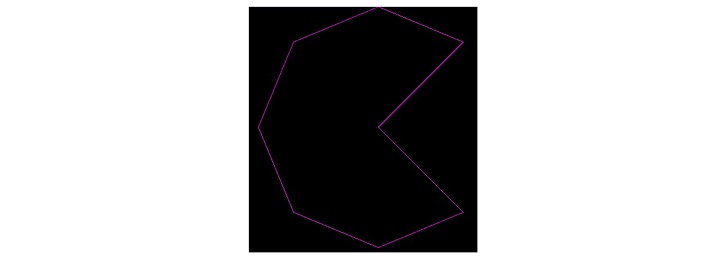
Then, we draw a Bezier line making use of the same list of points.
Color(1.0, 0.0, 1.0) self.line = Line( points=self.points + self.points[:2], dash_offset=0, dash_length=100 )
The Line as well as the Beizer will appear as this −

Now we want to construct these two curves dynamically. We use two slidersto change the dash length and offset values of both the line instruction and Bezier instruction as the value property of each slider changes with the following event handlers −
def _set_bezier_dash_offset(self, instance, value): # effect to reduce length while increase offset self.bezier.dash_length = 100 - value self.bezier.dash_offset = value def _set_line_dash_offset(self, instance, value): # effect to reduce length while increase offset self.line.dash_length = 100 - value self.line.dash_offset = value
As a result, change the slider values to see how the two curves are redrawn dynamically.
Example
The complete code is given below −
from kivy.app import App
from kivy.uix.floatlayout import FloatLayout
from kivy.uix.label import Label
from kivy.uix.slider import Slider
from kivy.graphics import Color, Bezier, Line
from kivy.core.window import Window
Window.size = (720,400)
class Main(App):
title='Bezier Example'
def _set_bezier_dash_offset(self, instance, value):
# effect to reduce length while increase offset
self.bezier.dash_length = 100 - value
self.bezier.dash_offset = value
def _set_line_dash_offset(self, instance, value):
# effect to reduce length while increase offset
self.line.dash_length = 100 - value
self.line.dash_offset = value
def build(self):
from math import cos, sin, radians
x = y = 300
z = 200
# Pacman !
self.points = [x, y]
for i in range(45, 360, 45):
i = radians(i)
self.points.extend([x + cos(i) * z, y + sin(i) * z])
print (self.points)
self.layout = FloatLayout()
with self.layout.canvas:
Color(1.0, 0.0, 0.0)
self.bezier = Bezier(
points=self.points, segments=150, loop=True,
dash_length=100, dash_offset=10
)
Color(1.0, 0.0, 1.0)
self.line = Line(
points=self.points + self.points[:2],
dash_offset=10,
dash_length=100)
l1=Label(
text='Beizer offset', pos_hint={'x':.1},
size_hint=(.1, None), height=50
)
self.layout.add_widget(l1)
s1 = Slider(
y=0, pos_hint={'x': .3},
size_hint=(.7, None), height=50
)
self.layout.add_widget(s1)
s1.bind(value=self._set_bezier_dash_offset)
l2=Label(
text='Line offset', y=50, pos_hint={'x':.1},
size_hint=(.1, None), height=50
)
self.layout.add_widget(l2)
s2 = Slider(
y=50, pos_hint={'x': .3},
size_hint=(.7, None), height=50
)
self.layout.add_widget(s2)
s2.bind(value=self._set_line_dash_offset)
return self.layout
if __name__ == '__main__':
Main().run()
Output
The following screenshots show the curves at two different slider positions −


Kivy - Canvas Stress
In this chapter, we shall find out how efficient is the graphics engine. This can be done by adding a large number of graphics instructions to the canvas of a Kivy object.
The program given below measures the time required by the graphics engine to draw ten thousand rectangles at random positions and with randomly chosen color value. Thus it will give an evaluation of how much stress the canvas can sustain.
Syntax
A rectangle instruction is drawn on the canvas of any Kivy widget with the following syntax −
with self.root.canvas: Color(r,g,b,a) Rectangle(pos, size)
We shall generate random values for RGB as well as x and y coordinates for the rectangle and display 10, 000 rectangles. The time taken for it is calculated by the perf_counter() function.
t1=perf_counter()
with self.root.canvas:
for i in range(10000):
Color(r,g,b,a)
Rectangle(pos, size)
t2=perf_counter()
The time required to draw will be "t2 - t1". It will be displayed on the title bar of the Kivy app window.
Example
The complete program is as follows −
from kivy.app import App
from kivy.graphics import *
from kivy.uix.floatlayout import FloatLayout
from kivy.uix.gridlayout import GridLayout
from kivy.uix.button import Button
from random import random as r
from time import perf_counter
from kivy.core.window import Window
Window.size = (720, 400)
class StresstestApp(App):
def add_rects(self, *args):
self.t1 = perf_counter()
with self.root.canvas:
for i in range(10000):
Color(r(), 1, 1, mode='hsv')
Rectangle(
pos=(r() * self.root.width + self.root.x, r() * self.root.height + self.root.y),
size=(20, 20)
)
self.t2 = perf_counter()
self.title = str(self.t2 - self.t1) + "Sec. to draw 10000 rectangles"
def build(self):
main = GridLayout(cols=1)
self.root = FloatLayout(size=(Window.width, 100))
self.btn1 = Button(
text='start', size_hint=(1, None),
pos_hint={'center_x': .5, 'center_y': .1}
)
self.btn1.bind(on_press=self.add_rects)
self.root.add_widget(self.btn1)
main.add_widget(self.root)
return main
StresstestApp().run()
Output
Run the program and click the "start" button.

You will get the time taken displayed on the title bar as shown in the following figure −

Kivy - Circle Drawing
In this chapter, we shall dynamically draw a circle on a Kivy application window. The idea is to set the value of width, height, and the center point of circle with four Kivy slider widgets and refresh the size and the position on a box layout canvas.
The "kivy.graphics" module includes the Ellipse class. A circle is actually an ellipse with equal width and height.
Syntax
The syntax to draw an ellipse on the canvas of any widget is −
with widget.canvas:
Color(1, 1, 1)
Ellipse(
pos=(w, h), size=(cx, cy),
angle_start=0, angle_end=360
)
Sliders are to be used to select the values of "w", "h", "cx" and "cy". The intended appearance of our application window is as follows −

The main layout uses a vertical box layout. It includes two horizontal box, each housing two sliders and two labels. In the first, width and height selectors are placed; and in the second, X and Y coordinates of the ellipse can be selected. The top vertical box then adds a FloatLayout, whose canvas is the target for drawing.
The following "kv" file assembles the above widget structure.
Example
BoxLayout:
orientation: 'vertical'
BoxLayout:
size_hint_y: None
height: sp(50)
BoxLayout:
orientation: 'horizontal'
Slider:
id: wd
min: 100
max: 300
value: 200
Label:
text: 'Width: {}'.format(int(wd.value))
Slider:
id: ht
min: 100
max: 300
value: 200
Label:
text: 'Height: {}'.format(int(ht.value))
BoxLayout:
size_hint_y: None
height: sp(50)
BoxLayout:
orientation: 'horizontal'
Slider:
id: cx
min: 10
max: 600
value: 360
Label:
text: 'cx: {}'.format(int(cx.value))
Slider:
id: cy
min: 10
max: 300
value: 50
Label:
text: 'cy: {}'.format(int(cy.value))
FloatLayout:
canvas:
Color:
rgb: 1, 1, 1
Ellipse:
pos: cx.value, cy.value
size: wd.value, ht.value
angle_start: 0
angle_end: 360
All you need to do is load this "kv" file in our Kivy App code. Call the load_file() method of "kivy.lang.Builder" class inside the build() method.
from kivy.app import App
from kivy.lang import Builder
from kivy.core.window import Window
Window.size = (720,400)
class CircleApp(App):
def build(self):
return Builder.load_file('circledemo.kv')
CircleApp().run()
That's it. Run the program, and you will get the circle drawn at the starting position. Slide the controls for different values and see the circle changing its position and size.
If you wish to use pure Python code to compose the application window appearance, you can do so by manually placing the required widgets inside the build() method as follows −
def build(self):
# main layout
lo = BoxLayout(orientation='vertical', size=Window.size)
# for width and height sliders
sliders_wh = BoxLayout(size_hint_y=None, height=50)
slb1 = BoxLayout(orientation='horizontal')
self.sl1 = Slider(min=100, max=300, value=200)
l1 = Label(text='Width: {}'.format(int(self.sl1.value)))
slb1.add_widget(self.sl1)
slb1.add_widget(l1)
self.sl2 = Slider(min=100, max=300, value=200)
l2 = Label(text='Height: {}'.format(int(self.sl2.value)))
slb1.add_widget(self.sl2)
slb1.add_widget(l2)
sliders_wh.add_widget(slb1)
# for cx and cy sliders
sliders_xy = BoxLayout(size_hint_y=None, height=50)
slb2 = BoxLayout(orientation='horizontal')
self.sl3 = Slider(min=10, max=600, value=360)
l3 = Label(text='cx: {}'.format(int(self.sl3.value)))
slb2.add_widget(self.sl3)
slb2.add_widget(l3)
self.sl4 = Slider(min=10, max=300, value=50)
l4 = Label(text='cy: {}'.format(int(self.sl4.value)))
slb2.add_widget(self.sl4)
slb2.add_widget(l4)
sliders_xy.add_widget(slb2)
lo.add_widget(sliders_wh)
lo.add_widget(sliders_xy)
self.flo = FloatLayout() # circle canvas
lo.add_widget(self.flo)
# redraw cicle
self.ev = Clock.schedule_interval(self.callback, .3)
return lo
However, to keep on refreshing the shape and position of circle on the canvas, we need to schedule a periodic event, clear the canvas to wipe out the existing circle and redraw it with instantaneous values of width, height, cx and cy.
The following callback method has to be added in the App class −
def callback(self, dt):
self.flo.canvas.clear()
with self.flo.canvas:
Color(1, 1, 1)
Ellipse(
pos=(self.sl3.value, self.sl4.value),
size=(self.sl1.value, self.sl2.value),
angle_start=0, angle_end=360
)
You can now run the code. Exactly the same result will be obtained as with the "kv" file version.
Kivy - Widget Animation
Any widget in Kivy toolkit can be animated. All you need to do is define an object of Animation class, choose at least one property of the target widget to animate and specify its final value to be reached after the animation effect is complete. Call the start() method of the Animation object, passing the target widget to it.
anim = Animation(property1=value1, property2=value2, ..) anim.start(widget)
In the following example, we have placed four Kivy Buttons. Two buttons are placed along the X-axis, keeping the "y" coordinate to 0 and randomizing the "x" coordinate so that one button is placed in first half and the other in second half.
Similarly, two more buttons are placed along the Y-axis, their "x" coordinate as 0 and y coordinate value assigned randomly.
Buttons placed along X-axis are animated to move up and down. The "y" coordinate value starts from its initial value all the way upto the maximum height of the window, and back to original position. The up and down movement is looping as the repeat property is set to True. Both horizontally placed buttons are bound to the method below −
def animate1(self, instance): animation = Animation(pos=(instance.pos[0], Window.height)) animation += Animation(pos=(instance.pos[0], 0)) animation.repeat=True animation.start(instance)
Similarly, the vertically arranged buttons b3 and b4 are bound to the following method. Their "x" coordinate value changes from their current value to maximum width and back.
def animate2(self, instance): animation = Animation(pos=(Window.width, instance.pos[1])) animation += Animation(pos=(0, instance.pos[1])) animation.repeat=True animation.start(instance)
While animation of each button can begin by pressing each button, we can make all the four buttons start animating simultaneously on a touch down event. The above callbacks are triggered by the trigger_action() method.
def on_touch_down(self, *args): self.b1.trigger_action(5) self.b2.trigger_action(10) self.b3.trigger_action(15) self.b4.trigger_action(20)
Rest of the code is just setting up the UI of four buttons in the build() method of the App class.
Example
Here's the complete code −
import kivy
kivy.require('1.0.7')
import random
from kivy.animation import Animation
from kivy.app import App
from kivy.uix.button import Button
from kivy.uix.floatlayout import FloatLayout
from kivy.core.window import Window
Window.size = (720,400)
class TestApp(App):
def animate1(self, instance):
animation = Animation(pos=(instance.pos[0], Window.height))
animation += Animation(pos=(instance.pos[0], 0))
animation.repeat=True
animation.start(instance)
def animate2(self, instance):
animation = Animation(pos=(Window.width, instance.pos[1]))
animation += Animation(pos=(0, instance.pos[1]))
animation.repeat=True
animation.start(instance)
def on_touch_down(self, *args):
self.b1.trigger_action(5)
self.b2.trigger_action(10)
self.b3.trigger_action(15)
self.b4.trigger_action(20)
def build(self):
box=FloatLayout()
# create a button and attach animate() method
# as a on_press handler
self.b1 = Button(
size_hint=(.15, .08), text='BTN1',
pos=(random.randint(Window.width/2, Window.width), 0),
on_press=self.animate1
)
self.b2 = Button(
size_hint=(.15, .08), text='BTN2',
pos=(random.randint(0, Window.width/2), 0),
on_press=self.animate1
)
self.b3 = Button(
size_hint=(.15, .08), text='BTN3',
pos=(0, random.randint(0, Window.height/2)),
on_press=self.animate2
)
self.b4 = Button(
size_hint=(.15, .08), text='BTN4',
pos=(0, random.randint(Window.height/2, Window.height)),
on_press=self.animate2
)
box.add_widget(self.b1)
box.add_widget(self.b2)
box.add_widget(self.b3)
box.add_widget(self.b4)
box.bind(on_touch_down=self.on_touch_down)
return box
if __name__ == '__main__':
TestApp().run()
Output
The program starts with the button position randomized. Click anywhere on the application window. Buttons b1 and b2 will start moving up and down. Buttons b3 and b4 will start moving back and forth.
This is the initial position −

The following figure is a screenshot of button positions while they are moving −

Kivy - Miscellaneous
Kivy - Exception Handling
In programming, Exception handling refers to the mechanism to prevent the program from crashing if it encounters run-time errors. Kivy provides a class called ExceptionHandler that can manage exceptions raised by Kivy or by your own code.
The ExceptionManager class is defined in the "kivy.base" module. You need to import it from "kivy.base" and access the instance that handles Kivy exceptions. You can use this class to add custom handlers for different types of exceptions, or to override the default behavior of Kivy when an exception occurs. For example, you can use the handle_exception method to log the exception, show a message to the user, or exit the app gracefully.
from kivy.base import ExceptionHandler, ExceptionManager
from logging import Logger
class handler(ExceptionHandler):
def handle_exception(self, inst):
Logger.exception('Exception caught by ExceptionHandler')
return ExceptionManager.PASS
ExceptionManager.add_handler(handler())
A handler function that takes the exception as an argument and returns one of the following values −
ExceptionManager.PASS − The exception should be ignored as it was handled by the handler.
ExceptionManager.RAISE − The exception should be re-raised.
ExceptionManager.USER_HANDLED − The exception was handled by the user and should not be logged.
You can also use the handle_exception method to manually handle an exception using the registered handlers.
Kivy - Resources Management
The "kivy.resources" module includes the functionality to for searching for specific resources across a list of paths particularly if you application deals with multiple paths and projects.
When Kivy looks for any resource such as an image file, or a "kv" file, it searches through a predetermined set of folders. You can modify this folder list using the resource_add_path() and resource_remove_path() functions.
If you want to use any alternative for the default style.kv or data/defaulttheme0.png you can add the path to your preferred alternatives via the resource_add_path() method.
Following functions are defined in the "kivy.resources" module −
resource_add_path(path) − Add a custom path to search in.
resource_find(filename, use_cache=False) − Search for a resource in the list of paths. Find results are cached for 60 seconds. This can be disabled using use_cache=False.
resource_remove_path(path) − Remove a search path.
Kivy - Weak Proxy
Python uses reference counting algorithm for garbage collection, by keeping count of how many objects are referencing a certain object. If the garbage collector finds that an object is referenced by another object, it can't be garbage collected. If the counter reaches zero, the garbage collector will free that object.
A weak reference is a reference that does not protect the object from getting garbage collected. To create weak references, Python has provided us with a module named weakref.
Kivy defines WeakProxy class in kivy.weakproxy module. In order to allow garbage collection, the WeakProxy class provides weak references to objects. It effectively enhances the weakref.proxy by adding comparison support.
Kivy - Context
The Kivy objects Clock, Cache and Builder are global objects. To use them in the context of the present application you will have to register it. The kivy.context module defines a Context class, which inherits the properties of Python's built-in dict class.
In addition to the dict methods, we have the following functions defined in this module −
get_current_context() − Return the current context.
egister_context(name, cls, *args, **kwargs) − Register a new context.