- Matplotlib - Home
- Matplotlib - Introduction
- Matplotlib - Vs Seaborn
- Matplotlib - Environment Setup
- Matplotlib - Anaconda distribution
- Matplotlib - Jupyter Notebook
- Matplotlib - Pyplot API
- Matplotlib - Simple Plot
- Matplotlib - Saving Figures
- Matplotlib - Markers
- Matplotlib - Figures
- Matplotlib - Styles
- Matplotlib - Legends
- Matplotlib - Colors
- Matplotlib - Colormaps
- Matplotlib - Colormap Normalization
- Matplotlib - Choosing Colormaps
- Matplotlib - Colorbars
- Matplotlib - Working With Text
- Matplotlib - Text properties
- Matplotlib - Subplot Titles
- Matplotlib - Images
- Matplotlib - Image Masking
- Matplotlib - Annotations
- Matplotlib - Arrows
- Matplotlib - Fonts
- Matplotlib - Font Indexing
- Matplotlib - Font Properties
- Matplotlib - Scales
- Matplotlib - LaTeX
- Matplotlib - LaTeX Text Formatting in Annotations
- Matplotlib - PostScript
- Matplotlib - Mathematical Expressions
- Matplotlib - Animations
- Matplotlib - Celluloid Library
- Matplotlib - Blitting
- Matplotlib - Toolkits
- Matplotlib - Artists
- Matplotlib - Styling with Cycler
- Matplotlib - Paths
- Matplotlib - Path Effects
- Matplotlib - Transforms
- Matplotlib - Ticks and Tick Labels
- Matplotlib - Radian Ticks
- Matplotlib - Dateticks
- Matplotlib - Tick Formatters
- Matplotlib - Tick Locators
- Matplotlib - Basic Units
- Matplotlib - Autoscaling
- Matplotlib - Reverse Axes
- Matplotlib - Logarithmic Axes
- Matplotlib - Symlog
- Matplotlib - Unit Handling
- Matplotlib - Ellipse with Units
- Matplotlib - Spines
- Matplotlib - Axis Ranges
- Matplotlib - Axis Scales
- Matplotlib - Axis Ticks
- Matplotlib - Formatting Axes
- Matplotlib - Axes Class
- Matplotlib - Twin Axes
- Matplotlib - Figure Class
- Matplotlib - Multiplots
- Matplotlib - Grids
- Matplotlib - Object-oriented Interface
- Matplotlib - PyLab module
- Matplotlib - Subplots() Function
- Matplotlib - Subplot2grid() Function
- Matplotlib - Anchored Artists
- Matplotlib - Manual Contour
- Matplotlib - Coords Report
- Matplotlib - AGG filter
- Matplotlib - Ribbon Box
- Matplotlib - Fill Spiral
- Matplotlib - Findobj Method
- Matplotlib - Hyperlinks
- Matplotlib - Image Thumbnail
- Matplotlib - Plotting with Keywords
- Matplotlib - Create Logo
- Matplotlib - Multipage PDF
- Matplotlib - Multiprocessing
- Matplotlib - Print Stdout
- Matplotlib - Compound Path
- Matplotlib - Sankey Class
- Matplotlib - MRI with EEG
- Matplotlib - Stylesheets
- Matplotlib - Background Colors
- Matplotlib - Basemap
Matplotlib Events
- Matplotlib - Event Handling
- Matplotlib - Close Event
- Matplotlib - Mouse Move
- Matplotlib - Click Events
- Matplotlib - Scroll Event
- Matplotlib - Keypress Event
- Matplotlib - Pick Event
- Matplotlib - Looking Glass
- Matplotlib - Path Editor
- Matplotlib - Poly Editor
- Matplotlib - Timers
- Matplotlib - Viewlims
- Matplotlib - Zoom Window
Matplotlib Widgets
- Matplotlib - Cursor Widget
- Matplotlib - Annotated Cursor
- Matplotlib - Button Widget
- Matplotlib - Check Buttons
- Matplotlib - Lasso Selector
- Matplotlib - Menu Widget
- Matplotlib - Mouse Cursor
- Matplotlib - Multicursor
- Matplotlib - Polygon Selector
- Matplotlib - Radio Buttons
- Matplotlib - RangeSlider
- Matplotlib - Rectangle Selector
- Matplotlib - Ellipse Selector
- Matplotlib - Slider Widget
- Matplotlib - Span Selector
- Matplotlib - Textbox
Matplotlib Plotting
- Matplotlib - Line Plots
- Matplotlib - Area Plots
- Matplotlib - Bar Graphs
- Matplotlib - Histogram
- Matplotlib - Pie Chart
- Matplotlib - Scatter Plot
- Matplotlib - Box Plot
- Matplotlib - Arrow Demo
- Matplotlib - Fancy Boxes
- Matplotlib - Zorder Demo
- Matplotlib - Hatch Demo
- Matplotlib - Mmh Donuts
- Matplotlib - Ellipse Demo
- Matplotlib - Bezier Curve
- Matplotlib - Bubble Plots
- Matplotlib - Stacked Plots
- Matplotlib - Table Charts
- Matplotlib - Polar Charts
- Matplotlib - Hexagonal bin Plots
- Matplotlib - Violin Plot
- Matplotlib - Event Plot
- Matplotlib - Heatmap
- Matplotlib - Stairs Plots
- Matplotlib - Errorbar
- Matplotlib - Hinton Diagram
- Matplotlib - Contour Plot
- Matplotlib - Wireframe Plots
- Matplotlib - Surface Plots
- Matplotlib - Triangulations
- Matplotlib - Stream plot
- Matplotlib - Ishikawa Diagram
- Matplotlib - 3D Plotting
- Matplotlib - 3D Lines
- Matplotlib - 3D Scatter Plots
- Matplotlib - 3D Contour Plot
- Matplotlib - 3D Bar Plots
- Matplotlib - 3D Wireframe Plot
- Matplotlib - 3D Surface Plot
- Matplotlib - 3D Vignettes
- Matplotlib - 3D Volumes
- Matplotlib - 3D Voxels
- Matplotlib - Time Plots and Signals
- Matplotlib - Filled Plots
- Matplotlib - Step Plots
- Matplotlib - XKCD Style
- Matplotlib - Quiver Plot
- Matplotlib - Stem Plots
- Matplotlib - Visualizing Vectors
- Matplotlib - Audio Visualization
- Matplotlib - Audio Processing
Matplotlib Useful Resources
Matplotlib - Logarithmic Axes
What is Logarithmic axes?
Logarithmic axes in Matplotlib allow for plots where one or both axes use a logarithmic scale rather than a linear scale. This scaling is particularly useful when dealing with a wide range of data values spanning several orders of magnitude. Instead of representing each unit equally as in linear scaling we can use logarithmic scaling which represents equal intervals in terms of orders of magnitude.
Now before seeing the comparison between Linear axes and Logarithmic axes lets go through the Linear Axes once.
What is Linear Axes?
Linear axes in the context of plotting and graphing refers to the standard Cartesian coordinate system where the axes are represented in a linear or arithmetic scale. In this system we have the following.
X-Axis and Y-Axis − The horizontal axis is typically the x-axis representing one variable while the vertical axis is the y-axis representing another variable.
Equal Spacing − The linear scale along each axis represents equal increments in the plotted values. For instance in a linear scale the distance between 0 and 1 is the same as the distance between 5 and 6.
Proportional Representation − Each unit along the axis corresponds directly to a unit change in the represented value. For example moving from 10 to 11 represents the same increase as moving from 20 to 21.
Straight Lines − Relationships between variables are represented as straight lines on a linear scale. For linear relationships the plotted data points form a straight line when connected.
Applicability − Linear axes are suitable for visualizing data where the relationships between variables are linear or when the values being represented do not vary widely across the scale.
Linear vs. Logarithmic Scales
Linear and logarithmic scales are different ways to represent data on an axis in a plot each with distinct characteristics that suit different types of data distributions and visualizations.
| Linear Axes | Logarthmic Axes | |
|---|---|---|
| Scaling | This used linear scaling; the distance between each value on the axis is uniform and represents an equal increment in the plotted quantity. | Logarithmic scaling represents values based on orders of magnitude rather than linear increments. Each tick on the axis corresponds to a power of a base value (e.g., 10 or e). |
| Intervals | The units along the axis correspond directly to the data values. For example on a linear scale from 0 to 10, each unit (e.g., from 0 to 1, 1 to 2) represents an equal increment of 1. | In a logarithmic scale, equal distances along the axis represent multiplicative factors rather than additive ones. For example on a log scale from 1 to 100, the distances might represent powers of 10 (1, 10, 100). |
| Representation | Linear axes are typically used for data where the relationship between plotted points is best described by a linear progression. | Logarithmic axes are suitable for data that spans multiple orders of magnitude, such as exponential growth or decay. They compress large ranges of values, making them visually manageable. |
| When to use | Typically used for data that shows a linear relationship between variables or data that does not span a wide range of values. | Useful for visualizing data that spans several orders of magnitude, especially when dealing with exponential growth or decay, frequency distributions, or data that concentrates in certain ranges with outliers. |
| Plot |  |
 |
Types of Logarithmic Scales
There are different types of Logarithmic scales available in Logarithmic axes. Lets see one by one.
Logarithmic X-axis
A logarithmic x-axis in a plot refers to an x-axis where the scale is logarithmic rather than linear. This scaling transforms the representation of data on the x-axis from a linear progression to a logarithmic progression by making it suitable for visualizing data that spans multiple orders of magnitude or exhibits exponential behavior along the x-axis.
Characteristics of Logarithmic X-axis
Scaling Method − Instead of representing values in equal increments along the x-axis as in linear scaling a logarithmic x-axis represents values based on powers of a base value (e.g., 10 or e).
Unequal Spacing − Equal distances on the axis correspond to multiplicative factors or orders of magnitude rather than fixed intervals.
Use Case − Logarithmic x-axes are valuable when dealing with datasets that cover a wide range of values such as exponential growth, large spans of time or data distributions that concentrate in specific ranges with outliers.
Example - Logarithmic X-axis
In this example plt.xscale('log') function sets the x-axis to a logarithmic scale. It transforms the x-axis from a linear scale to a logarithmic scale allowing for better visualization of the data especially when dealing with exponential or wide-ranging x-values.
import matplotlib.pyplot as plt
import numpy as np

# Generating sample data
x = np.linspace(1, 1000, 100)
y = np.sin(x) * np.log10(x)  # Generating data for demonstration

# Creating a plot with logarithmic x-axis
plt.figure(figsize=(8, 4))
plt.plot(x, y)
plt.xscale('log')  # Set x-axis to logarithmic scale
plt.xlabel('X-axis (Logarithmic Scale)')
plt.ylabel('Y-axis')
plt.title('Plot with Logarithmic X-axis')
plt.show()
Output
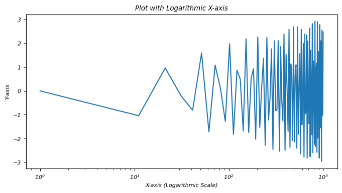
A logarithmic x-axis provides a different perspective on data visualization, emphasizing exponential behavior or patterns across varying orders of magnitude along the x-axis.
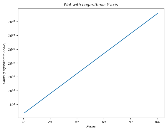
Logarithmic Y-axis
A logarithmic y-axis we often denoted as a log scale on the y-axis, represents a scaling method in plotting where the values along the y-axis are displayed logarithmically rather than linearly. This scaling is particularly useful when dealing with data that spans several orders of magnitude.
The logarithmic y-axis in Matplotlib allows for the effective visualization of data that covers a wide range of values by making it easier to observe patterns or trends that might not be apparent when using a linear scale.
Characteristics of Logarithmic Y-axis
Logarithmic Scaling − The values along the y-axis are scaled logarithmically where each unit increase represents a multiplicative factor i.e. powers of a base value typically 10 or e rather than an equal increment.
Equal Factors − Equal distances along the y-axis represent equal multiplicative factors, not equal numerical differences. For instance on a log scale, intervals of 1, 10, 100 represent factors of 10.
Compression of Data − Logarithmic scaling compresses a wide range of values by making it easier to visualize data that spans multiple orders of magnitude.
Example - Logarithmic Y-Axis
In this example plt.yscale('log') sets the y-axis to a logarithmic scale. As a result the exponential growth data is displayed on a logarithmic scale along the y-axis by facilitating the visualization of data across a broad range of values.
import matplotlib.pyplot as plt
import numpy as np

# Sample data with a wide range
x = np.linspace(1, 100, 100)
y = np.exp(x)  # Exponential growth for demonstration

# Creating a plot with a logarithmic y-axis
plt.plot(x, y)
plt.yscale('log')  # Set y-axis to logarithmic scale
plt.xlabel('X-axis')
plt.ylabel('Y-axis (Logarithmic Scale)')
plt.title('Plot with Logarithmic Y-axis')
plt.show()
Output
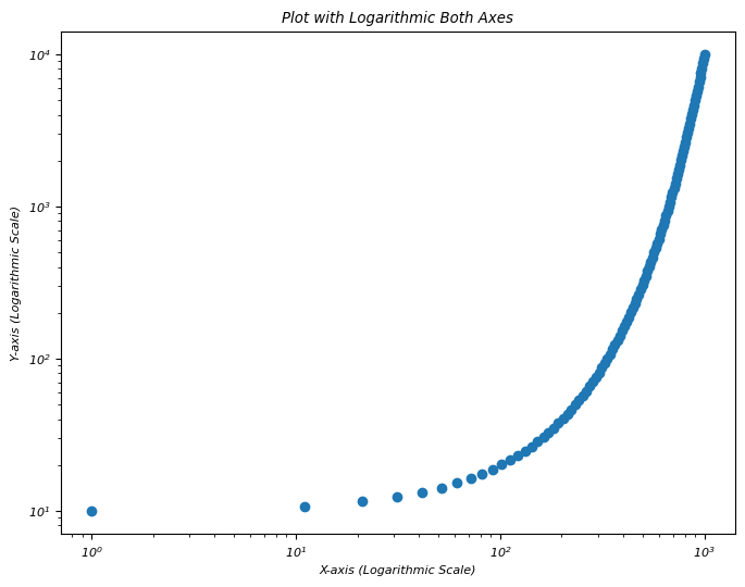
Logarithmic both axes
Logarithmic scaling for both axes i.e. x-axis and y-axis in a plot involves using a logarithmic scale for both dimensions representing values based on orders of magnitude rather than linear increments. This scaling is particularly useful when dealing with data that spans multiple orders of magnitude in both the horizontal and vertical directions.
Logarithmic scaling for both axes is effective when visualizing data that spans multiple orders of magnitude in both horizontal and vertical directions compressing the range of values for improved visualization and pattern identification.
Use Cases for Logarithmic Both Axes
Wide Range of Data − When both x and y-axis data spans several orders of magnitude then logarithmic scaling for both axes compresses the visual representation for better insights.
Exponential Relationships − Visualizing data with exponential relationships in both dimensions.
Scientific and Engineering Data − Commonly used in scientific and engineering plots where values span multiple scales.
Example - Logarithmic Scaling for Both Axes
In this example plt.xscale('log') and plt.yscale('log') functions set both the x-axis and y-axis to logarithmic scales respectively. The plot visualizes data points in a manner where each axis represents values in terms of orders of magnitude by allowing for better visualization of data that spans a wide range of values in both dimensions.
import matplotlib.pyplot as plt
import numpy as np

# Generating sample data with a wide range
x = np.linspace(1, 1000, 100)
y = np.logspace(1, 4, 100)  # Logarithmically spaced data for demonstration

# Creating a plot with logarithmic scaling for both axes
plt.figure(figsize=(8, 6))
plt.scatter(x, y)
plt.xscale('log')  # Set x-axis to logarithmic scale
plt.yscale('log')  # Set y-axis to logarithmic scale
plt.xlabel('X-axis (Logarithmic Scale)')
plt.ylabel('Y-axis (Logarithmic Scale)')
plt.title('Plot with Logarithmic Both Axes')
plt.show()
Output
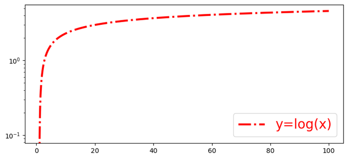
Logarithmic Y-axis bins
In this example we are plotting the logarithmic Y-Axis bins using the matplotlib library.
Example - Logarithmic Y-Axis Bins
import numpy as np
from matplotlib import pyplot as plt
plt.rcParams["figure.figsize"] = [7.50, 3.50]
plt.rcParams["figure.autolayout"] = True
x = np.linspace(1, 100, 1000)
y = np.log(x)
plt.yscale('log')
plt.plot(x, y, c="red", lw=3, linestyle="dashdot", label="y=log(x)")
plt.legend()
plt.show()
Output