- Matplotlib - Home
- Matplotlib - Introduction
- Matplotlib - Vs Seaborn
- Matplotlib - Environment Setup
- Matplotlib - Anaconda distribution
- Matplotlib - Jupyter Notebook
- Matplotlib - Pyplot API
- Matplotlib - Simple Plot
- Matplotlib - Saving Figures
- Matplotlib - Markers
- Matplotlib - Figures
- Matplotlib - Styles
- Matplotlib - Legends
- Matplotlib - Colors
- Matplotlib - Colormaps
- Matplotlib - Colormap Normalization
- Matplotlib - Choosing Colormaps
- Matplotlib - Colorbars
- Matplotlib - Working With Text
- Matplotlib - Text properties
- Matplotlib - Subplot Titles
- Matplotlib - Images
- Matplotlib - Image Masking
- Matplotlib - Annotations
- Matplotlib - Arrows
- Matplotlib - Fonts
- Matplotlib - Font Indexing
- Matplotlib - Font Properties
- Matplotlib - Scales
- Matplotlib - LaTeX
- Matplotlib - LaTeX Text Formatting in Annotations
- Matplotlib - PostScript
- Matplotlib - Mathematical Expressions
- Matplotlib - Animations
- Matplotlib - Celluloid Library
- Matplotlib - Blitting
- Matplotlib - Toolkits
- Matplotlib - Artists
- Matplotlib - Styling with Cycler
- Matplotlib - Paths
- Matplotlib - Path Effects
- Matplotlib - Transforms
- Matplotlib - Ticks and Tick Labels
- Matplotlib - Radian Ticks
- Matplotlib - Dateticks
- Matplotlib - Tick Formatters
- Matplotlib - Tick Locators
- Matplotlib - Basic Units
- Matplotlib - Autoscaling
- Matplotlib - Reverse Axes
- Matplotlib - Logarithmic Axes
- Matplotlib - Symlog
- Matplotlib - Unit Handling
- Matplotlib - Ellipse with Units
- Matplotlib - Spines
- Matplotlib - Axis Ranges
- Matplotlib - Axis Scales
- Matplotlib - Axis Ticks
- Matplotlib - Formatting Axes
- Matplotlib - Axes Class
- Matplotlib - Twin Axes
- Matplotlib - Figure Class
- Matplotlib - Multiplots
- Matplotlib - Grids
- Matplotlib - Object-oriented Interface
- Matplotlib - PyLab module
- Matplotlib - Subplots() Function
- Matplotlib - Subplot2grid() Function
- Matplotlib - Anchored Artists
- Matplotlib - Manual Contour
- Matplotlib - Coords Report
- Matplotlib - AGG filter
- Matplotlib - Ribbon Box
- Matplotlib - Fill Spiral
- Matplotlib - Findobj Method
- Matplotlib - Hyperlinks
- Matplotlib - Image Thumbnail
- Matplotlib - Plotting with Keywords
- Matplotlib - Create Logo
- Matplotlib - Multipage PDF
- Matplotlib - Multiprocessing
- Matplotlib - Print Stdout
- Matplotlib - Compound Path
- Matplotlib - Sankey Class
- Matplotlib - MRI with EEG
- Matplotlib - Stylesheets
- Matplotlib - Background Colors
- Matplotlib - Basemap
Matplotlib Events
- Matplotlib - Event Handling
- Matplotlib - Close Event
- Matplotlib - Mouse Move
- Matplotlib - Click Events
- Matplotlib - Scroll Event
- Matplotlib - Keypress Event
- Matplotlib - Pick Event
- Matplotlib - Looking Glass
- Matplotlib - Path Editor
- Matplotlib - Poly Editor
- Matplotlib - Timers
- Matplotlib - Viewlims
- Matplotlib - Zoom Window
Matplotlib Widgets
- Matplotlib - Cursor Widget
- Matplotlib - Annotated Cursor
- Matplotlib - Button Widget
- Matplotlib - Check Buttons
- Matplotlib - Lasso Selector
- Matplotlib - Menu Widget
- Matplotlib - Mouse Cursor
- Matplotlib - Multicursor
- Matplotlib - Polygon Selector
- Matplotlib - Radio Buttons
- Matplotlib - RangeSlider
- Matplotlib - Rectangle Selector
- Matplotlib - Ellipse Selector
- Matplotlib - Slider Widget
- Matplotlib - Span Selector
- Matplotlib - Textbox
Matplotlib Plotting
- Matplotlib - Line Plots
- Matplotlib - Area Plots
- Matplotlib - Bar Graphs
- Matplotlib - Histogram
- Matplotlib - Pie Chart
- Matplotlib - Scatter Plot
- Matplotlib - Box Plot
- Matplotlib - Arrow Demo
- Matplotlib - Fancy Boxes
- Matplotlib - Zorder Demo
- Matplotlib - Hatch Demo
- Matplotlib - Mmh Donuts
- Matplotlib - Ellipse Demo
- Matplotlib - Bezier Curve
- Matplotlib - Bubble Plots
- Matplotlib - Stacked Plots
- Matplotlib - Table Charts
- Matplotlib - Polar Charts
- Matplotlib - Hexagonal bin Plots
- Matplotlib - Violin Plot
- Matplotlib - Event Plot
- Matplotlib - Heatmap
- Matplotlib - Stairs Plots
- Matplotlib - Errorbar
- Matplotlib - Hinton Diagram
- Matplotlib - Contour Plot
- Matplotlib - Wireframe Plots
- Matplotlib - Surface Plots
- Matplotlib - Triangulations
- Matplotlib - Stream plot
- Matplotlib - Ishikawa Diagram
- Matplotlib - 3D Plotting
- Matplotlib - 3D Lines
- Matplotlib - 3D Scatter Plots
- Matplotlib - 3D Contour Plot
- Matplotlib - 3D Bar Plots
- Matplotlib - 3D Wireframe Plot
- Matplotlib - 3D Surface Plot
- Matplotlib - 3D Vignettes
- Matplotlib - 3D Volumes
- Matplotlib - 3D Voxels
- Matplotlib - Time Plots and Signals
- Matplotlib - Filled Plots
- Matplotlib - Step Plots
- Matplotlib - XKCD Style
- Matplotlib - Quiver Plot
- Matplotlib - Stem Plots
- Matplotlib - Visualizing Vectors
- Matplotlib - Audio Visualization
- Matplotlib - Audio Processing
Matplotlib Useful Resources
Matplotlib - Autoscaling
What is Autoscaling?
Autoscaling in Matplotlib refers to the automatic adjustment of axis limits based on the data being plotted, ensuring that the plotted data fits within the visible area of the plot without getting clipped or extending beyond the plot boundaries. This feature aims to provide an optimal view of the data by dynamically adjusting the axis limits to accommodate the entire dataset.
Key Aspects of Autoscaling in Matplotlib
The below are the key aspects of Autoscaling in Matplotlib library.
Automatic Adjustment
In Matplotlib automatic adjustment or autoscaling refers to the process by which the library dynamically determines and sets the axis limits both x-axis and y-axis based on the data being plotted. The aim is to ensure that the entire dataset is visible within the plot without any data points being clipped or extending beyond the plot boundaries.
The key aspects of automatic adjustment are as follows.
Data-Based Limits − Matplotlib examines the range of the data being plotted to determine suitable minimum and maximum limits for both axes.
Data Visibility − The goal is to display all data points clearly within the plot area, optimizing the view for visualization.
Dynamic Updates − When the plot is created or modified, Matplotlib recalculates and adjusts the axis limits as needed to accommodate the entire data range.
Preventing Clipping − Autoscaling ensures, that no data points are clipped or hidden due to the plot boundaries.
Manual Override − Users can also explicitly enable autoscaling using commands like plt.axis('auto') or plt.axis('tight') to let Matplotlib dynamically adjust the axis limits.
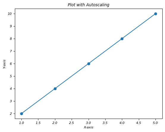
Example - Enabling Autoscaling
In this example plt.axis('auto') or plt.axis('tight') enables autoscaling by allowing Matplotlib to dynamically adjust the axis limits based on the data being plotted. The library recalculates the limits to ensure that all data points are visible within the plot area by providing an optimal view of the data.
import matplotlib.pyplot as plt

# Sample data
x = [1, 2, 3, 4, 5]
y = [2, 4, 6, 8, 10]

# Creating a plot with autoscaling
plt.plot(x, y, marker='o')

# Automatically adjust axis limits
plt.axis('auto')  # or simply plt.axis('tight') for tight axis limits
plt.xlabel('X-axis')
plt.ylabel('Y-axis')
plt.title('Plot with Autoscaling')
plt.show()
Output
Following is the output of the above code −
Tight Layout
In Matplotlib tight_layout() is a function that automatically adjusts the subplot parameters to ensure that the plot elements such as axis labels, titles and other items which fit within the figure area without overlapping or getting cut off. This function optimizes the layout by adjusting the spacing between subplots and other plot elements.
The below are the key Aspects of tight_layout:
Optimizing Layout − tight_layout() function optimizes the arrangement of subplots and plot elements within a figure to minimize overlaps and maximize space utilization.
Preventing Overlapping Elements − It adjusts the padding and spacing between subplots, axes, labels and titles to prevent any overlapping or clipping of plot elements.
Automatic Adjustment − This function is particularly useful when creating complex multi-subplot figures or when dealing with various plot elements.
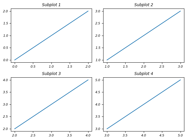
Example - Adjusting subplots layouts
In this example we are automatically adjusting the layout of the subplots by ensuring that all elements such as titles, labels etc are properly spaced and fit within the figure area.
import matplotlib.pyplot as plt

# Creating subplots
fig, axes = plt.subplots(2, 2)

# Plotting in subplots
for i, ax in enumerate(axes.flatten()):
   ax.plot([i, i+1, i+2], [i, i+1, i+2])
   ax.set_title(f'Subplot {i+1}')

# Applying tight layout
plt.tight_layout()
plt.show()
Output
Following is the output of the above code −
plt.axis('auto')
This command allows us to explicitly enable autoscaling for a specific axis.
Here's how plt.axis('auto') is typically used,
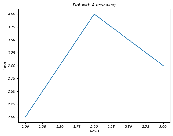
Example - Using axis('auto')
import matplotlib.pyplot as plt

# Creating a subplot
fig, ax = plt.subplots()

# Plotting data
ax.plot([1, 2, 3], [2, 4, 3])
plt.axis('auto')
plt.xlabel('X-axis')
plt.ylabel('Y-axis')
plt.title('Plot with Autoscaling')
plt.show()
Output
Following is the output of the above code −
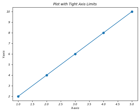
plt.axis('tight')
In Matplotlib plt.axis('tight') is a command used to set the axis limits of a plot to tightly fit the range of the data being plotted. This command adjusts the axis limits to exactly encompass the minimum and maximum values of the provided data by removing any excess space between the data points and the plot edges.
Example - Using plt.axis('tight')
import matplotlib.pyplot as plt

# Sample data
x = [1, 2, 3, 4, 5]
y = [2, 4, 6, 8, 10]

# Creating a plot with tight axis limits
plt.plot(x, y, marker='o')

# Setting axis limits tightly around the data range
plt.axis('tight')
plt.xlabel('X-axis')
plt.ylabel('Y-axis')
plt.title('Plot with Tight Axis Limits')
plt.show()
Output
Following is the output of the above code −
Dynamic Updates
In Matplotlib dynamic updates refer to the ability of the library to automatically adjust or update plot elements when changes are made to the data or the plot itself. This feature ensures that the visualization remains up-to-date and responsive to changes in the underlying data without requiring manual intervention.
Key Points about Dynamic Updates in Matplotlib
Real-Time Updates − When new data is added to an existing plot or modifications are made to the plot elements Matplotlib dynamically updates the visualization to reflect these changes.
Automatic Redrawing − Matplotlib automatically redraws the plot when changes occur such as adding new data points, adjusting axis limits or modifying plot properties.
Interactive Plotting − Interactive features in Matplotlib such as in Jupyter Notebooks or interactive backends allow for real-time manipulation and updates of plots in response to user interactions.
Efficient Rendering − Matplotlib optimizes the rendering process to efficiently update the plot elements while maintaining visual accuracy.
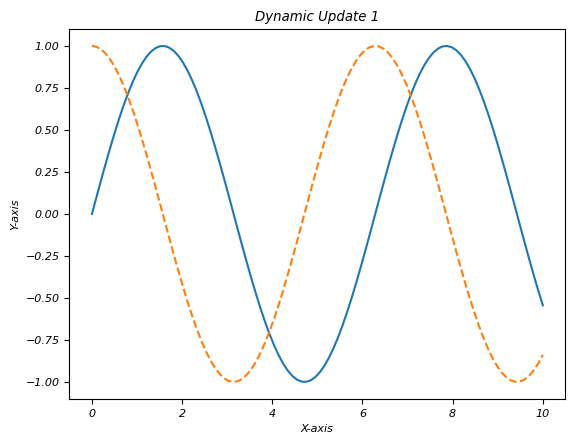
Example - Dynamic Updates
In this example the initial plot displays a sine wave. A loop simulates dynamic updates by adding new cosine waves and modifying the plot title in each iteration. plt.pause(1) introduces a pause to demonstrate the changes but in an interactive environment such as Jupyter Notebook which wouldn't be necessary.
import matplotlib.pyplot as plt
import numpy as np

# Initial plot with random data
x = np.linspace(0, 10, 100)
y = np.sin(x)
plt.plot(x, y)
plt.xlabel('X-axis')
plt.ylabel('Y-axis')
plt.title('Dynamic Updates Example')

# Simulating dynamic updates by modifying the plot
for _ in range(5):
   # Adding new data to the plot
   x_new = np.linspace(0, 10, 100)
   y_new = np.cos(x_new + _)
   plt.plot(x_new, y_new, linestyle='--')  # Plotting new data
   # Updating plot properties
   plt.title(f'Dynamic Update {_+1}')  # Updating the plot title
   plt.pause(1)  # Pause to display changes (for demonstration)
plt.show()
Output
Following is the output of the above code −