- Matplotlib - Home
- Matplotlib - Introduction
- Matplotlib - Vs Seaborn
- Matplotlib - Environment Setup
- Matplotlib - Anaconda distribution
- Matplotlib - Jupyter Notebook
- Matplotlib - Pyplot API
- Matplotlib - Simple Plot
- Matplotlib - Saving Figures
- Matplotlib - Markers
- Matplotlib - Figures
- Matplotlib - Styles
- Matplotlib - Legends
- Matplotlib - Colors
- Matplotlib - Colormaps
- Matplotlib - Colormap Normalization
- Matplotlib - Choosing Colormaps
- Matplotlib - Colorbars
- Matplotlib - Working With Text
- Matplotlib - Text properties
- Matplotlib - Subplot Titles
- Matplotlib - Images
- Matplotlib - Image Masking
- Matplotlib - Annotations
- Matplotlib - Arrows
- Matplotlib - Fonts
- Matplotlib - Font Indexing
- Matplotlib - Font Properties
- Matplotlib - Scales
- Matplotlib - LaTeX
- Matplotlib - LaTeX Text Formatting in Annotations
- Matplotlib - PostScript
- Matplotlib - Mathematical Expressions
- Matplotlib - Animations
- Matplotlib - Celluloid Library
- Matplotlib - Blitting
- Matplotlib - Toolkits
- Matplotlib - Artists
- Matplotlib - Styling with Cycler
- Matplotlib - Paths
- Matplotlib - Path Effects
- Matplotlib - Transforms
- Matplotlib - Ticks and Tick Labels
- Matplotlib - Radian Ticks
- Matplotlib - Dateticks
- Matplotlib - Tick Formatters
- Matplotlib - Tick Locators
- Matplotlib - Basic Units
- Matplotlib - Autoscaling
- Matplotlib - Reverse Axes
- Matplotlib - Logarithmic Axes
- Matplotlib - Symlog
- Matplotlib - Unit Handling
- Matplotlib - Ellipse with Units
- Matplotlib - Spines
- Matplotlib - Axis Ranges
- Matplotlib - Axis Scales
- Matplotlib - Axis Ticks
- Matplotlib - Formatting Axes
- Matplotlib - Axes Class
- Matplotlib - Twin Axes
- Matplotlib - Figure Class
- Matplotlib - Multiplots
- Matplotlib - Grids
- Matplotlib - Object-oriented Interface
- Matplotlib - PyLab module
- Matplotlib - Subplots() Function
- Matplotlib - Subplot2grid() Function
- Matplotlib - Anchored Artists
- Matplotlib - Manual Contour
- Matplotlib - Coords Report
- Matplotlib - AGG filter
- Matplotlib - Ribbon Box
- Matplotlib - Fill Spiral
- Matplotlib - Findobj Method
- Matplotlib - Hyperlinks
- Matplotlib - Image Thumbnail
- Matplotlib - Plotting with Keywords
- Matplotlib - Create Logo
- Matplotlib - Multipage PDF
- Matplotlib - Multiprocessing
- Matplotlib - Print Stdout
- Matplotlib - Compound Path
- Matplotlib - Sankey Class
- Matplotlib - MRI with EEG
- Matplotlib - Stylesheets
- Matplotlib - Background Colors
- Matplotlib - Basemap
Matplotlib Events
- Matplotlib - Event Handling
- Matplotlib - Close Event
- Matplotlib - Mouse Move
- Matplotlib - Click Events
- Matplotlib - Scroll Event
- Matplotlib - Keypress Event
- Matplotlib - Pick Event
- Matplotlib - Looking Glass
- Matplotlib - Path Editor
- Matplotlib - Poly Editor
- Matplotlib - Timers
- Matplotlib - Viewlims
- Matplotlib - Zoom Window
Matplotlib Widgets
- Matplotlib - Cursor Widget
- Matplotlib - Annotated Cursor
- Matplotlib - Button Widget
- Matplotlib - Check Buttons
- Matplotlib - Lasso Selector
- Matplotlib - Menu Widget
- Matplotlib - Mouse Cursor
- Matplotlib - Multicursor
- Matplotlib - Polygon Selector
- Matplotlib - Radio Buttons
- Matplotlib - RangeSlider
- Matplotlib - Rectangle Selector
- Matplotlib - Ellipse Selector
- Matplotlib - Slider Widget
- Matplotlib - Span Selector
- Matplotlib - Textbox
Matplotlib Plotting
- Matplotlib - Line Plots
- Matplotlib - Area Plots
- Matplotlib - Bar Graphs
- Matplotlib - Histogram
- Matplotlib - Pie Chart
- Matplotlib - Scatter Plot
- Matplotlib - Box Plot
- Matplotlib - Arrow Demo
- Matplotlib - Fancy Boxes
- Matplotlib - Zorder Demo
- Matplotlib - Hatch Demo
- Matplotlib - Mmh Donuts
- Matplotlib - Ellipse Demo
- Matplotlib - Bezier Curve
- Matplotlib - Bubble Plots
- Matplotlib - Stacked Plots
- Matplotlib - Table Charts
- Matplotlib - Polar Charts
- Matplotlib - Hexagonal bin Plots
- Matplotlib - Violin Plot
- Matplotlib - Event Plot
- Matplotlib - Heatmap
- Matplotlib - Stairs Plots
- Matplotlib - Errorbar
- Matplotlib - Hinton Diagram
- Matplotlib - Contour Plot
- Matplotlib - Wireframe Plots
- Matplotlib - Surface Plots
- Matplotlib - Triangulations
- Matplotlib - Stream plot
- Matplotlib - Ishikawa Diagram
- Matplotlib - 3D Plotting
- Matplotlib - 3D Lines
- Matplotlib - 3D Scatter Plots
- Matplotlib - 3D Contour Plot
- Matplotlib - 3D Bar Plots
- Matplotlib - 3D Wireframe Plot
- Matplotlib - 3D Surface Plot
- Matplotlib - 3D Vignettes
- Matplotlib - 3D Volumes
- Matplotlib - 3D Voxels
- Matplotlib - Time Plots and Signals
- Matplotlib - Filled Plots
- Matplotlib - Step Plots
- Matplotlib - XKCD Style
- Matplotlib - Quiver Plot
- Matplotlib - Stem Plots
- Matplotlib - Visualizing Vectors
- Matplotlib - Audio Visualization
- Matplotlib - Audio Processing
Matplotlib Useful Resources
Matplotlib - Axes Class
In the context of Matplotlib, axes does not refer to the plural form of an axis. Instead, it represents the entire plotting area on a figure or canvas. Which includes the x-axis, y-axis, plotting data, ticks, ticks labels, and more.
Refer to the image below −
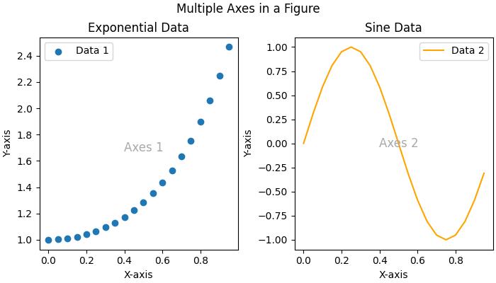
Consider the figure where two Axes objects are created using the ax = fig.subplots() method. The first axes display exponential data, while the second axes show a sine wave. Each Axes (subplot) has its own set of labels, ticks, and legends, providing a distinct representation within the same figure.
Axes class in matplotlib
The Axes() class serves as the gateway to creating data visualizations. Once an Axes object is instantiated on a figure, a variety of methods become available to add and manipulate data within that plotting area.
This class is part of the matplotlib.axes module, providing fundamental functionalities to work with the Matplotlib object-oriented programming (OOP) interface. Most of the essential plotting methods are defined on the Axes class, making it a central component for customizing and enhancing visualizations.
Creating an Axes
Creating an Axes object is typically the first step in Matplotlib plotting. This can be done through methods on Figure object like Figure.subplots(), Figure.add_axes(), or via the pyplot interface function, pyplot.subplots(). These methods provides the creation of one or more Axes objects in a figure.
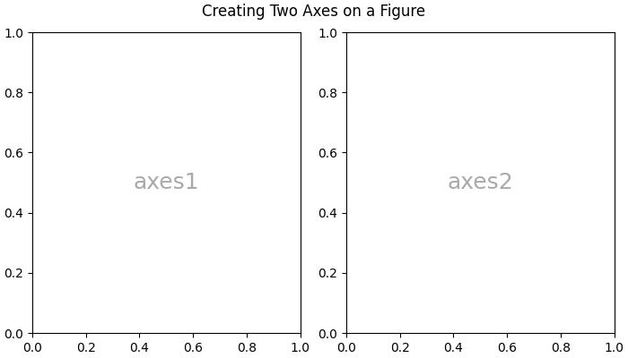
Example - Usage of Axes Class
The following example uses the pyplot.subplot() method to creat two axes on a figure. The subplots() method is useful for generating the axes instance.
import matplotlib.pyplot as plt
import numpy as np

# Creating a 1x2 subplot layout
fig, (axes1, axes2)  = plt.subplots(1, 2, figsize=(7, 4),
   layout="constrained")

# Adding labels to each subplot
axes1.annotate('axes1', (0.5, 0.5),transform=axes1.transAxes,
   ha='center', va='center', fontsize=18,
   color='darkgrey')

axes2.annotate('axes2', (0.5, 0.5),transform=axes2.transAxes,
   ha='center', va='center', fontsize=18,
   color='darkgrey')

fig.suptitle('Creating Two Axes on a Figure')

# Displaying the plot
plt.show()
Output
On executing the above code we will get the following output −
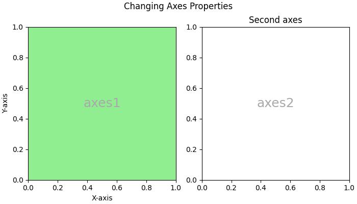
Changing an Axes properties
To set the properties of an axes, you have to access the axes object, after that you can use various `set_*` methods to modify its properties.
Example - Changing Axes Properties
import matplotlib.pyplot as plt
import numpy as np

# Creating a 1x2 subplot layout
fig, (axes1, axes2) = plt.subplots(1, 2, figsize=(7, 4),
   constrained_layout=True)

# Changing the properties of the first axes
axes1.set_xlabel("X-axis")        # Set label for X-axis
axes1.set_ylabel("Y-axis")        # Set label for Y-axis
axes1.set_facecolor('lightgreen') # Setting background color
axes1.annotate('axes1', (0.5, 0.5), transform=axes1.transAxes,
   ha='center', va='center', fontsize=18,
   color='darkgrey')
axes2.set_title('Second axes')
axes2.annotate('axes2', (0.5, 0.5), transform=axes2.transAxes,
   ha='center', va='center', fontsize=18,
   color='darkgrey')

# Adding a title to the figure
fig.suptitle('Changing Axes Properties')

# Displaying the plot
plt.show()
Output
On executing the above code you will get the following output −
Plotting on an Axes
This class offers several high-level plotting methods to create different plot on axes.
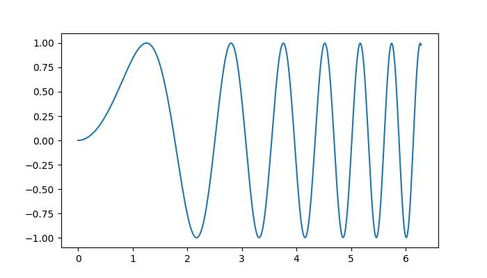
Example - Plotting Axes
Here is an example uses the Axes.plot() method to create a line plot representing the sin(x).
import matplotlib.pyplot as plt
import numpy as np

# Sample Data
x = np.linspace(0, 2 * np.pi, 400)
y = np.sin(x**2)

# Create subplots
fig, axs = plt.subplots(figsize=(7,4))

# Draw the plot
axs.plot(x, y)

# Show the plot
plt.show()
Output
On executing the above code we will get the following output −
Customizing the axes Data
The Axes object contains most of the figure elements such as Axis, Tick, Line2D, Text, Polygon, etc., and sets the coordinate system. These elements can be customized by adding labels, titles, legends, and annotations to the Axes enhances the clarity of visualizations.
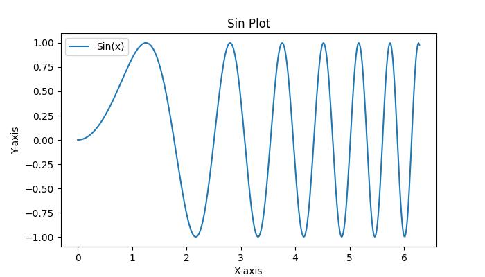
Example - Adding Labels, titles to Axes
Here is a simple example that adds the labels, titles, legends to an Axes.
import matplotlib.pyplot as plt
import numpy as np

# Sample Data
x = np.linspace(0, 2 * np.pi, 400)
y = np.sin(x**2)

# Create subplots
fig, axs = plt.subplots(figsize=(7,4))

# Draw the plot
axs.plot(x, y, label='Sin(x)')

# Add titles
axs.set_title('Sin Plot')

# Add X and Y labels
axs.set_xlabel('X-axis')
axs.set_ylabel('Y-axis')

# Add legend
axs.legend()

# Show the plot
plt.show()
Output
On executing the above code we will get the following output −
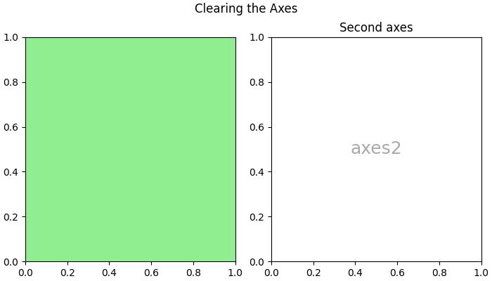
Clearing the Axes
To clear the contents of an axes, you can use the axes.cla() or axes.clear() method.
Example - Clearing An Axes
Here is an example that show how you can clear the first axes in a subplot.
import matplotlib.pyplot as plt
import numpy as np

# Sample data
x = np.linspace(-1, 1, 10)
y = np.exp(x)

# Creating subplots
fig, (axes1, axes2) = plt.subplots(1, 2, figsize=(7, 4),
   constrained_layout=True)

# Plotting on the first axes
axes1.plot(x, y, c='red')
axes1.set_xlabel("X-axis")        # Set label for X-axis
axes1.set_ylabel("Y-axis")        # Set label for Y-axis
axes1.set_facecolor('lightgreen') # Setting background color
axes1.annotate('axes1', (0.5, 0.5), transform=axes1.transAxes,
   ha='center', va='center', fontsize=18,
   color='darkgrey')

# Adding a title to the second axes
axes2.set_title('Second axes')
axes2.annotate('axes2', (0.5, 0.5), transform=axes2.transAxes,
   ha='center', va='center', fontsize=18,
   color='darkgrey')

# Clearing the first axes
axes1.cla()

# Adding a title to the figure
fig.suptitle('Clearing the Axes')

# Displaying the plot
plt.show()
Output
On executing the above code you will get the following output −