- Matplotlib - Home
- Matplotlib - Introduction
- Matplotlib - Vs Seaborn
- Matplotlib - Environment Setup
- Matplotlib - Anaconda distribution
- Matplotlib - Jupyter Notebook
- Matplotlib - Pyplot API
- Matplotlib - Simple Plot
- Matplotlib - Saving Figures
- Matplotlib - Markers
- Matplotlib - Figures
- Matplotlib - Styles
- Matplotlib - Legends
- Matplotlib - Colors
- Matplotlib - Colormaps
- Matplotlib - Colormap Normalization
- Matplotlib - Choosing Colormaps
- Matplotlib - Colorbars
- Matplotlib - Working With Text
- Matplotlib - Text properties
- Matplotlib - Subplot Titles
- Matplotlib - Images
- Matplotlib - Image Masking
- Matplotlib - Annotations
- Matplotlib - Arrows
- Matplotlib - Fonts
- Matplotlib - Font Indexing
- Matplotlib - Font Properties
- Matplotlib - Scales
- Matplotlib - LaTeX
- Matplotlib - LaTeX Text Formatting in Annotations
- Matplotlib - PostScript
- Matplotlib - Mathematical Expressions
- Matplotlib - Animations
- Matplotlib - Celluloid Library
- Matplotlib - Blitting
- Matplotlib - Toolkits
- Matplotlib - Artists
- Matplotlib - Styling with Cycler
- Matplotlib - Paths
- Matplotlib - Path Effects
- Matplotlib - Transforms
- Matplotlib - Ticks and Tick Labels
- Matplotlib - Radian Ticks
- Matplotlib - Dateticks
- Matplotlib - Tick Formatters
- Matplotlib - Tick Locators
- Matplotlib - Basic Units
- Matplotlib - Autoscaling
- Matplotlib - Reverse Axes
- Matplotlib - Logarithmic Axes
- Matplotlib - Symlog
- Matplotlib - Unit Handling
- Matplotlib - Ellipse with Units
- Matplotlib - Spines
- Matplotlib - Axis Ranges
- Matplotlib - Axis Scales
- Matplotlib - Axis Ticks
- Matplotlib - Formatting Axes
- Matplotlib - Axes Class
- Matplotlib - Twin Axes
- Matplotlib - Figure Class
- Matplotlib - Multiplots
- Matplotlib - Grids
- Matplotlib - Object-oriented Interface
- Matplotlib - PyLab module
- Matplotlib - Subplots() Function
- Matplotlib - Subplot2grid() Function
- Matplotlib - Anchored Artists
- Matplotlib - Manual Contour
- Matplotlib - Coords Report
- Matplotlib - AGG filter
- Matplotlib - Ribbon Box
- Matplotlib - Fill Spiral
- Matplotlib - Findobj Method
- Matplotlib - Hyperlinks
- Matplotlib - Image Thumbnail
- Matplotlib - Plotting with Keywords
- Matplotlib - Create Logo
- Matplotlib - Multipage PDF
- Matplotlib - Multiprocessing
- Matplotlib - Print Stdout
- Matplotlib - Compound Path
- Matplotlib - Sankey Class
- Matplotlib - MRI with EEG
- Matplotlib - Stylesheets
- Matplotlib - Background Colors
- Matplotlib - Basemap
Matplotlib Events
- Matplotlib - Event Handling
- Matplotlib - Close Event
- Matplotlib - Mouse Move
- Matplotlib - Click Events
- Matplotlib - Scroll Event
- Matplotlib - Keypress Event
- Matplotlib - Pick Event
- Matplotlib - Looking Glass
- Matplotlib - Path Editor
- Matplotlib - Poly Editor
- Matplotlib - Timers
- Matplotlib - Viewlims
- Matplotlib - Zoom Window
Matplotlib Widgets
- Matplotlib - Cursor Widget
- Matplotlib - Annotated Cursor
- Matplotlib - Button Widget
- Matplotlib - Check Buttons
- Matplotlib - Lasso Selector
- Matplotlib - Menu Widget
- Matplotlib - Mouse Cursor
- Matplotlib - Multicursor
- Matplotlib - Polygon Selector
- Matplotlib - Radio Buttons
- Matplotlib - RangeSlider
- Matplotlib - Rectangle Selector
- Matplotlib - Ellipse Selector
- Matplotlib - Slider Widget
- Matplotlib - Span Selector
- Matplotlib - Textbox
Matplotlib Plotting
- Matplotlib - Line Plots
- Matplotlib - Area Plots
- Matplotlib - Bar Graphs
- Matplotlib - Histogram
- Matplotlib - Pie Chart
- Matplotlib - Scatter Plot
- Matplotlib - Box Plot
- Matplotlib - Arrow Demo
- Matplotlib - Fancy Boxes
- Matplotlib - Zorder Demo
- Matplotlib - Hatch Demo
- Matplotlib - Mmh Donuts
- Matplotlib - Ellipse Demo
- Matplotlib - Bezier Curve
- Matplotlib - Bubble Plots
- Matplotlib - Stacked Plots
- Matplotlib - Table Charts
- Matplotlib - Polar Charts
- Matplotlib - Hexagonal bin Plots
- Matplotlib - Violin Plot
- Matplotlib - Event Plot
- Matplotlib - Heatmap
- Matplotlib - Stairs Plots
- Matplotlib - Errorbar
- Matplotlib - Hinton Diagram
- Matplotlib - Contour Plot
- Matplotlib - Wireframe Plots
- Matplotlib - Surface Plots
- Matplotlib - Triangulations
- Matplotlib - Stream plot
- Matplotlib - Ishikawa Diagram
- Matplotlib - 3D Plotting
- Matplotlib - 3D Lines
- Matplotlib - 3D Scatter Plots
- Matplotlib - 3D Contour Plot
- Matplotlib - 3D Bar Plots
- Matplotlib - 3D Wireframe Plot
- Matplotlib - 3D Surface Plot
- Matplotlib - 3D Vignettes
- Matplotlib - 3D Volumes
- Matplotlib - 3D Voxels
- Matplotlib - Time Plots and Signals
- Matplotlib - Filled Plots
- Matplotlib - Step Plots
- Matplotlib - XKCD Style
- Matplotlib - Quiver Plot
- Matplotlib - Stem Plots
- Matplotlib - Visualizing Vectors
- Matplotlib - Audio Visualization
- Matplotlib - Audio Processing
Matplotlib Useful Resources
Matplotlib - Contour Plot
A contour plot, also known as a contour map or a level plot, is a graphical representation of a three-dimensional surface on a two-dimensional plane.
In a contour plot, the surface is represented by a series of contour lines. Each contour line connects points of equal value on the surface, showing regions where the function has the same value. These contour lines are drawn at constant intervals or "levels", hence the name "level plot".
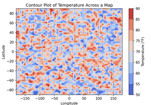
Imagine you have a contour plot of temperature across a map. Each contour line represents areas with the same temperature, like 50F, 60F, and so on. By looking at the plot, you can easily see where it is hotter or cooler across the map −
Contour Plot in Matplotlib
You can create contour plots in Matplotlib using the contour() function in the "matplotlib.pyplot" module. This function accepts X and Y coordinates as either 1D or 2D arrays, representing the grid on which the function "Z" is evaluated. "Z" is a 2D array containing the function values corresponding to the grid points defined by X and Y.
Let's start by drawing a basic contour plot.
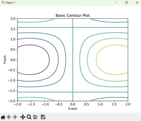
Example - Basic Contour Plot
A basic 3D contour in Matplotlib shows contour lines that connect points of equal value, representing the levels or "heights" of the data. Each contour line corresponds to a specific value, forming a map-like representation of the dataset.
In the following example, we are create a basic contour plot. We define the x and y coordinates for the grid, and then use a mathematical function to generate the z values. With these x, y, and z values, we create a contour plot using the contour() function −
import matplotlib.pyplot as plt
import numpy as np

# Generating data
x = np.linspace(-2, 2, 100)
y = np.linspace(-2, 2, 100)
X, Y = np.meshgrid(x, y)
Z = np.sin(X) * np.cos(Y)

# Creating contour plot
plt.contour(X, Y, Z)

# Adding labels and title
plt.xlabel('X-axis')
plt.ylabel('Y-axis')
plt.title('Basic Contour Plot')

# Displaying the plot
plt.show()
Output
Following is the output of the above code −
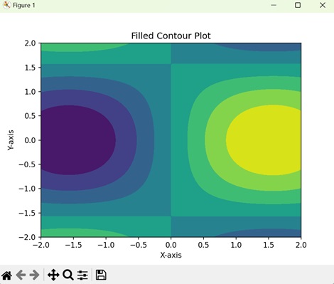
Example - Filled Contour Plot
In a filled contour plot in Matplotlib, instead of just showing contour lines, it fills in the areas between the lines with colors, creating a shaded representation of the data surface. Each color represents a different level or "height" of the data, allowing you to easily see the distribution within the dataset.
In here, we create a filled contour plot using the contourf() function, which colors the regions between contour lines −
import matplotlib.pyplot as plt
import numpy as np

# Generating data
x = np.linspace(-2, 2, 100)
y = np.linspace(-2, 2, 100)
X, Y = np.meshgrid(x, y)
Z = np.sin(X) * np.cos(Y)

# Creating a filled contour plot
plt.contourf(X, Y, Z)

# Adding labels and title
plt.xlabel('X-axis')
plt.ylabel('Y-axis')
plt.title('Filled Contour Plot')

# Displaying the plot
plt.show()
Output
On executing the above code we will get the following output −
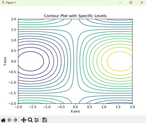
Example - Contour Plot with Specific Levels
In a contour plot with specific levels, you specify the levels at which you want the contours to be drawn. Each contour line connects points of equal value, representing different levels or "heights" of the data. This allows you to customize the visualization to highlight specific features or intervals within the dataset.
In this example, we customize the contour plot by specifying specific contour levels using Matplotlib. After generating the data and creating the contour plot, we use the levels parameter in the contour() function to define the contour levels −
import matplotlib.pyplot as plt
import numpy as np

# Generating data
x = np.linspace(-2, 2, 100)
y = np.linspace(-2, 2, 100)
X, Y = np.meshgrid(x, y)
Z = np.sin(X) * np.cos(Y)

# Defining contour levels
levels = np.linspace(-1, 1, 20)

# Creating contour plot with specific levels
plt.contour(X, Y, Z, levels=levels)

# Adding labels and title
plt.xlabel('X-axis')
plt.ylabel('Y-axis')
plt.title('Contour Plot with Specific Levels')

# Displaying the plot
plt.show()
Output
After executing the above code, we get the following output −
Example - Contour Plot with Colorbar
In Matplotlib, a contour plot with a colorbar displays contour lines to show points of equal value in the dataset, and a colorbar alongside the plot to indicate the correspondence between colors and data values. The colorbar acts as a visual guide, helping you to understand the range and distribution of data values represented by different colors in the plot.
Here, we create a contour plot with a colorbar using Matplotlib. After generating the data and creating the contour plot, we add a colorbar to the plot using the colorbar() function. This colorbar provides a visual representation of the z values corresponding to the contour plot −
import matplotlib.pyplot as plt
import numpy as np

# Generating data
x = np.linspace(-2, 2, 100)
y = np.linspace(-2, 2, 100)
X, Y = np.meshgrid(x, y)
Z = np.sin(X) * np.cos(Y)

# Creating a contour plot
contour = plt.contour(X, Y, Z)

# Adding colorbar
plt.colorbar(contour, label='Z-values')

# Adding labels and title
plt.xlabel('X-axis')
plt.ylabel('Y-axis')
plt.title('Contour Plot with Colorbar')

# Displaying the plot
plt.show()
Output
On executing the above code we will get the following output −
