- Tables, Graphs, Functions and Sequences
- Home
- Making a table and plotting points given a unit rate
- Graphing whole number functions
- Function tables with two-step rules
- Writing a function rule given a table of ordered pairs: One-step rules
- Graphing a line in quadrant 1
- Interpreting a line graph
- Finding outputs of a one-step function that models a real-world situation
- Finding outputs of a two-step function with decimals that models a real-world situation
- Writing and evaluating a function that models a real-world situation: Basic
- Graphing ordered pairs and writing an equation from a table of values in context
- Writing an equation and drawing its graph to model a real-world situation: Basic
- Identifying independent and dependent quantities from tables and graphs
- Finding the next terms of an arithmetic sequence with whole numbers
- Finding the next terms of a geometric sequence with whole numbers
- Finding patterns in shapes
Interpreting a line graph Online Quiz
Following quiz provides Multiple Choice Questions (MCQs) related to Interpreting a line graph. You will have to read all the given answers and click over the correct answer. If you are not sure about the answer then you can check the answer using Show Answer button. You can use Next Quiz button to check new set of questions in the quiz.

Answer : C
Explanation
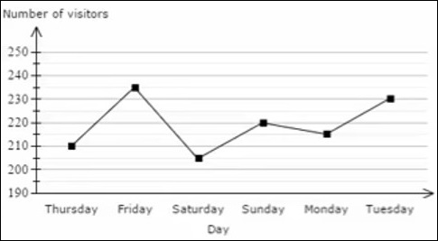
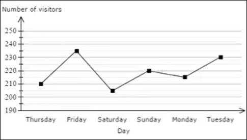
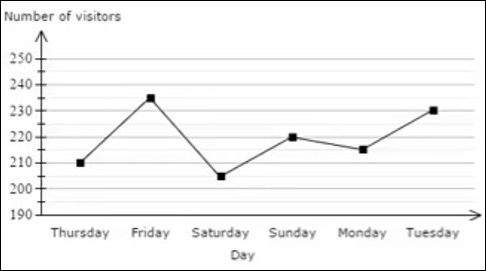
From the given graph, the weekday after which the number of visitors in a day started to increase for the second time is Saturday.
Answer : B
Explanation
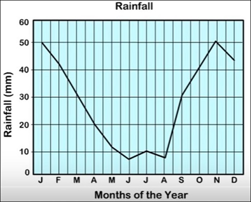
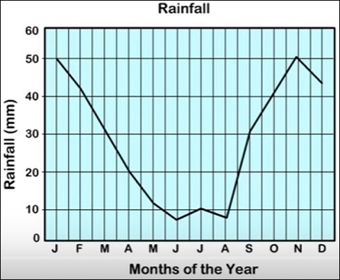
From the graph, the month after which the rainfall starting decreasing for the first time is January.
Answer : A
Explanation
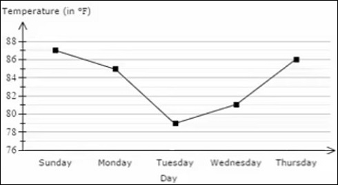
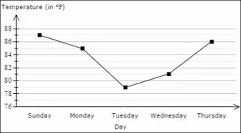
From the graph, the weekday when the noon temperature started to increase for the first time was Tuesday.
Answer : A
Explanation
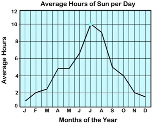
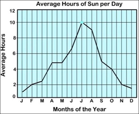
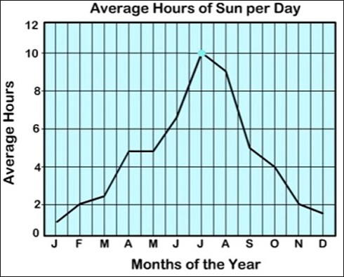
From the graph, the month in which there were the second least number of average hours of sun per day was January.
Answer : C
Explanation
From the graph, the weekday when there were the second least number of visitors in a day was Thursday.
Answer : B
Explanation
From the graph, the weekday that had the second least noon temperature for the five days was Wednesday.
Answer : D
Explanation
From the graph, the other month that had the same number of average hours of sun per day as February was November.
Answer : A
Explanation
From the graph, the month in which there were the most number of average hours of sun per day was July.
Answer : C
Explanation
From the graph, the month in which there was the second least rainfall was August.
Answer : B
Explanation
From the graph, the weekday when there were the greatest number of visitors in a day was Friday.