- Tables, Graphs, Functions and Sequences
- Home
- Making a table and plotting points given a unit rate
- Graphing whole number functions
- Function tables with two-step rules
- Writing a function rule given a table of ordered pairs: One-step rules
- Graphing a line in quadrant 1
- Interpreting a line graph
- Finding outputs of a one-step function that models a real-world situation
- Finding outputs of a two-step function with decimals that models a real-world situation
- Writing and evaluating a function that models a real-world situation: Basic
- Graphing ordered pairs and writing an equation from a table of values in context
- Writing an equation and drawing its graph to model a real-world situation: Basic
- Identifying independent and dependent quantities from tables and graphs
- Finding the next terms of an arithmetic sequence with whole numbers
- Finding the next terms of a geometric sequence with whole numbers
- Finding patterns in shapes
Interpreting a line graph
Introduction
A line graph is mostly used to show change over time as a series of data points connected by line segments on the coordinate plane. The line graph therefore helps to find the relationship between two data sets, with one data set always being dependent on the other set.
Line graphs are drawn such that the independent data values are on the x-axis and the dependent data values are on the y-axis. Line graphs are used to track changes over short and long periods of time or some independent variable.
Let's define the various parts of a line graph.
| S.No. | Part & Description |
|---|---|
| 1 | Title The title of the graph tells us what the graph is all about. |
| 2 | Labels The horizontal label across the bottom and the vertical label along the side tells us what kinds of data is being shown. |
| 3 | Scales The horizontal scale across the bottom and the vertical scale along the side tell us how much or how many. |
| 4 | Points The points or dots on the graph represents the (x,y) coordinates or ordered pairs. |
| 5 | Lines The line segments connecting the points give estimated values between th points. |
Uses of line graphs
Line graphs are useful in that they show data variables and trends clearly and help us make predictions about the results of data not yet included. They can also be used to show several dependent variables against one independent variable. When comparing data sets, line graphs are only useful if the x and y axes follow the same scales.
Interpreting line graphs
We interpret line graphs by studying and analysing data from line graphs. Interpreting the line graph data is
- Making sense of the given data
- Answering queries about the data
- Making predictions on trends,
- Finding value of one variable given the value of the other and so on.
Example 1
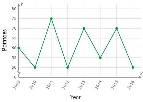
To monitor the health of her potato plants, Ms. Fiona recorded the number of potatoes that grow in her garden each year. In which year on the graph did the largest number of potatoes grow in Ms. Fiona's garden?
Solution
It is found from the graph above that the largest number of potatoes grew in the year 2011.
Example 2
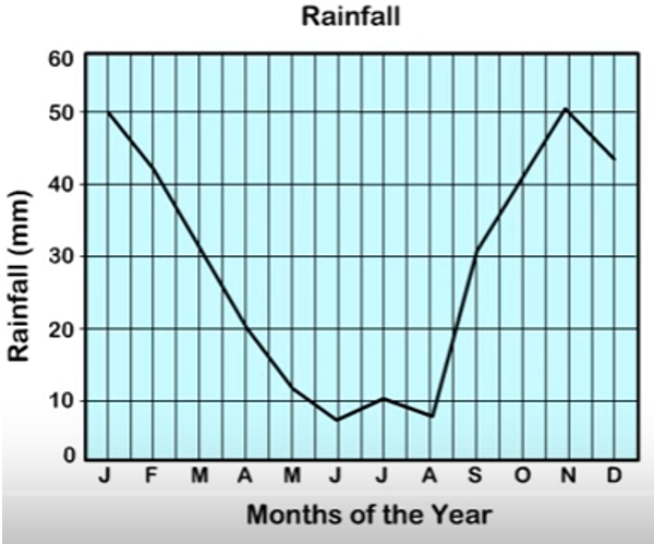
The graph below shows the rainfall over a period of 12 months. Find the month in which there was the second least rainfall.
Solution
From the graph, the month in which there was the second least rainfall was August.