- Python XlsxWriter - Home
- Python XlsxWriter - Overview
- Python XlsxWriter - Environment Setup
- Python XlsxWriter - Hello World
- Python XlsxWriter - Important classes
- Python XlsxWriter - Cell Notation & Ranges
- Python XlsxWriter - Defined Names
- Python XlsxWriter - Formula & Function
- Python XlsxWriter - Date and Time
- Python XlsxWriter - Tables
- Python XlsxWriter - Applying Filter
- Python XlsxWriter - Fonts & Colors
- Python XlsxWriter - Number Formats
- Python XlsxWriter - Border
- Python XlsxWriter - Hyperlinks
- Python XlsxWriter - Conditional Formatting
- Python XlsxWriter - Adding Charts
- Python XlsxWriter - Chart Formatting
- Python XlsxWriter - Chart Legends
- Python XlsxWriter - Bar Chart
- Python XlsxWriter - Line Chart
- Python XlsxWriter - Pie Chart
- Python XlsxWriter - Sparklines
- Python XlsxWriter - Data Validation
- Python XlsxWriter - Outlines & Grouping
- Python XlsxWriter - Freeze & Split Panes
- Python XlsxWriter - Hide/Protect Worksheet
- Python XlsxWriter - Textbox
- Python XlsxWriter - Insert Image
- Python XlsxWriter - Page Setup
- Python XlsxWriter - Header & Footer
- Python XlsxWriter - Cell Comments
- Python XlsxWriter - Working with Pandas
- Python XlsxWriter - VBA Macro
Python XlsxWriter - Chart Formatting
The default appearance of chart can be customized to make it more appealing, explanatory and user friendly. With XlsxWriter, we can do following enhancements to a Chart object −
Set and format chart title
Set the X and Y axis titles and other parameters
Configure the chart legends
Chat layout options
Setting borders and patterns
Title
You can set and configure the main title of a chart object by calling its set_title() method. Various parameters that can be are as follows −
Name − Set the name (title) for the chart to be displayed above the chart. The name property is optional. The default is to have no chart title.
name_font − Set the font properties for the chart title.
Overlay − Allow the title to be overlaid on the chart.
Layout − Set the (x, y) position of the title in chart relative units.
None − Excel adds an automatic chart title. The none option turns this default title off. It also turns off all other set_title() options.
X and Y axis
The two methods set_x_axis() and set_y_axis() are used to axis titles, the name_font to be used for the title text, the num_font to be used for numbers displayed on the X and Y axis.
name − Set the title or caption for the axis.
name_font − Set the font properties for the axis title.
num_font − Set the font properties for the axis numbers.
num_format − Set the number format for the axis.
major_gridlines − Configure the major gridlines for the axis.
display_units − Set the display units for the axis.
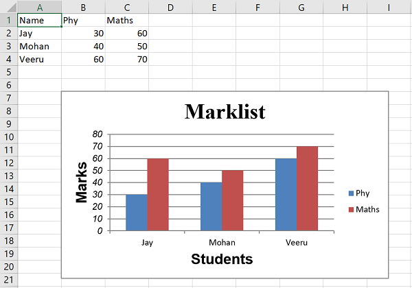
In the previous example, where the data of marklist has been shown in the form of a column chart, we set up the chart formatting options such as the chart title and X as well as Y axis captions and their other display properties as follows −
chart1.set_x_axis(
   {'name': 'Students', 'name_font':{'name':'Arial', 'size':16, 'bold':True},})
chart1.set_y_axis(
   {
      'name': 'Marks', 'name_font':
      {'name':'Arial', 'size':16, 'bold':True}, 'num_font':{'name':'Arial', 'italic':True}
   }
)
Example
Add the above snippet in the complete code. It now looks as given below −
import xlsxwriter

wb = xlsxwriter.Workbook('hello.xlsx')
worksheet = wb.add_worksheet()
chart1 = wb.add_chart({'type': 'column'})

# Add the worksheet data that the charts will refer to.
headings = ['Name', 'Phy', 'Maths']

data = [
   ["Jay", 30, 60],
   ["Mohan", 40, 50],
   ["Veeru", 60, 70],
]

worksheet.write_row(0,0, headings)
worksheet.write_row(1,0, data[0])
worksheet.write_row(2,0, data[1])
worksheet.write_row(3,0, data[2])

chart1.add_series({
   'name': '=Sheet1!$B$1',
   'categories': '=Sheet1!$A$2:$A$4',
   'values': '=Sheet1!$B$2:$B$4',
})

chart1.add_series({
   'name': ['Sheet1', 0, 2],
   'categories': ['Sheet1', 1, 0, 3, 0],
   'values': ['Sheet1', 1, 2, 3, 2],
})
chart1.set_title ({'name': 'Marklist',
   'name_font': {'name':'Times New Roman', 'size':24}
})
chart1.set_x_axis({'name': 'Students',
   'name_font': {'name':'Arial', 'size':16, 'bold':True},
})
chart1.set_y_axis({'name': 'Marks',
   'name_font':{'name':'Arial', 'size':16, 'bold':True},
   'num_font':{'name':'Arial', 'italic':True}
})
worksheet.insert_chart('B7', chart1)

wb.close()
Output
The chart shows the title and axes captions as follows −