- Silverlight - Home
- Silverlight - Overview
- Silverlight - Environment Setup
- Silverlight - Getting Started
- Silverlight - XAML Overview
- Silverlight - Project Types
- Silverlight - Fixed Layouts
- Silverlight - Dynamic Layout
- Constrained vs. Unconstrained
- Silverlight - CSS
- Silverlight - Controls
- Silverlight - Buttons
- Silverlight - Content Model
- Silverlight - ListBox
- Silverlight - Templates
- Silverlight - Visual State
- Silverlight - Data Binding
- Silverlight - Browser Integration
- Silverlight - Out-of-Browser
- Silverlight - Applications, Resources
- Silverlight - File Access
- Silverlight - View Model
- Silverlight - Input Handling
- Silverlight - Isolated Storage
- Silverlight - Text
- Silverlight - Animation
- Silverlight - Video and Audio
- Silverlight - Printing
Silverlight - Quick Guide
Silverlight - Overview
Welcome to Silverlight tutorials. Silverlight is a platform for building rich internet applications. This tutorial will explain the concepts behind Silverlight, and will show you how to build it into your web applications. After completing it, you will have a better understanding of Silverlight applications using XAML and C#.
What is Silverlight
Silverlight is a browser plug-in, designed for building rich internet applications; applications that run in the browser like normal web applications, but which try to advance the user interface beyond where HTML can go. For example,
Silverlight is a framework for building rich, browser-hosted applications that run on a variety of operating systems.
It can also co-exist with HTML. Therefore, Silverlight can enhance an existing web application.
Silverlight works its magic through a browser plug-in. When you surf to a web page that includes Silverlight content, this browser plug-in runs, executes the code, and renders that content in a specifically designated region of the page.
The important part is that the Silverlight plug-in provides a richer environment than the traditional blend of HTML and JavaScript that powers ordinary web pages.
You can create Silverlight pages that play video, have hardware accelerated 3D graphics, and use vector animations.
From a developer's perspective, the most interesting feature of Silverlight is that it brings the .NET Framework programming model to the client side of your web applications.
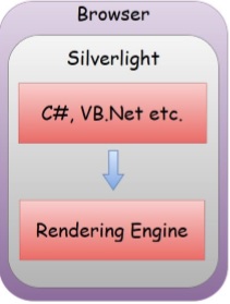
Silverlight is designed to run inside the web pages, so it can run as a browser plugin. It provides graphical services for rendering bitmaps, vector graphics, highdefinition video, and animations.
You can write in C#, or Visual Basic .NET, and use the .NET Framework class library features on the code that runs in the web browser.
Silverlight user interfaces, themselves use a very similar model to Windows Presentation Foundation(WPF), which is the user interface framework in the full desktop .NET Framework.
If you know WPF, Silverlight is easy to learn. Silverlight is a much smaller download than .NET. It is roughly a tenth of the size, so only a subset of the class library is present, and various implications have been made to WPF's model.
Despite the reduced scale, experienced .NET developers will feel instantly at home in Silverlight.
Platforms and Browsers
The platforms and browsers supported by Silverlight are −
Windows
Silverlight supports Windows, as you would expect of a Microsoft product. It requires Windows XP Service Pack 2 at least or recent versions of Windows.
The older versions are not fully supported. For example, Silverlight will not run at all on Windows ME, and Windows 2000 has limited support.
As for the browsers, Silverlight supports Microsoft's own Internet Explorer, of course, and it supports Firefox, and Google Chrome version 4.
Broadly, Silverlight supports the common web browser plug-in API. It works in a wider range of browsers than the officially supported list.
Mac
Silverlight supports Mac OS10, although Silverlight version 2 or later only runs on Intel-based Macs.
On modern Macs, both Firefox and Safari are supported.
Linux
Microsoft's own Silverlight plug-in does not run on Linux, but the Mono open source project has an offshoot called Moonlight, which is a Silverlight compatible plug-in that runs on Linux.
Moonlight runs in Firefox, and interestingly has always been able to run in Standalone mode.
One of the reasons the Mono project decided to build Moonlight in the first place is that they thought Silverlight would be a useful technology for building user interface widgets that run on the desktop.
Silverlight - Environment Setup
Microsoft provides two important tools for Silverlight application development. They are −
- Visual Studio
- Expression Blend
Currently, both tools can create Silverlight projects, but the fact is that Visual Studio is used more by developers while Blend is still used more often by designers. Microsoft provides a free version of visual studio, which can be downloaded from https://www.visualstudio.com. For this tutorial, we will be mostly using Visual Studio.
Installation
Step 1 − Once Silverlight is downloaded, run the installer. The following dialog box will be displayed.
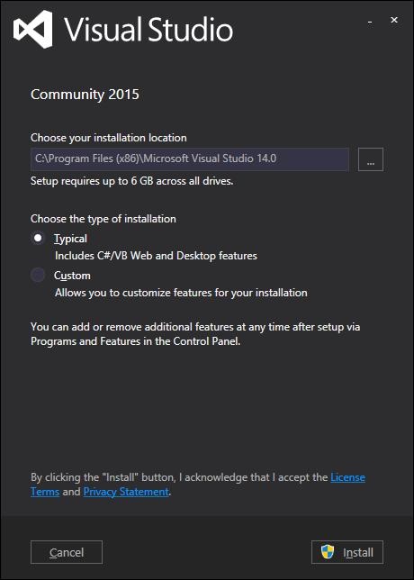
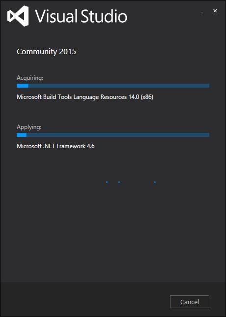
Step 2 − Click the Install button and it will start the installation process.
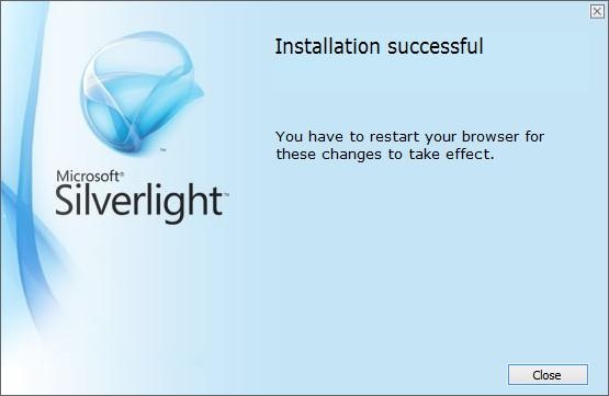
Step 3 − Once Sivelight is installed successfully, you will see the following dialog box.
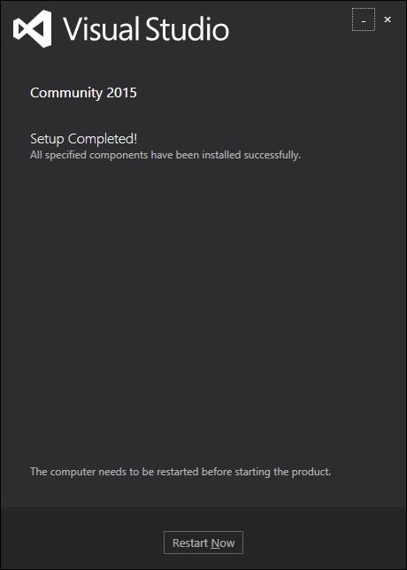
Step 4 − Close this dialog box and restart your computer if required.
Step 5 − Now open Visual studio from the Start menu, which will open the dialog box shown below. It will take some time for preparation, while staring for the first time.
Step 6 − Next, you will see the main window of Visual Studio.
Step 7 − Now, to start with Silverlight application, you also need to install Silverlight Developer tool on your machine. Download and install the latest Silverlight Developer tool from http://silverlight.dlservice.microsoft.com/download/8/E/7/8E7D9B4B-2088-4AED8356-20E65BE3EC91/40728.00/Silverlight_Developer_x64.exe
Step 8 − Click Install. It will take some time for installation.
Step 9 − Once the installation is complete, you will see the following message.
Step 10 − Now you are ready to build your first Silverlight application. Click Close.
Silverlight - Getting Started
In this chapter, we will look at a working example of Silverlight. We need two things −
First, we require a web page. Silverlight is intended for rich internet applications, It is designed to run inside of a web browser as part of a web page. The page needs to incorporate a suitable tag to load the Silverlight plug-in. It can also include the logic to detect whether Silverlight is installed, and can provide some fallback user interface, when it is absent.
The second thing we need is the Silverlight content itself. This tutorial will focus on the .NET programming model for Silverlight. We will create a compiled Silverlight application containing a mixture of XAML, the mockup language we use to define Silverlight user interfaces, and .NET code written in C#.
Create a Web-page
The easiest way to start using Silverlight is to create an ordinary website with HTML pages and no server side code. Let us look at a very simple example.
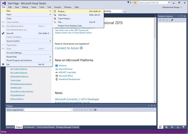
Step 1 − Open Visual Studio. Click the File menu, point to New and then click Project.
Step 2 − A New Project dialog box will open. Under Templates, select Visual C# and then click Silverlight. In the right pane, choose Silverlight Application.
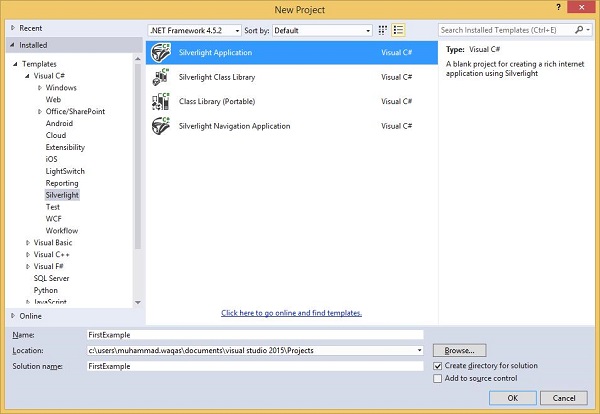
Enter a project name and a location on your hard drive to save your project and then click OK to create the project.
The Silverlight project itself is just going to build the Silverlight content, and that content is just one asset amongst many that are going to make up the whole web application.
Click OK.
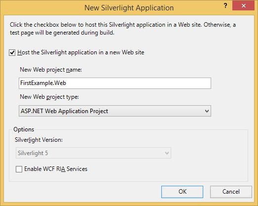
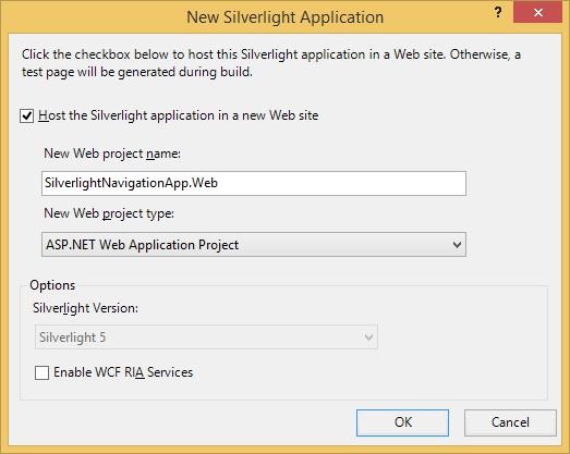
Step 3 − Check the Host the Silverlight application checkbox. The default is an ASP.NET Web Application Project.
Step 4 − MS-Visual Studio has created two projects, the Silverlight project and an ASP.NET web application. Now, we do need an ASP.NET web application. You can see this in the Solution Explorer window as shown below.
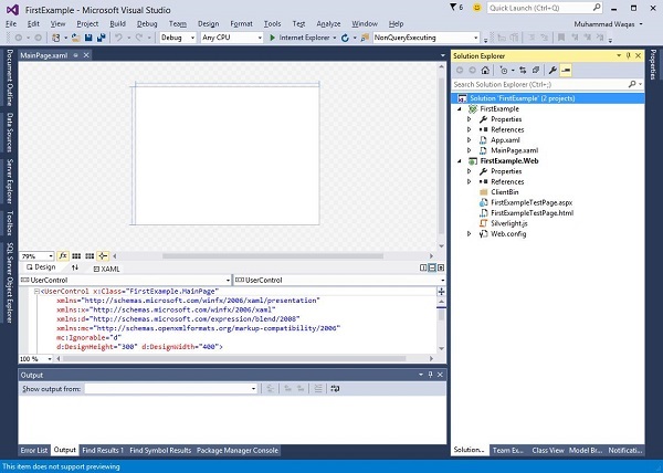
Anything that can serve up the content via HTTP will do but this is Visual Studio, and it understands the ASP.NET web technology, so that is what it gives us.
To demonstrate that Silverlight does not depend on any particular server-side technology, let us delete this .aspx file, leaving just the plain static HTML file.
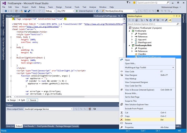
Step 5 − Right-click FirstExampleTestpage.aspx. From the list of options, click Delete.
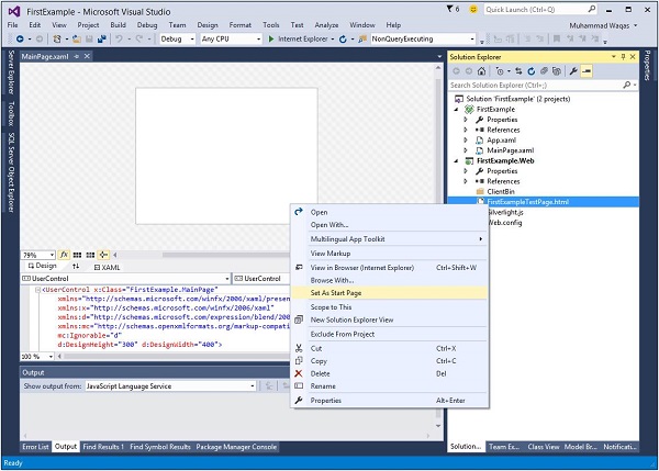
Step 6 − Set FirstExampleTestPage.html as the Start page.
The MainPage.xaml file defines the user interface for Silverlight content. Either you can write XAML code directly or you can also use Toolbox to drag and drop different UI elements.
Step 7 − Given below is a simple code in MainPage.xaml in which a Button and a TextBlock are defined inside the StackPanel.
<UserControl x:Class = "FirstExample.MainPage"
   xmlns = "http://schemas.microsoft.com/winfx/2006/xaml/presentation"
   xmlns:x = "http://schemas.microsoft.com/winfx/2006/xaml"
   xmlns:d = "http://schemas.microsoft.com/expression/blend/2008"
   xmlns:mc = "http://schemas.openxmlformats.org/markup-compatibility/2006"
   mc:Ignorable = "d"
   d:DesignHeight = "300" d:DesignWidth = "400">

   <Grid x:Name = "LayoutRoot" Background = "White">
      <StackPanel>
         <TextBlock x:Name = "TextMessage"
            Text = "Hello World!"
            Margin = "5">
         </TextBlock>

         <Button x:Name = "ClickMe"
            Click = "ClickMe_Click"
            Content = "Click Me!"
            Margin = "5">
         </Button>

      </StackPanel>
   </Grid>

</UserControl>
Step 8 − This example assumes that you have created an event-handling method named ClickMe_Click. Here is what it looks like in the MainPage.xaml.cs file.
using System.Windows;
using System.Windows.Controls;
namespace FirstExample {
public partial class MainPage : UserControl {
public MainPage() {
InitializeComponent();
}
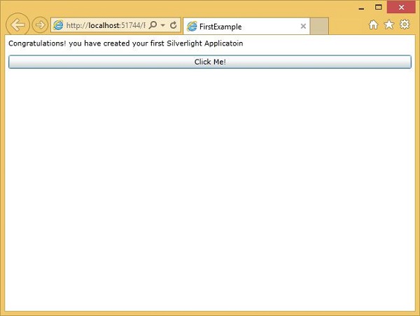
private void ClickMe_Click(object sender, RoutedEventArgs e) {
TextMessage.Text = "Congratulations! you have created your first Silverlight Applicatoin";
}
}
}
Step 9 − A Silverlight application can be run on any installed browsers.
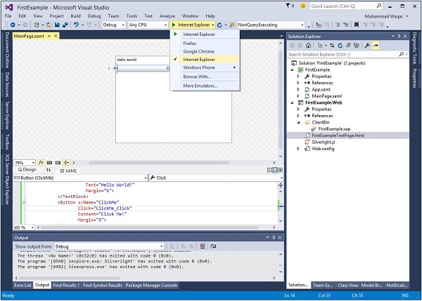
Step 10 − When the above code is compiled and executed, you will see the following webpage.
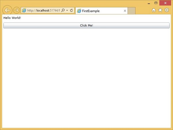
Step 11 − Now, when you click the Click Me button, it will update the text in the TextBlock as shown below.
We recommend you to execute the above example by adding some more UI elements.
Silverlight - XAML Overview
One of the first things you will encounter when working with Silverlight is XAML. XAML Stands for Extensible Application Markup Language. It is a simple and declarative language based on XML.
In XAML, it is very easy to create, initialize, and set properties of an object with hierarchical relations.
It is mainly used for designing GUI.
It can be used for other purposes as well, for example, to declare workflow in a Workflow foundation.
Basic Syntax
When you create a new Silverlight project, you will see some of the XAML code by default in MainPage.xaml as shown below.
<UserControl x:Class = "FirstExample.MainPage"
   xmlns = "http://schemas.microsoft.com/winfx/2006/xaml/presentation"
   xmlns:x = "http://schemas.microsoft.com/winfx/2006/xaml"
   xmlns:d = "http://schemas.microsoft.com/expression/blend/2008"
   xmlns:mc = "http://schemas.openxmlformats.org/markup-compatibility/2006"
   mc:Ignorable = "d"
   d:DesignHeight = "300" d:DesignWidth = "400">

   <Grid x:Name = "LayoutRoot" Background = "White">

   </Grid>

</UserControl>
You can see that the XAML file given above mentions different kinds of information; all of them are briefly described in the table given below.
| Information | Description |
|---|---|
| <UserControl | Provides the base class for defining a new control that encapsulates the existing controls and provides its own logic. |
| x:Class = "FirstExample.MainPage" | It is a partial class declaration, which connects the markup to that partial class code behind, defined in it. |
| xmlns = "http://schemas.microsoft.com /winfx/2006/xaml/presentation" | Maps the default XAML namespace for Silverlight client/framework. |
| xmlns:x = "http://schemas.microsoft.c om/winfx/2006/xaml" | XAML namespace for XAML language, which maps it to x: prefix. |
| xmlns:d = "http://schemas.microsoft.com /expression/blend/2008" | XAML namespace is intended for designer support, specifically designer support in the XAML design surfaces of Microsoft Visual Studio and Microsoft Expression Blend. |
| xmlns:mc = "http://schemas.openxmlforma ts.org/markup-compatibility/2006" | Indicates and supports a markup compatibility mode for reading XAML. |
| > | End of object element of the root. |
| <Grid></Grid> | These are the starting and closing tags of an empty grid object. |
| </UserControl> | Closing the object element. |
Syntax rules for XAML is almost similar to those of XML. If you look at an XAML document, you will notice that actually it is a valid XML file. Its vice versa is not true, because in XML, the value of the attributes must be a string while in XAML it can be a different object which is known as Property element syntax.
Syntax of an Object element starts with a left angle bracket (<) followed by the name of an object, e.g. Button.
The Properties and attributes of that object element are defined.
The Object element must be closed by a forward slash (/) followed immediately by a right angle bracket (>).
Example of a simple object with no child element is shown below.
<Button/>
Example of an object element with some attributes −
<Button Content = "Click Me" Height = "30" Width = "60"/>
Example of an alternate syntax to define the properties (Property element syntax) −
<Button>
   <Button.Content>Click Me</Button.Content>
   <Button.Height>30</Button.Height>
   <Button.Width>60</Button.Width>
</Button>
Example of an Object with Child Element: StackPanel contains Textblock as child element.
<StackPanel Orientation = "Horizontal">
   <TextBlock Text = "Hello"/>
</StackPanel/>
Why XAML in Silverlight
XAML was not originally invented for Silverlight. It came from WPF, the Windows Presentation Foundation. Silverlight is often described as being a subset of WPF. This is not strictly true, as Silverlight can do some things that WPF cannot. Even where the functionality overlaps, the two are slightly different in the details.
It is more accurate to say that WPF and Silverlight are very similar in many respects. Despite the differences, it is still informative to look at the XAML feature Silverlight has borrowed from WPF. For example, Silverlight offers graphics primitives for bitmaps and scalable shapes.
It also provides elements for rendering video and audio.
It has simple formatted text support, and you can animate any element. If you know WPF, this feature set will be familiar to you.
One important point, you cannot take WPF XAML and use it in Silverlight.
Although there are similarities, you will also find numerous small differences.
XAML & Code Behind
XAML defines the appearance and structure of a user interface. However, if you want your application to do anything useful when the user interacts with it, you will need some code.
Each XAML file is usually associated with a source code file, which we refer to as the code behind. Various Microsoft Frameworks use this term.
The code behind will usually need to use elements defined in the XAML, either to retrieve information about user input, or to show information to the user.
In the XAML code given below, TextBlock and Button are defined. By default, when the application is run, it will show a text Hello World! on the web page and a button.
<UserControl x:Class = "FirstExample.MainPage"
   xmlns = "http://schemas.microsoft.com/winfx/2006/xaml/presentation"
   xmlns:x = "http://schemas.microsoft.com/winfx/2006/xaml"
   xmlns:d = "http://schemas.microsoft.com/expression/blend/2008"
   xmlns:mc = "http://schemas.openxmlformats.org/markup-compatibility/2006"
   mc:Ignorable = "d"
   d:DesignHeight = "300" d:DesignWidth = "400">

   <Grid x:Name = "LayoutRoot" Background = "White">
      <StackPanel>
         <TextBlock x:Name = "TextMessage"
            Text = "Hello World!"
            Margin = "5">
         </TextBlock>

         <Button x:Name = "ClickMe"
            Click = "ClickMe_Click"
            Content = "Click Me!"
            Margin = "5">
         </Button>

      </StackPanel>
   </Grid>
</UserControl>
The code behind can access any element that is named with the x:Name directive.
Named elements become available through fields in the code behind, allowing the code to access these objects and their members in the usual way.
The x:Prefix signifies that the name is not a normal property.
x:Name is a special signal to the XAML compiler that we want to have access to this object in the code behind.
Given below is the button-click event implementation in which the TextBlock text is updated.
using System.Windows;
using System.Windows.Controls;

namespace FirstExample {

   public partial class MainPage : UserControl {

      public MainPage() {
         InitializeComponent();
      }

      private void ClickMe_Click(object sender, RoutedEventArgs e) {
         TextMessage.Text = "Congratulations! you have created your first Silverlight Applicatoin";
      }
   }
}
XAML is not the only way to design the UI elements. It is upto you to either declare objects in XAML or declare/write in a code.
XAML is optional, but despite this, it is the heart of Silverlight design.
The goal with XAML coding is to enable the visual designers to create the user interface elements directly. Therefore, Silverlight aims to make it possible to control all the visual aspects of the user interface from mark-up.
Silverlight - Project Types
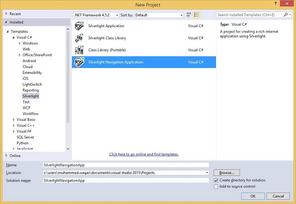
If you create a new project in Visual Studio, you will see four types of project in the right pane of the dialog box. They are −
- Silverlight Application
- Silverlight Class Library
- Class Library (Portable)
- Silverlight Navigation Application
The first two, Silverlight Application and Silverlight Class Library, are straightforward enough. These are analogous to executables in DLLs in the world of classic Windows applications. Both build DLLs because of how Silverlight applications are deployed.
Conceptually, a Silverlight Application project builds a program, which can be run, while the Class Library project builds a library designed to be incorporated into other applications.
You can build a class library if you are planning to build multiple applications, and want to reuse the common code. If you are planning to sell the controls that other people will use in their applications, again a library is the thing to build.
The other project types are a little less obvious, so we will look at those in detail later in this chapter.
Silverlight Web Applications
Silverlight applications are downloaded from the web, so you will normally have a web project associated with the Silverlight project. There are a couple of features of Visual Studio, designed to manage the relationship between these projects.
Let us have a look at a simple example of Silverlight Application project again.
Step 1 − Open Visual Studio. Click the File menu, point to New and then click Project.
Step 2 − A New Project dialog box will open. Under Templates, select Visual C# and then click Silverlight. In the right pane, choose Silverlight Application.
Enter a project name and a location on your hard drive to save your project.
The Silverlight project itself is just going to build the Silverlight content, and that content is just one asset amongst many that are going to make up the whole web application.
Click OK.
Step 3 − Check the Host the Silverlight application checkbox. The default is an ASP.NET Web Application Project.
Step 4 − MS-Visual Studio has created two projects, the Silverlight project and an ASP.NET web application. Now, we need an ASP.NET web application. You can see this in the Solution Explorer window as shown below.
Anything that can serve up the content via HTTP will do but this is Visual Studio, and it understands the ASP.NET web technology, so that is what it gives us.
To demonstrate that Silverlight does not depend on any particular server-side technology, let us delete this .aspx file, leaving just the plain static HTML file.
Step 5 − Right-click FirstExampleTestpage.aspx. From the list of options, click Delete.
Step 6 − Set FirstExampleTestPage.html as the Start page.
The MainPage.xaml file defines the user interface for Silverlight content. Either you can write XAML code directly or you can also use Toolbox to drag and drop different UI elements.
Step 7 − Given below is a simple code in MainPage.xaml in which a Button and a TextBlock are defined inside the StackPanel.
<UserControl x:Class = "FirstExample.MainPage"
   xmlns = "http://schemas.microsoft.com/winfx/2006/xaml/presentation"
   xmlns:x = "http://schemas.microsoft.com/winfx/2006/xaml"
   xmlns:d = "http://schemas.microsoft.com/expression/blend/2008"
   xmlns:mc = "http://schemas.openxmlformats.org/markup-compatibility/2006"
   mc:Ignorable = "d"
   d:DesignHeight = "300" d:DesignWidth = "400">

   <Grid x:Name = "LayoutRoot" Background = "White">
      <StackPanel>
         <TextBlock x:Name = "TextMessage" Text = "Hello World!"
            Margin = "5"> </TextBlock>
         <Button x:Name = "ClickMe" Click = "ClickMe_Click" Content = "Click
            Me!"  Margin = "5"> </Button>
      </StackPanel>
   </Grid>

</UserControl>
Step 8 − This example assumes that you have created an event-handling method named ClickMe_Click. Here is what it looks like in the MainPage.xaml.cs file.
using System.Windows;
using System.Windows.Controls;

namespace FirstExample {

   public partial class MainPage : UserControl {

      public MainPage() {
         InitializeComponent();
      }

      private void ClickMe_Click(object sender, RoutedEventArgs e) {
         TextMessage.Text = "Congratulations! you have created your
            first Silverlight Applicatoin";
      }
   }
}
Step 9 − A Silverlight application can be run on any installed browsers.
Step 10 − When the above code is compiled and executed, you will see the following webpage.
Silverlight Navigation Application
The Silverlight Navigation Application template builds a project similar to an ordinary Silverlight app. There is nothing fundamentally different about the two project types. The Navigation template just includes some additional code you could easily add yourself. As the name suggests, it supports web-like navigation within the Silverlight application.
Let us create a Navigation application.
Step 1 − Select Silverlight Navigation Application from the right pane in the New Project dialog box.
Step 2 − Follow the settings as you have done for the Silverlight Web Application.
Step 3 − Click the OK button. A window will open as shown below.
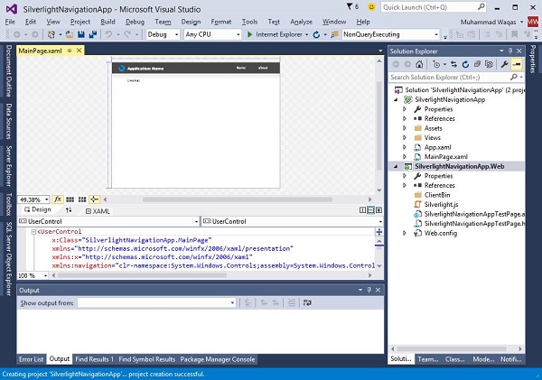
These usually have an associated web project, so we will have one of those. It creates two projects as described before, but as you can see, the default user interface looks a bit less blank.
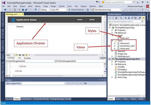
Step 4 − It provides an Application Chrome, including a Navigation bar. The solution contains a few extra files. This Styles file defines the look and feel for the Navigation bar. In this Views folder, we see a couple of pages, and also a window for showing errors.
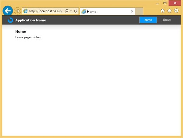
As you can see, when you run the application, it shows a Home page with some placeholder content.
Step 5 − When you click the About button, it will navigate to the About page.
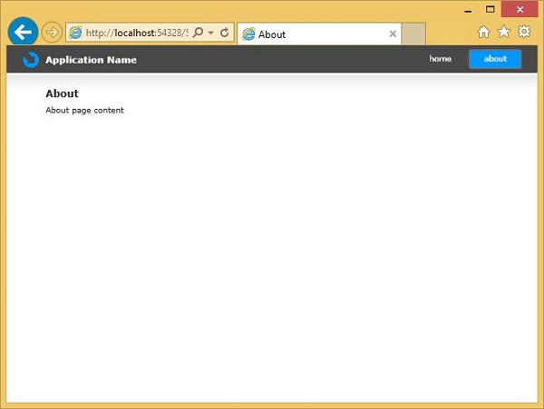
The important part is that you can then use the browser Back and Forward buttons to retrace the steps.
Normally when you do that, the web browser goes from one web page to another, but here it does not. The Silverlight application does not actually unload; it stays running, and just shows different content.
Therefore, from the browser's point of view, it is actually all on one web page. Silverlight plays some tricks with the navigation buttons to ensure that the web page does not unload as we navigate.
Silverlight - Fixed Layouts
Layout of controls is very important and critical for application usability. It is used to arrange a group of GUI elements in your application. There are certain important things to consider while selecting layout panels. They are −
- Positions of the child elements.
- Sizes of the child elements.
- Layering of overlapping child elements on top of each other.
A fixed pixel arrangement of controls does not work if the application has been used on different screen resolutions. XAML provides a rich set of built-in layout panels to arrange the GUI elements in an appropriate way.
We will start by looking at simple fixed layouts. Then we will look at the Dynamic layout scenarios, which Silverlight has designed to support. We will see the layout-related properties and concepts that permeate all user interface elements.
Fixed Layout
The simplest kind of layout is offered by the Canvas element. The Canvas panel is the basic layout panel in which the child elements can be positioned explicitly using the coordinates that are relative to any side of the Canvas such as left, right, top and bottom.
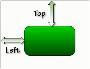
Typically, the Canvas is used for 2D graphic elements (such as Ellipse, Rectangle etc.). It is not used for UI elements because specifying absolute coordinates give trouble when you resize, localize or scale your XAML application.
Given below are the commonly used properties of Canvas class.
| Sr. No. | Property & Description |
|---|---|
| 1 | Background Gets or sets a Brush that fills the panel content area. (Inherited from Panel) |
| 2 | Children Gets a UIElementCollection of child elements of this Panel. (Inherited from Panel.) |
| 3 | Height Gets or sets the suggested height of the element. (Inherited from FrameworkElement.) |
| 4 | ItemHeight Gets or sets a value that specifies the height of all items that are contained within a WrapPanel. |
| 5 | ItemWidth Gets or sets a value that specifies the width of all items that are contained within a WrapPanel. |
| 6 | LogicalChildren Gets an enumerator that can iterate the logical child elements of this Panel element. (Inherited from Panel.) |
| 7 | LogicalOrientation The Orientation of the panel, if the panel supports layout in only a single dimension. (Inherited from Panel.) |
| 8 | LeftProperty Identifies the Canvas.Left XAML attached property. |
| 9 | Margin Gets or sets the outer margin of an element. (Inherited from FrameworkElement.) |
| 10 | Name Gets or sets the identifying name of the element. The name provides a reference so that code-behind, such as event handler code, can refer to a markup element after it is constructed during processing by a XAML processor. (Inherited from FrameworkElement.) |
| 11 | Orientation Gets or sets a value that specifies the dimension in which child content is arranged. |
| 12 | Parent Gets the logical parent element of this element. (Inherited from FrameworkElement.) |
| 13 | Resources Gets or sets the locally-defined resource dictionary. (Inherited from FrameworkElement.) |
| 14 | Style Gets or sets the style used by this element when it is rendered. (Inherited from FrameworkElement.) |
| 15 | TopProperty Identifies the Canvas.Top XAML attached property. |
| 16 | Width Gets or sets the width of the element. (Inherited from FrameworkElement.) |
| 17 | ZIndexProperty Identifies the Canvas.ZIndex XAML attached property. |
Given below are the commonly used methods of Canvas.
| Sr. No. | Method & Description |
|---|---|
| 1 | GetLeft Gets the value of the Canvas.Left XAML attached property for the target element. |
| 2 | GetTop Gets the value of the Canvas.Top XAML attached property for the target element. |
| 3 | GetZIndex Gets the value of the Canvas.ZIndex XAML attached property for the target element. |
| 4 | SetLeft Sets the value of the Canvas.Left XAML attached property for a target element. |
| 5 | SetTop Sets the value of the Canvas.Top XAML attached property for a target element. |
| 6 | SetZIndex Sets the value of the Canvas.ZIndex XAML attached property for a target element. |
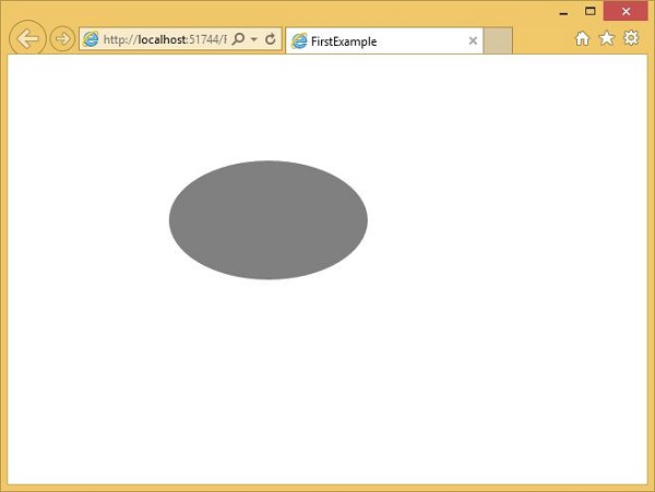
The following example shows how to add child elements into a Canvas. Below is the XAML implementation in which an Ellipse is created inside a Canvas with different offset properties.
<UserControl x:Class = "FirstExample.MainPage"
   xmlns = "http://schemas.microsoft.com/winfx/2006/xaml/presentation"
   xmlns:x = "http://schemas.microsoft.com/winfx/2006/xaml"
   xmlns:d = "http://schemas.microsoft.com/expression/blend/2008"
   xmlns:mc = "http://schemas.openxmlformats.org/markup-compatibility/2006"
   mc:Ignorable = "d"
   d:DesignHeight = "300" d:DesignWidth = "400">

   <Grid x:Name = "LayoutRoot" Background = "White">
      <Canvas Width = "380" Height = "280" >
         <Ellipse Canvas.Left = "30" Canvas.Top = "30"
            Fill = "Gray" Width = "200" Height = "120" />
      </Canvas>
   </Grid>

</UserControl>
When the above code is compiled and executed, you will see the following output.
Silverlight - Dynamic Layout
The Canvas is the least interesting of all of the Silverlight's Layout panels. The other panels enable Dynamic Layouts, meaning that the layouts can adapt as the number of displayed items changes, or the size of the displayed information varies, or if the amount of space available to the application changes because the user has resized the browser.
Silverlight offers two panels with Dynamic Layout strategies.
StackPanel − which arranges elements in a vertical or horizontal stack.
Grid − which provides a flexible grid-like, or table-like layout system.
Stack Panel
Stack panel is a simple and useful layout panel in XAML. In Stack Panel, the child elements can be arranged in a single line either horizontally or vertically based on their orientation property. It is often used whenever any kind of list needs to be created. ItemsControls use stack panels. Menu, ListBox and ComboBox are their default internal layout panel.
Given below are the commonly used properties of StackPanel.
| Sr. No. | Property & Description |
|---|---|
| 1 | Background Gets or sets a Brush that fills the panel content area. (Inherited from Panel) |
| 2 | Children Gets a UIElementCollection of child elements of this Panel. (Inherited from Panel.) |
| 3 | Height Gets or sets the suggested height of the element. (Inherited from FrameworkElement.) |
| 4 | ItemHeight Gets or sets a value that specifies the height of all items that are contained within a WrapPanel. |
| 5 | ItemWidth Gets or sets a value that specifies the width of all items that are contained within a WrapPanel. |
| 6 | LogicalChildren Gets an enumerator that can iterate the logical child elements of this Panel element. (Inherited from Panel.) |
| 7 | LogicalOrientation The Orientation of the panel, if the panel supports layout in only a single dimension. (Inherited from Panel.) |
| 8 | Margin Gets or sets the outer margin of an element. (Inherited from FrameworkElement.) |
| 9 | Name Gets or sets the identifying name of the element. The name provides a reference so that code-behind, such as event handler code, can refer to a markup element after it is constructed during processing by a XAML processor. (Inherited from FrameworkElement.) |
| 10 | Orientation Gets or sets a value that specifies the dimension in which child content is arranged. |
| 11 | Parent Gets the logical parent element of this element. (Inherited from FrameworkElement.) |
| 12 | Resources Gets or sets the locally-defined resource dictionary. (Inherited from FrameworkElement.) |
| 13 | Style Gets or sets the style used by this element when it is rendered. (Inherited from FrameworkElement.) |
| 14 | Width Gets or sets the width of the element. (Inherited from FrameworkElement.) |
The following example shows how to add child elements into a StackPanel. Given below is the XAML implementation in which Buttons are created inside a StackPanel with some properties.
<UserControl x:Class = "DynamicLayout.MainPage"
   xmlns = "http://schemas.microsoft.com/winfx/2006/xaml/presentation"
   xmlns:x = "http://schemas.microsoft.com/winfx/2006/xaml"
   xmlns:d = "http://schemas.microsoft.com/expression/blend/2008"
   xmlns:mc = "http://schemas.openxmlformats.org/markup-compatibility/2006"
   mc:Ignorable = "d"
   d:DesignHeight = "300" d:DesignWidth = "400">

   <Grid x:Name = "LayoutRoot" Background = "White">
      <StackPanel>
         <Button x:Name = "button" Content = "Button" Margin = "10" />
         <Button x:Name = "button1" Content = "Button" Margin = "10"/>
         <Button x:Name = "button2" Content = "Button" Margin = "10"/>
         <Button x:Name = "button3" Content = "Button" Margin = "10"/>
      </StackPanel>
   </Grid>

</UserControl>
When the above code is compiled and executed, you will see the following output.
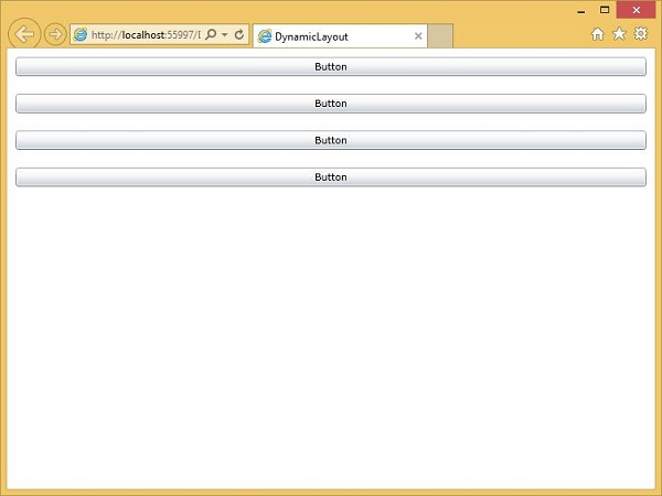
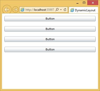
The StackPanel tries to arrange for each element to have as much space as it requires in the direction of stacking.
Now if you resize the browser, you will see that the width of the buttons have also changed.
Grid
Grid panel provides a flexible area, which consists of rows and columns. In Grid, the child elements can be arranged in tabular form. An element can be added to any specific row and column by using Grid.Row and Grid.Column properties. By default, the Grid panel is created with one row and one column. Multiple rows and columns are created by RowDefinitions and ColumnDefinitions properties. The height of the rows and the width of the columns can be defined in the following three ways −
Fixed value − To assign a fixed size of logical units (1/96 inch).
Auto − It will take the space, which is required for the controls in that specific row/column.
Star (*) − It will take the remaining space when Auto and fixed sized are filled.
Given below are the commonly used properties of Grid class.
| Sr. No. | Property & Description |
|---|---|
| 1 | Background Gets or sets a Brush that fills the panel content area. (Inherited from Panel) |
| 2 | Children Gets a UIElementCollection of child elements of this Panel. (Inherited from Panel.) |
| 3 | ColumnDefinitions Gets a list of ColumnDefinition objects defined on this instance of Grid. |
| 4 | Height Gets or sets the suggested height of the element. (Inherited from FrameworkElement.) |
| 5 | ItemHeight Gets or sets a value that specifies the height of all items that are contained within a WrapPanel. |
| 6 | ItemWidth Gets or sets a value that specifies the width of all items that are contained within a WrapPanel. |
| 7 | Margin Gets or sets the outer margin of an element. (Inherited from FrameworkElement.) |
| 8 | Name Gets or sets the identifying name of the element. The name provides a reference so that code-behind, such as event handler code, can refer to a markup element after it is constructed during processing by a XAML processor. (Inherited from FrameworkElement.) |
| 9 | Orientation Gets or sets a value that specifies the dimension in which child content is arranged. |
| 10 | Parent Gets the logical parent element of this element. (Inherited from FrameworkElement.) |
| 11 | Resources Gets or sets the locally-defined resource dictionary. (Inherited from FrameworkElement.) |
| 12 | RowDefinitions Gets a list of RowDefinition objects defined on this instance of Grid. |
| 13 | Style Gets or sets the style used by this element when it is rendered. (Inherited from FrameworkElement.) |
| 14 | Width Gets or sets the width of the element. (Inherited from FrameworkElement.) |
Given below are the commonly used methods of Grid class.
| Sr. No. | Method & Description |
|---|---|
| 1 | GetColumn Gets the value of the Grid.Column XAML attached property from the specified FrameworkElement. |
| 2 | GetColumnSpan Gets the value of the Grid.ColumnSpan XAML attached property from the specified FrameworkElement. |
| 3 | GetRow Gets the value of the Grid.Row XAML attached property from the specified FrameworkElement. |
| 4 | SetColumn Sets the value of the Grid.Column XAML attached property on the specified FrameworkElement. |
| 5 | SetRow Sets the value of the Grid.Row XAML attached property on the specified FrameworkElement. |
| 6 | SetRowSpan Sets the value of the Grid.RowSpan XAML attached property on the specified FrameworkElement. |
The following example shows how to add the child elements into a Grid to specify it in a tabular form. Given below is the XAML implementation in which some UI elements are added.
<UserControl x:Class = "DynamicLayout.MainPage"
   xmlns = "http://schemas.microsoft.com/winfx/2006/xaml/presentation"
   xmlns:x = "http://schemas.microsoft.com/winfx/2006/xaml"
   xmlns:d = "http://schemas.microsoft.com/expression/blend/2008"
   xmlns:mc = "http://schemas.openxmlformats.org/markup-compatibility/2006"
   mc:Ignorable = "d"
   d:DesignHeight = "300" d:DesignWidth = "400">

   <Grid x:Name = "LayoutRoot" Background = "White">

      <Grid.ColumnDefinitions>
         <ColumnDefinition Width = "130" />
         <ColumnDefinition Width = "1*" />
         <ColumnDefinition Width = "2*" />
      </Grid.ColumnDefinitions>

      <Grid.RowDefinitions>
         <RowDefinition Height = "Auto" />
         <RowDefinition Height = "50" />
      </Grid.RowDefinitions>

      <TextBlock Grid.Column = "0" Grid.Row = "0"
         Text = "Content that no longer fits, not even close here"
         TextWrapping = "Wrap" />

      <Button Grid.Column = "1" Grid.Row = "0" Content = "OK" />
      <Ellipse Grid.Column = "1" Grid.Row = "1"  Fill = "Aqua" />
      <Rectangle Grid.Column = "2" Grid.Row = "1" Fill = "Orchid" RadiusX = "20" RadiusY = "20" />

   </Grid>

</UserControl>
The first column is set to a fixed size. Any element in this column will have that width. Grid.Column and Grid.Row properties specify which row and column these items are in, and these are 0-based properties.
The second or third columns have a width of 1* and 2*. This means that they share out what space is left over after any fixed and auto width columns have taken their space. The significance of the 1 and 2 here is that the 2* column gets twice as much space as the 1* column.
When the above code is executed, you will see the following output.
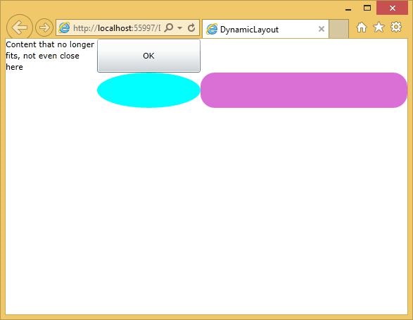
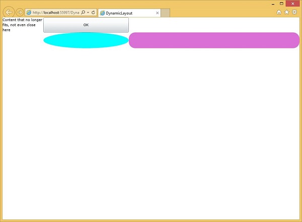
When you resize the application, the contents of those two columns resize to match. By the way, the absolute value of a star sized row or column does not matter; it is only the ratios, which are important.
Constrained vs. Unconstrained Layout
Layout in Silverlight always occurs in one of the two modes, either Constrained, or Unconstrained. A Constrained layout is one, where a container imposes the width or height. For example, the web browser, usually with CSS, always determines the overall dimensions of the Silverlight plug-ins.
Some important features are −
The top-level elements layout is constrained both horizontally and vertically. Whatever layout it produces, it must always end up with the results that are of the size imposed by the browser.
Some elements end up with Unconstrained Layout, meaning that the elements are free to choose their own size. For example, elements inside a vertical StackPanel are vertically unconstrained.
The StackPanel will give them as much height as they require. In fact, it will do this even if there is no enough space. It will tell the elements that they have the height they need, and then crop anything that does not fit.
Most Silverlight user interfaces contain a mixture of these two layout styles. Regardless of whether its parent imposes constraints or not, a StackPanel will always perform Unconstrained Layout in the direction of stacking. The same is true for a Grid row or column when the height or width set to Auto.
Suppose you have an element, which is inside a container that imposes a fixed horizontal width. By default, your element will be stretched to fill the space. If you set the alignment to Left, Right, or Center, it will remove the constraint.
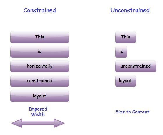
The element will take only the width that it needs.Of course, you can introduce a constraint with a fixed width or height.
Unconstrained Layout is sometimes called Size to Content, because the size of an unconstrained element is typically determined by its content.
Size to Content is an important idea in Silverlight layout. It is what enables the layout to adapt itself to whatever information is being displayed.
| Sr. No. | Controls & Description |
|---|---|
| 1 | GridSplitter
Constraints can come from the containing browser, or fixed dimensions in your design. However, it is sometimes useful to let the user impose constraints. |
| 2 | ScrollViewer
Some user interfaces end up needing to display more information than will fit in the available space. One common solution to this is to provide a scrollable region. Silverlight makes this very easy with the ScrollViewer. |
| 3 | Border
One more useful element to bear in mind when laying out the user interface is Border. |
Full Screen Mode
The Silverlight plug-in is able to take over the entire screen. There is a property you can set on a helper class to go into full screen mode. However, there are a couple of constraints for security purposes. To prevent a website from being able to take over the screen at will, and to do something evil, like faking up a prompt asking for the user's password.
To enter full screen mode, you need to get hold of the Host.Content property from the application object, and set its IsFullScreen property to true.
Let us have a look at a simple example which toggles the property, so it will flip back and forth between full screen and normal.
<UserControl x:Class = "FullScreenExample.MainPage"
   xmlns = "http://schemas.microsoft.com/winfx/2006/xaml/presentation"
   xmlns:x = "http://schemas.microsoft.com/winfx/2006/xaml"
   xmlns:d = "http://schemas.microsoft.com/expression/blend/2008"
   xmlns:mc = "http://schemas.openxmlformats.org/markup-compatibility/2006"
   mc:Ignorable = "d"
   d:DesignHeight = "300" d:DesignWidth = "400">

   <Border BorderBrush = "Gray" BorderThickness = "4" CornerRadius = "30" Padding = "20">

      <Border.Background>
         <LinearGradientBrush StartPoint = "0,0" EndPoint = "0,1">
            <GradientStop Offset = "0" Color = "Wheat" />
            <GradientStop Offset = "1" Color = "BurlyWood" />
         </LinearGradientBrush>
      </Border.Background>

      <Grid x:Name = "LayoutRoot">
         <Button x:Name = "fullScreenButton" HorizontalAlignment = "Center"
            VerticalAlignment = "Center" FontSize = "30" Width = "300"
            Height = "100" Content = "Go Full Screen" Click = "Button_Click" />
      </Grid>

   </Border>

</UserControl>
Here is a code in C# that initiates the return from full screen to normal. You can find out when this happens by handling the Host.Content objects FullScreenChanged event.
using System;
using System.Windows;
using System.Windows.Controls;

namespace FullScreenExample {

   public partial class MainPage : UserControl {

      public MainPage() {
         InitializeComponent();
         App.Current.Host.Content.FullScreenChanged += Content_FullScreenChanged;
      }

      void Content_FullScreenChanged(object sender, EventArgs e) {

         if (Application.Current.Host.Content.IsFullScreen) {
            fullScreenButton.Content = "Return to Normal";
         } else {
            fullScreenButton.Content = "Go Full Screen";
         }
      }

      private void Button_Click(object sender, RoutedEventArgs e) {
         var content = Application.Current.Host.Content;
         content.IsFullScreen = !content.IsFullScreen;
      }

   }
}
When the above code is compiled and executed, you will see the following output.
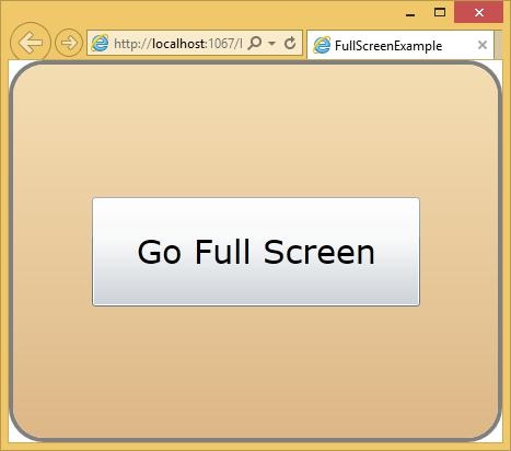
When the user clicks the Go Full Screen button, then it will switch to the full screen mode.
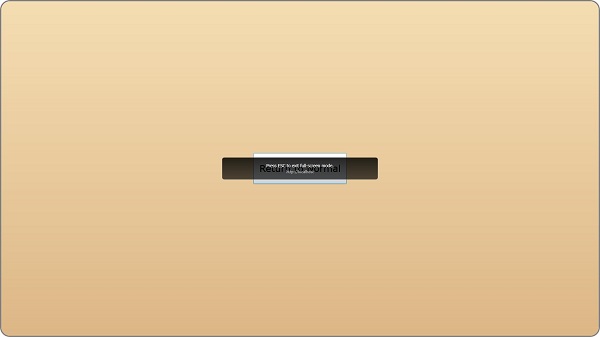
Notice that the button's text has changed. It now says Return to Normal. If you click it again or by hit Escape, it will flip back out of full screen mode.
Silverlight - CSS
Since Silverlight content always runs inside a web page, the object tag is subject to normal CSS layout rules. There is no way for the plug-in to push a preferred size back to the browser, so regardless of what size the Silverlight content may want to be, its size and position will be wholly determined by the containing web page.
The default Silverlight project template puts CSS in the web page that gives the object tag the whole of the browser window.
The default XAML appears to have a fixed size, but if you look closely, you will see that the template sets the design width, and design height properties.
These tell Visual Studio, or Blend, how large the user interface should look in the designer, but they allow it to resize at runtime.
In Solution Explorer you will see {project name}TestPage.html file, which is the default HTML you get when you create a new Silverlight project in Visual Studio as shown below.
The CSS at the top here, sets the HTML and body style to be 100%, which may seem a bit odd.
Here is the complete html file, which contains different settings.
<!DOCTYPE html PUBLIC "-//W3C//DTD XHTML 1.0 Transitional//EN"
   "http://www.w3.org/TR/xhtml1/DTD/xhtml1-transitional.dtd">

<html xmlns = "http://www.w3.org/1999/xhtml" >
   <head>
      <title>FirstExample</title>

      <style type = "text/css">
         html, body {
            height: 100%;
            overflow: auto;
         }

         body {
            padding: 0;
            margin: 0;
         }

         #silverlightControlHost {
            height: 100%;
            text-align:center;
         }
      </style>

      <script type = "text/javascript" src = "Silverlight.js"></script>

      <script type = "text/javascript">
         function onSilverlightError(sender, args) {
            var appSource = "";

            if (sender != null && sender != 0) {
               appSource = sender.getHost().Source;
            }

            var errorType = args.ErrorType;
            var iErrorCode = args.ErrorCode;

            if (errorType == "ImageError" || errorType == "MediaError") {
               return;
            }

            var errMsg = "Unhandled Error in Silverlight Application " +  appSource + "\n" ;
            errMsg += "Code: "+ iErrorCode + "    \n";
            errMsg += "Category: " + errorType + "       \n";
            errMsg += "Message: " + args.ErrorMessage + "     \n";

            if (errorType == "ParserError") {
               errMsg += "File: " + args.xamlFile + "     \n";
               errMsg += "Line: " + args.lineNumber + "     \n";
               errMsg += "Position: " + args.charPosition + "     \n";
            } else if (errorType == "RuntimeError") {
               if (args.lineNumber != 0) {
                  errMsg += "Line: " + args.lineNumber + "     \n";
                  errMsg += "Position: " +  args.charPosition + "     \n";
               }

               errMsg += "MethodName: " + args.methodName + "     \n";
            }

            throw new Error(errMsg);
         }

      </script>

   </head>

   <body>

      <form id = "form1" runat = "server" style = "height:100%">
         <div id = "silverlightControlHost">

            <object data = "data:application/x-silverlight-2,"
               type = "application/xsilverlight-2" width = "100%" height = "100%">

               <param name = "source" value = "ClientBin/FirstExample.xap"/>
               <param name = "onError" value = "onSilverlightError" />
               <param name = "background" value = "white" />
               <param name = "minRuntimeVersion" value = "5.0.61118.0" />
               <param name = "autoUpgrade" value = "true" />

               <a href = "http://go.microsoft.com/fwlink/?LinkID=149156&v=5.0.61118.0"
                  style = "textdecoration:none">
                  <img src = "http://go.microsoft.com/fwlink/?LinkId=161376"
                     alt = "Get Microsoft Silverlight" style = "border-style:none"/>
               </a>

            </object>

            <iframe id = "_sl_historyFrame" style = "visibility:hidden;height:0px;
               width:0px;border:0px"></iframe>

         </div>

      </form>

   </body>

</html>
Looking at the silverlightControlHost, we need to make sure it stars with a fixed height, say 300 pixels, and a width of 400 pixels, which matches the default design width and height in the XAML. You can also change these settings according to your application requirements.
Overlapping Content
By default, Silverlight and HTML contents cannot share the same space on the screen. If you make a content from both, such that they occupy the same space then only the Silverlight content will be visible.
This is because, by default, Silverlight will ask the browser for its own private window, rendering all the content into that. It is a child window inside the browser, so it looks like a part of the web page, but it prevents the content from overlapping.
The main reason for this is performance. By getting its own private area on the screen, Silverlight does not have to coordinate its rendering with a web browser.
However, sometimes it is useful to have an overlapping content. There is a performance price to pay. You might find that animations do not run as smoothly when Silverlight and HTML share space on screen, but the extra layout flexibility may be worth the price. To use the overlapping content, you need to enable Windowless mode.
In Windowless mode, the Silverlight plug-in renders to the same target window handler as the browser allowing the content to mingle.
Zed index, or Z index is significant when the contents overlap. As far as HTML is concerned, the Silverlight content is a single HTML element, so it appears at exactly one place in the HTML Z order.
This has an impact on mouse handling. If the Silverlight plug-in is at the top of the HMTL Z order, any mouse activity anywhere within its bounding box, will be delivered to the plug-in.
Even if some areas of the plug-in are transparent, and you can see the HTML behind, you won't be able to click it.
However, if you arrange for the Z index with some HTML content to be on top, it will continue to be interactive even when it overlaps with Silverlight content.
Example
Take a look at the simple example given below in which we have a layout with a container, in which three divs have all been arranged to overlap inside of this containing div.
<!DOCTYPE html PUBLIC "-//W3C//DTD XHTML 1.0 Transitional//EN"
   "http://www.w3.org/TR/xhtml1/DTD/xhtml1-transitional.dtd">

<html xmlns = "http://www.w3.org/1999/xhtml" >
   <head>

      <title>HtmlOverlap</title>

      <style type = "text/css">
         #container {
            position: relative;
            height: 300px;
            font-size: small;
            text-align:justify;
         }

         #silverlightControlHost {
            position: absolute;
            width: 400px;
            height: 300px;
         }

         #underSilverlight {
            position: absolute;
            left: 4px;
            width: 196px;
         }

         #overSilverlight {
            position: relative;
            left: 204px;
            width: 196px;
         }

      </style>

      <script type = "text/javascript" src = "Silverlight.js"></script>

      <script type = "text/javascript">
         function onSilverlightError(sender, args) {
            var appSource = "";

            if (sender != null && sender != 0) {
               appSource = sender.getHost().Source;
            }

            var errorType = args.ErrorType;
            var iErrorCode = args.ErrorCode;

            if (errorType == "ImageError" || errorType == "MediaError") {
               return;
            }

            var errMsg = "Unhandled Error in Silverlight Application " +
               appSource + "\n" ;

            errMsg += "Code: "+ iErrorCode + "    \n";
            errMsg += "Category: " + errorType + "       \n";
            errMsg += "Message: " + args.ErrorMessage + "     \n";

            if (errorType == "ParserError") {
               errMsg += "File: " + args.xamlFile + "     \n";
               errMsg += "Line: " + args.lineNumber + "     \n";
               errMsg += "Position: " + args.charPosition + "     \n";
            } else if (errorType == "RuntimeError") {
               if (args.lineNumber != 0) {
                  errMsg += "Line: " + args.lineNumber + "     \n";
                  errMsg += "Position: " +  args.charPosition + "     \n";
               }

               errMsg += "MethodName: " + args.methodName + "     \n";
            }

            throw new Error(errMsg);
         }
      </script>

   </head>

   <body>
      <form id = "form1" runat = "server" style = "height:100%">

         <div id = 'container'>

            <div id = 'underSilverlight'>
               This is below. This is below. This is below. This is below. This is below.

               This is below. This is below. This is below. This is below. This is below.

               This is below. This is below. This is below. This is below. This is below.

               This is below. This is below. This is below. This is below. This is below.

               This is below. This is below. This is below. This is below. This is below.

               This is below. This is below. This is below. This is below. This is below.

               This is below. This is below. This is below. This is below. This is below.

               This is below. This is below. This is below. This is below. This is below.

               This is below. This is below. This is below. This is below. This is below.

               This is below. This is below. This is below. This is below. This is below.

               This is below. This is below. This is below. This is below. This is below.

               This is below. This is below. This is below. This is below. This is below.
            </div>

            <div id = "silverlightControlHost">

               <object data = "data:application/x-silverlight-2,"
                  type = "application/xsilverlight-2" width = "100%" height = "100%">

                  <param name = "source" value = "ClientBin/HtmlOverlap.xap"/>
                  <param name = "onError" value = "onSilverlightError" />
                  <param name = "background" value = "transparent" />
                  <param name = "windowless" value = "true" />
                  <param name = "minRuntimeVersion" value = "4.0.50401.0" />
                  <param name = "autoUpgrade" value = "true" />

                  <a href = "http://go.microsoft.com/fwlink/?LinkID=149156&v=4.0.50401.0"
                     style = "text-decoration:none">

                  <img src = "http://go.microsoft.com/fwlink/?LinkId=161376"
                     alt = "Get Microsoft Silverlight" style = "border-style:none"/> </a>

               </object>

               <iframe id = "_sl_historyFrame" style = "visibility:hidden; height:0px;
                  width:0px; border:0px"> </iframe>

            </div>

            <div id = 'overSilverlight'>
               This is on top. This is on top. This is on top. This is on top.
                  This is on top. This is on top.

               This is on top. This is on top. This is on top. This is on top.
                  This is on top. This is on top.

               This is on top. This is on top. This is on top. This is on top.
                  This is on top. This is on top.

               This is on top. This is on top. This is on top. This is on top.
                  This is on top. This is on top.

               This is on top. This is on top. This is on top. This is on top.
                  This is on top. This is on top.

               This is on top. This is on top. This is on top. This is on top.
                  This is on top. This is on top.

               This is on top. This is on top. This is on top. This is on top.
                  This is on top. This is on top.

               This is on top. This is on top. This is on top. This is on top.
                  This is on top. This is on top.

               This is on top. This is on top. This is on top. This is on top.
            </div>

         </div>

      </form>

   </body>

</html>
This div is going over to the left, and it will be at the back of the Z order, because it comes first.
Then in the middle, we have the Silverlight content that is going to fill the whole width.
Then on top of this, there is a div over on the right containing the text- This is on top.
Given below is the XAML file in which one rectangle is added with some properties.
<UserControl x:Class = "HtmlOverlap.MainPage"
   xmlns = "http://schemas.microsoft.com/winfx/2006/xaml/presentation"
   xmlns:x = "http://schemas.microsoft.com/winfx/2006/xaml"
   xmlns:d = "http://schemas.microsoft.com/expression/blend/2008"
   xmlns:mc = "http://schemas.openxmlformats.org/markup-compatibility/2006"
   mc:Ignorable = "d"
   d:DesignHeight = "300" d:DesignWidth = "400">

   <Grid x:Name = "LayoutRoot">
      <Rectangle Margin = "0,120" Fill = "Aquamarine" />
   </Grid>

</UserControl>
When you run this application, you will see two columns, one saying below on the left, and on top on the right. Silverlight plug-in sits in the same area as both of these, and in the Z order the Silverlight content is in the middle of those two.
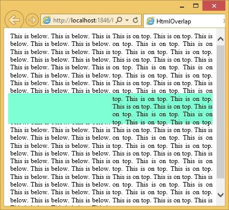
You can see that the semi-transparent green fill here has slightly tinted the text on the left because it is on top of that, but it has not tinted the text on the right, because it is behind that text.
You can select the text on the right. If you try that with this text on the left, nothing happens, and that is because, as far as the browser is concerned, this whole space here is occupied by the Silverlight control. Since it is above the text in the Z order, the Silverlight control that gets to handle the input.
Silverlight - Controls
All controls have interactive behavior of some kind such as, the way the button lights up when you move the mouse over it and pushes it when you press it, scrolling and selection behavior of a list box. In all the cases, the controls go beyond simple visibility. It might be more complex than it seems. These controls are a combination of the parents and the code. Silverlight allows a developer to easily build and create visually enriched UI based applications. The controls distinguish Silverlight from the other elements.
Some important features are −
The classical UI elements or controls in other UI frameworks are also enhanced in silverlight applications.
Almost all of the standard Silverlight controls can be found in the Toolbox, which is a part of the System.Windows.Controls.
These controls can also be created in XAML markup language.
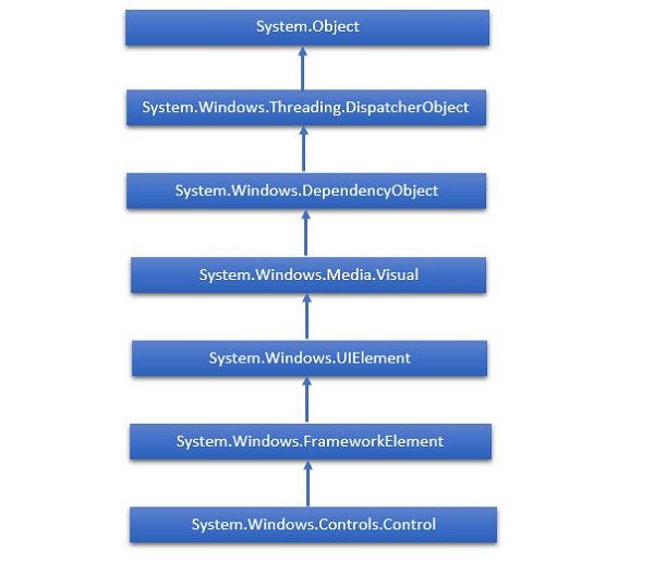
The complete inheritance hierarchy of Silverlight controls is as follows −
Silverlight - Buttons
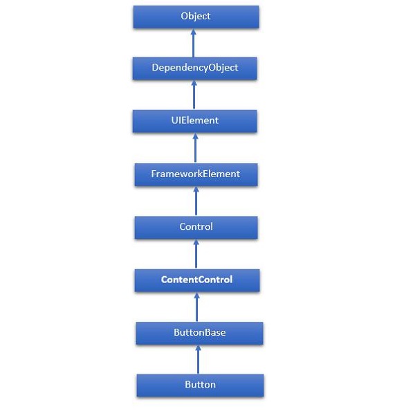
The Button class represents the most basic type of button control. Silverlight recognizes three types of button controls: the familiar Button, the CheckBox, and the RadioButton. All of these controls are content controls that are derived from ButtonBase. The hierarchical inheritance of Button class is as follows −
Given below are the most commonly used Properties of a button.
| Sr. No. | Property & Description |
|---|---|
| 1 | Background Gets or sets a brush that provides the background of the control. (Inherited from Control) |
| 2 | BorderBrush Gets or sets a brush that describes the border fill of a control. (Inherited from Control) |
| 3 | BorderThickness Gets or sets the border thickness of a control. (Inherited from Control) |
| 4 | Content Gets or sets the content of a ContentControl. (Inherited from ContentControl) |
| 5 | ClickMode Gets or sets a value that indicates when the Click event occurs, in terms of device behavior. (Inherited from ButtonBase) |
| 6 | ContentTemplate Gets or sets the data template that is used to display the content of the ContentControl. (Inherited from ContentControl) |
| 7 | FontFamily Gets or sets the font used to display text in the control. (Inherited from Control) |
| 8 | FontSize Gets or sets the size of the text in this control. (Inherited from Control) |
| 9 | FontStyle Gets or sets the style in which the text is rendered. (Inherited from Control) |
| 10 | FontWeight Gets or sets the thickness of the specified font. (Inherited from Control) |
| 11 | Foreground Gets or sets a brush that describes the foreground color. (Inherited from Control) |
| 12 | Height Gets or sets the suggested height of a FrameworkElement. (Inherited from FrameworkElement) |
| 13 | HorizontalAlignment Gets or sets the horizontal alignment characteristics that are applied to a FrameworkElement when it is composed in a layout parent, such as a panel or items control. (Inherited from FrameworkElement) |
| 14 | IsEnabled Gets or sets a value indicating whether the user can interact with the control. (Inherited from Control) |
| 15 | IsPressed Gets a value that indicates whether a ButtonBase is currently in a pressed state. (Inherited from ButtonBase) |
| 16 | Margin Gets or sets the outer margin of a FrameworkElement. (Inherited from FrameworkElement) |
| 17 | Name Gets or sets the identifying name of the object. When a XAML processor creates the object tree from XAML markup, run-time code can refer to the XAMLdeclared object by this name. (Inherited from FrameworkElement) |
| 18 | Opacity Gets or sets the degree of the object's opacity. (Inherited from UIElement) |
| 19 | Resources Gets the locally defined resource dictionary. In XAML, you can establish resource items as child object elements of a frameworkElement.Resources property element, through XAML implicit collection syntax. (Inherited from FrameworkElement) |
| 20 | Style Gets or sets an instance Style that is applied for this object during layout and rendering. (Inherited from FrameworkElement) |
| 21 | Template Gets or sets a control template. The control template defines the visual appearance of a control in UI, and is defined in XAML markup. (Inherited from Control) |
| 22 | VerticalAlignment Gets or sets the vertical alignment characteristics that are applied to a FrameworkElement when it is composed in a parent object such as a panel or items control. (Inherited from FrameworkElement) |
| 23 | Visibility Gets or sets the visibility of a UIElement. A UIElement that is not visible is not rendered and does not communicate its desired size to layout. (Inherited from UIElement) |
| 24 | Width Gets or sets the width of a FrameworkElement. (Inherited from FrameworkElement) |
Given below are the commonly used methods of Button.
| Sr. No. | Method & Description |
|---|---|
| 1 | ClearValue Clears the local value of a dependency property. (Inherited from DependencyObject) |
| 2 | FindName Retrieves an object that has the specified identifier name. (Inherited from FrameworkElement) |
| 3 | OnApplyTemplate Invoked whenever application code or internal processes (such as a rebuilding layout pass) call ApplyTemplate. In simplest terms, this means the method is called just before a UI element displays in your app. Override this method to influence the default post-template logic of a class. (Inherited from FrameworkElement) |
| 4 | OnContentChanged Invoked when the value of the Content property changes. (Inherited from ContentControl) |
| 5 | OnDragEnter Called before the DragEnter event occurs. (Inherited from Control) |
| 6 | OnDragLeave Called before the DragLeave event occurs. (Inherited from Control) |
| 7 | OnDragOver Called before the DragOver event occurs. (Inherited from Control) |
| 8 | OnDrop Called before the Drop event occurs. (Inherited from Control) |
| 9 | OnGotFocus Called before the GotFocus event occurs. (Inherited from Control) |
| 10 | OnKeyDown Called before the KeyDown event occurs. (Inherited from Control) |
| 11 | OnKeyUp Called before the KeyUp event occurs. (Inherited from Control) |
| 12 | OnLostFocus Called before the LostFocus event occurs. (Inherited from Control) |
| 13 | SetBinding Attaches a binding to a FrameworkElement, using the provided binding object. (Inherited from FrameworkElement) |
Given below are the commonly used Events of Button.
| Sr. No. | Event & Description |
|---|---|
| 1 | Click Occurs when a button control is clicked. (Inherited from ButtonBase) |
| 2 | DataContextChanged Occurs when the value of the FrameworkElement.DataContext property changes. (Inherited from FrameworkElement) |
| 3 | DragEnter Occurs when the input system reports an underlying drag event with this element as the target. (Inherited from UIElement) |
| 4 | DragLeave Occurs when the input system reports an underlying drag event with this element as the origin. (Inherited from UIElement) |
| 5 | DragOver Occurs when the input system reports an underlying drag event with this element as the potential drop target. (Inherited from UIElement) |
| 6 | DragStarting Occurs when a drag operation is initiated. (Inherited from UIElement) |
| 7 | GotFocus Occurs when a UIElement receives focus. (Inherited from UIElement) |
| 8 | Holding Occurs when an otherwise unhandled Hold interaction occurs over the hit test area of this element. (Inherited from UIElement) |
| 9 | IsEnabledChanged Occurs when the IsEnabled property changes. (Inherited from Control) |
| 10 | KeyDown Occurs when a keyboard key is pressed while the UIElement has focus. (Inherited from UIElement) |
| 11 | KeyUp Occurs when a keyboard key is released while the UIElement has focus. (Inherited from UIElement) |
| 12 | LostFocus Occurs when a UIElement loses focus. (Inherited from UIElement) |
| 13 | SizeChanged Occurs when either the ActualHeight or the ActualWidth property changes value on a FrameworkElement. (Inherited from FrameworkElement) |
| Sr. No. | Buttons & Description |
|---|---|
| 1 | HyperlinkButton
The HyperlinkButton does not draw the standard button background. Instead, it simply renders the content that you supply. |
| 2 | ToggleButton & RepeatButton
RepeatButton control fires Click events continuously, as long as the button is held down. ToggleButton control represents a button that has two states (clicked or unclicked). |
| 3 | CheckBox
A control that a user can select (check) or de-select (uncheck). It provides a list of options that a user can select, such as a list of settings to apply to an application. |
| 4 | RadioButton
The RadioButton is a button that allows a user to select a single option from a group of options. |
Silverlight - Content Model
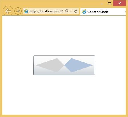
The buttons offer a form of content to the model content. Models crop up a lot in controls. The idea is simple. It will accept any content and not just text. If you want to create a truly exotic button, you could even place other content controls such as text boxes and buttons inside (and nest still elements inside these). It is doubtful that such an interface would make much sense, but it is possible.
Let us have a look at a simple example with button, inside button other content controls.
<UserControl x:Class = "ContentModel.MainPage"
   xmlns = "http://schemas.microsoft.com/winfx/2006/xaml/presentation"
   xmlns:x = "http://schemas.microsoft.com/winfx/2006/xaml"
   xmlns:d = "http://schemas.microsoft.com/expression/blend/2008"
   xmlns:mc = "http://schemas.openxmlformats.org/markup-compatibility/2006"
   mc:Ignorable = "d"
   d:DesignHeight = "300" d:DesignWidth = "400">

   <Grid x:Name = "LayoutRoot" Background = "White">

      <Button Margin = "3" Height = "70" Width = "215">
         <Grid Margin = "5">
            <Polygon Points = "100,25 125,0 200,25 125,50" Fill = "LightSteelBlue" />
            <Polygon Points = "100,25 75,0 0,25 75,50" Fill = "LightGray"/>
         </Grid>
      </Button>

   </Grid>

</UserControl>
When the above code is compiled and executed, you will see the following button.
RangeControl
The scrollbar and slider controls are closely related. They both allow the user to choose an input value from a particular range. Conventionally, these controls signify different things. Scrollbars are normally used to set the position into a scrotal area whereas, the slider is used to specify some value or setting. These are just conventions; the controls have similar behaviors and APIs.
The range controls are simple to use. You specify the minimum and maximum values to indicate the range of values you would like the slider to represent. The Value property will vary as the use of drags varies.
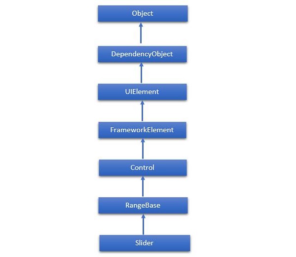
The hierarchical inheritance of Slider class is as follows −
Given below are the commonly used properties of Slider.
| Sr. No. | Property & Description |
|---|---|
| 1 | Header Gets or sets the content for the control's header. |
| 2 | HeaderProperty Identifies the Header dependency property. |
| 3 | HeaderTemplate Gets or sets the DataTemplate used to display the content of the control's header. |
| 4 | HeaderTemplateProperty Identifies the HeaderTemplate dependency property. |
| 5 | IntermediateValue Gets or sets the value of the Slider while the user is interacting with it, before the value is snapped to either the tick or step value. The SnapsTo property specifies the value of slider. |
| 6 | IntermediateValueProperty Identifies the IntermediateValue dependency property. |
| 7 | IsDirectionReversed Gets or sets a value that indicates the direction of increasing value. |
| 8 | IsDirectionReversedProperty Identifies the IsDirectionReversed dependency property. |
| 9 | IsThumbToolTipEnabled Gets or sets a value that determines whether the slider value is shown in a tool tip for the Thumb component of the Slider. |
| 10 | IsThumbToolTipEnabledProperty Identifies the IsThumbToolTipEnabled dependency property. |
| 11 | Orientation Gets or sets the orientation of a Slider. |
| 12 | OrientationProperty Identifies the Orientation dependency property. |
| 13 | StepFrequency Gets or sets the value part of a value range that steps should be created for. |
| 14 | StepFrequencyProperty Identifies the StepFrequency dependency property. |
| 15 | ThumbToolTipValueConverter Gets or sets the converter logic that converts the range value of the Slider into tool tip content. |
| 16 | ThumbToolTipValueConverterProperty Identifies the ThumbToolTipValueConverter dependency property. |
| 17 | TickFrequency Gets or sets the increment of the value range that ticks should be created for. |
| 18 | TickFrequencyProperty Identifies the TickFrequency dependency property. |
| 19 | TickPlacement Gets or sets a value that indicates where to draw tick marks in relation to the track. |
| 20 | TickPlacementProperty Identifies the TickPlacement dependency property. |
Given below are the commonly used events in Slider class.
| Sr. No. | Event & Description |
|---|---|
| 1 | ManipulationCompleted Occurs when a manipulation on the UIElement is complete. (Inherited from UIElement) |
| 2 | ManipulationDelta Occurs when the input device changes position during a manipulation. (Inherited from UIElement) |
| 3 | ManipulationInertiaStarting Occurs when the input device loses contact with the UIElement object during a manipulation and inertia begins. (Inherited from UIElement) |
| 4 | ManipulationStarted Occurs when an input device begins a manipulation on the UIElement. (Inherited from UIElement) |
| 5 | ManipulationStarting Occurs when the manipulation processor is first created. (Inherited from UIElement) |
| 6 | ValueChanged Occurs when the range value changes. (Inherited from RangeBase) |
Given below are the commonly used methods in Slider class.
| Sr. No. | Method & Description |
|---|---|
| 1 | OnManipulationCompleted Called before the ManipulationCompleted event occurs. (Inherited from Control) |
| 2 | OnManipulationDelta Called before the ManipulationDelta event occurs. (Inherited from Control) |
| 3 | OnManipulationInertiaStarting Called before the ManipulationInertiaStarting event occurs. (Inherited from Control) |
| 4 | OnManipulationStarted Called before the ManipulationStarted event occurs. (Inherited from Control) |
| 5 | OnManipulationStarting Called before the ManipulationStarting event occurs. (Inherited from Control) |
| 6 | OnMaximumChanged Called when the Maximum property changes. (Inherited from RangeBase) |
| 7 | OnMinimumChanged Called when the Minimum property changes. (Inherited from RangeBase) |
| 8 | OnValueChanged Fires the ValueChanged routed event. (Inherited from RangeBase) |
| 9 | SetBinding Attaches a binding to a FrameworkElement, using the provided binding object. (Inherited from FrameworkElement) |
| 10 | SetValue Sets the local value of a dependency property on a DependencyObject. (Inherited from DependencyObject) |
Example
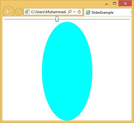
Let us have a look at a simple example in which a slider and an ellipse are added and the slider controls the width of the ellipse.
<UserControl x:Class = "SliderExample.MainPage"
   xmlns = "http://schemas.microsoft.com/winfx/2006/xaml/presentation"
   xmlns:x = "http://schemas.microsoft.com/winfx/2006/xaml"
   xmlns:d = "http://schemas.microsoft.com/expression/blend/2008" xmlns:mc = "
   http://schemas.openxmlformats.org/markup-compatibility/2006"
   mc:Ignorable = "d" d:DesignWidth = "640" d:DesignHeight = "480">

   <Grid x:Name = "LayoutRoot">

      <Grid.RowDefinitions>
         <RowDefinition Height = "Auto" />
         <RowDefinition />
      </Grid.RowDefinitions>

      <Slider Minimum = "1" Maximum = "400" Value = "1"
         ValueChanged = "Slider_ValueChanged" />

      <Ellipse Grid.Row = "1" Fill = "Aqua" Width = "1" x:Name = "myEllipse" />

   </Grid>

</UserControl>
Given below is the value changed event implementation is C#.
using System.Windows;
using System.Windows.Controls;

namespace SliderExample {

   public partial class MainPage : UserControl {

      public MainPage() {
         InitializeComponent();
      }

      private void Slider_ValueChanged(object sender,
         RoutedPropertyChangedEventArgs<double> e) {

            if (myEllipse != null) {
               myEllipse.Width = e.NewValue;
            }
      }
   }
}
When the above code is compiled and executed, you will see the following output. As you can see, when you move the slider from left to right, the ellipse width increases.
Silverlight - ListBox
Listbox is a control that provides a list of items to the user for selection of an item. A user can select one or more items from a predefined list of items at a time. In a ListBox, multiple options are always visible to the user without any user interaction.
A Listbox presents a scrollable list of items. If a user selects an item, the selected item changes appearance to indicate selection. It supports a more extensive form of content model and Button. A major difference between a button and a list box is that a button contains a single piece of content whereas a listbox allows every single item in the list.
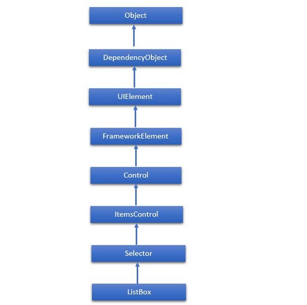
The hierarchical inheritance of ListBox class is as follows −
Given below are the commonly used Properties of ListBox class.
| Sr. No. | Property & Description |
|---|---|
| 1 | Background Gets or sets a brush that provides the background of the control. (Inherited from Control) |
| 2 | BorderThickness Gets or sets the border thickness of a control. (Inherited from Control) |
| 3 | FontFamily Gets or sets the font used to display text in the control. (Inherited from Control) |
| 4 | FontSize Gets or sets the size of the text in this control. (Inherited from Control) |
| 5 | FontStyle Gets or sets the style in which the text is rendered. (Inherited from Control) |
| 6 | FontWeight Gets or sets the thickness of the specified font. (Inherited from Control) |
| 7 | Foreground Gets or sets a brush that describes the foreground color. (Inherited from Control) |
| 8 | GroupStyle Gets a collection of GroupStyle objects that define the appearance of each level of groups. (Inherited from ItemsControl) |
| 9 | Height Gets or sets the suggested height of a FrameworkElement. (Inherited from FrameworkElement) |
| 10 | HorizontalAlignment Gets or sets the horizontal alignment characteristics that are applied to a FrameworkElement when it is composed in a layout parent, such as a panel or items control. (Inherited from FrameworkElement) |
| 11 | IsEnabled Gets or sets a value indicating whether the user can interact with the control. (Inherited from Control) |
| 12 | Item Gets the collection used to generate the content of the control. (Inherited from ItemsControl) |
| 13 | ItemsSource Gets or sets an object source used to generate the content of the ItemsControl. (Inherited from ItemsControl) |
| 14 | Margin Gets or sets the outer margin of a FrameworkElement. (Inherited from FrameworkElement) |
| 15 | Name Gets or sets the identifying name of the object. When a XAML processor creates the object tree from XAML markup, run-time code can refer to the XAML-declared object by this name. (Inherited from FrameworkElement) |
| 16 | Opacity Gets or sets the degree of the object's opacity. (Inherited from UIElement) |
| 17 | SelectedIndex Gets or sets the index of the selected item. (Inherited from Selector) |
| 18 | SelectedItem Gets or sets the selected item. (Inherited from Selector) |
| 19 | SelectedValue Gets or sets the value of the selected item, obtained by using the SelectedValuePath. (Inherited from Selector) |
| 20 | Style Gets or sets an instance Style that is applied for this object during layout and rendering. (Inherited from FrameworkElement) |
| 21 | VerticalAlignment Gets or sets the vertical alignment characteristics that are applied to a FrameworkElement when it is composed in a parent object such as a panel or items control. (Inherited from FrameworkElement) |
| 22 | Width Gets or sets the width of a FrameworkElement. (Inherited from FrameworkElement) |
Given below are the most commonly used Events of ListBox.
| Sr. No. | Event & Description |
|---|---|
| 1 | DragEnter Occurs when the input system reports an underlying drag event with this element as the target. (Inherited from UIElement) |
| 2 | DragLeave Occurs when the input system reports an underlying drag event with this element as the origin. (Inherited from UIElement) |
| 3 | DragOver Occurs when the input system reports an underlying drag event with this element as the potential drop target. (Inherited from UIElement) |
| 4 | DragStarting Occurs when a drag operation is initiated. (Inherited from UIElement) |
| 5 | Drop Occurs when the input system reports an underlying drop event with this element as the drop target. (Inherited from UIElement) |
| 6 | DropCompleted Occurs when a drag-and-drop operation is ended. (Inherited from UIElement) |
| 7 | GotFocus Occurs when a UIElement receives focus. (Inherited from UIElement) |
| 8 | IsEnabledChanged Occurs when the IsEnabled property changes. (Inherited from Control) |
| 9 | KeyDown Occurs when a keyboard key is pressed while the UIElement has focus. (Inherited from UIElement) |
| 10 | KeyUp Occurs when a keyboard key is released while the UIElement has focus. (Inherited from UIElement) |
| 11 | LostFocus Occurs when a UIElement loses focus. (Inherited from UIElement) |
| 12 | SelectionChanged Occurs when the currently selected item changes. (Inherited from Selector) |
| 13 | SizeChanged Occurs when either the ActualHeight or the ActualWidth property changes value on a FrameworkElement. (Inherited from FrameworkElement) |
Given below are the most commonly used Methods of ListBox.
| Sr. No. | Method & Description |
|---|---|
| 1 | Arrange Positions child objects and determines a size for a UIElement. Parent objects that implement custom layout for their child elements should call this method from their layout override implementations to form a recursive layout update. (Inherited from UIElement) |
| 2 | FindName Retrieves an object that has the specified identifier name. (Inherited from FrameworkElement) |
| 3 | Focus Attempts to set the focus on the control. (Inherited from Control) |
| 4 | GetValue Returns the current effective value of a dependency property from a DependencyObject. (Inherited from DependencyObject) |
| 5 | IndexFromContainer Returns the index to the item that has the specified, generated container. (Inherited from ItemsControl) |
| 6 | OnDragEnter Called before the DragEnter event occurs. (Inherited from Control) |
| 7 | OnDragLeave Called before the DragLeave event occurs. (Inherited from Control) |
| 8 | OnDragOver Called before the DragOver event occurs. (Inherited from Control) |
| 9 | OnDrop Called before the Drop event occurs. (Inherited from Control) |
| 10 | OnKeyDown Called before the KeyDown event occurs. (Inherited from Control) |
| 11 | OnKeyUp Called before the KeyUp event occurs. (Inherited from Control) |
| 12 | OnLostFocus Called before the LostFocus event occurs. (Inherited from Control) |
| 13 | ReadLocalValue Returns the local value of a dependency property, if a local value is set. (Inherited from DependencyObject) |
| 14 | SetBinding Attaches a binding to a FrameworkElement, using the provided binding object. (Inherited from FrameworkElement) |
| 15 | SetValue Sets the local value of a dependency property on a DependencyObject. (Inherited from DependencyObject) |
Let us look at a simple example in which different UI elements are added in a ListBox.
<UserControl x:Class = "ListBoxExample.MainPage"
   xmlns = "http://schemas.microsoft.com/winfx/2006/xaml/presentation"
   xmlns:x = "http://schemas.microsoft.com/winfx/2006/xaml"
   xmlns:d = "http://schemas.microsoft.com/expression/blend/2008"
   xmlns:mc = "http://schemas.openxmlformats.org/markup-compatibility/2006"
   mc:Ignorable = "d" d:DesignWidth = "640" d:DesignHeight = "480">

   <Grid x:Name = "LayoutRoot">

      <ListBox x:Name = "myList">

         <TextBlock Text = "First item" />
         <Button Content = "Second item" />
         <Path Fill = "Blue" Data = "M4,0 l-4,10 8,0z M15,0 l-4,10 8,0z M26,0 l4,10 8,0z"
            Margin = "10" />

         <StackPanel Orientation = "Horizontal">
            <Ellipse Fill = "Red" Height = "30" Width = "100" />
            <TextBlock Text = "Name: " />
            <TextBox Width = "200" />
         </StackPanel>

         <TextBlock Text = "More..." />

      </ListBox>

   </Grid>

</UserControl>
Given below is the C# implementation.
using System.Windows.Controls;

namespace ListBoxExample {

   public partial class MainPage : UserControl {

      public MainPage() {
         InitializeComponent();

         myList.Items.Add("String entry");
         myList.Items.Add(new Button { Content = "Content entry" });
      }
   }
}
When the above code is compiled and executed, you will see a list box which contains mixture of graphics text and also an editable field where you can type the text.
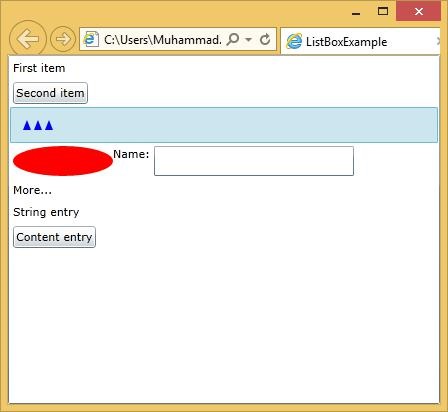
| Sr. No. | Controls & Description |
|---|---|
| 1 | Calendar & DatePicker
Calendar & DatePicker represents a control that enables a user to select a date by using a visual calendar display. It provides some basic navigation using either the mouse or the keyboard. |
| 2 | TabControl
A container that places items into separate tabs and allows the user to view just one tab at a time. It allows the user to select from a number of different views by clicking on the tab headers. |
| 3 | Popup
This class displays the content on top of the existing content, within the bounds of the application window. It is a temporarily display on the other content. |
| 4 | ToolTip
Tooltip represents a control that creates a pop-up window that displays information for an element in the GUI. Silverlight lets you attach a tooltip to any control. |
Silverlight - Templates
A Template describes the overall look and visual appearance of the control. For each control, there is a default template associated with it, which gives the appearance to that control.
In WPF application, you can easily create your own templates when you want to customize the visual behavior and visual appearance of a control.
Some important features are −
All of the UI elements have some kind of appearance as well as behavior e.g. Button has an appearance and behavior.
Click event or mouse hover event are the behaviors, which are fired in response to a click and hover and there is a default appearance of button, which can be changed by the Control template.
Let us look at a simple example again in which a button is defined with template.
<UserControl x:Class = "ButtonTemplate.MainPage"
   xmlns = "http://schemas.microsoft.com/winfx/2006/xaml/presentation"
   xmlns:x = "http://schemas.microsoft.com/winfx/2006/xaml"
   xmlns:d = "http://schemas.microsoft.com/expression/blend/2008"
   xmlns:mc = "http://schemas.openxmlformats.org/markup-compatibility/2006"
   mc:Ignorable = "d" d:DesignWidth = "640" d:DesignHeight = "480">

   <Grid x:Name = "LayoutRoot" HorizontalAlignment = "Center"
      VerticalAlignment = "Center">

      <Button Height = "100" Width = "100" Content = "Click!"
         HorizontalContentAlignment = "Left" Click = "button_Click">

         <Button.Template>
            <ControlTemplate TargetType = "Button">

               <Grid>

                  <Ellipse Fill = "Gray" Stroke = "Black"
                     StrokeThickness = "3" Margin = "-64,0,0,0" />

                  <ContentPresenter HorizontalAlignment = "{TemplateBinding
                     HorizontalContentAlignment}" VerticalAlignment = "Center"
                     Content = "{TemplateBinding Content}" />
               </Grid>

            </ControlTemplate>

         </Button.Template>

      </Button>

   </Grid>

</UserControl>
When the above code is compiled and executed, you will see the following output.
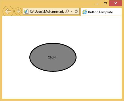
Connecting the Template
All of the control features, which we want to template, are with template bindings. Some aspects are a little more complex. For example, anytime you have a form of content model, Template binding alone is not enough that you saw on the button. We also have to use a content presenter as shown in the example above.
Silverlight - Visual State
It is good if your user can tell which bit of an application is likely to respond to the input. To some extent, this can be done by making buttons just look like buttons. If something looks clickable, it probably is.
However, a convention in modern user interface design is that a user interface element should also signal a willingness to respond by changing their parents when the mouse moves over them.
For example, the built in button control changes its background slightly, when the mouse moves over, to hint that it is interactive and then changes the parents further when clicked to make it look like its selected. Almost all controls need to do this and the designers need a way to create and edit the animations to make it happen.
State & State Group
Let us look at an example of visual state in action. Consider a checkbox. It may be unchecked or checked and if you choose, it can support a third indeterminate state. The control needs to look different for all the three cases. Therefore, we have three Visual States.
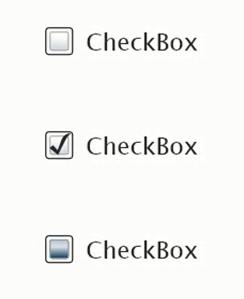
In order to demonstrate that it is ready to respond to the user input, the checkbox changes its appearance slightly when the mouse moves over it and it changes further when the mouse is held there. A fourth state has to be considered if the checkbox is disabled, it looks great out and signals that its not going to respond to the user input.
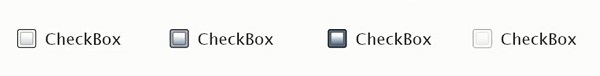
So, we have another four states here. At any given time, the visual state of a checkbox must be either Normal, Mouse over, Checked or Disabled. At the same time, it must be either checked, unchecked or indeterminate.
Visual State Manager
Since its templates define the appearance of the controls, the template needs to define what happens to each of the Visual States. The templates we have looked at so far do not contain such information. As a result, the appearance of the controls remain static, regardless of its current state.
To add visual states to a template, you begin by adding a property element.
The simplest thing you can do for visual state handling is to define animation that will run when the control enters a particular state.
The controls notify the visual state manager class whenever they change state.
The visual state manager then looks in this section of the template and figures out what animation to run.
So, when the checkbox enters the mouse overstate, this animation will run, changing the color of some part of a template.
Let us have a look at a simple example by using the visual state mechanisms to make a custom template for a checkbox that reflects state changes.
Given below is the XAML code for custom template of check box with visual state.
<UserControl
   xmlns = "http://schemas.microsoft.com/winfx/2006/xaml/presentation"
   xmlns:x = "http://schemas.microsoft.com/winfx/2006/xaml"
   x:Class = "CheckboxVisualState.Page"
   Width = "640" Height="480"
   xmlns:vsm = "clrnamespace:System.Windows;assembly = System.Windows"
   xmlns:d = "http://schemas.microsoft.com/expression/blend/2008"
   xmlns:mc = "http://schemas.openxmlformats.org/markup-compatibility/2006"
   mc:Ignorable = "d">

   <UserControl.Resources>
      <ControlTemplate x:Key = "CheckBoxControlTemplate1" TargetType = "CheckBox">

         <Grid>

            <vsm:VisualStateManager.VisualStateGroups>

               <vsm:VisualStateGroup x:Name = "FocusStates">
                  <vsm:VisualState x:Name = "ContentFocused"/>
                  <vsm:VisualState x:Name = "Focused"/>
                  <vsm:VisualState x:Name = "Unfocused"/>
               </vsm:VisualStateGroup>

               <vsm:VisualStateGroup x:Name = "CommonStates">

                  <vsm:VisualStateGroup.Transitions>
                     <vsm:VisualTransition GeneratedDuration = "00:00:00.5000000"/>
                  </vsm:VisualStateGroup.Transitions>

                  <vsm:VisualState x:Name = "MouseOver">

                     <Storyboard>

                        <ColorAnimationUsingKeyFrames BeginTime = "00:00:00"
                           Duration = "00:00:00.0010000" Storyboard.TargetName = "background"
                           Storyboard.TargetProperty = "(Shape.Fill).
                           (SolidColorBrush.Color)">

                              <SplineColorKeyFrame KeyTime = "00:00:00" Value = "#FFFF0000"/>
                        </ColorAnimationUsingKeyFrames>

                     </Storyboard>

                  </vsm:VisualState>

                  <vsm:VisualState x:Name = "Pressed">

                     <Storyboard>

                        <ColorAnimationUsingKeyFrames BeginTime = "00:00:00"
                           Duration = "00:00:00.0010000" Storyboard.TargetName = "background"
                           Storyboard.TargetProperty = "(Shape.Fill).
                           (SolidColorBrush.Color)">

                              <SplineColorKeyFrame KeyTime = "00:00:00" Value = "#FFCEFF00"/>
                        </ColorAnimationUsingKeyFrames>

                     </Storyboard>

                  </vsm:VisualState>

                  <vsm:VisualState x:Name = "Disabled"/>
                  <vsm:VisualState x:Name = "Normal"/>

               </vsm:VisualStateGroup>

               <vsm:VisualStateGroup x:Name = "CheckStates">

                  <vsm:VisualStateGroup.Transitions>
                     <vsm:VisualTransition GeneratedDuration = "00:00:00.5000000"/>
                  </vsm:VisualStateGroup.Transitions>

                  <vsm:VisualState x:Name = "Checked">

                     <Storyboard>

                        <DoubleAnimationUsingKeyFrames BeginTime = "00:00:00"
                           Duration = "00:00:00.0010000" Storyboard.TargetName = "checkPath"
                           Storyboard.TargetProperty = "(UIElement.Opacity)">

                              <SplineDoubleKeyFrame KeyTime = "00:00:00" Value = "1"/>
                        </DoubleAnimationUsingKeyFrames>

                     </Storyboard>

                  </vsm:VisualState>

                  <vsm:VisualState x:Name = "Unchecked"/>
                  <vsm:VisualState x:Name = "Indeterminate"/>

               </vsm:VisualStateGroup>

            </vsm:VisualStateManager.VisualStateGroups>

            <Grid.ColumnDefinitions>

               <ColumnDefinition Width = "Auto"/>
                  <ColumnDefinition Width = "3.61782296696066"/>
               <ColumnDefinition Width = "Auto"/>

            </Grid.ColumnDefinitions>

            <Canvas Height = "50" HorizontalAlignment = "Left" VerticalAlignment = "Top"
               Width = "50">

               <Rectangle Height = "33.746" x:Name = "background" Width = "33.746"
                  Canvas.Left = "8.452" Canvas.Top = "7.88" Fill = "#FFFFFFFF"
                  Stroke = "#FF000000"
                  RadiusX = "5.507" RadiusY = "5.507"/>

               <Path Height = "40.25" x:Name = "checkPath" Width = "39.75" Opacity = "0"
                  Canvas.Left = "5.959" Canvas.Top = "7.903" Stretch = "Fill"
                  Stroke = "#FF1F9300" StrokeThickness = "3"
                  Data = "M1.5,1.5 C15.495283,8.7014561 27.056604,18.720875 33.75,33.75
                  M36,3.75 C22.004717,10.951456 10.443395,20.970875 3.7499986,36"/>

            </Canvas>

            <ContentPresenter HorizontalAlignment = "Left"
               Margin = "{TemplateBinding Padding}"
               VerticalAlignment = "{TemplateBinding VerticalContentAlignment}"
               Grid.Column = "2" Grid.ColumnSpan = "1" d:LayoutOverrides = "Height"/>

         </Grid>

      </ControlTemplate>

   </UserControl.Resources>

   <Grid x:Name = "LayoutRoot" Background = "White" >
      <CheckBox HorizontalAlignment = "Left"
         Margin = "52.5410003662109,53.5970001220703,0,0" VerticalAlignment = "Top"
         Template = "{StaticResource CheckBoxControlTemplate1}"
         Content = "CheckBox"/>
   </Grid>

</UserControl>
When the above code is compiled and executed, you will see the following web page, which contains one checkbox.
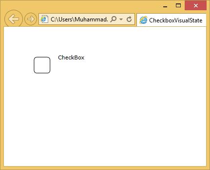
When the curser enters the checkbox region, it will change the state.
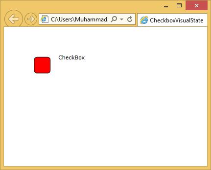
When you click the checkbox, you will see the following state.
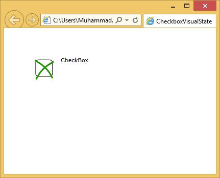
We recommend you to execute the above example for a better understanding.
Silverlight - Data Binding
Data binding is a mechanism in Silverlight application, which provides a simple and easy way for Windows Runtime apps using partial classes to display and interact with data. The management of data is separated entirely, from the way data is displayed in this mechanism. Data binding allows the flow of data between UI elements and the data object on user interface. When a binding is established and the data or your business model changes, then it will reflect the updates automatically to the UI elements and vice versa. It is also possible to bind, not to a standard data source, but rather to another element on the page.
Data binding are of the following two types −
- One-way data binding
- Two-way data binding
One-way Data Binding
In one-way data binding, the data is bound from its source (that is the object that holds the data) to its target (that is the object that displays the data).
Let us have a look at a simple example of one-way data binding.
Given below is the XAML code in which two labels, two text boxes and one button are created with some properties.
<UserControl x:Class = "DataBinding.MainPage"
   xmlns = "http://schemas.microsoft.com/winfx/2006/xaml/presentation"
   xmlns:x = "http://schemas.microsoft.com/winfx/2006/xaml"
   xmlns:d = "http://schemas.microsoft.com/expression/blend/2008"
   xmlns:mc = "http://schemas.openxmlformats.org/markup-compatibility/2006"
   mc:Ignorable = "d"
   d:DesignHeight = "300" d:DesignWidth = "400">

   <Grid x:Name = "LayoutRoot" Background = "White">

      <Grid.RowDefinitions>
         <RowDefinition Height = "Auto" />
         <RowDefinition Height = "Auto" />
         <RowDefinition Height = "*" />
      </Grid.RowDefinitions>

      <Grid.ColumnDefinitions>
         <ColumnDefinition Width = "Auto" />
         <ColumnDefinition Width = "200" />
      </Grid.ColumnDefinitions>

      <TextBlock Name = "nameLabel" Margin = "2">Name:</TextBlock>
      <TextBox Name = "nameText" Grid.Column = "1" Margin = "2"
         Text = "{Binding Name, Mode=OneWay}"/>

      <TextBlock Name = "ageLabel" Margin = "2" Grid.Row = "1">Age:</TextBlock>

      <TextBox Name = "ageText" Grid.Column = "1" Grid.Row = "1" Margin="2"
         Text = "{Binding Age, Mode = OneWay}"/>

      <StackPanel Grid.Row = "2" Grid.ColumnSpan = "2">
         <Button Content = "_Show..." Click = "Button_Click" />
      </StackPanel>

   </Grid>

</UserControl>
We observe the following things −
The text properties of both the text boxes bind to Name and Age, which are class variables of Person class as shown below.
In Person class, we have just two variables Name and Age, and its object is initialized in MainPage class.
In XAML code, we are binding to a property Name and Age, but we have not selected which property belongs to the object.
An easy way is to assign an object to DataContext whose properties we are binding in the C# code in MainPage constructor as shown below.
using System.Windows;
using System.Windows.Controls;

namespace DataBinding {

   public partial class MainPage : UserControl {
      Person person = new Person { Name = "Salman", Age = 26 };

      public MainPage() {
         InitializeComponent();
         this.DataContext = person;
      }

      private void Button_Click(object sender, RoutedEventArgs e) {
         string message = person.Name + " is " + person.Age;
         MessageBox.Show(message);
      }
   }

   public class Person {
      private string nameValue;

      public string Name {
         get { return nameValue; }
         set { nameValue = value; }
      }

      private double ageValue;

      public double Age {
         get { return ageValue; }

         set {
            if (value != ageValue) {
               ageValue = value;
            }
         }
      }
   }
}
Let us run this application and you can see in your webpage immediately that we have successfully bound to the Name and Age of that Person object.
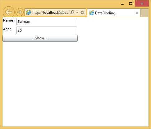
When you press the Show button, it will display the name and age in the message box.
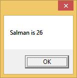
Let us change the Name and Age in the above dialog box.
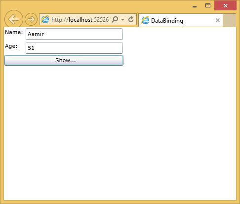
Now, if you click the Show button, it will display the same message again.
This is because the data-binding mode is set to oneway in the XAML code. To show the updated message, you will need to understand the two-way data binding.
Two-way data binding
In two-way binding, the user is able to modify the data through the user interface and have that data updated in the source. If the source changes while the user is looking at the view, you want the view to be updated.
Let us have a look at the same example but only change the binding mode from one-way to two-way binding in XAML code as shown below.
<UserControl x:Class = "DataBinding.MainPage"
   xmlns = "http://schemas.microsoft.com/winfx/2006/xaml/presentation"
   xmlns:x = "http://schemas.microsoft.com/winfx/2006/xaml"
   xmlns:d = "http://schemas.microsoft.com/expression/blend/2008"
   xmlns:mc = "http://schemas.openxmlformats.org/markup-compatibility/2006"
   mc:Ignorable = "d"
   d:DesignHeight = "300" d:DesignWidth = "400">

   <Grid x:Name = "LayoutRoot" Background = "White">

      <Grid.RowDefinitions>
         <RowDefinition Height = "Auto" />
         <RowDefinition Height = "Auto" />
         <RowDefinition Height = "*" />
      </Grid.RowDefinitions>

      <Grid.ColumnDefinitions>
         <ColumnDefinition Width = "Auto" />
         <ColumnDefinition Width = "200" />
      </Grid.ColumnDefinitions>

      <TextBlock Name = "nameLabel" Margin = "2">_Name:</TextBlock>

      <TextBox Name = "nameText" Grid.Column = "1" Margin = "2"
         Text = "{Binding Name, Mode=TwoWay}"/>

      <TextBlock Name = "ageLabel" Margin = "2" Grid.Row = "1">_Age:</TextBlock>

      <TextBox Name = "ageText" Grid.Column = "1" Grid.Row = "1" Margin = "2"
         Text = "{Binding Age, Mode = TwoWay}"/>

      <StackPanel Grid.Row = "2" Grid.ColumnSpan = "2">
         <Button Content = "_Show..." Click = "Button_Click" />
      </StackPanel>

   </Grid>

</UserControl>
Let us run this application again and you can see the same output.
Let us change the Name and Age in the above dialog box.
Now, if you click the Show button it will display the updated message.
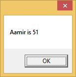
Silverlight - Browser Integration
In this chapter, we are going to see how a Silverlight application can work in conjunction with a web page using the browser integration support.
We can explore Silverlight integration with the browser in the following two ways −
JavaScript code running in the browser can access features within your Silverlight application.
Silverlight has the ability to provide JavaScript wrappers for objects. Your .NET code running inside the Silverlight plug-in has access to the HTML DOM and other browser scripting features because of Silverlight .NET wrappers for JavaScript objects.
We will see how a browser based software application can store information persistently on the client.
Silverlight and HTML
As far as the world of HTML is concerned, Silverlight content is just a single element. This is true for layout. The whole of the Silverlight plug-in and all its content looks like just a single object element.
You must keep in mind that −
Silverlight was not a replacement for HTML, it was designed to complement it. Therefore, the ability to access just another element in the DOM is important.
It enables you to use Silverlight where appropriate.
On a page, that mainly uses HTML, Silverlight integration with the world of the browser goes beyond merely existing as a DOM element, subject to normal HTML Layout.
Accessing DOM
The Silverlight content must able to participate fully in a web page. Therfore, it should be able to access the HTML DOM. Silverlight provides the bridge objects that wrap browser script objects as Dot Net objects, the Script object class in the system. The browser namespace provides methods that let you read and write properties and devote functions on the browser script object.
You need a way to get hold of a Script object in the first place. Silverlight provides an HTML page class that gives you access to various pages of the features such as the Script objects.
Let us have a look at a simple example in which we have a simple script that creates an object with a few attributes. Some of them are just values and a couple of them are functions.
<script type = "text/javascript">
   myJsObject = {
      answer: 42,
      message: "Hello, world",
      modifyHeading: function(title)
         { document.getElementById('heading').innerHTML = title; },
      performReallyComplexCalculation: function(x, y) { return x + y; }
   };

</script>
Given below is the XAML code in which a button is added.
<UserControl x:Class = "DomAccess.Page"
   xmlns = "http://schemas.microsoft.com/winfx/2006/xaml/presentation"
   xmlns:x = "http://schemas.microsoft.com/winfx/2006/xaml"
   Width = "400" Height = "300">

   <Grid x:Name = "LayoutRoot" Background = "White">
      <Button x:Name = "useDomButton" Content = "Use DOM" Width = "75" Height = "30"
         Click = "useDomButton_Click" />
   </Grid>

</UserControl>
Here is the button click implementation in which a script is called which is created in HTML file.
using System;
using System.Collections.Generic;
using System.Linq;
using System.Net;

using System.Windows;
using System.Windows.Controls;
using System.Windows.Documents;
using System.Windows.Input;
using System.Windows.Media;
using System.Windows.Media.Animation;
using System.Windows.Shapes;
using System.Windows.Browser;

using System.Diagnostics;

namespace DomAccess {

   public partial class Page : UserControl {

      public Page() {
         InitializeComponent();
      }

      private void useDomButton_Click(object sender, RoutedEventArgs e) {
         ScriptObject myJsObject = HtmlPage.Window.GetProperty("myJsObject") as ScriptObject;
         string[] propertyNames = { "answer", "message", "modifyHeading",
            "performReallyComplexCalculation" };

         foreach (string propertyName in propertyNames) {
            object value = myJsObject.GetProperty(propertyName);
            Debug.WriteLine("{0}: {1} ({2})", propertyName, value, value.GetType());
         }

         object result = myJsObject.Invoke("performReallyComplexCalculation", 11, 31);
         HtmlElement h1 = HtmlPage.Document.GetElementById("heading");
         h1.SetProperty("innerHTML", "Text from C# (without JavaScript's help)");
         h1.SetStyleAttribute("height", "200px");
      }
   }
}
Given below is the complete HTML file.
<!DOCTYPE html PUBLIC "-//W3C//DTD XHTML 1.0 Transitional//EN" "
   http://www.w3.org/TR/xhtml1/DTD/xhtml1-transitional.dtd">

<html xmlns = "http://www.w3.org/1999/xhtml" >
   <!-- saved from url = (0014)about:internet -->

   <head>
      <title>DomAccess</title>

      <script type = "text/javascript">

         myJsObject = {
            answer: 42,
            message: "Hello, world",
            modifyHeading: function(title) {
               document.getElementById('heading').innerHTML = title; },
            performReallyComplexCalculation: function(x, y) { return x + y; }
         };

      </script>

      <style type = "text/css">

         html, body {
            height: 100%;
            overflow: auto;
         }

         body {
            padding: 0;
            margin: 0;
         }

         #silverlightControlHost {
            height: 100%;
         }

      </style>

      <script type = "text/javascript" src = "Silverlight.js"></script>

      <script type = "text/javascript">

         function onSilverlightError(sender, args) {
            var appSource = "";

            if (sender != null && sender != 0) {
               appSource = sender.getHost().Source;
            }

            var errorType = args.ErrorType;
            var iErrorCode = args.ErrorCode;

            var errMsg = "Unhandled Error in Silverlight 2 Application " +
               appSource + "\n" ;

            errMsg += "Code: "+ iErrorCode + "    \n";
            errMsg += "Category: " + errorType + "       \n";
            errMsg += "Message: " + args.ErrorMessage + "     \n";

            if (errorType == "ParserError") {
               errMsg += "File: " + args.xamlFile + "     \n";
               errMsg += "Line: " + args.lineNumber + "     \n";
               errMsg += "Position: " + args.charPosition + "     \n";
            } else if (errorType == "RuntimeError") {

               if (args.lineNumber != 0) {
                  errMsg += "Line: " + args.lineNumber + "     \n";
                  errMsg += "Position: " +  args.charPosition + "     \n";
               }

               errMsg += "MethodName: " + args.methodName + "     \n";
            }

            throw new Error(errMsg);
         }

      </script>

   </head>

   <body>

      <!-- Runtime errors from Silverlight will be displayed here.
         This will contain debugging information and should be removed or hidden when
         debugging is completed -->

      <div id = 'errorLocation' style = "font-size: small;color: Gray;"></div>

      <h1 id = 'heading'></h1>

      <div id = "silverlightControlHost">

         <object data = "data:application/x-silverlight-2,"
            type = "application/x-silverlight-2" width = "100%" height = "100%">

            <param name = "source" value = "ClientBin/DomAccess.xap"/>
            <param name = "onerror" value = "onSilverlightError" />
            <param name = "background" value = "white" />
            <param name = "minRuntimeVersion" value = "2.0.30923.0" />
            <param name = "autoUpgrade" value = "true" />

            <a href = "http://go.microsoft.com/fwlink/?LinkID=124807"
               style = "text-decoration: none;">
               <img src = "http://go.microsoft.com/fwlink/?LinkId=108181"
               alt = "Get Microsoft Silverlight" style = "border-style: none"/>
            </a>

         </object>

         <iframe style = 'visibility:hidden;height:0;width:0;border:0px'></iframe>

      </div>

   </body>

</html>
When the above code is compiled and executed, you will see all the values in the output window, which are fetched from the HTML file.
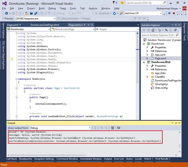
Silverlight - Out-of-Browser Applications
We are now going to explore Silverlight support for applications that can be installed on the end-user's machine to run outside of the web browser like a normal Windows application. There are three main reasons you might want your application to be able to run out-of-browser −
- Interaction
- Offline
- Elevated Trust
Interaction
It may enable better interaction design. A navigation model of the web is not a particularly good fit for some applications. For example, the Address bar and Back button may be a waste of space, and useless.
Importance of Silverlight here is as given below −
Web applications can use client-side technologies, such as Silverlight, Flash, or AJAX to provide continuous updates to a single page, perhaps removing any need to navigate to other pages.
In some applications, a user can spend many minutes, or even hours on what the browser considers to be a single page.
For this sort of application, the Back button can end up having a rather surprising effect of exiting the application because it will dump you back at whatever page you were on before you went into the application.
Distinctly, non-web-like applications are usually better served by running out of the browser, because that gets rid of the browser Chrome. Generally, usability is not the only reason for running out of browser.
Offline
Another reason to use this feature is to enable offline execution. When a Silverlight application is installed for out-of-browser operation, it is copied to a per user repository on the local machine and becomes available through the usual operating system mechanisms for launching applications, like the Start menu on Windows, for example.
The application will then be available even if the user does not have internet connectivity.
Obviously, this is only helpful for applications that do not depend wholly on the server-side information.
For example, an auto-tracking application for a parcel delivery service would not be of much use without the network connectivity.
For some applications, the ability to continue working during occasional connectivity failures is very helpful.
Elevated Trust
Silverlight's version 4 added support for trusted applications. Silverlight's security sandbox normally blocks certain privileged operations, such as accessing the user's files.
However, an out-of-browser application may request elevation. If the user grants that request, the application is able to do more of the kind of work any normal Windows application will be able to do, such as making use of COM Automation, or customizing the window border.
Applications that run inside the browser are never trusted, so you have to write an outof-browser application if you want to use these features.
Enabling OOB
How do we write an out-of-browser application? It is very easy. We have to change a single setting in the project properties of Silverlight and it just adds a suitable setting to the AppManifest.xaml.
Let us see how it works.
When your manifest indicates that out-of-browser execution is supported, this has no initial effect. The application will run in the browser as usual.
However, if the user right clicks, the standard Silverlight ContextMenu offers an extra item to install the application on the computer.
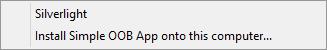
If the user selects that item, a dialog box appears asking for confirmation. It also asks whether the application should be accessible from the Start menu, the Desktop, or both.
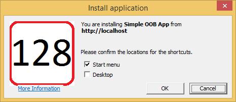
You do not have to rely on the context menu. You could also offer a button that the user can click to install the application, because there is an API, you can call to initiate installation.
When you kick off the installation programmatically, the user still sees the dialog box. You cannot install your app without the user consent.
A Silverlight Application
Here is a very simple Silverlight application. Given below is its XAML code.
<UserControl x:Class = "SimpleOob.MainPage"
   xmlns = "http://schemas.microsoft.com/winfx/2006/xaml/presentation"
   xmlns:x = "http://schemas.microsoft.com/winfx/2006/xaml"
   xmlns:d = "http://schemas.microsoft.com/expression/blend/2008"
   xmlns:mc = "http://schemas.openxmlformats.org/markup-compatibility/2006"
   mc:Ignorable = "d"
   d:DesignHeight = "300" d:DesignWidth = "400">

   <Grid x:Name = "LayoutRoot" Background = "White">

      <Border BorderBrush = "Blue" BorderThickness = "4" CornerRadius = "20" >

         <Border.Background>

            <LinearGradientBrush StartPoint = "0,0" EndPoint = "0,1">
               <GradientStop Offset = "0.0" Color = "White" />
               <GradientStop Offset = "0.15" Color = "#cef" />
               <GradientStop Offset = "1.0" Color = "White" />
            </LinearGradientBrush>

         </Border.Background>

         <TextBlock HorizontalAlignment = "Center" VerticalAlignment = "Center"
            Text = "Silverlight Application" TextOptions.TextHintingMode = "Animated"
            TextAlignment = "Center" TextWrapping = "Wrap"
            FontSize = "72" FontFamily = "Trebuchet MS" >

               <TextBlock.Effect>
                  <DropShadowEffect Color = "#888" />
               </TextBlock.Effect>

         </TextBlock>

      </Border>

   </Grid>

</UserControl>
Step 1 − To enable out-of-browser execution, go to the project's Properties, and click the Silverlight tab. All we need to do is − check the Enable running application out of the browser checkbox.
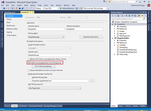
If you run this application, you will notice that you will not get a web browser at all.
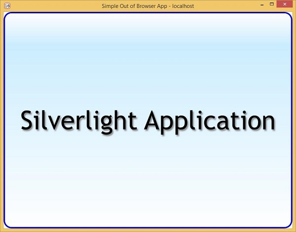
In fact, Visual Studio has made a decision on your behalf. When you enabled out-of-browser execution, it unfairly changed your debug settings.
Step 2 − So, here in the Solution Explorer, notice that Silverlight project is now in bold, indicating that it is a startup project.
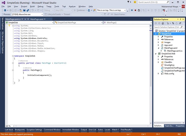
That was not the case before. It had been the web project. Right now, we do not want that, because we want to show how that checkbox changes things for the end user.
Step 3 − We will set the web project back to being the StartUp Project.
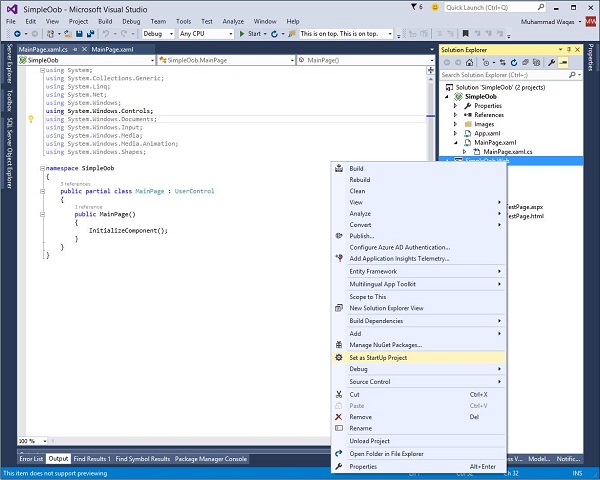
Step 4 − Run the application again, and you will see that the application is back in the browser now.
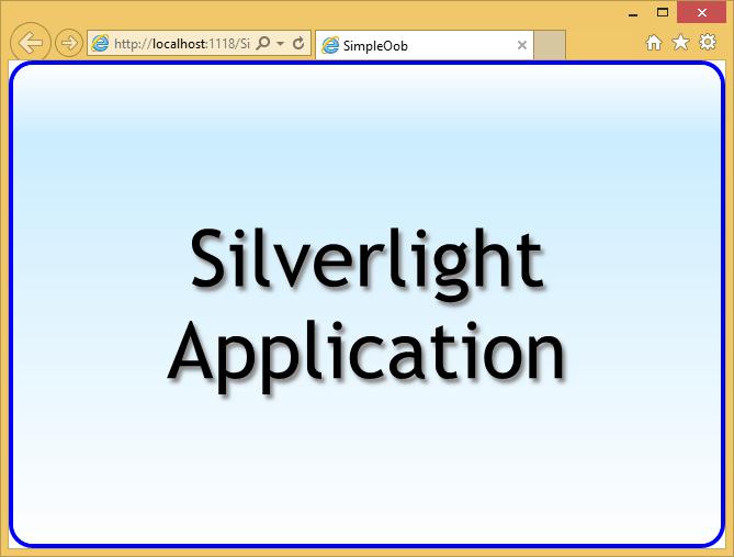
Step 5 − Right-click the webpage. You will notice the usual Silverlight entry in the context menu, and an extra item to install.
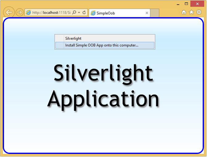
Step 6 − When you select the second option, Install application dialog box appears as shown below.
Notice that it shows the root URL of the website, the application came from. We are using the local debug web server provided by Visual Studio, which is why it says localhost.
Step 7 − Click OK, and the application runs in its own window separate from the browser.
It might be natural to think that this window is somehow owned by, or connected to the browser, but it is not. You can close the browser, and this window stays around. More importantly, you can close this window, and then rerun the application without using the browser at all.
Step 8 − If you open the Search dialog box in the Start menu and start to type the application name, it shows up just like any normal Windows application does.
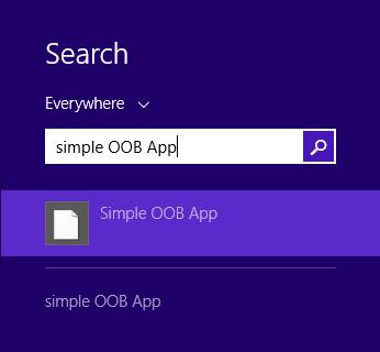
Step 9 − You can run it without the browser being anywhere in sight.
To uninstall the application
The default context menu on the application provides an easy way for doing that. A user could reasonably expect to uninstall this the same way they would any other application.
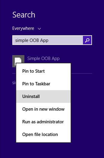
You can also remove by right-clicking on the web page and selecting Remove this application.
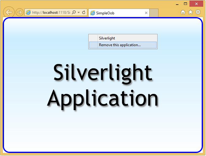
OOB Settings
Although we only had to change a single setting to enable out-of-browser operation, in practice, you will normally want to do a bit more than that. The AppManifest.xaml file can contain several settings related to out-of-browser operation, which we usually configure through Visual Studio.
As you may have noticed, when you checked the checkbox to enable running out-ofbrowser, Visual Studio enabled a button labeled Out-of-Browser Settings.
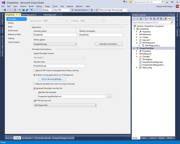
Let us take a look at it by clicking the button. It will produce the following dialog box.
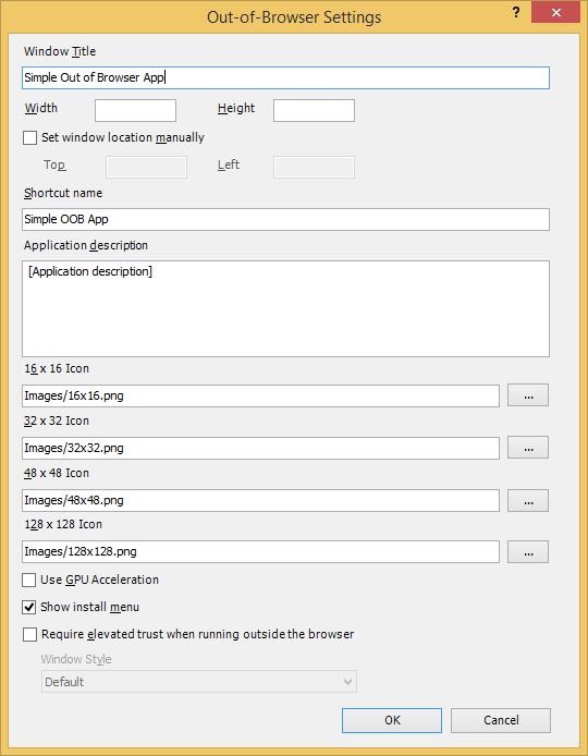
The first thing we can configure is the text that appears as the Window Title.
We also have the option to fix the window dimensions and locations, but we will leave those on automatic for now.
This Shortcut name appears in the Start menu, and the Desktop link for the app once it's installed.
It is also the text that appears in the context menu, and the install application dialog.
This Application description appears in the tool tip when I hover over the shortcuts.
We get to provide icons at various sizes. These have to be built into your project.
Applications, Resources & Deployment
In this chapter, we are going to look at common issues around creating and deploying applications and the resources they need.
Loading the Plug-in
The minimum requirements for running a Silverlight application are hosting web page containing an object tag to load the Silverlight plug-in, and the compiled Silverlight content itself.
As you saw, we used param tags in the object tag to point to the content.
HTML <Object> tag
There are other parameters we can pass in to control features such as the user interface to be shown while the content is downloaded, the JavaScript code to run in the event of an error, and fallback content to be shown if Silverlight is not installed.
<Object> in HTML
Here is an example object tag that loads some Silverlight content. You have seen this before, but we are going to look at a few things in a bit more detail, starting with the attributes on the object tag itself.
Type Attribute
The type attribute contains a MIME type identifying this as a Silverlight element. This is how the browser knows what sort of embedded content we are using. The object tag is surprisingly flexible. It is not just for plug-ins. You can use it to host embedded images, or HTML, as well as plug-in-based content, such as Silverlight, or Flash.
If the Silverlight plug-in is installed, this will load it. If not, the standard format behavior is for the browser to render any HTML content inside the object tag as though the object and param tags were not there.
<object data = "data:application/x-silverlight-2," type =  "application/x-silverlight-2"
   width = "100%" height = "100%">

   <param name = "source" value = "ClientBin/DataBinding.xap"/>
   <param name = "onError" value = "onSilverlightError" />
   <param name = "background" value = "white" />
   <param name = "minRuntimeVersion" value = "5.0.61118.0" />
   <param name = "autoUpgrade" value = "true" />

   <a href = "http://go.microsoft.com/fwlink/?LinkID=149156&v=5.0.61118.0"
      style = "textdecoration:none">

      <img src = "http://go.microsoft.com/fwlink/?LinkId=161376"
         alt = "Get Microsoft Silverlight" style = "border-style:none"/>
   </a>

</object>
Data Attribute
The next attribute, data, is a little less obvious. The comma at the end is meant to be there. Some important features are −
This attribute is not technically necessary, but Microsoft recommends you add it because some web browsers have a rather surprising behavior when loading plugins.
The object tag is designed to host embedded content, so browsers expect a binary string to be involved, a bitmap file, or a video, or audio stream, or something.
You would normally expect to put a URL in the data attribute, and the browser to download that data, and pass it to the plug-in.
The data attribute takes a URI, and usually it will be pointed at some data, such as a JPEG file, but here, we are using a slightly unusual URI scheme.
<param> Tags
We have various param tags inside the object, starting with the source param.
<param name = "source" value = "ClientBin/DataBinding.xap"/>
It gives the plug-in from where to download the Silverlight content.
You should provide a JavaScript error handler. This will be called if the download process fails. It will also be called if an unhandled exception is thrown, once the Silverlight code is up and running.
<param name = "onError" value = "onSilverlightError" />
So it's not just for load failures. You should also specify the minimum version of Silverlight required by your code.
Microsoft encourages the users to keep up to date, so once a machine has the Silverlight plug-in installed, new versions will be offered via Windows update, but it is always possible that a user will be running an older version than the one you require.
<param name = "minRuntimeVersion" value = "5.0.61118.0" />
<param name = "autoUpgrade" value = "true" />
This minRuntimeVersion parameter lets you say which version you need. If the installed version is older, the onError handler will be invoked.
Silverlight passes numeric error codes to the error handling JavaScript function, and there is a distinct error code, 8001 as it happens, to indicate that the plug-in is out of date.
You can write JavaScript code to respond to the problem, or you can just ask the plug-in to attempt to upgrade for you.
Here, the autoUpgrade parameter is set to True, which means that if the installed plugin is out of date, Silverlight will automatically show a message telling the user that a more recent version is required, offering to install it for them.
Fallback HTML Content
After the param tags, comes the fallback HTML content to be used if Silverlight is not installed.
The standard browser behavior for object tags whose MIME type is unknown is to act as though the object and param tags were not there at all. So, this a tag and its contents will be shown in systems that do not have the Silverlight plug-in.
<a href = "http://go.microsoft.com/fwlink/?LinkID=149156&v=5.0.61118.0"
   style = "text-decoration:none">
   <img src = "http://go.microsoft.com/fwlink/?LinkId=161376"
      alt = "Get Microsoft Silverlight" style = "border-style:none"/>
</a>
Notice the two URLs to the go.microsoft.com site, a hyperlink, and an image.
The image link resolves to a bitmap with some Silverlight branding, and some text offering to install Silverlight. The endpoint for the hyperlink is moderately smart. The server inspects the user agent to decide where to redirect.
It may serve back the Silverlight Install executable, or if the user is on an unsupported platform, it will direct the browser to a page containing information about Silverlight.
Silverlight.js
There is an alternative to the HTML object tag for loading Silverlight content. Microsoft provides a JavaScript file called Silverlight.js that allows the loading process to be managed from the browser script.
Visual Studio adds a copy when you create a web project to host a newly created Silverlight project. The Silverlight SDK also contains a copy of this file.
The main benefit of Silverlight.js is that it allows more flexibility when Silverlight is not installed.
XAML Resources
Silverlight also offers a mechanism for creating object resources in XAML. There are certain kinds of objects usually corrected through XAML that you might want to be able to use in multiple places in your application. It is very common to want to use templates in more than one place.
If you have defined a custom look for a button, you might want to apply it to multiple buttons, or maybe even all the buttons in your application. The XAML resource system provides a way to do this. You can define a named resource, and then use it elsewhere in the XAML.
Besides templates, it is also common to want to do this for graphical resources, such as brushes and shapes. If you have a particular color scheme in use in your application, you might define the colors and brushes for that scheme as resources.
Here is a simple application for the SolidColorBrush resource.
<UserControl x:Class = "XAMLResources.MainPage"
   xmlns = "http://schemas.microsoft.com/winfx/2006/xaml/presentation"
   xmlns:x = "http://schemas.microsoft.com/winfx/2006/xaml"
   xmlns:d = "http://schemas.microsoft.com/expression/blend/2008"
   xmlns:mc = "http://schemas.openxmlformats.org/markup-compatibility/2006"
   mc:Ignorable = "d"
   d:DesignHeight = "300" d:DesignWidth = "400">

   <UserControl.Resources>
      <SolidColorBrush x:Key = "brushResource" Color = "AliceBlue" />
   </UserControl.Resources>

   <Grid x:Name = "LayoutRoot" Background = "White">
      <StackPanel>
         <Rectangle Height = "50" Margin = "20" Fill = "{StaticResource brushResource}" />
         <Rectangle Height = "50" Margin = "20" Fill = "{StaticResource brushResource}"/>
      </StackPanel>
   </Grid>

</UserControl>
In the above XAML code, you can see that both rectangles have StaticResource The color of brushResource is AliceBlue.
When the above code is compiled and executed, you will see the following output.
App.xaml
All Silverlight applications have a file called App.xaml. It contains application-wide information. For example, it has a Resources property just like user interface elements do.
Resources that you define in the App.xaml file are available across all XAML files in the project. So rather than cluttering up my MainPage.xaml with these sorts of resources, we can move them out to application scope.
<Application
   xmlns = "http://schemas.microsoft.com/winfx/2006/xaml/presentation"
   xmlns:x = "http://schemas.microsoft.com/winfx/2006/xaml"
   x:Class = "XAMLResources.App" >

   <Application.Resources>
      <SolidColorBrush x:Key = "brushResource" Color = "AliceBlue" />
   </Application.Resources>

</Application>
Application Class
Like most XAML files, the App.xaml file and its corresponding code behind file define a class. This Application class is the entry point to the Silverlight application. The App.xaml typically deals with application scope resources; its code behind file contains startup and shutdown handling code.
Shortly after creating an instance of your Application class, Silverlight raises its Application.Startup event.
Here we create the user interface. We are expected to create a user interface element and assign it to the application objects RootVisual property in the Startup event, and that will become the user interface displayed by the Silverlight plug-in.
public partial class App : Application {

   public App() {
      this.Startup += this.Application_Startup;
      this.Exit += this.Application_Exit;
      this.UnhandledException += this.Application_UnhandledException;
      InitializeComponent();
   }

   private void Application_Startup(object sender, StartupEventArgs e) {
      this.RootVisual = new MainPage();
   }

   private void Application_Exit(object sender, EventArgs e) {}

   private void Application_UnhandledException(object sender,
      ApplicationUnhandledExceptionEventArgs e) {

      if (!System.Diagnostics.Debugger.IsAttached) {
         e.Handled = true;
         Deployment.Current.Dispatcher.BeginInvoke(delegate { ReportErrorToDOM(e); });
      }

   }

   private void ReportErrorToDOM(ApplicationUnhandledExceptionEventArgs e) {
      try {
         string errorMsg = e.ExceptionObject.Message + e.ExceptionObject.StackTrace;
         errorMsg = errorMsg.Replace('"', '\'').Replace("\r\n", @"\n");
         System.Windows.Browser.HtmlPage.Window.Eval("throw new Error
            (\"Unhandled Error in Silverlight Application " + errorMsg + "\");");
      } catch (Exception) {}
   }
}
Points to Note
Note that you cannot change the RootVisual. You have to set it exactly once. If you want to change the user interface while your application is running, you must do it by changing the content of your MainPage, rather than trying to replace the MainPage with a different one.
The other application events are Exit, which is your last minute chance to run the shutdown code when the user interface is about to go away, and UnhandledException, which is raised if your code throws an unhandled exception.
If you do not provide a handler for the UnhandledException event, or if that handler does not mark the event as being handled, UnhandledExceptions will effectively shut down your Silverlight application.
The plug-ins area on screen will go blank, and a scripting error will be reported to the browser.
Silverlight - File Access
In this chapter, we will see how Silverlight applications can access files on the end user's computer. There are three main ways to access files in Silverlight. The choice will depend on the reason you need to use files, and on whether you are writing a trusted application.
The most flexible option is to use the file dialog classes. With the Open and Save file dialogs, you can get access to any file that the end user chooses, as long as the user has appropriate permissions. User consent is central to this approach. The user has to choose which file to read, or when saving, they pick a file to overwrite or pick a location and a file name for you.
The second option is to use the various classes in the System.IO namespace. Silverlight offers classes such as FileStream, StreamWriter, FileInfo, Directory, and DirectoryInfo, all of which make it possible to write code that opens and accesses files without needing to get the user involved. That may be more convenient for the developer, but of course, most users would not want any old code downloaded as part of a web page to be able to search around in their files.
The third option is Isolated Storage, which we will discuss later.
Open & Save File Dialogs
SaveFileDialog
The SaveFileDialog class shows the standard operating system supplied user interface for choosing where to save a file.
Some important features are −
To use it, we create an instance of the SaveFileDialog class.
Calling ShowDialog, causes it to appear, and the return code tells us whether the user selected a place to save the file, or cancelled the dialog.
You might be wondering about the redundant-looking comparison with True there. If ShowDialog returns True value, which means the user has selected a file. So we can go on to call the OpenFile method, which returns us a Stream.
If we want to, we can discover the name the user chose. The dialog provides a property called SafeFileName, but that does not include the path. In any case, the only way to write data is to use the Stream returned by the dialog. From a developers perspective, this is just an ordinary .NET stream, so we can wrap it in a StreamWriter, to write text into it.
OpenFileDialog
The OpenFileDialog is similar in use to the SaveFileDialog. Obviously, you are always picking an existing file rather than a new one, but there is another important difference.
It offers a property called MultiSelect. If you set that to True, the user can choose multiple files. This means the dialog needs a slightly more complex API.
The SaveFileDialog only deals with one file at a time, but OpenFileDialog is able to cope with more, so it does not offer an OpenFile method. We need to expand the code. Depending on whether the dialog is in single file mode, or MultiSelect mode, you use either its File, or Files property.
Here, in the below given example, we are in single file mode. Hence, we use File, and we call OpenRead on the FileInfo object that returns.
In multiselect mode, we would use Files instead, which returns a collection of FileInfo objects.
FileStream
The second approach to file access as mentioned above is to use the FileStream class, or related types in the System.IO namespace directly. There is not very much to say about this, because for the most part, it is similar to file access with the full .NET Framework.
However, there are a couple of Silverlight-specific twists.
First, this approach lets you access files at any time without user intervention, and without any obvious visible indication of file activity, only trusted applications are allowed to use this technique. Remember, you need to run out of browser to get elevated trust.
The second issue is that only files in certain specific folders are available. You can only read and write files that are under the User's Documents, Music, Pictures, or Video files. One reason for this is that Silverlight runs on multiple platforms, and the file system structure for, say, an Apple Mac, is very different from that of Windows. Hence, cross-platform file access has to work in terms of a limited set of folders that are available on all systems Silverlight supports.
Since these folders will be in different locations on different operating systems, and their location will typically vary from one user to another, you need to use the Environment.GetFolderPath method to discover the actual location at runtime.
You can inspect the directory structure beneath the starting points. The Directory and DirectoryInfo classes in the System.IO namespace lets you enumerate files and directories.
Consider a simple example in which file can open via OpenFileDialog and save some text to the file via SaveFileDialog.
Given below is the XAML code in which two buttons and a text box are created.
<UserControl x:Class = "FileDialogs.MainPage"
   xmlns = "http://schemas.microsoft.com/winfx/2006/xaml/presentation"
   xmlns:x = "http://schemas.microsoft.com/winfx/2006/xaml"
   xmlns:d = "http://schemas.microsoft.com/expression/blend/2008"
   xmlns:mc = "http://schemas.openxmlformats.org/markup-compatibility/2006"
   mc:Ignorable = "d"
   d:DesignHeight = "300" d:DesignWidth = "400">

   <Grid x:Name = "LayoutRoot" Background = "White">

      <Grid.RowDefinitions>
         <RowDefinition Height = "Auto" />
         <RowDefinition Height = "265*" />
      </Grid.RowDefinitions>

      <Button
         x:Name = "saveFileButton"
         Content = "Save"
         Width = "75" FontSize = "20"
         HorizontalAlignment = "Left" VerticalAlignment = "Top"
         Margin = "12,12" Click = "saveFileButton_Click" />

      <Button
         x:Name = "openFileButton"
         Content = "Open"
         Width = "75" FontSize = "20"
         HorizontalAlignment = "Left" VerticalAlignment = "Top"
         Margin = "101,12,0,0" Click = "openFileButton_Click" />

      <TextBox
         x:Name = "contentTextBox"
         Grid.Row = "1"
         Margin = "12" FontSize = "20" />

   </Grid>

</UserControl>
Given below is C# code for click events implementation in which file is opened and saved.
using System;
using System.Diagnostics;
using System.IO;

using System.Windows;
using System.Windows.Controls;

namespace FileDialogs {

   public partial class MainPage : UserControl {

      public MainPage() {
         InitializeComponent();
      }

      private void saveFileButton_Click(object sender, RoutedEventArgs e) {
         var save = new SaveFileDialog();
         save.Filter = "Text Files (*.txt)|*.txt|All Files (*.*)|*.*";
         save.DefaultExt = ".txt";

         if (save.ShowDialog() == true) {
            Debug.WriteLine(save.SafeFileName);
            using (Stream saveStream = save.OpenFile())
            using (var w = new StreamWriter(saveStream)) {
               var fs = saveStream as FileStream;

               if (fs != null) {
                  w.Write(contentTextBox.Text);
               }
            }
         }
      }

      private void openFileButton_Click(object sender, RoutedEventArgs e) {
         var open = new OpenFileDialog();

         if (open.ShowDialog() == true) {
            using (Stream openStream = open.File.OpenRead()) {
               using (var read = new StreamReader(openStream)) {
                  contentTextBox.Text = read.ReadToEnd();
               }
            }
         }
      }
   }
}
When the above code is compiled and executed, you will see the following webpage, which contains two buttons.
Click the Open button, which will open OpenFileDialog to select a text file.
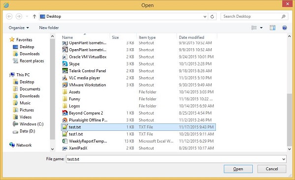
Select a text file and click Open, you will see the text on textbox.
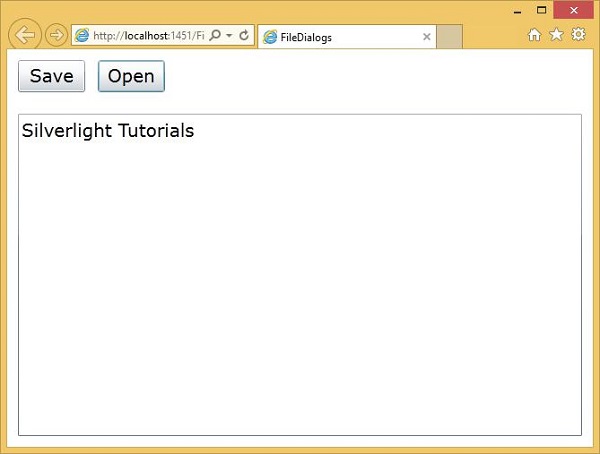
To save text to the file, update the text.
Click the Save button to save the changes to either new text file or existing file.
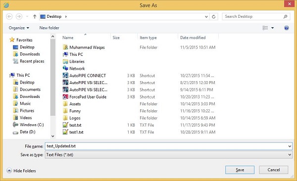
To save changes to the existing text file, select the text file in SaveFileDialog, but if you want to save changes to the new file write the file name and click the Save button.
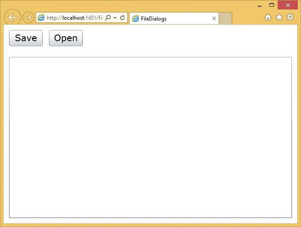
Silverlight - View Model
In this chapter, we will be looking at an important technique in Silverlight's software development, the use of View Models.
The view model is a key piece, which introduces a technique called separated presentation by keeping the view separate from the model.
View Models offer one-way of achieving separated presentation, and we will see how they exploit Silverlight's data binding to reduce the amount of code needed in your user interface.
UI Development Challenges
View Models are designed to solve certain problems that crop up frequently when developing user interface software. Perhaps the most important one is that user interface code is often difficult to inextricably test, especially with automated unit tests. There are also code quality problems that can affect the ongoing flexibility and maintainability of your code.
If you follow the path of least resistance that Visual Studio's design tools lead you down, you can end up putting far too much code into the code behind.
It is very common to see large amounts of application functionality are added into the code behind.
Few developers would actually plan to put business logic into a user interface class, but because that is where Visual Studio puts your event handlers, it becomes an all too convenient place to get the things done.
It is widely accepted that software is easier to develop and maintain if classes have well-defined, and reasonably narrow responsibilities.
The code behind's job is to interact directly with the objects that make up the user interface where it is necessary.
As soon as you start putting code that makes decisions about how your application behaves in there which tends to lead to problems.
Not only can application logic flow into code that's supposed to be concerned with the user interface, some developers start to rely on controls, and other user interface objects to hold important application state.
The model simply holds the data, the view simply holds the formatted date, and the controller (ViewModel) acts as the liaison between the two. The controller might take input from the view and place it on the model and vice versa.
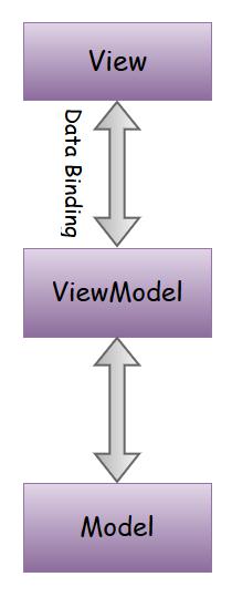
Separated Presentation
To avoid the problems caused by putting application logic in the code behind or XAML, it is best to use a technique known as separated presentation. Having XAML and code behind with the minimum required for working with user interface objects directly, a user interface classes also contain code for complex interaction behaviors, application logic, and everything else as shown below on left side.
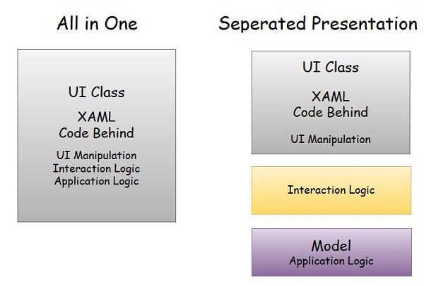
Important features of Seperated Presentation −
With separated presentation, the user interface class is much simpler. It has XAML of course, but the code behind does as little as is practical.
The application logic belongs in a separate class, which is often referred to as the model.
Many developers attempt to use data binding to connect elements in the XAML directly to properties in the model.
The problem is the model is entirely concerned with matters of what the application does, and not with how the user interacts with the application.
Most user interfaces have some state that does not belong in the application model. For example, if your user interface uses a drag and drop, something needs to keep track of things like where the item being dragged is right now, how its appearance should change as it moves over possible drop targets, and how those drop targets might also change as the item is dragged over them.
This sort of state can get surprisingly complex, and needs to be thoroughly tested.
In practice, you normally want some other class sitting between the user interface and the model. This has two important roles.
First, it adapts your application model for a particular user interface view.
Second, it is where any nontrivial interaction logic lives, and by that, I mean code required to get your user interface to behave in the way you want.
Model / View / ViewModel
View Model is an example of the separated presentation approach, but let us be clear about exactly what sort of thing we have in each layer. There are three layers −
- Model
- View
- ViewModel
Model
This is a classic object model comprising of ordinary C# classes that has no direct relationship with the user interface.
You would typically expect your Model codes to be able to compile without references to any user interface libraries. In fact, you would probably be able to take the exact same source code and compile it into a Silverlight application, an ordinary .NET Console application, or even server-side web code.
The types in the Model should represent the concepts your application works with.
View
A View is normally a UserControl, it might be your MainPage, or it might just be some part of your page.
In most Silverlight applications, it is a good idea to split your user interface up into small pieces defining a UserControl, or View for each piece.
Silverlight applications are not unique in this respect. Something that is obviously Silverlight specific is the View. The more fine-grained your user interface is, the better things tend to be. Not only are you less likely to trip over other developers working on the same files, keeping things small and simple naturally discourages the shortcuts that lead to spaghetti-like code.
For example, it is very common to define a View to represent an individual item in a List.
ViewModel
Finally, for each View, you write a ViewModel. So, this is one of the important features of a ViewModel class.
It exists to serve a particular View. The ViewModel is specialized for a particular way of presenting things, such as a particular data item as it appears in Lists.
This is why it is called a ViewModel; it adapts the underlying Model especially for a particular View. Like the Model, the ViewModel is also an ordinary C# class. It does not need to derive from any particular type.
As it happens, some developers find it convenient to put some common functionality into a base ViewModel class, but the pattern does not demand that. In particular, your ViewModel does not derive from any Silverlight specific type. However, unlike the model, it can use Silverlight types in its properties.
For example, your ViewModel might choose to make certain parts of your user interface visible only under certain conditions, and so you might provide a property of type System.Windows.Visibility, which is the type Silverlight elements use for their Visibility property. This makes it possible to bind the visibility of an element, such as a panel, directly to the ViewModel.
Example
Let us look at a simple example in which we will be using Model-View-ViewModel (MVVM) approach.
Step 1 − Create a new Silverlight Application project SilverlightMVVMDemo.
Step 2 − Add the three folders (Model, ViewModel, and Views) into your project as shown below.
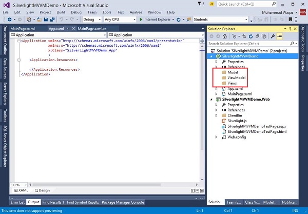
Step 3 − Add a StudentModel class in the Model folder and paste the below code in that class.
using System.ComponentModel;

namespace SilverlightMVVMDemo.Model {

   public class StudentModel {}

   public class Student : INotifyPropertyChanged {
      private string firstName;
      private string lastName;

      public string FirstName {
         get { return firstName; }

         set {
            if (firstName != value) {
               firstName = value;
               RaisePropertyChanged("FirstName");
               RaisePropertyChanged("FullName");
            }
         }
      }

      public string LastName {
         get { return lastName; }

         set {
            if (lastName != value) {
               lastName = value;
               RaisePropertyChanged("LastName");
               RaisePropertyChanged("FullName");
            }
         }
      }

      public string FullName {
         get {
            return firstName + " " + lastName;
         }
      }

      public event PropertyChangedEventHandler PropertyChanged;

      private void RaisePropertyChanged(string property) {
         if (PropertyChanged != null) {
            PropertyChanged(this, new PropertyChangedEventArgs(property));
         }
      }
   }
}
Step 4 − Add another StudentViewModel class into ViewModel folder and paste the following code.
using SilverlightMVVMDemo.Model;
using System.Collections.ObjectModel;

namespace SilverlightMVVMDemo.ViewModel {

   public class StudentViewModel {

      public ObservableCollection<Student> Students {
         get;
         set;
      }

      public void LoadStudents() {
         ObservableCollection<Student> students = new ObservableCollection<Student>();

         students.Add(new Student { FirstName = "Mark", LastName = "Allain" });
         students.Add(new Student { FirstName = "Allen", LastName = "Brown" });
         students.Add(new Student { FirstName = "Linda", LastName = "Hamerski" });

         Students = students;
      }
   }
}
Step 5 − Add Silverlight User Control by right-clicking on Views folder and Select Add New Item.

Step 6 − Click Add. Now you will see the XAML file. Add the following code into StudentView.xaml file, which contains different UI elements.
<UserControl x:Class = "SilverlightMVVMDemo.Views.StudentView"
   xmlns = "http://schemas.microsoft.com/winfx/2006/xaml/presentation"
   xmlns:x = "http://schemas.microsoft.com/winfx/2006/xaml"
   xmlns:d = "http://schemas.microsoft.com/expression/blend/2008"
   xmlns:mc = "http://schemas.openxmlformats.org/markup-compatibility/2006"
   mc:Ignorable = "d"
   d:DesignHeight = "300" d:DesignWidth = "400">

   <Grid x:Name = "LayoutRoot" Background = "White">

      <StackPanel HorizontalAlignment = "Left">

         <ItemsControl ItemsSource = "{Binding Path=Students}">

            <ItemsControl.ItemTemplate>

               <DataTemplate>

                  <StackPanel Orientation = "Horizontal">
                     <TextBox Text = "{Binding Path = FirstName, Mode = TwoWay}"
                        Width = "100" Margin = "3 5 3 5"/>

                     <TextBox Text = "{Binding Path = LastName, Mode = TwoWay}"
                        Width = "100" Margin = "0 5 3 5"/>

                     <TextBlock  Text = "{Binding Path = FullName, Mode=OneWay}"
                        Margin = "0 5 3 5"/>

                  </StackPanel>

               </DataTemplate>

            </ItemsControl.ItemTemplate>

         </ItemsControl>

      </StackPanel>

   </Grid>

</UserControl>
Step 7 − Now add the StudentView into your MainPage.xaml file as shown below.
<UserControl x:Class = "SilverlightMVVMDemo.MainPage"
   xmlns = "http://schemas.microsoft.com/winfx/2006/xaml/presentation"
   xmlns:x = "http://schemas.microsoft.com/winfx/2006/xaml"
   xmlns:d = "http://schemas.microsoft.com/expression/blend/2008"
   xmlns:mc = "http://schemas.openxmlformats.org/markup-compatibility/2006"
   xmlns:views = "clr-namespace:SilverlightMVVMDemo.Views"
   mc:Ignorable = "d"
   d:DesignHeight = "576.316" d:DesignWidth = "863.158">

   <Grid x:Name = "LayoutRoot" Background = "White">
      <views:StudentView x:Name = "StudentViewControl" Loaded = "StudentViewControl_Loaded"/>
   </Grid>

</UserControl>
Step 8 − Here is the implementation of Loaded event in the MainPage.xaml.cs file, which will update the View from the ViewModel.
using System.Windows;
using System.Windows.Controls;

namespace SilverlightMVVMDemo {

   public partial class MainPage : UserControl {

      public MainPage() {
         InitializeComponent();
      }
   }

   private void StudentViewControl_Loaded(object sender, RoutedEventArgs e) {
      SilverlightMVVMDemo.ViewModel.StudentViewModel
      studentViewModelObject = new SilverlightMVVMDemo.ViewModel.
      StudentViewModel();
      studentViewModelObject.LoadStudents();
      StudentViewControl.DataContext = studentViewModelObject;
   }
}
Step 9 − When the above code is compiled and executed, you will see the following output on you webpage.
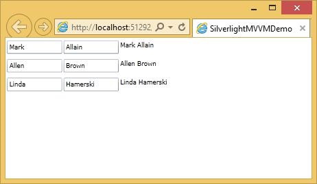
UI vs ViewModel
One of the hardest parts of the MVVM approach is working out where the dividing line should come. It is not always obvious which things belong where.
In particular, some user interface elements provide functionality, which, according to a strict View, should arguably belong in the ViewModel.
In general, not all behaviors implemented in the View are so ViewModel friendly.
Part of the reason for this is that there is not any standard way to package ViewModel behavior for reuse, particularly not if you want to use a design environment, such as Visual Studio, or Blend.
Advantages of MVVM
MVVM offers the following advantages −
Separation of Presentation Concerns (View, ViewModel, Model)
Clean testable and manageable code. Can include presentation tier logic in unit testing.
No code behind code, so the presentation layer and the logic is loosely coupled.
Better way of databinding.
Disadvantages of MVVM
For simple UIs, MVVM can be an overkill. Debugging would be a bit difficult when we have complex data bindings.
Silverlight - Input Handling
In this chapter, we will learn how to handle user input in Silverlight applications. Silverlight provides a powerful API with the help of which an application can get input from various devices such as mouse, keyboard, and touch etc.
Input Types
There are several different ways, a user can interact with your application. The most obvious way is with a mouse. Silverlight offers events for tracking −
- Mouse movements
- Button clicks, and
- Wheel activity
There is also the keyboard, of course, and Silverlight also supports touch screen input. If you are familiar with touch support in Windows, you know that touch input can be represented either as low-level events providing detailed information, or it can be summarized into high-level events called gestures.
Mouse Events
Let us get started by looking at the mouse input events Silverlight offers. Some events are concerned with the movement of the mouse pointer.
The MouseMove event is raised anytime the pointer moves while it is over the elements to which you have attached the handler.
You also get MouseEnter and MouseLeave events to notify you of when the mouse moves in to, and out of the element.
Given below is the XAML code in which ellipse and TextBlock is added.
<UserControl x:Class="MouseInput.MainPage"
   xmlns = "http://schemas.microsoft.com/winfx/2006/xaml/presentation"
   xmlns:x = "http://schemas.microsoft.com/winfx/2006/xaml"
   xmlns:d = "http://schemas.microsoft.com/expression/blend/2008"
   xmlns:mc = "http://schemas.openxmlformats.org/markup-compatibility/2006"
   mc:Ignorable = "d"
   d:DesignHeight = "300" d:DesignWidth = "400">

   <Grid x:Name = "LayoutRoot" Background = "White">

      <TextBlock x:Name = "mouseText" FontSize = "40"
         VerticalAlignment = "Top" Height = "76" Margin = "0,10,0,0" />

      <Ellipse
         Name = "myEllipse"
         Width = "320" Height = "150" HorizontalAlignment = "Left"
         VerticalAlignment = "Top" Margin = "27,103,0,0"
         Stroke = "Black" StrokeThickness = "10" Fill = "#00FF0000"
         MouseEnter = "myEllipse_MouseEnter"
         MouseLeave = "myEllipse_MouseLeave"
         MouseMove = "myEllipse_MouseMove" />

   </Grid>

</UserControl>
Given below is the implementation for different mouse input events.
using System.Windows.Controls;
using System.Windows.Input;
using System.Windows.Media;

namespace MouseInput {

   public partial class MainPage : UserControl {

      public MainPage() {
         InitializeComponent();
      }

      private void myEllipse_MouseEnter(object sender, MouseEventArgs e) {
         mouseText.Text = "Mouse Enter";
         myEllipse.Stroke = new SolidColorBrush(Colors.Blue);
      }

      private void myEllipse_MouseLeave(object sender, MouseEventArgs e) {
         mouseText.Text = "Mouse Leave";
         myEllipse.Stroke = new SolidColorBrush(Colors.Black);
      }

      private void myEllipse_MouseMove(object sender, MouseEventArgs e) {
         mouseText.Text = "Mouse Move: " + e.GetPosition(myEllipse);
      }
   }
}
When the above code is compiled and executed, you will see the following output.
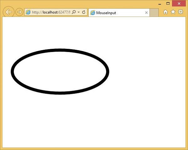
When the mouse enters the ellipse, you will see the change in color and coordinates.
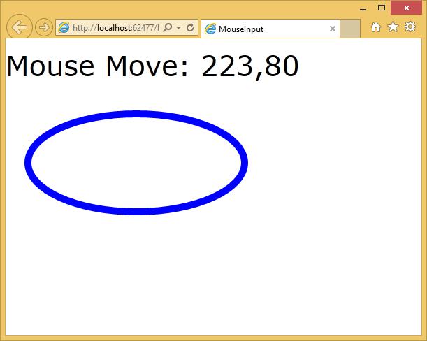
When the mouse leaves the ellipse, it will show a message mouse leave and will change to the default color.
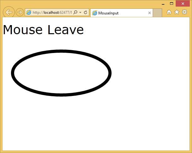
Keyboard
The easiest way for a user to enter textual data into your application is through the keyboard, where available. Remember that not all mobile devices have keyboards except for laptops and desktops.
Silverlight offers two straightforward events for keyboard input, KeyUp and KeyDown.
Both of these pass a KeyEventArgs to the handler, and the Key property indicates which key was pressed.
In the below example some of the keyboard input are handled.
The following example defines a handler for the Click event and a handler for the KeyDown event.
Given below is the XAML code in which different UI elements are added.
<UserControl x:Class = "KeyboardInput.MainPage"
   xmlns = "http://schemas.microsoft.com/winfx/2006/xaml/presentation"
   xmlns:x = "http://schemas.microsoft.com/winfx/2006/xaml"
   xmlns:d = "http://schemas.microsoft.com/expression/blend/2008"
   xmlns:mc = "http://schemas.openxmlformats.org/markup-compatibility/2006"
   mc:Ignorable = "d"
   d:DesignHeight = "300" d:DesignWidth = "400">

   <Grid x:Name = "LayoutRoot" Background = "White">

      <StackPanel Orientation = "Horizontal" KeyDown = "OnTextInputKeyDown">
         <TextBox Width = "400" Height = "30" Margin = "10"/>

         <Button Click = "OnTextInputButtonClick"
            Content = "Open" Margin = "10" Width = "50" Height = "30"/>

      </StackPanel>

   </Grid>

</UserControl>
Given below is the C# code in which different keyboard and click events are handled.
using System.Windows;
using System.Windows.Controls;
using System.Windows.Input;

namespace KeyboardInput {

   public partial class MainPage : UserControl {

      public MainPage() {
         InitializeComponent();
      }

      private void OnTextInputKeyDown(object sender, KeyEventArgs e) {
         if (e.Key == Key.O) {
            handle();
            e.Handled = true;
         }
      }

      private void OnTextInputButtonClick(object sender, RoutedEventArgs e) {
         handle();
         //e.Handled = true;
      }

      public void handle() {
         MessageBox.Show("Do you want to open a file?");
      }
   }
}
When the above code is compiled and executed, you will see the following −
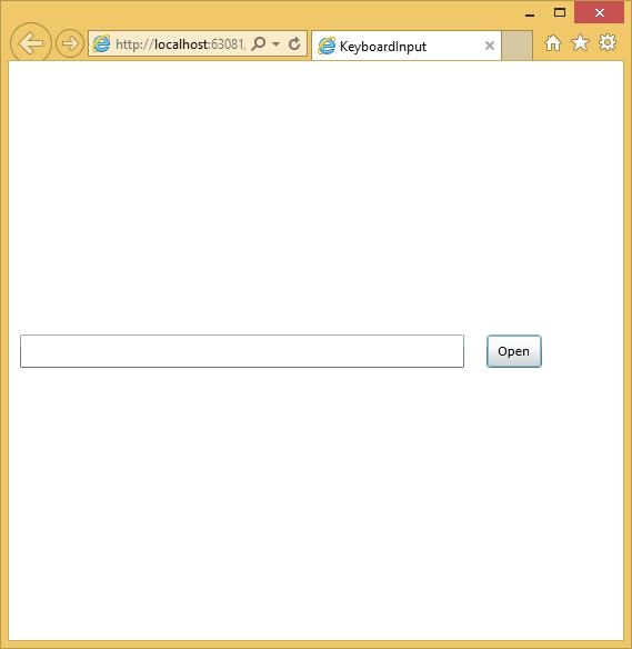
If you click the Open button or click in the textbox and click OK, then it will display the same message.
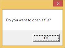
We recommend you to execute the above example for better understanding.
Silverlight - Isolated Storage
The third file access mechanism is Isolated Storage mechanism, which provides storage associated with the logged in user. The API presents data through the Stream class from .NET System.IO namespace. Therefore, as with the other mechanisms we have looked at so far, you can use the other types in System.IO to work with the streams, enabling you to store either textual or binary data.
Some important features are −
This storage mechanism is called Isolated Storage because the store is partitioned, and a Silverlight application has access only to certain parts.
You cannot access any old stored data. First of all, the store is partitioned per user. A Silverlight application cannot get access to the store for a different user than the one logged in, and running the application.
This has nothing to do with any identification mechanisms your web application may use. That is an important point to remember because some people who share computers do not bother with separate Windows accounts, and are accustomed just to logging in and out of the websites that they use.
Using Isolated Storage
Isolated Storage is not unique to Silverlight. The API was originally introduced for Windows Forms to enable applications launched from the web to store data locally in partial trust scenarios. The implementation is different, and there is no way to access the full .NET Framework's Isolated Storage from Silverlight's, or vice versa.
However, if you have used it, the steps here will look very familiar.
You begin by asking for the user specific store. In this case, we are asking for the one for the application. If we wanted the per-site store shared by all XAPs on the site, we would call GetUserStoreForSite instead.
Either method returns an IsolatedStorageFile object, which is a pretty unhelpful name as this represents a directory, not a file.
To access a file, you need to ask the IsolatedStorageFile for a Stream.
We use the IsolatedStorageFileStream class, and its constructor requires you to pass the IsolatedStorageFile object as an argument.
So we are creating a new file in the store. The exact location of the file on disk is unknown.
The containing directory has randomized elements in order to make it impossible to guess the name of the file.
Without this, it might be possible for malicious websites to place a file on the user's computer, and then construct a file URL to open it, in the hope of fooling the user into clicking a link that executes a program locally.
There are various other safeguards built into Windows that try to prevent this from happening, but this is another layer of defense in case the others have somehow been disabled, or bypassed.
The file will be stored somewhere inside the user's profile, but that is as much as you can know about it. Your IsolatedStorageFileStream will not report its true location.
Let us have a look at a simple example that tracks how many times the application has been run. Given below is the XAML code.
<UserControl x:Class = "StoreRunCount.MainPage"
   xmlns = "http://schemas.microsoft.com/winfx/2006/xaml/presentation"
   xmlns:x = "http://schemas.microsoft.com/winfx/2006/xaml"
   xmlns:d = "http://schemas.microsoft.com/expression/blend/2008"
   xmlns:mc = "http://schemas.openxmlformats.org/markup-compatibility/2006"
   mc:Ignorable = "d"
   d:DesignHeight = "300" d:DesignWidth = "400">

   <Grid x:Name = "LayoutRoot" Background = "White">
      <TextBlock x:Name = "runCountText" FontSize = "20" />
   </Grid>

</UserControl>
Here is the C# code in which Isolated storage are used.
using System;
using System.Collections.Generic;
using System.Linq;
using System.Net;

using System.Windows;
using System.Windows.Controls;
using System.Windows.Documents;
using System.Windows.Input;
using System.Windows.Media;
using System.Windows.Media.Animation;
using System.Windows.Shapes;

using System.IO.IsolatedStorage;
using System.IO;

namespace StoreRunCount {

   public partial class MainPage : UserControl {

      const string RunCountFileName = "RunCount.bin";

      public MainPage() {
         InitializeComponent();
         int runCount = 0;

         using (var store = IsolatedStorageFile.GetUserStoreForApplication()) {

            if (store.FileExists(RunCountFileName)) {
               using (var stm = store.OpenFile(RunCountFileName,
                  FileMode.Open, FileAccess.Read))
               using (var r = new BinaryReader(stm)) {
                  runCount = r.ReadInt32();
               }
            }

            runCount += 1;
            using (var stm = store.OpenFile(RunCountFileName,
               FileMode.Create, FileAccess.Write))

            using (var w = new BinaryWriter(stm)) {
               w.Write(runCount);
            }
         }

         runCountText.Text = "You have run this application " + runCount.ToString() + " time(s)";
      }
   }
}
When the above code is compiled and executed, you will see the following webpage which will show you that how many times you run this application.
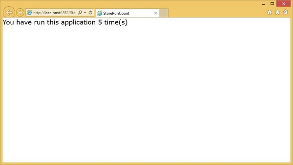
Increasing Your Quota
Applications may ask for more space if the initial amount is insufficient for some reason. There is no guarantee that the request will succeed. Silverlight will ask the user if they are happy to grant the application more space.
By the way, you are only allowed to ask for more storage in response to user input, such as a click. If you try to ask it some other time, such as when the plug-in loads, or in a timer handler, Silverlight will automatically fail the request without even prompting the user. Extra quota is only available to the applications with which the user is interacting.
The IsolatedStorageFile object provides three members for managing quota −
- AvailableFreeSpace
- IncreaseQuotaTo
- Quota
AvailableFreeSpace
The AvailableFreeSpace property tells you how much of your quota remains free.
Note that even an empty subdirectory consumes some of your quota because the operating system needs to allocate space on disk to represent the directory. So, the available space may be less than the total quota, minus the sum size of all your files.
IncreaseQuotaTo
If you do not have sufficient space to proceed, you ask for more by calling the IncreaseQuotaTo method.
Quota
Here we are using the third property, Quota, to discover the current quota size, and then we are adding the amount extra we require to get our new requested quota.
The method returns either True or False to indicate whether we are allocated what we asked for. Note that Silverlight may decide to allocate more space than you asked for.
Here is a simple example to increase the quota, when the button is clicked. Given below is the XAML code.
<UserControl x:Class = "ChangeQuota.MainPage"
   xmlns = "http://schemas.microsoft.com/winfx/2006/xaml/presentation"
   xmlns:x = "http://schemas.microsoft.com/winfx/2006/xaml"
   xmlns:d = "http://schemas.microsoft.com/expression/blend/2008"
   xmlns:mc = "http://schemas.openxmlformats.org/markup-compatibility/2006"
   mc:Ignorable = "d"
   d:DesignHeight = "300" d:DesignWidth = "400">

   <Grid x:Name = "LayoutRoot" Background = "White">
      <TextBlock x:Name = "infoText" FontSize = "20" TextWrapping = "Wrap" />
      <Button x:Name = "increaseQuota" Content = "Increase" HorizontalAlignment = "Center"
         FontSize = "20"
         VerticalAlignment = "Center" Click = "increaseQuota_Click" />
   </Grid>

</UserControl>
Here is the implementation of click event in which quota is increased.
using System;
using System.Collections.Generic;
using System.Linq;
using System.Net;

using System.Windows;
using System.Windows.Controls;
using System.Windows.Documents;
using System.Windows.Input;
using System.Windows.Media;
using System.Windows.Media.Animation;
using System.Windows.Shapes;

using System.IO.IsolatedStorage;

namespace ChangeQuota {

   public partial class MainPage : UserControl {

      public MainPage() {
         InitializeComponent();
      }

      private void increaseQuota_Click(object sender, RoutedEventArgs e) {
         using (IsolatedStorageFile isoStore =
            IsolatedStorageFile.GetUserStoreForApplication()) {
               long newQuota = isoStore.Quota + 10240;

               if (isoStore.IncreaseQuotaTo(newQuota)) {
                  infoText.Text = "Quota is " + isoStore.Quota + ", free space: " +
                  isoStore.AvailableFreeSpace;
               } else {
                  infoText.Text = "Meanie!";
               }
         }
      }
   }
}
When the above code is compiled and executed, you will see the following output.
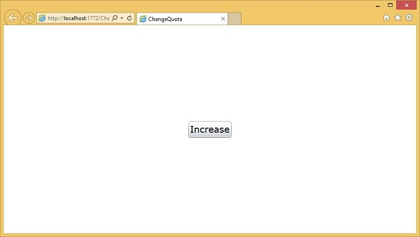
When you click Increase, the prompt appears. It asks to increase the Quota to be 10KB larger than whatever it already is.
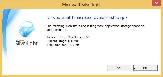
When you click Yes, it then prints out the amount of Quota available.
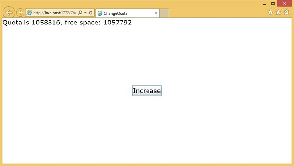
We recommend you to execute the above examples for better understanding.
Silverlight - Text
In this chapter, we will look at what Silverlight offers to display text. The text block is used for all text rendering and Silverlight. Other important features are −
- It can be used to simple plain text or you can apply a mixture of formatting styles.
- Silverlight supports a standard set of built in fonts.
- You can also download custom fonts when your applications visual style need something less ordinary.
TextBlock
To display text we use Silverlight textbook element, which is a lightweight control for displaying small amounts of read-only text. In fact, we have already seen this quite a lot as its basic usage does not really need much explanation. You just set the text property and it displays that text for you.
<TextBlock Text = "Print Testing" HorizontalAlignment Center" FontFamily = "Georgia"/>
The hierarchical inheritance of TextBlock class is as follows,
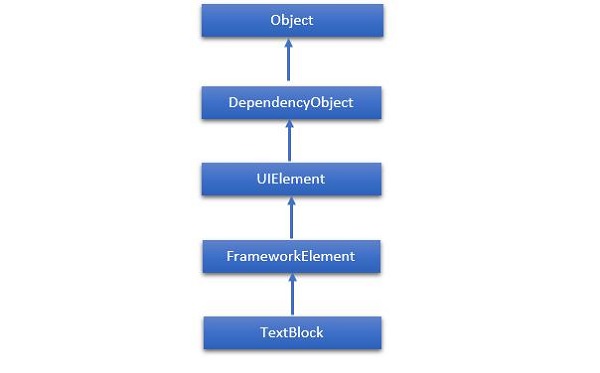
Given below are the commonly used properties of TextBlock class.
| Sr. No. | Property & Description |
|---|---|
| 1 | ContentEnd Gets a TextPointer object for the end of text content in the TextBlock. |
| 2 | ContentStart Gets a TextPointer object for the start of text content in the TextBlock. |
| 3 | IsTextSelectionEnabled Gets or sets a value that indicates whether text selection is enabled in the TextBlock, either through user action or calling selection-related API. |
| 4 | IsTextSelectionEnabledProperty Identifies the IsTextSelectionEnabled dependency property. |
| 5 | LineHeight Gets or sets the height of each line of content. |
| 6 | MaxLines Gets or sets the maximum lines of text shown in the TextBlock. |
| 7 | SelectedText Gets a text range of selected text. |
| 8 | SelectionEnd Gets the end position of the text selected in the TextBlock. |
| 9 | SelectionHighlightColor Gets or sets the brush used to highlight the selected text. |
| 10 | SelectionStart Gets the starting position of the text selected in the TextBlock. |
| 11 | Text Gets or sets the text contents of a TextBlock. |
| 12 | TextAlignment Gets or sets a value that indicates the horizontal alignment of text content. |
| 13 | TextTrimming Gets or sets the text trimming behavior to employ when content overflows the content area. |
| 14 | TextWrapping Gets or sets how the TextBlock wraps text. |
Given below are commonly used events of TextBlock class.
| Sr. No. | Event & Description |
|---|---|
| 1 | ContextMenuOpening Occurs when the system processes an interaction that displays a context menu. |
| 2 | SelectionChanged Occurs when the text selection has changed. |
Given below are the commonly used methods in TextBlock class.
| Sr. No. | Method & Description |
|---|---|
| 1 | Focus Focuses the TextBlock, as if it were a conventionally focusable control. |
| 2 | Select Selects a range of text in the TextBlock. |
| 3 | SelectAll Selects the entire contents in the TextBlock. |
Run
Sometimes you want fine-grained control over formatting and setting one style for an entire text block. It is sometimes useful to format individual words or even letters, and if you want this then instead of using the Text property, you put the text inside the TextBlock as content. If you are using a code, this corresponds to adding items to the TextBlock inline property.
Using this approach, you can add a series of run elements. Each Run supports the same font family, front weight, foreground and so on properties for controlling the text style. Although Run is a separate element this does not disrupt the flow.
Let us have a look at a simple example, which contains multiple Run element inside TextBlock. Given below is the XAML code.
<UserControl x:Class = "SilverlightRunDemo.MainPage"
   xmlns = "http://schemas.microsoft.com/winfx/2006/xaml/presentation"
   xmlns:x = "http://schemas.microsoft.com/winfx/2006/xaml"
   xmlns:d = "http://schemas.microsoft.com/expression/blend/2008"
   xmlns:mc = "http://schemas.openxmlformats.org/markup-compatibility/2006"
   mc:Ignorable = "d"
   d:DesignHeight = "300" d:DesignWidth = "400">

   <Grid x:Name = "LayoutRoot" Background = "White">

      <TextBlock Width = "192" TextWrapping = "Wrap" FontFamily = "Verdana">
         <Run Text = "Hello, " />
         <Run FontWeight = "Bold" Text = "world!" />
         <Run Text = "You" />
         <Run FontStyle = "Italic" Text = " are  " />
         <Run Text = "learning" FontSize = "40" FontFamily = "01d English Text MT" />
         <Run Text = "   the " />
         <Run Text = "basics of " Foreground = "Blue" />
         <Run Text = " Silverlight." FontSize = "30" />
      </TextBlock>

   </Grid>

</UserControl>
When the above code is compiled and executed, you will see the following output.
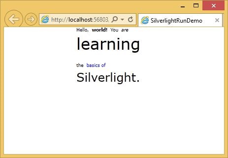
As you can see, this text block is arranged with different formatting styles by using the Run element.
By the way, you do not need to wrap every single bit of text in a run. You can leave most of the content of a text block as plain text and just apply run to the parts that need different formatting as shown below.
<TextBlock> Hello,
   <Run FontWeight = "Bold" Text =" world!"/>
</TextBlock>
LineBreak
Silverlight usually ignores line breaks in the XAML. It assumes that most white spaces are there to make them easier to read because you actually want that space to appear.
Let us have a look at this XAML code, which has three separate lines of text in it.
<TextBlock>
   This is not the end.
   It is not even the beginning of the end.
   But it is, perhaps, the end of the beginning
</TextBlock>
When the above code is compiled and executed, you will see the following output.
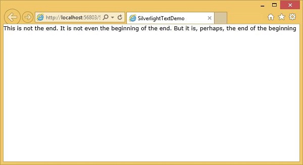
As you can see that it has ignored the line breaks and executed all the text together.
If you enable text wrapping, it will put line breaks in where it needs to be to make the text fit but it will ignore the line breaks in your example.
If you just want to add explicit line breaks, you need to add a line break tag inside your text block. The text follows it will start on a new line.
Let us have a look at the same example again by adding the LineBreak tag.
<TextBlock FontSize = "16">
   This is not the end.
   <LineBreak/>

   It is not even the beginning of the end.
   <LineBreak/>

   But it is, perhaps, the end of the beginning
</TextBlock>
When the above code is executed, you will see the that it now looks like as specified in XAML.
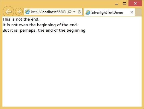
Built-in Fonts
Silverlight has a fixed set of built-in font families. The fonts actually have different family names for historical reasons. The default family is technically different on Mac OS and windows such as on Mac OS it is Lucida Grande, while on Windows it is the almost identical but named Lucida Sans Unicode.
Some of the most commonly used fonts are given below.
| Fonts |
|---|
| Arial |
| Arial Black |
| Comic Sans MS |
| Courier New |
| Georgia |
| Lucida Grande (Mac) or Lucida Sans Unicode (Windows) |
| Times New Roman |
| Trebuchet MS |
| Verdana |
Silverlight - Animation
Animation allows you to create truly dynamic user interfaces. It is often used to apply effects, for example, icons that grow when you move over them, logos that spin, text that scrolls into view, and so on.
Sometimes, these effects seem like excessive glitz. If used properly, animations can enhance an application in a number of ways. They can make an application seem more responsive, natural, and intuitive.
For example, a button that slides in when you click it feels like a real, physical button, not just another gray rectangle. Animations can also draw attention to important elements and guide the user through transitions to new content.
Silverlights approach to animation is declarative rather than focusing on sequences of frames animations.
Defining Animations
Animations are typically defined in resource sections. In fact, they are usually wrapped in a story board element, which we will see in detail shortly.
It provides a Begin() method, so the animation can be invoked from code.
Animations can also be put inside of the visual state elements in a control template.
Declarative Animation
Animations in Silverlight are declarative. They describe what would like to have happen. Leave it up to Silverlight to work out how to make that happen. So animations typically follow the pattern we tell Silverlight what we would like to change.
This is always some property on some named elements i.e. TargetName and TargetProperty.
<DoubleAnimation
   Storyboard.TargetName = "myRectangle"
   Storyboard.TargetProperty = "Opacity"
   From = "0" To = "1"
   Duration = "0:0:5"
/>
We say how we would like that property to change in this case we are changing the opacity from a value of zero to a value of one. In other words, we like the target elements to fade from opaque to transparent.
Finally, we say how long we would like this to take, in this case it will take five seconds.
the significance of the double in this double animation is that it targets a property which has type double, so a floating point value.
If you want to animate a property representing a color, you use a color animation instead.
Let us have a look at a simple example of double animation. Given below is the XAML code in which two buttons, one rectangle and two story boards are added.
<UserControl x:Class = "DoubleAnimationExample.MainPage"
   xmlns = "http://schemas.microsoft.com/winfx/2006/xaml/presentation"
   xmlns:x = "http://schemas.microsoft.com/winfx/2006/xaml"
   xmlns:d = "http://schemas.microsoft.com/expression/blend/2008"
   xmlns:mc = "http://schemas.openxmlformats.org/markup-compatibility/2006"
   mc:Ignorable = "d" d:DesignWidth = "640" d:DesignHeight = "480">

   <UserControl.Resources>

      <Storyboard x:Name = "fadeDown">
         <DoubleAnimation
            Storyboard.TargetName = "myRectangle"
            Storyboard.TargetProperty = "Opacity"
            From = "1" To = "0"
            Duration = "0:0:5" />
      </Storyboard>

      <Storyboard x:Name = "fadeUp">
         <DoubleAnimation
            Storyboard.TargetName = "myRectangle"
            Storyboard.TargetProperty = "Opacity"
            From = "0" To = "1"
            Duration = "0:0:5" />
      </Storyboard>

   </UserControl.Resources>

   <Grid x:Name = "LayoutRoot">
      <Rectangle x:Name = "myRectangle"
         Fill = "Blue" Width = "300" Height = "100"
         HorizontalAlignment = "Center"
         VerticalAlignment = "Top" Margin = "0,30" />

      <Button x:Name = "fadeUpButton" Content = "Up" Width = "80"
         Height = "30" HorizontalAlignment = "Left"
         VerticalAlignment = "Top" Margin = "50,140,0,0"
         Click = "fadeUpButton_Click" />

      <Button x:Name = "fadeDownButton" Content = "Down"
         Width = "80" Height = "30" HorizontalAlignment = "Left"
         VerticalAlignment = "Top" Margin = "50,180,0,0"
         Click = "fadeDownButton_Click" />

   </Grid>

</UserControl>
Here is the implementation for different events in C#.
using System.Windows;
using System.Windows.Controls;

namespace DoubleAnimationExample {

   public partial class MainPage : UserControl {

      public MainPage() {
         InitializeComponent();
      }

      private void fadeUpButton_Click(object sender, RoutedEventArgs e) {
         fadeUp.Begin();
      }

      private void fadeDownButton_Click(object sender, RoutedEventArgs e) {
         fadeDown.Begin();
      }
   }
}
When the above code is compiled and executed, you will see the following output.
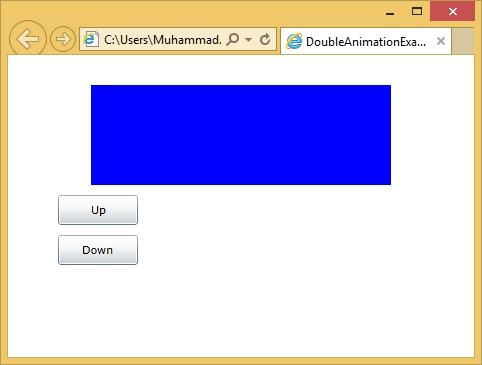
Repeating and Reversing
Animations offer some properties to automatically repeat and all reverse animations.
If you set the repeat behavior property to a time spam the animation will loop around repeating until the specified amount of time has elapsed or you can just tell it how many times you would like it to repeat.
This supports decimal points so you can repeat four and a half times.
You can repeat forever and you can also tell the animation that once it reaches the end, it should run in reverse back to the start.
Key Frame Animation
Often a simple animation from A to B is a little too simple. For example, you want to animate a ball bouncing off the ground. This is not a simple point to point movement. The ball drops, speeding up gradually and then reverses its direction as it hits the bottom. Slowing up again as it comes back to the top of its travel.
Let us have a look at a simple example of Key Frame animation.
Given below is the XAML code, which contains an ellipse and double animation with key frames.
<UserControl x:Class = "LinearKeyFrames.MainPage"
   xmlns = "http://schemas.microsoft.com/winfx/2006/xaml/presentation"
   xmlns:x = "http://schemas.microsoft.com/winfx/2006/xaml"
   xmlns:d = "http://schemas.microsoft.com/expression/blend/2008"
   xmlns:mc = "http://schemas.openxmlformats.org/markup-compatibility/2006"
   mc:Ignorable = "d"
   Width = "400" Height = "300">

   <UserControl.Resources>

      <Storyboard x:Name = "ballAnim" SpeedRatio = "0.2">
         <DoubleAnimation From = "0" Duration = "00:00:03" To = "96"
            Storyboard.TargetName = "ellipse"
            Storyboard.TargetProperty = "(Canvas.Left)" />

         <DoubleAnimationUsingKeyFrames
            Storyboard.TargetName = "ellipse"
            Storyboard.TargetProperty = "(Canvas.Top)">

            <LinearDoubleKeyFrame KeyTime = "00:00:00"   Value = "0"/>
            <LinearDoubleKeyFrame KeyTime = "00:00:00.5" Value = "16" />
            <LinearDoubleKeyFrame KeyTime = "00:00:01"   Value = "48"/>
            <LinearDoubleKeyFrame KeyTime = "00:00:01.5" Value = "112"/>
            <LinearDoubleKeyFrame KeyTime = "00:00:02"   Value = "48"/>
            <LinearDoubleKeyFrame KeyTime = "00:00:02.5" Value = "16"/>
            <LinearDoubleKeyFrame KeyTime = "00:00:03"   Value = "0"/>

         </DoubleAnimationUsingKeyFrames>

      </Storyboard>

   </UserControl.Resources>

   <Grid x:Name = "LayoutRoot" Background = "White">
      <Canvas>
         <Ellipse x:Name = "ellipse" Fill = "Aqua" Width = "50" Height = "50" />
      </Canvas>
   </Grid>

</UserControl>
Here is the implementation for mouse left button down event, which will begin animation when user press mouse left button down on the web page.
using System.Windows.Controls;
using System.Windows.Input;

namespace LinearKeyFrames {

   public partial class MainPage : UserControl {

      public MainPage() {
         InitializeComponent();
         this.MouseLeftButtonDown += new MouseButtonEventHandler(Page_MouseLeftButtonDown);
      }

      void Page_MouseLeftButtonDown(object sender, MouseButtonEventArgs e) {
         ballAnim.Begin();
      }
   }
}
When the above code is compiled and executed, you will see the following output.
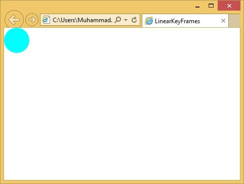
When you click the web page, you will see that the ball starts moving.
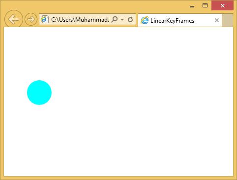
Silverlight - Video & Audio
In this chapter, we will see how Silverlight facilities are playing video and audio. The MediaElement is the heart of all video and audio in Silverlight. This allows you to integrate audio and video in your application. The MediaElement class works in a similar way like as Image class. You just point it at the media and it renders audio and video.
The main difference is it will be a moving image, but if you point it to the file that contains just audio and no video such as an MP3, it will play that without showing anything on the screen.
MediaElement as UI Element
MediaElement derives from framework element, which is the base class of all Silverlight user interface elements. This means it offers all the standard properties, so you can modify its opacity, you can set the clip, or transform it and so.
Let us have a look at a simple example of MediaElement.
Open Microsoft Blend for Visual Studio and create a new Silverlight Application project.
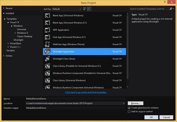
Now drag and video or audio file into Blend design surface.
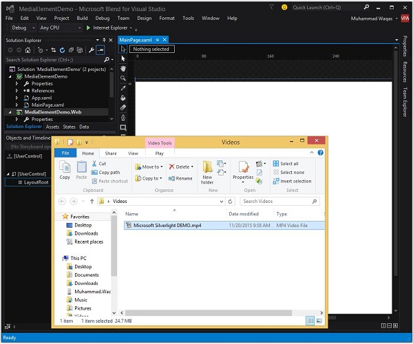
It will add a MediaElement to the surface and also add a copy of the video file in your project. You can see it in Solution explorer.
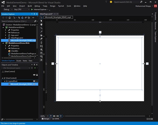
You can move it around, change its size, you can do things like applying a rotation etc.
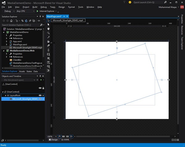
Now, it will generate the related XAML for you in MainPage.xaml file like shown below.
<UserControl x:Class = "MediaElementDemo.MainPage"
   xmlns = "http://schemas.microsoft.com/winfx/2006/xaml/presentation"
   xmlns:x = "http://schemas.microsoft.com/winfx/2006/xaml"
   xmlns:d = "http://schemas.microsoft.com/expression/blend/2008"
   xmlns:mc = "http://schemas.openxmlformats.org/markup-compatibility/2006"
   mc:Ignorable = "d"
   d:DesignHeight = "300" d:DesignWidth = "400">

   <Grid x:Name = "LayoutRoot" Background = "White">

      <MediaElement x:Name = "Microsoft_Silverlight_DEMO_mp4"
         Margin = "51,49,53,53"
         Source = "/Microsoft Silverlight DEMO.mp4"
         Stretch = "Fill" RenderTransformOrigin = "0.5,0.5">

         <MediaElement.RenderTransform>
            <CompositeTransform Rotation = "-18.384"/>
         </MediaElement.RenderTransform>

      </MediaElement>

   </Grid>

</UserControl>
When the above application is compiled and executed, you will see that the video is playing on your web page.
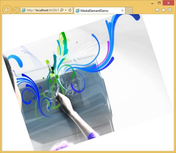
Controlling
The MediaElement just presents the media. It does not offer any standard player controls. It starts playing automatically and stops when it reaches the end, and there is nothing a user can do to pause or otherwise control it. So in practice most applications will want to provide the user with a bit more control than that.
You can disable the automatic playback by setting AutoPlay to False. This means the media player will not play anything until you ask it.
<MediaElement x:Name = "Microsoft_Silverlight_DEMO_mp4"
   AutoPlay = "False"
   Margin = "51,49,53,53"
   Source = "/Microsoft Silverlight DEMO.mp4"
   Stretch = "Fill" RenderTransformOrigin = "0.5,0.5">
So when you want to play the video, you can just call the MediaElement Play() method. It also offers stop and pause methods.
Let us have a look at the same example again and modify it little bit to allow a bit of control. Attach the MouseLeftButtonDown handler in MediaElement as shown in the XAML code below.
<UserControl x:Class = "MediaElementDemo.MainPage"
   xmlns = "http://schemas.microsoft.com/winfx/2006/xaml/presentation"
   xmlns:x = "http://schemas.microsoft.com/winfx/2006/xaml"
   xmlns:d = "http://schemas.microsoft.com/expression/blend/2008"
   xmlns:mc = "http://schemas.openxmlformats.org/markup-compatibility/2006"
   mc:Ignorable = "d"
   d:DesignHeight = "300" d:DesignWidth = "400">

   <Grid x:Name = "LayoutRoot" Background = "White">

      <MediaElement x:Name = "Microsoft_Silverlight_DEMO_mp4"
         AutoPlay = "False"
         MouseLeftButtonDown = "Microsoft_Silverlight_DEMO_mp4_MouseLeftButtonDown"
         Margin = "51,49,53,53"
         Source = "/Microsoft Silverlight DEMO.mp4"
         Stretch = "Fill" RenderTransformOrigin = "0.5,0.5">
      </MediaElement>

   </Grid>

</UserControl>
Here is the implementation on the MouseLeftButtonDown event handler in which it will check that if the current state of the media element is plating then it will pause the video otherwise it will start playing the video.
using System.Windows.Controls;
using System.Windows.Input;
using System.Windows.Media;

namespace MediaElementDemo {

   public partial class MainPage : UserControl {

      public MainPage() {
         InitializeComponent();
      }

      private void Microsoft_Silverlight_DEMO_mp4_MouseLeftButtonDown
         (object sender, MouseButtonEventArgs e) {

         if (Microsoft_Silverlight_DEMO_mp4.CurrentState == MediaElementState.Playing) {
            Microsoft_Silverlight_DEMO_mp4.Pause();
         } else {
            Microsoft_Silverlight_DEMO_mp4.Play();
         }
      }
   }
}
When the above code is compiled and executed, you will see the blank web page because we have set the AutoPlay property to False. When you click the web page, it will start the video.
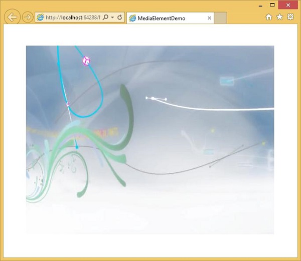
When you click the web page again, it will pause the video.
Silverlight - Printing
Printing is an important capability for certain kinds of applications. In this chapter, we will look at the relevant facilities in Silverlight.
Printing APIs, and the basic steps that all Silverlight applications must perform if they want to print. Various options for choosing water print.
The simplest is to print a copy of user interface elements that are already on the screen.
Most applications will want to get a bit more advanced than this, and generate content adapted specifically for printing, and in some cases, it will be necessary to split the content across multiple pages.
Steps for Printing
Whether you are printing a snapshot or something already on screen, or going for a fully customized multi-page print output, the same basic steps are required.
At the heart of the printing API is the PrintDocument class.
You begin by constructing one of these, and when you call its Print method, it shows the standard user interface for starting a print job.
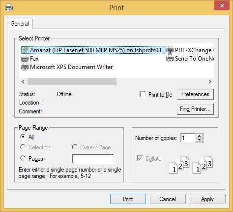
The user can select a printer and configure the settings as usual. If the user then decides to go ahead by clicking Print, the PrintDocument will immediately raise its PrintPage event, and your handler for that event supplies the contents to be printed.
The event argument offers a PageVisual property for this purpose.
You can set it to any Silverlight user interface element, either one already visible on screen, or a new one you created especially for printing.
Printing Existing Elements
Elements The simplest option is to print the content that is already on screen in your Silverlight application. Since the PrintPage event arguments PageVisual, accepts any user interface elements, you can pick anything in your user interface, and print it.
It is only a small step up from using the PrintScreen key to grab a screenshot. It is marginally better than that because the user does not have to manually paste the screenshot into some other program to crop it and print it. It is still only a slight improvement.
Printing content that is already on screen is problematic.
First of all, there is no guarantee that a layout that works on screen will work well for paper.
Let us have a look at a simple example in which the ScrollViewer contains some UI elements and its layout adapted for the screen. It resizes based on the browser window size, and it offers scroll bars to ensure that everything is accessible even if it does not fit.
Given below is the XAML code.
<UserControl
   xmlns = "http://schemas.microsoft.com/winfx/2006/xaml/presentation"
   xmlns:x = "http://schemas.microsoft.com/winfx/2006/xaml"
   xmlns:d = "http://schemas.microsoft.com/expression/blend/2008"
   xmlns:mc = "http://schemas.openxmlformats.org/markup-compatibility/2006"
   xmlns:sdk = "http://schemas.microsoft.com/winfx/2006/xaml/presentation/sdk"
   x:Class = "SilverlightPrinting.MainPage"
   mc:Ignorable = "d"
   d:DesignHeight = "300" d:DesignWidth = "500">

   <Grid x:Name = "LayoutRoot" Background = "White">

      <Button x:Name = "print" Content = "Print" Click = "print_Click" Width = "60"
         Height = "20" Margin = "10,10,430,270"/>

      <ScrollViewer x:Name = "myScrollViewer"
         HorizontalScrollBarVisibility = "Auto"
         VerticalScrollBarVisibility = "Auto"
         Width = "400" Margin = "90,0,10,0">

         <StackPanel>
            <Rectangle Fill = "Gray" Width = "100" Height = "100" />
            <Button x:Name = "button" Content = "Button" Width = "75"/>
            <sdk:Calendar Height = "169" Width = "230"/>
            <Rectangle Fill = "AliceBlue" Width = "475" Height = "100" />
         </StackPanel>

      </ScrollViewer>

   </Grid>

</UserControl>
Here is the Print button click-event implementation, which will print the ScrollViewer and its visible data.
using System;
using System.Windows;
using System.Windows.Controls;
using System.Windows.Printing;

namespace SilverlightPrinting {

   public partial class MainPage : UserControl {

      public MainPage() {
         InitializeComponent();
      }

      private void print_Click(object sender, RoutedEventArgs e) {
         PrintDocument pd = new PrintDocument();
         pd.PrintPage += new System.EventHandler<PrintPageEventArgs>(pd_PrintPage);
         pd.Print("Print Screen Content");
      }

      private void pd_PrintPage(object sender, PrintPageEventArgs e) {
         e.PageVisual = myScrollViewer;
      }
   }
}
As you can see, in Print button click event that PrintDocument object is created, we attach a handler to its PrintPage event.
You can set the PageVisual property to refer to ScrollViewer.
Then Print method is called. This takes a string, which will show up as the job name in the print queue.
When the above code is compiled and executed, you will see the following output.
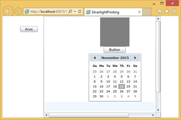
When you click the Print button, you will see the standard Print dialog.
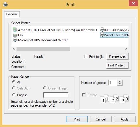
Now, select the default printer. For the purpose of demonstration, let us select OneNote and click the Print button. You will see that ScrollViewer is printed.
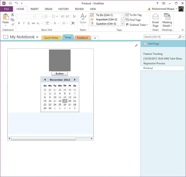
Notice that the scroll bars are still visible on the ScrollViewer.
Custom UI Tree
Instead of printing content that is already onscreen, it usually makes more sense to build a tree of user interface elements specifically for printing. That way, you can ensure that you use only non-interactive elements on paper, and you can create a specialized layout that is better suited to the paper shape and size. You could create a UserControl just for printing.
Let us have a look at a simple example by creating a Silverlight project and add a UserControl called PrintLayout.
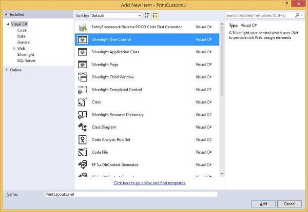
Set the design time width and height to be approximately paper shaped. Given below is the XAML code of PrintLayout.xaml file.
<UserControl x:Class = "PrintCustomUI.PrintLayout"
   xmlns = "http://schemas.microsoft.com/winfx/2006/xaml/presentation"
   xmlns:x = "http://schemas.microsoft.com/winfx/2006/xaml"
   xmlns:d = "http://schemas.microsoft.com/expression/blend/2008"
   xmlns:mc = "http://schemas.openxmlformats.org/markup-compatibility/2006"
   mc:Ignorable = "d"
   d:DesignHeight = "768" d:DesignWidth = "960">

   <Grid x:Name = "LayoutRoot" Background = "White">

      <Grid.RowDefinitions>
         <RowDefinition Height = "Auto" />
         <RowDefinition />
         <RowDefinition Height = "Auto" />
      </Grid.RowDefinitions>

      <TextBlock Text = "Silverlight" HorizontalAlignment = "Center"
         FontSize = "60" FontWeight = "Bold" FontFamily = "Georgia" />

      <TextBlock Grid.Row = "2" Text = "Print Testing"
         HorizontalAlignment = "Center" FontFamily = "Georgia"
         FontSize = "24" Margin = "0,10"/>

      <Rectangle Grid.Row = "2" Height = "1" Fill = "Black"
         VerticalAlignment = "Top"/>

      <Ellipse Grid.Row = "1" Stroke = "Black" StrokeThickness = "10" Margin = "10">

         <Ellipse.Fill>

            <RadialGradientBrush
               GradientOrigin = "0.2,0.2"
               Center = "0.4,0.4">
               <GradientStop Color = "Aqua" Offset = "0.006" />
               <GradientStop Color = "AntiqueWhite" Offset = "1" />
            </RadialGradientBrush>

         </Ellipse.Fill>

      </Ellipse>

   </Grid>

</UserControl>
Given below is the code in the MainPage.xaml file, which contains a Print button only.
<UserControl x:Class = "PrintCustomUI.MainPage"
   xmlns = "http://schemas.microsoft.com/winfx/2006/xaml/presentation"
   xmlns:x = "http://schemas.microsoft.com/winfx/2006/xaml"
   xmlns:d = "http://schemas.microsoft.com/expression/blend/2008"
   xmlns:mc = "http://schemas.openxmlformats.org/markup-compatibility/2006"
   mc:Ignorable = "d"
   d:DesignHeight = "300" d:DesignWidth = "400">

   <Grid x:Name = "LayoutRoot" Background = "White">

      <Button Content = "Print..." Height = "23" HorizontalAlignment = "Left"
         Margin = "12,28,0,0" Name = "printButton"
         VerticalAlignment = "Top" Width = "75"
         Click = "printButton_Click" />

   </Grid>

</UserControl>
Here is the Click event implementation for print button.
using System;
using System.Collections.Generic;
using System;

using System.Windows;
using System.Windows.Controls;
using System.Windows.Printing;

namespace PrintCustomUI {

   public partial class MainPage : UserControl {

      public MainPage() {
         InitializeComponent();
      }

      private void printButton_Click(object sender, RoutedEventArgs e) {
         PrintDocument pd = new PrintDocument();
         pd.PrintPage += new EventHandler<PrintPageEventArgs>(pd_PrintPage);
         pd.Print("Custom");
      }

      void pd_PrintPage(object sender, PrintPageEventArgs e) {
         var pl = new PrintLayout();
         pl.Width = e.PrintableArea.Width;
         pl.Height = e.PrintableArea.Height;
         e.PageVisual = pl;
      }
   }
}
When the above code is compiled and executed, you will see the following output on web page.
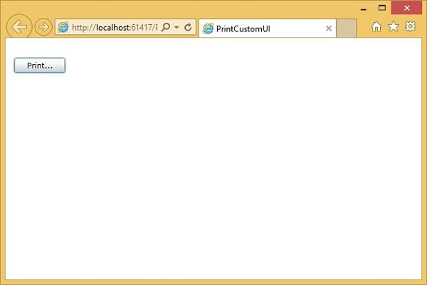
Click Print and select OneNote to print the layout. You will see that the layout is printed.
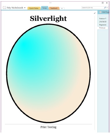
You can see that it has filled the available space. We recommend you to execute the above examples for better understanding.