- Silverlight - Home
- Silverlight - Overview
- Silverlight - Environment Setup
- Silverlight - Getting Started
- Silverlight - XAML Overview
- Silverlight - Project Types
- Silverlight - Fixed Layouts
- Silverlight - Dynamic Layout
- Constrained vs. Unconstrained
- Silverlight - CSS
- Silverlight - Controls
- Silverlight - Buttons
- Silverlight - Content Model
- Silverlight - ListBox
- Silverlight - Templates
- Silverlight - Visual State
- Silverlight - Data Binding
- Silverlight - Browser Integration
- Silverlight - Out-of-Browser
- Silverlight - Applications, Resources
- Silverlight - File Access
- Silverlight - View Model
- Silverlight - Input Handling
- Silverlight - Isolated Storage
- Silverlight - Text
- Silverlight - Animation
- Silverlight - Video and Audio
- Silverlight - Printing
Silverlight - TabControl
A container that places items into separate tabs and allows the user to view just one tab at a time. It allows the user to select from a number of different views by clicking on the tab headers. This control illustrates yet another variation on the content model. You can put anything you like as the content of a tab item. Normally you put a layout. Elements such as the stack panel.
Given below are the commonly used properties of TabControl.
| Sr. No. | Property & Description |
|---|---|
| 1 | AllowDrop Gets or sets a value indicating whether the control can accept data that the user drags onto it (Inherited from Control). |
| 2 | BackgroundImage This API supports the product infrastructure and is not intended to be used directly from your code. This member is not meaningful for this control (Overrides Control.BackgroundImage). |
| 3 | Dock Gets or sets which control borders are docked to its parent control and determines how a control is resized with its parent (Inherited from Control). |
| 4 | Height Gets or sets the height of the control (Inherited from Control). |
| 5 | Name Gets or sets the name of the control (Inherited from Control). |
| 6 | Width Gets or sets the width of the control (Inherited from Control). 6 |
Let us have a look at a simple example of TabControl, which contains two tabs.
<UserControl
xmlns = "http://schemas.microsoft.com/winfx/2006/xaml/presentation"
xmlns:x = "http://schemas.microsoft.com/winfx/2006/xaml"
xmlns:d = "http://schemas.microsoft.com/expression/blend/2008"
xmlns:mc = "http://schemas.openxmlformats.org/markup-compatibility/2006"
xmlns:sdk = "http://schemas.microsoft.com/winfx/2006/xaml/presentation/sdk"
x:Class = "TabControl.MainPage"
mc:Ignorable = "d"
d:DesignHeight = "300" d:DesignWidth = "400">
<Grid x:Name = "LayoutRoot" Background = "White">
<sdk:TabControl x:Name = "tabControl" HorizontalAlignment = "Left" Height = "172"
Margin = "80,77,0,0" VerticalAlignment = "Top" Width = "273">
<sdk:TabItem Header = "First Tab">
<Grid Background = "#FFE5E5E5">
<StackPanel>
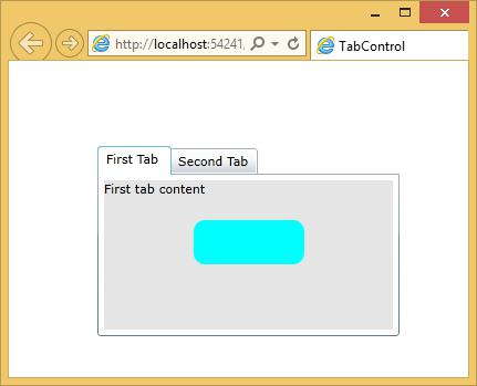
<TextBlock Text = "First tab content" Margin = "0,0,0,20" />
<Rectangle Fill = "Aqua" RadiusX = "10" RadiusY = "10" Width = "100"
Height = "40" />
</StackPanel>
</Grid>
</sdk:TabItem>
<sdk:TabItem Header = "Second Tab">
<Grid Background = "#FFE5E5E5">
<StackPanel>
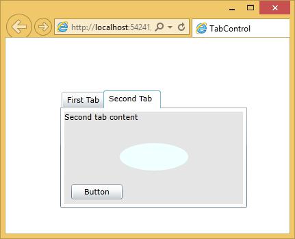
<TextBlock Text = "Second tab content" Margin = "0,0,0,20" />
<Ellipse Fill = "Azure" Width = "100" Height = "40" Margin = "10" />
<Button x:Name = "button" Content = "Button"
HorizontalAlignment = "Left"Margin = "10" VerticalAlignment = "Top"
Width = "75" RenderTransformOrigin = "0.494,1.715"/>
</StackPanel>
</Grid>
</sdk:TabItem>
</sdk:TabControl>
</Grid>
</UserControl>
When the above code is compiled and executed, you will see the content in the first tab.
When you click the second tab, you will see the content of second tab.