- Silverlight - Home
- Silverlight - Overview
- Silverlight - Environment Setup
- Silverlight - Getting Started
- Silverlight - XAML Overview
- Silverlight - Project Types
- Silverlight - Fixed Layouts
- Silverlight - Dynamic Layout
- Constrained vs. Unconstrained
- Silverlight - CSS
- Silverlight - Controls
- Silverlight - Buttons
- Silverlight - Content Model
- Silverlight - ListBox
- Silverlight - Templates
- Silverlight - Visual State
- Silverlight - Data Binding
- Silverlight - Browser Integration
- Silverlight - Out-of-Browser
- Silverlight - Applications, Resources
- Silverlight - File Access
- Silverlight - View Model
- Silverlight - Input Handling
- Silverlight - Isolated Storage
- Silverlight - Text
- Silverlight - Animation
- Silverlight - Video and Audio
- Silverlight - Printing
Silverlight - Dynamic Layout
The Canvas is the least interesting of all of the Silverlight's Layout panels. The other panels enable Dynamic Layouts, meaning that the layouts can adapt as the number of displayed items changes, or the size of the displayed information varies, or if the amount of space available to the application changes because the user has resized the browser.
Silverlight offers two panels with Dynamic Layout strategies.
StackPanel − which arranges elements in a vertical or horizontal stack.
Grid − which provides a flexible grid-like, or table-like layout system.
Stack Panel
Stack panel is a simple and useful layout panel in XAML. In Stack Panel, the child elements can be arranged in a single line either horizontally or vertically based on their orientation property. It is often used whenever any kind of list needs to be created. ItemsControls use stack panels. Menu, ListBox and ComboBox are their default internal layout panel.
Given below are the commonly used properties of StackPanel.
| Sr. No. | Property & Description |
|---|---|
| 1 | Background Gets or sets a Brush that fills the panel content area. (Inherited from Panel) |
| 2 | Children Gets a UIElementCollection of child elements of this Panel. (Inherited from Panel.) |
| 3 | Height Gets or sets the suggested height of the element. (Inherited from FrameworkElement.) |
| 4 | ItemHeight Gets or sets a value that specifies the height of all items that are contained within a WrapPanel. |
| 5 | ItemWidth Gets or sets a value that specifies the width of all items that are contained within a WrapPanel. |
| 6 | LogicalChildren Gets an enumerator that can iterate the logical child elements of this Panel element. (Inherited from Panel.) |
| 7 | LogicalOrientation The Orientation of the panel, if the panel supports layout in only a single dimension. (Inherited from Panel.) |
| 8 | Margin Gets or sets the outer margin of an element. (Inherited from FrameworkElement.) |
| 9 | Name Gets or sets the identifying name of the element. The name provides a reference so that code-behind, such as event handler code, can refer to a markup element after it is constructed during processing by a XAML processor. (Inherited from FrameworkElement.) |
| 10 | Orientation Gets or sets a value that specifies the dimension in which child content is arranged. |
| 11 | Parent Gets the logical parent element of this element. (Inherited from FrameworkElement.) |
| 12 | Resources Gets or sets the locally-defined resource dictionary. (Inherited from FrameworkElement.) |
| 13 | Style Gets or sets the style used by this element when it is rendered. (Inherited from FrameworkElement.) |
| 14 | Width Gets or sets the width of the element. (Inherited from FrameworkElement.) |
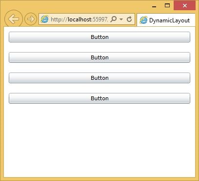
The following example shows how to add child elements into a StackPanel. Given below is the XAML implementation in which Buttons are created inside a StackPanel with some properties.
<UserControl x:Class = "DynamicLayout.MainPage"
   xmlns = "http://schemas.microsoft.com/winfx/2006/xaml/presentation"
   xmlns:x = "http://schemas.microsoft.com/winfx/2006/xaml"
   xmlns:d = "http://schemas.microsoft.com/expression/blend/2008"
   xmlns:mc = "http://schemas.openxmlformats.org/markup-compatibility/2006"
   mc:Ignorable = "d"
   d:DesignHeight = "300" d:DesignWidth = "400">

   <Grid x:Name = "LayoutRoot" Background = "White">
      <StackPanel>
         <Button x:Name = "button" Content = "Button" Margin = "10" />
         <Button x:Name = "button1" Content = "Button" Margin = "10"/>
         <Button x:Name = "button2" Content = "Button" Margin = "10"/>
         <Button x:Name = "button3" Content = "Button" Margin = "10"/>
      </StackPanel>
   </Grid>

</UserControl>
When the above code is compiled and executed, you will see the following output.
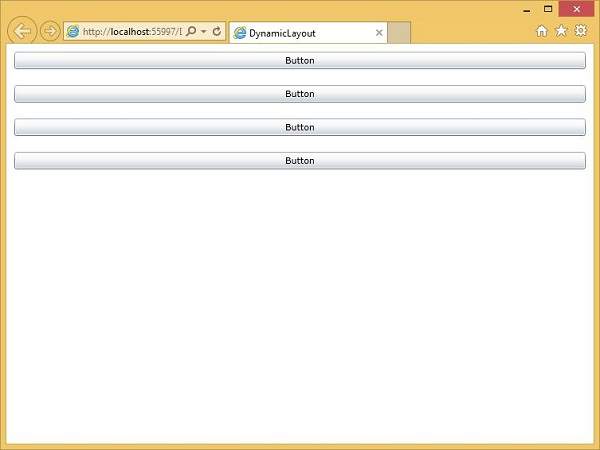
The StackPanel tries to arrange for each element to have as much space as it requires in the direction of stacking.
Now if you resize the browser, you will see that the width of the buttons have also changed.
Grid
Grid panel provides a flexible area, which consists of rows and columns. In Grid, the child elements can be arranged in tabular form. An element can be added to any specific row and column by using Grid.Row and Grid.Column properties. By default, the Grid panel is created with one row and one column. Multiple rows and columns are created by RowDefinitions and ColumnDefinitions properties. The height of the rows and the width of the columns can be defined in the following three ways −
Fixed value − To assign a fixed size of logical units (1/96 inch).
Auto − It will take the space, which is required for the controls in that specific row/column.
Star (*) − It will take the remaining space when Auto and fixed sized are filled.
Given below are the commonly used properties of Grid class.
| Sr. No. | Property & Description |
|---|---|
| 1 | Background Gets or sets a Brush that fills the panel content area. (Inherited from Panel) |
| 2 | Children Gets a UIElementCollection of child elements of this Panel. (Inherited from Panel.) |
| 3 | ColumnDefinitions Gets a list of ColumnDefinition objects defined on this instance of Grid. |
| 4 | Height Gets or sets the suggested height of the element. (Inherited from FrameworkElement.) |
| 5 | ItemHeight Gets or sets a value that specifies the height of all items that are contained within a WrapPanel. |
| 6 | ItemWidth Gets or sets a value that specifies the width of all items that are contained within a WrapPanel. |
| 7 | Margin Gets or sets the outer margin of an element. (Inherited from FrameworkElement.) |
| 8 | Name Gets or sets the identifying name of the element. The name provides a reference so that code-behind, such as event handler code, can refer to a markup element after it is constructed during processing by a XAML processor. (Inherited from FrameworkElement.) |
| 9 | Orientation Gets or sets a value that specifies the dimension in which child content is arranged. |
| 10 | Parent Gets the logical parent element of this element. (Inherited from FrameworkElement.) |
| 11 | Resources Gets or sets the locally-defined resource dictionary. (Inherited from FrameworkElement.) |
| 12 | RowDefinitions Gets a list of RowDefinition objects defined on this instance of Grid. |
| 13 | Style Gets or sets the style used by this element when it is rendered. (Inherited from FrameworkElement.) |
| 14 | Width Gets or sets the width of the element. (Inherited from FrameworkElement.) |
Given below are the commonly used methods of Grid class.
| Sr. No. | Method & Description |
|---|---|
| 1 | GetColumn Gets the value of the Grid.Column XAML attached property from the specified FrameworkElement. |
| 2 | GetColumnSpan Gets the value of the Grid.ColumnSpan XAML attached property from the specified FrameworkElement. |
| 3 | GetRow Gets the value of the Grid.Row XAML attached property from the specified FrameworkElement. |
| 4 | SetColumn Sets the value of the Grid.Column XAML attached property on the specified FrameworkElement. |
| 5 | SetRow Sets the value of the Grid.Row XAML attached property on the specified FrameworkElement. |
| 6 | SetRowSpan Sets the value of the Grid.RowSpan XAML attached property on the specified FrameworkElement. |
The following example shows how to add the child elements into a Grid to specify it in a tabular form. Given below is the XAML implementation in which some UI elements are added.
<UserControl x:Class = "DynamicLayout.MainPage"
xmlns = "http://schemas.microsoft.com/winfx/2006/xaml/presentation"
xmlns:x = "http://schemas.microsoft.com/winfx/2006/xaml"
xmlns:d = "http://schemas.microsoft.com/expression/blend/2008"
xmlns:mc = "http://schemas.openxmlformats.org/markup-compatibility/2006"
mc:Ignorable = "d"
d:DesignHeight = "300" d:DesignWidth = "400">
<Grid x:Name = "LayoutRoot" Background = "White">
<Grid.ColumnDefinitions>
<ColumnDefinition Width = "130" />
<ColumnDefinition Width = "1*" />
<ColumnDefinition Width = "2*" />
</Grid.ColumnDefinitions>
<Grid.RowDefinitions>
<RowDefinition Height = "Auto" />
<RowDefinition Height = "50" />
</Grid.RowDefinitions>
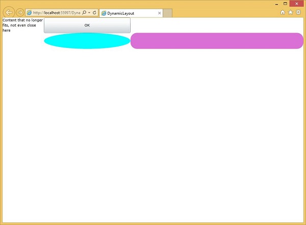
<TextBlock Grid.Column = "0" Grid.Row = "0"
Text = "Content that no longer fits, not even close here"
TextWrapping = "Wrap" />
<Button Grid.Column = "1" Grid.Row = "0" Content = "OK" />
<Ellipse Grid.Column = "1" Grid.Row = "1" Fill = "Aqua" />
<Rectangle Grid.Column = "2" Grid.Row = "1" Fill = "Orchid" RadiusX = "20" RadiusY = "20" />
</Grid>
</UserControl>
The first column is set to a fixed size. Any element in this column will have that width. Grid.Column and Grid.Row properties specify which row and column these items are in, and these are 0-based properties.
The second or third columns have a width of 1* and 2*. This means that they share out what space is left over after any fixed and auto width columns have taken their space. The significance of the 1 and 2 here is that the 2* column gets twice as much space as the 1* column.
When the above code is executed, you will see the following output.
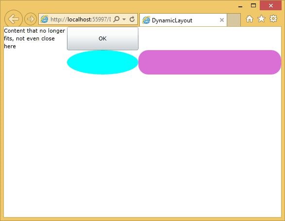
When you resize the application, the contents of those two columns resize to match. By the way, the absolute value of a star sized row or column does not matter; it is only the ratios, which are important.