- Seaborn - Home
- Seaborn - Introduction
- Seaborn - Environment Setup
- Importing Datasets and Libraries
- Seaborn - Figure Aesthetic
- Seaborn- Color Palette
- Seaborn - Histogram
- Seaborn - Kernel Density Estimates
- Visualizing Pairwise Relationship
- Seaborn - Plotting Categorical Data
- Distribution of Observations
- Seaborn - Statistical Estimation
- Seaborn - Plotting Wide Form Data
- Multi Panel Categorical Plots
- Seaborn - Linear Relationships
- Seaborn - Facet Grid
- Seaborn - Pair Grid
- Seaborn Useful Resources
- Seaborn - Quick Guide
- Seaborn - cheatsheet
- Seaborn - Useful Resources
- Seaborn - Discussion
Seaborn - Statistical Estimation
In most of the situations, we deal with estimations of the whole distribution of the data. But when it comes to central tendency estimation, we need a specific way to summarize the distribution. Mean and median are the very often used techniques to estimate the central tendency of the distribution.
In all the plots that we learnt in the above section, we made the visualization of the whole distribution. Now, let us discuss regarding the plots with which we can estimate the central tendency of the distribution.
Bar Plot
The barplot() shows the relation between a categorical variable and a continuous variable. The data is represented in rectangular bars where the length the bar represents the proportion of the data in that category.
Bar plot represents the estimate of central tendency. Let us use the titanic dataset to learn bar plots.
Example
import pandas as pd
import seaborn as sb
from matplotlib import pyplot as plt
df = sb.load_dataset('titanic')
sb.barplot(x = "sex", y = "survived", hue = "class", data = df)
plt.show()
Output
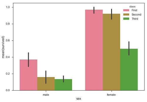
In the above example, we can see that the average number of survivals of male and female in each class. From the plot we can understand that more number of females survived than males. In both males and females more number of survivals are from first class.
A special case in barplot is to show the no of observations in each category rather than computing a statistic for a second variable. For this, we use countplot().
Example
import pandas as pd
import seaborn as sb
from matplotlib import pyplot as plt
df = sb.load_dataset('titanic')
sb.countplot(x = " class ", data = df, palette = "Blues");
plt.show()
Output
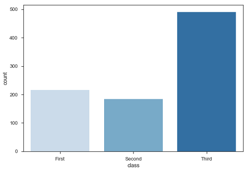
Plot says that, the number of passengers in the third class are higher than first and second class.
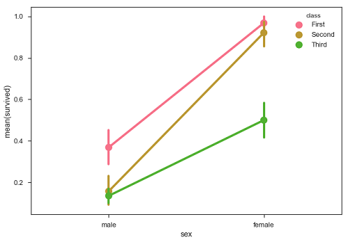
Point Plots
Point plots serve same as bar plots but in a different style. Rather than the full bar, the value of the estimate is represented by the point at a certain height on the other axis.
Example
import pandas as pd
import seaborn as sb
from matplotlib import pyplot as plt
df = sb.load_dataset('titanic')
sb.pointplot(x = "sex", y = "survived", hue = "class", data = df)
plt.show()
Output