- Seaborn - Home
- Seaborn - Introduction
- Seaborn - Environment Setup
- Importing Datasets and Libraries
- Seaborn - Figure Aesthetic
- Seaborn- Color Palette
- Seaborn - Histogram
- Seaborn - Kernel Density Estimates
- Visualizing Pairwise Relationship
- Seaborn - Plotting Categorical Data
- Distribution of Observations
- Seaborn - Statistical Estimation
- Seaborn - Plotting Wide Form Data
- Multi Panel Categorical Plots
- Seaborn - Linear Relationships
- Seaborn - Facet Grid
- Seaborn - Pair Grid
- Seaborn Useful Resources
- Seaborn - Quick Guide
- Seaborn - cheatsheet
- Seaborn - Useful Resources
- Seaborn - Discussion
Seaborn - Linear Relationships
Most of the times, we use datasets that contain multiple quantitative variables, and the goal of an analysis is often to relate those variables to each other. This can be done through the regression lines.
While building the regression models, we often check for multicollinearity, where we had to see the correlation between all the combinations of continuous variables and will take necessary action to remove multicollinearity if exists. In such cases, the following techniques helps.
Functions to Draw Linear Regression Models
There are two main functions in Seaborn to visualize a linear relationship determined through regression. These functions are regplot() and lmplot().
regplot vs lmplot
| regplot | lmplot |
|---|---|
| accepts the x and y variables in a variety of formats including simple numpy arrays, pandas Series objects, or as references to variables in a pandas DataFrame | has data as a required parameter and the x and y variables must be specified as strings. This data format is called long-form data |
Let us now draw the plots.
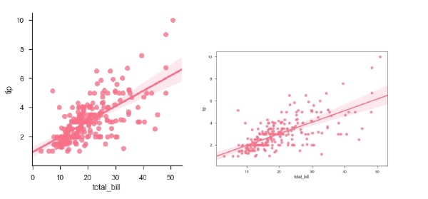
Example
Plotting the regplot and then lmplot with the same data in this example
import pandas as pd
import seaborn as sb
from matplotlib import pyplot as plt
df = sb.load_dataset('tips')
sb.regplot(x = "total_bill", y = "tip", data = df)
sb.lmplot(x = "total_bill", y = "tip", data = df)
plt.show()
Output
You can see the difference in the size between two plots.
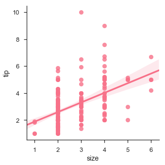
We can also fit a linear regression when one of the variables takes discrete values
Example
import pandas as pd
import seaborn as sb
from matplotlib import pyplot as plt
df = sb.load_dataset('tips')
sb.lmplot(x = "size", y = "tip", data = df)
plt.show()
Output
Fitting Different Kinds of Models
The simple linear regression model used above is very simple to fit, but in most of the cases, the data is non-linear and the above methods cannot generalize the regression line.
Let us use Anscombes dataset with the regression plots −
Example
import pandas as pd
import seaborn as sb
from matplotlib import pyplot as plt
df = sb.load_dataset('anscombe')
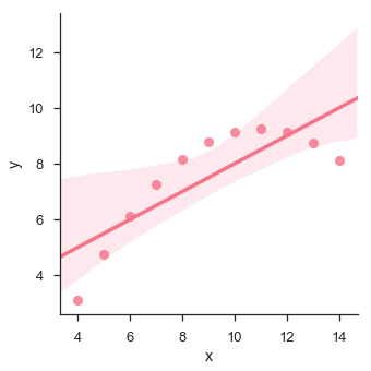
sb.lmplot(x="x", y="y", data=df.query("dataset == 'I'"))
plt.show()
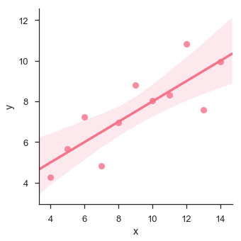
In this case, the data is good fit for linear regression model with less variance.
Let us see another example where the data takes high deviation which shows the line of best fit is not good.
Example
import pandas as pd
import seaborn as sb
from matplotlib import pyplot as plt
df = sb.load_dataset('anscombe')
sb.lmplot(x = "x", y = "y", data = df.query("dataset == 'II'"))
plt.show()
Output
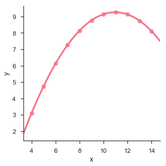
The plot shows the high deviation of data points from the regression line. Such non-linear, higher order can be visualized using the lmplot() and regplot().These can fit a polynomial regression model to explore simple kinds of nonlinear trends in the dataset −
Example
import pandas as pd
import seaborn as sb
from matplotlib import pyplot as plt
df = sb.load_dataset('anscombe')
sb.lmplot(x = "x", y = "y", data = df.query("dataset == 'II'"),order = 2)
plt.show()
Output