- Seaborn - Home
- Seaborn - Introduction
- Seaborn - Environment Setup
- Importing Datasets and Libraries
- Seaborn - Figure Aesthetic
- Seaborn- Color Palette
- Seaborn - Histogram
- Seaborn - Kernel Density Estimates
- Visualizing Pairwise Relationship
- Seaborn - Plotting Categorical Data
- Distribution of Observations
- Seaborn - Statistical Estimation
- Seaborn - Plotting Wide Form Data
- Multi Panel Categorical Plots
- Seaborn - Linear Relationships
- Seaborn - Facet Grid
- Seaborn - Pair Grid
- Seaborn Useful Resources
- Seaborn - Quick Guide
- Seaborn - cheatsheet
- Seaborn - Useful Resources
- Seaborn - Discussion
Seaborn.histplot() method
The Seaborn.histplot() method helps to visualize dataset distributions. We can draw either univariate or bivariate histograms.
A histogram is a traditional visualization tool that counts the number of data that fall into discrete bins to illustrate the distribution of one or more variables. This function can add a smooth curve derived using a kernel density estimate to the statistic computed within each bin to estimate frequency, density, or probability mass.
Syntax
Following is the syntax of the Seaborn.histplot() method −
seaborn.histplot(data=None, *, x=None, y=None, hue=None, weights=None, stat='count', bins='auto', binwidth=None, binrange=None, discrete=None, cumulative=False, common_bins=True, common_norm=True, multiple='layer', element='bars', fill=True, shrink=1, kde=False, kde_kws=None, line_kws=None, thresh=0, pthresh=None, pmax=None, cbar=False, cbar_ax=None, cbar_kws=None, palette=None, hue_order=None, hue_norm=None, color=None, log_scale=None, legend=True, ax=None, **kwargs)
Parameters
Some of the parameters of this method are shown below −
| S.NO | Parameter and Description |
|---|---|
| 1 | x,y Variables that are represented on the x,y axis. |
| 2 | Hue This will produce elements with different colors. It is a grouping variable. |
| 3 | stat These parameters define the subsets are to be plotted. |
| 4 | bins This parameter takes the input data structure. That is either a mapping or a sequence. |
| 5 | Binwidth Boolean value that if true, shows marginal ticks. |
| 6 | Binrange Corresponds to the kind of plot to be drawn. Can be hist,kde or ecdf. |
| 7 | Cumulative Plots the cumulative count as number of bins increase. |
| 8 | Multiple Related to univariate data and takes values: stacked, layer, dodge and fill. |
| 9 | Log_scale Sets axes scales to log and the values plotted are in log scale. |
| 10 | Legend Boolean value. If false, does not print out the legend of semantic variables. |
let us load the Seaborn library and the dataset before moving on to the developing the plots.
Loading the Seaborn library
To load or import the seaborn library the following line of code can be used.
Import seaborn as sns
Loading the dataset
in this article, we will make use of the Tips dataset inbuilt in the seaborn library. the following command is used to load the dataset.
tips=sns.load_dataset("tips")
The below mentioned command is used to view the first 5 rows in the dataset. This enables us to understand what variables can be used to plot a graph.
tips.head()
the below is the output for the above piece of code.
index,total_bill,tip,sex,smoker,day,time,size
0,16.99,1.01,Female,No,Sun,Dinner,2
1,10.34,1.66,Male,No,Sun,Dinner,3
2,21.01,3.5,Male,No,Sun,Dinner,3
3,23.68,3.31,Male,No,Sun,Dinner,2
4,24.59,3.61,Female,No,Sun,Dinner,4
Now that we have loaded the data, we will move on to plotting the data.
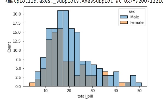
Example 1
Printing a bivariate histogram plot and using the bins parameter. This parameter takes number of bins and plots these many bins in the histogram plot.
import seaborn as sns
import matplotlib.pyplot as plt
tips=sns.load_dataset("tips")
tips.head()
sns.histplot(data=tips, x="total_bill", hue="sex",bins=20)
plt.show()
Output
The output of the plot is seen below.
Example 2
To plot graphs of different kind, the element parameter can be used to change the kind of graph to be plotted. This parameter can take values, bar, step, and poly.
The below code snippet can be used to understand the usage of the element parameter.
import seaborn as sns
import matplotlib.pyplot as plt
tips=sns.load_dataset("tips")
tips.head()
sns.histplot(data=tips, x="total_bill", hue="sex", element="poly")
plt.show()
Output
the below graph shows the output obtained after using the above code snippet.

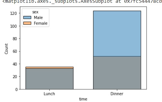
Example 3
In this example, we will understand how to draw a plot for a categorical variable. In the histplot method, drawing a graph for a catergorical variable is still under development and is an experimental feature. But, we can still know how to use it now.
import seaborn as sns
import matplotlib.pyplot as plt
tips=sns.load_dataset("tips")
tips.head()
sns.histplot(data=tips, x="time",hue="sex",shrink=.7)
plt.show()
Output
Here, time and sex are both categorical variables and the parameter shrink is used to specify the width spacing between the bins. The output for the above code is the graph seen below. Like mentioned, because of using shrink, there is spacing between the bins in the graph.
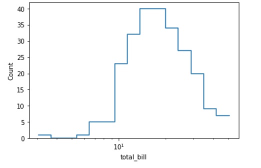
Example 4
In this example, we will plot a histogram on a logarithmic scale. Being able to plot graphs in a logarithmic scale is very useful in a lot of business scenarios and below we will see the usage of log_scale and some other parameters in the histplot() method.
The element parameter as discussed above will describe the kind of graph to be drawn. It can be bars, step and poly. The fill parameter takes Boolean values and either fills the graph or keeps it unfilled. In all the above examples, we have seen graphs that are filled so, in this case we will pass the Boolean value False to the fill parameter and observe the difference in the graph.
import seaborn as sns
import matplotlib.pyplot as plt
tips=sns.load_dataset("tips")
tips.head()
sns.histplot(data=tips, x="total_bill", log_scale=True,element="step", fill=False)
plt.show()
Output
the above code snippet gives the following graph.
This is the usage of the histplot() method and its various parameters.