- Seaborn - Home
- Seaborn - Introduction
- Seaborn - Environment Setup
- Importing Datasets and Libraries
- Seaborn - Figure Aesthetic
- Seaborn- Color Palette
- Seaborn - Histogram
- Seaborn - Kernel Density Estimates
- Visualizing Pairwise Relationship
- Seaborn - Plotting Categorical Data
- Distribution of Observations
- Seaborn - Statistical Estimation
- Seaborn - Plotting Wide Form Data
- Multi Panel Categorical Plots
- Seaborn - Linear Relationships
- Seaborn - Facet Grid
- Seaborn - Pair Grid
- Seaborn Useful Resources
- Seaborn - Quick Guide
- Seaborn - cheatsheet
- Seaborn - Useful Resources
- Seaborn - Discussion
Seaborn.heatmap() method
The Seaborn.heatmap() method is used to plot rectangular data in the form of a color-coded matrix.
Let us define the heat map first −
A heat map is one of the data visualization tools that shows the magnitude of a certain phenomenon in the form of colors. The hue and intensity attributes are used to depict the variation in the data plotted on the heat map. These usually show the nature of the phenomenon plotted; whether it is clustered or dispersed over a space.
Syntax
Following is the syntax of the seaborn.heatmap() method −
seaborn.heatmap(data, *, vmin=None, vmax=None, cmap=None, center=None, robust=False, annot=None, fmt='.2g', annot_kws=None, linewidths=0, linecolor='white', cbar=True, cbar_kws=None, cbar_ax=None, square=False, xticklabels='auto', yticklabels='auto', mask=None, ax=None, **kwargs)
Parameters
Some of the parameters of the heatmap() method are discussed below.
| S.No | Parameter and Description |
|---|---|
| 1 | Data It takes a rectangular dataset as input. An ndarray that can be forced into a 2D dataset. If a Pandas DataFrame is provided, the columns and rows will be labelled using the index and column information. |
| 2 | Vmin, vmax This optional arguments takes floating point values as input and these values serve as colormap anchors; if not, the data and other keyword arguments will be used to infer them. |
| 3 | Cmap This optional parameter takes matplotlib colors or a list of colors as input. It performs the transformation of data values into a colour space. The default, if not specified, will depend on whether centre is set. |
| 4 | Center Takes floating point values as input and determines The value at which to center the colormap when plotting divergant data. |
| 5 | Mask Takes bool array or DataFrame and is an optional parameter. If passed, data will not be shown in cells where mask is True. |
| 6 | Robust This optional parameter takes Boolean values and the colormap range is produced using robust quantiles rather than the extreme values if True and vmin or vmax are not present. |
| 7 | Linewidth Takes floating value and determines the width of lines that divide each cell. |
| 8 | linecolor Takes color as input and determines the color of the lines that divide each cell. |
| 9 | cbar Takes Boolean values and determines if a colorbar should be drawn or not. |
Return Value
This method returns the axes object with the heatmap plotted. Let us load the seaborn library and the dataset before moving on to developing the plots.
Loading the seaborn library
To load or import the seaborn library the following line of code can be used.
Import seaborn as sns
Loading the dataset
In this article, we will make use of the flights dataset inbuilt in the seaborn library. the following command is used to load the dataset.
flights=sns.load_dataset("flights")
The below mentioned command is used to view the first 5 rows in the dataset. This enables us to understand what variables can be used to plot a graph.
flights.head()
The below is the output for the above piece of code.
index,year,passengers
0,1949,112
1,1949,118
2,1949,132
3,1949,129
4,1949,121
Now that we have loaded the dataset, we will explore as few examples.
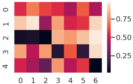
Example 1
In this example, we will understand how to plot a heatmap for array data. We begin by importing the numpy library and then we reset the seed so as to obtain same values for every iteration which makes it easier to plot a map.
Then we will set the theme for the plot and in this example the theme is set to poster. The set_theme() method in seaborn can take the values, paper, notebook, talk and poster.
import numpy as np
np.random.seed(0)
sns.set_theme("poster")
#"paper", "notebook", "talk", "poster values for set_theme
Then we will generate random numbers ranging from 5 to 7 and store them in a matrix. This matrix is passed to the seaborn.heatmap() method as argument and then the plot is obtained for random numbers ranging from 5 to 7.
import seaborn as sns
import matplotlib.pyplot as plt
import numpy as np
flights=sns.load_dataset("flights")
flights.head()
np.random.seed(0)
sns.set_theme("poster")
data = np.random.rand(5, 7)
sns.heatmap(data)
plt.show()
Output
the graph obtained is attached below.
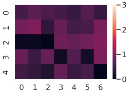
Example 2
Now that we have plotted a heatmap() we will understand the working of a few of its parameters. In this case, we will use the vmin and vmax parameters and pass them to the heatmap() method along with the data.
Vmin and Vmax are optional arguments and they take floating point values as input and these values serve as colormap anchors; if not, the data and other keyword arguments will be used to infer them.
The code and the plot generated are below.
import seaborn as sns
import matplotlib.pyplot as plt
import numpy as np
flights=sns.load_dataset("flights")
flights.head()
np.random.seed(0)
sns.set_theme("poster")
data = np.random.rand(5, 7)
sns.heatmap(data, vmin=0, vmax=3)
plt.show()
Output
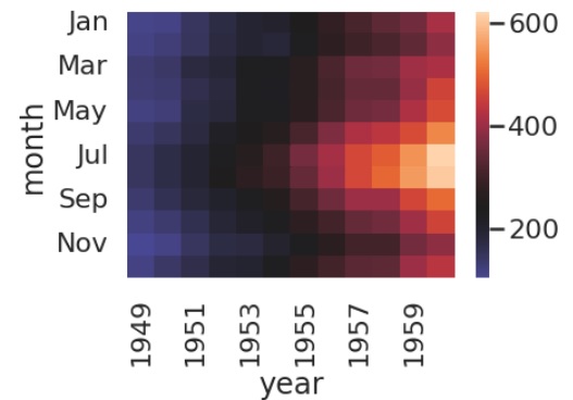
Example 3
Now that we have seen how to plot data from an array, we will see how to plot data from a dataset. In the below example, we are using the flights dataset.
We are using the pivot function on this dataset so as to pivot or rotate the dataset in such a way that the first column is categorical and the rest are numerical. And once we have achieved that we will plot a heat map on this pivoted data.
import seaborn as sns
import matplotlib.pyplot as plt
import numpy as np
flights=sns.load_dataset("flights")
flights.head()
np.random.seed(0)
sns.set_theme("poster")
data = np.random.rand(5, 7)
flights = flights.pivot("month", "year", "passengers")
sns.heatmap(flights)
plt.show()
Output
the plot obtained is as follows,
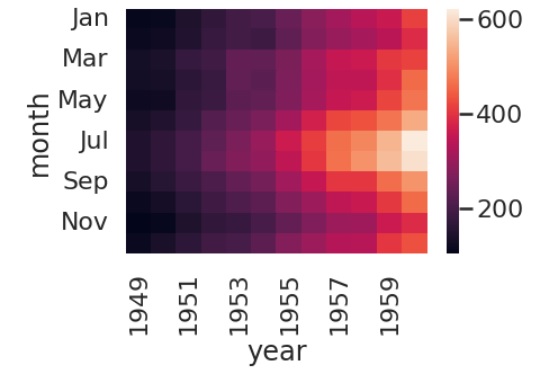
Example 4
In this example, we will create a heatmap at a specific region or at a center. To do so we need to pass values to the center parameter of the heatmap method. The center parameter consists of the point at which the colormap should be centered when plotting divergent data.
The center in this example is Jan 1995 and the plot obtained can be seen below.
import seaborn as sns
import matplotlib.pyplot as plt
import numpy as np
flights=sns.load_dataset("flights")
flights.head()
np.random.seed(0)
sns.set_theme("poster")
data = np.random.rand(5, 7)
flights = flights.pivot("month", "year", "passengers")
sns.heatmap(flights, center=flights.loc["Jan", 1955])
plt.show()
Output