- Angular Material - Home
- Angular Material - Overview
- Angular Material - Environment Setup
- Angular Material - First Application
Form Controls
- Angular Material - Auto-Complete
- Angular Material - Check Box
- Angular Material - Date Picker
- Angular Material - Form Field
- Angular Material - Input
- Angular Material - Radio Button
- Angular Material - Select
- Angular Material - Slider
- Angular Material - Toggle Slider
Navigation
Layout
- Angular Material - Card
- Angular Material - Divider
- Angular Material - Expansion Panel
- Angular Material - Grid List
- Angular Material - List
- Angular Material - Stepper
- Angular Material - Tabs
- Angular Material - Tree
Buttons & Indicators
- Angular Material - Button
- Angular Material - Button Toggle
- Angular Material - Badge
- Angular Material - Chips
- Angular Material - Icons
- Angular Material - Progress Spinner
- Angular Material - Progress Bar
- Angular Material - Ripples
Popups & Modals
Data table
Angular Material Resources
Angular Material - Slider
The <mat-slider>, an Angular Directive, is used as a enhanced range selector with material design styling and animation capabilities.
In this chapter, we will showcase the configuration required to draw a slider control using Angular Material.
Create Angular Application
Follow the following steps to update the Angular application we created in Angular Material - First Application chapter −
| Step | Description |
|---|---|
| 1 | Create a project with a name material-app as explained in the Angular Material - First Application chapter. |
| 2 | Modify app.ts, app.css and app.html as explained below. Keep rest of the files unchanged. |
| 3 | Compile and run the application to verify the result of the implemented logic. |
app.ts
Following is the content of the modified app.ts.
import { Component, signal } from '@angular/core';
import { FormsModule, ReactiveFormsModule } from '@angular/forms';
import { MatCheckboxModule } from '@angular/material/checkbox';
import { MatFormFieldModule } from '@angular/material/form-field';
import { MatSliderModule } from '@angular/material/slider';

@Component({
   selector: 'app-root',
   imports: [
      FormsModule,
      MatFormFieldModule,
      MatSliderModule,
      MatCheckboxModule,
      ReactiveFormsModule,
   ],
   templateUrl: './app.html',
   styleUrl: './app.css'
})
export class App {
   protected readonly title = signal('material-app');
   disabled = false;
   max = 100;
   min = 0;
   showTicks = false;
   step = 1;
   thumbLabel = false;
   value = 0;
}
app.html
Following is the content of the modified HTML host file app.html.
<mat-slider
   class = "tp-margin"
   [disabled]="disabled"
   [max]="max"
   [min]="min"
   [step]="step"
   [discrete]="thumbLabel"
   [showTickMarks]="showTicks">
   <input matSliderThumb [(ngModel)]="value" #slider>
</mat-slider>
<section class = "tp-section">
   <mat-checkbox class = "tp-margin" [(ngModel)] = "thumbLabel">Show thumb label</mat-checkbox>
</section>
<section class = "tp-section">
   <mat-checkbox class = "tp-margin" [(ngModel)] = "showTicks">Show Ticks</mat-checkbox>
</section>
<section class = "tp-section">
   <mat-checkbox class = "tp-margin" [(ngModel)] = "disabled">Disabled</mat-checkbox>
</section>
app.css
Following is the content of the modified CSS file app.css.
.tp-section {
   display: flex;
   align-content: center;
   align-items: center;
   height: 60px;
}
.tp-margin {
   margin: 30px;
}

.mat-slider-horizontal {
   width: 300px;
}
.mat-slider-vertical {
   height: 300px;
}
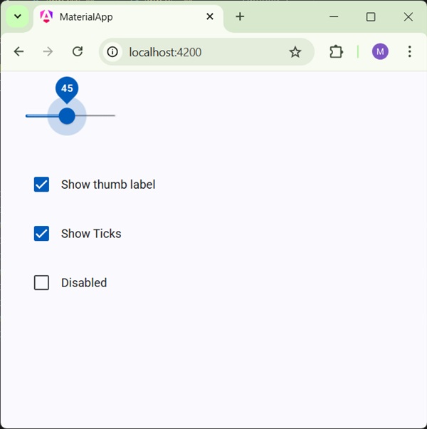
Result
Verify the result.
Details
As first, we've created three check boxes using mat-checkbox and bind them using ngModel with variables. These properties will be used to customize the slider.
Then, we've created the slider and showcased its various attributes bound with variables in .ts file.