- Angular Material - Home
- Angular Material - Overview
- Angular Material - Environment Setup
- Angular Material - First Application
Form Controls
- Angular Material - Auto-Complete
- Angular Material - Check Box
- Angular Material - Date Picker
- Angular Material - Form Field
- Angular Material - Input
- Angular Material - Radio Button
- Angular Material - Select
- Angular Material - Slider
- Angular Material - Toggle Slider
Navigation
Layout
- Angular Material - Card
- Angular Material - Divider
- Angular Material - Expansion Panel
- Angular Material - Grid List
- Angular Material - List
- Angular Material - Stepper
- Angular Material - Tabs
- Angular Material - Tree
Buttons & Indicators
- Angular Material - Button
- Angular Material - Button Toggle
- Angular Material - Badge
- Angular Material - Chips
- Angular Material - Icons
- Angular Material - Progress Spinner
- Angular Material - Progress Bar
- Angular Material - Ripples
Popups & Modals
Data table
Angular Material Resources
Angular Material - Toolbar
The <mat-card>, an Angular Directive, is used to create a card with material design styling and animation capabilities. It provides preset styles for the common card sections.
<mat-card-title> − Represents the section for title.
<mat-card-subtitle> − Represents the section for subtitle.
<mat-card-content> − Represents the section for content.
<mat-card-actions> − Represents the section for actions.
<mat-card-footer> − Represents the section for footer.
In this chapter, we will showcase the configuration required to draw a card control using Angular Material.
Create Angular Application
Follow the following steps to update the Angular application we created in Angular Material - First Application chapter −
| Step | Description |
|---|---|
| 1 | Create a project with a name material-app as explained in the Angular Material - First Application chapter. |
| 2 | Modify app.ts,app.css and app.html as explained below. Keep rest of the files unchanged. |
| 3 | Compile and run the application to verify the result of the implemented logic. |
app.ts
Following is the content of the modified app.ts.
import { Component, signal } from '@angular/core';
import { FormsModule, ReactiveFormsModule } from '@angular/forms';
import { MatButtonModule } from '@angular/material/button';
import { MatCardModule } from '@angular/material/card';
import { MatCheckboxModule } from '@angular/material/checkbox';
import { MatFormFieldModule } from '@angular/material/form-field';
import { MatIconModule } from '@angular/material/icon';
import { MatToolbarModule } from '@angular/material/toolbar';

@Component({
   selector: 'app-root',
   imports: [
      FormsModule,
      MatFormFieldModule,
      MatCardModule,
      MatButtonModule,
      MatCheckboxModule,
      ReactiveFormsModule,
   ],
   templateUrl: './app.html',
   styleUrl: './app.css'
})
export class App {
   protected readonly title = signal('material-app');
}
app.html
Following is the content of the modified HTML host file app.html.
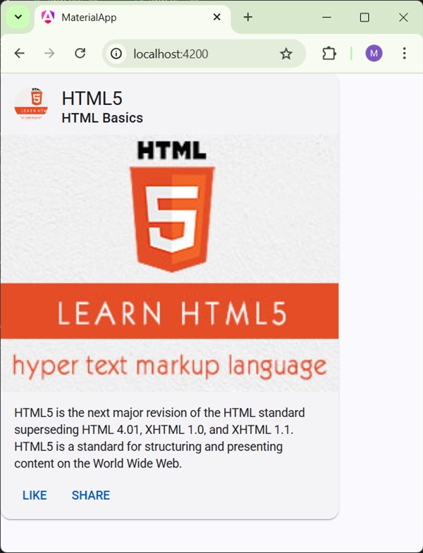
<mat-card class = "tp-card">
   <mat-card-header>
      <div mat-card-avatar class = "tp-header-image"></div>
      <mat-card-title>HTML5</mat-card-title>
      <mat-card-subtitle>HTML Basics</mat-card-subtitle>
   </mat-card-header>
   <img mat-card-image src = "https://www.tutorialspoint.com/materialize/src/html5-mini-logo.jpg" alt = "Learn HTML5">
   <mat-card-content>
      <p>
         HTML5 is the next major revision of the HTML standard superseding
         HTML 4.01, XHTML 1.0, and XHTML 1.1. HTML5 is a standard for
         structuring and presenting content on the World Wide Web.
      </p>
   </mat-card-content>
   <mat-card-actions>
      <button mat-button>LIKE</button>
      <button mat-button>SHARE</button>
   </mat-card-actions>
</mat-card>
app.css
Following is the content of the modified CSS file app.css.
.tp-card {
   max-width: 400px;
}
.tp-header-image {
   background-image: url('https://www.tutorialspoint.com/materialize/src/html5-mini-logo.jpg');
   background-size: cover;
}
Result
Verify the result.
Details
- Here, we've created a card using mat-card.