- Python - Home
- Python - Overview
- Python - History
- Python - Features
- Python vs C++
- Python - Hello World Program
- Python - Application Areas
- Python - Interpreter
- Python - Environment Setup
- Python - Virtual Environment
- Python - Basic Syntax
- Python - Variables
- Python - Private Variables
- Python - Data Types
- Python - Type Casting
- Python - Unicode System
- Python - Literals
- Python - Operators
- Python - Arithmetic Operators
- Python - Comparison Operators
- Python - Assignment Operators
- Python - Logical Operators
- Python - Bitwise Operators
- Python - Membership Operators
- Python - Identity Operators
- Python - Walrus Operator
- Python - Operator Precedence
- Python - Comments
- Python - User Input
- Python - Numbers
- Python - Booleans
- Python - Floating Points
- Python - Control Flow
- Python - Decision Making
- Python - If Statement
- Python - If else
- Python - Nested If
- Python - Conditional User Inputs
- Python - Match-Case Statement
- Python - Loops
- Python - for Loops
- Python - for-else Loops
- Python - While Loops
- Python - break Statement
- Python - continue Statement
- Python - pass Statement
- Python - Nested Loops
- Python Functions & Modules
- Python - Functions
- Python - Default Arguments
- Python - Keyword Arguments
- Python - Keyword-Only Arguments
- Python - Positional Arguments
- Python - Positional-Only Arguments
- Python - Arbitrary Arguments
- Python - Variables Scope
- Python - Function Annotations
- Python - Modules
- Python - Packing and Unpacking
- Python - Built in Functions
- Python Strings
- Python - Strings
- Python - Slicing Strings
- Python - Modify Strings
- Python - String Concatenation
- Python - String Formatting
- Python - Escape Characters
- Python - String Methods
- Python - String Exercises
- Python Lists
- Python - Lists
- Python - Access List Items
- Python - Change List Items
- Python - Add List Items
- Python - Remove List Items
- Python - Loop Lists
- Python - List Comprehension
- Python - Sort Lists
- Python - Copy Lists
- Python - Join Lists
- Python - List Methods
- Python - List Exercises
- Python Tuples
- Python - Tuples
- Python - Access Tuple Items
- Python - Update Tuples
- Python - Unpack Tuples
- Python - Loop Tuples
- Python - Join Tuples
- Python - Tuple Methods
- Python - Namedtuple
- Python - Tuple Exercises
- Python Sets
- Python - Sets
- Python - Access Set Items
- Python - Add Set Items
- Python - Remove Set Items
- Python - Loop Sets
- Python - Join Sets
- Python - Copy Sets
- Python - Set Operators
- Python - Set Methods
- Python - Set Exercises
- Python Dictionaries
- Python - Dictionaries
- Python - Access Dictionary Items
- Python - Change Dictionary Items
- Python - Add Dictionary Items
- Python - Remove Dictionary Items
- Python - Dictionary View Objects
- Python - Loop Dictionaries
- Python - Copy Dictionaries
- Python - Nested Dictionaries
- Python - Dictionary Methods
- Python - Dictionary Exercises
- Python Arrays
- Python - Arrays
- Python - Access Array Items
- Python - Add Array Items
- Python - Remove Array Items
- Python - Loop Arrays
- Python - Copy Arrays
- Python - Reverse Arrays
- Python - Sort Arrays
- Python - Join Arrays
- Python - Array Methods
- Python - Array Exercises
- Python File Handling
- Python - File Handling
- Python - Write to File
- Python - Read Files
- Python - Renaming and Deleting Files
- Python - Directories
- Python - File Methods
- Python - OS File/Directory Methods
- Python - OS Path Methods
- Object Oriented Programming
- Python - OOPs Concepts
- Python - Classes & Objects
- Python - Class Attributes
- Python - Class Methods
- Python - Static Methods
- Python - Constructors
- Python - Access Modifiers
- Python - Inheritance
- Python - Multiple Inheritance
- Python - Multilevel Inheritance
- Python - Polymorphism
- Python - Method Overriding
- Python - Method Overloading
- Python - Dynamic Binding
- Python - Dynamic Typing
- Python - Abstraction
- Python - Encapsulation
- Python - Interfaces
- Python - Packages
- Python - Inner Classes
- Python - Anonymous Class and Objects
- Python - Singleton Class
- Python - Wrapper Classes
- Python - Enums
- Python - Reflection
- Python - Data Classes
- Python Errors & Exceptions
- Python - Syntax Errors
- Python - Exceptions
- Python - try-except Block
- Python - try-finally Block
- Python - Raising Exceptions
- Python - Exception Chaining
- Python - Nested try Block
- Python - User-defined Exception
- Python - Logging
- Python - Assertions
- Python - Warnings
- Python - Built-in Exceptions
- Python - Debugger (PDB)
- Python Multithreading
- Python - Multithreading
- Python - Thread Life Cycle
- Python - Creating a Thread
- Python - Starting a Thread
- Python - Joining Threads
- Python - Naming Thread
- Python - Thread Scheduling
- Python - Thread Pools
- Python - Main Thread
- Python - Thread Priority
- Python - Daemon Threads
- Python - Synchronizing Threads
- Python Synchronization
- Python - Inter-thread Communication
- Python - Thread Deadlock
- Python - Interrupting a Thread
- Python Networking
- Python - Networking
- Python - Socket Programming
- Python - URL Processing
- Python - Generics
- Python Libraries
- NumPy Tutorial
- Pandas Tutorial
- SciPy Tutorial
- Matplotlib Tutorial
- Django Tutorial
- OpenCV Tutorial
- Python Miscellenous
- Python - Date & Time
- Python - Maths
- Python - Iterators
- Python - Generators
- Python - Generator Expressions
- Python - Lambda Expressions
- Python - Closures
- Python - Decorators
- Python - Recursion
- Python - Reg Expressions
- Python - PIP
- Python - Database Access
- Python - Weak References
- Python - Serialization
- Python - Templating
- Python - Output Formatting
- Python - Performance Measurement
- Python - Data Compression
- Python - CGI Programming
- Python - XML Processing
- Python - GUI Programming
- Python - Command-Line Arguments
- Python - Docstrings
- Python - JSON
- Python - Sending Email
- Python - Further Extensions
- Python - Tools/Utilities
- Python - Odds and Ends
- Python - GUIs
- Python Advanced Concepts
- Python - Abstract Base Classes
- Python - Custom Exceptions
- Python - Higher Order Functions
- Python - Object Internals
- Python - Memory Management
- Python - Metaclasses
- Python - Metaprogramming with Metaclasses
- Python - Mocking and Stubbing
- Python - Monkey Patching
- Python - Signal Handling
- Python - Type Hints
- Python - Automation Tutorial
- Python - Humanize Package
- Python - Context Managers
- Python - Coroutines
- Python - Descriptors
- Python - Diagnosing and Fixing Memory Leaks
- Python - Immutable Data Structures
- Python - Domain Specific Language (DSL)
- Python - Data Model
- Python Useful Resources
- Python - Questions & Answers
- Python - Interview Questions & Answers
- Python - Online Quiz
- Python - Quick Guide
- Python - Reference
- Python - Cheatsheet
- Python - Projects
- Python - Useful Resources
- Python - Discussion
- Python Compiler
- NumPy Compiler
- Matplotlib Compiler
- SciPy Compiler
Tkinter Text
Text widgets provide advanced capabilities that allow you to edit a multiline text and format the way it has to be displayed, such as changing its color and font.
You can also use elegant structures like tabs and marks to locate specific sections of the text, and apply changes to those areas. Moreover, you can embed windows and images in the text because this widget was designed to handle both plain and formatted text.
Syntax
Here is the simple syntax to create this widget −
w = Text ( master, option, ... )
Parameters
master − This represents the parent window
options − Here is the list of most commonly used options for this widget. These options can be used as key-value pairs separated by commas.
| Sr.No. | Options & Description |
|---|---|
| 1 | bg The default background color of the text widget |
| 2 | bd The width of the border around the text widget. Default is 2 pixels. |
| 3 | cursor The cursor that will appear when the mouse is over the text widget. |
| 4 | exportselection Normally, text selected within a text widget is exported to be the selection in the window manager. Set exportselection=0 if you don't want that behavior. |
| 5 | font The default font for text inserted into the widget. |
| 6 | fg The color used for text (and bitmaps) within the widget. You can change the color for tagged regions; this option is just the default. |
| 7 | height The height of the widget in lines (not pixels!), measured according to the current font size. |
| 8 | highlightbackground The color of the focus highlight when the text widget does not have focus. |
| 9 | highlightcolor The color of the focus highlight when the text widget has the focus. |
| 10 | highlightthickness The thickness of the focus highlight. Default is 1. Set highlightthickness=0 to suppress display of the focus highlight. |
| 11 | insertbackground The color of the insertion cursor. Default is black. |
| 12 | insertborderwidth Size of the 3-D border around the insertion cursor. Default is 0. |
| 13 | insertofftime The number of milliseconds the insertion cursor is off during its blink cycle. Set this option to zero to suppress blinking. Default is 300. |
| 14 | insertontime The number of milliseconds the insertion cursor is on during its blink cycle. Default is 600. |
| 15 | insertwidth Width of the insertion cursor (its height is determined by the tallest item in its line). Default is 2 pixels. |
| 16 | padx The size of the internal padding added to the left and right of the text area. Default is one pixel. |
| 17 | pady The size of the internal padding added above and below the text area. Default is one pixel. |
| 18 | relief The 3-D appearance of the text widget. Default is relief=SUNKEN. |
| 19 | selectbackground The background color to use displaying selected text. |
| 20 | selectborderwidth The width of the border to use around selected text. |
| 21 | spacing1 This option specifies how much extra vertical space is put above each line of text. If a line wraps, this space is added only before the first line it occupies on the display. Default is 0. |
| 22 | spacing2 This option specifies how much extra vertical space to add between displayed lines of text when a logical line wraps. Default is 0. |
| 23 | spacing3 This option specifies how much extra vertical space is added below each line of text. If a line wraps, this space is added only after the last line it occupies on the display. Default is 0. |
| 24 | state Normally, text widgets respond to keyboard and mouse events; set state=NORMAL to get this behavior. If you set state=DISABLED, the text widget will not respond, and you won't be able to modify its contents programmatically either. |
| 25 | tabs This option controls how tab characters position text. |
| 26 | width The width of the widget in characters (not pixels!), measured according to the current font size. |
| 27 | wrap This option controls the display of lines that are too wide. Set wrap=WORD and it will break the line after the last word that will fit. With the default behavior, wrap=CHAR, any line that gets too long will be broken at any character. |
| 28 | xscrollcommand To make the text widget horizontally scrollable, set this option to the set() method of the horizontal scrollbar. |
| 29 | yscrollcommand To make the text widget vertically scrollable, set this option to the set() method of the vertical scrollbar. |
Methods
Text objects have these methods −
| Sr.No. | Methods & Description |
|---|---|
| 1 | delete(startindex [,endindex]) This method deletes a specific character or a range of text. |
| 2 | get(startindex [,endindex]) This method returns a specific character or a range of text. |
| 3 | index(index) Returns the absolute value of an index based on the given index. |
| 4 | insert(index [,string]...) This method inserts strings at the specified index location |
| 5 | see(index) This method returns true if the text located at the index position is visible. |
Text widgets support three distinct helper structures: Marks, Tabs, and Indexes −
Marks are used to bookmark positions between two characters within a given text. We have the following methods available when handling marks −
| Sr.No. | Methods & Description |
|---|---|
| 1 | index(mark) Returns the line and column location of a specific mark. |
| 2 | mark_gravity(mark [,gravity]) Returns the gravity of the given mark. If the second argument is provided, the gravity is set for the given mark. |
| 3 | mark_names() Returns all marks from the Text widget. |
| 4 | mark_set(mark, index) Informs a new position to the given mark. |
| 5 | mark_unset(mark) Removes the given mark from the Text widget. |
Tags are used to associate names to regions of text which makes easy the task of modifying the display settings of specific text areas. Tags are also used to bind event callbacks to specific ranges of text.
Following are the available methods for handling tabs −
| Sr.No. | Methods & Description |
|---|---|
| 1 | tag_add(tagname, startindex[,endindex] ...) This method tags either the position defined by startindex, or a range delimited by the positions startindex and endindex. |
| 2 | tag_config You can use this method to configure the tag properties, which include, justify(center, left, or right), tabs(this property has the same functionality of the Text widget tabs's property), and underline(used to underline the tagged text). |
| 3 | tag_delete(tagname) This method is used to delete and remove a given tag. |
| 4 | tag_remove(tagname [,startindex[.endindex]] ...) After applying this method, the given tag is removed from the provided area without deleting the actual tag definition. |
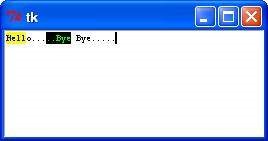
Example
Try the following example yourself −
from tkinter import *
root = Tk()
text = Text(root)
text.insert(INSERT, "Hello.....")
text.insert(END, "Bye Bye.....")
text.pack()
text.tag_add("here", "1.0", "1.4")
text.tag_add("start", "1.8", "1.13")
text.tag_config("here", background="yellow", foreground="blue")
text.tag_config("start", background="black", foreground="green")
root.mainloop()
When the above code is executed, it produces the following result −