- Python - Home
- Python - Overview
- Python - History
- Python - Features
- Python vs C++
- Python - Hello World Program
- Python - Application Areas
- Python - Interpreter
- Python - Environment Setup
- Python - Virtual Environment
- Python - Basic Syntax
- Python - Variables
- Python - Private Variables
- Python - Data Types
- Python - Type Casting
- Python - Unicode System
- Python - Literals
- Python - Operators
- Python - Arithmetic Operators
- Python - Comparison Operators
- Python - Assignment Operators
- Python - Logical Operators
- Python - Bitwise Operators
- Python - Membership Operators
- Python - Identity Operators
- Python - Walrus Operator
- Python - Operator Precedence
- Python - Comments
- Python - User Input
- Python - Numbers
- Python - Booleans
- Python - Floating Points
- Python - Control Flow
- Python - Decision Making
- Python - If Statement
- Python - If else
- Python - Nested If
- Python - Conditional User Inputs
- Python - Match-Case Statement
- Python - Loops
- Python - for Loops
- Python - for-else Loops
- Python - While Loops
- Python - break Statement
- Python - continue Statement
- Python - pass Statement
- Python - Nested Loops
- Python Functions & Modules
- Python - Functions
- Python - Default Arguments
- Python - Keyword Arguments
- Python - Keyword-Only Arguments
- Python - Positional Arguments
- Python - Positional-Only Arguments
- Python - Arbitrary Arguments
- Python - Variables Scope
- Python - Function Annotations
- Python - Modules
- Python - Packing and Unpacking
- Python - Built in Functions
- Python Strings
- Python - Strings
- Python - Slicing Strings
- Python - Modify Strings
- Python - String Concatenation
- Python - String Formatting
- Python - Escape Characters
- Python - String Methods
- Python - String Exercises
- Python Lists
- Python - Lists
- Python - Access List Items
- Python - Change List Items
- Python - Add List Items
- Python - Remove List Items
- Python - Loop Lists
- Python - List Comprehension
- Python - Sort Lists
- Python - Copy Lists
- Python - Join Lists
- Python - List Methods
- Python - List Exercises
- Python Tuples
- Python - Tuples
- Python - Access Tuple Items
- Python - Update Tuples
- Python - Unpack Tuples
- Python - Loop Tuples
- Python - Join Tuples
- Python - Tuple Methods
- Python - Namedtuple
- Python - Tuple Exercises
- Python Sets
- Python - Sets
- Python - Access Set Items
- Python - Add Set Items
- Python - Remove Set Items
- Python - Loop Sets
- Python - Join Sets
- Python - Copy Sets
- Python - Set Operators
- Python - Set Methods
- Python - Set Exercises
- Python Dictionaries
- Python - Dictionaries
- Python - Access Dictionary Items
- Python - Change Dictionary Items
- Python - Add Dictionary Items
- Python - Remove Dictionary Items
- Python - Dictionary View Objects
- Python - Loop Dictionaries
- Python - Copy Dictionaries
- Python - Nested Dictionaries
- Python - Dictionary Methods
- Python - Dictionary Exercises
- Python Arrays
- Python - Arrays
- Python - Access Array Items
- Python - Add Array Items
- Python - Remove Array Items
- Python - Loop Arrays
- Python - Copy Arrays
- Python - Reverse Arrays
- Python - Sort Arrays
- Python - Join Arrays
- Python - Array Methods
- Python - Array Exercises
- Python File Handling
- Python - File Handling
- Python - Write to File
- Python - Read Files
- Python - Renaming and Deleting Files
- Python - Directories
- Python - File Methods
- Python - OS File/Directory Methods
- Python - OS Path Methods
- Object Oriented Programming
- Python - OOPs Concepts
- Python - Classes & Objects
- Python - Class Attributes
- Python - Class Methods
- Python - Static Methods
- Python - Constructors
- Python - Access Modifiers
- Python - Inheritance
- Python - Multiple Inheritance
- Python - Multilevel Inheritance
- Python - Polymorphism
- Python - Method Overriding
- Python - Method Overloading
- Python - Dynamic Binding
- Python - Dynamic Typing
- Python - Abstraction
- Python - Encapsulation
- Python - Interfaces
- Python - Packages
- Python - Inner Classes
- Python - Anonymous Class and Objects
- Python - Singleton Class
- Python - Wrapper Classes
- Python - Enums
- Python - Reflection
- Python - Data Classes
- Python Errors & Exceptions
- Python - Syntax Errors
- Python - Exceptions
- Python - try-except Block
- Python - try-finally Block
- Python - Raising Exceptions
- Python - Exception Chaining
- Python - Nested try Block
- Python - User-defined Exception
- Python - Logging
- Python - Assertions
- Python - Warnings
- Python - Built-in Exceptions
- Python - Debugger (PDB)
- Python Multithreading
- Python - Multithreading
- Python - Thread Life Cycle
- Python - Creating a Thread
- Python - Starting a Thread
- Python - Joining Threads
- Python - Naming Thread
- Python - Thread Scheduling
- Python - Thread Pools
- Python - Main Thread
- Python - Thread Priority
- Python - Daemon Threads
- Python - Synchronizing Threads
- Python Synchronization
- Python - Inter-thread Communication
- Python - Thread Deadlock
- Python - Interrupting a Thread
- Python Networking
- Python - Networking
- Python - Socket Programming
- Python - URL Processing
- Python - Generics
- Python Libraries
- NumPy Tutorial
- Pandas Tutorial
- SciPy Tutorial
- Matplotlib Tutorial
- Django Tutorial
- OpenCV Tutorial
- Python Miscellenous
- Python - Date & Time
- Python - Maths
- Python - Iterators
- Python - Generators
- Python - Generator Expressions
- Python - Lambda Expressions
- Python - Closures
- Python - Decorators
- Python - Recursion
- Python - Reg Expressions
- Python - PIP
- Python - Database Access
- Python - Weak References
- Python - Serialization
- Python - Templating
- Python - Output Formatting
- Python - Performance Measurement
- Python - Data Compression
- Python - CGI Programming
- Python - XML Processing
- Python - GUI Programming
- Python - Command-Line Arguments
- Python - Docstrings
- Python - JSON
- Python - Sending Email
- Python - Further Extensions
- Python - Tools/Utilities
- Python - Odds and Ends
- Python - GUIs
- Python Advanced Concepts
- Python - Abstract Base Classes
- Python - Custom Exceptions
- Python - Higher Order Functions
- Python - Object Internals
- Python - Memory Management
- Python - Metaclasses
- Python - Metaprogramming with Metaclasses
- Python - Mocking and Stubbing
- Python - Monkey Patching
- Python - Signal Handling
- Python - Type Hints
- Python - Automation Tutorial
- Python - Humanize Package
- Python - Context Managers
- Python - Coroutines
- Python - Descriptors
- Python - Diagnosing and Fixing Memory Leaks
- Python - Immutable Data Structures
- Python - Domain Specific Language (DSL)
- Python - Data Model
- Python Useful Resources
- Python - Questions & Answers
- Python - Interview Questions & Answers
- Python - Online Quiz
- Python - Quick Guide
- Python - Reference
- Python - Cheatsheet
- Python - Projects
- Python - Useful Resources
- Python - Discussion
- Python Compiler
- NumPy Compiler
- Matplotlib Compiler
- SciPy Compiler
Tkinter Entry
The Entry widget is used to accept single-line text strings from a user.
If you want to display multiple lines of text that can be edited, then you should use the Text widget.
If you want to display one or more lines of text that cannot be modified by the user, then you should use the Label widget.
Syntax
Here is the simple syntax to create this widget −
w = Entry( master, option, ... )
Parameters
master − This represents the parent window.
options − Here is the list of most commonly used options for this widget. These options can be used as key-value pairs separated by commas.
| Sr.No. | Option & Description |
|---|---|
| 1 | Bg The normal background color displayed behind the label and indicator. |
| 2 | Bd The size of the border around the indicator. Default is 2 pixels. |
| 3 | Command A procedure to be called every time the user changes the state of this checkbutton. |
Cursor If you set this option to a cursor name (arrow, dot etc.), the mouse cursor will change to that pattern when it is over the checkbutton. |
|
| 4 | Font The font used for the text. |
| 5 | Exportselection By default, if you select text within an Entry widget, it is automatically exported to the clipboard. To avoid this exportation, use exportselection=0. |
| 6 | Fg The color used to render the text. |
| 7 | Highlightcolor The color of the focus highlight when the checkbutton has the focus. |
| 8 | Justify If the text contains multiple lines, this option controls how the text is justified: CENTER, LEFT, or RIGHT. |
| 9 | Relief With the default value, relief=FLAT, the checkbutton does not stand out from its background. You may set this option to any of the other styles. |
| 10 | selectbackground The background color to use displaying selected text. |
| 11 | selectborderwidth The width of the border to use around selected text. The default is one pixel. |
| 12 | selectforeground The foreground (text) color of selected text. |
| 13 | Show Normally, the characters that the user types appear in the entry. To make a .password. entry that echoes each character as an asterisk, set show="*". |
| 14 | State The default is state=NORMAL, but you can use state=DISABLED to gray out the control and make it unresponsive. If the cursor is currently over the checkbutton, the state is ACTIVE. |
| 15 | Textvariable In order to be able to retrieve the current text from your entry widget, you must set this option to an instance of the StringVar class. |
| 16 | Width The default width of a checkbutton is determined by the size of the displayed image or text. You can set this option to a number of characters and the checkbutton will always have room for that many characters. |
| 17 | xscrollcommand If you expect that users will often enter more text than the onscreen size of the widget, you can link your entry widget to a scrollbar. |
Methods
Following are commonly used methods for this widget −
| Sr.No. | Method & Description |
|---|---|
| 1 | delete ( first, last=None ) Deletes characters from the widget, starting with the one at index first, up to but not including the character at position last. If the second argument is omitted, only the single character at position first is deleted. |
| 2 | get() Returns the entry's current text as a string. |
| 3 | icursor ( index ) Set the insertion cursor just before the character at the given index. |
| 4 | index ( index ) Shift the contents of the entry so that the character at the given index is the leftmost visible character. Has no effect if the text fits entirely within the entry. |
| 5 | insert ( index, s ) Inserts string s before the character at the given index. |
| 6 | select_adjust ( index ) This method is used to make sure that the selection includes the character at the specified index. |
| 7 | select_clear() Clears the selection. If there isn't currently a selection, has no effect. |
| 8 | select_from ( index ) Sets the ANCHOR index position to the character selected by index, and selects that character. |
| 9 | select_present() If there is a selection, returns true, else returns false. |
| 10 | select_range ( start, end ) Sets the selection under program control. Selects the text starting at the start index, up to but not including the character at the end index. The start position must be before the end position. |
| 11 | select_to ( index ) Selects all the text from the ANCHOR position up to but not including the character at the given index. |
| 12 | xview ( index ) This method is useful in linking the Entry widget to a horizontal scrollbar. |
| 13 | xview_scroll ( number, what ) Used to scroll the entry horizontally. The what argument must be either UNITS, to scroll by character widths, or PAGES, to scroll by chunks the size of the entry widget. The number is positive to scroll left to right, negative to scroll right to left. |
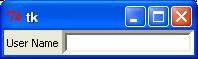
Example
Try the following example yourself −
from tkinter import *

top = Tk()
L1 = Label(top, text="User Name")
L1.pack( side = LEFT)
E1 = Entry(top, bd =5)
E1.pack(side = RIGHT)

top.mainloop()
When the above code is executed, it produces the following result −