- Python - Home
- Python - Overview
- Python - History
- Python - Features
- Python vs C++
- Python - Hello World Program
- Python - Application Areas
- Python - Interpreter
- Python - Environment Setup
- Python - Virtual Environment
- Python - Basic Syntax
- Python - Variables
- Python - Private Variables
- Python - Data Types
- Python - Type Casting
- Python - Unicode System
- Python - Literals
- Python - Operators
- Python - Arithmetic Operators
- Python - Comparison Operators
- Python - Assignment Operators
- Python - Logical Operators
- Python - Bitwise Operators
- Python - Membership Operators
- Python - Identity Operators
- Python - Walrus Operator
- Python - Operator Precedence
- Python - Comments
- Python - User Input
- Python - Numbers
- Python - Booleans
- Python - Floating Points
- Python - Control Flow
- Python - Decision Making
- Python - If Statement
- Python - If else
- Python - Nested If
- Python - Conditional User Inputs
- Python - Match-Case Statement
- Python - Loops
- Python - for Loops
- Python - for-else Loops
- Python - While Loops
- Python - break Statement
- Python - continue Statement
- Python - pass Statement
- Python - Nested Loops
- Python Functions & Modules
- Python - Functions
- Python - Default Arguments
- Python - Keyword Arguments
- Python - Keyword-Only Arguments
- Python - Positional Arguments
- Python - Positional-Only Arguments
- Python - Arbitrary Arguments
- Python - Variables Scope
- Python - Function Annotations
- Python - Modules
- Python - Packing and Unpacking
- Python - Built in Functions
- Python Strings
- Python - Strings
- Python - Slicing Strings
- Python - Modify Strings
- Python - String Concatenation
- Python - String Formatting
- Python - Escape Characters
- Python - String Methods
- Python - String Exercises
- Python Lists
- Python - Lists
- Python - Access List Items
- Python - Change List Items
- Python - Add List Items
- Python - Remove List Items
- Python - Loop Lists
- Python - List Comprehension
- Python - Sort Lists
- Python - Copy Lists
- Python - Join Lists
- Python - List Methods
- Python - List Exercises
- Python Tuples
- Python - Tuples
- Python - Access Tuple Items
- Python - Update Tuples
- Python - Unpack Tuples
- Python - Loop Tuples
- Python - Join Tuples
- Python - Tuple Methods
- Python - Namedtuple
- Python - Tuple Exercises
- Python Sets
- Python - Sets
- Python - Access Set Items
- Python - Add Set Items
- Python - Remove Set Items
- Python - Loop Sets
- Python - Join Sets
- Python - Copy Sets
- Python - Set Operators
- Python - Set Methods
- Python - Set Exercises
- Python Dictionaries
- Python - Dictionaries
- Python - Access Dictionary Items
- Python - Change Dictionary Items
- Python - Add Dictionary Items
- Python - Remove Dictionary Items
- Python - Dictionary View Objects
- Python - Loop Dictionaries
- Python - Copy Dictionaries
- Python - Nested Dictionaries
- Python - Dictionary Methods
- Python - Dictionary Exercises
- Python Arrays
- Python - Arrays
- Python - Access Array Items
- Python - Add Array Items
- Python - Remove Array Items
- Python - Loop Arrays
- Python - Copy Arrays
- Python - Reverse Arrays
- Python - Sort Arrays
- Python - Join Arrays
- Python - Array Methods
- Python - Array Exercises
- Python File Handling
- Python - File Handling
- Python - Write to File
- Python - Read Files
- Python - Renaming and Deleting Files
- Python - Directories
- Python - File Methods
- Python - OS File/Directory Methods
- Python - OS Path Methods
- Object Oriented Programming
- Python - OOPs Concepts
- Python - Classes & Objects
- Python - Class Attributes
- Python - Class Methods
- Python - Static Methods
- Python - Constructors
- Python - Access Modifiers
- Python - Inheritance
- Python - Multiple Inheritance
- Python - Multilevel Inheritance
- Python - Polymorphism
- Python - Method Overriding
- Python - Method Overloading
- Python - Dynamic Binding
- Python - Dynamic Typing
- Python - Abstraction
- Python - Encapsulation
- Python - Interfaces
- Python - Packages
- Python - Inner Classes
- Python - Anonymous Class and Objects
- Python - Singleton Class
- Python - Wrapper Classes
- Python - Enums
- Python - Reflection
- Python - Data Classes
- Python Errors & Exceptions
- Python - Syntax Errors
- Python - Exceptions
- Python - try-except Block
- Python - try-finally Block
- Python - Raising Exceptions
- Python - Exception Chaining
- Python - Nested try Block
- Python - User-defined Exception
- Python - Logging
- Python - Assertions
- Python - Warnings
- Python - Built-in Exceptions
- Python - Debugger (PDB)
- Python Multithreading
- Python - Multithreading
- Python - Thread Life Cycle
- Python - Creating a Thread
- Python - Starting a Thread
- Python - Joining Threads
- Python - Naming Thread
- Python - Thread Scheduling
- Python - Thread Pools
- Python - Main Thread
- Python - Thread Priority
- Python - Daemon Threads
- Python - Synchronizing Threads
- Python Synchronization
- Python - Inter-thread Communication
- Python - Thread Deadlock
- Python - Interrupting a Thread
- Python Networking
- Python - Networking
- Python - Socket Programming
- Python - URL Processing
- Python - Generics
- Python Libraries
- NumPy Tutorial
- Pandas Tutorial
- SciPy Tutorial
- Matplotlib Tutorial
- Django Tutorial
- OpenCV Tutorial
- Python Miscellenous
- Python - Date & Time
- Python - Maths
- Python - Iterators
- Python - Generators
- Python - Generator Expressions
- Python - Lambda Expressions
- Python - Closures
- Python - Decorators
- Python - Recursion
- Python - Reg Expressions
- Python - PIP
- Python - Database Access
- Python - Weak References
- Python - Serialization
- Python - Templating
- Python - Output Formatting
- Python - Performance Measurement
- Python - Data Compression
- Python - CGI Programming
- Python - XML Processing
- Python - GUI Programming
- Python - Command-Line Arguments
- Python - Docstrings
- Python - JSON
- Python - Sending Email
- Python - Further Extensions
- Python - Tools/Utilities
- Python - Odds and Ends
- Python - GUIs
- Python Advanced Concepts
- Python - Abstract Base Classes
- Python - Custom Exceptions
- Python - Higher Order Functions
- Python - Object Internals
- Python - Memory Management
- Python - Metaclasses
- Python - Metaprogramming with Metaclasses
- Python - Mocking and Stubbing
- Python - Monkey Patching
- Python - Signal Handling
- Python - Type Hints
- Python - Automation Tutorial
- Python - Humanize Package
- Python - Context Managers
- Python - Coroutines
- Python - Descriptors
- Python - Diagnosing and Fixing Memory Leaks
- Python - Immutable Data Structures
- Python - Domain Specific Language (DSL)
- Python - Data Model
- Python Useful Resources
- Python - Questions & Answers
- Python - Interview Questions & Answers
- Python - Online Quiz
- Python - Quick Guide
- Python - Reference
- Python - Cheatsheet
- Python - Projects
- Python - Useful Resources
- Python - Discussion
- Python Compiler
- NumPy Compiler
- Matplotlib Compiler
- SciPy Compiler
Tkinter Scrollbar
This widget provides a slide controller that is used to implement vertical scrolled widgets, such as Listbox, Text and Canvas. Note that you can also create horizontal scrollbars on Entry widgets.
Syntax
Here is the simple syntax to create this widget −
w = Scrollbar ( master, option, ... )
Parameters
master − This represents the parent window.
options − Here is the list of most commonly used options for this widget. These options can be used as key-value pairs separated by commas.
| Sr.No. | Options & Description |
|---|---|
| 1 | activebackground The color of the slider and arrowheads when the mouse is over them. |
| 2 | bg The color of the slider and arrowheads when the mouse is not over them. |
| 3 | bd The width of the 3-d borders around the entire perimeter of the trough, and also the width of the 3-d effects on the arrowheads and slider. Default is no border around the trough, and a 2-pixel border around the arrowheads and slider. |
| 4 | command A procedure to be called whenever the scrollbar is moved. |
| 5 | cursor The cursor that appears when the mouse is over the scrollbar. |
| 6 | elementborderwidth The width of the borders around the arrowheads and slider. The default is elementborderwidth=-1, which means to use the value of the borderwidth option. |
| 7 | highlightbackground The color of the focus highlight when the scrollbar does not have focus. |
| 8 | highlightcolor The color of the focus highlight when the scrollbar has the focus. |
| 9 | highlightthickness The thickness of the focus highlight. Default is 1. Set to 0 to suppress display of the focus highlight. |
| 10 | jump This option controls what happens when a user drags the slider. Normally (jump=0), every small drag of the slider causes the command callback to be called. If you set this option to 1, the callback isn't called until the user releases the mouse button. |
| 11 | orient Set orient=HORIZONTAL for a horizontal scrollbar, orient=VERTICAL for a vertical one. |
| 12 | repeatdelay This option controls how long button 1 has to be held down in the trough before the slider starts moving in that direction repeatedly. Default is repeatdelay=300, and the units are milliseconds. |
| 13 | repeatinterval repeatinterval |
| 14 | takefocus Normally, you can tab the focus through a scrollbar widget. Set takefocus=0 if you don't want this behavior. |
| 15 | troughcolor The color of the trough. |
| 16 | width Width of the scrollbar (its y dimension if horizontal, and its x dimension if vertical). Default is 16. |
Methods
Scrollbar objects have these methods −
| Sr.No. | Methods & Description |
|---|---|
| 1 | get() Returns two numbers (a, b) describing the current position of the slider. The a value gives the position of the left or top edge of the slider, for horizontal and vertical scrollbars respectively; the b value gives the position of the right or bottom edge. |
| 2 | set ( first, last ) To connect a scrollbar to another widget w, set w's xscrollcommand or yscrollcommand to the scrollbar's set() method. The arguments have the same meaning as the values returned by the get() method. |
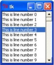
Example
Try the following example yourself −
from tkinter import *

root = Tk()
scrollbar = Scrollbar(root)
scrollbar.pack( side = RIGHT, fill=Y )

mylist = Listbox(root, yscrollcommand = scrollbar.set )
for line in range(100):
   mylist.insert(END, "This is line number " + str(line))

mylist.pack( side = LEFT, fill = BOTH )
scrollbar.config( command = mylist.yview )

mainloop()
When the above code is executed, it produces the following result −