- PyGTK - Home
- PyGTK - Introduction
- PyGTK - Environment
- PyGTK - Hello World
- PyGTK - Important Classes
- PyGTK - Window Class
- PyGTK - Button Class
- PyGTK - Label CLass
- PyGTK - Entry Class
- PyGTK - Signal Handling
- PyGTK - Event Handling
- PyGTK - Containers
- PyGTK - Box Class
- PyGTK - ButtonBox Class
- PyGTK - Alignment Class
- PyGTK - EventBox Class
- PyGTK - Layout Class
- PyGTK - ComboBox Class
- PyGTK - ToggleButton Class
- PyGTK - CheckButton Class
- PyGTK - RadioButton Class
- PyGTK - MenuBar, Menu & MenuItem
- PyGTK - Toolbar Class
- PyGTK - Adjustment Class
- PyGTK - Range Class
- PyGTK - Scale Class
- PyGTK - Scrollbar Class
- PyGTK - Dialog Class
- PyGTK - MessageDialog Class
- PyGTK - AboutDialog Class
- PyGTK - Font Selection Dialog
- PyGTK - Color Selection Dialog
- PyGTK - File Chooser Dialog
- PyGTK - Notebook Class
- PyGTK - Frame Class
- PyGTK - AspectFrame Class
- PyGTK - TreeView Class
- PyGTK - Paned Class
- PyGTK - Statusbar Class
- PyGTK - ProgressBar Class
- PyGTK - Viewport Class
- PyGTK - Scrolledwindow Class
- PyGTK - Arrow Class
- PyGTK - Image Class
- PyGTK - DrawingArea Class
- PyGTK - SpinButton Class
- PyGTK - Calendar Class
- PyGTK - Clipboard Class
- PyGTK - Ruler Class
- PyGTK - Timeout
- PyGTK - Drag and Drop
PyGTK - Quick Guide
PyGTK - Introduction
PyGTK is a set of wrappers written in Python and C for GTK + GUI library. It is part of the GNOME project. It offers comprehensive tools for building desktop applications in Python. Python bindings for other popular GUI libraries are also available.
PyQt is a Python port of QT library. Our PyQt tutorial can be found here. Similarly, wxPython toolkit is Python binding for wxWidgets, another popular cross-platform GUI library. Our wxPython tutorial is available here.
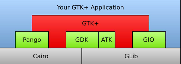
GTK+, or the GIMP Toolkit, is a multi-platform toolkit for creating graphical user interfaces. Offering a complete set of widgets, GTK+ is suitable for projects ranging from small one-off tools to complete application suites.
GTK+ has been designed from the ground up to support a wide range of languages. PyGTK is a Python wrapper for GTK+.
GTK+ is built around the following four libraries −
Glib − A low-level core library that forms the basis of GTK+. It provides data structure handling for C.
Pango − A library for layout and rendering of text with an emphasis on internationalization.
Cairo − A library for 2D graphics with support for multiple output devices (including the X Window System, Win32)
ATK − A library for a set of interfaces providing accessibility tools such as screen readers, magnifiers, and alternative input devices.
PyGTK eases the process and helps you create programs with a graphical user interface using the Python programming language. The underlying GTK+ library provides all kinds of visual elements and utilities for it to develop full-featured applications for the GNOME Desktop. PyGTK is a cross-platform library. It is a free software distributed under the LGPL license.
PyGTK is built around GTK + 2.x. In order to build applications for GTK +3, PyGObject bindings are also available.
PyGTK - Environment
PyGTK for Microsoft Windows
The installation of PyGTK for Microsoft Windows involves the following steps −
Step 1 − Install a 32-bit Python interpreter (latest Python 2.7 distribution)
Step 2 − Download and install GTK+ runtime.
Step 3 − Download and install GTK+ runtime −https://ftp.gnome.org
Step 4 − It is also recommended that you download PyCairo and PyGobject modules from the following URLs − https://ftp.gnome.org https://ftp.gnome.org/pub
Step 5 − For convenience, all-in-one installer which handles all of the PyGTK dependencies is also available. Download and install the latest all-in-one installer for Windows from the following URL − https://ftp.gnome.org/pub/GNOME
PyGTK for Linux
PyGTK is included in most Linux distributions (including Debian, Fedora, Ubuntu,RedHat etc); the source code can also be downloaded and compiled from the following URL
https://ftp.gnome.org/pub/GNOME/sources/pygtk/2.24/
PyGTK - Hello World
Creating a window using PyGTK is very simple. To proceed, we first need to import the gtk module in our code.
import gtk
The gtk module contains the gtk.Window class. Its object constructs a toplevel window. We derive a class from gtk.Window.
class PyApp(gtk.Window):
Define the constructor and call the show_all() method of the gtk.window class.
def __init__(self):
   super(PyApp, self).__init__()
   self.show_all()
We now have to declare the object of this class and start an event loop by calling its main() method.
PyApp()
gtk.main()
It is recommended we add a label Hello World in the parent window.
label = gtk.Label("Hello World")
self.add(label)
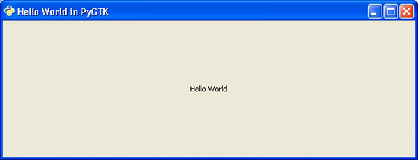
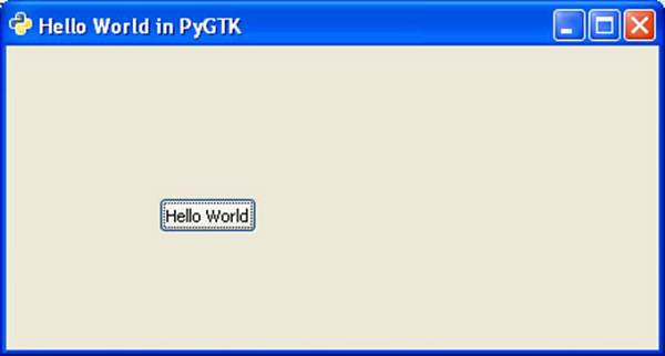
The following is a complete code to display Hello World−
import gtk

class PyApp(gtk.Window):
   def __init__(self):
      super(PyApp, self).__init__()
      self.set_default_size(300,200)
      self.set_title("Hello World in PyGTK")
      label = gtk.Label("Hello World")
      self.add(label)
      self.show_all()
PyApp()
gtk.main()
The implementation of the above code will yield the following output −
PyGTK - Important Classes
The PyGTK module contains various widgets. gtk.Object class acts as the base class for most of the widgets as well as for some non-widget classes. The toplevel window for desktop applications using PyGTK is provided by gtk.Window class. The following table lists the important widgets and their functions −
| S.NO | Classes and Description |
|---|---|
| 1 | gtk.Widget This is a gtk.base class for all PyGTK widgets. gtk.Widget provides a common set of methods and signals for the widgets. |
| 2 | gtk.Window This is a toplevel window that holds one child widget. gtk.Window is a display area decorated with a title bar, and items to allow the user to close, resize and move the window. |
| 3 | gtk.Button This is a pushbutton widget that issues a signal when clicked. gtk.Button is usually displayed as a pushbutton with a text label and is generally used to attach a callback function. |
| 4 | gtk.Entry This is a single line text entry widget. |
| 5 | gtk.Label This widget displays a limited amount of read-only text. |
| 6 | gtk.ButtonBox This is a base class for widgets that contains multiple buttons. |
| 7 | gtk.HBox This is a container that organizes its child widgets into a single horizontal row. |
| 8 | gtk.VBox This is a container that organizes its child widgets into a single column. |
| 9 | gtk.Fixed This is a container that can place child widgets at fixed positions and with fixed sizes, given in pixels. |
| 10 | gtk.Layout This provides infinite scrollable area containing child widgets and custom drawing. |
| 11 | gtk.MenuItem This widget implements the appearance and behavior of menu items. The derived widget subclasses of the gtk.MenuItem are the only valid children of menus. When selected by a user, they can display a popup menu or invoke an associated function or method |
| 12 | gtk.Menu This is a dropdown menu consisting of a list of MenuItem objects which can be navigated and activated by the user to perform application functions. |
| 13 | gtk.MenuBar This displays the menu items horizontally in an application window or dialog. |
| 14 | gtk.ComboBox This widget is used to choose from a list of items. |
| 15 | gtk.Scale This is a horizontal or vertical slider control to select a numeric value. |
| 16 | gtk.Scrollbar This displays a horizontal or vertical scrollbar. |
| 17 | gtk.ProgressBar This is used to display the progress of a long running operation. |
| 18 | gtk.Dialog This displays a popup window for user information and action. |
| 19 | gtk.Notebook This widget is a container whose children are overlapping pages that can be switched between using tab labels. |
| 20 | gtk.Paned This is a base class for widgets with two panes, arranged either horizontally or vertically. Child widgets are added to the panes of the widget. The division between the two children can be adjusted by the user. |
| 21 | gtk.TextView This widget displays the contents of a TextBuffer object. |
| 22 | gtk.Toolbar This container holds and manages a set of buttons and widgets in a horizontal or vertical bar. |
| 23 | gtk.TreeView This widget displays the contents of standard TreeModel (ListStore, TreeStore, TreeModelSort) |
| 24 | gtk.DrawingArea This widget helps in creating custom user interface elements. gtk.DrawingArea is essentially a blank widget containing a window that you can draw on. |
| 25 | gtk.Calendar This widget displays a calendar and allows the user to select a date. |
| 26 | gtk.Viewport This widget displays a portion of a larger widget. |
PyGTK - Window Class
An object of the gtk.Window class provides a widget that users commonly think of as a Wwindow. This widget is a container hence, it can hold one child widget. It provides a displayable area decorated with title bar and resizing controls.
gtk.Window class has the following constructor −
gtk.Window(type)
Type paramter takes one of the following values −
| gtk.WINDOW_TOPLEVEL (default) | This window has no parent. The Toplevel windows are the main application window and dialogs. |
| gtk.WINDOW_POPUP | This window has no frame or decorations. A popup window is used for menus and tooltips. |
Some of the important methods of the gtk.Window class are listed below −
| S.NO | Methods and Description |
|---|---|
| 1 | set_title(string) This sets the "title" property of the gtk.window to the value specified by the title. The title of a window will be displayed in its title bar. |
| 2 | get_title() This returns the title of a window if set. |
| 3 | set_position() This sets the position of window. The predefined position constants are −
|
| 3 | set_focus() This sets the widget specified to be the focus widget for the window. |
| 4 | set_resizable() This is true by default. set_resizable() helps the user to set the size of a window. |
| 5 | set_decorated() This is true by default. If false, the title bar and the resizing controls of window will be disabled. |
| 6 | set_modal() If true, window becomes modal and the interaction with other windows is prevented. This is used for the Dialog widgets. |
| 7 | set_default_size() This sets the default size of the window to the specified width and height in pixels. |
The gtk.Window widget emits the following signals −
| activate-default | This is emitted when the default child widget of window is activated usually by the user pressing the Return or Enter key. |
| activate-focus | This is emitted when the child widget with the focus is activated usually by the user pressing the Space key. |
| move-focus | This is emitted when the focus is changed within the window's child widgets when the user presses the Tab, the Shift+Tab or the Up, Down, Left or Right arrow keys. |
| set-focus | This is emitted when the focus changes to widget in window. |
PyGTK - Button Class
The gtk.Button widget is usually displayed as a pushbutton with a text label. It is generally used to attach a callback function or method that is called when the button is clicked.
The gtk.Button class has the following constructor −
gtk.Button(label = None, stock = None, use_underline = True)
Wherein,
Label − The text to be displayed by the button label
Stock − The stock id identifying the stock image and text to be used in the button. Default is None.
Underline − If True, an underscore in the text indicates the next character should be underlined and used for the mnemonic accelerator.
Some of the predefined constants for stock parameter are −
- STOCK_OK
- STOCK_STOP
- STOCK_YES
- STOCK_NO
- STOCK_QUIT
- STOCK_CANCEL
- STOCK_CLOSE
The Button class has the following important methods −
| S.NO | Methods and Description |
|---|---|
| 1 | set_label() This sets the text of the button label to label. This string is also used to select the stock item if the "use_stock" property is True. |
| 2 | get_label() This retrieves the text from the label of the button |
| 3 | set_focus_on_click() If True, the button grabs focus when clicked with the mouse. |
| 4 | set_alignment() This is the horizontal and vertical alignment of the child widget. The value ranges from 0.0 to 1.0. |
| 5 | set_image() This sets the image property to the value of image. The "gtkbutton-images" property should be set to True. |
The following signals are emitted by the Button widget −
| activate | This is emitted when the gtk.Widget's activate() method is called. For a button it causes the "clicked" signal to be emitted. |
| clicked | This is emitted when the mouse button is pressed and released while the pointer is over the button or when the button is triggered with the keyboard. |
PyGTK - Label Class
A Label widget is useful to display non-editable text. Label is used by many other widgets internally. For example, Button has a label to show text on the face. Similarly, MenuItem objects have a label. A label is a windowless object, so it cannot receive events directly.
Label class has a simple constructor −
gtk.Label(str = None)
The following useful methods can be used with Label object −
| S.NO | Methods and Description |
|---|---|
| 1 | set_text() This sets new text as label |
| 2 | get_text() This returns text from label |
| 3 | set_use_underline() If true, an underscore in the text indicates the next character should be used for the mnemonic accelerator key. |
| 4 | set_justify This sets the alignment of the lines in the text of the label relative to each other. Possible values are gtk.JUSTIFY_LEFT, gtk.JUSTIFY_RIGHT, gtk.JUSTIFY_CENTER, and gtk.JUSTIFY_FILL. |
| 5 | Set_line_wrap() If true, the line will be wrapped |
| 6 | set_selectable() If true, the text in the label can be selected for copy-paste |
| 7 | set_width_chars() This sets the width of a label |
The following signals are emitted by label widget −
| activate-current-link | This gets emitted when the user activates a link in the label. |
| activate-link | This gets emitted to activate a URI. |
| copy-clipboard | This gets emitted when text is copied from the label to the clipboard. |
PyGTK - Entry Class
Entry widget is a single-line text entry widget. If the entered text is longer than the allocation of the widget, the widget will scroll so that the cursor position is visible.
Entry field can be converted in password mode using set_visibility() method of this class. Entered text is substituted by character chosen by invisible_char() method, default being '*'.
The Entry class has the following constructor −
gtk.Entry(max = 0)
Here, max stands for maximum length of entry field in characters. The parameter takes a numeric value (0-65536).
The following table shows the important methods of an Entry class −
| S.NO | Methods and Description |
|---|---|
| 1 | set_visibility(visible) If false, the contents are obscured by replacing the characters with the default invisible character '*' |
| 2 | set_invisible_char(char) The default '*' characters in the entry field are replaced by char |
| 3 | set_max_length(x) This sets the "max-length" property to the value of x. (0-65536) |
| 4 | set_text(str) This sets the "text" property to the value of str. The string in str replaces the current contents of the entry. |
| 5 | get_text() This returns the value of the "text" property which is a string containing the contents of the entry. |
| 6 | set_alignment() This sets the "xalign" property to the value of xalign. set_alignment() controls the horizontal positioning of the contents in the Entry field. |
The following signals are emitted by entry widget −
| activate | This is emitted when the entry is activated either by user action or programmatically with the gtk.Widget.activate() method. |
| backspace | This is emitted when the Backspace key is entered from the keyboard. |
| copy-clipboard | This is emitted when the selection text in the entry is copied to the clipboard. |
| cut-clipboard | This is emitted when the selection in the entry is cut and placed in the clipboard. |
| paste-clipboard | This is emitted when the contents of the clipboard are pasted into the entry. |
PyGTK - Signal Handling
Unlike a console mode application, which is executed in a sequential manner, a GUI-based application is event driven. The gtk.main() function starts an infinite loop. Events occurring on the GUI are transferred to appropriate callback functions.
Each PyGTK widget, which is derived from the GObject class, is designed to emit signal in response to one or more events. The signal on its own does not perform any action. Instead, it is connected to a callback function.
Some signals are inherited by the widget, whereas some signals are widget specific. For example, "toggled" signal is emitted by the toggleButton widget.
A signal handler is set up by invoking the connect() method of the gtk.widget class.
handler_id = object.connect(name, func, func_data)
The first argument, name, is a string containing the name of the signal you wish to catch.
The second argument, func, is the call back function you wish to be called when it is caught.
The third argument, func_data, the data you wish to pass to this function.
The handler id, which is used to uniquely identify the callback method.
For example, to invoke onClicked() function when a button is clicked, use the following syntax −
btn.connect("clicked",onClicked,None)
The onClicked() function is defined as −
def onClicked(widget, data=None):
If the callback method is an object method, it receives self as an additional argument −
def onClicked(self, widget, data=None):
Example
In the following example, a Button is added to gtk.Window. Hello World message is printed when the button is clicked.
import gtk
class PyApp(gtk.Window):
   def __init__(self):
      super(PyApp, self).__init__()
      self.set_title("Hello World in PyGTK")
      self.set_default_size(400,300)
      self.set_position(gtk.WIN_POS_CENTER)

      self.label = gtk.Label("Enter name")
      self.entry = gtk.Entry()

      self.btn = gtk.Button("Say Hello")
      self.btn.connect("clicked",self.hello)

      fixed = gtk.Fixed()
      fixed.put(self.label, 100,100)
      fixed.put(self.entry, 100,125)
      fixed.put(self.btn,100,150)

      self.add(fixed)
      self.show_all()

   def hello(self,widget):
      print "hello",self.entry.get_text()
PyApp()
gtk.main()
Run the above code from Python prompt. The following output will be displayed −
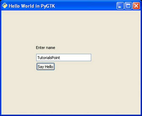
When the button is pressed, the following output is displayed on the console −
Hello TutorialsPoint
PyGTK - Event Handling
In addition to the signal mechanism, window system events can also be connected to callback functions. Window resizing, key press, scroll event etc. are some of common window system events. These events are reported to application's main loop. From there, they are passed along via signals to the callback functions.
Some of the system events are listed below −
- button_press_event
- button_release_event
- scroll_event
- motion_notify_event
- delete_event
- destroy_event
- expose_event
- key_press_event
- key_release_event
The connect() method is used to associate the event with callback function following the syntax −
Object.connect(name, function, data)
Here, name stands for the string corresponding to the name of event which is to be captured. And, function is name of the callback function that is to be called when an event occurs. Data is the argument to be passed on to the callback function.
Hence, the following code connects a Button widget and captures the button_press event −
self.btn.connect("button_press_event", self.hello)
The following will be the Prototype of hello() function −
def hello(self,widget,event):
Example
The following is the code for button event handler −
import gtk
class PyApp(gtk.Window):
   def __init__(self):
      super(PyApp, self).__init__()
      self.set_title("Hello World in PyGTK")
      self.set_default_size(400,300)
      self.set_position(gtk.WIN_POS_CENTER)

      self.label = gtk.Label("Enter name")
      self.entry = gtk.Entry()
      self.btn = gtk.Button("Say Hello")
      self.btn.connect("button_press_event", self.hello)

      fixed = gtk.Fixed()
      fixed.put(self.label, 100,100)
      fixed.put(self.entry, 100,125)
      fixed.put(self.btn,100,150)

      self.add(fixed)
      self.show_all()

   def hello(self,widget,event):
      print "hello",self.entry.get_text()

PyApp()
gtk.main()
When you run the above code, it displays the following output on the console −
Hello TutorialsPoint
PyGTK - Containers
PyGTK library provides different container classes to control the placement of widgets inside a window. The easiest way is to use a fixed container class and place a widget inside it by specifying its absolute coordinates measured in pixels.
Let us now follow these steps −
Step 1 − Declare an object of the fixed class
fixed = gtk.Fixed()
Step 2 − Create a button widget and add it to the fixed container by using put() method which needs x and y coordinates. Here, the button will be placed at (100,100) position.
btn = gtk.Button("Hello")
fixed.put(btn, 100,100)
Step 3 − You can place multiple controls in the fixed container. And, add it to the top-level window and invoke the show_all() method
self.add(fixed)
self.show_all()
This Absolute Layout, however, is not suitable because of the following reasons −
- The position of the widget does not change even if the window is resized.
- The appearance may not be uniform on different display devices with different resolutions.
- Modification in the layout is difficult as it may need redesigning of the entire form.
The following is the original window −
The following is the resized window −
The position of the button is unchanged here.
PyGTK API provides container classes for enhanced management of positioning of widgets inside the container. The advantages of Layout managers over absolute positioning are −
- Widgets inside the window are automatically resized.
- Ensures uniform appearance on display devices with different resolutions.
- Adding or removing widget dynamically is possible without having to redesign.
gtk.Container acts as the base class for the following classes −
- gtk.ButtonBox
- gtk.Box
- gtk.Alignment
- gtk.EventBox
- gtk.Table
PyGTK - Box Class
The gtk.Box class is an abstract class defining the functionality of a container in which widgets are placed in a rectangular area. gtk.HBox and gtk.VBox widgets are derived from it.
Child widgets in gtk.Hbox are arranged horizontally in the same row. On the other hand, child widgets of gtk.VBox are arranged vertically in the same column.
gtk.Box class uses the following constructor −
gtk.Box(homogenous = True, spacing = 0)
The homogenous property is set to True by default. As a result, all child widgets are given equal allocation.
gtk.Box uses the packing mechanism to place child widgets in it with reference to a particular position, either with reference to start or end. pack_start() method places widgets from start to end. On the contrary, the pack_end() method puts widgets from end to start. Alternatively, you can use the add() method which is similar to pack_start().
The following methods are available for gtk.HBox as well as gtk.VBox −
gtk_box_pack_start ()
gtk_box_pack_end ()
gtk_box_pack_start ()
This method adds child to the box, packed with reference to the start of box −
pack_start(child, expand = True, fill = True, padding = 0)
The following are the parameters −
child − This is the widget object to be added to box
expand − This is set to True if child is to be given extra space in the box. Extra space is divided between all child widgets.
fill − If True, extra space will be allocated to child. Otherwise, this parameter is used as padding.
padding − This is the space in pixels between widgets in the box.
gtk_box_pack_end ()
This adds child to the box, packed with reference to the end of the box.
pack_end (child, expand = True, fill = True, padding = 0)
The following are the parameters −
child − This is the widget object to be added
expand − This is set to True if child is to be given extra space in the box. This extra space is divided between all child widgets.
fill − If True, extra space will be allocated to child otherwise used as padding.
padding − This is the space in pixels between the widgets in the box.
set_spacing (spacing) is the function that sets the number of pixels to place between the children of the box.
The method add (widget) is inherited from the gtk.Container class. It adds widget to the container. This method can be used instead of the pack_start() method.
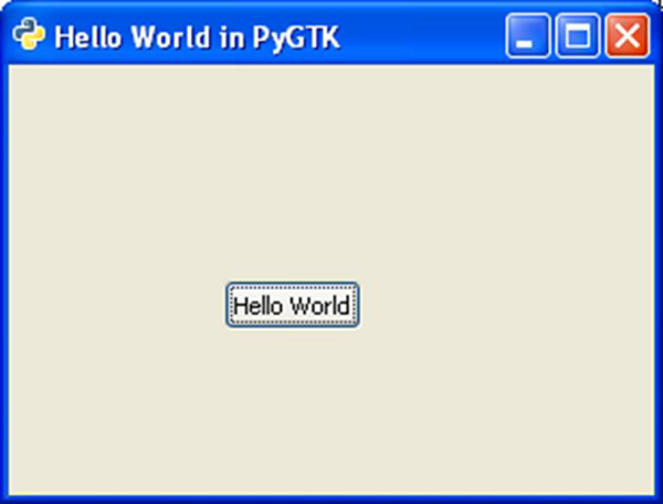
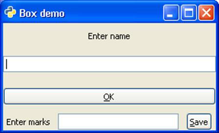
Example
In the example given below, the toplevel window contains a vertical box (gtk.VBox object box). It in turn has a VBox object vb and HBox object hb. In the upper box, a label, an entry widget and a button are placed vertically. In the lower box, another set of label, entry and button are placed vertically.
Observe the following code −
import gtk
class PyApp(gtk.Window):
   def __init__(self):
      super(PyApp, self).__init__()
         self.set_title("Box demo")

      box = gtk.VBox()
      vb = gtk.VBox()
      lbl = gtk.Label("Enter name")

      vb.pack_start(lbl, expand = True, fill = True, padding = 10)
      text = gtk.Entry()

      vb.pack_start(text, expand = True, fill = True, padding = 10)
      btn = gtk.Button(stock = gtk.STOCK_OK)

      vb.pack_start(btn, expand = True, fill = True, padding = 10)
      hb = gtk.HBox()

      lbl1 = gtk.Label("Enter marks")
      hb.pack_start(lbl1, expand = True, fill = True, padding = 5)
      text1 = gtk.Entry()

      hb.pack_start(text1, expand = True, fill = True, padding = 5)
      btn1 = gtk.Button(stock = gtk.STOCK_SAVE)

      hb.pack_start(btn1, expand = True, fill = True, padding = 5)
      box.add(vb)
      box.add(hb)
      self.add(box)
      self.show_all()
PyApp()
gtk.main()
The above code will produce the following output −
PyGTK - ButtonBox Class
The ButtonBox class in gtk API serves as a base class for containers to hold multiple buttons either horizontally or vertically. Two subclasses HButtonBox and VButtonBox are derived from the ButtonBox class, which itself is a subclass of gtk.Box class.
A button box is used to provide a consistent layout of buttons throughout an application. It provides one default layout and a default spacing value that are persistent across all widgets.
The set_spacing() method of the gtk.Box class can be used to change the default spacing between buttons in the button box.
The default layout of buttons can be changed by the set_default() method. The possible values of the button layout are −
gtk.BUTTONBOX_SPREAD
gtk.BUTTONBOX_EDGE
gtk.BUTTONBOX_START
gtk.BUTTONBOX_END.
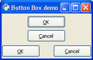
Example
In the following example, a VBox object inside the toplevel window internally contains one VButtonBox object and one HButtonBox object, each containing two buttons, arranged vertically and horizontally respectively.
Observe the code −
import gtk

class PyApp(gtk.Window):
   def __init__(self):
      super(PyApp, self).__init__()

	  self.set_title("Button Box demo")
      self.set_size_request(200,100)
      self.set_position(gtk.WIN_POS_CENTER)
	  vb = gtk.VBox()
      box1 = gtk.VButtonBox()
      btn1 = gtk.Button(stock = gtk.STOCK_OK)
      btn2 = gtk.Button(stock = gtk.STOCK_CANCEL)

      box1.pack_start(btn1, True, True, 0)
      box1.pack_start(btn2, True, True, 0)
      box1.set_border_width(5)

      vb.add(box1)
      box2 = gtk.HButtonBox()
      btn3 = gtk.Button(stock = gtk.STOCK_OK)
      btn4 = gtk.Button(stock = gtk.STOCK_CANCEL)

      ent = gtk.Entry()
      box2.pack_start(btn3, True, True, 0)
      box2.pack_start(btn4, True, True, 0)
      box1.set_border_width(5)

      vb.add(box2)
      self.add(vb)
      self.show_all()

PyApp()
gtk.main()
The above code generates the following output −
PyGTK - Alignment Class
This widget proves useful in controlling alignment and size of its child widgets. It has four properties called xalign, yalign, xscale and yscale. The scale properties specify how much of free space will be used by the child widgets. The align properties areused to place the child widget within available area.
All four properties take up a float value between 0 and 1.0. If xscale and yscale property is set to 0, it means that widget absorbs none of free space and if set to 1, widget absorbs maximum free space horizontally or vertically respectively.
The xalign and yalign property if set to 0, means that there will be no free space to the left or above widget. If set to 1, there will be maximum free space to left or above the widget.
The gtk.alignment class has the following constructor −
gtk.alignment(xalign = 0.0, yalign = 0.0, xscale = 0.0, yscale = 0.0)
Where,
xalign − Is the fraction of the horizontal free space to the left of the child widget.
yalign − Is the fraction of vertical free space above the child widget.
xscale − Is is the fraction of horizontal free space that the child widget absorbs.
yscale − Is is the fraction of vertical free space that the child widget absorbs.
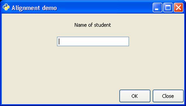
Example
The following code demonstrates the use of gtk.alignment widget. A Vbox in the toplevel window has an upper Vbox and lower Hbox placed in it. In the upper vertical box, a label and an Entry widget are placed such that towards the left, 50% of space is kept free and more than 25% of this is occupied by assigning 0.5 xalign and 0.25 to yalign properties.
In the lower HBox, all the available free space is on the left side. This is achieved by assigning 1 to xalign property. Hence, two buttons in the horizontal box appear right aligned.
import gtk

class PyApp(gtk.Window):

   def __init__(self):
      super(PyApp, self).__init__()
      self.set_title("Alignment demo")
      self.set_size_request(400,200)
      self.set_position(gtk.WIN_POS_CENTER)

      vbox = gtk.VBox(False, 5)
      vb = gtk.VBox()
      hbox = gtk.HBox(True, 3)
      valign = gtk.Alignment(0.5,0.25, 0, 0)

      lbl = gtk.Label("Name of student")
      vb.pack_start(lbl, True, True, 10)
      text = gtk.Entry()

      vb.pack_start(text, True, True, 10)
      valign.add(vb)
      vbox.pack_start(valign)

      ok = gtk.Button("OK")
      ok.set_size_request(70, 30)

      close = gtk.Button("Close")
      hbox.add(ok)
      hbox.add(close)

      halign = gtk.Alignment(1, 0, 0, 0)
      halign.add(hbox)

      vbox.pack_start(halign, False, False, 3)

      self.add(vbox)
      self.connect("destroy", gtk.main_quit)
      self.show_all()
PyApp()
gtk.main()
The above code produces the following output −
PyGTK - EventBox Class
Some widgets in PyGTK tool kit do not have their own window. Such windowless widgets cannot receive event signals. Such widgets, for example a label, if put inside an eventbox can receive signals.
EventBox is an invisible container that provides window to windowless widgets. It has a simple constructor without any argument −
gtk.EventBox()
Example
In the following example, two widgets of the gtk.EventBox are placed in the toplevel window. Inside each eventbox, a label is added. The eventbox is now connected to a callback function to process the button_press_event on it. As the eventbox itself is invisible, effectively the event occurs on the embedded label. Hence, as and when we click on any label, the corresponding callback function is invoked.
Observe the code −
import gtk

class PyApp(gtk.Window):

   def __init__(self):
      super(PyApp, self).__init__()
      self.set_title("EventBox demo")
      self.set_size_request(200,100)
      self.set_position(gtk.WIN_POS_CENTER)
      fixed = gtk.Fixed()

      event1 = gtk.EventBox()
      label1 = gtk.Label("Label 1")
      event1.add(label1)
      fixed.put(event1, 80,20)

      event1.connect("button_press_event",self.hello1)
      event2 = gtk.EventBox()
      label2 = gtk.Label("Label 2")
      event2.add(label2)
      event2.connect("button_press_event",self.hello2)
      fixed.put(event2, 80,70)

      self.add(fixed)
      self.connect("destroy", gtk.main_quit)
      self.show_all()

   def hello1(self, widget, event):
      print "clicked label 1"

   def hello2(self, widget, event):
      print "clicked label 2"

PyApp()
gtk.main()
The above code generates the following output −
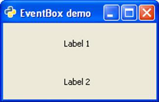
When Label 1 is clicked on the console, the message "clicked label 1" gets printed. Similarly, when Label 2 is clicked on, "clicked label 2" message is printed.
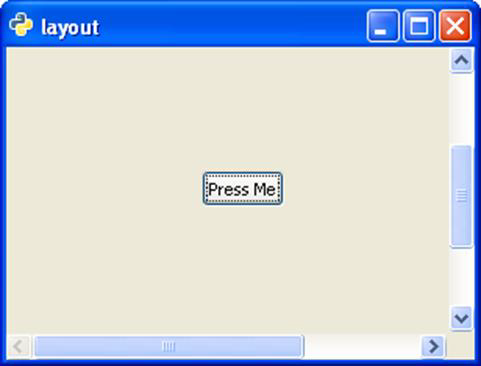
PyGTK - Layout Class
The gtk.Layout is a container widget similar to gtk.Fixed. Widgets are placed in Layout widget by specifying absolute coordinates. However, the Layout differs from fixed widget in the following ways −
The layout widget can have infinite width and height. The maximum value of width and height is limited by the size of unsigned integer.
A gtk.DrawingArea widget can be enclosed in a layout container. The DrawingArea is a canvas on which 2D elements like line, rectangle etc. can be drawn.
In order to put the Layout container in the toplevel window of lesser dimensions, it can be associated with the scrollbars or can be placed in a ScrolledWindow.
The gtk.Layout class has the following constructor −
gtk.Layout(hadjustment = None, vadjustment = None)
The hadjustment and vadjustment properties represent an object having an adjustable bounded value.
The following table lists out the frequently used methods of the layout −
| put(widget, x, y) | Places a child widget at the specified coordinates |
| set_size(w, h) | Sets the size of the Layout container to the specified width and height |
The Layout object emits the set_scroll_adjustment signal when the adjustments associated with it are changed.
Example
In the following example, a Label is paced at the centre of a Layout container, which in turn is to be placed in a toplevel window of smaller size. Hence, it is first added to a ScrolledWindow and the ScrolledWindow is then added to the main window.
Observe the code −
import gtk

class PyApp(gtk.Window):

   def __init__(self):
      super(PyApp, self).__init__()
      self.set_title("layout")
      self.set_size_request(300,200)
      self.set_position(gtk.WIN_POS_CENTER)
      sc = gtk.ScrolledWindow()
      lo = gtk.Layout()
      lo.set_size(400,400)
      button = gtk.Button("Press Me")
      lo.put(button, 125,200)
      sc.add(lo)
      self.add(sc)
      self.connect("destroy", gtk.main_quit)
      self.show_all()

PyApp()
gtk.main()
The above code will generate the following output −
PyGTK - ComboBox Class
ComboBox is a powerful and popular widget in any GUI toolkit. It provides a dropdown list of items from which a user can choose. The gtk.ComboBox widget implements the CellLayout interface and provides a number of methods to manage the display of items.
The object of gtk.ComboBox class is associated with a ListSore, which is a list model that can be used with widgets that display collection of items. Items are added to ListStore with the append() method. Further, a CellRendererText object is created and packed into the combobox.
Follow these steps to set up a combobox.
combobox = gtk.ComboBox()
store = gtk.ListStore(gobject.TYPE_STRING)
cell = gtk.CellRendererText()
combobox.pack_start(cell)
combobox.add_attribute(cell, 'text', 0)
PyGTK offers a convenience method gtk.combo_box_new_text() to create a combo box instead of using a list store. Associated convenience methods append_text(), prepend_text(), insert_text() and remove_text() are used to manage the combo boxcontents.
gtk.ComboBox class has the following methods −
| S.NO | Methods and Description |
|---|---|
| 1 | set_wrap_width() Sets the number of columns to be displayed in the popup table layout |
| 2 | get_active() Returns the value of the "active" property which is the index in the model of the currently active item |
| 3 | set_active() Sets the active item of the combo_box to the item with the model index specified |
| 4 | set_model() Sets the model used by the combo box |
| 5 | append_text() Appends the string specified by text to the list of strings stored in the combo box list store |
| 6 | Insert_text() Inserts the string specified by text in the combo box gtk.ListStore at the index specified by position |
| 7 | prepend_text() Prepends the string specified by text to the list of strings stored in the list store |
| 8 | remove_text() Removes the string at the index specified by position in the associated liststore |
| 9 | get_active_text() Returns the currently active string |
The ComboBox widget emits the following signals −
| changed | This is emitted when a new item in the combo box is selected |
| move_active | This is a keybinding signal which gets emitted to move the active selection. |
| Popdown | This is a keybinding signal which gets emitted to popdown the combo box list. The default bindings for this signal are Alt+Up and Escape |
| Popup | This is a keybinding signal which gets emitted to popup the combo box list. The default bindings for this signal are Alt+Down. |
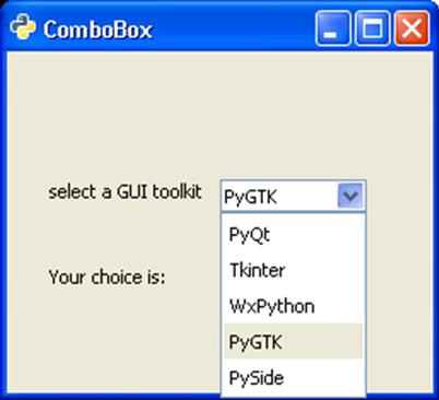
Two example codes for the demonstration of ComboBox are given below.
Example 1
In this example, a ListStore is populated with the names of popular Python GUI toolkits and it is associated with a ComboBox widget. As a user makes a choice, the changed signal is emitted. It is connected to a callback function to display the user's choice.
import pygtk
pygtk.require('2.0')
import gtk

class PyApp(gtk.Window):
   def __init__(self):
      super(PyApp, self).__init__()
      self.set_title("ComboBox with ListStore")
      self.set_default_size(250, 200)
      self.set_position(gtk.WIN_POS_CENTER)

      combobox = gtk.ComboBox()
      store = gtk.ListStore(str)
      cell = gtk.CellRendererText()
      combobox.pack_start(cell)
      combobox.add_attribute(cell, 'text', 0)
      fixed = gtk.Fixed()
      lbl = gtk.Label("select a GUI toolkit")
      fixed.put(lbl, 25,75)
      fixed.put(combobox, 125,75)
      lbl2 = gtk.Label("Your choice is:")
      fixed.put(lbl2, 25,125)
      self.label = gtk.Label("")
      fixed.put(self.label, 125,125)
      self.add(fixed)

      store.append (["PyQt"])
      store.append (["Tkinter"])
      store.append (["WxPython"])
      store.append (["PyGTK"])
      store.append (["PySide"])
      combobox.set_model(store)
      combobox.connect('changed', self.on_changed)
      combobox.set_active(0)
      self.connect("destroy", gtk.main_quit)
      self.show_all()
      return

   def on_changed(self, widget):
      self.label.set_label(widget.get_active_text())
      return

if __name__ == '__main__':
PyApp()
gtk.main()
Upon execution, the program displays the following output −
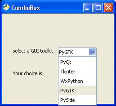
Example 2
The second version of the program uses the convenience method combo_box_new_text() to create a combo box and append_text() function to add strings in it. In both programs, the get_active_text() method is used to fetch user's selection and display on a label on the window.
import gtk

class PyApp(gtk.Window):
   def __init__(self):
      super(PyApp, self).__init__()
      self.set_title("Simple ComboBox")
      self.set_default_size(250, 200)
      self.set_position(gtk.WIN_POS_CENTER)

      cb = gtk.combo_box_new_text()
      cb.connect("changed", self.on_changed)
      cb.append_text('PyQt')
      cb.append_text('Tkinter')
      cb.append_text('WxPython')
      cb.append_text('PyGTK')
      cb.append_text('PySide')

      fixed = gtk.Fixed()
      lbl = gtk.Label("select a GUI toolkit")
      fixed.put(lbl, 25,75)

      fixed.put(cb, 125,75)
      lbl2 = gtk.Label("Your choice is:")
      fixed.put(lbl2, 25,125)

      self.label = gtk.Label("")
      fixed.put(self.label, 125,125)
      self.add(fixed)
      self.connect("destroy", gtk.main_quit)
      self.show_all()

   def on_changed(self, widget):
      self.label.set_label(widget.get_active_text())
if __name__ == '__main__':
   PyApp()
   gtk.main()
The output of this program is similar to that of the previous program.
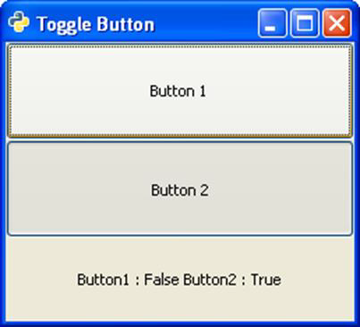
PyGTK - ToggleButton Class
ToggleButton widget is a gtk.Button with two states a pressed or active (or on) state and a normal or inactive (or off) state. Every time the button is pressed, the state alternates. The state of the ToggleButton can also be changed programmatically by set_active() method. To switch the state of the button, the toggled() method is also available.
The gtk.ToggleButton class has the following constructor −
gtk.ToggleButton(label = None, use_underline = True)
Here, label is the test to be displayed on button. The use_underline property , if True, an underscore in the text indicates the next character should be underlined and used for the mnemonic accelerator.
Some of the important methods of the gtk.ToggleButton class are given in the following table −
| set_active() | This sets the active property to the value to True (active or pressed or on) or False (inactive or normal or off) |
| get_active() | This retrieves the state of button |
| toggled() | This emits the "toggled" signal on the togglebutton. |
The ToggleButton widget emits the following signal −
| Toggled | This is emitted when the togglebutton state changes either programmatically or by the user action. |
The code given below demonstrates the use of ToggleButton widgets.
Two ToggleButtons and Label widgets are placed in a VBox container. The toggled signal emitted by Button1 is connected to a callback function on_toggled(). In this function, the state of Button2 is set to True if that of Button1 is False and vice versa.
if self.btn1.get_active() == True:
   self.btn2.set_active(False)
else:
   self.btn2.set_active(True)
It displays the instantaneous states of buttons on the Label.
Example
Observe the following code −
import gtk

 PyApp(gtk.Window):

   def __init__(self):
      super(PyApp, self).__init__()
      self.set_title("Toggle Button")
      self.set_default_size(250, 200)
      self.set_position(gtk.WIN_POS_CENTER)

      vbox = gtk.VBox()
      self.btn1 = gtk.ToggleButton("Button 1")
      self.btn1.connect("toggled", self.on_toggled)
      self.btn2 = gtk.ToggleButton("Button 2")
      self.lbl = gtk.Label()

      vbox.add(self.btn1)
      vbox.add(self.btn2)
      vbox.add(self.lbl)
      self.add(vbox)
      self.connect("destroy", gtk.main_quit)
      self.show_all()

   def on_toggled(self, widget, data = None):
      if self.btn1.get_active() == True:
         self.btn2.set_active(False)
      else:
         self.btn2.set_active(True)
         state = "Button1 : "+str(self.btn1.get_active())+"
         Button2 : "+str(self.btn2.get_active())
         self.lbl.set_text(state)
if __name__ == '__main__':
   PyApp()
   gtk.main()
The above code generates the following output −
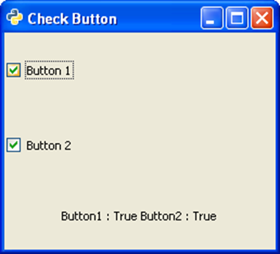
PyGTK - CheckButton Class
A CheckButton widget is nothing but a ToggleButton styled as a checkbox and a label. It inherits all properties and methods from the ToggleButton class. Unlike ToggleButton where the caption is on the button's face, a CheckButton displays a small square which is checkable and has a label to its right.
Constructor, methods, and signals associated with gtk.CheckButton are exactly the same as gtk.ToggleButton.
Example
The following example demonstrates the use of CheckButton widget. Two CheckButtons and a Label are placed in a VBox. The toggled signal of the first CheckButton is connected to the on_checked() method which sets the state of the second button to True if that of the first is false and vice versa.
Observe the code −
import gtk

class PyApp(gtk.Window):

   def __init__(self):
      super(PyApp, self).__init__()
      self.set_title("Check Button")
      self.set_default_size(250, 200)
      self.set_position(gtk.WIN_POS_CENTER)

      vbox = gtk.VBox()
      self.btn1 = gtk.CheckButton("Button 1")
      self.btn1.connect("toggled", self.on_checked)
      self.btn2 = gtk.CheckButton("Button 2")
      self.btn2.connect("toggled", self.on_checked)
      self.lbl = gtk.Label()

      vbox.add(self.btn1)
      vbox.add(self.btn2)
      vbox.add(self.lbl)

      self.add(vbox)
      self.connect("destroy", gtk.main_quit)
      self.show_all()

   def on_checked(self, widget, data = None):
      state = "Button1 : "+str(self.btn1.get_active())+"
         Button2 : "+str(self.btn2.get_active())
      self.lbl.set_text(state)
if __name__ == '__main__':
   PyApp()
   gtk.main()
The above code will generate the following output −
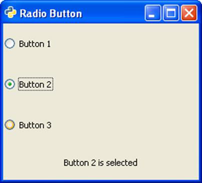
PyGTK - RadioButton Class
A single RadioButton widget offers functionality similar to CheckButton. However, when more than one radio button is present in the same container, then a mutually exclusive choice is available for the user to choose from one of the available options. If every radio button in the container belongs to the same group, then as one is selected, others are automatically deselected.
The following is a constructor of the gtk.RadioButton class −
gtk.RadioButton(group = None, Label = None, unerline = None)
In order to create a button group, provide group=None for the first Radio button, and for the subsequent options, provide the object of the first button as group.
As in case of ToggleButton and CheckButton, the RadioButton also emits the toggled signal. In the example given below, three objects of the gtk.RadioButton widget are placed in a VBox. All of them are connected to a callback function on_selected(), to process the toggled signal.
The callback function identifies the label of source RadioButton widget and displays it on the label put in the VBox.
Example
Observe the following code −
import gtk

class PyApp(gtk.Window):

   def __init__(self):
      super(PyApp, self).__init__()
      self.set_title("Radio Button")
      self.set_default_size(250, 200)
      self.set_position(gtk.WIN_POS_CENTER)
      vbox = gtk.VBox()

      btn1 = gtk.RadioButton(None, "Button 1")
      btn1.connect("toggled", self.on_selected)
      btn2 = gtk.RadioButton(btn1,"Button 2")
      btn2.connect("toggled", self.on_selected)
      btn3 = gtk.RadioButton(btn1,"Button 3")
      btn3.connect("toggled", self.on_selected)

      self.lbl = gtk.Label()
      vbox.add(btn1)
      vbox.add(btn2)
      vbox.add(btn3)
      vbox.add(self.lbl)
      self.add(vbox)
      self.connect("destroy", gtk.main_quit)
      self.show_all()

   def on_selected(self, widget, data=None):
      self.lbl.set_text(widget.get_label()+" is selected")
if __name__ == '__main__':
   PyApp()
   gtk.main()
The above code will generate the following output −
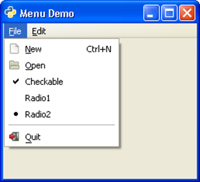
PyGTK - MenuBar,Menu and MenuItem
A horizontal bar just below the title bar of a toplevel gtk.Window is reserved to display series of menus. It is an object of gtk.MenuBar class in PyGTK API.
An object of the gtk.Menu class is added to the menu bar. It is also used to create context menu and popup menu. Each menu may contain one or more gtk.MenuItem widgets. Some of them can be a submenu.and have cascaded MenuItem buttons.
The gtk.MenuBar is subclassed from the gtk.MenuShell class. It has a simple default constructor −
gtk.MenuBar()
To add a menu to MenuBar, the append() method of the MenuBar class is used.
In order to construct a menu, create a MenuItem widget with a label which is desired to appear in menu bar and set it as submenu.
For example, the following code is used to set up a File menu −
menu1 = gtk.Menu()
file = gtk.MenuItem("_File")
file.set_submenu(menu1)
Now, one or more widgets of the MenuItem class can be added in the menu.
item1 = gtk.MenuItem("New")
item2 = gtk.MenuItem("Open")
These MenuItems are added to the Menu widget and the menu object in turn is added to the menu bar.
menu1.append(item1)
menu1.append(item2)
mb.append(menu1)
The PyGTK toolkit offers many types of MenuItem widgets. An ImageMenuItem is a menu item with an image associated with it. You can use any of the stock images by using Stock ID parameter or assign any other image by set_image() method.
For example, 'New' menu item having image is created in the following way −
new = gtk.ImageMenuItem(gtk.STOCK_NEW)
menu1.append(new)
Similarly, it is also possible to add CheckMenuItem using the following code −
chk = gtk.CheckMenuItem("Checkable")
menu1.append(chk)
A group of radio items can also be added using this code −
radio1 = gtk.RadioMenuItem(None,"Radio1")
radio2 = gtk.RadioMenuItem(radio1, "Radio2")
menu1.append(radio1)
menu1.append(radio2)
Sometimes, you may want to add a seperator line between menu items. For that purpose, the SeparatorMenuItem is also available.
sep = gtk.SeparatorMenuItem()
menu1.append(sep)
You can also assign keyboard shortcuts to menu items. PyGTK has accelerators. Start by creating an accelerator group and attach it to the toplevel window.
acgroup = gtk.AccelGroup()
self.add_accel_group(acgroup)
To assign shortcut, use add_accelerator() function with the following prototype −
Item1.add_accelerator(signal, group, key, modifier, flags)
The following are some of the predefined modifiers −
- SHIFT_MASK
- LOCK_MASK
- CONTROL_MASK
- BUTTON1_MASK
- BUTTON1_MASK
In order to assign Ctrl+N shortcut to New Menu item, use the following syntax −
new = gtk.ImageMenuItem(gtk.STOCK_NEW,acgroup)
new.add_accelerator("activate", acgroup, ord('N'),
   gtk.gdk.CONTROL_MASK, gtk.ACCEL_VISIBLE)
Example
The following example demonstrates the features discussed above −
import gtk

class PyApp(gtk.Window):
   def __init__(self):

      super(PyApp, self).__init__()
      self.set_title("Menu Demo")
      self.set_default_size(250, 200)
      self.set_position(gtk.WIN_POS_CENTER)

      mb = gtk.MenuBar()

	  menu1 = gtk.Menu()
      file = gtk.MenuItem("_File")
      file.set_submenu(menu1)
      acgroup = gtk.AccelGroup()
      self.add_accel_group(acgroup)
      new = gtk.ImageMenuItem(gtk.STOCK_NEW,acgroup)
      new.add_accelerator("activate", acgroup, ord('N'),
         gtk.gdk.CONTROL_MASK, gtk.ACCEL_VISIBLE)

      menu1.append(new)
      open = gtk.ImageMenuItem(gtk.STOCK_OPEN)

      menu1.append(open)
      chk = gtk.CheckMenuItem("Checkable")

      menu1.append(chk)
      radio1 = gtk.RadioMenuItem(None,"Radio1")
      radio2 = gtk.RadioMenuItem(radio1, "Radio2")

      menu1.append(radio1)
      menu1.append(radio2)
      sep = gtk.SeparatorMenuItem()

      menu1.append(sep)
      exit = gtk.ImageMenuItem(gtk.STOCK_QUIT)

      menu1.append(exit)
      menu2 = gtk.Menu()
      edit = gtk.MenuItem("_Edit")
      edit.set_submenu(menu2)
      copy = gtk.ImageMenuItem(gtk.STOCK_COPY)

      menu2.append(copy)
      cut = gtk.ImageMenuItem(gtk.STOCK_CUT)

      menu2.append(cut)
      paste = gtk.ImageMenuItem(gtk.STOCK_PASTE)

      menu2.append(paste)
      mb.append(file)
      mb.append(edit)
      vbox = gtk.VBox(False, 2)
      vbox.pack_start(mb, False, False, 0)

      self.add(vbox)
      self.connect("destroy", gtk.main_quit)
      self.show_all()
if __name__ == '__main__':
   PyApp()
   gtk.main()
The above code will produce the following output −
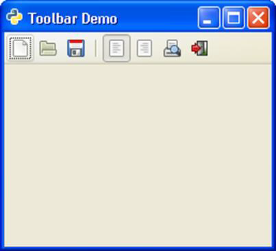
PyGTK - Toolbar Class
Toolbar class is inherited from the gtk.Container class. It holds and manages a set of buttons and other widgets. One or more horizontal strips of buttons are normally seen just below the menu bar in a top level window. The Toolbar can also be put in a detachable window called HandleBox. By default, the buttons in the gtk.Toolbar widget are laid horizontally. Vertical toolbar can be set up by setting the orientation property to gtk.ORIENTATION_VERTICAL.
The toolbar can be configured to show buttons with icons, text, or both. The style enumerators are −
| gtk.TOOLBAR_ICONS | These buttons display only icons in the toolbar. |
| gtk.TOOLBAR_TEXT | These buttons display only text labels in the toolbar. |
| gtk.TOOLBAR_BOTH | These buttons display text and icons in the toolbar. |
| gtk.TOOLBAR_BOTH_HORIZ | These buttons display icons and text alongside each other, rather than vertically stacked. |
A Toolbar widget is set up using the following constructor −
bar = gtk.Toolbar()
The constituents of Toolbar are instances of the gtk.ToolItem. The items can be ToolButton, RadioToolButton, ToggleToolButton, or SeparatorToolItem. In order to assign icon to the ToolItem object, images with predefined stock_ID can be used or a custom image can be assigned by the set_image() method.
The following examples show how to construct different ToolItems −
ToolButton
newbtn = gtk.ToolButton(gtk.STOCK_NEW)
RadioToolButton
rb1 = gtk.RadioToolButton(None,gtk.STOCK_JUSTIFY_LEFT)
rb2 = gtk.RadioToolButton(rb1,gtk.STOCK_JUSTIFY_RIGHT)
Note that multiple radio buttons are put in the same group.
SeparatorToolItem
sep = gtk.SeparatorToolItem()
These items are put in the toolbar by calling its insert method.
gtk.Toolbar.insert(item, index)
For example,
bar.insert(new,0)
You can also assign a tooltip to the ToolButton using the set_tooltip_text() nethod. For example, New tooltip is assigned to the new ToolButton.
newbtn.set_tooltip_text("New")
Example
The following code shows a toplevel window with a tool bar set up to contain normal tool item, radio items and a separator item.
import gtk

class PyApp(gtk.Window):

   def __init__(self):
      super(PyApp, self).__init__()
      self.set_title("Toolbar Demo")
      self.set_default_size(250, 200)
      self.set_position(gtk.WIN_POS_CENTER)

      toolbar = gtk.Toolbar()
      toolbar.set_style(gtk.TOOLBAR_ICONS)
      toolbar.set_orientation(gtk.ORIENTATION_HORIZONTAL)

      newbtn = gtk.ToolButton(gtk.STOCK_NEW)
      newbtn.set_tooltip_text("New")
      openbtn = gtk.ToolButton(gtk.STOCK_OPEN)
      savebtn = gtk.ToolButton(gtk.STOCK_SAVE)
      sep = gtk.SeparatorToolItem()

      rb1 = gtk.RadioToolButton(None,gtk.STOCK_JUSTIFY_LEFT)
      53
      rb2 = gtk.RadioToolButton(rb1,gtk.STOCK_JUSTIFY_RIGHT)

      prv = gtk.ToggleToolButton(gtk.STOCK_PRINT_PREVIEW)
      quitbtn = gtk.ToolButton(gtk.STOCK_QUIT)

      toolbar.insert(newbtn, 0)
      toolbar.insert(openbtn, 1)
      toolbar.insert(savebtn, 2)
      toolbar.insert(sep, 3)
      toolbar.insert(rb1,4)
      toolbar.insert(rb2,5)
      toolbar.insert(prv,6)
      toolbar.insert(quitbtn, 7)

      quitbtn.connect("clicked", gtk.main_quit)
      vbox = gtk.VBox(False, 2)
      vbox.pack_start(toolbar, False, False, 0)

      self.add(vbox)
      self.connect("destroy", gtk.main_quit)
      self.show_all()

   def on_checked(self, widget, data = None):
      state = "Button1 : "+str(self.btn1.get_active())+"
         Button2 : "+str(self.btn2.get_active())
      self.lbl.set_text(state)
if __name__ == '__main__':
   PyApp()
   gtk.main()
The above code will generate the following output −
PyGTK - Adjustment Class
Some widgets in PyGTK toolkit are such that their properties can be adjusted over a specified range by the user by using a mouse or a keyboard. A widget like Viewport is used to display some adjustable portion of a large data, for example, a multiline text in TextView control.
PyGTK uses gtk.Adjustment object to be used in association with such widgets so that user adjustments are passed to some callback function for processing. An Adjustment object contains lower and upper bounds of an adjustable value and its increment step paramaters. When parameters of adjustment object changes, it emits changed or value_changed signals.
The following is the constructor of the gtk.Adjustment class −
gtk.Adjustment(value = 0, lower = 0, upper = 0, step_incr = 0,
   page_incr = 0, page_size = 0)
The meaning of each of the attributes in the constructor is as follows −
| value | The initial value |
| lower | The minimum value |
| upper | The maximum value |
| step_incr | The step increment |
| page_incr | The page increment |
| page_size | The page sizes |
The following signals are emitted by the Adjustment object −
| Changed | This is emitted when one (or more) of the adjustment attributes (except the value attribute) has changed. |
| Value-changed | This is emitted when the adjustment value attribute has changed. |
As mentioned above, the Adjustment object is not a physical widget. Rather, it is used in association with the other widgets using which its attributes get changed. Range widgets are used along with the Adjustment object.
PyGTK - Range Class
This class acts as a base class for widgets which let the user to adjust the value of a numeric parameter between the lower and upper bounds. Scale widgets (gtk.Hscale and gtk.Vscale) and scrollbar widgets (gtk.HScrollbar and gtk.VScrollbar) derive functionality from the Range class. These Range widgets work in conjunction with the Adjustment object.
The following important functions of the gtk.Range class are implemented by the Scale and Scrollbar widgets −
set_update_policy() − This sets the "update-policy" property to the value. The policy has the following values −
| gtk.UPDATE_CONTINUOUS | anytime the range slider is moved, the range value will change and the "value_changed" signal will be emitted. |
| gtk.UPDATE_DELAYED | the value will be updated after a brief timeout where no slider motion occurs, so value changes are delayed slightly rather than continuously updated. |
| gtk.UPDATE_DISCONTINUOUS | the value will only be updated when the user releases the button and ends the slider drag operation. |
set_adjustment() − This sets the "adjustment" property. The Adjustment object is used as model for the Range object.
set_increments() − This sets the step and page sizes for the range.
set_range() − This sets the minimum and maximum allowable values for the Range widget
set_value() − This sets the current value of the range to the value specified.
The scale widget classes − (HScale and VScale) are derived from the gtk.Range class.
PyGTK - Scale Class
This class acts as an abstract base class for HScale and VScale widgets. These widgets work as a slider control and select a numeric value.
The following methods of this abstract class are implemented by the HScale class and the VScale class −
set_digits() − This sets number of decimal places to be used to display instantaneous value of widget.
set_draw_value() − set to True, current value will be displayed next to the slider.
set_value_pos() − This is the position at which the values are drawn. This can be either gtk.POS_LEFT, gtk.POS_RIGHT, gtk.POS_TOP or gtk.POS_BOTTOM.
An object of gtk.HScale class provides a horizontal slider, whereas an object of gtk.VScale class provides vertical slider. Both classes have identical constructors −
gtk.HScale(Adjustment = None)
gtk.VScale(Adjustment = None)
The adjustment object contains many attributes that provide access to value and bounds.
PyGTK - Scrollbar Class
This class is an abstract base class for gtk.Hscrollbar and gtk.Vscrollbar widgets. Both are associated with an Adjustment object. The position of the thumb of the scrollbar is controlled by scroll adjustments. The attributes of adjustment object are used as follows −
| lower | The minimum value of the scroll region |
| upper | The maximum value of the scroll region |
| value | Represents the position of the scrollbar, which must be between lower and upper |
| page_size | Represents the size of the visible scrollable area |
| step_increment | Distance to scroll when the small stepper arrows are clicked |
| page_increment | Distance to scroll when the Page Up or Page Down keys pressed |
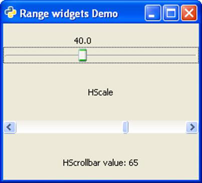
The following program shows an HScale and an HScrollbar widget placed in a VBox added to the toplevel window. Each of them is associated with an adjustment object.
adj1 = gtk.Adjustment(0, 0, 101, 0.1, 1, 1)
self.adj2 = gtk.Adjustment(10,0,101,5,1,1)
An gtk.HScale widget is a slider control attached with adj1. Its update policy, number and position of drawing value are set up as follows −
scale1 = gtk.HScale(adj1)
scale1.set_update_policy(gtk.UPDATE_CONTINUOUS)
scale1.set_digits(1)
scale1.set_value_pos(gtk.POS_TOP)
scale1.set_draw_value(True)
gtk.HScrollbar provides a horizontal scrollbar. It is associated with adj2 object. Its update policy too is set to CONTINUOUS.
self.bar1 = gtk.HScrollbar(self.adj2)
self.bar1.set_update_policy(gtk.UPDATE_CONTINUOUS)
In order to display instantaneous value of the scrollbar, 'value-changed' signal of the adjustment object adj2 is connected to callback function on_scrolled(). The function retrieves the value property of adjustment object and displays it on a label below the scrollbar.
self.adj2.connect("value_changed", self.on_scrolled)
   def on_scrolled(self, widget, data = None):
   self.lbl2.set_text("HScrollbar value: "+str(int(self.adj2.value)))
Example
Observe the following code −
import gtk

class PyApp(gtk.Window):

   def __init__(self):
      super(PyApp, self).__init__()
      self.set_title("Range widgets Demo")
      self.set_default_size(250, 200)
      self.set_position(gtk.WIN_POS_CENTER)

      adj1 = gtk.Adjustment(0.0, 0.0, 101.0, 0.1, 1.0, 1.0)
      self.adj2 = gtk.Adjustment(10,0,101,5,1,1)

      scale1 = gtk.HScale(adj1)
      scale1.set_update_policy(gtk.UPDATE_CONTINUOUS)
      scale1.set_digits(1)
      scale1.set_value_pos(gtk.POS_TOP)
      scale1.set_draw_value(True)

      vb = gtk.VBox()
      vb.add(scale1)
      lbl1 = gtk.Label("HScale")

      vb.add(lbl1)
      self.bar1 = gtk.HScrollbar(self.adj2)
      self.bar1.set_update_policy(gtk.UPDATE_CONTINUOUS)
      vb.add(self.bar1)
      self.lbl2 = gtk.Label("HScrollbar value: ")

      vb.add(self.lbl2)
      self.adj2.connect("value_changed", self.on_scrolled)
      self.add(vb)
      self.connect("destroy", gtk.main_quit)
      self.show_all()

   def on_scrolled(self, widget, data=None):
      self.lbl2.set_text("HScrollbar value: "+str(int(self.adj2.value)))
if __name__ == '__main__':
   PyApp()
   gtk.main()
The above code will generate the following output −
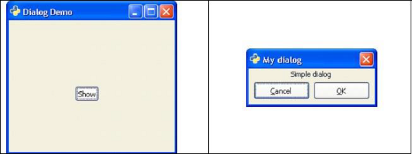
PyGTK - Dialog Class
A Dialog widget is normally used as a pop-up window on top of a parent window. The objective of a Dialog is to collect some data from the user and send it to the parent window. Dialog can be modal (where it blocks the parent frame) or modeless (dialog frame can be bypassed).
The Dialog widget of PyGTK library is a window split vertically. In its top section, there is a gtk.VBox in which Label or Entry Widgets are packed. The bottom section is called action_area in which one or more buttons are placed. Two areas are separated by gtk.HSeparator.
gtk.Dialog class has the following constructor −
dlg = gtk.Dialog (Title = None, parent = None, flags = 0, buttons = None)
Where,
Title − Is the text appearing in the Title bar of the Dialog widget.
Parent − Is the reference to the toplevel window from which the dialog pops up.
Flag − Defines constants controlling operation of Dialog. The defined constants are −
| gtk.DIALOG_MODAL | If set, the dialog grabs all the keyboard events |
| gtk.DIALOG_DESTROY_WITH_PARENT | If set, the dialog is destroyed when its parent is. |
| gtk.DIALOG_NO_SEPARATOR | If set, there is no separator bar above the buttons. |
What is a Button?
A Button is a tuple object containing pairs of gtk.Button with a stock ID (or text) and its response IDs.
The response ID can be any number or one of the predefined Response ID constants −
- gtk.RESPONSE_NONE
- gtk.RESPONSE_REJECT
- gtk.RESPONSE_ACCEPT
- gtk.RESPONSE_DELETE_EVENT
- gtk.RESPONSE_OK
- gtk.RESPONSE_CANCEL
- gtk.RESPONSE_CLOSE
- gtk.RESPONSE_YES
- gtk.RESPONSE_NO
- gtk.RESPONSE_APPLY
- gtk.RESPONSE_HELP
The important methods of the gtk.Dialog class are given below −
add_button() − Adds a button with the text specified by button_text (or a stock button, if button_text is a stock ID) in action_area.
response() − Emits the "response" signal with the value specified in response_id
run() − Displays the dialog and returns the response_id when delete_event gets emitted.
set_default_response() − Sets the last widget in the dialog's action area with the specified response_id as the default widget for the dialog.
gtk.Dialog widget emits the following signals −
| Close | This is emitted when the dialog is closed. |
| Response | This is emitted when an action_area widget is activated (button "clicked"), the dialog receives a delete_event or the application calls the response() method. |
Two buttons in action_area of Dialog widget use Stock IDs gtk.STOCK.CANCEL and gtk.STOCK_OK. They are associated with response IDs gtk. RESPONSE_REJECT and gtk. RESPONSE_ACCEPT respectively. The Dialog is closed when any button is pressed. The run() methods returns corresponding response ID which may be utilized for further processing.
Following code displays a top level gtk.Window with a Button in it. When button is clicked, a Dialog appears with a label and two buttons.
Example
Observe the following code −
import gtk

class PyApp(gtk.Window):
   def __init__(self):
      super(PyApp, self).__init__()
      self.set_title("Dialog Demo")
      self.set_default_size(250, 200)
      fixed = gtk.Fixed()
      btn = gtk.Button("Show")
      btn.connect("clicked",self.show_sialog)
      fixed.put(btn,100,100)
      self.add(fixed)
      self.connect("destroy", gtk.main_quit)
      self.show_all()

   def show_sialog(self, widget, data=None):
      dialog = gtk.Dialog("My dialog",
         self,
         gtk.DIALOG_MODAL | gtk.DIALOG_DESTROY_WITH_PARENT,
         (gtk.STOCK_CANCEL, gtk.RESPONSE_REJECT,
         gtk.STOCK_OK, gtk.RESPONSE_ACCEPT))
      label = gtk.Label("Simple dialog")
      dialog.vbox.add(label)
      label.show()
      res = dialog.run()
      print res
      dialog.destroy()
if __name__ == '__main__':
   PyApp()
   gtk.main()
The above code produces the following output −
Preconfigured Dialog Widgets
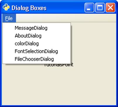
PyGTK API has a number of preconfigured Dialog widgets −
- MessageDialog
- AboutDialog
- ColorSelectionDialog
- FontSelectionDialog
- FileChooserDialog
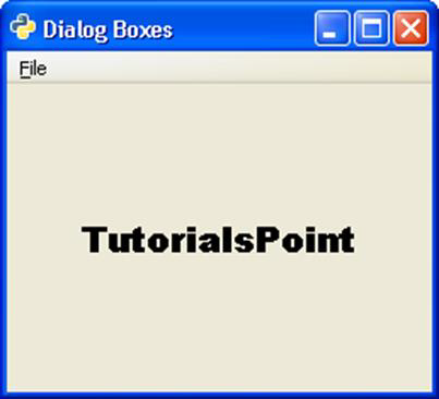
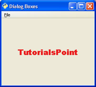
In order to demonstrate the functioning of the above standard dialog in PyGTK, a menu with a menu item each invoking a dialog when clicked, is put in a gtk.Window in the following program. The Callback functions responding to activate the signal of each menu item is listed. You can also understand the explanation provided for each type of dialog widget.
Example
Observe the following code −
import gtk, pango

class PyApp(gtk.Window):
   def __init__(self):
      super(PyApp, self).__init__()
      self.set_title("Dialog Boxes")
      self.set_default_size(250, 200)
      self.set_position(gtk.WIN_POS_CENTER)

      mb = gtk.MenuBar()
      menu1 = gtk.Menu()
      file = gtk.MenuItem("_File")
      file.set_submenu(menu1)
      msg = gtk.MenuItem("MessageDialog")

      menu1.append(msg)
      abt = gtk.MenuItem("AboutDialog")
      menu1.append(abt)
      colo = gtk.MenuItem("colorDialog")
      menu1.append(colo)
      font = gtk.MenuItem("FontSelectionDialog")
      menu1.append(font)
      fl = gtk.MenuItem("FileChooserDialog")
      menu1.append(fl)
      mb.append(file)

      vbox = gtk.VBox(False, 2)
      vbox.pack_start(mb, False, False, 0)
      self.add(vbox)
      self.text = gtk.Label("TutorialsPoint")
      vbox.pack_start(self.text, True, True, 0)
      msg.connect("activate",self.on_msgdlg)
      abt.connect("activate",self.on_abtdlg)
      font.connect("activate",self.on_fntdlg)
      colo.connect("activate",self.on_color)

      fl.connect("activate", self.on_file)
      self.connect("destroy", gtk.main_quit)
      self.show_all()
   def on_msgdlg(self, widget):
      #MessageDialog usage code
   def on_abtdlg(self, widget):
      #AboutDialog usage code
   def on_fntdlg(self,widget):
      #FontSelectionDialog usage code
   def on_color(self, widget):
      #ColorChooserDialog usage cde
   Def on_file(self, widget):
      #FileChooserDialog usage code
if __name__ == '__main__':
   PyApp()
   gtk.main()
The above code will generate the following output −
PyGTK - MessageDialog Class
A Messagedialog widget is a Dialog window configured to display an image representing the type of message, i.e., error, question, or some informational text. A MessageDialog object is declared by using the following constructor −
gtk.MessageDialog(parent = None, flags = 0, type = gtk.MESSAGE_INFO,
   buttons = gtk.BUTTONS_NONE, message_format = None)
The following predefined message types are used to configure message dialog −
| gtk.MESSAGE_INFO | This is an informational message |
| gtk.MESSAGE_WARNING | This is a nonfatal warning message |
| gtk.MESSAGE_QUESTION | This question requires a choice |
| gtk.MESSAGE_ERROR | This is a fatal error message |
A set of predefined button sets are also available for use.
| gtk.BUTTONS_NONE | No buttons at all |
| gtk.BUTTONS_OK | This is an OK button |
| gtk.BUTTONS_CLOSE | This is a Close button |
| gtk.BUTTONS_CANCEL | This is a Cancel button |
| gtk.BUTTONS_YES_NO | These are the Yes and No buttons |
| gtk.BUTTONS_OK_CANCEL | These are OK and Cancel buttons |
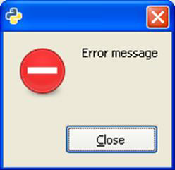
When the MessageBox menu item is activated, the following callback function is called and a message box pops up as an output.
def on_msgdlg(self, widget):
   md = gtk.MessageDialog(self,
      gtk.DIALOG_DESTROY_WITH_PARENT, gtk.MESSAGE_ERROR,
      gtk.BUTTONS_CLOSE, "Error message")
   md.run()
The above function will generate the following output −
PyGTK - AboutDialog Class
A simple way to display information about a program like its logo, name, copyright, website and license is offered by the gtk.AboutDialog widget. An about dialog is typically opened when the user selects the About option from the Help menu. All parts of the dialog are optional.
The About Dialog can contain URLs and email addresses. gtk.AboutDialog offers global hooks when the user clicks URLs and email ID
The following is a constructor of the gtk.AboutDialog class −
dlg = gtk.AboutDialog()
The following methods are used to configure the About Dialog
set_program_name() − This sets the name to be displayed in the About Dialog. defaults to application_name().
set_version() − This sets the "version" property
set_copyright() − This sets the "copyright". If None, the copyright notice is hidden.
set_license() − This sets the "license". If None, the license button is hidden.
set_website() − This sets the "website" property to the string whichg should be a valid URL.
set_author() − This sets the "authors" property to the list of author names displayed in the authors tab of the secondary credits dialog.
set_logo() − This sets the "logo" property to the Pixbuf object. If None, the default window icon set will be used.
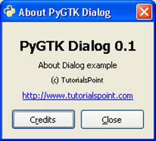
When the AboutDialog menu button is clicked, the following callback function is called. This function generates the About Dialog −
def on_abtdlg(self, widget):

   about = gtk.AboutDialog()
   about.set_program_name("PyGTK Dialog")
   about.set_version("0.1")
   about.set_authors("M.V.Lathkar")
   about.set_copyright("(c) TutorialsPoint")
   about.set_comments("About Dialog example")
   about.set_website("http://www.tutorialspoint.com")

   about.run()
   about.destroy()
The above function generates the following output −
PyGTK - Font Selection Dialog
The gtk.FontSelection widget allows users to select and apply the font of a particular name, size and style. The dialog has a preview box containing some text which will be displayed in selected font description, and two buttons CANCEL and OK.
PyGTK API contains a Pango module which defines classes and functionality required to render high quality internationalized text. Font and text handling in gtk is supported by Pango. The pango.Font object represents a font in a system independent way. The pango.FontDescription object contains the characteristics of a font.
gtk.FontSelectionDialog returns a pango.Font object. In order to apply the selected font, fontmetrics is fetched by obtaining the pango.FontDescription object from it.
The following is a constructor of the FontSelectionDialog class −
dlg = gtk.FontSelectionDialog(title)
The following are some frequently used methods of this class −
get_font_name() − This returns a string containing the currently selected font name or None if no font name is selected.
set_font_name() − This sets the current font
set_preview_text() − This sets the text in the preview area entry
The selected font is applied to the text in a widget using the modify_font() method.
When FontSelectionDialog menu item is activated, the following callback function is invoked −
def on_abtdlg(self, widget):
   about = gtk.AboutDialog()
   about.set_program_name("PyGTK Dialog")
   about.set_version("0.1")
   about.set_authors("M.V.Lathkar")
   about.set_copyright("(c) TutorialsPoint")
   about.set_comments("About Dialog example")
   about.set_website("http://www.tutorialspoint.com")
   about.run()
   about.destroy()
The selected font is applied to the text of label placed on the toplevel window.
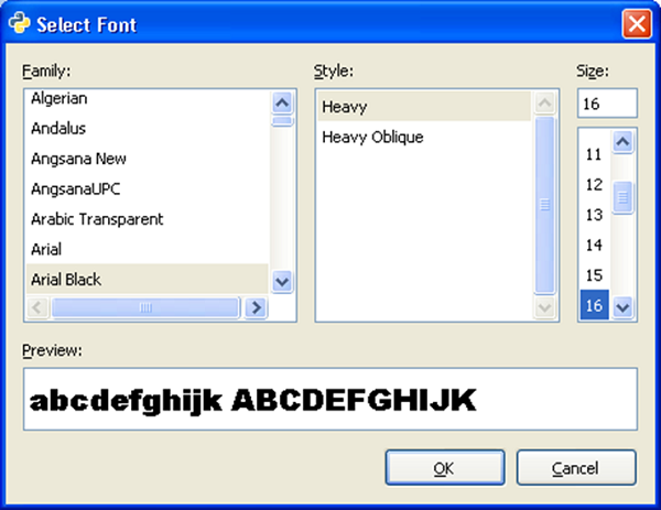
The following is the output −
PyGTK - Color Selection Dialog
This is a preconfigured Dialog in PyGTK API which lets the user to select and apply color. It internally embeds a gtk.ColorSelection widget.
The gtk.ColorScelection widget presents a colow wheel, and entry boxes for color parameters such as HSV and RGB. New color can be selected by manipulating color wheel or entering color parameters. Its get_current_color is useful for further processing.
Following is the prototype of the constructor of the gtk.ColorSelectionDialog class −
dlg = gtk.ColorSelectionDialog(title)
The current selected color is obtained from the colorsel attribute. The selected color is applied to a widget using modify_fg() or modify_bg() methods.
When the ColorDialog menu button is activated, the following callback function is executed −
def on_color(self, widget):
   dlg = gtk.ColorSelectionDialog("Select color")
   col = dlg.run()
   sel = dlg.colorsel.get_current_color()
   self.text.modify_fg(gtk.STATE_NORMAL, sel)
The chosen color is applied to the text in a label widget on the window −
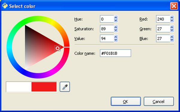
The following is the output −
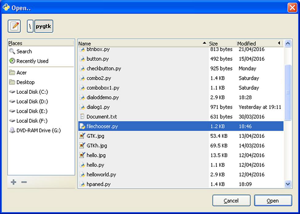
PyGTK - File Chooser Dialog
This dialog is useful to let the user select the location and the name of file that needs to be opened or saved. It embeds FileChooserWidget and provides OK and CANCEL buttons in the action_area.
The following is a constructor of the gtk.FileChooserDialog class −
Dlg=gtk.FileChooserDialog (title = None, parent = None,
   action = gtk.FILE_CHOOSER_ACTION_OPEN,  buttons = None, backend = None)
The parameters are −
| title | This is the title of the dialog |
| parent | The transient parent of the dialog, or None |
| action | The open or save mode for the dialog |
| buttons | This is a tuple containing button label-response id pairs or None |
| backend | The name of the specific filesystem backend to use. |
The following are the action modes −
- gtk.FILE_CHOOSER_ACTION_OPEN
- gtk.FILE_CHOOSER_ACTION_SAVE
- gtk.FILE_CHOOSER_ACTION_SELECT_FOLDER
- gtk.FILE_CHOOSER_ACTION_CREATE_FOLDER
If it is desired to restrict the types of files to be available for display, an object of the gtk.FileFilter can be applied by using the add_filter() method.
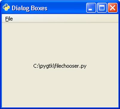
If the FileChooserDialog menu button is clicked, the following callback function is run.
def on_file(self, widget):
   dlg = gtk.FileChooserDialog("Open..", None, gtk.FILE_CHOOSER_ACTION_OPEN,
      (gtk.STOCK_CANCEL, gtk.RESPONSE_CANCEL, gtk.STOCK_OPEN, gtk.RESPONSE_OK))
   response = dlg.run()
   self.text.set_text(dlg.get_filename())
   dlg.destroy()
The file is selected from the dialog −
The selected file is displayed on the label on the toplevel gtk.Window −
PyGTK - Notebook Class
Notebook widget is a tabbed container. Each tab in this container holds a different page and the pages are seen in overlapped manner. Any desired page is made visible by clicking on the label of the tab. The labels can be configured to be displayed on top or bottom or to the left or right. A container widget with other widgets placed in it or a single widget is placed under each page.
If data to be displayed is too big in one view, it is grouped in different pages, each placed under one tab of a Notebook widget. This type of control is very widely used. Internet browser for instance, uses this tabbed display for rendering different pages in different tabs.
The following is a constructor of the gtk.Notebook class −
gtk.Notebook()
The following are the frequently used methods of the gtk.Notebook class −
append_page(child, label) − This appends a page to the notebook containing a widget specified by tab_label as the label on the tab. If tab_label can be None to use a default label.
insert_page(child, label, position) − This inserts a page into the notebook at the location specified by position.
remove_page(index) − This removes a page at the specified index.
get_current_page() − This returns the page index of the current page.
set_current_page(index) − This switches to the page number specified by the index.
set_show_tabs() − If false, tabs will not be visible. This is True by default.
set_tab_pos(pos) − This sets the edge at which the tabs for switching pages in the notebook are drawn. The predefined constants are −
gtk.POS_LEFT
gtk.POS_RIGHT
gtk.POS_TOP
gtk.POS_BOTTOM
set_tab_label_text(child, text) − This creates a new label with the text specified and sets it as the tab label for the page containing child.
The gtk.Notebook widget emits the following signals −
| change-current-page | This is emitted when the page forward or page backward request is issued |
| focus-tab | This is emitted when the focus is changed by tabbing. |
| page-added | This is emitted when a page is added to the notebook. |
| page-removed | This is emitted after a page is removed from the notebook. |
| select-page | This is emitted when a new child page is selected. |
| switch-page | This is emitted when the notebook page is changed. |
Example
In the following example, a gtk.Notebook with three pages is placed in a toplevel gtk.Window. The first page holds a VBox in which a label and Entry field is packed. The second page labelled 'qualifications' has a HButtonBox in which three mutually exclusive RadioButton widgets are added. The third page has a TextView object. The page labels are displayed at top.
Observe the code −
import gtk
class PyApp(gtk.Window):
   def __init__(self):
      super(PyApp, self).__init__()
      self.set_title("Notebook Demo")
      self.set_default_size(250, 200)

      nb = gtk.Notebook()
      nb.set_tab_pos(gtk.POS_TOP)
      vbox = gtk.VBox(False, 5)

      vb = gtk.VBox()
      hbox = gtk.HBox(True, 3)

      valign = gtk.Alignment(0.5,0.25, 0, 0)
      lbl = gtk.Label("Name of student")

      vb.pack_start(lbl, True, True, 10)
      text = gtk.Entry()

      vb.pack_start(text, True, True, 10)
      valign.add(vb)

      vbox.pack_start(valign)
      nb.append_page(vbox)
      nb.set_tab_label_text(vbox, "Name")
      hb = gtk.HButtonBox()

      btn1 = gtk.RadioButton(None,"Degree")
      hb.add(btn1)

      btn2 = gtk.RadioButton(btn1,"P.G.")
      hb.add(btn2)

      btn3 = gtk.RadioButton(btn1,"Doctorate")
      hb.add(btn3)

      nb.append_page(hb)
      nb.set_tab_label_text(hb, "Qualification")

      tv = gtk.TextView()
      nb.append_page(tv)
      nb.set_tab_label_text(tv, "about")

      self.add(nb)
      self.connect("destroy", gtk.main_quit)
      self.show_all()
if __name__ == '__main__':
   PyApp()
   gtk.main()
Upon execution, the above code displays a Notebook with three pages −
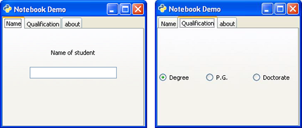
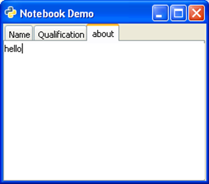
PyGTK - Frame Class
Frame class is a subclass of the gtk.Bin class. It draws a decorative border around the child widget placed in it. The frame may contain a label whose position may be customized.
A gtk.Frame object is constructed with the help of the following constructor −
frame = gtk.Frame(label = None)
The following are the methods of the gtk.Frame() class −
set_label(text) − This sets the label as specified by text. If None, the current label is removed.
set_label_widget() − This sets a widget other than gtk.Label as label for frame.
set_label_align(x, y) − This sets the alignment of the frame's label widget and decoration (defaults are 0.0 and 0.5)
set_shadow_type() − This sets the frame's shadow type.
The possible values are −
- gtk.SHADOW_NONE
- gtk.SHADOW_IN
- gtk.SHADOW_OUT
- gtk.SHADOW_ETCHED_IN
- tk.SHADOW_ETCHED_OUT
The following code demonstrates the functioning of the Frame widget. A group of three objects of gtk.RadioButton is placed in an HButtonBox.
btn1 = gtk.RadioButton(None,"Degree")
btn2 = gtk.RadioButton(btn1,"P.G.")
btn3 = gtk.RadioButton(btn1,"Doctorate")
hb = gtk.HButtonBox()
hb.add(btn1)
hb.add(btn2)
hb.add(btn3)
In order to draw border around the box, it is placed in a Frame widget, and it is added to the toplevel window.
frm = gtk.Frame()
frm.add(hb)
self.add(frm)
Example
Observe the following code −
import gtk

class PyApp(gtk.Window):
   def __init__(self):
      super(PyApp, self).__init__()
      self.set_title("Frame Demo")
      self.set_default_size(250, 200)
      self.set_border_width(5)
      frm = gtk.Frame()
      hb = gtk.HButtonBox()
      btn1 = gtk.RadioButton(None,"Degree")
      hb.add(btn1)
      btn2 = gtk.RadioButton(btn1,"P.G.")
      hb.add(btn2)
      btn3 = gtk.RadioButton(btn1,"Doctorate")
      hb.add(btn3)
      frm.add(hb)
      frm.set_label("Qualifications")
      self.add(frm)
      self.connect("destroy", gtk.main_quit)
      self.show_all()

if __name__ == '__main__':
   PyApp()
   gtk.main()
The above code will generate the following output −
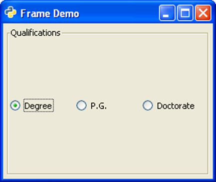
PyGTK - AspectFrame Class
gtk.AspectFrame class is a subclass of the Frame class. The child widget in this frame always retains its aspect ratio (of width and height) even if the main window is resized.
The ratio property of gtk.AspectFrame widget determines the widget width:height ratio. An aspect ratio of 0.5 means the width is one half the height; an aspect ratio of 2.0 means the width is twice the height. The default value for the "ratio" property is 1.0.
The following syntax is used for the constructor of gtk.AspectFrame class −
gtk.AspectFrame (label = None, xalign = 0.5, yalign = 0.5, ratio = 1.0, obey_child = True)
The xalign property determines the fraction of horizontal free space to the left of the child. 0.0 means no free space to the left, 1.0 means all free space to the left.
The yalign property determines the fraction of vertical free space above the child. 0.0 means no free space above, 1.0 means all free space above.
Ratio of width to height of frame is maintained if obey_child property is False.
The obey_child property determines if the ratio is to be ignored. The default is True.
The following code is similar to the one used for the Frame class. The only difference is that the ButonBox is placed in an AspectFrame widget.
frm = gtk.AspectFrame(label = None, xalign = 0.5, yalign = 0.5,
   ratio = 5.0, obey_child = False)
Note − The obey_child property is set to False because it is desired to retain the aspect ratio even if the window is resized.
Example
Observe the following code −
import gtk

class PyApp(gtk.Window):
   def __init__(self):
      super(PyApp, self).__init__()
      self.set_title("Aspect Frame Demo")
      self.set_default_size(250, 200)
      self.set_border_width(5)
      frm = gtk.AspectFrame(label = None, xalign = 0.5, yalign = 0.5,
         ratio = 5.0, obey_child = False)
      hb = gtk.HButtonBox()
      btn1 = gtk.RadioButton(None,"Degree")
      hb.add(btn1)
      btn2 = gtk.RadioButton(btn1,"P.G.")
      hb.add(btn2)
      btn3 = gtk.RadioButton(btn1,"Doctorate")
      hb.add(btn3)
      frm.add(hb)
      frm.set_label("Qualifications")
      self.add(frm)
      self.connect("destroy", gtk.main_quit)
      self.show_all()

if __name__ == '__main__':
   PyApp()
   gtk.main()
The above code will produce the following original and resized windows −
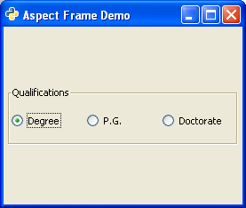
Original Window
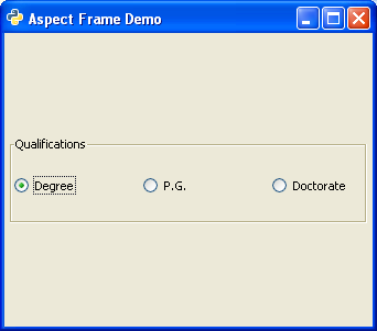
Resized Window
PyGTK - TreeView Class
The Treeview widget displays contents of a model implementing the gtk.TreeModel interface. PyGTK provides the following types of models −
- gtk.ListStore
- gtk.TreeStore
- gtk.TreeModelSort
ListStore is a list model. When associated with a gtk.TreeView widget, it produces a List box containing the items to be selected from. A gtk.ListStore object is declared with following syntax −
store = gtk.ListStore(column_type)
A list may have multiple columns, the predefined type constants are −
- gobject.TYPE_BOOLEAN
- gobject.TYPE_BOXED
- gobject.TYPE_CHAR
- gobject.TYPE_DOUBLE
- gobject.TYPE_ENUM
- gobject.TYPE_FLOAT
- gobject.TYPE_INT
- gobject.TYPE_LONG
- gobject.TYPE_NONE
- gobject.TYPE_OBJECT
- gobject.TYPE_STRING
- gobject.TYPE_UCHAR
- gobject.TYPE_UINT
- gobject.TYPE_ULONG
- gtk.gdk.pixbuf etc.
For example, a ListStore object to store string items is declared as −
store = gtk.ListStore(gobject.TYPE_STRING
In order to add items in the store, append() methods are used −
store.append (["item 1"])
TreeStore is a model for multi-columned Tree widget. For example, the following statement creates a store with one column having string item.
Store = gtk.TreeStore(gobject.TYPE_STRING)
In order to add items in a TreeStore, use the append() method. The append() method has two parameters, parent and row. To add toplevel item, parent is None.
row1 = store.append(None, ['row1'])
You need to repeat this statement to add multiple rows.
In order to add child rows, pass the toplevel row as parent parameter to the append() method −
childrow = store.append(row1, ['child1'])
You need to repeat this statement to add multiple child rows.
Now, create a TreeView widget and use the above TreeStore object as model.
treeview = gtk.TreeView(store)
We now have to create TreeViewColumn to display store data. The object of gtk.TreeViewColumn manages header and the cells using gtk.CelRenderer. TreeViewColumn object is created using the following constructor −
gtk.TreeViewColumn(title, cell_renderer,)
In addition to title and renderer, it takes zero or more attribute=column pairs to specify from which tree model column the attribute's value is to be retrieved. These parameters can also be set using methods of TreeViewColumn class given below.
A gtk.CellRenderer is a base class for a set of objects for rendering different types of data. The derived classes are CellRendererText, CellRendererPixBuf and CellRendererToggle.
The following methods of the TreeViewColumn class are used to configure its object −
TreeViewColumn.pack_start(cell, expand = True) − This method packs the CellRenderer object into the beginning column. If expand parameter is set to True, columns entire allocated space is assigned to cell.
TreeViewColumn.add_attribute(cell, attribute, column) − This method adds an attribute mapping to the list in the tree column. The column is the column of the tree model.
TreeViewColumn.set_attributes() − This method sets the attribute locations of the renderer using the attribute = column pairs
TreeViewColumn.set_visible() − If True, the treeview column is visible
TreeViewColumn.set_title() − This method sets the "title" property to the value specified.
TreeViewColumn.set_lickable() − If set to True, the header can take keyboard focus, and be clicked.
TreeViewColumn.set_alignment(xalign) − This method sets the "alignment" property to the value of xalign.
The "clicked" signal is emitted when the user clicks on the treeviewcolumn header button.
After having configured the TreeViewColumn object, it is added to the TreeView widget using the append_column() method.
The following are the important methods of the TreeView class −
TreevVew.set_model() − This sets the "model" property for the treeview. If the treeview already has a model set, this method will remove it before setting the new model. If model is None, it will unset the old model.
TreeView.set_header_clickable() − If set to True, the column title buttons can be clicked.
TreeView.append_column() − This appends the specified TreeViewColumn to the list of columns.
TreeView.remove_column() − This removes the specified column from the treeview.
TreeView.insert_column() − This inserts the specified column into the treeview at the location specified by position.
The TreeView widget emits the following signals −
| cursor-changed | This is emitted when the cursor moves or is set. |
| expand-collapse-cursor-row | This is emitted when the row at the cursor needs to be expanded or collapsed. |
| row-activated | This is emitted when the user double clicks a treeview row |
| row-collapsed | This is emitted when a row is collapsed by the user or programmatic action. |
| row-expanded | This is emitted when a row is expanded via the user or programmatic action. |
Two examples of the TreeView widget are given below. The first example uses a ListStore to produce a simple ListView.
Here a ListStore object is created and string items are added to it. This ListStore object is used as model for TreeView object −
store = gtk.ListStore(str)

treeView = gtk.TreeView()
treeView.set_model(store)
Then a CellRendererText is added to a TreeViewColumn object and the same is appended to TreeView.
rendererText = gtk.CellRendererText()
column = gtk.TreeViewColumn("Name", rendererText, text = 0)
treeView.append_column(column)
TreeView Object is placed on the toplevel window by adding it to a Fixed container.
Example 1
Observe the following code −
import pygtk
pygtk.require('2.0')
import gtk

class PyApp(gtk.Window):
   def __init__(self):
      super(PyApp, self).__init__()
      self.set_title("TreeView with ListStore")
      self.set_default_size(250, 200)
      self.set_position(gtk.WIN_POS_CENTER)

      store = gtk.ListStore(str)
      store.append (["PyQt"])
      store.append (["Tkinter"])
      store.append (["WxPython"])
      store.append (["PyGTK"])
      store.append (["PySide"])

      treeView = gtk.TreeView()
      treeView.set_model(store)

      rendererText = gtk.CellRendererText()
      column = gtk.TreeViewColumn("Python GUI Libraries", rendererText, text=0)
      treeView.append_column(column)

      fixed = gtk.Fixed()
      lbl = gtk.Label("select a GUI toolkit")
      fixed.put(lbl, 25,75)
      fixed.put(treeView, 125,15)

      lbl2 = gtk.Label("Your choice is:")
      fixed.put(lbl2, 25,175)
      self.label = gtk.Label("")

      fixed.put(self.label, 125,175)
      self.add(fixed)

      treeView.connect("row-activated", self.on_activated)
      self.connect("destroy", gtk.main_quit)
      self.show_all()

   def on_activated(self, widget, row, col):

	  model = widget.get_model()
      text = model[row][0]
      self.label.set_text(text)

def main():
   gtk.main()
   return

if __name__ == "__main__":
   bcb = PyApp()
   main()
The item selected by the user is displayed on a label in the window as the on_activated callback function is invoked.
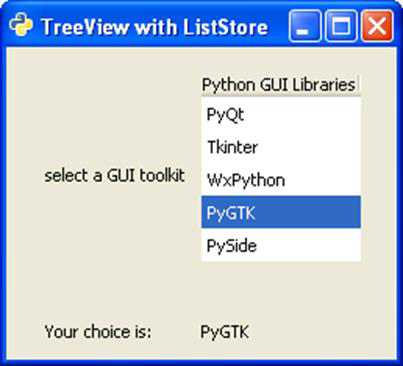
Example 2
The second example builds a hierarchical TreeView from a TreeStore. This program follows the same sequence of building the store, setting it as model for TreeView, designing a TreeViewColumn and appending it to TreeView.
import gtk

class PyApp(gtk.Window):

   def __init__(self):
      super(PyApp, self).__init__()

	  self.set_title("TreeView with TreeStore")
      self.set_size_request(400,200)
      self.set_position(gtk.WIN_POS_CENTER)
      vbox = gtk.VBox(False, 5)

      # create a TreeStore with one string column to use as the model
      store = gtk.TreeStore(str)

      # add row
      row1 = store.append(None, ['JAVA'])

      #add child rows
      store.append(row1,['AWT'])
      store.append(row1,['Swing'])
      store.append(row1,['JSF'])

      # add another row
      row2 = store.append(None, ['Python'])
      store.append(row2,['PyQt'])
      store.append(row2,['WxPython'])
      store.append(row2,['PyGTK'])

      # create the TreeView using treestore
      treeview = gtk.TreeView(store)
      tvcolumn = gtk.TreeViewColumn('GUI Toolkits')
      treeview.append_column(tvcolumn)

      cell = gtk.CellRendererText()
      tvcolumn.pack_start(cell, True)
      tvcolumn.add_attribute(cell, 'text', 0)
      vbox.add(treeview)

      self.add(vbox)

	  self.connect("destroy", gtk.main_quit)
      self.show_all()

PyApp()
gtk.main()
The following TreeView is displayed as an output −
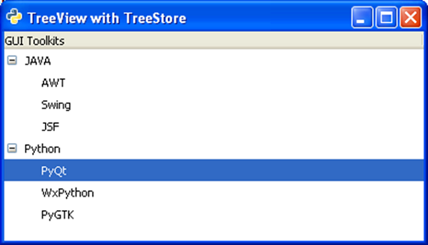
PyGTK - Paned Class
Paned class is the base class for widgets which can display two adjustable panes either horizontally (gtk.Hpaned) or vertically (gtk.Vpaned). Child widgets to panes are added by using pack1() and pack2() methods.
Paned widget draws a separator slider between two panes and provides a handle to adjust their relative width/height. If the resize property of child widget inside a pane is set to True, it will resize according to the size of the panes.
The following methods are available for HPaned as well as VPaned class −
Paned.add1(child) − This adds the widget specified by child to the top or left pane
Paned.add2(child) − This adds the widget specified by child to the bottom or right pane.
Paned.pack1(child, resize, shrink) − This adds the widget specified by child to the top or left pane with the parameters. If resize is True, child should be resized when the paned widget is resized. If shrink is True, child can be made smaller than its minimum size request.
Paned.pack2(child, resize, shrink) − This sets the position of the divider between the two panes.
Both types of Paned widgets emit the following signals −
| accept-position | This is emitted when paned has the focus causing the child widget with the focus to be activated. |
| cancel-position | This is emitted when the Esc key is pressed while paned has the focus. |
| move-handle | This is emitted when paned has the focus and the separator is moved. |
Example
The following example uses a gtk.Hpaned widget. In the left pane, a TreeView widget is added, and in the right pane, there is a TextView widget. When any row in TreeView is selected, it will emit row_activated signal which is connected to a callback function. The on_activated()function retrieves row's text and displays in the text view panel.
Observe the code −
import gtk, gobject

class PyApp(gtk.Window):
   def __init__(self):
      super(PyApp, self).__init__()
      self.set_title("HPaned widget Demo")
      self.set_default_size(250, 200)
      vp = gtk.HPaned()
      sw = gtk.ScrolledWindow()
      sw.set_policy(gtk.POLICY_AUTOMATIC, gtk.POLICY_AUTOMATIC)

      tree = gtk.TreeView()
      languages = gtk.TreeViewColumn()
      languages.set_title("GUI Toolkits")
      cell = gtk.CellRendererText()
      languages.pack_start(cell, True)
      languages.add_attribute(cell, "text", 0)
      treestore = gtk.TreeStore(str)
      it = treestore.append(None, ["Python"])

      treestore.append(it, ["PyQt"])
      treestore.append(it, ["wxPython"])
      treestore.append(it, ["PyGTK"])
      treestore.append(it, ["Pydide"])

      it = treestore.append(None, ["Java"])
      treestore.append(it, ["AWT"])
      treestore.append(it, ["Swing"])
      treestore.append(it, ["JSF"])
      treestore.append(it, ["SWT"])

      tree.append_column(languages)
      tree.set_model(treestore)

      vp.add1(tree)
      self.tv = gtk.TextView()
      vp.add2(self.tv)
      vp.set_position(100)
      self.add(vp)

      tree.connect("row-activated", self.on_activated)
      self.connect("destroy", gtk.main_quit)
      self.show_all()

   def on_activated(self, widget, row, col):
      model = widget.get_model()
      text = model[row][0]
      print text

      buffer = gtk.TextBuffer()
      buffer.set_text(text+" is selected")
      self.tv.set_buffer(buffer)

if __name__ == '__main__':
   PyApp()
   gtk.main()
The above code will generate the following output −
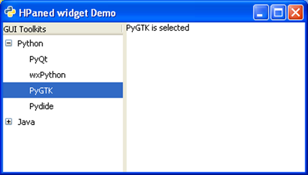
PyGTK - Statusbar Class
A notification area, usually at the bottom of a window is called the status bar. Any type of status change message can be displayed on the status bar. It also has a grip using which it can be resized.
The gtk.Statusbar widget maintains a stack of messages. Hence, new message gets displayed on top of the current message. If it is popped, earlier message will be visible again. Source of the message must be identified by context_id to identify it uniquely.
The following is the constructor of the gtk.Statusbar widget −
bar = gtk.Statusbar()
The following are the methods of the gtk.Statusbar class −
Statusbar.push(context_id, text) − This pushes a new message onto a statusbar's stack.
Statusbar.pop(context_id) − This removes the top message with the specified context_id from the statusbar's stack.
The following signals are emitted by the Statusbar widget −
| text-popped | This is emitted when a message is removed from the statusbar message stack. |
| text-pushed | This is emitted when a message is added to the statusbar message stack. |
The following example demonstrates the functioning of Statusbar. Toplevel window contains a VBox with two rows. Upper row has a Fixed widget in which a label, an Entry widget and a button is put. Whereas, in the bottom row, a gtk.Statusbar widget is added.
In order to send message to status bar, its context_id needs to be fetched.
id1 = self.bar.get_context_id("Statusbar")
The 'clicked' signal of the Button object is connected to a callback function through which a message is pushed in the status bar. And, the 'activate' signal is emitted when Enter key is pressed inside the Entry widget. This widget is connected to another callback.
btn.connect("clicked", self.on_clicked, id1)
txt.connect("activate", self.on_entered, id1)
Both callbacks use push() method to flash the message in the notification area.
Example
Observe the following code −
import gtk

class PyApp(gtk.Window):

   def __init__(self):
      super(PyApp, self).__init__()
      self.set_title("Statusbar demo")
      self.set_size_request(400,200)
      self.set_position(gtk.WIN_POS_CENTER)

      vbox = gtk.VBox()
      fix = gtk.Fixed()
      lbl = gtk.Label("Enter name")

      fix.put(lbl, 175, 50)
      txt = gtk.Entry()
      fix.put(txt, 150, 100)

      btn = gtk.Button("ok")
      fix.put(btn, 200,150)

      vbox.add(fix)
      self.bar = gtk.Statusbar()
      vbox.pack_start(self.bar, True, False, 0)

      id1 = self.bar.get_context_id("Statusbar")
      btn.connect("clicked", self.on_clicked, id1)
      txt.connect("activate", self.on_entered, id1)

      self.add(vbox)
      self.connect("destroy", gtk.main_quit)
      self.show_all()

      def on_clicked(self, widget, data=None):
         self.bar.push(data, "Button clicked

      def on_entered(self, widget, data):
         self.bar.push(data, "text entered")

PyApp()
gtk.main()
Upon execution, the above code will display the following output −
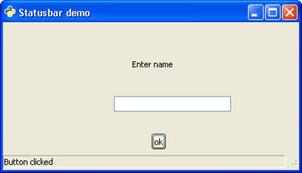
Try typing in the text box and press Enter to see the 'text entered' message in status bar.
PyGTK - ProgressBar Class
Progress bars are used to give user the visual indication of a long running process. The gtk.ProgressBar widget can be used in two modes percentage mode and activity mode.
When it is possible to accurately estimate how much of work is pending to be completed, the progress bar can be used in percentage mode, and the user sees an incremental bar showing percentage of completed job. If on the other hand, the amount of work to be completed can be accurately determined, the progress bar is used in activity mode in which, the bar shows the activity by displaying a block moving back and forth.
The following constructor initializes the widget of the gtk.ProgressBar class −
pb = gtk.ProgressBar()
gtk.ProgressBar uses the following methods to manage functionality −
ProgressBar.pulse() − This nudges the progressbar to indicate that some progress has been made, but you don't know how much. This method also changes the progress bar mode to "activity mode," where a block bounces back and forth.
ProgressBar.set_fraction(fraction) − This causes the progress bar to "fill in" the portion of the bar specified by fraction. The value of fraction should be between 0.0 and 1.0.
ProgressBar.set_pulse_setup() − This sets the portion (specified by fraction) of the total progress bar length to move the bouncing block for each call to the pulse() method.
ProgressBar.set_orientation() − This sets the orientation of the progress bar. It may be set to one of the following constants:
gtk.PROGRESS_LEFT_TO_RIGHT
gtk.PROGRESS_RIGHT_TO_LEFT
gtk.PROGRESS_BOTTOM_TO_TOP
gtk.PROGRESS_TOP_TO_BOTTOM
In the following program, the gtk.ProgressBar widget is used in activity mode. Hence, the initial position of progress is set to 0.0 by the set_fraction() method.
self.pb = gtk.ProgressBar()
self.pb.set_text("Progress")
self.pb.set_fraction(0.0)
In order to increment the progress by 1 percent after 100 milliseconds, a timer object is declared and a callback function is set up to be invoked after every 100 ms so that the progress bar is updated.
self.timer = gobject.timeout_add (100, progress_timeout, self)
Here, progress_timeout() is the callback function. It increments the parameter of the set_fraction() method by 1 percent and updates the text in progress bar to show the percentage of completion.
def progress_timeout(pbobj):
   new_val = pbobj.pb.get_fraction() + 0.01
   pbobj.pb.set_fraction(new_val)
   pbobj.pb.set_text(str(new_val*100)+" % completed")
   return True
Example
Observe the following code −
import gtk, gobject

def progress_timeout(pbobj):
   new_val = pbobj.pb.get_fraction() + 0.01
   pbobj.pb.set_fraction(new_val)
   pbobj.pb.set_text(str(new_val*100)+" % completed")
   return True

class PyApp(gtk.Window):

   def __init__(self):
      super(PyApp, self).__init__()
      self.set_title("Progressbar demo")
      self.set_size_request(300,200)
      self.set_position(gtk.WIN_POS_CENTER)

      fix = gtk.Fixed()
      self.pb = gtk.ProgressBar()
      self.pb.set_text("Progress")
      self.pb.set_fraction(0.0)

      fix.put(self.pb,80,100)
      self.add(fix)
      self.timer = gobject.timeout_add (100, progress_timeout, self)
      self.connect("destroy", gtk.main_quit)
      self.show_all()
PyApp()
gtk.main()
The above code will generate the following output −
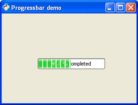
To use the progress bar in activity mode, change callback function to the following and run −
def progress_timeout(pbobj):
   pbobj.pb.pulse()
   return True
The back and forth movement of a block inside the Progress bar will show the progress of the activity.
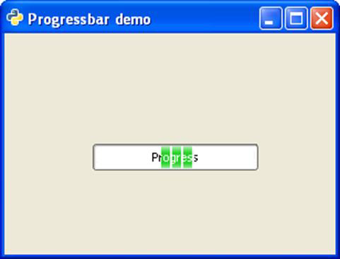
PyGTK - Viewport Class
If a widget has an area larger than that of the toplevel window, it is associated with a ViewPort container. A gtk.Viewport widget provides adjustment capability to be used in a ScrolledWindow. A Label widget for instance, doesn't have any adjustments. Hence it needs a Viewport. Some widgets have a native scrolling support. But a Label or a gtk.Table widget doesn't have an in-built scrolling support. Hence they must use Viewport.
ViewPort class has the following constructor −
gtk.Viewport(hadj, vadj)
Here, hadj and vadj are the adjustment objects associated with the viewport.
gtk.ViewPort class uses the following methods −
Viewport.set_hadjustment() − This sets the "hadjustment" property
Viewport.set_vadjustment() − This sets the "vadjustment" property
Viewport.set_shadow_type() − This sets the "shadow-type" property to the value of type. The value of type must be one of −
gtk.SHADOW_NONE
gtk.SHADOW_IN
gtk.SHADOW_OUT
gtk.SHADOW_ETCHED_IN
gtk.SHADOW_ETCHED_OUT
The gtk.Viewport object emits the set-scroll-adjustments signal when one or both of the horizontal and vertical gtk.Adjustment objects is changed.
PyGTK - ScrolledWindow Class
Scrolled window is created to access other widget of area larger than parent window. Some widgets like TreeView and TextView of native support for scrolling. For others such as Label or Table, a Viewport should be provided.
The following syntax is used for the constructor of the gtk.ScrolledWindow class −
sw = gtk.ScrolledWindow(hadj, vadj)
The following are the methods of the gtk.ScrolledWindow class −
ScrolledWindow.set_hadjustment() − This sets the horizontal adjustment to a gtk.Adjustment object
ScrolledWindow.set_vadjustment() − This sets the vertical adjustment to a gtk.Adjustment object
ScrolledWindow.set_Policy (hpolicy, vpolicy) − This sets the "hscrollbar_policy" and "vscrollbar_policy" properties. One of the following predefined constants are used −
gtk.POLICY_ALWAYS − The scrollbar is always present
gtk.POLICY_AUTOMATIC − The scrollbar is present only if needed i.e. the contents are larget than the window
gtk.POLICY_NEVER − The scrollbar is never present
ScrolledWindow.add_with_viewport(child) − This method is used to add a widget (specified by child) without native scrolling capabilities to the scrolled window. This is a convenience function that is equivalent to adding child to a gtk.Viewport, then adding the viewport to the scrolled window.
The following code adds a scrolled window around a gtk.Table object with 10 by 10 dimensions. Since a Table object doesn't support adjustments automatically, it is added in a Viewport.
sw = gtk.ScrolledWindow()
table = gtk.Table(10,10)
Two nested loops are used to add 10 rows of 10 columns each. A gtk.Button widget is placed in each cell.
for i in range(1,11):
   for j in range(1,11):
      caption = "Btn"+str(j)+str(i)
      btn = gtk.Button(caption)
      table.attach(btn, i, i+1, j, j+1)
This large enough table is now added in the scrolled window along with a viewport.
sw.add_with_viewport(table)
Example
Observe the following code −
import gtk

class PyApp(gtk.Window):

   def __init__(self):
      super(PyApp, self).__init__()

	  self.set_title("ScrolledWindow and Viewport")
      self.set_size_request(400,300)
      self.set_position(gtk.WIN_POS_CENTER)
      sw = gtk.ScrolledWindow()
      table = gtk.Table(10,10)
      table.set_row_spacings(10)
      table.set_col_spacings(10)
      for i in range(1,11):
         for j in range(1,11):
            caption = "Btn"+str(j)+str(i)
            btn = gtk.Button(caption)
            table.attach(btn, i, i+1, j, j+1)
      sw.add_with_viewport(table)
      self.add(sw)

	  self.connect("destroy", gtk.main_quit)
      self.show_all()

PyApp()
gtk.main()
The above code will generate the following output −
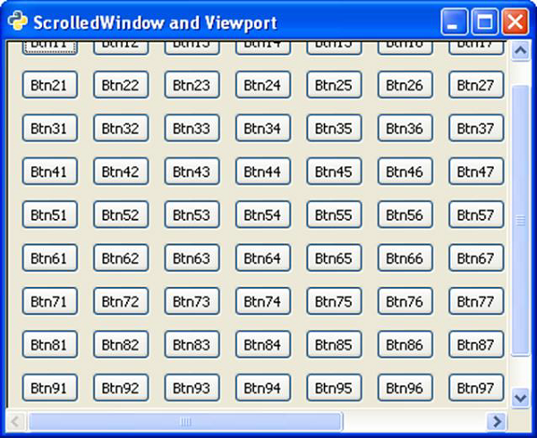
PyGTK - Arrow Class
The gtk.Arrow object is used to draw simple arrow pointing towards four cardinal directions. This class is inherited from the gtk.Misc class and the object will occupy any space allocated it, for instance, a Label or Button widget.
Typically, Arrow object is created using the following constructor −
Arr = gtk.Arrow(arrow_type, shadow_type)
The predefined arrow_type constants are −
- gtk.ARROW_UP
- gtk.ARROW_DOWN
- gtk.ARROW_LEFT
- gtk.ARROW_RIGHT
The predefined shadow_type constants are listed in the following table −
| gtk.SHADOW_NONE | No outline. |
| gtk.SHADOW_IN | The outline is beveled inward. |
| gtk.SHADOW_OUT | The outline is beveled outward like a button. |
| gtk.SHADOW_ETCHED_IN | The outline itself is an inward bevel, but the frame bevels outward. |
| gtk.SHADOW_ETCHED_OUT | The outline is an outward bevel, frame bevels inward. |
Example
In the following example, four Button widgets are added to an Hbox. On top of each button, a gtk.Arrow object pointing UP, DOWN, LEFT and RIGHT respectively is placed. The HBOX container is placed at the bottom of the toplevel window with the help of an Alignment container.
Observe the code −
import gtk

class PyApp(gtk.Window):

   def __init__(self):
      super(PyApp, self).__init__()
      self.set_title("Arrow Demo")
      self.set_size_request(300, 200)
      self.set_position(gtk.WIN_POS_CENTER)

      vbox = gtk.VBox(False, 5)
      hbox = gtk.HBox(True, 3)
      valign = gtk.Alignment(0, 1, 0, 0)
      vbox.pack_start(valign)

      arr1 = gtk.Arrow(gtk.ARROW_UP, gtk.SHADOW_NONE)
      arr2 = gtk.Arrow(gtk.ARROW_DOWN, gtk.SHADOW_NONE)
      arr3 = gtk.Arrow(gtk.ARROW_LEFT, gtk.SHADOW_NONE)
      arr4 = gtk.Arrow(gtk.ARROW_RIGHT, gtk.SHADOW_NONE)

      btn1 = gtk.Button()
      btn1.add(arr1)
      btn2 = gtk.Button()
      btn2.add(arr2)
      btn3 = gtk.Button()
      btn3.add(arr3)
      btn4 = gtk.Button()
      btn4.add(arr4)

      hbox.add(btn1)
      hbox.add(btn2)
      hbox.add(btn3)
      hbox.add(btn4)

      halign = gtk.Alignment(0.5, 0.5, 0, 0)
      halign.add(hbox)

      vbox.pack_start(halign, False, True, 10)
      self.add(vbox)
      self.connect("destroy", gtk.main_quit)
      self.show_all()

PyApp()
gtk.main()
The above code will generate the following output −
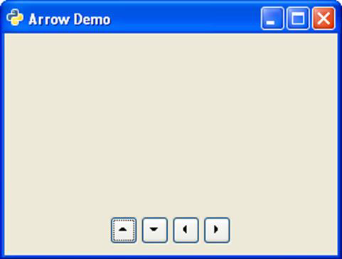
PyGTK - Image Class
This class is also inherited from the gtk.Misc class. The object of the gtk.Image class displays an image. Usually, the image is to be loaded from a file in a pixel buffer representing gtk.gdk.Pixbuf class. Instead a convenience function set_from_file() is commonly used to display image data from file in a gk.Image widget.
The easiest way to create the gtk.Image object is to use the following constructor −
img = gtk.Image()
The following are the methods of the gtk.Image class −
Image.set_from_file() − This sets the image data from the contents of the file.
Image.set_from_pixbuf() − This sets the image data from pixmap in which the image data is loaded for offscreen manipulation.
Image.set_from_pixbuf() − This sets the image data using pixbuf which is an object containing the data that describes an image using client side resources.
Image.set_from_stock() − This sets the image data from the stock item identified by stock_id.
Image.clear() − This removes the current image.
Image.set_from_image() − This sets the image data from a client-side image buffer in the pixel format of the current display. If the image is None, the current image data will be removed.
Example
In the following program, the gtk.Image object is obtained from an image file. It is further added in the toplevel window.
import gtk

class PyApp(gtk.Window):

   def __init__(self):
      super(PyApp, self).__init__()

	  self.set_title("PyGtk Image demo")
      self.set_size_request(300, 200)
      self.set_position(gtk.WIN_POS_CENTER)

	  image1 = gtk.Image()
      image1.set_from_file("python.png")
      self.add(image1)

	  self.connect("destroy", gtk.main_quit)
      self.show_all()

PyApp()
gtk.main()
The above code will generate the following output −
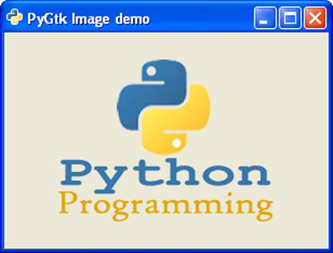
PyGTK - DrawingArea Class
The DrawingArea widget presents a blank canvas containing a gtk.gdk.Window on which objects such as line, rectangle, arc, etc. can be drawn.
PyGTK uses Cairo library for such drawing operations. Cairo is a popular 2D vector graphics library. It is written in C., although, it has bindings in most Languages such as C++, Java, Python, PHP etc. Cairo library can be used to draw on standard output devices in various operating systems. It can also be used to create PDF, SVG and post-script files.
In order to perform different drawing operations, we must fetch the device on text of the target output object. In this case, since the drawing is appearing on gtk.DrawingArea widget, the device context of gdk.Window contained inside it is obtained. This class has a cairo-create() method which returns the device context.
area = gtk.DrawingArea()
dc = area.window.cairo_create()
The DrawingArea widget can be connected to the callbacks based on the following signals emitted by it −
| Realize | To take any necessary actions when the widget is instantiated on a particular display. |
| configure_event | To take any necessary actions when the widget changes size. |
| expose_event | To handle redrawing the contents of the widget when a drawing area first comes on screen, or when it's covered by another window and then uncovered (exposed). |
The Mouse and Keyboard events can also be used to invoke callbacks by add_events() method of the gtk.Widget class.
Of particular interest is the expose-event signal which is emitted when the DrawingArea canvas first comes up. The different methods for drawing 2D objects, that are defined in the Cairo library are called from this callback connected to the expose-event signal. These methods draw corresponding objects on the Cairo device context.
The following are the available drawing methods −
dc.rectangle(x,y,w,h) − This draws a rectangle at the specified top left coordinate and having givwn width and height.
dc.arc(x,y,r,a1,a2) − This draws a circular arc with given radius and two angles.
dc.line(x1, y1, x2, y2) − This draws a line between two pairs of coordinates.
dc.line_to(x,y) − This draws a line from the current position to (x,y)
dc.show_text(str) − draws string at current cursor position
dc.stroke() − draws outline
dc.fill() − fills shape with current color
dc.set_color_rgb(r,g,b) − sets color to outline and fill with r, g and b values between 0.0 to 1.0
Example
The following script draws different shapes and test using Cairo methods.
import gtk
import math

class PyApp(gtk.Window):

   def __init__(self):
      super(PyApp, self).__init__()

	  self.set_title("Basic shapes using Cairo")
      self.set_size_request(400, 250)
      self.set_position(gtk.WIN_POS_CENTER)

	  self.connect("destroy", gtk.main_quit)

      darea = gtk.DrawingArea()
      darea.connect("expose-event", self.expose)

      self.add(darea)
      self.show_all()

      def expose(self, widget, event):
      cr = widget.window.cairo_create()

      cr.set_line_width(2)
      cr.set_source_rgb(0,0,1)
      cr.rectangle(10,10,100,100)
      cr.stroke()

      cr.set_source_rgb(1,0,0)
      cr.rectangle(10,125,100,100)
      cr.stroke()

      cr.set_source_rgb(0,1,0)
      cr.rectangle(125,10,100,100)
      cr.fill()

      cr.set_source_rgb(0.5,0.6,0.7)
      cr.rectangle(125,125,100,100)
      cr.fill()

      cr.arc(300, 50, 50,0, 2*math.pi)
      cr.set_source_rgb(0.2,0.2,0.2)
      cr.fill()

      cr.arc(300, 200, 50, math.pi,0)
      cr.set_source_rgb(0.1,0.1,0.1)
      cr.stroke()

      cr.move_to(50,240)
      cr.show_text("Hello PyGTK")
      cr.move_to(150,240)
      cr.line_to(400,240)
      cr.stroke()

PyApp()
gtk.main()
The above script will generate the following output −
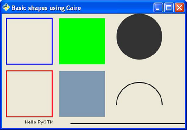
PyGTK - SpinButton Class
The SpinnButton widget, often called the Spinner is a gtk.Entry widget with up and down arrows on its right. A user can type in a numeric value directly in it or increment or decrement using up and down arrows. The gtk.SpinButton class is inherited from the gtk.Entry class. It uses a gtk.Adjustment object with which the range and step of the numeric value in the spinner can be restricted.
The SpinButton widget is created using the following constructor −
sp = gtk.SpinButton(adj, climb_rate, digits)
Here, adj represents the gtk.Adjustment object controlling range, climb_rate is an acceleration factor and the number of decimals specified by digits.
The gtk.SpinButton class has the following methods −
SpinButton.set_adjustment() − This sets the "adjustment" property.
SpinButton.set_digits() − This sets the "digits" property to the value to determine the number of decimal places to be displayed by the spinbutton.
SpinButton.set_increments(step, page) − This sets the step value which has increment applied for each left mousebutton press and page value which is increment applied for each middle mousebutton press.
SpinButton.set_range() − This sets the minimum and maximum allowable values for spinbutton.
SpinButton.set_value() − This sets the spin button to a new value programmatically.
SpinButton.update_policy() − The valid values are gtk.UPDATE_ALWAYS and gtk.UPDATE_VALID
SpinButton.spin(direction, increment=1) − This increments or decrements Spinner's value in the specified direction.
The following are the predefined direction constants −
| gtk.SPIN_STEP_FORWARD | forward by step_increment |
| gtk.SPIN_STEP_BACKWARD | backward by step_increment |
| gtk.SPIN_PAGE_FORWARD | forward by step_increment |
| gtk.SPIN_PAGE_BACKWARD | backward by step_increment |
| gtk.SPIN_HOME | move to minimum value |
| gtk.SPIN_END | move to maximum value |
| gtk.SPIN_USER_DEFINED | add increment to the value |
SpinButton.set_wrap() If wrap is True, the spin button value wraps around to the opposite limit when the upper or lower limit of the range exceeds.
The gtk.SpinButton widget emits the following signals −
| change-value | This is emitted when the spinbutton value is changed by keyboard action |
| input | This is emitted when the value changes. |
| output | This is emitted when the spinbutton display value is changed. Returns True if the handler successfully sets the text and no further processing is required. |
| value-changed | This is emitted when any of the settings that change the display of the spinbutton is changed. |
| wrapped | This is emitted right after the spinbutton wraps from its maximum to minimum value or vice-versa. |
Example
The following example constructs a simple Date Selector by using three SpinButton widgets. The Day Selector is applied an Adjustment object to restrict value between 131. The second selector is for the number of months 112. The third selector selects the year range 20002020.
Observe the code −
import gtk

class PyApp(gtk.Window):

   def __init__(self):
      super(PyApp, self).__init__()
      self.set_title("SpinButton Demo")
      self.set_size_request(300, 200)
      self.set_position(gtk.WIN_POS_CENTER)
      self.set_border_width(20)

      vbox = gtk.VBox(False, 5)
      hbox = gtk.HBox(True, 3)
      lbl1 = gtk.Label("Date")
      hbox.add(lbl1)

      adj1 = gtk.Adjustment(1.0, 1.0, 31.0, 1.0, 5.0, 0.0)
      spin1 = gtk.SpinButton(adj1, 0, 0)
      spin1.set_wrap(True)

      hbox.add(spin1)
      lbl2 = gtk.Label("Month")
      hbox.add(lbl2)

      adj2 = gtk.Adjustment(1.0, 1.0, 12.0, 1.0, 5.0, 0.0)
      spin2 = gtk.SpinButton(adj2, 0, 0)
      spin2.set_wrap(True)

      hbox.add(spin2)
      lbl3 = gtk.Label("Year")
      hbox.add(lbl3)

      adj3 = gtk.Adjustment(1.0, 2000.0, 2020.0, 1.0, 5.0, 0.0)
      spin3 = gtk.SpinButton(adj3, 0, 0)
      spin3.set_wrap(True)
      hbox.add(spin3)

      frame = gtk.Frame()
      frame.add(hbox)
      frame.set_label("Date of Birth")

      vbox.add(frame)
      self.add(vbox)
      self.connect("destroy", gtk.main_quit)
      self.show_all()
PyApp()
gtk.main()
Upon execution, the above code will produce the following output −
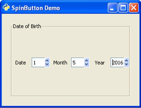
PyGTK - Calendar Class
The Calendar widget in PyGTK toolkit displays a simple calendar with one month view at a time. The navigation controls to change month and year are displayed by default. The display options can be suitably configured.
The value of month property is between 0 to 11, and that of date property is between 1 to 31.
There is a simple constructor to create a gtk.Calendar object −
cal = gtk.Calendar()
The default display style shows the current month and year as well as names of days.
The gtk.Calendar class has the following methods −
Calendar.select_month(mm,yy) This changes the calendar display to the specified mm and yy.
Calendar.select_day(dd) This selects the specified dd on the calendar when it has a value between 1 and 31. If dd is 0 then the current day selection is removed.
Calendar.display_options() This sets the calendar display options to the value specified by flags. The possible display options are a combination of:
| gtk.CALENDAR_SHOW_HEADING | Specifies that the month and year should be displayed. |
| gtk.CALENDAR_SHOW_DAY_NAMES | Specifies that three letter day descriptions should be present. |
| gtk.CALENDAR_NO_MONTH_CHANGE | Prevents the user from switching months with the calendar. |
| gtk.CALENDAR_SHOW_WEEK_NUMBERS | Displays each week numbers of the current year, down the left side of the calendar. |
| gtk.CALENDAR_WEEK_START_MONDAY | Starts the calendar week on Monday, instead of the default Sunday. |
Calendar.get_date() This retrieves the calendar's current year, month and selected day numbers as a tuple (year, month, day).
The gtk.Calendar widget emits the following signals −
| day-selected | This is emitted when a day is selected either by the user or programmatically. |
| month-changed | This is emitted when the calendar month is changed programmatically or by the user. |
| next-month | This is emitted when the user clicks the "next-month" navigation control in the calendar header. |
| next-year | This is emitted when the user clicks the "next-year" navigation control in the calendar header. |
| prev-month | This is emitted when the user clicks the "prev-month" navigation control in the calendar header. |
| prev-year | This is emitted when the user clicks the "prev-year" navigation control in the calendar header. |
In the following example, a gtk.Calendar control and four buttons are placed in the toplevel window.
When the 'heading' button is clicked, the Calendar's display options are set to SHOW_HEADING −
def heading(self, widget):
   self.cal.set_display_options(gtk.CALENDAR_SHOW_HEADING)
When the user clicks the 'day name' button, the callback sets display options to SHOW_DAY_NAMES −
def dayname(self, widget):
self.cal.set_display_options(gtk.CALENDAR_SHOW_DAY_NAMES)
Both the display options are enabled when 'both' button is pressed. To begin with, all flags of display options are removed by setting it to 0.
self.cal.set_display_options(0)
The 'set' button pops up a message box displaying the currently marked date.
tp = self.cal.get_date()
str1 = str(tp[0])
str2 = str(tp[1]+1)
str3 = str(tp[2])
label = gtk.Label("Date selected:"+str3+"-"+str2+"-"+str1)
dialog.vbox.add(label)
label.show()
Example
Observe the following code −
import gtk

class PyApp(gtk.Window):

   def __init__(self):
      super(PyApp, self).__init__()
      self.set_title("Calendar Demo")
      self.set_size_request(300, 200)
      self.set_position(gtk.WIN_POS_CENTER)

      vbox = gtk.VBox(False, 5)
      self.cal = gtk.Calendar()
      halign1 = gtk.Alignment(0.5, 0.5, 0, 0)
      halign1.add(self.cal)

      self.cal.set_display_options(0)
      valign = gtk.Alignment(0, 1, 0, 0)
      vbox.pack_start(halign1)

      self.btn1 = gtk.Button("set")
      self.btn2 = gtk.Button("heading")
      self.btn3 = gtk.Button("day name")
      self.btn4 = gtk.Button("Both")

      hbox = gtk.HBox(True, 3)
      hbox.add(self.btn1)
      hbox.add(self.btn2)
      hbox.add(self.btn3)
      hbox.add(self.btn4)

      halign = gtk.Alignment(0.5, 0.5, 0, 0)
      halign.add(hbox)

      vbox.pack_start(halign, False, True, 10)
      self.add(vbox)

      self.btn1.connect("clicked", self.selectdate)
      self.btn2.connect("clicked", self.heading)
      self.btn3.connect("clicked", self.dayname)
      self.btn4.connect("clicked", self.bothflags)

      self.connect("destroy", gtk.main_quit)
      self.show_all()

   def heading(self, widget):
      self.cal.set_display_options(gtk.CALENDAR_SHOW_HEADING)

   def dayname(self, widget):
      self.cal.set_display_options(gtk.CALENDAR_SHOW_DAY_NAMES)

   def bothflags(self, widget):
      self.cal.set_display_options(gtk.CALENDAR_SHOW_HEADING|gtk.CALENDAR_SHOW_DAY_NAMES)
   def selectdate(self, widget):
      tp = self.cal.get_date()
      dialog = gtk.Dialog("My dialog",
      self,
      gtk.DIALOG_MODAL | gtk.DIALOG_DESTROY_WITH_PARENT,
      (gtk.STOCK_OK, gtk.RESPONSE_ACCEPT))

      str1 = str(tp[0])
      str2 = str(tp[1]+1)
      str3 = str(tp[2])

      label = gtk.Label("Date selected:"+str3+"-"+str2+"-"+str1)
      dialog.vbox.add(label)
      label.show()
      res = dialog.run()
      dialog.destroy()

PyApp()
gtk.main()
The above code will generate the following output −
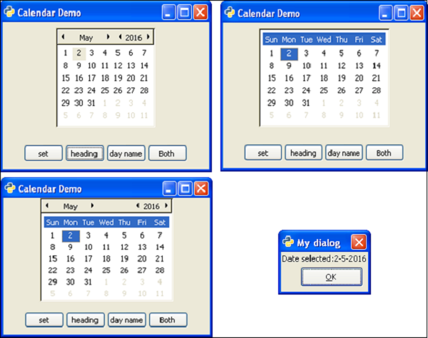
PyGTK - Clipboard Class
A Clipboard object holds shared data between two processes or two widgets of the same application. The gtk.Clipboard is a high level interface for the gtk.SelectionData class.
The following is a prototype of the gtk.Clipboard constructor −
gtk.Clipboard(display,selction)
Here, the display parameter corresponds to the gtk.gdk.Display object for which the clipboard is to be created or retrieved. By default, it is the standard output device. The selection parameter defaults to CLIPBOARD, an object representing an interned string.
PyGTK provides a convenience function to create a clipboard object with defaults.
gtk.clipboard.get()
gtk.Clipboard class has the following methods −
Clipboard.store() − This stores the current clipboard data somewhere so that it will stay around even after the application has quit.
Clipboard.clear() − This removes the contents of the clipboard.
Clipboard.set_text(text) − This sets the contents of the clipboard to the string.
Clipboard.request_text() − This requests the contents of the clipboard as text. When the text is later received, callback will be called with the data specified by user_data. The signature of callback is:
def callback(clipboard, text, data) − text will contain the text retrieved from clipboard.
As a demonstration of clipboard, the following code uses two TextViews and two buttons on a toplevel gtk.Window. The 'Set' button calls the on_set() function which puts the text from first textView on the clipboard.
buf = self.tv1.get_buffer()
text = buf.get_text(buf.get_start_iter(), buf.get_end_iter())
self.clipboard = gtk.clipboard_get()
self.clipboard.set_text(text)
self.clipboard.store()
When the second button ('retrieved') is pressed, the data from clipboard is fetched by the request_text() method −
self.clipboard.request_text(self.readclipboard, user_data = None)
The content of user_data goes to a callback method readclipboard() which displays it on second textview.
def readclipboard(self, clipboard, text, data):
   buffer = gtk.TextBuffer()
   buffer.set_text(text)
   self.tv2.set_buffer(buffer)
Example
The following is the entire code for clipboard operation −
import gtk

class PyApp(gtk.Window):

   def __init__(self):
      super(PyApp, self).__init__()

	  self.set_title("Clipboard demo")
      self.set_size_request(300,200)
      self.set_position(gtk.WIN_POS_CENTER)

      vbox = gtk.VBox(False, 5)
      self.tv1 = gtk.TextView()

      vbox.add(self.tv1)
      self.tv2 = gtk.TextView()

      vbox.add(self.tv2)
      hbox = gtk.HBox(True, 3)

      Set = gtk.Button("set")
      Set.set_size_request(70, 30)

      retrieve = gtk.Button("retrieve")
      hbox.add(Set)
      hbox.add(retrieve)
      halign = gtk.Alignment(1, 0, 0, 0)
      halign.add(hbox)

      vbox.pack_start(halign, False, False, 3)
      self.add(vbox)
      Set.connect("clicked", self.on_set)
      retrieve.connect("clicked", self.on_retrieve)
      self.connect("destroy", gtk.main_quit)
      self.show_all()

   def on_set(self, widget):
      buf = self.tv1.get_buffer()
      text = buf.get_text(buf.get_start_iter(), buf.get_end_iter())
      self.clipboard = gtk.clipboard_get()
      self.clipboard.set_text(text)
      self.clipboard.store()

   def on_retrieve(self, widget):
      self.clipboard.request_text(self.readclipboard, user_data=None)

   def readclipboard(self, clipboard, text, data):
      buffer = gtk.TextBuffer()
      buffer.set_text(text)
      self.tv2.set_buffer(buffer)

PyApp()
gtk.main()
The above code will generate the following output −
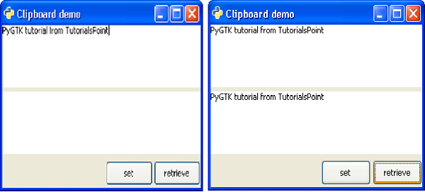
PyGTK - Ruler Class
This is a base class for horizontal (gtk.Hruler) and vertical (gtk.Vruler) rulers that are useful to show mouse pointer's position in window. A small triangle in the ruler indicates the location of pointer.
Ruler objects are created with their respective constructors −
hrule = gtk.Hruler()
vrule = gtk.Vruler()
The following gtk.Ruler class methods are available for both the derived classes −
Ruler.set_metric() − This sets the measurement unit. The predefined metric constants are: gtk.PIXELS (default), gtk.INCHES and gtk.CENTIMETERS
Ruler.set_range() − This sets the lower and upper bounds, position and maximum size of ruler.
In the example given below, the horizontal and vertical rulers are placed above and to the left of a gtk.TextView widget.
The measurement of horizontal ruler is in pixels. Its minimum and maximum values are 0 and 400 respectively. It is placed in the upper row of a gtk.VBox.
hrule = gtk.HRuler()
hrule.set_metric(gtk.PIXELS)
hrule.set_range(0, 4,0,0.5)
vbox.pack_start(hrule)
The lower row of Vbox contains an HBox. A vertical ruler and a TextView widget, in which a multi-line text can be entered, is packed.
vrule=gtk.VRuler()
vrule.set_metric(gtk.PIXELS)
vrule.set_range(0, 4, 10, 0.5)
hbox.pack_start(vrule)
Example
Observe the following code −
import gtk
class PyApp(gtk.Window):

   def __init__(self):
      super(PyApp, self).__init__()

	  self.set_title("Ruler demo")
      self.set_size_request(400,400)
      self.set_position(gtk.WIN_POS_CENTER)

      vbox = gtk.VBox()
      tv = gtk.TextView()
      tv.set_size_request(350,350)

      hrule = gtk.HRuler()
      hrule.set_metric(gtk.PIXELS)
      hrule.set_range(0, 4,0,0.5)

      vbox.pack_start(hrule)
      hbox = gtk.HBox()
      vrule = gtk.VRuler()

      vrule.set_metric(gtk.PIXELS)
      vrule.set_range(0, 4, 10, 0.5)

      hbox.pack_start(vrule)
      halign = gtk.Alignment(0.5, 0.5, 0, 0)
      halign.add(tv)

      hbox.pack_start(halign, False, True, 10)
      vbox.add(hbox)

      self.add(vbox)
      self.connect("destroy", gtk.main_quit)
      self.show_all()

PyApp()
gtk.main()
The output generated by the above program resembles an MS Word document −
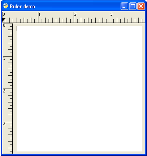
PyGTK - Timeout
The gobject module of the PyGTK API has a useful function to create a timeout function that will be called periodically.
source_id = gobject.timeout_add(interval, function, )
The second argument is the callback function you wish to have called after every millisecond which is the value of the first argument interval. Additional arguments may be passed to the callback as function data.
The return value of this function is source_id. Using it, the callback function is stopped from calling.
gobject.source_remove(source_id)
The callback function must return True in order to keep repeating. Therefore, it can be stopped by returning False.
Two buttons and two labels are put on a toplevel window in the following program. One label displays an incrementing number. The btn1 calls on_click which sets the timeout function with an interval of 1000 ms (1 second).
btn1.connect("clicked", self.on_click)

def on_click(self, widget):
   self.source_id = gobject.timeout_add(1000, counter, self)
The timeout function is named as counter(). It increments the number on a label after every 1 second.
def counter(timer):
   c=timer.count+1
   print c
   timer.count=c
   timer.lbl.set_label(str(c))
   return True
The Callback on the second button removes the timeout function.
btn2.connect("clicked", self.on_stop)
def on_stop(self, widget):
gobject.source_remove(self.source_id)
Example
The following is the complete code for the Timeout example −
import gtk, gobject

def counter(timer):
      c = timer.count+1
      print c
      timer.count = c
      timer.lbl.set_label(str(c))
      return True
      class PyApp(gtk.Window):

   def __init__(self):
      super(PyApp, self).__init__()
      self.set_title("Timeout Demo")
      self.set_size_request(300, 200)
      self.set_position(gtk.WIN_POS_CENTER)

      vbox = gtk.VBox(False, 5)
      hbox = gtk.HBox(True, 3)

      hb = gtk.HBox()
      lbl1 = gtk.Label("Counter: ")

      hb.add(lbl1)
      self.lbl = gtk.Label("")
      hb.add(self.lbl)
      valign = gtk.Alignment(0.5, 0.5, 0, 0)
      valign.add(hb)
      vbox.pack_start(valign, True, True, 10)

      btn1 = gtk.Button("start")
      btn2 = gtk.Button("stop")

      self.count = 0
      self.source_id = 0

      hbox.add(btn1)
      hbox.add(btn2)

      halign = gtk.Alignment(0.5, 0.5, 0, 0)
      halign.add(hbox)

      vbox.pack_start(halign, False, True, 10)
      self.add(vbox)

      btn1.connect("clicked", self.on_click)
      btn2.connect("clicked", self.on_stop)

      self.connect("destroy", gtk.main_quit)
      self.show_all()

   def on_click(self, widget):
      self.source_id = gobject.timeout_add(1000, counter, self)

   def on_stop(self, widget):
      gobject.source_remove(self.source_id)

PyApp()
gtk.main()
When executed, the window shows two buttons at the bottom. The number on the label will increment periodically when the Start button is clicked on and it will stop incrementing when the Stop button is clicked on.
Observe the output −
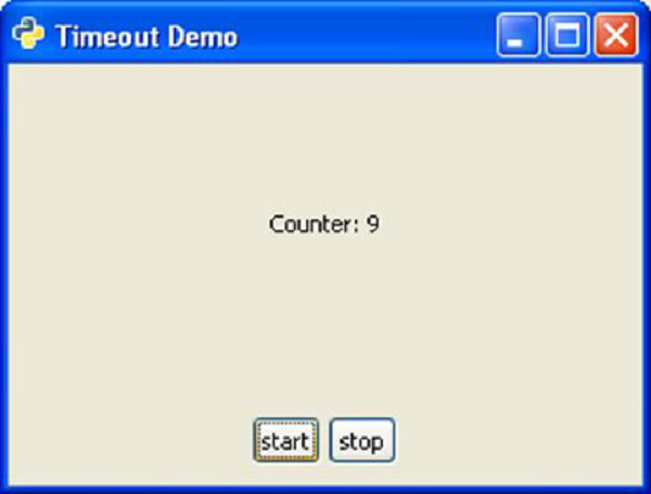
PyGTK - Drag and Drop
Widgets having associated X Window are capable of drag and drop. In the program, a widget as a source and/or destination for drag-and-drop must first be designated. The widget defined as source can send out the dragged data. The destination widget accepts it when dragged data is dropped on it.
The following steps are involved in setting up a drag-and-drop enabled application −
Step 1 − Setting up a source widget.
Step 2 − The drag_source_set() method specifies the target types for a drag operation −
widget.drag_source_set(start_button_mask, targets, info)
Step 3 − The start_button_mask argument specifies a bitmask of buttons that starts the drag operation.
Step 4 − The target argument is a list of tuples of this structure −
(target, flags, info)
The target argument is a string representing drag type, for example, text/plain or image/x-xpixmap.
Step 6 − The following flags are predefined −
- gtk.TARGET_SAME_APP
- gtk.TARGET_SAME_WIDGET
Step 7 − There will be no limitation as the flag is set to 0.
If the widget is not required to act as source, it can be unset −
widget.drag_source_unset()
The source signal emits signals. The following table lists the signals and their callbacks.
| drag_begin | def drag_begin_cb(widget, drag_context, data): |
| drag_data_get | def drag_data_get_cb(widget, drag_context, selection_data, info, time, data): |
| drag_data_delete | def drag_data_delete_cb(widget, drag_context, data): |
| drag_end | def drag_end_cb(widget, drag_context, data): |
Setting up a Destination Widget
The drag_dest_set() method specifies which widget can receive dragged data.
widget.drag_dest_set(flags, targets, action)
The flags parameter can take one of the following constants −
| gtk.DEST_DEFAULT_MOTION | This checks if the drag matches this widget's list of possible targets and actions, then calls the drag_status() as appropriate. |
| gtk.DEST_DEFAULT_HIGHLIGHT | This draws a highlight on this widget as long as a drag is over this widget |
| gtk.DEST_DEFAULT_DROP | When a drop occurs, if the drag matches this widget's list of possible targets and actions call drag_get_data() on behalf of the widget. Whether or not the drop is successful, call drag_finish(). If the action was a move and the drag was successful, then TRUE will be passed for the delete parameter to drag_finish(). |
| gtk.DEST_DEFAULT_ALL | If set, specifies that all default actions should be taken. |
The target is a list of tuples containing target information. The actions argument is a bitmask of or a combination of one or more of the following values −
- gtk.gdk.ACTION_DEFAULT
- gtk.gdk.ACTION_COPY
- gtk.gdk.ACTION_MOVE
- gtk.gdk.ACTION_LINK
- gtk.gdk.ACTION_PRIVATE
- gtk.gdk.ACTION_ASK
The "drag-motion" handler must determine if the drag data is appropriate by matching the destination targets with the gtk.gdk.DragContext targets and optionally by examining the drag data by calling the drag_get_data() method. The gtk.gdk.DragContext. drag_status() method must be called to update the drag_context status.
The "drag-drop" handler must determine the matching target using the drag_dest_find_target() method and then ask for the drag data using the drag_get_data() method. The data will be available in the "drag-data-received" handler.