- Ngx-Bootstrap - Home
- Ngx-Bootstrap - Overview
- Ngx-Bootstrap - Environment Setup
- Ngx-Bootstrap - Accordion
- Ngx-Bootstrap - Alerts
- Ngx-Bootstrap - Buttons
- Ngx-Bootstrap - Carousel
- Ngx-Bootstrap - Collapse
- Ngx-Bootstrap - DatePicker
- Ngx-Bootstrap - Dropdowns
- Ngx-Bootstrap - Modals
- Ngx-Bootstrap - Pagination
- Ngx-Bootstrap - Popover
- Ngx-Bootstrap - Progressbar
- Ngx-Bootstrap - Rating
- Ngx-Bootstrap - Sortable
- Ngx-Bootstrap - Tabs
- Ngx-Bootstrap - Timepicker
- Ngx-Bootstrap - Tooltip
- Ngx-Bootstrap - Typeahead
- Ngx-Bootstrap Useful Resources
- Ngx-Bootstrap - Quick Guide
- Ngx-Bootstrap - Useful Resources
- Ngx-Bootstrap - Discussion
Ngx-Bootstrap - Quick Guide
Ngx-Bootstrap - Overview
The ngx-bootstrap is a very popular library to use bootstrap components in Angular Based projects. It contains almost all core components of Bootstrap. ngx-bootstrap components are by design modular,extensible and adaptable. Following are the key highlighting points of this bootstrap library.
Flexibility
All components are modular by design. Custom templates, Styles can be applied easily.
All components are extensible and adaptable and works on desktop and mobile with same ease and performance.
Support
All components uses latest style guides and guidelines for code maintainability and readablity.
All components are fully unit tested and supports latest angular versions.
Extensive Documentation
All components are richly documented and well written.
All components are have multiple working demos to exihibits multiple types of functionalities.
Open Source
ngx-bootstrap is open source project. It is backed by MIT License.
Ngx-Bootstrap - Environment Setup
In this chapter, you will learn in detail about setting up the working environment of ngx-bootstrap on your local computer. As ngx-bootstrap is primarily for angular projects, make sure you have Node.js and npm and angular installed on your system.
Create an angular project
First create a angular project to test ngx-bootstrap components using following commands.
ng new ngxbootstrap
It will create an angular project named ngxbootstrap.
Add ngx-bootstrap as dependency
You can use the following command to install ngx-bootstrap in newly created project−
npm install ngx-bootstrap
You can observe the following output once ngx-bootstrap is successfully installed −
+ ngx-bootstrap@5.6.1
added 1 package from 1 contributor and audited 1454 packages in 16.743s
Now, to test if bootstrap works fine with Node.js, create the test component using following command −
ng g component test
CREATE src/app/test/test.component.html (19 bytes)
CREATE src/app/test/test.component.spec.ts (614 bytes)
CREATE src/app/test/test.component.ts (267 bytes)
CREATE src/app/test/test.component.css (0 bytes)
UPDATE src/app/app.module.ts (388 bytes)
Clear content of app.component.html and update it following contents.
app.component.html
<app-test></app-test>
Update content of app.module.ts to include ngx-bootstrap accordion module. We'll add other module in subsequent chapters. Update it following contents.
app.module.ts
import { BrowserModule } from '@angular/platform-browser';
import { NgModule } from '@angular/core';
import { BrowserAnimationsModule } from '@angular/platform-browser/animations';
import { AppComponent } from './app.component';
import { TestComponent } from './test/test.component';
import { AccordionModule } from 'ngx-bootstrap/accordion'
@NgModule({
   declarations: [
      AppComponent,
      TestComponent
   ],
   imports: [
      BrowserAnimationsModule,
      BrowserModule,
      AccordionModule.forRoot()
   ],
   providers: [],
   bootstrap: [AppComponent]
})
export class AppModule { }
Update content of index.html to include bootstrap.css. Update it following contents.
index.html
<!doctype html>
<html lang="en">
   <head>
      <meta charset="utf-8">
      <title>Ngxbootstrap</title>
      <base href="/">
      <meta name="viewport" content="width=device-width, initial-scale=1">
      <link rel="icon" type="image/x-icon" href="favicon.ico">
      <link href="https://maxcdn.bootstrapcdn.com/bootstrap/4.0.0/css/bootstrap.min.css" rel="stylesheet">
   </head>
   <body>
      <app-root></app-root>
   </body>
</html>
In next chapter, we'll update test component to use ngx-bootstrap components.
Ngx-Bootstrap - accordion
Accordion is a control to display collapsible panels and it is used to display information in limited space.
AccordionComponent
Displays collapsible content panels for presenting information in a limited amount of space.
selector
accordion
Inputs
closeOthers − boolean, if true expanding one item will close all others
isAnimated − boolean, turn on/off animation, default: false
AccordionPanelComponent
AccordionHeading
Instead of using heading attribute on the accordion-group, you can use an accordion-heading attribute on any element inside of a group that will be used as group's header template.
selector
accordion-group, accordion-panel
Inputs
heading − string, Clickable text in accordion's group header
isDisabled − boolean, enables/disables accordion group
isOpen − boolean, Is accordion group open or closed. This property supports two-way binding
panelClass − string, Provides an ability to use Bootstrap's contextual panel classes (panel-primary, panel-success, panel-info, etc...).
Outputs
isOpenChange − Emits when the opened state changes
AccordionConfig
Configuration service, provides default values for the AccordionComponent.
Properties
closeOthers − boolean, Whether the other panels should be closed when a panel is opened. Default: false
isAnimated − boolean, turn on/off animation
Example
As we're going to use accordion, We've updated app.module.ts to use AccordionModule as in ngx-bootstrap Environment Setup chapter.
Update test.component.html to use the accordion.
test.component.html
<accordion>
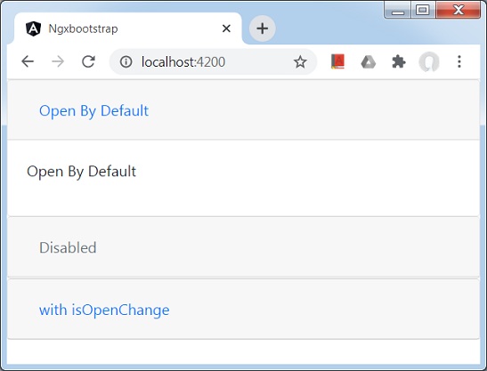
<accordion-group heading="Open By Default" [isOpen]="open">
<p>Open By Default</p>
</accordion-group>
<accordion-group heading="Disabled" [isDisabled]="disabled">
<p>Disabled</p>
</accordion-group>
<accordion-group heading="with isOpenChange" (isOpenChange)="log($event)">
<p>Open Event</p>
</accordion-group>
</accordion>
Update test.component.ts for corresponding variables and methods.
test.component.ts
import { Component, OnInit } from '@angular/core';
@Component({
   selector: 'app-test',
   templateUrl: './test.component.html',
   styleUrls: ['./test.component.css']
})
export class TestComponent implements OnInit {
   open: boolean = true;
   disabled: boolean = true;
   constructor() { }
   ngOnInit(): void {
   }
   log(isOpened: boolean){
      console.log(isOpened);
   }
}
Build and Serve
Run the following command to start the angular server.
ng serve
Once server is up and running. Open http://localhost:4200 and verify the following output.
Ngx-Bootstrap - Alerts
Alerts provides contextual messages for typical user actions like info, error with available and flexible alert messages.
AlertComponent
Displays collapsible content panels for presenting information in a limited amount of space.
selector
alert,bs-alert
Inputs
dismissible − boolean, If set, displays an inline "Close" button, default: false
dismissOnTimeout − string | number, Number in milliseconds, after which alert will be closed
isOpen − boolean, Is alert visible, default: true
type − string, alert type. Provides one of four bootstrap supported contextual classes: success, info, warning and danger, default: warning
Outputs
onClose − This event fires immediately after close instance method is called, $event is an instance of Alert component.
onClosed − This event fires when alert closed, $event is an instance of Alert component
AlertConfig
Properties
dismissible − boolean, is alerts are dismissible by default, default: false
dismissOnTimeout − number, default time before alert will dismiss, default: undefined
type − string, default alert type, default: warning
Example
As we're going to use alerts, We've to update app.module.ts used in ngx-bootstrap Accordion chapter to use AlertModule and AlertConfig.
Update app.module.ts to use the AlertModule and AlertConfig.
app.module.ts
import { BrowserModule } from '@angular/platform-browser';
import { NgModule } from '@angular/core';
import { BrowserAnimationsModule } from '@angular/platform-browser/animations';
import { AppComponent } from './app.component';
import { TestComponent } from './test/test.component';
import { AccordionModule } from 'ngx-bootstrap/accordion';
import { AlertModule, AlertConfig } from 'ngx-bootstrap/alert';
@NgModule({
   declarations: [
      AppComponent,
      TestComponent
   ],
   imports: [
      BrowserAnimationsModule,
      BrowserModule,
      AccordionModule,
      AlertModule
   ],
   providers: [AlertConfig],
   bootstrap: [AppComponent]
})
export class AppModule { }
Update test.component.html to use the alerts.
test.component.html
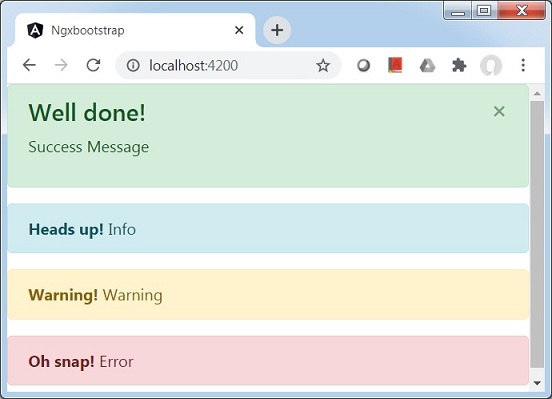
<alert type="success"
   [dismissible]="dismissible"
   [isOpen]="open"
   (onClosed)="log($event)"
   [dismissOnTimeout]="timeout">
   <h4 class="alert-heading">Well done!</h4>
   <p>Success Message</p>
</alert>
<alert type="info">
   <strong>Heads up!</strong> Info
</alert>
<alert type="warning">
   <strong>Warning!</strong> Warning
</alert>
<alert type="danger">
   <strong>Oh snap!</strong> Error
</alert>
Update test.component.ts for corresponding variables and methods.
test.component.ts
import { Component, OnInit } from '@angular/core';
@Component({
   selector: 'app-test',
   templateUrl: './test.component.html',
   styleUrls: ['./test.component.css']
})
export class TestComponent implements OnInit {
   open: boolean = true;
   dismissible: boolean = true;
   timeout: number = 10000;
   constructor() { }

   ngOnInit(): void {
   }
   log(alert){
      console.log('alert message closed');
   }
}
Build and Serve
Run the following command to start the angular server.
ng serve
Once server is up and running. Open http://localhost:4200 and verify the following output.
Ngx-Bootstrap - Buttons
ngx-bootstrap buttons have two specific directives which makes a group of buttons to behave as checkbox or radio buttons or hybrid where a radio button can be unchecked.
ButtonCheckboxDirective
Add checkbox functionality to any element.
selector
[btnCheckbox]
Inputs
btnCheckboxFalse − boolean, Falsy value, will be set to ngModel, default: false
btnCheckboxTrue − boolean, Truthy value, will be set to ngModel, default: true
ButtonRadioDirective
Create radio buttons or groups of buttons. A value of a selected button is bound to a variable specified via ngModel.
selector
[btnRadio]
Inputs
btnRadio − string, Radio button value, will be set to ngModel
disabled − boolean, If true - radio button is disabled
uncheckable − boolean, If true - radio button can be unchecked
value − string, Current value of radio component or group
ButtonRadioGroupDirective
A group of radio buttons. A value of a selected button is bound to a variable specified via ngModel.
selector
[btnRadioGroup]
Example
As we're going to use buttons, We've to update app.module.ts used in ngx-bootstrap Alerts chapter to use ButtonsModule. We're also adding support for input controls using FormModule.
Update app.module.ts to use the AlertModule and AlertConfig.
app.module.ts
import { BrowserModule } from '@angular/platform-browser';
import { NgModule } from '@angular/core';
import { BrowserAnimationsModule } from '@angular/platform-browser/animations';
import { AppComponent } from './app.component';
import { TestComponent } from './test/test.component';
import { AccordionModule } from 'ngx-bootstrap/accordion';
import { AlertModule,AlertConfig } from 'ngx-bootstrap/alert';
import { ButtonsModule } from 'ngx-bootstrap/buttons';
import { FormsModule } from '@angular/forms';
@NgModule({
   declarations: [
      AppComponent,
      TestComponent
   ],
   imports: [
      BrowserAnimationsModule,
      BrowserModule,
      AccordionModule,
      AlertModule,
      ButtonsModule,
      FormsModule
   ],
   providers: [AlertConfig],
   bootstrap: [AppComponent]
})
export class AppModule { }
Update test.component.html to use the buttons.
test.component.html
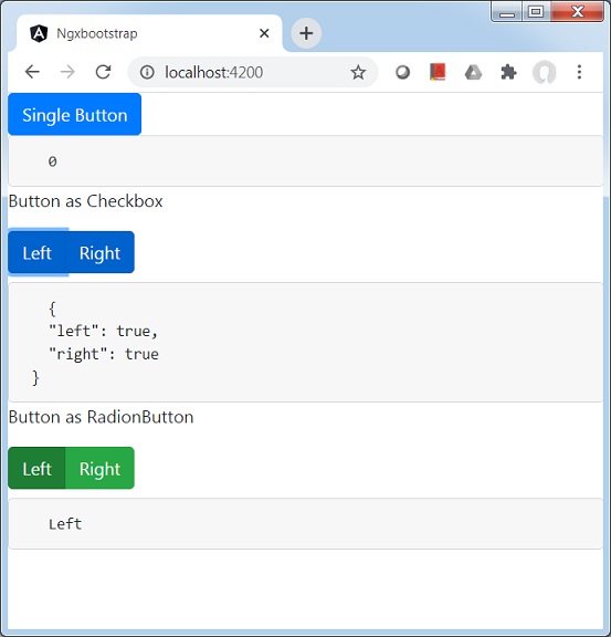
<button type="button" class="btn btn-primary" (click)="clicked()">
   Single Button
</button>
<pre class="card card-block card-header">
   {{clickCounter}}
</pre>
<p>Button as Checkbox</p>
<div class="btn-group">
   <label class="btn btn-primary" [(ngModel)]="checkModel.left"
      btnCheckbox tabindex="0" role="button">Left</label>
   <label class="btn btn-primary" [(ngModel)]="checkModel.right"
      btnCheckbox tabindex="0" role="button">Right</label>
</div>
<pre class="card card-block card-header">
   {{checkModel | json}}
</pre>
<p>Button as RadionButton</p>
<div class="form-inline">
   <div class="btn-group" btnRadioGroup [(ngModel)]="radioModel">
      <label class="btn btn-success" btnRadio="Left">Left</label>
      <label class="btn btn-success" btnRadio="Right">Right</label>
   </div>
</div>
<pre class="card card-block card-header">
   {{radioModel}}
</pre>
Update test.component.ts for corresponding variables and methods.
test.component.ts
import { Component, OnInit } from '@angular/core';
@Component({
   selector: 'app-test',
   templateUrl: './test.component.html',
   styleUrls: ['./test.component.css']
})
export class TestComponent implements OnInit {
   checkModel = { left: false, right: false };
   radioModel = 'Left';
   clickCounter = 0;
   constructor() { }

   ngOnInit(): void {
   }
   clicked(): void {
      this.clickCounter++;
   }
}
Build and Serve
Run the following command to start the angular server.
ng serve
Once server is up and running. Open http://localhost:4200 and verify the following output.
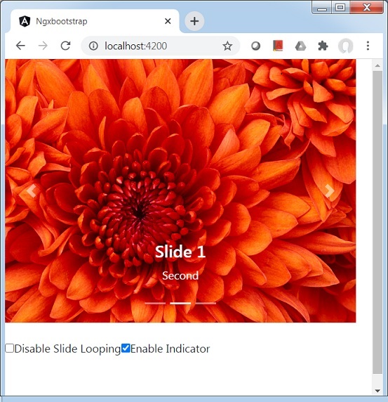
Ngx-Bootstrap - Carousel
ngx-bootstrap Carousel is used to create slide show of images or text
CarouselComponent
Base element to create carousel.
selector
carousel
Inputs
activeSlide − number, Index of currently displayed slide(started for 0)
indicatorsByChunk − boolean, default: false
interval − number, Delay of item cycling in milliseconds. If false, carousel won't cycle automatically.
isAnimated − boolean, Turn on/off animation. Animation doesn't work for multilist carousel, default: false
itemsPerSlide − number, default: 1
noPause − boolean
noWrap − boolean
pauseOnFocus − boolean
showIndicators − boolean
singleSlideOffset − boolean
startFromIndex − number, default: 0
Outputs
activeSlideChange − Will be emitted when active slide has been changed. Part of two-way-bindable [(activeSlide)] property
slideRangeChange − Will be emitted when active slides has been changed in multilist mode
SlideComponent
selector
slide
Inputs
active − boolean, Is current slide active
Example
As we're going to use carousel, We've to update app.module.ts used in ngx-bootstrap Buttons chapter to use CarouselModule.
Update app.module.ts to use the CarouselModule.
app.module.ts
import { BrowserModule } from '@angular/platform-browser';
import { NgModule } from '@angular/core';
import { BrowserAnimationsModule } from '@angular/platform-browser/animations';
import { AppComponent } from './app.component';
import { TestComponent } from './test/test.component';
import { AccordionModule } from 'ngx-bootstrap/accordion';
import { AlertModule,AlertConfig } from 'ngx-bootstrap/alert';
import { ButtonsModule } from 'ngx-bootstrap/buttons';
import { FormsModule } from '@angular/forms';
import { CarouselModule } from 'ngx-bootstrap/carousel';

@NgModule({
   declarations: [
      AppComponent,
      TestComponent
   ],
   imports: [
      BrowserAnimationsModule,
      BrowserModule,
      AccordionModule,
      AlertModule,
      ButtonsModule,
      FormsModule,
      CarouselModule
   ],
   providers: [AlertConfig],
   bootstrap: [AppComponent]
})
export class AppModule { }
Update test.component.html to use the Carousel.
test.component.html
<div style="width: 500px; height: 500px;">
   <carousel [noWrap]="noWrapSlides" [showIndicators]="showIndicator">
      <slide *ngFor="let slide of slides; let index=index">
         <img [src]="slide.image" alt="image slide" style="display: block; width: 100%;">
         <div class="carousel-caption">
			<h4>Slide {{index}}</h4>
            <p>{{slide.text}}</p>
         </div>
      </slide>
   </carousel>
   <br/>
   <div>
      <div class="checkbox">
         <label><input type="checkbox" [(ngModel)]="noWrapSlides">Disable Slide Looping</label>
         <label><input type="checkbox" [(ngModel)]="showIndicator">Enable Indicator</label>
      </div>
   </div>
</div>
Update test.component.ts for corresponding variables and methods.
test.component.ts
import { Component, OnInit } from '@angular/core';
import { CarouselConfig } from 'ngx-bootstrap/carousel';

@Component({
   selector: 'app-test',
   templateUrl: './test.component.html',
   providers: [
      { provide: CarouselConfig, useValue: { interval: 1500, noPause: false, showIndicators: true } }
   ],
   styleUrls: ['./test.component.css']
})
export class TestComponent implements OnInit {
   slides = [
      {image: 'assets/images/nature/1.jpg', text: 'First'},
      {image: 'assets/images/nature/2.jpg',text: 'Second'},
      {image: 'assets/images/nature/3.jpg',text: 'Third'}
   ];
   noWrapSlides = false;
   showIndicator = true;
   constructor() { }

   ngOnInit(): void {
   }
}
Build and Serve
Run the following command to start the angular server.
ng serve
Once server is up and running. Open http://localhost:4200 and verify the following output.
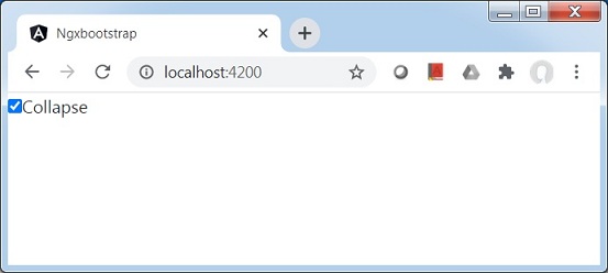
Ngx-Bootstrap - Collapse
ngx-bootstrap Collapse directive helps to show/hide a container content.
CollapseDirective
selector
[collapse]
Inputs
collapse − boolean, A flag indicating visibility of content (shown or hidden)
display − string
isAnimated − boolean, turn on/off animation. default: false
Outputs
collapsed − This event fires as soon as content collapses
collapses − This event fires when collapsing is started
expanded − This event fires as soon as content becomes visible
expands − This event fires when expansion is started
Methods
toggle() − allows to manually toggle content visibility
hide − allows to manually hide content
show − allows to manually show collapsed content
Example
As we're going to use collapse, We've to update app.module.ts used in ngx-bootstrap Carousel chapter to use CollapseModule.
Update app.module.ts to use the CollapseModule.
app.module.ts
import { BrowserModule } from '@angular/platform-browser';
import { NgModule } from '@angular/core';
import { BrowserAnimationsModule } from '@angular/platform-browser/animations';
import { AppComponent } from './app.component';
import { TestComponent } from './test/test.component';
import { AccordionModule } from 'ngx-bootstrap/accordion';
import { AlertModule,AlertConfig } from 'ngx-bootstrap/alert';
import { ButtonsModule } from 'ngx-bootstrap/buttons';
import { FormsModule } from '@angular/forms';
import { CarouselModule } from 'ngx-bootstrap/carousel';
import { CollapseModule } from 'ngx-bootstrap/collapse';

@NgModule({
   declarations: [
      AppComponent,
      TestComponent
   ],
   imports: [
      BrowserAnimationsModule,
      BrowserModule,
      AccordionModule,
      AlertModule,
      ButtonsModule,
      FormsModule,
      CarouselModule,
      CollapseModule
   ],
   providers: [AlertConfig],
   bootstrap: [AppComponent]
})
export class AppModule { }
Update test.component.html to use the Collapse.
test.component.html
<div>
   <div class="checkbox">
      <label><input type="checkbox" [(ngModel)]="isCollapsed">Collapse</label>
   </div>
</div>
<div [collapse]="isCollapsed" [isAnimated]="true">
   <div class="well well-lg card card-block card-header">Welcome to Tutorialspoint.</div>
</div>
Update test.component.ts for corresponding variables and methods.
test.component.ts
import { Component, OnInit } from '@angular/core';

@Component({
   selector: 'app-test',
   templateUrl: './test.component.html',
   styleUrls: ['./test.component.css']
})
export class TestComponent implements OnInit {
   isCollapsed: boolean = false;
   constructor() { }

   ngOnInit(): void {
   }
}
Build and Serve
Run the following command to start the angular server.
ng serve
Once server is up and running. Open http://localhost:4200 and verify the following output.
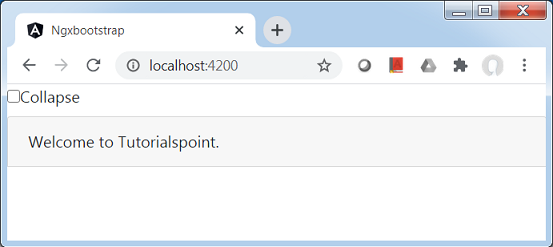
Check the collapse check box and then content will be collapsed.
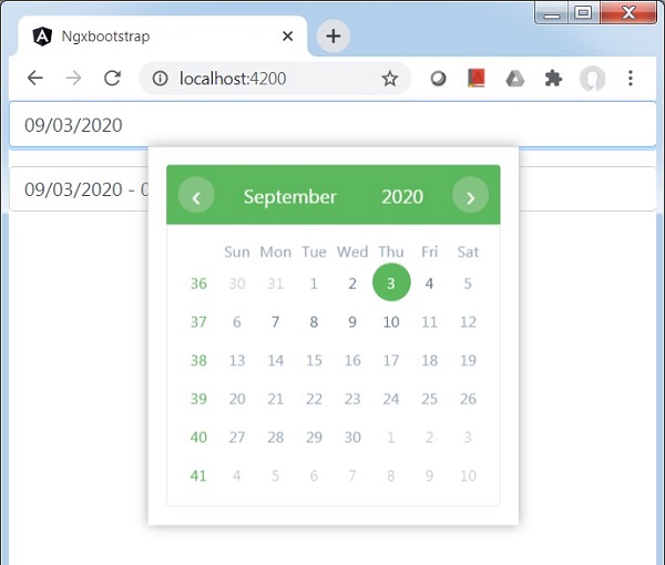
Ngx-Bootstrap - DatePicker
ngx-bootstrap DatePicker component is highly configurable and customizable as per our need. It provides various options to select date or date range.
BsDatepickerDirective
selector
[bsDatepicker]
Inputs
bsConfig − Partial<BsDatepickerConfig>, Config object for datepicker
bsValue − Date, Initial value of datepicker
container − string, A selector specifying the element the datepicker should be appended to. default: body
dateCustomClasses − DatepickerDateCustomClasses[], Date custom classes
datesDisabled − Date[], Disable specific dates
datesEnabled − Date[], Enable specific dates
dateTooltipTexts − DatepickerDateTooltipText[], Date tooltip text
daysDisabled − number[], Disable Certain days in the week
isDisabled − boolean, Indicates whether datepicker's content is enabled or not
isOpen − boolean, Returns whether or not the datepicker is currently being shown
maxDate − boolean, Maximum date which is available for selection
minDate − boolean, Minimum date which is available for selection
minMode − BsDatepickerViewMode, Minimum view mode : day, month, or year
outsideClick − boolean, Close datepicker on outside click, default: true
outsideEsc − boolean, Close datepicker on escape click, default: true
placement − "top" | "bottom" | "left" | "right", Placement of a datepicker. Accepts: "top", "bottom", "left", "right", default: bottom
triggers − string, Specifies events that should trigger. Supports a space separated list of event names., default: click
Outputs
bsValueChange − Emits when datepicker value has been changed
onHidden − Emits an event when the datepicker is hidden
onShown − Emits an event when the datepicker is shown
Methods
show() − Opens an element's datepicker. This is considered a 'manual' triggering of the datepicker.
hide() − Closes an element's datepicker. This is considered a 'manual' triggering of the datepicker.
toggle() − Toggles an element's datepicker. This is considered a 'manual' triggering of the datepicker.
setConfig() − Set config for datepicker
BsDaterangepickerDirective
selector
[bsDaterangepicker]
Inputs
bsConfig − Partial<BsDaterangepickerConfig>, Config object for daterangepicker
bsValue − Date, Initial value of daterangepicker
container − string, A selector specifying the element the daterangepicker should be appended to. default: body
dateCustomClasses − DatepickerDateCustomClasses[], Date custom classes
datesDisabled − Date[], Disable specific dates
datesEnabled − Date[], Enable specific dates
dateTooltipTexts − DatepickerDateTooltipText[], Date tooltip text
daysDisabled − number[], Disable Certain days in the week
isDisabled − boolean, Indicates whether daterangepicker's content is enabled or not
isOpen − boolean, Returns whether or not the daterangepicker is currently being shown
maxDate − boolean, Maximum date which is available for selection
minDate − boolean, Minimum date which is available for selection
minMode − BsDatepickerViewMode, Minimum view mode : day, month, or year
outsideClick − boolean, Close daterangepicker on outside click, default: true
outsideEsc − boolean, Close daterangepicker on escape click, default: true
placement − "top" | "bottom" | "left" | "right", Placement of a daterangepicker. Accepts: "top", "bottom", "left", "right", default: bottom
triggers − string, Specifies events that should trigger. Supports a space separated list of event names., default: click
Outputs
bsValueChange − Emits when daterangepicker value has been changed
onHidden − Emits an event when the daterangepicker is hidden
onShown − Emits an event when the daterangepicker is shown
Methods
show() − Opens an element's datepicker. This is considered a 'manual' triggering of the datepicker.
hide() − Closes an element's datepicker. This is considered a 'manual' triggering of the datepicker.
toggle() − Toggles an element's datepicker. This is considered a 'manual' triggering of the datepicker.
setConfig() − Set config for datepicker
Example
As we're going to use DatePicker and DateRangePicker, We've to update app.module.ts used in ngx-bootstrap Collapse chapter to use BsDatepickerModule and BsDatepickerConfig.
Update app.module.ts to use the BsDatepickerModule and BsDatepickerConfig.
app.module.ts
import { BrowserModule } from '@angular/platform-browser';
import { NgModule } from '@angular/core';
import { BrowserAnimationsModule } from '@angular/platform-browser/animations';
import { AppComponent } from './app.component';
import { TestComponent } from './test/test.component';
import { AccordionModule } from 'ngx-bootstrap/accordion';
import { AlertModule,AlertConfig } from 'ngx-bootstrap/alert';
import { ButtonsModule } from 'ngx-bootstrap/buttons';
import { FormsModule } from '@angular/forms';
import { CarouselModule } from 'ngx-bootstrap/carousel';
import { CollapseModule } from 'ngx-bootstrap/collapse';
import { BsDatepickerModule, BsDatepickerConfig } from 'ngx-bootstrap/datepicker';

@NgModule({
   declarations: [
      AppComponent,
      TestComponent
   ],
   imports: [
      BrowserAnimationsModule,
      BrowserModule,
      AccordionModule,
      AlertModule,
      ButtonsModule,
      FormsModule,
      CarouselModule,
      CollapseModule,
      BsDatepickerModule.forRoot()
   ],
   providers: [AlertConfig, BsDatepickerConfig],
   bootstrap: [AppComponent]
})
export class AppModule { }
Update index.html to use the bs-datepicker.css.
app.module.ts
<!doctype html>
<html lang="en">
   <head>
      <meta charset="utf-8">
      <title>Ngxbootstrap</title>
      <base href="/">
      <meta name="viewport" content="width=device-width, initial-scale=1">
      <link rel="icon" type="image/x-icon" href="favicon.ico">
      <link href="https://maxcdn.bootstrapcdn.com/bootstrap/4.0.0/css/bootstrap.min.css" rel="stylesheet">
      <link href="https://unpkg.com/ngx-bootstrap/datepicker/bs-datepicker.css" rel="stylesheet" >
   </head>
   <body>
      <app-root></app-root>
   </body>
</html>
Update test.component.html to use the datepickers.
test.component.html
<div class="row">
   <div class="col-xs-12 col-12 col-md-4 form-group">
      <input type="text"
         placeholder="Datepicker"
         class="form-control"
         bsDatepicker
         [bsValue]="bsValue"
         [minDate]="minDate"
         [maxDate]="maxDate"
         [daysDisabled]="[6,0]"
         [datesDisabled]="disabledDates"
         [bsConfig]="{ isAnimated: true, dateInputFormat: 'YYYY-MM-DD' }">
   </div>
   <div class="col-xs-12 col-12 col-md-4 form-group">
      <input type="text"
         placeholder="Daterangepicker"
         class="form-control"
         bsDaterangepicker
         [(ngModel)]="bsRangeValue"
         [datesEnabled]="enabledDates"
         [bsConfig]="{ isAnimated: true }">
   </div>
</div>
Update test.component.ts for corresponding variables and methods.
test.component.ts
import { Component, OnInit } from '@angular/core';

@Component({
   selector: 'app-test',
   templateUrl: './test.component.html',
   styleUrls: ['./test.component.css']
})
export class TestComponent implements OnInit {

   bsValue = new Date();
   bsRangeValue: Date[];
   maxDate = new Date();
   minDate = new Date();

   constructor() {
      this.minDate.setDate(this.minDate.getDate() - 1);
      this.maxDate.setDate(this.maxDate.getDate() + 7);
      this.bsRangeValue = [this.bsValue, this.maxDate];
   }

   ngOnInit(): void {
   }
}
Build and Serve
Run the following command to start the angular server.
ng serve
Once server is up and running. Open http://localhost:4200 and verify the following output.
Ngx-Bootstrap - Dropdowns
ngx-bootstrap dropdown component is toggleable and provides contextual overlay to display list of links etc. With dropdown directives we can make dropdowns interactive.
BsDropdownDirective
selector
[bsDropdown],[dropdown]
Inputs
autoClose − boolean, Indicates that dropdown will be closed on item or document click, and after pressing ESC
container − string, A selector specifying the element the popover should be appended to.
dropup − boolean, This attribute indicates that the dropdown should be opened upwards.
insideClick − boolean, This attribute indicates that the dropdown shouldn't close on inside click when autoClose is set to true.
isAnimated − boolean, Indicates that dropdown will be animated
isDisabled − boolean, Disables dropdown toggle and hides dropdown menu if opened
isOpen − boolean, Returns whether or not the popover is currently being shown
placement − string, Placement of a popover. Accepts: "top", "bottom", "left", "right"
triggers − string, Specifies events that should trigger. Supports a space separated list of event names.
Outputs
isOpenChange − Emits an event when isOpen change
onHidden − Emits an event when the popover is hidden
onShown − Emits an event when the popover is shown
Methods
show() − Opens an element's popover. This is considered a 'manual' triggering of the popover.
hide() − Closes an element's popover. This is considered a 'manual' triggering of the popover.
toggle() − Toggles an element's popover. This is considered a 'manual' triggering of the popover.
setConfig() − Set config for popover
Example
As we're going to use dropdowns, We've to update app.module.ts used in ngx-bootstrap DatePicker chapter to use BsDropdownModule and BsDropdownConfig.
Update app.module.ts to use the BsDropdownModule and BsDropdownConfig.
app.module.ts
import { BrowserModule } from '@angular/platform-browser';
import { NgModule } from '@angular/core';
import { BrowserAnimationsModule } from '@angular/platform-browser/animations';
import { AppComponent } from './app.component';
import { TestComponent } from './test/test.component';
import { AccordionModule } from 'ngx-bootstrap/accordion';
import { AlertModule,AlertConfig } from 'ngx-bootstrap/alert';
import { ButtonsModule } from 'ngx-bootstrap/buttons';
import { FormsModule } from '@angular/forms';
import { CarouselModule } from 'ngx-bootstrap/carousel';
import { CollapseModule } from 'ngx-bootstrap/collapse';
import { BsDatepickerModule, BsDatepickerConfig } from 'ngx-bootstrap/datepicker';
import { BsDropdownModule,BsDropdownConfig } from 'ngx-bootstrap/dropdown';

@NgModule({
   declarations: [
      AppComponent,
      TestComponent
   ],
   imports: [
      BrowserAnimationsModule,
      BrowserModule,
      AccordionModule,
      AlertModule,
      ButtonsModule,
      FormsModule,
      CarouselModule,
      CollapseModule,
      BsDatepickerModule.forRoot(),
      BsDropdownModule
   ],
   providers: [AlertConfig, BsDatepickerConfig, BsDropdownConfig],
   bootstrap: [AppComponent]
})
export class AppModule { }
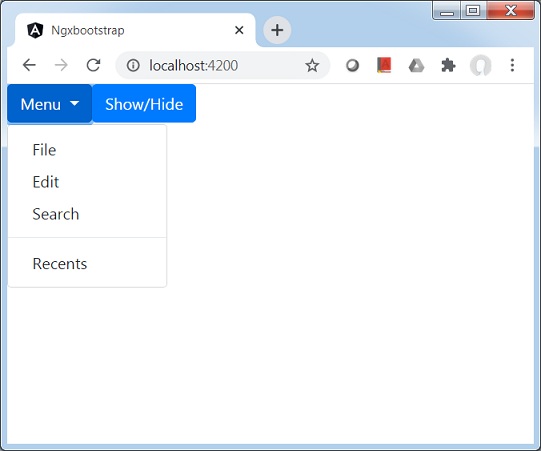
Update test.component.html to use the dropdowns.
test.component.html
<div class="btn-group" dropdown #dropdown="bs-dropdown" [autoClose]="false">
   <button id="button-basic" dropdownToggle type="button"
      class="btn btn-primary dropdown-toggle"
      aria-controls="dropdown-basic">
      Menu <span class="caret"></span>
   </button>
   <ul id="dropdown-basic" *dropdownMenu class="dropdown-menu"
      role="menu" aria-labelledby="button-basic">
      <li role="menuitem"><a class="dropdown-item" href="#">File</a></li>
      <li role="menuitem"><a class="dropdown-item" href="#">Edit</a></li>
      <li role="menuitem"><a class="dropdown-item" href="#">Search</a></li>
      <li class="divider dropdown-divider"></li>
      <li role="menuitem"><a class="dropdown-item" href="#">Recents</a>
      </li>
   </ul>
</div>
<button type="button" class="btn btn-primary"
   (click)="dropdown.isOpen = !dropdown.isOpen">Show/Hide
</button>
Update test.component.ts for corresponding variables and methods.
test.component.ts
import { Component, OnInit } from '@angular/core';

@Component({
   selector: 'app-test',
   templateUrl: './test.component.html',
   styleUrls: ['./test.component.css']
})
export class TestComponent implements OnInit {
   constructor() {}

   ngOnInit(): void {}
}
Build and Serve
Run the following command to start the angular server.
ng serve
Once server is up and running. Open http://localhost:4200 and verify the following output.
Ngx-Bootstrap - Modals
ngx-bootstrap modal component is a flexible and highly configurable dialog prompt and provides multiple defaults and can be used with minimum code.
ModalDirective
selector
[bsModal]
Inputs
config − ModalOptions, allows to set modal configuration via element property
Outputs
onHidden − This event is fired when the modal has finished being hidden from the user (will wait for CSS transitions to complete).
onHide − This event is fired immediately when the hide instance method has been called.
onShow − This event fires immediately when the show instance method is called.
onShown − This event is fired when the modal has been made visible to the user (will wait for CSS transitions to complete).
Methods
show() − Allows to manually open modal.
hide() − Allows to manually close modal.
toggle() − Allows to manually toggle modal visibility.
showElement() − Show dialog.
focusOtherModal() − Events tricks.
Example
As we're going to use a modal, We've to update app.module.ts used in ngx-bootstrap Dropdowns chapter to use ModalModule and BsModalService.
Update app.module.ts to use the ModalModule and BsModalService.
app.module.ts
import { BrowserModule } from '@angular/platform-browser';
import { NgModule } from '@angular/core';
import { BrowserAnimationsModule } from '@angular/platform-browser/animations';
import { AppComponent } from './app.component';
import { TestComponent } from './test/test.component';
import { AccordionModule } from 'ngx-bootstrap/accordion';
import { AlertModule,AlertConfig } from 'ngx-bootstrap/alert';
import { ButtonsModule } from 'ngx-bootstrap/buttons';
import { FormsModule } from '@angular/forms';
import { CarouselModule } from 'ngx-bootstrap/carousel';
import { CollapseModule } from 'ngx-bootstrap/collapse';
import { BsDatepickerModule, BsDatepickerConfig } from 'ngx-bootstrap/datepicker';
import { BsDropdownModule,BsDropdownConfig } from 'ngx-bootstrap/dropdown';
import { ModalModule, BsModalService } from 'ngx-bootstrap/modal';

@NgModule({
   declarations: [
      AppComponent,
      TestComponent
   ],
   imports: [
      BrowserAnimationsModule,
      BrowserModule,
      AccordionModule,
      AlertModule,
      ButtonsModule,
      FormsModule,
      CarouselModule,
      CollapseModule,
      BsDatepickerModule.forRoot(),
      BsDropdownModule,
      ModalModule
   ],
   providers: [AlertConfig, BsDatepickerConfig, BsDropdownConfig,BsModalService],
   bootstrap: [AppComponent]
})
export class AppModule { }
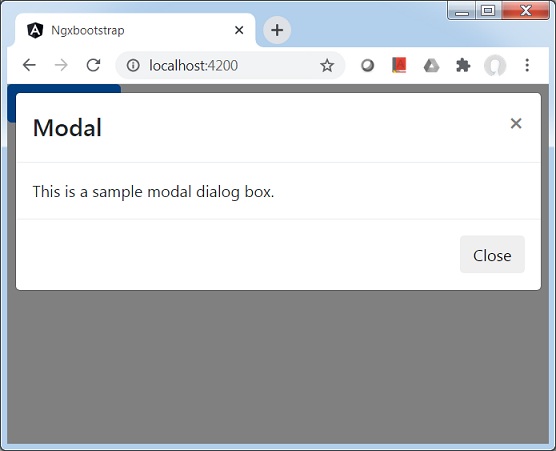
Update test.component.html to use the modal.
test.component.html
<button type="button" class="btn btn-primary" (click)="openModal(template)">Open modal</button>

<ng-template #template>
   <div class="modal-header">
      <h4 class="modal-title pull-left">Modal</h4>
      <button type="button" class="close pull-right" aria-label="Close" (click)="modalRef.hide()">
         <span aria-hidden="true">×</span>
      </button>
   </div>
   <div class="modal-body">
      This is a sample modal dialog box.
   </div>
   <div class="modal-footer">
      <button type="button" class="btn btn-default" (click)="modalRef.hide()">Close</button>
   </div>
</ng-template>
Update test.component.ts for corresponding variables and methods.
test.component.ts
import { Component, OnInit, TemplateRef } from '@angular/core';
import { BsModalRef, BsModalService } from 'ngx-bootstrap/modal';

@Component({
   selector: 'app-test',
   templateUrl: './test.component.html',
   styleUrls: ['./test.component.css']
})
export class TestComponent implements OnInit {

   modalRef: BsModalRef;
   constructor(private modalService: BsModalService) {}

   openModal(template: TemplateRef<any>) {
      this.modalRef = this.modalService.show(template);
   }

   ngOnInit(): void {
   }
}
Build and Serve
Run the following command to start the angular server.
ng serve
Once server is up and running. Open http://localhost:4200. Click on Open modal button and verify the following output.
Ngx-Bootstrap - Pagination
ngx-bootstrap pagination component provides pagination links or a pager component to your site or component.
PaginationComponent
selector
pagination
Inputs
align − boolean, if true aligns each link to the sides of pager
boundaryLinks − boolean, if false first and last buttons will be hidden
customFirstTemplate − TemplateRef<PaginationLinkContext>, custom template for first link
customLastTemplate − TemplateRef<PaginationLinkContext>, custom template for last link
customNextTemplate − TemplateRef<PaginationLinkContext>, custom template for next link
customPageTemplate − TemplateRef<PaginationLinkContext>, custom template for page link
customPreviousTemplate − TemplateRef<PaginationLinkContext>, custom template for previous link
directionLinks − boolean, if false previous and next buttons will be hidden
disabled − boolean, if true pagination component will be disabled
firstText − boolean, first button text
itemsPerPage − number, maximum number of items per page. If value less than 1 will display all items on one page
lastText − string, last button text
maxSize − number, limit number for page links in pager
nextText − string, next button text
pageBtnClass − string, add class to <li>
previousText − string, previous button text
rotate − boolean, if true current page will in the middle of pages list
totalItems − number, total number of items in all pages
Outputs
numPages − fired when total pages count changes, $event:number equals to total pages count.
pageChanged − fired when page was changed, $event:{page, itemsPerPage} equals to object with current page index and number of items per page.
Example
As we're going to use a pagination, We've to update app.module.ts used in ngx-bootstrap Modals chapter to use PaginationModule and PaginationConfig.
Update app.module.ts to use the PaginationModule and PaginationConfig.
app.module.ts
import { BrowserModule } from '@angular/platform-browser';
import { NgModule } from '@angular/core';
import { BrowserAnimationsModule } from '@angular/platform-browser/animations';
import { AppComponent } from './app.component';
import { TestComponent } from './test/test.component';
import { AccordionModule } from 'ngx-bootstrap/accordion';
import { AlertModule,AlertConfig } from 'ngx-bootstrap/alert';
import { ButtonsModule } from 'ngx-bootstrap/buttons';
import { FormsModule } from '@angular/forms';
import { CarouselModule } from 'ngx-bootstrap/carousel';
import { CollapseModule } from 'ngx-bootstrap/collapse';
import { BsDatepickerModule, BsDatepickerConfig } from 'ngx-bootstrap/datepicker';
import { BsDropdownModule,BsDropdownConfig } from 'ngx-bootstrap/dropdown';
import { PaginationModule,PaginationConfig } from 'ngx-bootstrap/pagination';

@NgModule({
   declarations: [
      AppComponent,
      TestComponent
   ],
   imports: [
      BrowserAnimationsModule,
      BrowserModule,
      AccordionModule,
      AlertModule,
      ButtonsModule,
      FormsModule,
      CarouselModule,
      CollapseModule,
      BsDatepickerModule.forRoot(),
      BsDropdownModule,
      ModalModule,
      PaginationModule
   ],
   providers: [AlertConfig,
      BsDatepickerConfig,
      BsDropdownConfig,
      BsModalService,
      PaginationConfig],
   bootstrap: [AppComponent]
})
export class AppModule { }
Update test.component.html to use the modal.
test.component.html
<div class="row">
   <div class="col-xs-12 col-12">
      <div class="content-wrapper">
         <p class="content-item" *ngFor="let content of returnedArray">{{content}}</p>
      </div>
      <pagination [boundaryLinks]="showBoundaryLinks"
         [directionLinks]="showDirectionLinks"
         [totalItems]="contentArray.length"
         [itemsPerPage]="5"
         (pageChanged)="pageChanged($event)"></pagination>
   </div>
</div>
<div>
   <div class="checkbox">
      <label><input type="checkbox" [(ngModel)]="showBoundaryLinks">Show Boundary Links</label>
      <br/>
      <label><input type="checkbox" [(ngModel)]="showDirectionLinks">Show Direction Links</label>
   </div>
</div>
Update test.component.ts for corresponding variables and methods.
test.component.ts
import { Component, OnInit } from '@angular/core';
import { BsModalService } from 'ngx-bootstrap/modal';
import { PageChangedEvent } from 'ngx-bootstrap/pagination';

@Component({
   selector: 'app-test',
   templateUrl: './test.component.html',
   styleUrls: ['./test.component.css']
})
export class TestComponent implements OnInit {
   contentArray: string[] = new Array(50).fill('');
   returnedArray: string[];
   showBoundaryLinks: boolean = true;
   showDirectionLinks: boolean = true;
   constructor() {}

   pageChanged(event: PageChangedEvent): void {
      const startItem = (event.page - 1) * event.itemsPerPage;
      const endItem = event.page * event.itemsPerPage;
      this.returnedArray = this.contentArray.slice(startItem, endItem);
   }
   ngOnInit(): void {
      this.contentArray = this.contentArray.map((v: string, i: number) => {
         return 'Line '+ (i + 1);
      });
      this.returnedArray = this.contentArray.slice(0, 5);
   }
}
Build and Serve
Run the following command to start the angular server.
ng serve
Once server is up and running. Open http://localhost:4200. Click on Open modal button and verify the following output.
Ngx-Bootstrap - Popover
ngx-bootstrap popover component provides a small overlay component to provide small information about a component.
PopoverDirective
selector
popover
Inputs
adaptivePosition − boolean, sets disable adaptive position.
container − string, A selector specifying the element the popover should be appended to.
containerClass − string, Css class for popover container
delay − number, Delay before showing the tooltip
isOpen − boolean, Returns whether or not the popover is currently being shown
outsideClick − boolean, Close popover on outside click, default: false
placement − "top" | "bottom" | "left" | "right" | "auto" | "top left" | "top right" | "right top" | "right bottom" | "bottom right" | "bottom left" | "left bottom" | "left top", Placement of a popover. Accepts: "top", "bottom", "left", "right".
popover − string | TemplateRef<any>, Content to be displayed as popover.
popoverContext − any, Context to be used if popover is a template.
popoverTitle − string, Title of a popover.
triggers − string, Specifies events that should trigger. Supports a space separated list of event names.
Outputs
onHidden − Emits an event when the popover is hidden.
onShown − Emits an event when the popover is shown.
Methods
setAriaDescribedBy() − Set attribute aria-describedBy for element directive and set id for the popover.
show() − Opens an element's popover. This is considered a "manual" triggering of the popover.
hide() − Closes an element's popover. This is considered a "manual" triggering of the popover.
toggle() − Toggles an element's popover. This is considered a "manual" triggering of the popover.
Example
As we're going to use a popover, We've to update app.module.ts used in ngx-bootstrap Pagination chapter to use PopoverModule and PopoverConfig.
Update app.module.ts to use the PopoverModule and PopoverConfig.
app.module.ts
import { BrowserModule } from '@angular/platform-browser';
import { NgModule } from '@angular/core';
import { BrowserAnimationsModule } from '@angular/platform-browser/animations';
import { AppComponent } from './app.component';
import { TestComponent } from './test/test.component';
import { AccordionModule } from 'ngx-bootstrap/accordion';
import { AlertModule,AlertConfig } from 'ngx-bootstrap/alert';
import { ButtonsModule } from 'ngx-bootstrap/buttons';
import { FormsModule } from '@angular/forms';
import { CarouselModule } from 'ngx-bootstrap/carousel';
import { CollapseModule } from 'ngx-bootstrap/collapse';
import { BsDatepickerModule, BsDatepickerConfig } from 'ngx-bootstrap/datepicker';
import { BsDropdownModule,BsDropdownConfig } from 'ngx-bootstrap/dropdown';
import { PaginationModule,PaginationConfig } from 'ngx-bootstrap/pagination';
import { PopoverModule, PopoverConfig } from 'ngx-bootstrap/popover';

@NgModule({
   declarations: [
      AppComponent,
      TestComponent
   ],
   imports: [
      BrowserAnimationsModule,
      BrowserModule,
      AccordionModule,
      AlertModule,
      ButtonsModule,
      FormsModule,
      CarouselModule,
      CollapseModule,
      BsDatepickerModule.forRoot(),
      BsDropdownModule,
      ModalModule,
      PaginationModule,
      PopoverModule
   ],
   providers: [AlertConfig,
      BsDatepickerConfig,
      BsDropdownConfig,
      BsModalService,
      PaginationConfig],
   bootstrap: [AppComponent]
})
export class AppModule { }
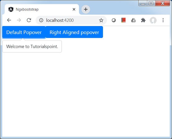
Update test.component.html to use the modal.
test.component.html
<button type="button" class="btn btn-default btn-primary"
   popover="Welcome to Tutorialspoint." [outsideClick]="true">
   Default Popover
</button>
<button type="button" class="btn btn-default btn-primary"
   popover="Welcome to Tutorialspoint."
   popoverTitle="Tutorialspoint"
   [outsideClick]="true"
   placement="right">
   Right Aligned popover
</button>
Update test.component.ts for corresponding variables and methods.
test.component.ts
import { Component, OnInit } from '@angular/core';
import { BsModalService } from 'ngx-bootstrap/modal';
import { PageChangedEvent } from 'ngx-bootstrap/pagination';

@Component({
   selector: 'app-test',
   templateUrl: './test.component.html',
   styleUrls: ['./test.component.css']
})
export class TestComponent implements OnInit {
   constructor() {}
   ngOnInit(): void {
   }
}
Build and Serve
Run the following command to start the angular server.
ng serve
Once server is up and running. Open http://localhost:4200. Click on Open modal button and verify the following output.
Ngx-Bootstrap - ProgressBar
ngx-bootstrap progress bar component provides a progress component to show progress of a workflow with flexible bars.
ProgressbarComponent
selector
progressbar
Inputs
animate − boolean, if true changing value of progress bar will be animated.
max − number, maximum total value of progress element.
striped − boolean, If true, striped classes are applied.
type − ProgressbarType, provide one of the four supported contextual classes: success, info, warning, danger.
value − number | any[], current value of progress bar. Could be a number or array of objects like {"value":15,"type":"info","label":"15 %"}.
Example
As we're going to use a progressbar, We've to update app.module.ts used in ngx-bootstrap Popover chapter to use ProgressbarModule and ProgressbarConfig.
Update app.module.ts to use the ProgressbarModule and ProgressbarConfig.
app.module.ts
import { BrowserModule } from '@angular/platform-browser';
import { NgModule } from '@angular/core';
import { BrowserAnimationsModule } from '@angular/platform-browser/animations';
import { AppComponent } from './app.component';
import { TestComponent } from './test/test.component';
import { AccordionModule } from 'ngx-bootstrap/accordion';
import { AlertModule,AlertConfig } from 'ngx-bootstrap/alert';
import { ButtonsModule } from 'ngx-bootstrap/buttons';
import { FormsModule } from '@angular/forms';
import { CarouselModule } from 'ngx-bootstrap/carousel';
import { CollapseModule } from 'ngx-bootstrap/collapse';
import { BsDatepickerModule, BsDatepickerConfig } from 'ngx-bootstrap/datepicker';
import { BsDropdownModule,BsDropdownConfig } from 'ngx-bootstrap/dropdown';
import { PaginationModule,PaginationConfig } from 'ngx-bootstrap/pagination';
import { PopoverModule, PopoverConfig } from 'ngx-bootstrap/popover';
import { ProgressbarModule,ProgressbarConfig } from 'ngx-bootstrap/progressbar';

@NgModule({
   declarations: [
      AppComponent,
      TestComponent
   ],
   imports: [
      BrowserAnimationsModule,
      BrowserModule,
      AccordionModule,
      AlertModule,
      ButtonsModule,
      FormsModule,
      CarouselModule,
      CollapseModule,
      BsDatepickerModule.forRoot(),
      BsDropdownModule,
      ModalModule,
      PaginationModule,
      PopoverModule,
      ProgressbarModule
   ],
   providers: [AlertConfig,
      BsDatepickerConfig,
      BsDropdownConfig,
      BsModalService,
      PaginationConfig,
      ProgressbarConfig],
   bootstrap: [AppComponent]
})
export class AppModule { }
Update test.component.html to use the modal.
test.component.html
<div class="row">
   <div class="col-sm-4">
      <div class="mb-2">
         <progressbar [value]="value"></progressbar>
      </div>
   </div>
   <div class="col-sm-4">
      <div class="mb-2">
         <progressbar [value]="value" type="warning"
            [striped]="true">{{value}}%</progressbar>
      </div>
   </div>
   <div class="col-sm-4">
      <div class="mb-2">
         <progressbar [value]="value" type="danger"
            [striped]="true" [animate]="true"
            ><i>{{value}} / {{max}}</i></progressbar>
      </div>
   </div>
</div>
Update test.component.ts for corresponding variables and methods.
test.component.ts
import { Component, OnInit } from '@angular/core';

@Component({
   selector: 'app-test',
   templateUrl: './test.component.html',
   styleUrls: ['./test.component.css']
})
export class TestComponent implements OnInit {

   max: number = 100;
   value: number = 25;
   constructor() {}

   ngOnInit(): void {
   }
}
Build and Serve
Run the following command to start the angular server.
ng serve
Once server is up and running. Open http://localhost:4200.
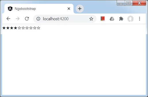
Ngx-Bootstrap - Rating
ngx-bootstrap rating component provides a configurable rating component, a star bar by default.
RatingComponent
selector
rating
Inputs
customTemplate − TemplateRef<any>, custom template for icons.
max − number, no. of icons, default: 5.
readonly − boolean, if true will not react on any user events.
titles − string[], array of icons titles, default: ([1, 2, 3, 4, 5])
Outputs
onHover − fired when icon selected, $event:number equals to selected rating.
onLeave − fired when icon selected, $event:number equals to previous rating value.
Example
As we're going to use a rating, We've to update app.module.ts used in ngx-bootstrap ProgressBar chapter to use RatingModule, RatingConfig.
Update app.module.ts to use the RatingModule and RatingConfig.
app.module.ts
import { BrowserModule } from '@angular/platform-browser';
import { NgModule } from '@angular/core';
import { BrowserAnimationsModule } from '@angular/platform-browser/animations';
import { AppComponent } from './app.component';
import { TestComponent } from './test/test.component';
import { AccordionModule } from 'ngx-bootstrap/accordion';
import { AlertModule,AlertConfig } from 'ngx-bootstrap/alert';
import { ButtonsModule } from 'ngx-bootstrap/buttons';
import { FormsModule } from '@angular/forms';
import { CarouselModule } from 'ngx-bootstrap/carousel';
import { CollapseModule } from 'ngx-bootstrap/collapse';
import { BsDatepickerModule, BsDatepickerConfig } from 'ngx-bootstrap/datepicker';
import { BsDropdownModule,BsDropdownConfig } from 'ngx-bootstrap/dropdown';
import { PaginationModule,PaginationConfig } from 'ngx-bootstrap/pagination';
import { PopoverModule, PopoverConfig } from 'ngx-bootstrap/popover';
import { ProgressbarModule,ProgressbarConfig } from 'ngx-bootstrap/progressbar';
import { RatingModule, RatingConfig } from 'ngx-bootstrap/rating';

@NgModule({
   declarations: [
      AppComponent,
      TestComponent
   ],
   imports: [
      BrowserAnimationsModule,
      BrowserModule,
      AccordionModule,
      AlertModule,
      ButtonsModule,
      FormsModule,
      CarouselModule,
      CollapseModule,
      BsDatepickerModule.forRoot(),
      BsDropdownModule,
      ModalModule,
      PaginationModule,
      PopoverModule,
      ProgressbarModule,
      RatingModule
   ],
   providers: [AlertConfig,
      BsDatepickerConfig,
      BsDropdownConfig,
      BsModalService,
      PaginationConfig,
      ProgressbarConfig,
      RatingConfig],
   bootstrap: [AppComponent]
})
export class AppModule { }
Update test.component.html to use the rating.
test.component.html
<rating [(ngModel)]="value"
   [max]="max"
   [readonly]="false"
   [titles]="['one','two','three','four']"></rating>
Update test.component.ts for corresponding variables and methods.
test.component.ts
import { Component, OnInit } from '@angular/core';

@Component({
   selector: 'app-test',
   templateUrl: './test.component.html',
   styleUrls: ['./test.component.css']
})
export class TestComponent implements OnInit {
   max: number = 10;
   value: number = 5;
   constructor() {}
   ngOnInit(): void {
   }
}
Build and Serve
Run the following command to start the angular server.
ng serve
Once server is up and running. Open http://localhost:4200. Click on Open modal button and verify the following output.
Ngx-Bootstrap - Sortable
ngx-bootstrap sortable component provides a configurable sortable component, with drag drop support.
SortableComponent
selector
bs-sortable
Inputs
fieldName − string, field name if input array consists of objects.
itemActiveClass − string, class name for active item.
itemActiveStyle − { [key: string]: string; }, style object for active item.
itemClass − string, class name for item
itemStyle − string, class name for item
itemTemplate − TemplateRef<any>, used to specify a custom item template. Template variables: item and index;
placeholderClass − string, class name for placeholder
placeholderItem − string, placeholder item which will be shown if collection is empty
placeholderStyle − string, style object for placeholder
wrapperClass − string, class name for items wrapper
wrapperStyle − { [key: string]: string; }, style object for items wrapper
Outputs
onChange − fired on array change (reordering, insert, remove), same as ngModelChange. Returns new items collection as a payload.
Example
As we're going to use a sortable, We've to update app.module.ts used in ngx-bootstrap Rating chapter to use SortableModule and DraggableItemService.
Update app.module.ts to use the SortableModule and DraggableItemService.
app.module.ts
import { BrowserModule } from '@angular/platform-browser';
import { NgModule } from '@angular/core';
import { BrowserAnimationsModule } from '@angular/platform-browser/animations';
import { AppComponent } from './app.component';
import { TestComponent } from './test/test.component';
import { AccordionModule } from 'ngx-bootstrap/accordion';
import { AlertModule,AlertConfig } from 'ngx-bootstrap/alert';
import { ButtonsModule } from 'ngx-bootstrap/buttons';
import { FormsModule } from '@angular/forms';
import { CarouselModule } from 'ngx-bootstrap/carousel';
import { CollapseModule } from 'ngx-bootstrap/collapse';
import { BsDatepickerModule, BsDatepickerConfig } from 'ngx-bootstrap/datepicker';
import { BsDropdownModule,BsDropdownConfig } from 'ngx-bootstrap/dropdown';
import { PaginationModule,PaginationConfig } from 'ngx-bootstrap/pagination';
import { PopoverModule, PopoverConfig } from 'ngx-bootstrap/popover';
import { ProgressbarModule,ProgressbarConfig } from 'ngx-bootstrap/progressbar';
import { RatingModule, RatingConfig } from 'ngx-bootstrap/rating';
import { SortableModule, DraggableItemService } from 'ngx-bootstrap/sortable';

@NgModule({
   declarations: [
      AppComponent,
      TestComponent
   ],
   imports: [
      BrowserAnimationsModule,
      BrowserModule,
      AccordionModule,
      AlertModule,
      ButtonsModule,
      FormsModule,
      CarouselModule,
      CollapseModule,
      BsDatepickerModule.forRoot(),
      BsDropdownModule,
      ModalModule,
      PaginationModule,
      PopoverModule,
      ProgressbarModule,
      RatingModule,
      SortableModule
   ],
   providers: [AlertConfig,
      BsDatepickerConfig,
      BsDropdownConfig,
      BsModalService,
      PaginationConfig,
      ProgressbarConfig,
      RatingConfig,
      DraggableItemService],
   bootstrap: [AppComponent]
})
export class AppModule { }
Update styles.css to use styles for sortable component.
Styles.css
.sortableItem {
   padding: 6px 12px;
   margin-bottom: 4px;
   font-size: 14px;
   line-height: 1.4em;
   text-align: center;
   cursor: grab;
   border: 1px solid transparent;
   border-radius: 4px;
   border-color: #adadad;
}

.sortableItemActive {
   background-color: #e6e6e6;
   box-shadow: inset 0 3px 5px rgba(0,0,0,.125);
}

.sortableWrapper {
   min-height: 150px;
}
Update test.component.html to use the sortable component.
test.component.html
<bs-sortable
   [(ngModel)]="items"
   fieldName="name"
   itemClass="sortableItem"
   itemActiveClass="sortableItemActive"
   wrapperClass="sortableWrapper">
</bs-sortable>
Update test.component.ts for corresponding variables and methods.
test.component.ts
import { Component, OnInit } from '@angular/core';

@Component({
   selector: 'app-test',
   templateUrl: './test.component.html',
   styleUrls: ['./test.component.css']
})
export class TestComponent implements OnInit {
   items = [
      {
         id: 1,
         name: 'Apple'
      },
      {
         id: 2,
         name: 'Orange'
      },
      {
         id: 3,
         name: 'Mango'
      }
   ];
   constructor() {}
   ngOnInit(): void {
   }
}
Build and Serve
Run the following command to start the angular server.
ng serve
Once server is up and running. Open http://localhost:4200.
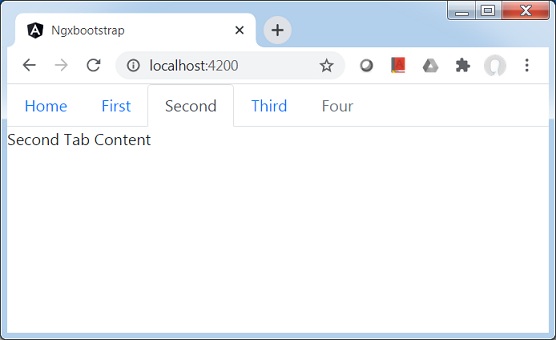
Ngx-Bootstrap - Tabs
ngx-bootstrap tabs component provides a easy to use and highly configurable Tab component.
TabsetComponent
selector
tabset
Inputs
justified − boolean, if true tabs fill the container and have a consistent width.
type − string, navigation context class: 'tabs' or 'pills'.
vertical − if true tabs will be placed vertically.
TabDirective
selector
tab, [tab]
Inputs
active − boolean, tab active state toggle.
customClass − string, if set, will be added to the tab's class attribute. Multiple classes are supported.
disabled − boolean, if true tab can not be activated.
heading − string, tab header text.
id − string, tab id. The same id with suffix '-link' will be added to the corresponding
- element.
removable − boolean, if true tab can be removable, additional button will appear.
Outputs
deselect − fired when tab became inactive, $event:Tab equals to deselected instance of Tab component.
removed − fired before tab will be removed, $event:Tab equals to instance of removed tab.
selectTab − fired when tab became active, $event:Tab equals to selected instance of Tab component.
Example
As we're going to use a Tab, We've to update app.module.ts used in ngx-bootstrap Sortable chapter to use TabsModule and TabsetConfig.
Update app.module.ts to use the TabsModule and TabsetConfig.
app.module.ts
import { BrowserModule } from '@angular/platform-browser';
import { NgModule } from '@angular/core';
import { BrowserAnimationsModule } from '@angular/platform-browser/animations';
import { AppComponent } from './app.component';
import { TestComponent } from './test/test.component';
import { AccordionModule } from 'ngx-bootstrap/accordion';
import { AlertModule,AlertConfig } from 'ngx-bootstrap/alert';
import { ButtonsModule } from 'ngx-bootstrap/buttons';
import { FormsModule } from '@angular/forms';
import { CarouselModule } from 'ngx-bootstrap/carousel';
import { CollapseModule } from 'ngx-bootstrap/collapse';
import { BsDatepickerModule, BsDatepickerConfig } from 'ngx-bootstrap/datepicker';
import { BsDropdownModule,BsDropdownConfig } from 'ngx-bootstrap/dropdown';
import { PaginationModule,PaginationConfig } from 'ngx-bootstrap/pagination';
import { PopoverModule, PopoverConfig } from 'ngx-bootstrap/popover';
import { ProgressbarModule,ProgressbarConfig } from 'ngx-bootstrap/progressbar';
import { RatingModule, RatingConfig } from 'ngx-bootstrap/rating';
import { SortableModule, DraggableItemService } from 'ngx-bootstrap/sortable';
import { TabsModule, TabsetConfig } from 'ngx-bootstrap/tabs';

@NgModule({
   declarations: [
      AppComponent,
      TestComponent
   ],
   imports: [
      BrowserAnimationsModule,
      BrowserModule,
      AccordionModule,
      AlertModule,
      ButtonsModule,
      FormsModule,
      CarouselModule,
      CollapseModule,
      BsDatepickerModule.forRoot(),
      BsDropdownModule,
      ModalModule,
      PaginationModule,
      PopoverModule,
      ProgressbarModule,
      RatingModule,
      SortableModule,
      TabsModule
   ],
   providers: [AlertConfig,
      BsDatepickerConfig,
      BsDropdownConfig,
      BsModalService,
      PaginationConfig,
      ProgressbarConfig,
      RatingConfig,
      DraggableItemService,
      TabsetConfig],
   bootstrap: [AppComponent]
})
export class AppModule { }
Update test.component.html to use the tabs component.
test.component.html
<tabset>
   <tab heading="Home">Home</tab>
   <tab *ngFor="let tabz of tabs"
      [heading]="tabz.title"
      [active]="tabz.active"
      (selectTab)="tabz.active = true"
      [disabled]="tabz.disabled">
      {{tabz?.content}}
   </tab>
</tabset>
Update test.component.ts for corresponding variables and methods.
test.component.ts
import { Component, OnInit } from '@angular/core';

@Component({
   selector: 'app-test',
   templateUrl: './test.component.html',
   styleUrls: ['./test.component.css']
})
export class TestComponent implements OnInit {
   tabs = [
      { title: 'First', content: 'First Tab Content' },
      { title: 'Second', content: 'Second Tab Content', active: true },
      { title: 'Third', content: 'Third Tab Content', removable: true },
      { title: 'Four', content: 'Fourth Tab Content', disabled: true }
   ];
   constructor() {}
   ngOnInit(): void {
   }
}
Build and Serve
Run the following command to start the angular server.
ng serve
Once server is up and running. Open http://localhost:4200. Click on Open modal button and verify the following output.
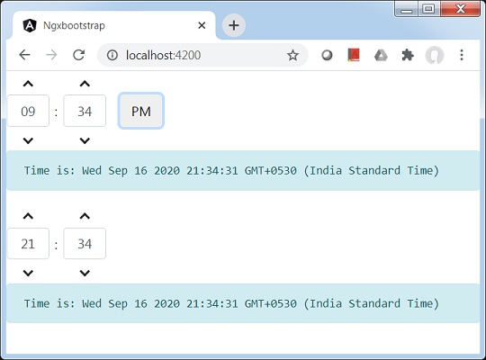
Ngx-Bootstrap - TimePicker
ngx-bootstrap timepicker component provides a easy to use and highly configurable Time Picker component.
TimepickerComponent
selector
timepicker
Inputs
arrowkeys − boolean, if true the values of hours and minutes can be changed using the up/down arrow keys on the keyboard.
disabled − boolean, if true hours and minutes fields will be disabled.
hoursPlaceholder − string, placeholder for hours field in timepicker.
hourStep − number, hours change step.
max − Date, maximum time user can select.
meridians − string[], meridian labels based on locale.
min − Date, minimum time user can select.
minutesPlaceholder − string, placeholder for minutes field in timepicker.
minuteStep − number, hours change step.
mousewheel − boolean, if true scroll inside hours and minutes inputs will change time.
readonlyInput − boolean, if true hours and minutes fields will be readonly.
secondsPlaceholder − string, placeholder for seconds field in timepicker.
secondsStep − number, seconds change step.
showMeridian − boolean, if true meridian button will be shown.
showMinutes − boolean, show minutes in timepicker.
showSeconds − boolean, show seconds in timepicker.
showSpinners − boolean, if true spinner arrows above and below the inputs will be shown.
Outputs
isValid − emits true if value is a valid date.
Example
As we're going to use a TimePicker, We've to update app.module.ts used in ngx-bootstrap Tabs chapter to use TimepickerModule.
Update app.module.ts to use the TimepickerModule.
app.module.ts
import { BrowserModule } from '@angular/platform-browser';
import { NgModule } from '@angular/core';
import { BrowserAnimationsModule } from '@angular/platform-browser/animations';
import { AppComponent } from './app.component';
import { TestComponent } from './test/test.component';
import { AccordionModule } from 'ngx-bootstrap/accordion';
import { AlertModule,AlertConfig } from 'ngx-bootstrap/alert';
import { ButtonsModule } from 'ngx-bootstrap/buttons';
import { FormsModule } from '@angular/forms';
import { CarouselModule } from 'ngx-bootstrap/carousel';
import { CollapseModule } from 'ngx-bootstrap/collapse';
import { BsDatepickerModule, BsDatepickerConfig } from 'ngx-bootstrap/datepicker';
import { BsDropdownModule,BsDropdownConfig } from 'ngx-bootstrap/dropdown';
import { PaginationModule,PaginationConfig } from 'ngx-bootstrap/pagination';
import { PopoverModule, PopoverConfig } from 'ngx-bootstrap/popover';
import { ProgressbarModule,ProgressbarConfig } from 'ngx-bootstrap/progressbar';
import { RatingModule, RatingConfig } from 'ngx-bootstrap/rating';
import { SortableModule, DraggableItemService } from 'ngx-bootstrap/sortable';
import { TabsModule, TabsetConfig } from 'ngx-bootstrap/tabs';
import { TimepickerModule } from 'ngx-bootstrap/timepicker';

@NgModule({
   declarations: [
      AppComponent,
      TestComponent
   ],
   imports: [
      BrowserAnimationsModule,
      BrowserModule,
      AccordionModule,
      AlertModule,
      ButtonsModule,
      FormsModule,
      CarouselModule,
      CollapseModule,
      BsDatepickerModule.forRoot(),
      BsDropdownModule,
      ModalModule,
      PaginationModule,
      PopoverModule,
      ProgressbarModule,
      RatingModule,
      SortableModule,
      TabsModule,
      TimepickerModule.forRoot()
   ],
   providers: [AlertConfig,
      BsDatepickerConfig,
      BsDropdownConfig,
      BsModalService,
      PaginationConfig,
      ProgressbarConfig,
      RatingConfig,
      DraggableItemService,
      TabsetConfig],
   bootstrap: [AppComponent]
})
export class AppModule { }
Update test.component.html to use the timepicker component.
test.component.html
<timepicker [(ngModel)]="time"></timepicker>
<pre class="alert alert-info">Time is: {{time}}</pre>

<timepicker [(ngModel)]="time" [showMeridian]="false"></timepicker>
<pre class="alert alert-info">Time is: {{time}}</pre>
Update test.component.ts for corresponding variables and methods.
test.component.ts
import { Component, OnInit } from '@angular/core';

@Component({
   selector: 'app-test',
   templateUrl: './test.component.html',
   styleUrls: ['./test.component.css']
})
export class TestComponent implements OnInit {
   time: Date = new Date();
   constructor() {}
   ngOnInit(): void {
   }
}
Build and Serve
Run the following command to start the angular server.
ng serve
Once server is up and running. Open http://localhost:4200. Click on Open modal button and verify the following output.
Ngx-Bootstrap - Tooltip
ngx-bootstrap tooltip component provides a easy to use and highly configurable Tooltip component.
TooltipDirective
selector
[tooltip], [tooltipHtml]
Inputs
adaptivePosition − boolean, sets disable adaptive position.
container − string, A selector specifying the element the tooltip should be appended to.
containerClass − string, Css class for tooltip container.
delay − number, Delay before showing the tooltip.
isDisabled − boolean, Allows to disable tooltip.
isOpen − boolean, Returns whether or not the tooltip is currently being shown.
placement − string, Placement of a tooltip. Accepts: "top", "bottom", "left", "right".
tooltip − string | TemplateRef<any>, Content to be displayed as tooltip.
tooltipAnimation − boolean, default: true.
tooltipAppendToBody − boolean.
tooltipClass − string.
tooltipContext − any.
tooltipEnable − boolean.
tooltipFadeDuration − number, default: 150.
tooltipHtml − string | TemplateRef<any>.
tooltipIsOpen − boolean.
tooltipPlacement − string
tooltipPopupDelay − number
tooltipTrigger − string | string[]
triggers − string, Specifies events that should trigger. Supports a space separated list of event names.
Outputs
onHidden − Emits an event when the tooltip is hidden.
onShown − Emits an event when the tooltip is shown.
tooltipChange − Fired when tooltip content changes.
tooltipStateChanged − Fired when tooltip state changes.
Example
As we're going to use Tooltip, We've to update app.module.ts used in ngx-bootstrap TimePicker chapter to use TooltipModule.
Update app.module.ts to use the TooltipModule.
app.module.ts
import { BrowserModule } from '@angular/platform-browser';
import { NgModule } from '@angular/core';
import { BrowserAnimationsModule } from '@angular/platform-browser/animations';
import { AppComponent } from './app.component';
import { TestComponent } from './test/test.component';
import { AccordionModule } from 'ngx-bootstrap/accordion';
import { AlertModule,AlertConfig } from 'ngx-bootstrap/alert';
import { ButtonsModule } from 'ngx-bootstrap/buttons';
import { FormsModule } from '@angular/forms';
import { CarouselModule } from 'ngx-bootstrap/carousel';
import { CollapseModule } from 'ngx-bootstrap/collapse';
import { BsDatepickerModule, BsDatepickerConfig } from 'ngx-bootstrap/datepicker';
import { BsDropdownModule,BsDropdownConfig } from 'ngx-bootstrap/dropdown';
import { PaginationModule,PaginationConfig } from 'ngx-bootstrap/pagination';
import { PopoverModule, PopoverConfig } from 'ngx-bootstrap/popover';
import { ProgressbarModule,ProgressbarConfig } from 'ngx-bootstrap/progressbar';
import { RatingModule, RatingConfig } from 'ngx-bootstrap/rating';
import { SortableModule, DraggableItemService } from 'ngx-bootstrap/sortable';
import { TabsModule, TabsetConfig } from 'ngx-bootstrap/tabs';
import { TimepickerModule } from 'ngx-bootstrap/timepicker';
import { TooltipModule  } from 'ngx-bootstrap/tooltip';

@NgModule({
   declarations: [
      AppComponent,
      TestComponent
   ],
   imports: [
      BrowserAnimationsModule,
      BrowserModule,
      AccordionModule,
      AlertModule,
      ButtonsModule,
      FormsModule,
      CarouselModule,
      CollapseModule,
      BsDatepickerModule.forRoot(),
      BsDropdownModule,
      ModalModule,
      PaginationModule,
      PopoverModule,
      ProgressbarModule,
      RatingModule,
      SortableModule,
      TabsModule,
      TimepickerModule.forRoot(),
      TooltipModule.forRoot()
   ],
   providers: [AlertConfig,
      BsDatepickerConfig,
      BsDropdownConfig,
      BsModalService,
      PaginationConfig,
      ProgressbarConfig,
      RatingConfig,
      DraggableItemService,
      TabsetConfig],
   bootstrap: [AppComponent]
})
export class AppModule { }
Update test.component.html to use the timepicker component.
test.component.html
<timepicker [(ngModel)]="time"></timepicker>
<pre class="alert alert-info">Time is: {{time}}</pre>

<timepicker [(ngModel)]="time" [showMeridian]="false"></timepicker>
<pre class="alert alert-info">Time is: {{time}}</pre>
Update test.component.ts for corresponding variables and methods.
test.component.ts
import { Component, OnInit } from '@angular/core';

@Component({
   selector: 'app-test',
   templateUrl: './test.component.html',
   styleUrls: ['./test.component.css']
})
export class TestComponent implements OnInit {
   time: Date = new Date();
   constructor() {}
   ngOnInit(): void {
   }
}
Build and Serve
Run the following command to start the angular server.
ng serve
Once server is up and running. Open http://localhost:4200. Click on Open modal button and verify the following output.
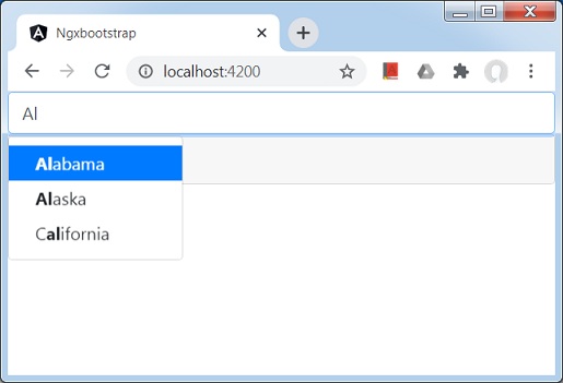
Ngx-Bootstrap - Typeahead
ngx-bootstrap Typeahead directive provides a easy to use and highly configurable, easy to use Typeahead component.
TypeaheadDirective
selector
[typeahead]
Inputs
adaptivePosition − boolean, sets use adaptive position.
container − string, A selector specifying the element the typeahead should be appended to.
dropup − boolean, This attribute indicates that the dropdown should be opened upwards, default:false.
isAnimated − boolean, turn on/off animation, default:false.
optionsListTemplate − TemplateRef<TypeaheadOptionListContext>, used to specify a custom options list template. Template variables: matches, itemTemplate, query.
typeahead − Typeahead, options source, can be Array of strings, objects or an Observable for external matching process.
typeaheadAsync − boolean, should be used only in case of typeahead attribute is Observable of array. If true - loading of options will be async, otherwise - sync. true make sense if options array is large.
typeaheadGroupField − string, when options source is an array of objects, the name of field that contains the group value, matches are grouped by this field when set.
typeaheadHideResultsOnBlur − boolean, used to hide result on blur.
typeaheadIsFirstItemActive − boolean, makes active first item in a list. Default:true.
typeaheadItemTemplate − TemplateRef<TypeaheadOptionItemContext>, used to specify a custom item template. Template variables exposed are called item and index.
typeaheadLatinize − boolean, match latin symbols. If true the word sper would match super and vice versa.Default: true.
typeaheadMinLength − number, minimal no of characters that needs to be entered before typeahead kicks-in. When set to 0, typeahead shows on focus with full list of options (limited as normal by typeaheadOptionsLimit)
typeaheadMultipleSearch − boolean, Can be used to conduct a search of multiple items and have suggestion not for the whole value of the input but for the value that comes after a delimiter provided via typeaheadMultipleSearchDelimiters attribute. This option can only be used together with typeaheadSingleWords option if typeaheadWordDelimiters and typeaheadPhraseDelimiters are different from typeaheadMultipleSearchDelimiters to avoid conflict in determining when to delimit multiple searches and when a single word.
typeaheadMultipleSearchDelimiters − string, should be used only in case typeaheadMultipleSearch attribute is true. Sets the multiple search delimiter to know when to start a new search. Defaults to comma. If space needs to be used, then explicitly set typeaheadWordDelimiters to something else than space because space is used by default OR set typeaheadSingleWords attribute to false if you don't need to use it together with multiple search.
typeaheadOptionField − string, when options source is an array of objects, the name of field that contains the options value, we use array item as option in case of this field is missing. Supports nested properties and methods.
typeaheadOptionsInScrollableView − number, Default value: 5,specifies number of options to show in scroll view
typeaheadOptionsLimit − number, maximum length of options items list. The default value is 20.
typeaheadOrderBy − TypeaheadOrder, Used to specify a custom order of matches. When options source is an array of objects a field for sorting has to be set up. In case of options source is an array of string, a field for sorting is absent. The ordering direction could be changed to ascending or descending.
typeaheadPhraseDelimiters − string, should be used only in case typeaheadSingleWords attribute is true. Sets the word delimiter to match exact phrase. Defaults to simple and double quotes.
typeaheadScrollable − boolean, Default value: false, specifies if typeahead is scrollable
typeaheadSelectFirstItem − boolean, Default value: true, fired when an options list was opened and the user clicked Tab If a value equal true, it will be chosen first or active item in the list If value equal false, it will be chosen an active item in the list or nothing
typeaheadSingleWords − boolean, Default value: true, Can be use to search words by inserting a single white space between each characters for example 'C a l i f o r n i a' will match 'California'.
typeaheadWaitMs − number, minimal wait time after last character typed before typeahead kicks-in
typeaheadWordDelimiters − string, should be used only in case typeaheadSingleWords attribute is true. Sets the word delimiter to break words. Defaults to space.
Outputs
typeaheadLoading − fired when 'busy' state of this component was changed, fired on async mode only, returns boolean.
typeaheadNoResults − fired on every key event and returns true in case of matches are not detected.
typeaheadOnBlur − fired when blur event occurs. returns the active item.
typeaheadOnSelect − fired when option was selected, return object with data of this option.
Example
As we're going to use a Typeahead, We've to update app.module.ts used in ngx-bootstrap Timepicker chapter to use TypeaheadModule.
Update app.module.ts to use the TypeaheadModule.
app.module.ts
import { BrowserModule } from '@angular/platform-browser';
import { NgModule } from '@angular/core';
import { BrowserAnimationsModule } from '@angular/platform-browser/animations';
import { AppComponent } from './app.component';
import { TestComponent } from './test/test.component';
import { AccordionModule } from 'ngx-bootstrap/accordion';
import { AlertModule,AlertConfig } from 'ngx-bootstrap/alert';
import { ButtonsModule } from 'ngx-bootstrap/buttons';
import { FormsModule } from '@angular/forms';
import { CarouselModule } from 'ngx-bootstrap/carousel';
import { CollapseModule } from 'ngx-bootstrap/collapse';
import { BsDatepickerModule, BsDatepickerConfig } from 'ngx-bootstrap/datepicker';
import { BsDropdownModule,BsDropdownConfig } from 'ngx-bootstrap/dropdown';
import { PaginationModule,PaginationConfig } from 'ngx-bootstrap/pagination';
import { PopoverModule, PopoverConfig } from 'ngx-bootstrap/popover';
import { ProgressbarModule,ProgressbarConfig } from 'ngx-bootstrap/progressbar';
import { RatingModule, RatingConfig } from 'ngx-bootstrap/rating';
import { SortableModule, DraggableItemService } from 'ngx-bootstrap/sortable';
import { TabsModule, TabsetConfig } from 'ngx-bootstrap/tabs';
import { TimepickerModule } from 'ngx-bootstrap/timepicker';
import { TypeaheadModule } from 'ngx-bootstrap/typeahead';

@NgModule({
   declarations: [
      AppComponent,
      TestComponent
   ],
   imports: [
      BrowserAnimationsModule,
      BrowserModule,
      AccordionModule,
      AlertModule,
      ButtonsModule,
      FormsModule,
      CarouselModule,
      CollapseModule,
      BsDatepickerModule.forRoot(),
      BsDropdownModule,
      ModalModule,
      PaginationModule,
      PopoverModule,
      ProgressbarModule,
      RatingModule,
      SortableModule,
      TabsModule,
      TimepickerModule.forRoot(),
      TypeaheadModule.forRoot()
   ],
   providers: [AlertConfig,
      BsDatepickerConfig,
      BsDropdownConfig,
      BsModalService,
      PaginationConfig,
      ProgressbarConfig,
      RatingConfig,
      DraggableItemService,
      TabsetConfig],
   bootstrap: [AppComponent]
})
export class AppModule { }
Update test.component.html to use the timepicker component.
test.component.html
<input [(ngModel)]="selectedState"
   [typeahead]="states"
   class="form-control">
<pre class="card card-block card-header mb-3">Model: {{selectedState | json}}</pre>
Update test.component.ts for corresponding variables and methods.
test.component.ts
import { Component, OnInit } from '@angular/core';

@Component({
   selector: 'app-test',
   templateUrl: './test.component.html',
   styleUrls: ['./test.component.css']
})
export class TestComponent implements OnInit {
   selectedState: string;
   states: string[] = ['Alabama','Alaska','Arizona','Arkansas','California','Colorado',
   'Connecticut','Delaware','Florida','Georgia','Hawaii','Idaho','Illinois',
   'Indiana','Iowa','Kansas','Kentucky','Louisiana','Maine',
   'Maryland','Massachusetts','Michigan','Minnesota','Mississippi',
   'Missouri','Montana','Nebraska','Nevada','New Hampshire','New Jersey',
   'New Mexico','New York','North Dakota','North Carolina','Ohio',
   'Oklahoma','Oregon','Pennsylvania','Rhode Island','South Carolina',
   'South Dakota','Tennessee','Texas','Utah','Vermont',
   'Virginia','Washington','West Virginia','Wisconsin','Wyoming'];
   constructor() {}
   ngOnInit(): void {
   }
}
Build and Serve
Run the following command to start the angular server.
ng serve
Once server is up and running. Open http://localhost:4200. Click on Open modal button and verify the following output.