- Ngx-Bootstrap - Home
- Ngx-Bootstrap - Overview
- Ngx-Bootstrap - Environment Setup
- Ngx-Bootstrap - Accordion
- Ngx-Bootstrap - Alerts
- Ngx-Bootstrap - Buttons
- Ngx-Bootstrap - Carousel
- Ngx-Bootstrap - Collapse
- Ngx-Bootstrap - DatePicker
- Ngx-Bootstrap - Dropdowns
- Ngx-Bootstrap - Modals
- Ngx-Bootstrap - Pagination
- Ngx-Bootstrap - Popover
- Ngx-Bootstrap - Progressbar
- Ngx-Bootstrap - Rating
- Ngx-Bootstrap - Sortable
- Ngx-Bootstrap - Tabs
- Ngx-Bootstrap - Timepicker
- Ngx-Bootstrap - Tooltip
- Ngx-Bootstrap - Typeahead
- Ngx-Bootstrap Useful Resources
- Ngx-Bootstrap - Quick Guide
- Ngx-Bootstrap - Useful Resources
- Ngx-Bootstrap - Discussion
Ngx-Bootstrap - accordion
Accordion is a control to display collapsible panels and it is used to display information in limited space.
AccordionComponent
Displays collapsible content panels for presenting information in a limited amount of space.
selector
accordion
Inputs
closeOthers − boolean, if true expanding one item will close all others
isAnimated − boolean, turn on/off animation, default: false
AccordionPanelComponent
AccordionHeading
Instead of using heading attribute on the accordion-group, you can use an accordion-heading attribute on any element inside of a group that will be used as group's header template.
selector
accordion-group, accordion-panel
Inputs
heading − string, Clickable text in accordion's group header
isDisabled − boolean, enables/disables accordion group
isOpen − boolean, Is accordion group open or closed. This property supports two-way binding
panelClass − string, Provides an ability to use Bootstrap's contextual panel classes (panel-primary, panel-success, panel-info, etc...).
Outputs
isOpenChange − Emits when the opened state changes
AccordionConfig
Configuration service, provides default values for the AccordionComponent.
Properties
closeOthers − boolean, Whether the other panels should be closed when a panel is opened. Default: false
isAnimated − boolean, turn on/off animation
Example
As we're going to use accordion, We've updated app.module.ts to use AccordionModule as in ngx-bootstrap Environment Setup chapter.
Update test.component.html to use the accordion.
test.component.html
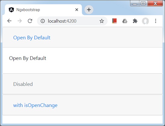
<accordion>
   <accordion-group heading="Open By Default" [isOpen]="open">
      <p>Open By Default</p>
   </accordion-group>
   <accordion-group heading="Disabled" [isDisabled]="disabled">
      <p>Disabled</p>
   </accordion-group>
   <accordion-group heading="with isOpenChange" (isOpenChange)="log($event)">
      <p>Open Event</p>
   </accordion-group>
</accordion>
Update test.component.ts for corresponding variables and methods.
test.component.ts
import { Component, OnInit } from '@angular/core';
@Component({
   selector: 'app-test',
   templateUrl: './test.component.html',
   styleUrls: ['./test.component.css']
})
export class TestComponent implements OnInit {
   open: boolean = true;
   disabled: boolean = true;
   constructor() { }
   ngOnInit(): void {
   }
   log(isOpened: boolean){
      console.log(isOpened);
   }
}
Build and Serve
Run the following command to start the angular server.
ng serve
Once server is up and running. Open http://localhost:4200 and verify the following output.