- Python - Home
- Python - Overview
- Python - History
- Python - Features
- Python vs C++
- Python - Hello World Program
- Python - Application Areas
- Python - Interpreter
- Python - Environment Setup
- Python - Virtual Environment
- Python - Basic Syntax
- Python - Variables
- Python - Private Variables
- Python - Data Types
- Python - Type Casting
- Python - Unicode System
- Python - Literals
- Python - Operators
- Python - Arithmetic Operators
- Python - Comparison Operators
- Python - Assignment Operators
- Python - Logical Operators
- Python - Bitwise Operators
- Python - Membership Operators
- Python - Identity Operators
- Python - Walrus Operator
- Python - Operator Precedence
- Python - Comments
- Python - User Input
- Python - Numbers
- Python - Booleans
- Python - Floating Points
- Python - Control Flow
- Python - Decision Making
- Python - If Statement
- Python - If else
- Python - Nested If
- Python - Conditional User Inputs
- Python - Match-Case Statement
- Python - Loops
- Python - for Loops
- Python - for-else Loops
- Python - While Loops
- Python - break Statement
- Python - continue Statement
- Python - pass Statement
- Python - Nested Loops
- Python Functions & Modules
- Python - Functions
- Python - Default Arguments
- Python - Keyword Arguments
- Python - Keyword-Only Arguments
- Python - Positional Arguments
- Python - Positional-Only Arguments
- Python - Arbitrary Arguments
- Python - Variables Scope
- Python - Function Annotations
- Python - Modules
- Python - Packing and Unpacking
- Python - Built in Functions
- Python Strings
- Python - Strings
- Python - Slicing Strings
- Python - Modify Strings
- Python - String Concatenation
- Python - String Formatting
- Python - Escape Characters
- Python - String Methods
- Python - String Exercises
- Python Lists
- Python - Lists
- Python - Access List Items
- Python - Change List Items
- Python - Add List Items
- Python - Remove List Items
- Python - Loop Lists
- Python - List Comprehension
- Python - Sort Lists
- Python - Copy Lists
- Python - Join Lists
- Python - List Methods
- Python - List Exercises
- Python Tuples
- Python - Tuples
- Python - Access Tuple Items
- Python - Update Tuples
- Python - Unpack Tuples
- Python - Loop Tuples
- Python - Join Tuples
- Python - Tuple Methods
- Python - Namedtuple
- Python - Tuple Exercises
- Python Sets
- Python - Sets
- Python - Access Set Items
- Python - Add Set Items
- Python - Remove Set Items
- Python - Loop Sets
- Python - Join Sets
- Python - Copy Sets
- Python - Set Operators
- Python - Set Methods
- Python - Set Exercises
- Python Dictionaries
- Python - Dictionaries
- Python - Access Dictionary Items
- Python - Change Dictionary Items
- Python - Add Dictionary Items
- Python - Remove Dictionary Items
- Python - Dictionary View Objects
- Python - Loop Dictionaries
- Python - Copy Dictionaries
- Python - Nested Dictionaries
- Python - Dictionary Methods
- Python - Dictionary Exercises
- Python Arrays
- Python - Arrays
- Python - Access Array Items
- Python - Add Array Items
- Python - Remove Array Items
- Python - Loop Arrays
- Python - Copy Arrays
- Python - Reverse Arrays
- Python - Sort Arrays
- Python - Join Arrays
- Python - Array Methods
- Python - Array Exercises
- Python File Handling
- Python - File Handling
- Python - Write to File
- Python - Read Files
- Python - Renaming and Deleting Files
- Python - Directories
- Python - File Methods
- Python - OS File/Directory Methods
- Python - OS Path Methods
- Object Oriented Programming
- Python - OOPs Concepts
- Python - Classes & Objects
- Python - Class Attributes
- Python - Class Methods
- Python - Static Methods
- Python - Constructors
- Python - Access Modifiers
- Python - Inheritance
- Python - Multiple Inheritance
- Python - Multilevel Inheritance
- Python - Polymorphism
- Python - Method Overriding
- Python - Method Overloading
- Python - Dynamic Binding
- Python - Dynamic Typing
- Python - Abstraction
- Python - Encapsulation
- Python - Interfaces
- Python - Packages
- Python - Inner Classes
- Python - Anonymous Class and Objects
- Python - Singleton Class
- Python - Wrapper Classes
- Python - Enums
- Python - Reflection
- Python - Data Classes
- Python Errors & Exceptions
- Python - Syntax Errors
- Python - Exceptions
- Python - try-except Block
- Python - try-finally Block
- Python - Raising Exceptions
- Python - Exception Chaining
- Python - Nested try Block
- Python - User-defined Exception
- Python - Logging
- Python - Assertions
- Python - Warnings
- Python - Built-in Exceptions
- Python - Debugger (PDB)
- Python Multithreading
- Python - Multithreading
- Python - Thread Life Cycle
- Python - Creating a Thread
- Python - Starting a Thread
- Python - Joining Threads
- Python - Naming Thread
- Python - Thread Scheduling
- Python - Thread Pools
- Python - Main Thread
- Python - Thread Priority
- Python - Daemon Threads
- Python - Synchronizing Threads
- Python Synchronization
- Python - Inter-thread Communication
- Python - Thread Deadlock
- Python - Interrupting a Thread
- Python Networking
- Python - Networking
- Python - Socket Programming
- Python - URL Processing
- Python - Generics
- Python Libraries
- NumPy Tutorial
- Pandas Tutorial
- SciPy Tutorial
- Matplotlib Tutorial
- Django Tutorial
- OpenCV Tutorial
- Python Miscellenous
- Python - Date & Time
- Python - Maths
- Python - Iterators
- Python - Generators
- Python - Generator Expressions
- Python - Lambda Expressions
- Python - Closures
- Python - Decorators
- Python - Recursion
- Python - Reg Expressions
- Python - PIP
- Python - Database Access
- Python - Weak References
- Python - Serialization
- Python - Templating
- Python - Output Formatting
- Python - Performance Measurement
- Python - Data Compression
- Python - CGI Programming
- Python - XML Processing
- Python - GUI Programming
- Python - Command-Line Arguments
- Python - Docstrings
- Python - JSON
- Python - Sending Email
- Python - Further Extensions
- Python - Tools/Utilities
- Python - Odds and Ends
- Python - GUIs
- Python Advanced Concepts
- Python - Abstract Base Classes
- Python - Custom Exceptions
- Python - Higher Order Functions
- Python - Object Internals
- Python - Memory Management
- Python - Metaclasses
- Python - Metaprogramming with Metaclasses
- Python - Mocking and Stubbing
- Python - Monkey Patching
- Python - Signal Handling
- Python - Type Hints
- Python - Automation Tutorial
- Python - Humanize Package
- Python - Context Managers
- Python - Coroutines
- Python - Descriptors
- Python - Diagnosing and Fixing Memory Leaks
- Python - Immutable Data Structures
- Python - Domain Specific Language (DSL)
- Python - Data Model
- Python Useful Resources
- Python - Questions & Answers
- Python - Interview Questions & Answers
- Python - Online Quiz
- Python - Quick Guide
- Python - Reference
- Python - Cheatsheet
- Python - Projects
- Python - Useful Resources
- Python - Discussion
- Python Compiler
- NumPy Compiler
- Matplotlib Compiler
- SciPy Compiler
Tkinter Radiobutton
This widget implements a multiple-choice button, which is a way to offer many possible selections to the user and lets user choose only one of them.
In order to implement this functionality, each group of radiobuttons must be associated to the same variable and each one of the buttons must symbolize a single value. You can use the Tab key to switch from one radionbutton to another.
Syntax
Here is the simple syntax to create this widget −
w = Radiobutton ( master, option, ... )
Parameters
master − This represents the parent window.
options − Here is the list of most commonly used options for this widget. These options can be used as key-value pairs separated by commas.
| Sr.No. | Options & Description |
|---|---|
| 1 | activebackground The background color when the mouse is over the radiobutton. |
| 2 | activeforeground The foreground color when the mouse is over the radiobutton. |
| 3 | anchor If the widget inhabits a space larger than it needs, this option specifies where the radiobutton will sit in that space. The default is anchor=CENTER. |
| 4 | bg The normal background color behind the indicator and label. |
| 5 | bitmap To display a monochrome image on a radiobutton, set this option to a bitmap. |
| 6 | borderwidth The size of the border around the indicator part itself. Default is 2 pixels. |
| 7 | command A procedure to be called every time the user changes the state of this radiobutton. |
| 8 | cursor If you set this option to a cursor name (arrow, dot etc.), the mouse cursor will change to that pattern when it is over the radiobutton. |
| 9 | font The font used for the text. |
| 10 | fg The color used to render the text. |
| 11 | height The number of lines (not pixels) of text on the radiobutton. Default is 1. |
| 12 | highlightbackground The color of the focus highlight when the radiobutton does not have focus. |
| 13 | highlightcolor The color of the focus highlight when the radiobutton has the focus. |
| 14 | image To display a graphic image instead of text for this radiobutton, set this option to an image object. |
| 15 | justify If the text contains multiple lines, this option controls how the text is justified: CENTER (the default), LEFT, or RIGHT. |
| 16 | padx How much space to leave to the left and right of the radiobutton and text. Default is 1. |
| 17 | pady How much space to leave above and below the radiobutton and text. Default is 1. |
| 18 | relief Specifies the appearance of a decorative border around the label. The default is FLAT; for other values. |
| 19 | selectcolor The color of the radiobutton when it is set. Default is red. |
| 20 | selectimage If you are using the image option to display a graphic instead of text when the radiobutton is cleared, you can set the selectimage option to a different image that will be displayed when the radiobutton is set. |
| 21 | state The default is state=NORMAL, but you can set state=DISABLED to gray out the control and make it unresponsive. If the cursor is currently over the radiobutton, the state is ACTIVE. |
| 22 | text The label displayed next to the radiobutton. Use newlines ("\n") to display multiple lines of text. |
| 23 | textvariable To slave the text displayed in a label widget to a control variable of class StringVar, set this option to that variable. |
| 24 | underline You can display an underline (_) below the nth letter of the text, counting from 0, by setting this option to n. The default is underline=-1, which means no underlining. |
| 25 | value When a radiobutton is turned on by the user, its control variable is set to its current value option. If the control variable is an IntVar, give each radiobutton in the group a different integer value option. If the control variable is aStringVar, give each radiobutton a different string value option. |
| 26 | variable The control variable that this radiobutton shares with the other radiobuttons in the group. This can be either an IntVar or a StringVar. |
| 27 | width Width of the label in characters (not pixels!). If this option is not set, the label will be sized to fit its contents. |
| 28 | wraplength You can limit the number of characters in each line by setting this option to the desired number. The default value, 0, means that lines will be broken only at newlines. |
Methods
These methods are available.
| Sr.No. | Methods & Description |
|---|---|
| 1 | deselect() Clears (turns off) the radiobutton. |
| 2 | flash() Flashes the radiobutton a few times between its active and normal colors, but leaves it the way it started. |
| 3 | invoke() You can call this method to get the same actions that would occur if the user clicked on the radiobutton to change its state. |
| 4 | select() Sets (turns on) the radiobutton. |
Example
Try the following example yourself −
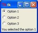
from tkinter import *

def sel():
   selection = "You selected the option " + str(var.get())
   label.config(text = selection)
root = Tk()
var = IntVar()
R1 = Radiobutton(root, text="Option 1", variable=var, value=1, command=sel)
R1.pack( anchor = W )
R2 = Radiobutton(root, text="Option 2", variable=var, value=2, command=sel)
R2.pack( anchor = W )
R3 = Radiobutton(root, text="Option 3", variable=var, value=3, command=sel)
R3.pack( anchor = W)
label = Label(root)
label.pack()
root.mainloop()
When the above code is executed, it produces the following output −