- Polymer - Home
- Polymer - Overview
- Polymer - Installation
- Polymer - Elements
- Polymer - Custom Elements
- Polymer - Shadow DOM and Styling
- Polymer - Events
- Polymer - Data System
Polymer - Shadow DOM and Styling
Shadow DOM is a new property of DOM used for building components.
Example
In the following code, the header component includes page title and menu button.
<header-demo>
   <header>
      <h1>
         <button>
Shadow DOM allows locating the children in a scoped subtree, which is known as shadow tree.
<header-demo>
   #shadow-root
   <header>
      <h1>
      <button>
The shadow-root root is called as the top of shadow tree and the element which is attached to the tree is called shadow host (header-demo). This shadow host includes a property called shadowRoot, that specifies the shadow root. The shadow root identifies the host element using a host property.
Shadow DOM and Composition
The shadow tree can be rendered instead of element's children, if there is an element in the shadow DOM. The element's children can be rendered by adding the <slot> element to the shadow tree.
For instance, use the following shadow tree for <header-demo>.
<header> <h1><slot></slot></h1> <button>Menu</button> </header>
Add the children to <my-header> element as −
<header-demo>Shadow DOM</header-demo>
The header replaces the </slot> element with the above specified children as −
<header-demo>
   <header>
      <h1>Shadow DOM</h1>
      <button>Menu</button>
   </header>
</header-demo>
Fallback Content
The fallback content can be displayed when there are no nodes allocated to the slot. For instance −
<my-element>
   #shadow-root
   <slot id = "myimgicon">
      <img src = "img-demo.png">
   </slot>
   <slot></slot>
<my-element>
You can provide your own icon for an element as −
<my-element>
   <img slot = "myimgicon" src = "warning.png">
<my-element>
Multi-level Distribution
You can allocate the slot element to a slot, which is known as multi-level distribution.
For instance, take two levels of a shadow tree as shown below −
<parent-element>
   #shadow-root
      <child-element>
      <!-- display the light DOM children of parent-element inside child-element -->
      <slot id = "parent-slot">

   <child-element>
      #shadow-root
         <div>
            <!-- Render the light DOM children inside div by using child-element -->
            <slot id = "child-slot">
Consider the following code −
<parent-element>
   <p>This is light DOM</p>
<parent-element>
The structure of a flattened tree looks like the following.
<parent-element>
   <child-element>
      <div>
         <slot id = "child-slot">
            <slot id = "parent-slot">
               <p>This is light DOM</p>
Shadow DOM uses the following Slot APIs for checking distribution −
HTMLElement.assignedSlot − It allocates the slot for an element and returns null, if there is no allocation of an element to a slot.
HTMLSlotElement.assignedNodes − It provides the list of nodes along with the slot and returns the distributed nodes, when you set the flatten option to true.
HTMLSlotElement.slotchange − This event triggers when there are changes in the slot's distributed nodes.
Event Retargeting
It specifies the event's target in which the element can be represented in the same scope as the listening element. It provides an event from a custom element, which looks like it's coming from the custom element tag, as opposed to an element within.
Example
The following example shows the use of event retargeting in the Polymer.js. Create a file called index.html and put the following code in it.
<!doctype html>
<html>
<head>
<title>Polymer Example</title>
<script src = "bower_components/webcomponentsjs/webcomponents-lite.js"></script>
<link rel = "import" href = "bower_components/polymer/polymer.html">
<link rel = "import" href = "retarget-event.html">
</head>
<body>
<template id = "myapp" is = "dom-bind">
<retarget-event on-tap = "clicky"></retarget-event>
</template>
<script>
var myval = document.querySelector('#myapp');
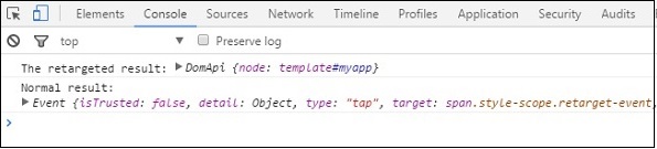
myval.clicky = function(e) {
console.log("The retargeted result:", Polymer.dom(myval));
console.log("Normal result:", e);
};
</script>
</body>
</html>
Now, create another file called retarget-event.html and include the following code.
<link rel = "import" href = "bower_components/polymer/polymer-element.html">

//it specifies the start of an element's local DOM
<dom-module id = "retarget-event">

   <template>
      <span>Click on this text to see result in console...</span>
   </template>

   <script>
      Polymer ({
         is: 'retarget-event',
      });
   </script>
</dom-module>
Output
To run the application, navigate to the created project directory and run the following command.
polymer serve
Now open the browser and navigate to http://127.0.0.1:8081/. Following will be the output.
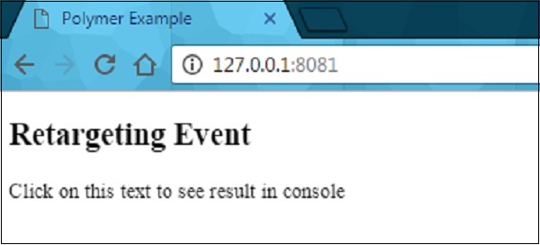
Click the above text and open the console to see a retargeted event as shown in the following screenshot.
Shadow DOM Styling
You can style the shadow DOM using the style properties, which inherit from the host to the shadow tree.
Example
<style>
   .mydemo { background-color: grey; }
</style>

<my-element>
#shadow-root
   <style>
      //this div will have blue background color
      div { background-color: orange; }
   </style>
   <div class = "mydemo">Demo</div>
DOM Templating
The DOM subtree can be created for an element using the DOM templating. You can create the shadow root for the element and copy the template into a shadow tree by adding DOM template to an element.
The DOM template can be specified in two ways −
Create a <dom-module> element, which should match an element's name along with an id attribute.
Define a <template> element inside the <dom-module>.
Example
<dom-module id = "my-template">
   <template>I am in my template!!!</template>

   <script>
      class MyTemplate extends Polymer.Element {
         static get is() { return  'my-template' }
      }
      customElements.define(MyTemplate.is, MyTemplate);
   </script>
</dom-module>
Style an Element's Shadow DOM
Shadow DOM allows to style the custom elements using styling properties such as fonts, text colors, and classes, without applying it outside the scope of your element.
Let's style the host element using the :host selector (an element attached to the shadow DOM is called as the host). Create a file called polymer-app.html and add the following code in it.
<link rel = "import" href = "../../bower_components/polymer/polymer-element.html">

<dom-module id = "polymer-app">
   <template>
      <style>
         :host {
            color:#33ACC9;
         }
      </style>
      <h2>Hello...[[myval]]!</h2>
  </template>

  <script>
      class PolymerApp extends Polymer.Element {
         static get is() { return 'polymer-app'; }
         static get properties() {
            return {
               myval: {
                  type: String, value: 'Welcome to Tutorialspoint!!!'
               }
            };
         }
      }

      window.customElements.define(PolymerApp.is, PolymerApp);
   </script>
</dom-module>
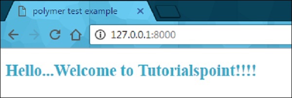
Run the application as shown in the previous chapter and navigate to http://127.0.0.1:8000/. Following will be the output.
Style Slotted Content
It is possible to create slots in the template of an element, which are occupied at run time.
Example
The following example depicts the use of slotted content in the element's template. Create an index.html file and add the following code in it.
<!doctype html>
<html>
   <head>
      <title>Polymer Example</title>
      <link rel = "import" href = "bower_components/polymer/polymer.html">
      <link rel = "import" href = "slotted-content.html">
   </head>

   <body>
      <slotted-content>
         <div slot = "text">This is Polymer.JS Slotted Content Example</div>
      </slotted-content>
   </body>
</html>
Now create another file called slotted-content.html and include the following code.
<link rel = "import" href = "bower_components/polymer/polymer-element.html">

<dom-module id = "slotted-content">
   <template>
      <style>
         ::slotted(*) {
            font-family: sans-serif;
            color:#E94A9D;
         }
      </style>

      <h2>Hello...[[prop1]]</h2>
      <h3>
         <div><slot name='text'></slot></div>
      </h3>
   </template>

   <script>
      Polymer ({
         is: 'slotted-content', properties: {
            prop1: {
               type: String,
               value: 'Welcome to Tutorialspoint!!',
            },
         },
      });
   </script>
</dom-module>
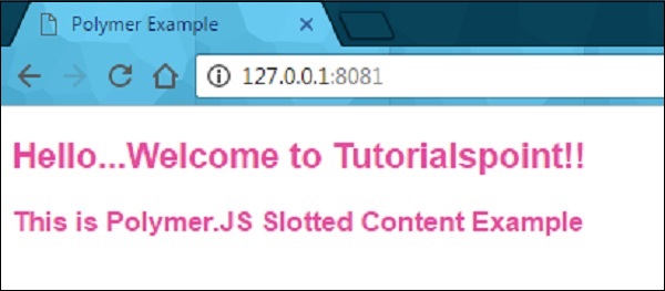
Run the application as shown in the previous example, and navigate to http://127.0.0.1:8081/. Following will be the output.
Using Style Modules
You can share the styles between elements along with style modules. Specify the styles in the style module, and share them between the elements.
Example
The following example shows how to use the style module between the elements. Create an index.html file and add the following code in it.
<!doctype html>
<html>
   <head>
      <title>Polymer Example</title>
      <link rel = "import" href = "bower_components/polymer/polymer.html">
      <link rel = "import" href = "style-module.html">
   </head>

   <body>
      <style-module></style-module>
   </body>
</html>
Create another file called style-module.html with the following code.
<link rel = "import" href = "bower_components/polymer/polymer-element.html">

<dom-module id = "style-module">
   <template>
      <!-- here, including the imported styles from colors-module page -->
      <style include="colors-module"></style>
      <style>
         :host {
            font-family: sans-serif;
            color: green;
         }
      </style>

      <h2>Hello...[[prop1]]</h2>
      <p class = "color1">Sharing styles with style modules 1...</p>
      <p class = "color2">Sharing styles with style modules 2...</p>
      <p class = "color3">Sharing styles with style modules 3...</p>
   </template>

   <script>
      Polymer ({
         is: 'style-module', properties: {
            prop1: {
               type: String, value: 'Welcome to Tutorialspoint!!',
            },
         },
      });
   </script>
</dom-module>
Now, create a one more file called colors-module.html, which provides the style modules to the elements as shown in the following code.
<link rel = "import" href = "bower_components/polymer/polymer-element.html">

<dom-module id = 'colors-module'>
   <template>
      <style>
         p.color1 {
            color: #EA5AA5;
         }
         p.color2 {
            color: #4B61EA;
         }
         p.color3 {
            color: #D3AA0A;
         }
      </style>
   </template>
</dom-module>
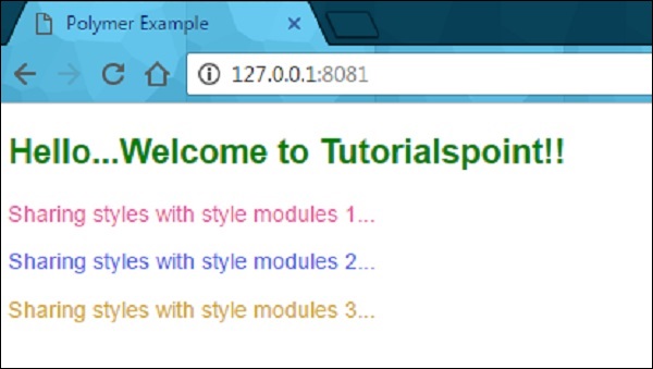
Run the application and navigate to http://127.0.0.1:8081/. Following will be the output.
Use Custom Properties
The custom CSS properties can be used to style the appearance of the element in your application using Polymer element. Custom properties provide cascading CSS variables, which can be used outside the environment of custom elements that keep away from scattering the style data through a stylesheet.
The custom properties can be defined similar to standard CSS properties, which inherit from the composed DOM tree. In the previous example, you can see the custom CSS properties defined for the elements.
Under the CSS inheritance, if there is no style defined for an element, then it will inherit style from its parent as shown in the following code.
<link rel = "import" href = "components/polymer/myelement-style.html">
<myelement-style>
   <style is = "myelement-style">
      p {
         color: var(--paper-red-900);
      }
      paper-checkbox {
         --paper-checkbox-checked-color: var(--paper-red-900);
      }
   </style>
</myelement-style>

<body>
   <p><paper-checkbox>Check Here</paper-checkbox></p>
</body>