Polymer - Quick Guide
Polymer - Overview
Polymer.js is a JavaScript library created by Google that allows reusing the HTML elements for building applications with components.
Polymer is an open-source JavaScript library developed by Google developers and was initially released on May 27, 2015. The stable release is 1.7.0 and it was released on September 29, 2016.
Why Use Polymer.js?
It allows to create our own custom elements easily using the HTML, CSS, and JavaScript for adding interactions to the element.
It is created by Google that provides cross-browser compatible applications along with the web components.
It provides both one-way and two-way data binding.
It provides Polymer command line interface for managing the projects from simple components to complicated web applications.
Features of Polymer.js
It is a JavaScript library built on top of the web standards APIs that allow building custom HTML elements.
It provides the polyfills (web component specifications) for creating our own customized and reusable elements.
It uses the web component standards for the creation of reusable widgets in web documents and web applications.
It uses Google material design for the development of hybrid mobile application.
It distributes the custom elements across the network and the users can use these elements with the help of HTML Imports.
Polymer - Installation
It's easy to configure Polymer in your system. Following are the two ways to install Polymer.
- The Polymer CLI (Command Line Interface)
- The Bower
Installing Polymer Using Polymer CLI
Step 1 − Install Polymer using the following npm command.
npm install -g polymer-cli@next
Step 2 − Check the successful installation and version using the following command.
polymer --version
If it has installed successfully, then it will show the version as −
Step 3 − Create a directory with the name of your choice and switch to that directory.
mkdir polymer-js
cd polymer-js
Step 4 − To initialize your project, run the following command in your polymer-jsdirectory.
polymer init
After executing the above command, it will show something like this −
C:\polymer-js>polymer init
? Which starter template would you like to use?
   1) polymer-1-element - A simple Polymer 1.0 element template
   2) polymer-2-element - A simple Polymer 2.0 element template
   3) polymer-1-application - A simple Polymer 1.0 application template
   4) polymer-2-application - A simple Polymer 2.0 application
   5) polymer-1-starter-kit - A Polymer 1.x starter application template, with
      navigation and "PRPL pattern" loading
   6) polymer-2-starter-kit - A Polymer 2.x starter application template, with
      navigation and "PRPL pattern" loading
   7) shop - The "Shop" Progressive Web App demo
   Answer: 4
Step 5 − Select the polymer-2-application from the above given options.
Now, start your project using the following command.
polymer serve
Installing Polymer Using Bower
Step 1 − To start from scratch using Bower method, install the Bower using the following command.
npm install -g bower
Step 2 − Install the Polymer using the following command.
npm install -g polymer-cli@next
Step 3 − Check the successful installation and version of Polymer, using the following command.
polymer --version
If it has installed successfully, then it will show the version as −
0.18.0-pre.13.
Step 4 − To install the latest Polymer 2.0 RC release from bower, use the following command.
bower install Polymer/polymer#^2.0.0-rc.3
Step 5 − Create a index.html file and add the following code in the <head> tag.
<script src = "/bower_components/webcomponentsjs/webcomponentsloader.js"></script>
// it loads the polyfills

<link rel = "import" href = "/bower_components/polymer/polymer.html">
// it import Polymer
Step 6 − Start your project using the following command.
polymer serve
Building for Deployment
To build your project for deployment, polymer build command is an easier way, which will minify, compile, or bundle your code depending on the command line flags.
To create a universal build that works on all browsers, use the following command.
polymer build --js-compile
The above command will build the project to build/default and you can start this directory, using the following command.
polymer serve build/default
Polymer 2.0 uses ES6 and HTML Custom Elements. For best practice, it is always good to use ES6 to browsers with full ES6 support and compile ES5 to old browsers that don't support ES6. The following table shows the best strategy for your project.
| Strategy | Easiest for cross-browser support | Most optimal for WC v1 performance |
|---|---|---|
| Server | Any server works, including static ones | Differential serving required |
| Deployed Code | ES5 transpiled | ES6 |
| Polyfill Loader | webcomponents-es5-loader.js | webcomponents-loader.js |
Polymer - Elements
Polymer elements are a set of visual and non-visual elements designed to work with the layout, user interaction, selection, and scaffolding applications. These include everything from a simple button to a dialog box with neat visual effects. The following table shows different types of polymer elements.
| Sr.No. | Types & Description |
|---|---|
| 1 | app elements
The app elements are useful when building entire applications. |
| 2 | iron elements
These are the basic building blocks for creating an application. |
| 3 | paper elements
The paper elements are a set of UI components designed to implement Google's material design guidelines. |
| 4 | google Web components
The google Web component are a stock of web components for Google APIs & services. |
| 5 | gold elements
The gold elements are built for e-commerce-specific use cases. |
| 6 | neon elements
It is used for implementing animated transitions for Polymer elements using web animations. |
| 7 | platinum elements
The platinum elements provide features to turn your web page into a true webapp. |
| 8 | molecules elements
The molecule element helps to develop an application easily and is used to connect a group of plugins to the Polymer application. |
Polymer - Custom Elements
Polymer is a framework that allows creating custom elements using standard HTML elements. Custom web elements provide the following features −
It provides custom element name with associating class.
When you change the state of custom element instance, it will request the lifecycle callbacks.
If you change the attributes on an instance, then callback will be requested.
You can define the custom element using ES6 class and class can be associated with the custom element as shown in the following code.
//ElementDemo class is extending the HTMLElement
class ElementDemo extends HTMLElement {
   // code here
};

//link the new class with an element name
window.customElements.define('element-demo', ElementDemo);
The custom element can be used as a standard element as shown below −
<element-demo></element-demo>
Note − Custom element name should start with a lower case letter and contain a dash between the names.
Custom Element Lifecycle
Custom element lifecycle provides a set of custom element reactions which are responsible for change in element lifecycle and are defined in the following table.
| Sr.No. | Reactions & Description |
|---|---|
| 1 | constructor When you create an element or define the previously-created element, this element reaction will be called. |
| 2 | connectedCallback When you add an element to a document, this element reaction will be called. |
| 3 | disconnectedCallback When you remove an element from a document, this element reaction will be called. |
| 4 | attributeChangedCallback Whenever you change, append, remove, or replace an element from a document, this element reaction will be called. |
Element Upgrades
We can use custom elements before defining them by specification and any existing instances of an element will be upgraded to the custom class by adding a definition to that element.
The custom element state contains the following values −
uncustomized − The valid custom element name is either a built-in element or an unknown element, which cannot become a custom element.
undefined − The element can have a valid custom element name, but it cannot be defined.
custom − The element can have a valid custom element name, which can be defined and upgraded.
failed − Trying to upgrade the failed element of an invalid class.
Defining an Element
A custom element can be defined by creating a class which extends Polymer.Element and it passes the class to customElements.define method. The class contains is getter method that returns a HTML tag name of the custom element. For instance −
//ElementDemo class is extending the Polymer.Element
class ElementDemo extends Polymer.Element {
   static get is() { return 'element-demo'; }
   static get properties() {
      . . .
      . . .
   }
   constructor(){
      super();
      . . .
      . . .
   }
   . . .
   . . .
}

//Associate the new class with an element name
window.customElements.define(ElementDemo.is, ElementDemo);

// create an instance with createElement
var el1 = document.createElement('element-demo');
Imports and APIs
The Polymer elements can be defined by specifying the following three HTML imports −
polymer-element.html − It specifies the Polymer.Element base class.
legacy-element.html − It extends Polymer.Element using Polymer.LegacyElement base class and adds 1.x compatible legacy API. It also creates hybrid elements by defining the legacy Polymer() factory method.
polymer.html − It comprises the Polymer base classes along with helper elements, which were included in the 1.x polymer.html.
Define an Element in the Main HTML Document
You can define an element in the main HTML document using HTMLImports.whenReady() function.
Example
The following example shows how to define an element in the main HTML document. Create an index.html file and add the following code.
<!doctype html>
<html lang = "en">
   <head>
      <title>Polymer Example</title>
      <script src = "bower_components/webcomponentsjs/webcomponents-lite.js"></script>
      <link rel = "import" href = "bower_components/polymer/polymer.html">
      <link rel = "import" href = "define-element.html">
   </head>

   <body>
      <define-element></define-element>
   </body>
</html>
Now create a custom element called define-element.html and include the following code.
<dom-module id = "define-element">
<template>
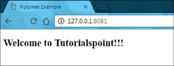
<h2>Welcome to Tutorialspoint!!!</h2>
</template>
<script>
HTMLImports.whenReady(function(){
Polymer ({
is: "define-element"
})
})
</script>
</dom-module>
Output
To run the application, navigate to the created project directory and run the following command.
polymer serve
Now open the browser and navigate to http://127.0.0.1:8081/. Following will be the output.
Define a Legacy Element
Legacy element can be used to register an element using the Polymer function, which takes the prototype for a new element. The prototype should contain is which defines the HTML tag name for a custom element.
Example
//registering an element
ElementDemo = Polymer ({
   is: 'element-demo',

   //it is a legecy callback, called when the element has been created
   created: function() {
     this.textContent = 'Hello World!!!';
   }
});

//'createElement' is used to create an instance
var myelement1 = document.createElement('element-demo');

//use the constructor create an instance
var myelement2 = new ElementDemo();
Lifecycle Callbacks
Lifecycle callbacks are used to accomplish the tasks for built-in features of Polymer.Element class. Polymer uses ready callback, which will be invoked when Polymer completes creating and initializing DOM elements.
Following is a list of legacy callbacks in Polymer.js.
created − It is called when you create an element before setting the property values and initializing local DOM.
ready − It is called when you create an element after setting the property values and initializing local DOM.
attached − It is called after attaching the element to the document and can be called more than one time throughout the lifetime of an element.
detached − It is called after detaching the element from the document and can be called more than once throughout the lifetime of an element.
attributeChanged − It is called when there are changes in an element's attributes and it holds the attribute changes, which are not compatible with the declared properties.
Declaring Properties
The properties can be declared on an element to add default value and other specific features in the data system and they can be used to specify the following features −
It specifies the property type and default value.
It calls the observer method, when there are changes in the property value.
It specifies the read-only status to stop the unexpected changes to the property value.
It provides support for two-way data binding, which triggers an event when you change the property values.
It is a computed property, which calculates a value dynamically depending on the other properties.
It updates and reflects the corresponding attribute value, when you change the property values.
The following table shows keys for each property, which are supported by the properties object.
| Sr.No. | Key & Description | Type |
|---|---|---|
| 1 | type It deserializes from an attribute whose property type is determined using the type's constructor. |
constructor (Boolean, Date, Number, String, Array or Object) |
| 2 | value It specifies the default value for the property and if it is a function, then it uses the return value as the default value of the property. |
boolean, number, string or function. |
| 3 | reflectToAttribute If this key sets to true, then it sets the corresponding attribute on the host node. The attribute can be created as a standard HTML boolean attribute, if you set the property value as Boolean. |
boolean |
| 4 | readOnly You cannot set the property directly by assignment or data binding, if this key is set to true. |
boolean |
| 5 | notify You can use the property for two-way data binding, if this key is set to true and when you change the property, property-name-changed event will get triggered. |
boolean |
| 6 | computed You can calculate the value of an argument whenever it changes, by invoking the method and value will be simplified as method name and argument list. |
string |
| 7 | observer Invoke the method name, which is simplified by a value, when the property value changes. |
string |
Attribute Deserialization
Deserialize the property name that matches an attribute on instance according to the type specified and the same property name on the element instance, if the property is configured in the properties object.
You can set the specified type directly as the value of the property, if there are no other properties options defined in the properties object; otherwise, it will provide the value to the type key in the properties configuration object.
Configuring Boolean Properties
The Boolean property can be configured from markup, by setting it to false and if it is set to true, then you cannot configure from markup because the attribute with or without a value is equalized to true. Therefore, it is known as a standard behavior for attributes in the web platform.
The object and array properties can be configured by passing them in JSON format as −
<element-demo player = '{ "name": "Sachin", "country": "India" }'></element-demo>
Configuring Default Property Values
The default property can be configured using the value field in the properties object and it may be either primitive value, or a function which returns a value.
Example
The following example depicts how to configure the default property values in properties object.
<link rel = "import" href = "../../bower_components/polymer/polymer-element.html">
//it specifies the start of an element's local DOM
<dom-module id="polymer-app">
<template>
<style>
:host {
color:#33ACC9;
}
</style>
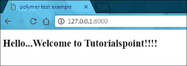
<h2>Hello...[[myval]]!</h2>
</template>
<script>
//cusom element extending the Polymer.Element class
class PolymerApp extends Polymer.Element {
static get is() { return 'polymer-app'; }
static get properties() {
return {
myval: {
type: String,
//displaying this value on screen
value: 'Welcome to Tutorialspoint;!!!'
},
data: {
type: Object,
notify: true,
value: function() { return {}; }
}
}
}
}
window.customElements.define(PolymerApp.is, PolymerApp);
</script>
</dom-module>
Output
Run the application as shown in the previous example, and navigate to http://127.0.0.1:8000/. Following will be the output.
Read-only Properties
You can avoid unexpected changes on produced data by setting the readOnly flag to true, in the properties object. Element uses the setter of the convention _setProperty(value), in order to change the property value.
Example
Following example depicts the use of read-only properties in the properties object. Create an index.html file and add the following code in it
<!doctype html>
<html>
   <head>
      <title>Polymer Example</title>
      <script src = "bower_components/webcomponentsjs/webcomponents-lite.js"></script>

      <link rel = "import" href = "bower_components/polymer/polymer.html">
      <link rel = "import" href = "my-element.html">
   </head>

   <body>
      <my-element></my-element>
   </body>
</html>
Now, create another file called my-element.html and include the following code.
<link rel = "import" href = "bower_components/polymer/polymer-element.html">
<link rel = "import" href = "prop-element.html">
//it specifies the start of an element's local DOM
<dom-module id = "my-element">
<template>
<prop-element my-prop = "{{demoProp}}"></prop-element>
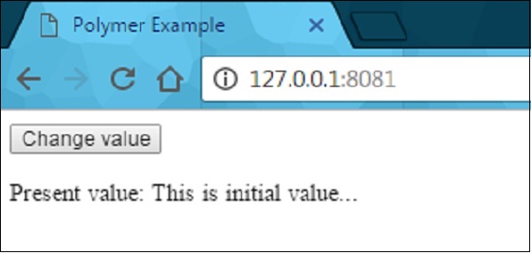
<p>Present value: <span>{{demoProp}}</span></p>
</template>
<script>
Polymer ({
is: "my-element", properties: {
demoProp: String
}
});
</script>
</dom-module>
Next, create one more file called prop-element.html and add the following code.
//it specifies the start of an element's local DOM
<dom-module id="prop-element">
<template>
<button on-click="onClickFunc">Change value</button>
</template>
<script>
Polymer ({
is: "prop-element", properties: {
myProp: {
type: String,
notify: true,
readOnly: true,
value: 'This is initial value...'
}
},
onClickFunc: function(){
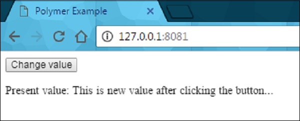
this._setMyProp('This is new value after clicking the button...');
}
});
</script>
</dom-module>
Output
Run the application as shown in the previous example, and navigate to http://127.0.0.1:8081/. Following will be the output.
After clicking the button, it will change the value as shown in the following screenshot.
Reflecting Properties to Attributes
HTML attribute can be synchronized with the property value by setting the reflectToAttribute to true on a property in the properties configuration object.
Attribute Serialization
The property value can be serialized to the attribute, while reflecting or binding a property to an attribute, and by default values can be serialized depending on the value's current type.
String − There is no need of serialization.
Date or Number − Use the toString to serialize the values.
Boolean − Set the displayed non-valued attribute as either true or false.
Array or Object − Use the JSON.stringify to serialize the value.
Polymer - Shadow DOM and Styling
Shadow DOM is a new property of DOM used for building components.
Example
In the following code, the header component includes page title and menu button.
<header-demo>
   <header>
      <h1>
         <button>
Shadow DOM allows locating the children in a scoped subtree, which is known as shadow tree.
<header-demo>
   #shadow-root
   <header>
      <h1>
      <button>
The shadow-root root is called as the top of shadow tree and the element which is attached to the tree is called shadow host (header-demo). This shadow host includes a property called shadowRoot, that specifies the shadow root. The shadow root identifies the host element using a host property.
Shadow DOM and Composition
The shadow tree can be rendered instead of element's children, if there is an element in the shadow DOM. The element's children can be rendered by adding the <slot> element to the shadow tree.
For instance, use the following shadow tree for <header-demo>.
<header> <h1><slot></slot></h1> <button>Menu</button> </header>
Add the children to <my-header> element as −
<header-demo>Shadow DOM</header-demo>
The header replaces the </slot> element with the above specified children as −
<header-demo>
   <header>
      <h1>Shadow DOM</h1>
      <button>Menu</button>
   </header>
</header-demo>
Fallback Content
The fallback content can be displayed when there are no nodes allocated to the slot. For instance −
<my-element>
   #shadow-root
   <slot id = "myimgicon">
      <img src = "img-demo.png">
   </slot>
   <slot></slot>
<my-element>
You can provide your own icon for an element as −
<my-element>
   <img slot = "myimgicon" src = "warning.png">
<my-element>
Multi-level Distribution
You can allocate the slot element to a slot, which is known as multi-level distribution.
For instance, take two levels of a shadow tree as shown below −
<parent-element>
   #shadow-root
      <child-element>
      <!-- display the light DOM children of parent-element inside child-element -->
      <slot id = "parent-slot">

   <child-element>
      #shadow-root
         <div>
            <!-- Render the light DOM children inside div by using child-element -->
            <slot id = "child-slot">
Consider the following code −
<parent-element>
   <p>This is light DOM</p>
<parent-element>
The structure of a flattened tree looks like the following.
<parent-element>
   <child-element>
      <div>
         <slot id = "child-slot">
            <slot id = "parent-slot">
               <p>This is light DOM</p>
Shadow DOM uses the following Slot APIs for checking distribution −
HTMLElement.assignedSlot − It allocates the slot for an element and returns null, if there is no allocation of an element to a slot.
HTMLSlotElement.assignedNodes − It provides the list of nodes along with the slot and returns the distributed nodes, when you set the flatten option to true.
HTMLSlotElement.slotchange − This event triggers when there are changes in the slot's distributed nodes.
Event Retargeting
It specifies the event's target in which the element can be represented in the same scope as the listening element. It provides an event from a custom element, which looks like it's coming from the custom element tag, as opposed to an element within.
Example
The following example shows the use of event retargeting in the Polymer.js. Create a file called index.html and put the following code in it.
<!doctype html>
<html>
<head>
<title>Polymer Example</title>
<script src = "bower_components/webcomponentsjs/webcomponents-lite.js"></script>
<link rel = "import" href = "bower_components/polymer/polymer.html">
<link rel = "import" href = "retarget-event.html">
</head>
<body>
<template id = "myapp" is = "dom-bind">
<retarget-event on-tap = "clicky"></retarget-event>
</template>
<script>
var myval = document.querySelector('#myapp');
myval.clicky = function(e) {
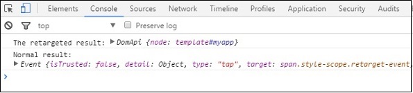
console.log("The retargeted result:", Polymer.dom(myval));
console.log("Normal result:", e);
};
</script>
</body>
</html>
Now, create another file called retarget-event.html and include the following code.
<link rel = "import" href = "bower_components/polymer/polymer-element.html">

//it specifies the start of an element's local DOM
<dom-module id = "retarget-event">

   <template>
      <span>Click on this text to see result in console...</span>
   </template>

   <script>
      Polymer ({
         is: 'retarget-event',
      });
   </script>
</dom-module>
Output
To run the application, navigate to the created project directory and run the following command.
polymer serve
Now open the browser and navigate to http://127.0.0.1:8081/. Following will be the output.
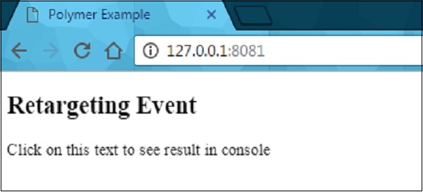
Click the above text and open the console to see a retargeted event as shown in the following screenshot.
Shadow DOM Styling
You can style the shadow DOM using the style properties, which inherit from the host to the shadow tree.
Example
<style>
   .mydemo { background-color: grey; }
</style>

<my-element>
#shadow-root
   <style>
      //this div will have blue background color
      div { background-color: orange; }
   </style>
   <div class = "mydemo">Demo</div>
DOM Templating
The DOM subtree can be created for an element using the DOM templating. You can create the shadow root for the element and copy the template into a shadow tree by adding DOM template to an element.
The DOM template can be specified in two ways −
Create a <dom-module> element, which should match an element's name along with an id attribute.
Define a <template> element inside the <dom-module>.
Example
<dom-module id = "my-template">
   <template>I am in my template!!!</template>

   <script>
      class MyTemplate extends Polymer.Element {
         static get is() { return  'my-template' }
      }
      customElements.define(MyTemplate.is, MyTemplate);
   </script>
</dom-module>
Style an Element's Shadow DOM
Shadow DOM allows to style the custom elements using styling properties such as fonts, text colors, and classes, without applying it outside the scope of your element.
Let's style the host element using the :host selector (an element attached to the shadow DOM is called as the host). Create a file called polymer-app.html and add the following code in it.
<link rel = "import" href = "../../bower_components/polymer/polymer-element.html">

<dom-module id = "polymer-app">
   <template>
      <style>
         :host {
            color:#33ACC9;
         }
      </style>
      <h2>Hello...[[myval]]!</h2>
  </template>

  <script>
      class PolymerApp extends Polymer.Element {
         static get is() { return 'polymer-app'; }
         static get properties() {
            return {
               myval: {
                  type: String, value: 'Welcome to Tutorialspoint!!!'
               }
            };
         }
      }

      window.customElements.define(PolymerApp.is, PolymerApp);
   </script>
</dom-module>
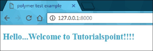
Run the application as shown in the previous chapter and navigate to http://127.0.0.1:8000/. Following will be the output.
Style Slotted Content
It is possible to create slots in the template of an element, which are occupied at run time.
Example
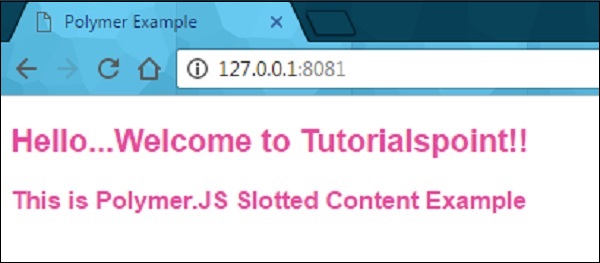
The following example depicts the use of slotted content in the element's template. Create an index.html file and add the following code in it.
<!doctype html>
<html>
   <head>
      <title>Polymer Example</title>
      <link rel = "import" href = "bower_components/polymer/polymer.html">
      <link rel = "import" href = "slotted-content.html">
   </head>

   <body>
      <slotted-content>
         <div slot = "text">This is Polymer.JS Slotted Content Example</div>
      </slotted-content>
   </body>
</html>
Now create another file called slotted-content.html and include the following code.
<link rel = "import" href = "bower_components/polymer/polymer-element.html">

<dom-module id = "slotted-content">
   <template>
      <style>
         ::slotted(*) {
            font-family: sans-serif;
            color:#E94A9D;
         }
      </style>

      <h2>Hello...[[prop1]]</h2>
      <h3>
         <div><slot name='text'></slot></div>
      </h3>
   </template>

   <script>
      Polymer ({
         is: 'slotted-content', properties: {
            prop1: {
               type: String,
               value: 'Welcome to Tutorialspoint!!',
            },
         },
      });
   </script>
</dom-module>
Run the application as shown in the previous example, and navigate to http://127.0.0.1:8081/. Following will be the output.
Using Style Modules
You can share the styles between elements along with style modules. Specify the styles in the style module, and share them between the elements.
Example
The following example shows how to use the style module between the elements. Create an index.html file and add the following code in it.
<!doctype html>
<html>
   <head>
      <title>Polymer Example</title>
      <link rel = "import" href = "bower_components/polymer/polymer.html">
      <link rel = "import" href = "style-module.html">
   </head>

   <body>
      <style-module></style-module>
   </body>
</html>
Create another file called style-module.html with the following code.
<link rel = "import" href = "bower_components/polymer/polymer-element.html">
<dom-module id = "style-module">
<template>
<!-- here, including the imported styles from colors-module page -->
<style include="colors-module"></style>
<style>
:host {
font-family: sans-serif;
color: green;
}
</style>
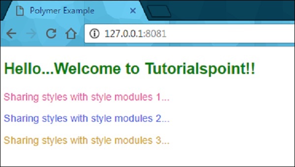
<h2>Hello...[[prop1]]</h2>
<p class = "color1">Sharing styles with style modules 1...</p>
<p class = "color2">Sharing styles with style modules 2...</p>
<p class = "color3">Sharing styles with style modules 3...</p>
</template>
<script>
Polymer ({
is: 'style-module', properties: {
prop1: {
type: String, value: 'Welcome to Tutorialspoint!!',
},
},
});
</script>
</dom-module>
Now, create a one more file called colors-module.html, which provides the style modules to the elements as shown in the following code.
<link rel = "import" href = "bower_components/polymer/polymer-element.html">

<dom-module id = 'colors-module'>
   <template>
      <style>
         p.color1 {
            color: #EA5AA5;
         }
         p.color2 {
            color: #4B61EA;
         }
         p.color3 {
            color: #D3AA0A;
         }
      </style>
   </template>
</dom-module>
Run the application and navigate to http://127.0.0.1:8081/. Following will be the output.
Use Custom Properties
The custom CSS properties can be used to style the appearance of the element in your application using Polymer element. Custom properties provide cascading CSS variables, which can be used outside the environment of custom elements that keep away from scattering the style data through a stylesheet.
The custom properties can be defined similar to standard CSS properties, which inherit from the composed DOM tree. In the previous example, you can see the custom CSS properties defined for the elements.
Under the CSS inheritance, if there is no style defined for an element, then it will inherit style from its parent as shown in the following code.
<link rel = "import" href = "components/polymer/myelement-style.html">
<myelement-style>
   <style is = "myelement-style">
      p {
         color: var(--paper-red-900);
      }
      paper-checkbox {
         --paper-checkbox-checked-color: var(--paper-red-900);
      }
   </style>
</myelement-style>

<body>
   <p><paper-checkbox>Check Here</paper-checkbox></p>
</body>
Polymer - Events
Events are used by the elements that can communicate with state changes of DOM tree to parent elements and uses the standard DOM APIs for creating, dispatching, and listening for events. The annotated event listeners are used by Polymer, which defines the event listeners as small chunks of DOM template and can be added to DOM children using onevent annotations in the template.
Example
The following example adds annotated event listeners in the template. Create a file called index.html and put the following code in it.
<!doctype html>
<html>
<head>
<title>Polymer Example</title>
<script src = "bower_components/webcomponentsjs/webcomponents-lite.js"></script>
<link rel = "import" href="bower_components/polymer/polymer.html">
<link rel = "import" href = "annotated-eventlistners.html">
</head>
<body>
<template id = "myapp" is = "dom-bind">
//tap event is part of gesture events that fires consistently across both mobile
//and desktop devices
<annotated-eventlistners on-tap = "myClick"></annotated-eventlistners>
</template>
<script>
var myval = document.querySelector('#myapp');
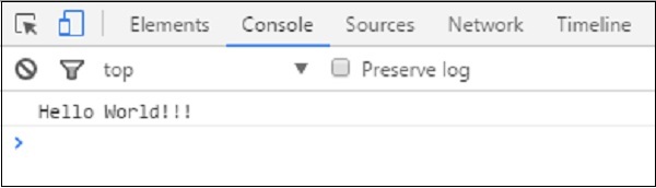
myval.myClick = function(e) {
console.log('Hello World!!!');
};
</script>
</body>
</html>
Output
To run the application, navigate to the created project directory and run the following command.
polymer serve
Now open the browser and navigate to http://127.0.0.1:8000/. Following will be the output.
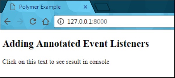
Click the text to see the result in the console as shown in the following screenshot.
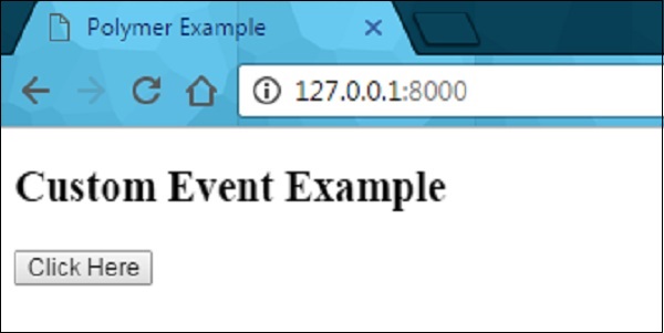
Custom Events
Custom events can be triggered using the standard CustomEvent constructor and the dispatchEvent method from the host element.
Consider the following example that triggers the custom event from the host element. Open the index.html file and add the following code in it.
<!doctype html>
<html>
   <head>
      <title>Polymer Example</title>
      <script src = "bower_components/webcomponentsjs/webcomponents-lite.js"></script>
      <link rel = "import" href = "bower_components/polymer/polymer.html">
      <link rel = "import" href = "custom-event.html">
   </head>

   <body>
      <custom-event></custom-event>
      <script>
         document.querySelector('custom-event').addEventListener('customValue', function (e) {
            console.log(e.detail.customval); // true
         })
      </script>
   </body>
</html>
Now, create another file called custom-event.html and include the following code.
<link rel = "import" href = "bower_components/polymer/polymer-element.html">

//it specifies the start of an element's local DOM
<dom-module id = "custom-event">
   <template>
      <h2>Custom Event Example</h2>
      <button on-click = "myClick">Click Here</button>
   </template>

   <script>
      Polymer ({
         is: "custom-event", myClick(e) {
            this.dispatchEvent(new CustomEvent('customValue', {detail: {customval: true}}));
         }
      });
   </script>
</dom-module>
Output
Run the application as shown in the previous example and navigate to http://127.0.0.1:8000/. Following will be the output.
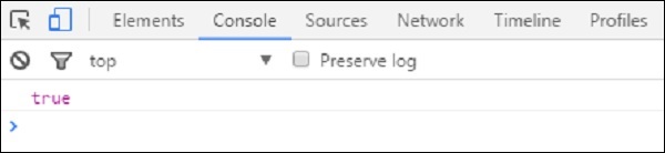
Now click the button, open the console, and see the true value for the custom event as shown in the following screenshot.
Now moving with "event retargeting", which specifies the event's target where the element can be represented in the same scope as the listening element. For instance, the target can be considered as an element in the main document, while using a listener in the main document, not in a shadow tree. You can refer the Polymer shadow dom styling chapter for more explanation and example.
Gesture Events
Gesture events can be used for user interactions, which define better interaction on both touch and mobile devices. For instance, the tap event is a part of gesture events that fires consistently across both mobile and desktop devices.
You can refer the example for gesture event explained at the beginning of this chapter, which uses on-tap event that adds annotated event listeners in the template.
The following table lists different types of gesture event types.
| Sr.No. | Event Type & Description | Properties |
|---|---|---|
| 1 | down It specifies that the finger/button has moved down. |
|
| 2 | up It specifies that the finger/button has moved up. |
|
| 3 | tap It specifies the occurrence of up and down actions. |
|
| 4 | track It specifies the occurrence of up and down actions. |
|
Example
The following example specifies the use of gesture event types in the template. Create a file called index.html and place the following code in it.
<!doctype html>
<html>
   <head>
      <title>Polymer Example</title>
      <script src = "bower_components/webcomponentsjs/webcomponents-lite.js"></script>
      <link rel = "import" href = "bower_components/polymer/polymer.html">
      <link rel = "import" href = "gesture-event.html">
   </head>

   <body>
      <gesture-event></gesture-event>
   </body>
</html>
Now, create another file called gesture-event.html and include the following code.
<link rel = "import" href = "bower_components/polymer/polymer-element.html">

//it specifies the start of an element's local DOM
<dom-module id = "gesture-event">
   <template>
      <style>
         #box {
            width: 200px;
            height: 200px;
            background: #D7D0B7;
         }
      </style>

      <h2>Gesture Event Types Example</h2>
      <div id = "box" on-track = "myClick">{{track_message}}</div>
   </template>

   <script>
      Polymer ({
         is: 'gesture-event', myClick: function(e) {
            switch(e.detail.state) {
               case 'start':
               this.track_message = 'Tracking event started...';
               break;
               case 'track':
                  this.track_message = 'Tracking event is in progress... ' +
                  e.detail.x + ', ' + e.detail.y;
               break;
               case 'end':
                  this.track_message = 'Tracking event ended...';
               break;
            }
         }
      });
   </script>
</dom-module>
Output
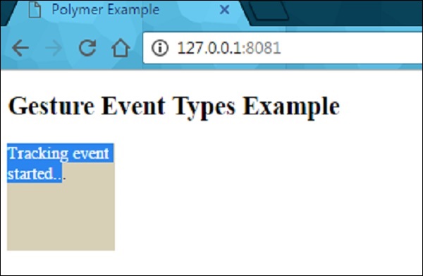
Run the application as shown in the previous example and navigate to http://127.0.0.1:8081/. Now start dragging the mouse in the element, it will display the state as shown in the following screenshot.
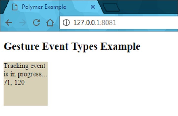
After dragging the mouse in the element, it will show the progress of event tracking as shown in the following screenshot.
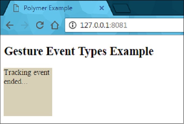
When you stop dragging the mouse, it will end the tracking event on the element as shown in the following screenshot.
Polymer - Data System
Polymer allows observing the changes on an element's properties by taking different actions such as −
Observers − It invokes the callbacks whenever the data changes.
Computed Properties − It computes the virtual properties based on other properties, and re-computes them whenever the input data changes.
Data Bindings − It updates the properties, attributes, or the text content of a DOM node using annotations whenever the data changes.
Data Paths
Path is a string in the data system, that provides a property or a sub-property relative to a scope. The scope can be a host element. Paths can be linked to different elements using data binding. Data change can be moved from one element to another, if the elements are connected with data binding.
Example
<dom-module id = "my-profile">
   <template>
      . . .
      <address-card address="{{myAddress}}"></address-card>
   </template>
   . . .
</dom-module>
The above two paths (my-profile and address-card) can be connected with data binding, if <address-card> is in the local DOM of the <my-profile> element.
Following are the special types of path segments in Polymer.js −
The wild card (*) character can be used as the last segment in a path.
The array mutations can be displayed to a given array by placing string splices as the last segment in a path.
Array item paths indicate an item in an array and the numeric path segment specifies an array index.
In a data path, each path segment is a property name and they include following two kinds of paths −
The path segments separated by dots. For example: "apple.grapes.orange".
In an array of strings, each array element is either a path segment or a dotted path. For example: ["apple","grapes","orange"], ["apple.grapes","orange"].
Data Flow
Example
The following example specifies a two-way binding of data flow. Create an index.html file and add the following code in it.
<!doctype html>
<html>
   <head>
      <title>Polymer Example</title>
      <script src = "bower_components/webcomponentsjs/webcomponents-lite.js"></script>
      <link rel = "import" href = "bower_components/polymer/polymer.html">
      <link rel = "import" href = "my-element.html">
   </head>

   <body>
      <my-element></my-element>
   </body>
</html>
Now create another file called my-element.html and include the following code.
<link rel = "import" href = "bower_components/polymer/polymer-element.html">
<link rel = "import" href = "prop-element.html">

//it specifies the start of an element's local DOM
<dom-module id = "my-element">
   <template>
      <prop-element my-prop="{{demoProp}}"></prop-element>
      <p>
         Present value: <span>{{demoProp}}</span>
      </p>
   </template>

   <script>
      Polymer ({
         is: "my-element", properties: {
            demoProp: String
         }
      });
   </script>
</dom-module>
Next, create one more file called prop-element.html and add the following code.
//it specifies the start of an element's local DOM
<dom-module id = "prop-element">
   <template>
      <button on-click = "onClickFunc">Change value</button>
   </template>

   <script>
      Polymer ({
         is: "prop-element", properties: {
            myProp: {
               type: String,
               notify: true,
               readOnly: true,
               value: 'This is initial value...'
            }
         },
         onClickFunc: function(){
            this._setMyProp('This is new value after clicking the button...');
         }
      });
   </script>
</dom-module>
Output
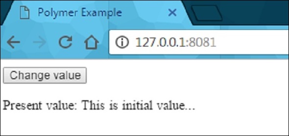
Run the application as shown in the previous chapters, and navigate to http://127.0.0.1:8081/. Following will be the output.
After clicking the button, it will change the value as shown in the following screenshot.

Linking Two Paths
You can link the two paths to the same object using the linkPaths method and need to use data binding to generate changes between the elements.
Example
linkPaths('myTeam', 'players.5');
The path linkage can be removed using the unlinkPaths method as shown below −
unlinkPaths('myTeam');
Observers
The observable changes that occur to the element's data invoke methods known as observers. Following are the types of observers.
Simple observers are used to observe a single property.
Complex observers are used to observe more than one property or path.
Data Binding
Data binding can be used to connect the property or an attribute of an element from the host element in its local DOM. Data binding can be created by adding annotations to DOM template as shown in the following code.
<dom-module id = "myhost-element">
   <template>
      <target-element target-property = "{{myhostProperty}}"></target-element>
   </template>
</dom-module>
The anatomy of data binding in the local DOM template looks like the following −
property-name=annotation-or-compound-binding
or
attribute-name$=annotation-or-compound-binding
The left-hand side of the binding specifies the target property or attribute, while the righthand side of the binding specifies either a binding annotation or a compound binding. The text in binding annotation are enclosed by double curly bracket ({{ }}) or double square bracket ([[ ]]) delimiters and the compound binding includes one or more string literal binding annotations.
Following are the helper elements, which are used with data binding use cases −
Template Repeater − An instance of the template's contents can be created for each item in an array.
Array Selector − It provides the selection state for an array of structured data.
Conditional Template − You can identify the content, if the condition is true.
Auto-binding Template − It specifies the data binding outside of polymer element.
The DOM tree triggers a dom-change event, if the helper elements update the DOM tree. Sometimes, you can interact with DOM by changing the model data, not by interacting with the created nodes. Therefore, you can use the dom-change event to access the nodes directly.