Polymer - Paper Checkbox
The paper-checkbox is a checkbox to check or uncheck it. Normally, checkboxes are used to select multiple options from a set. To get the paper-checkbox in your directory, you should use the following command in the command prompt.
bower install --save PolymerElements/paper-checkbox
Example
The following example specifies the use of paper-checkbox element in Polymer.js. Create an index.html file and add the following code in it.
<!doctype html>
<html>
   <head>
      <link rel = 'import' href = 'my-app.html'>
   </head>

   <body>
      <h2>Paper-Card Example</h2>
      <my-app></my-app>
   </body>
</html>
Now, open the my-app.html file and include the following code in it.
<link rel = 'import' href = 'bower_components/polymer/polymer.html'>
<link rel = "import" href = "bower_components/paper-button/paper-button.html">
<link rel = "import" href = "bower_components/paper-styles/paper-styles.html">
<link rel = "import" href = "bower_components/paper-card/paper-card.html">
<link rel = "import" href = "bower_components/iron-icons/iron-icons.html">
<link rel = "import" href = "bower_components/iron-icons/communication-icons.html">
<link rel = "import" href = "bower_components/paper-checkbox/paper-checkbox.html">
<dom-module id = 'my-app'>

   <template>
      <style is = "custom-style">
         paper-checkbox {
            font-family: 'Roboto', sans-serif;
            margin: 24px;
         }
         paper-checkbox.styled {
            align-self: center;
            border: 1px solid var(--paper-green-200);
            padding: 8px 16px;
            --paper-checkbox-checked-color: var(--paper-green-500);
            --paper-checkbox-checked-ink-color: var(--paper-green-500);
            --paper-checkbox-unchecked-color: var(--paper-green-900);
            --paper-checkbox-unchecked-ink-color: var(--paper-green-900);
            --paper-checkbox-label-color: var(--paper-green-500);
            --paper-checkbox-label-spacing: 0;
            --paper-checkbox-margin: 8px 16px 8px 0;
            --paper-checkbox-vertical-align: top;
         }
      </style>

      <paper-checkbox class = "styled">
         Checkbox With a long label
      </paper-checkbox>
      <paper-checkbox disabled>Disabled</paper-checkbox>
   </template>

   <script>
      Polymer ({
         is: 'my-app',
         ready: function() {
            this.async(function() {
            });
         }
      });
   </script>
</dom-module>
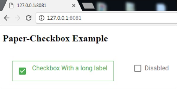
Output
To run the application, navigate to the created project directory and run the following command.
polymer serve
Now open the browser and navigate to http://127.0.0.1:8081/. Following will be the output.
polymer_elements.htm
Advertisements