
Article Categories
- All Categories
-
 Data Structure
-
 Networking
-
 RDBMS
RDBMS
-
 Operating System
-
 Java
Java
-
 MS Excel
-
 iOS
iOS
-
 HTML
HTML
-
 CSS
CSS
-
 Android
-
 Python
-
 C Programming
-
 C++
C++
-
 C#
C#
-
 MongoDB
-
 MySQL
MySQL
-
 Javascript
-
 PHP
PHP
Selected Reading
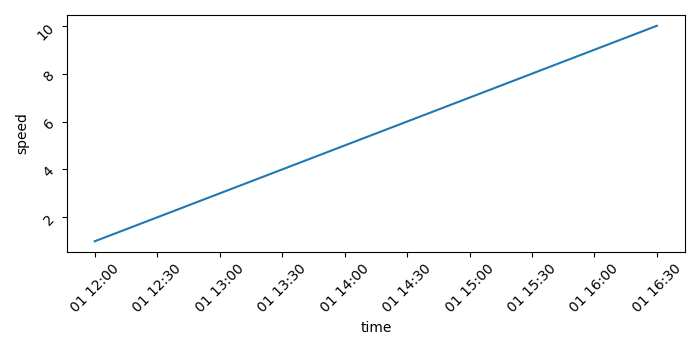
How to plot a time series graph using Seaborn or Plotly?
To plot a time series graph using Seaborn or Plotly, we can take the following steps −
- Set the figure size and adjust the padding between and around the subplots.
- Create a Pandas dataframe, df, to hold a date_time series "time" and another variable data, speed.
- Make a Seaborn line plot with the data, "time" and "speed"
- Rotate the tick params by 45.
- To display the figure, use show() method.
Example
import seaborn as sns
from matplotlib import pyplot as plt
import pandas as pd
import numpy as np

plt.rcParams["figure.figsize"] = [7.00, 3.50]
plt.rcParams["figure.autolayout"] = True

df = pd.DataFrame(
   dict(
      time=list(pd.date_range("2021-01-01 12:00:00", periods=10, freq="30min")),
      speed=np.linspace(1, 10, 10)
   )
)

ax = sns.lineplot(x="time", y="speed", data=df)

ax.tick_params(rotation=45)

plt.show()
Output
It will produce the following output


Updated on: 2021-09-22T05:58:00+05:30
3K+ Views

Advertisements