- CSS - Home
- CSS - Roadmap
- CSS - Introduction
- CSS - Syntax
- CSS - Inclusion
- CSS - Types
- CSS - Measurement Units
- CSS - Selectors
- CSS - Colors
- CSS - Backgrounds
- CSS - Fonts
- CSS - Text
- CSS - Images
- CSS - Links
- CSS - Tables
- CSS - Borders
- CSS - Border Block
- CSS - Border Inline
- CSS - Margins
- CSS - Lists
- CSS - Padding
- CSS - Cursor
- CSS - Outlines
- CSS - Dimension
- CSS - Scrollbars
- CSS - Inline Block
- CSS - Dropdowns
- CSS - Visibility
- CSS - Overflow
- CSS - Clearfix
- CSS - Float
- CSS - Arrows
- CSS - Resize
- CSS - Quotes
- CSS - Order
- CSS - Position
- CSS - Hyphens
- CSS - Hover
- CSS - Display
- CSS - Focus
- CSS - Zoom
- CSS - Translate
- CSS - Height
- CSS - Hyphenate Character
- CSS - Width
- CSS - Opacity
- CSS - Z-Index
- CSS - Bottom
- CSS - Navbar
- CSS - Overlay
- CSS - Forms
- CSS - Align
- CSS - Icons
- CSS - Image Gallery
- CSS - Comments
- CSS - Loaders
- CSS - Attr Selectors
- CSS - Combinators
- CSS - Root
- CSS - Box Model
- CSS - Counters
- CSS - Clip
- CSS - Writing Mode
- CSS - Unicode-bidi
- CSS - min-content
- CSS - All
- CSS - Inset
- CSS - Isolation
- CSS - Overscroll
- CSS - Justify Items
- CSS - Justify Self
- CSS - Tab Size
- CSS - Pointer Events
- CSS - Place Content
- CSS - Place Items
- CSS - Place Self
- CSS - Max Block Size
- CSS - Min Block Size
- CSS - Mix Blend Mode
- CSS - Max Inline Size
- CSS - Min Inline Size
- CSS - Offset
- CSS - Accent Color
- CSS - User Select
- CSS - Cascading
- CSS - Universal Selectors
- CSS - ID Selectors
- CSS - Group Selectors
- CSS - Class Selectors
- CSS - Child Selectors
- CSS - Element Selectors
- CSS - Descendant Selectors
- CSS - General Sibling Selectors
- CSS - Adjacent Sibling Selectors
- CSS Advanced
- CSS - Grid
- CSS - Grid Layout
- CSS - Flexbox
- CSS - Visibility
- CSS - Positioning
- CSS - Layers
- CSS - Pseudo Classes
- CSS - Pseudo Elements
- CSS - @ Rules
- CSS - Text Effects
- CSS - Paged Media
- CSS - Printing
- CSS - Layouts
- CSS - Validations
- CSS - Image Sprites
- CSS - Important
- CSS - Data Types
- CSS3 Advanced Features
- CSS - Rounded Corner
- CSS - Border Images
- CSS - Multi Background
- CSS - Color
- CSS - Gradients
- CSS - Box Shadow
- CSS - Box Decoration Break
- CSS - Caret Color
- CSS - Text Shadow
- CSS - Text
- CSS - 2d transform
- CSS - 3d transform
- CSS - Transition
- CSS - Animation
- CSS - Multi columns
- CSS - Box Sizing
- CSS - Tooltips
- CSS - Buttons
- CSS - Pagination
- CSS - Variables
- CSS - Media Queries
- CSS - Functions
- CSS - Math Functions
- CSS - Masking
- CSS - Shapes
- CSS - Style Images
- CSS - Specificity
- CSS - Custom Properties
- CSS Responsive
- CSS RWD - Introduction
- CSS RWD - Viewport
- CSS RWD - Grid View
- CSS RWD - Media Queries
- CSS RWD - Images
- CSS RWD - Videos
- CSS RWD - Frameworks
- CSS References
- CSS Interview Questions
- CSS Online Quiz
- CSS Online Test
- CSS Mock Test
- CSS - Quick Guide
- CSS - Cheatsheet
- CSS - Properties References
- CSS - Functions References
- CSS - Color References
- CSS - Web Browser References
- CSS - Web Safe Fonts
- CSS - Units
- CSS - Animation
- CSS Resources
- CSS - Useful Resources
- CSS - Discussion
CSS RWD Introduction
Responsive Web Design (RWD) is an approach of designing web applications that render accurately on various devices with different screen sizes and resolutions.

What is Responsive Web Design?
- Responsive web design ensure the webpage to look good in any user devices such as mobile, tablets, smart TVs and PCs.
- To make a webpage responsive we can just use HTML and CSS. We don't need to use programming languages like JavaScript.
- CSS frameworks like bootstrap and tailwind CSS can simplify the process of making responsive designs.
Example of Responsive Webpage
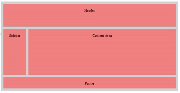
Here is a complete example code explaining how to develop a simple responsive webpage using HTML and CSS. In the code given below, we have used media queries to define style for small screens.
<!DOCTYPE html>
<html lang="en">

<head>
    <style>
        .grid-container {
            display: grid;
            grid-template-rows: 100px 200px 50px;
            grid-template-columns: 100px 1fr 1fr;
            grid-template-areas:
                "header header header"
                "sidebar content content"
                "footer footer footer";
            gap: 10px;
            background-color: lightgray;
            padding: 10px;
        }
        .grid-item {
            background-color: lightcoral;
            padding: 20px;
            text-align: center;
        }
        .header {
            grid-area: header;
        }
        .sidebar {
            grid-area: sidebar;
        }
        .content {
            grid-area: content;
        }
        .footer {
            grid-area: footer;
        }

        /* Responsive design for screens smaller than 768px */
        @media (max-width: 768px) {
            .grid-container {
                grid-template-columns: 1fr;
                grid-template-rows: auto;
                grid-template-areas:
                    "header"
                    "content"
                    "sidebar"
                    "footer";
            }
        }
    </style>
</head>

<body>
    <div class="grid-container">
        <div class="grid-item header">Header</div>
        <div class="grid-item sidebar">Sidebar</div>
        <div class="grid-item content">Content Area</div>
        <div class="grid-item footer">Footer</div>
    </div>
</body>

</html>
Output
Responsive Web Design Concepts
We have mentioned below a list of concepts and techniques that are used in CSS for responsive web designing.
- Media Queries: We use media queries to apply CSS rules based on device characteristics, such as screen width, height, or orientation (landscape or portrait). We can define different styles for different devices by using media queries.
- Responsive Grid Layouts: We use responsive grid layouts, to alter the number of columns in layout dynamically based on dimensions of user devices. CSS frameworks such as Bootstrap, provide inbuilt grid systems that can automatically adjust the layout based on the screen size.
- Responsive Images & Videos: To ensure images and videos are rendered properly in all user devices, we have to set a max-width property. It prevents stretching of media in large screens.
- Viewport Meta Tag: The viewport meta tag is used in the HTML <head> section. It controls the viewport behavior and scale on mobile devices. It is important for proper rendering based on various screen sizes.
Advertisements