- CSS - Home
- CSS - Roadmap
- CSS - Introduction
- CSS - Syntax
- CSS - Inclusion
- CSS - Types
- CSS - Measurement Units
- CSS - Selectors
- CSS - Colors
- CSS - Backgrounds
- CSS - Fonts
- CSS - Text
- CSS - Images
- CSS - Links
- CSS - Tables
- CSS - Borders
- CSS - Border Block
- CSS - Border Inline
- CSS - Margins
- CSS - Lists
- CSS - Padding
- CSS - Cursor
- CSS - Outlines
- CSS - Dimension
- CSS - Scrollbars
- CSS - Inline Block
- CSS - Dropdowns
- CSS - Visibility
- CSS - Overflow
- CSS - Clearfix
- CSS - Float
- CSS - Arrows
- CSS - Resize
- CSS - Quotes
- CSS - Order
- CSS - Position
- CSS - Hyphens
- CSS - Hover
- CSS - Display
- CSS - Focus
- CSS - Zoom
- CSS - Translate
- CSS - Height
- CSS - Hyphenate Character
- CSS - Width
- CSS - Opacity
- CSS - Z-Index
- CSS - Bottom
- CSS - Navbar
- CSS - Overlay
- CSS - Forms
- CSS - Align
- CSS - Icons
- CSS - Image Gallery
- CSS - Comments
- CSS - Loaders
- CSS - Attr Selectors
- CSS - Combinators
- CSS - Root
- CSS - Box Model
- CSS - Counters
- CSS - Clip
- CSS - Writing Mode
- CSS - Unicode-bidi
- CSS - min-content
- CSS - All
- CSS - Inset
- CSS - Isolation
- CSS - Overscroll
- CSS - Justify Items
- CSS - Justify Self
- CSS - Tab Size
- CSS - Pointer Events
- CSS - Place Content
- CSS - Place Items
- CSS - Place Self
- CSS - Max Block Size
- CSS - Min Block Size
- CSS - Mix Blend Mode
- CSS - Max Inline Size
- CSS - Min Inline Size
- CSS - Offset
- CSS - Accent Color
- CSS - User Select
- CSS - Cascading
- CSS - Universal Selectors
- CSS - ID Selectors
- CSS - Group Selectors
- CSS - Class Selectors
- CSS - Child Selectors
- CSS - Element Selectors
- CSS - Descendant Selectors
- CSS - General Sibling Selectors
- CSS - Adjacent Sibling Selectors
- CSS Advanced
- CSS - Grid
- CSS - Grid Layout
- CSS - Flexbox
- CSS - Visibility
- CSS - Positioning
- CSS - Layers
- CSS - Pseudo Classes
- CSS - Pseudo Elements
- CSS - @ Rules
- CSS - Text Effects
- CSS - Paged Media
- CSS - Printing
- CSS - Layouts
- CSS - Validations
- CSS - Image Sprites
- CSS - Important
- CSS - Data Types
- CSS3 Advanced Features
- CSS - Rounded Corner
- CSS - Border Images
- CSS - Multi Background
- CSS - Color
- CSS - Gradients
- CSS - Box Shadow
- CSS - Box Decoration Break
- CSS - Caret Color
- CSS - Text Shadow
- CSS - Text
- CSS - 2d transform
- CSS - 3d transform
- CSS - Transition
- CSS - Animation
- CSS - Multi columns
- CSS - Box Sizing
- CSS - Tooltips
- CSS - Buttons
- CSS - Pagination
- CSS - Variables
- CSS - Media Queries
- CSS - Functions
- CSS - Math Functions
- CSS - Masking
- CSS - Shapes
- CSS - Style Images
- CSS - Specificity
- CSS - Custom Properties
- CSS Responsive
- CSS RWD - Introduction
- CSS RWD - Viewport
- CSS RWD - Grid View
- CSS RWD - Media Queries
- CSS RWD - Images
- CSS RWD - Videos
- CSS RWD - Frameworks
- CSS References
- CSS Interview Questions
- CSS Online Quiz
- CSS Online Test
- CSS Mock Test
- CSS - Quick Guide
- CSS - Cheatsheet
- CSS - Properties References
- CSS - Functions References
- CSS - Color References
- CSS - Web Browser References
- CSS - Web Safe Fonts
- CSS - Units
- CSS - Animation
- CSS Resources
- CSS - Useful Resources
- CSS - Discussion
CSS - Responsive
CSS3 Responsive Web Design
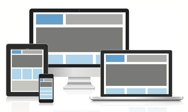
Responsive web design provides an optimal experience, easy reading and easy navigation with a minimum of resizing on different devices such as desktops, mobiles and tabs).
Responsive structure
Below image shows the responsive structure of web pages.
Flexible Grid demo
<html>
   <head>
      <style>
         body {
            font: 600 14px/24px "Open Sans",
               "HelveticaNeue-Light",
               "Helvetica Neue Light",
               "Helvetica Neue",
               Helvetica, Arial,
               "Lucida Grande",
               Sans-Serif;
         }
         h1 {
            color: #9799a7;
            font-size: 14px;
            font-weight: bold;
            margin-bottom: 6px;
         }
         .container:before, .container:after {
            content: "";
            display: table;
         }
         .container:after {
            clear: both;
         }
         .container {
            background: #eaeaed;
            margin-bottom: 24px;
            *zoom: 1;
         }
         .container-75 {
            width: 75%;
         }
         .container-50 {
            margin-bottom: 0;
            width: 50%;
         }
         .container, section, aside {
            border-radius: 6px;
         }
         section, aside {
            background: #2db34a;
            color: #fff;
            margin: 1.858736059%;
            padding: 20px 0;
            text-align: center;
         }
         section {
            float: left;
            width: 63.197026%;
         }
         aside {
            float: right;
            width: 29.3680297%;
         }
      </style>
   </head>

   <body>

      <h1>100% Wide Container</h1>

      <div class = "container">
         <section>Section</section>
         <aside>Aside</aside>
      </div>

      <h1>75% Wide Container</h1>

      <div class = "container container-75">
         <section>Section</section>
         <aside>Aside</aside>
      </div>

      <h1>50% Wide Container</h1>

      <div class = "container container-50">
         <section>Section</section>
         <aside>Aside</aside>
      </div>

   </body>
</html>
It will produce the following result −
Media queries
Media queries is for different style rules for different size devices such as mobiles, desktops, etc.,
<html>
   <head>
      <style>
         body {
            background-color: lightpink;
         }
         @media screen and (max-width: 420px) {
            body {
               background-color: lightblue;
            }
         }
      </style>
   </head>

   <body>
      <p>
         If screen size is less than 420px, then it will show lightblue
         color, or else it will show light pink color
      </p>
   </body>
</html>
It will produce the following result −
Bootstrap responsive web design
Bootstrap is most popular web design framework based on HTML,CSS and Java script and it helps you to design web pages in responsive way for all devices.
<html>
   <head>
      <meta charset = "utf-8">
      <meta name = "viewport" content = "width=device-width, initial-scale = 1">
      <link rel = "stylesheet"
         href = "http://maxcdn.bootstrapcdn.com/bootstrap/3.2.0/css/bootstrap.min.css">
      <style>
         body {
            color:green;
         }
      </style>
   </head>

   <body>

      <div class = "container">

         <div class = "jumbotron">
            <h1>Tutorials point</h1>
            <p>
               Tutorials Point originated from the idea that there exists a class
               of readers who respond better to online content and prefer to learn
               new skills at their own pace from the comforts of their drawing rooms.
            </p>
         </div>

         <div class = "row">
            <div class = "col-md-4">
               <h2>Android</h2>
               <p>
                  Android is an open source and Linux-based operating system for mobile
                  devices such as smartphones and tablet computers. Android was developed
                  by the Open Handset Alliance, led by Google, and other companies.
               </p>
         </div>

         <div class = "col-md-4">
            <h2>CSS</h2>
            <p>
               Cascading Style Sheets, fondly referred to as CSS, is a simple design
               language intended to simplify the process of making web pages presentable.
            </p>
         </div>

         <div class = "col-md-4">
            <h2>Java</h2>
            <p>
               Java is a high-level programming language originally developed by Sun
               Microsystems and released in 1995. Java runs on a variety of platforms,
               such as Windows, Mac OS, and the various versions of UNIX. This tutorial
               gives a complete understanding of Java.
            </p>
         </div>
      </div>

   </body>
</html>
It will produce the following result −
Advertisements