- CSS - Home
- CSS - Roadmap
- CSS - Introduction
- CSS - Syntax
- CSS - Inclusion
- CSS - Types
- CSS - Measurement Units
- CSS - Selectors
- CSS - Colors
- CSS - Backgrounds
- CSS - Fonts
- CSS - Text
- CSS - Images
- CSS - Links
- CSS - Tables
- CSS - Borders
- CSS - Border Block
- CSS - Border Inline
- CSS - Margins
- CSS - Lists
- CSS - Padding
- CSS - Cursor
- CSS - Outlines
- CSS - Dimension
- CSS - Scrollbars
- CSS - Inline Block
- CSS - Dropdowns
- CSS - Visibility
- CSS - Overflow
- CSS - Clearfix
- CSS - Float
- CSS - Arrows
- CSS - Resize
- CSS - Quotes
- CSS - Order
- CSS - Position
- CSS - Hyphens
- CSS - Hover
- CSS - Display
- CSS - Focus
- CSS - Zoom
- CSS - Translate
- CSS - Height
- CSS - Hyphenate Character
- CSS - Width
- CSS - Opacity
- CSS - Z-Index
- CSS - Bottom
- CSS - Navbar
- CSS - Overlay
- CSS - Forms
- CSS - Align
- CSS - Icons
- CSS - Image Gallery
- CSS - Comments
- CSS - Loaders
- CSS - Attr Selectors
- CSS - Combinators
- CSS - Root
- CSS - Box Model
- CSS - Counters
- CSS - Clip
- CSS - Writing Mode
- CSS - Unicode-bidi
- CSS - min-content
- CSS - All
- CSS - Inset
- CSS - Isolation
- CSS - Overscroll
- CSS - Justify Items
- CSS - Justify Self
- CSS - Tab Size
- CSS - Pointer Events
- CSS - Place Content
- CSS - Place Items
- CSS - Place Self
- CSS - Max Block Size
- CSS - Min Block Size
- CSS - Mix Blend Mode
- CSS - Max Inline Size
- CSS - Min Inline Size
- CSS - Offset
- CSS - Accent Color
- CSS - User Select
- CSS - Cascading
- CSS - Universal Selectors
- CSS - ID Selectors
- CSS - Group Selectors
- CSS - Class Selectors
- CSS - Child Selectors
- CSS - Element Selectors
- CSS - Descendant Selectors
- CSS - General Sibling Selectors
- CSS - Adjacent Sibling Selectors
- CSS Advanced
- CSS - Grid
- CSS - Grid Layout
- CSS - Flexbox
- CSS - Visibility
- CSS - Positioning
- CSS - Layers
- CSS - Pseudo Classes
- CSS - Pseudo Elements
- CSS - @ Rules
- CSS - Text Effects
- CSS - Paged Media
- CSS - Printing
- CSS - Layouts
- CSS - Validations
- CSS - Image Sprites
- CSS - Important
- CSS - Data Types
- CSS3 Advanced Features
- CSS - Rounded Corner
- CSS - Border Images
- CSS - Multi Background
- CSS - Color
- CSS - Gradients
- CSS - Box Shadow
- CSS - Box Decoration Break
- CSS - Caret Color
- CSS - Text Shadow
- CSS - Text
- CSS - 2d transform
- CSS - 3d transform
- CSS - Transition
- CSS - Animation
- CSS - Multi columns
- CSS - Box Sizing
- CSS - Tooltips
- CSS - Buttons
- CSS - Pagination
- CSS - Variables
- CSS - Media Queries
- CSS - Functions
- CSS - Math Functions
- CSS - Masking
- CSS - Shapes
- CSS - Style Images
- CSS - Specificity
- CSS - Custom Properties
- CSS Responsive
- CSS RWD - Introduction
- CSS RWD - Viewport
- CSS RWD - Grid View
- CSS RWD - Media Queries
- CSS RWD - Images
- CSS RWD - Videos
- CSS RWD - Frameworks
- CSS References
- CSS Interview Questions
- CSS Online Quiz
- CSS Online Test
- CSS Mock Test
- CSS - Quick Guide
- CSS - Cheatsheet
- CSS - Properties References
- CSS - Functions References
- CSS - Color References
- CSS - Web Browser References
- CSS - Web Safe Fonts
- CSS - Units
- CSS - Animation
- CSS Resources
- CSS - Useful Resources
- CSS - Discussion
CSS - repeating-conic-gradient()
In CSS, the function repeating-conic-gradient() is useful in creating an image that contains a repeating gradient with color transitions rotated around a center point. The resultant image is a special image, of <gradient> datatype.
Overview
The conic gradient will not get repeated, when neither the first nor the last color stops include a color stop angle that is greater than 0deg or lesser than 360deg.
A conic-gradient has no intrinsic dimensions, which means an image with no preferred size or aspect ratio.
The size of the image will match the size of the element it applies to or the size of the image.
The <gradient> datatype can be used only where <image>s are used.
The conic-gradient() function can not be used with <color> datatype and properties such as background-color.
In order to create a conic-gradient that does not repeat itself, you need to use the CSS function conic-gradient(), or make the gradient a complete 360 degree rotation.
Possible Values
The function repeating-conic-gradient() can have following values as arguments:
1. <angle>: Value specifies the gradient rotation in clockwise direction. Takes the value as an angle and preceded by the keyword from.
2. <position>:
Determines the center of the gradient.
Uses the same length, order, and keywords as the background-position property.
When no value is specified, the default value set is center.
3. <angular-color-stop>: Consists of a color stop's <color> values, along with one or two optional values of stop positions, which is an angle along the gradient's circumference axis. The size of the repeating gradient is determined by the last color stop minus the first color-stop angle.
4. <color-hint>: Determines the gradient progression between adjacent color stops. When no value specified, midpoint of the color transition is the midpoint between two color stops.
Syntax
repeating-conic-gradient([from angle] [at position,] color degree, color degree, ...);
Understanding repeating conic gradient
The syntax of repeating-conic-gradient is similar to that of conic-gradient and repeating-radial-gradient. The color-stops are positioned around a gradient arc. The size of the repeating section of conic gradient is equal to the first color stop subtracted from the angle of last color stop.
For a conic gradient to be repeating you need to specify the first and last color stops. The color stops are positioned around the circumference of the circle, instead of, on the gradient line starting from the center of the gradient.
The color transition happens around the center of the circle, starting at the top (when no from <angle> is specified) and going in clockwise direction.
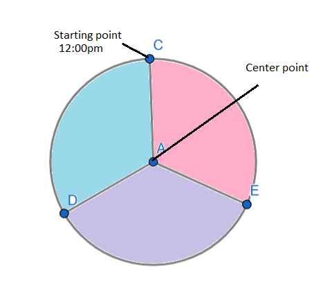
A conic gradient is defined by indicating a rotation angle, center of the gradient, and lastly specifying a list of color stops.
The color stops are placed using the angle value, unlike the linear and radial gradient where the length and percentage values are given.
The units used to specify the value are deg for degrees, grad for gradians, rad for radians, and turn for turns. There are 360 degrees, 400 gradians, 2pie radians, and 1 turn in a circle.
The values for position of the gradient is similar to the syntax for 2-value background-position.
The circumference of the gradient is the arc of the gradient. The starting point of the gradient is the 12:00pm or the north. The rotation of the gradient is determined by the from angle in clockwise direction.
The angled color stops, their starting points and ending points, determines the colors of the gradient. Using the color hints between the adjacent colors' color stops, you can alter the transitions between colors.
The browsers that support repeating conic gradients, accepts percentage values, where 100% equals 360 degrees.
Customization of gradients
The gradients can be customized in many ways. You can add more angled color-stop points on the gradient arc, change the position of the color stop's using <angle>, moving the color transition midpoint to any point between the two color stops, via a color hint, etc.
When the location of the color stop is not defined, it is positioned halfway between the one that precedes it and the one that follows it.
When no angle is specified for the first or last color stop, the values will be 0deg and 360deg, respectively.
When no angle is defined for either of them, a conic-gradient is the result.
When a non 0 or 360deg value is specified for the first or last color stop, the gradient will repeat based on the value specified.
Color at one color stop will smoothly transition into the color at subsequent color stop, by default.
The color transition midpoint can be be moved to any point between two color stops by adding a color hint.
The color transition will be hard line between the first and last color stops, when two or more color stops are at the same location.
It is advised not to mix and match different angle units, to create a repeating-conic-gradient, as it makes it difficult for CSS to read it.
Accessibility concerns: Assistive technologies do not have much special information about the background images, as browsers do not provide them. The images reprsented by the conic-gradients, will not be read or announced by the screen readers. So if the image lists critical information, it is advisable to describe it semantically.
CSS repeating-conic-gradient() - Angle Value
Here is an example of repeating conic gradient, where the starting angle is defined along with color stops and their values in degrees:
<html>
<head>
<style>
   div {
      height: 150px;
      width: 150px;
   }

   .repeat-conic-gradient {
      background: repeating-conic-gradient(
      from 0deg,
      blue 0deg 45deg,
      lightgreen 45deg 60deg);
   }
</style>
</head>
<body>
   <h1>Repeating Conic Gradient</h1>
   <div class="repeat-conic-gradient"></div>
</body>
</html>
CSS repeating-conic-gradient() - With starburst
Here is an example of repeating conic gradient, with red and black starburst:
<html>
<head>
<style>
   div {
      height: 200px;
      width: 400px;
   }

   .repeat-conic {
      background-image: repeating-conic-gradient(red 0 19deg, black 19deg 28deg);
   }
</style>
</head>
<body>
   <h1>Repeating conic gradient</h1>
   <div class="repeat-conic"></div>
</body>
</html>