- Tcl - Home
- Tcl - Overview
- Tcl - Environment Setup
- Tcl - Special Variables
- Tcl - Basic Syntax
- Tcl - Commands
- Tcl - Data Types
- Tcl - Variables
- Tcl - Operators
- Tcl - Decisions
- Tcl - Loops
- Tcl - Arrays
- Tcl - Strings
- Tcl - Lists
- Tcl - Dictionary
- Tcl - Procedures
- Tcl - Packages
- Tcl - Namespaces
- Tcl - File I/O
- Tcl - Error Handling
- Tcl - Built-in Functions
- Tcl - Regular Expressions
- Tk - Overview
- Tk - Environment
- Tk - Special Variables
- Tk - Widgets Overview
- Tk - Basic Widgets
- Tk - Layout Widgets
- Tk - Selection Widgets
- Tk - Canvas Widgets
- Tk - Mega Widgets
- Tk - Fonts
- Tk - Images
- Tk - Events
- Tk - Windows Manager
- Tk - Geometry Manager
- Tcl/Tk Useful Resources
- Tcl/Tk - Quick Guide
- Tcl/Tk - Useful Resources
- Tcl/Tk - Discussion
Tk - Listbox Widget
Tk listbox widgets are scrollable lists that can be selected. The syntax for listbox widget is shown below −
listbox buttonName options
Listbox Options
| Sr.No. | Syntax & Description |
|---|---|
| 1 | -background color Used to set background color for widget. |
| 2 | -borderwidth width Used to draw with border in 3D effects. |
| 3 | -font fontDescriptor Used to set font for widget. |
| 4 | -foreground color Used to set foreground color for widget. |
| 5 | -height numberOfLines Used to set number of lines for height of widget. |
| 6 | -selectmode mode Mode can be single, browse, multiple and extended. |
| 7 | -exportselection bool To use multiple listbox widgets, set this option to FALSE. The default is TRUE. |
| 8 | -width number Sets the width for widget. |
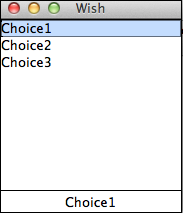
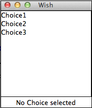
A simple example for listbox is shown below −
#!/usr/bin/wish

proc setLabel {text} {
    .label configure -text $text
}
listbox .myList
label .label -text "No Choice selected"
bind .myList {<<ListboxSelect>>}  {setLabel [.myList get active]}
grid .myList -row 0 -column 0 -sticky news
grid .label -row 1 -column 0 -columnspan 2
.myList insert 0 Choice1 Choice2 Choice3
When we run the above program, we will get the following output −
When we select an option, we will get the following output.