
Article Categories
- All Categories
-
 Data Structure
-
 Networking
-
 RDBMS
RDBMS
-
 Operating System
-
 Java
Java
-
 MS Excel
-
 iOS
iOS
-
 HTML
HTML
-
 CSS
CSS
-
 Android
-
 Python
-
 C Programming
-
 C++
C++
-
 C#
C#
-
 MongoDB
-
 MySQL
MySQL
-
 Javascript
-
 PHP
PHP
-
 Economics & Finance
Selected Reading
Python Pandas - Draw a vertical violinplot grouped by a categorical variable with Seaborn
Violin Plot in Seaborn is used to draw a combination of boxplot and kernel density estimate. The seaborn.violinplot() is used for this. We will plotti violin plot with the columns grouped by a categorical variable.
Let’s say the following is our dataset in the form of a CSV file − Cricketers.csv
At first, import the required libraries −
import seaborn as sb
import pandas as pd
import matplotlib.pyplot as plt
Load data from a CSV file into a Pandas DataFrame −
dataFrame = pd.read_csv("C:\Users\amit_\Desktop\Cricketers.csv")
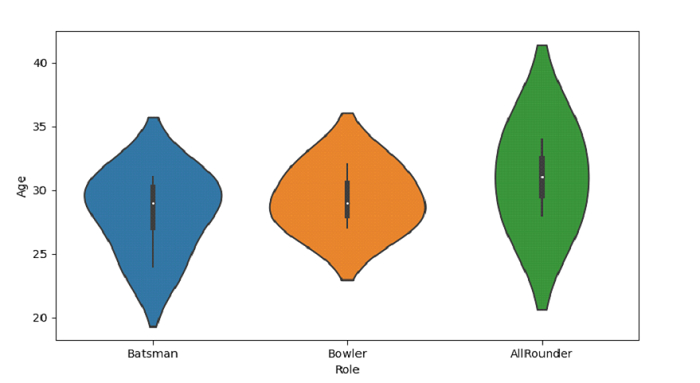
Plotting violin plot with Role and Age grouped by a categorical variable −
sb.violinplot(x = 'Role', y = "Age", data = dataFrame)
Example
Following is the code −
import seaborn as sb
import pandas as pd
import matplotlib.pyplot as plt

# Load data from a CSV file into a Pandas DataFrame:
dataFrame = pd.read_csv("C:\Users\amit_\Desktop\Cricketers.csv")

# plotting violin plot with Role and Age
# grouped by a categorical variable
sb.violinplot(x = 'Role', y = "Age", data = dataFrame)

# display
plt.show()
Output
This will produce the following output −

Updated on: 2021-10-04T07:39:55+05:30
609 Views

Advertisements