Flexbox - Flex-Wrap
Generally, in case of insufficient space for the container, the rest of the flex items will be hidden as shown below.
The flex-wrap property is used to specify the controls whether the flex-container is single-line or multi-line.
usage −
flex-wrap: nowrap | wrap | wrap-reverse
flex-direction: column | column-reverse
This property accepts the following values −
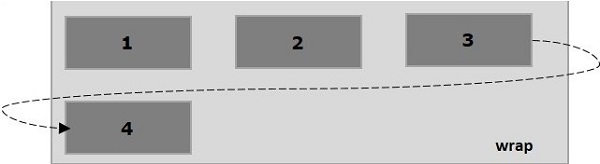
wrap − In case of insufficient space for them, the elements of the container (flexitems) will wrap into additional flex lines from top to bottom.
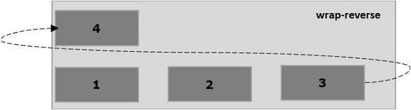
wrap-reverse − In case of insufficient space for them, the elements of the container (flex-items) will wrap into additional flex lines from bottom to top.
Now, we will see how to use the wrap property, with examples.
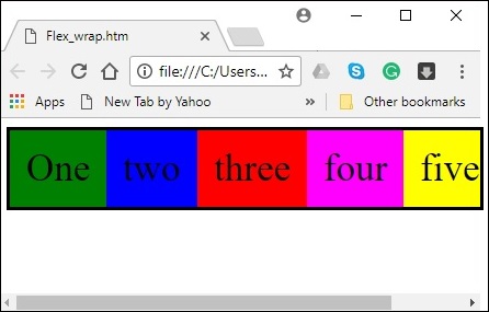
wrap
On passing the value wrap to the property flex-wrap, the elements of the container are arranged horizontally from left to right as shown below.
The following example demonstrates the result of passing the value wrap to the flex-wrap property. Here, we are creating six boxes with different colors with the flex-direction value row.
<!doctype html>
<html lang = "en">
   <style>
      .box1{background:green;}
      .box2{background:blue;}
      .box3{background:red;}
      .box4{background:magenta;}
      .box5{background:yellow;}
      .box6{background:pink;}

      .box{
         font-size:35px;
         padding:15px;
         width:100px;
      }
      .container{
         display:flex;
         border:3px solid black;
         flex-direction:row;
         flex-wrap:wrap;
      }
   </style>

   <body>
      <div class = "container">
         <div class = "box box1">One</div>
         <div class = "box box2">two</div>
         <div class = "box box3">three</div>
         <div class = "box box4">four</div>
         <div class = "box box5">five</div>
         <div class = "box box6">six</div>
      </div>
   </body>
</html>
It will produce the following result −
wrap-reverse
On passing the value wrap-reverse to the property flex-wrap, the elements of the container are arranged horizontally from left to right as shown below.
The following example demonstrates the result of passing the value wrap-reverse to the flex-wrap property. Here, we are creating six boxes with different colors with the flex-direction value row.
<!doctype html>
<html lang = "en">
   <style>
      .box1{background:green;}
      .box2{background:blue;}
      .box3{background:red;}
      .box4{background:magenta;}
      .box5{background:yellow;}
      .box6{background:pink;}

      .box{
         font-size:35px;
         padding:15px;
         width:100px;
      }
      .container{
         display:flex;
         border:3px solid black;
         flex-direction:row;
         flex-wrap:wrap-reverse;
      }
   </style>
   <body>
      <div class = "container">
         <div class = "box box1">One</div>
         <div class = "box box2">two</div>
         <div class = "box box3">three</div>
         <div class = "box box4">four</div>
         <div class = "box box5">five</div>
         <div class = "box box6">six</div>
      </div>
   </body>
</html>
It will produce the following result −
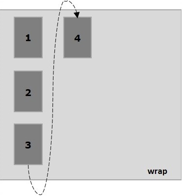
wrap (column)
On passing the value wrap to the property flex-wrap and the value column to the property flex-direction, the elements of the container are arranged horizontally from left to right as shown below.
The following example demonstrates the result of passing the value wrap to the flex-wrap property. Here, we are creating six boxes with different colors with the flex-direction value column.
<!doctype html>
<html lang = "en">
   <style>
      .box1{background:green;}
      .box2{background:blue;}
      .box3{background:red;}
      .box4{background:magenta;}
      .box5{background:yellow;}
      .box6{background:pink;}

      .box{
         font-size:35px;
         padding:15px;
         width:100px;
      }
      .container{
         display:flex;
         border:3px solid black;
         flex-direction:column;
         flex-wrap:wrap;
         height:100vh;
      }
   </style>

   <body>
      <div class = "container">
         <div class = "box box1">One</div>
         <div class = "box box2">two</div>
         <div class = "box box3">three</div>
         <div class = "box box4">four</div>
         <div class = "box box5">five</div>
         <div class = "box box6">six</div>
      </div>
   </body>
</html>
It will produce the following result −
wrap-reverse (column)
On passing the value wrap-reverse to the property flex-wrap and the value column to the property flex-direction, the elements of the container are arranged horizontally from left to right as shown below.
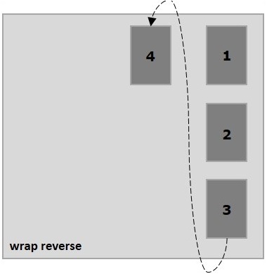
The following example demonstrates the result of passing the value wrap-reverse to the flex-wrap property. Here, we are creating six boxes with different colors and the with the flex-direction value column.
<!doctype html>
<html lang = "en">
   <style>
      .box1{background:green;}
      .box2{background:blue;}
      .box3{background:red;}
      .box4{background:magenta;}
      .box5{background:yellow;}
      .box6{background:pink;}

      .box{
         font-size:35px;
         padding:15px;
         width:100px;
      }
      .container{
         display:flex;
         border:3px solid black;
         flex-direction:column;
         flex-wrap:wrap-reverse;
         height:100vh;
      }
   </style>

   <body>
      <div class = "container">
         <div class = "box box1">One</div>
         <div class = "box box2">two</div>
         <div class = "box box3">three</div>
         <div class = "box box4">four</div>
         <div class = "box box5">five</div>
         <div class = "box box6">six</div>
      </div>
   </body>
</html>
It will produce the following result −