- Excel Charts - Home
- Excel Charts - Introduction
- Excel Charts - Creating Charts
- Excel Charts - Types
- Excel Charts - Column Chart
- Excel Charts - Line Chart
- Excel Charts - Pie Chart
- Excel Charts - Doughnut Chart
- Excel Charts - Bar Chart
- Excel Charts - Area Chart
- Excel Charts - Scatter (X Y) Chart
- Excel Charts - Bubble Chart
- Excel Charts - Stock Chart
- Excel Charts - Surface Chart
- Excel Charts - Radar Chart
- Excel Charts - Combo Chart
- Excel Charts - Chart Elements
- Excel Charts - Chart Styles
- Excel Charts - Chart Filters
- Excel Charts - Fine Tuning
- Excel Charts - Design Tools
- Excel Charts - Quick Formatting
- Excel Charts - Aesthetic Data Labels
- Excel Charts - Format Tools
- Excel Charts - Sparklines
- Excel Charts - PivotCharts
Excel Charts - Area Chart
Area charts can be used to plot change over time (years, months and days) or categories and draw attention to the total value across a trend. By showing the sum of the plotted values, an Area chart also shows the relationship of parts to a whole.
You can use Area charts to highlight the magnitude of change over time.
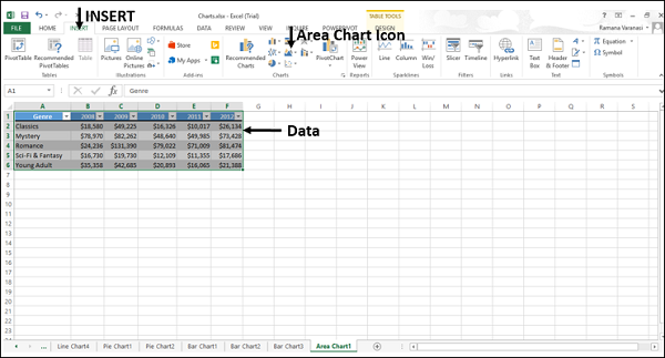
Step 1 − Arrange the data in columns or rows on the worksheet.
Step 2 − Select the data.
Step 3 − On the INSERT tab, in the Charts group, click the Area chart icon on the Ribbon.
You will see the different types of available Area charts.
An Area Chart has the following sub-types −
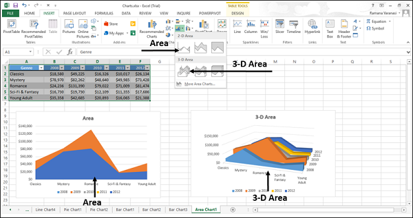
2-D Area Charts
Area
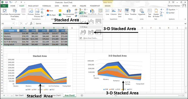
Stacked Area
100% Stacked Area
3-D Area Charts
3-D Area
3-D Stacked Area
3-D 100% Stacked Area

Step 4 − Point your mouse on each of the icons. A preview of that chart type will be shown on the worksheet.
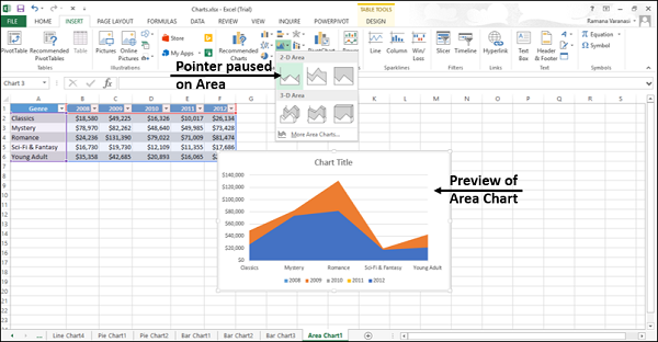
Step 5 − Double-Click the chart type that suits your data. In this chapter, you will understand when each of the Area Chart Types is useful.
Area and 3-D Area
These chart types are useful to show the trend of values over time or other category data.
An Area chart shows the values in 2-D format. A 3-D Area chart shows values in 3-D format. 3-D Area charts use three axes (horizontal, vertical, and depth) that you can change.
You can use Area charts −
When the category order is important.
To highlight the magnitude of change over time.
As you can see in the screen shot given above, in a non-Stacked Area chart, the data from one series can be hidden behind the data from another series. In such a case, use a line chart or a stacked area chart.
Stacked Area and 3-D Stacked Area
Stacked Area charts are useful to show the trend of the contribution of each value over time or other category data in 2-D format. 3-D Stacked Area charts are also useful for the same but they show areas in 3-D format without using a depth axis.
You can use Stacked Area charts to −
Highlight the magnitude of change over time.
Draw attention to the total value across a trend.
100% Stacked Area and 3-D 100% Stacked Area
100% Stacked Area charts are useful to show the trend of the percentage that each value contributes over time or other category data. 100% 3-D Stacked Area charts are also useful for the same, but they show areas in 3-D format without using a depth axis.
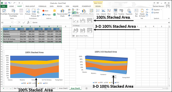
You can use 100% Stacked Area charts to −
Draw attention to the total value across a trend.
Highlight the magnitude of change to the percentage that each value contributes over time.