- DIP - Home
- DIP - Image Processing Introduction
- DIP - Signal and System Introduction
- DIP - History of Photography
- DIP - Applications and Usage
- DIP - Concept of Dimensions
- DIP - Image Formation on Camera
- DIP - Camera Mechanism
- DIP - Concept of Pixel
- DIP - Perspective Transformation
- DIP - Concept of Bits Per Pixel
- DIP - Types of Images
- DIP - Color Codes Conversion
- DIP - Grayscale to RGB Conversion
- DIP - Concept of Sampling
- DIP - Pixel Resolution
- DIP - Concept of Zooming
- DIP - Zooming methods
- DIP - Spatial Resolution
- DIP - Pixels Dots and Lines per inch
- DIP - Gray Level Resolution
- DIP - Concept of Quantization
- DIP - ISO Preference curves
- DIP - Concept of Dithering
- DIP - Histograms Introduction
- DIP - Brightness and Contrast
- DIP - Image Transformations
- DIP - Histogram Sliding
- DIP - Histogram Stretching
- DIP - Introduction to Probability
- DIP - Histogram Equalization
- DIP - Gray Level Transformations
- DIP - Concept of convolution
- DIP - Concept of Masks
- DIP - Concept of Blurring
- DIP - Concept of Edge Detection
- DIP - Prewitt Operator
- DIP - Sobel operator
- DIP - Robinson Compass Mask
- DIP - Krisch Compass Mask
- DIP - Laplacian Operator
- DIP - Frequency Domain Analysis
- DIP - Fourier series and Transform
- DIP - Convolution theorm
- DIP - High Pass vs Low Pass Filters
- DIP - Introduction to Color Spaces
- DIP - JPEG compression
- DIP - Optical Character Recognition
- DIP - Computer Vision and Graphics
ISO Preference Curves
What is Contouring?
As we decrease the number of gray levels in an image, some false colors, or edges start appearing on an image. This has been shown in our last tutorial of Quantization.
Lets have a look at it.
Consider we, have an image of 8bpp (a grayscale image) with 256 different shades of gray or gray levels.

This above picture has 256 different shades of gray. Now when we reduce it to 128 and further reduce it 64, the image is more or less the same. But when re reduce it further to 32 different levels, we got a picture like this

If you will look closely, you will find that the effects start appearing on the image.These effects are more visible when we reduce it further to 16 levels and we got an image like this.

These lines, that start appearing on this image are known as contouring that are very much visible in the above image.
Increase and Decrease in Contouring
The effect of contouring increase as we reduce the number of gray levels and the effect decrease as we increase the number of gray levels. They are both vice versa
VS

That means more quantization, will effect in more contouring and vice versa. But is this always the case. The answer is No. That depends on something else that is discussed below.
ISO Preference Curves
A study conducted on this effect of gray level and contouring, and the results were shown in the graph in the form of curves, known as Iso preference curves.
The phenomena of Isopreference curves shows, that the effect of contouring not only depends on the decreasing of gray level resolution but also on the image detail.
The essence of the study is:
If an image has more detail, the effect of contouring would start appear on this image later, as compare to an image which has less detail, when the gray levels are quantized.
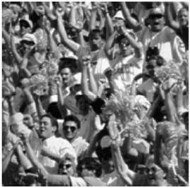
According to the original research, the researchers took these three images and they vary the Gray level resolution, in all three images.
The images were


Level of detail
The first image has only a face in it, and hence very less detail. The second image has some other objects in the image too, such as camera man, his camera, camera stand, and background objects e.t.c. Whereas the third image has more details then all the other images.
Experiment
The gray level resolution was varied in all the images, and the audience was asked to rate these three images subjectively. After the rating, a graph was drawn according to the results.
Result
The result was drawn on the graph. Each curve on the graph represents one image. The values on the x axis represents the number of gray levels and the values on the y axis represents bits per pixel (k).
The graph has been shown below.
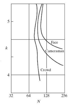
According to this graph, we can see that the first image which was of face, was subject to contouring early then all of the other two images. The second image, that was of the cameraman was subject to contouring a bit after the first image when its gray levels are reduced. This is because it has more details then the first image. And the third image was subject to contouring a lot after the first two images i-e: after 4 bpp. This is because, this image has more details.
Conclusion
So for more detailed images, the isopreference curves become more and more vertical. It also means that for an image with a large amount of details, very few gray levels are needed.