- AWT - Home
- AWT - Overview
- AWT - Environment
- AWT - Controls
- AWT - Event Handling
- AWT - Event Classes
- AWT - Event Listeners
- AWT - Event Adapters
- AWT - Layouts
- AWT - Containers
- AWT - Menu
- AWT - Graphics
AWT - Useful Resources
AWT - Controls
Every user interface considers the following three main aspects:
UI elements : Thes are the core visual elements the user eventually sees and interacts with. GWT provides a huge list of widely used and common elements varying from basic to complex which we will cover in this tutorial.
Layouts: They define how UI elements should be organized on the screen and provide a final look and feel to the GUI (Graphical User Interface). This part will be covered in Layout chapter.
Behavior: These are events which occur when the user interacts with UI elements. This part will be covered in Event Handling chapter.
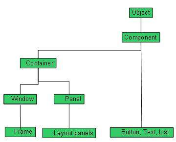
Every AWT controls inherits properties from Component class.
| Sr. No. | Control & Description |
|---|---|
| 1 |
A Component is an abstract super class for GUI controls and it represents an object with graphical representation. |
AWT UI Elements:
Following is the list of commonly used controls while designed GUI using AWT.
| Sr. No. | Control & Description |
|---|---|
| 1 |
A Label object is a component for placing text in a container. |
| 2 |
This class creates a labeled button. |
| 3 |
A check box is a graphical component that can be in either an on (true) or off (false) state. |
| 4 |
The CheckboxGroup class is used to group the set of checkbox. |
| 5 |
The List component presents the user with a scrolling list of text items. |
| 6 |
A TextField object is a text component that allows for the editing of a single line of text. |
| 7 |
A TextArea object is a text component that allows for the editing of a multiple lines of text. |
| 8 |
A Choice control is used to show pop up menu of choices. Selected choice is shown on the top of the menu. |
| 9 |
A Canvas control represents a rectangular area where application can draw something or can receive inputs created by user. |
| 10 |
An Image control is superclass for all image classes representing graphical images. |
| 11 |
A Scrollbar control represents a scroll bar component in order to enable user to select from range of values. |
| 12 |
A Dialog control represents a top-level window with a title and a border used to take some form of input from the user. |
| 13 |
A FileDialog control represents a dialog window from which the user can select a file. |