- MATLAB - Home
- MATLAB - Overview
- MATLAB - Features
- MATLAB - Environment Setup
- MATLAB - Editors
- MATLAB - Online
- MATLAB - Workspace
- MATLAB - Syntax
- MATLAB - Variables
- MATLAB - Commands
- MATLAB - Data Types
- MATLAB - Operators
- MATLAB - Dates and Time
- MATLAB - Numbers
- MATLAB - Random Numbers
- MATLAB - Strings and Characters
- MATLAB - Text Formatting
- MATLAB - Timetables
- MATLAB - M-Files
- MATLAB - Colon Notation
- MATLAB - Data Import
- MATLAB - Data Output
- MATLAB - Normalize Data
- MATLAB - Predefined Variables
- MATLAB - Decision Making
- MATLAB - Decisions
- MATLAB - If End Statement
- MATLAB - If Else Statement
- MATLAB - If…Elseif Else Statement
- MATLAB - Nest If Statememt
- MATLAB - Switch Statement
- MATLAB - Nested Switch
- MATLAB - Loops
- MATLAB - Loops
- MATLAB - For Loop
- MATLAB - While Loop
- MATLAB - Nested Loops
- MATLAB - Break Statement
- MATLAB - Continue Statement
- MATLAB - End Statement
- MATLAB - Arrays
- MATLAB - Arrays
- MATLAB - Vectors
- MATLAB - Transpose Operator
- MATLAB - Array Indexing
- MATLAB - Multi-Dimensional Array
- MATLAB - Compatible Arrays
- MATLAB - Categorical Arrays
- MATLAB - Cell Arrays
- MATLAB - Matrix
- MATLAB - Sparse Matrix
- MATLAB - Tables
- MATLAB - Structures
- MATLAB - Array Multiplication
- MATLAB - Array Division
- MATLAB - Array Functions
- MATLAB - Functions
- MATLAB - Functions
- MATLAB - Function Arguments
- MATLAB - Anonymous Functions
- MATLAB - Nested Functions
- MATLAB - Return Statement
- MATLAB - Void Function
- MATLAB - Local Functions
- MATLAB - Global Variables
- MATLAB - Function Handles
- MATLAB - Filter Function
- MATLAB - Factorial
- MATLAB - Private Functions
- MATLAB - Sub-functions
- MATLAB - Recursive Functions
- MATLAB - Function Precedence Order
- MATLAB - Map Function
- MATLAB - Mean Function
- MATLAB - End Function
- MATLAB - Error Handling
- MATLAB - Error Handling
- MATLAB - Try...Catch statement
- MATLAB - Debugging
- MATLAB - Plotting
- MATLAB - Plotting
- MATLAB - Plot Arrays
- MATLAB - Plot Vectors
- MATLAB - Bar Graph
- MATLAB - Histograms
- MATLAB - Graphics
- MATLAB - 2D Line Plot
- MATLAB - 3D Plots
- MATLAB - Formatting a Plot
- MATLAB - Logarithmic Axes Plots
- MATLAB - Plotting Error Bars
- MATLAB - Plot a 3D Contour
- MATLAB - Polar Plots
- MATLAB - Scatter Plots
- MATLAB - Plot Expression or Function
- MATLAB - Draw Rectangle
- MATLAB - Plot Spectrogram
- MATLAB - Plot Mesh Surface
- MATLAB - Plot Sine Wave
- MATLAB - Interpolation
- MATLAB - Interpolation
- MATLAB - Linear Interpolation
- MATLAB - 2D Array Interpolation
- MATLAB - 3D Array Interpolation
- MATLAB - Polynomials
- MATLAB - Polynomials
- MATLAB - Polynomial Addition
- MATLAB - Polynomial Multiplication
- MATLAB - Polynomial Division
- MATLAB - Derivatives of Polynomials
- MATLAB - Transformation
- MATLAB - Transforms
- MATLAB - Laplace Transform
- MATLAB - Laplacian Filter
- MATLAB - Laplacian of Gaussian Filter
- MATLAB - Inverse Fourier transform
- MATLAB - Fourier Transform
- MATLAB - Fast Fourier Transform
- MATLAB - 2-D Inverse Cosine Transform
- MATLAB - Add Legend to Axes
- MATLAB - Object Oriented
- MATLAB - Object Oriented Programming
- MATLAB - Classes and Object
- MATLAB - Functions Overloading
- MATLAB - Operator Overloading
- MATLAB - User-Defined Classes
- MATLAB - Copy Objects
- MATLAB - Algebra
- MATLAB - Linear Algebra
- MATLAB - Gauss Elimination
- MATLAB - Gauss-Jordan Elimination
- MATLAB - Reduced Row Echelon Form
- MATLAB - Eigenvalues and Eigenvectors
- MATLAB - Integration
- MATLAB - Integration
- MATLAB - Double Integral
- MATLAB - Trapezoidal Rule
- MATLAB - Simpson's Rule
- MATLAB - Miscellenous
- MATLAB - Calculus
- MATLAB - Differential
- MATLAB - Inverse of Matrix
- MATLAB - GNU Octave
- MATLAB - Simulink
MATLAB - 2D Line Plot
A 2D line plot is a fundamental visualization tool in MATLAB used to represent relationships between two variables. It displays data points connected by straight lines, where the x-axis usually represents one variable, and the y-axis represents another.
Syntax
plot(X,Y)
plot(X,Y,LineSpec)
plot(X1,Y1,...,Xn,Yn)
plot(X1,Y1,LineSpec1,...,Xn,Yn,LineSpecn)
plot(Y)
plot(Y,LineSpec)
Explanation
Detailed explanation of syntax mentioned above −
plot(X,Y) − Using the command plot(X,Y) generates a 2-D line plot representing the relationship between the data in Y and the corresponding values in X.When plotting a series of connected coordinates, ensure X and Y are vectors of equal length.To plot various coordinate sets on a shared set of axes, provide at least one of X or Y as a matrix.
plot(X,Y,LineSpec) − The plot(X,Y,LineSpec) function generates the plot while incorporating the designated line style, marker, and color specifications.
plot(X1,Y1,...,Xn,Yn) − The plot(X1,Y1,...,Xn,Yn) function simultaneously plots multiple x and y coordinate pairs on a shared set of axes. This syntax provides an alternative to representing coordinates using matrices.
plot(X1,Y1,LineSpec1,...,Xn,Yn,LineSpecn) − The plot(X1,Y1,LineSpec1,...,Xn,Yn,LineSpecn) function allows assigning distinct line styles, markers, and colors to individual x-y pairs. You have the flexibility to specify LineSpec for certain x-y pairs while omitting it for others. For instance, using plot(X1,Y1,"o",X2,Y2) sets markers for the first x-y pair but not for the second pair.
plot(Y) − The plot(Y) function visualizes Y against an inferred set of x-coordinates.For a vector Y, the x-coordinates span from 1 to the length of Y.
When Y is a matrix, each column in Y corresponds to a distinct line in the plot. The x-coordinates span from 1 to the number of rows in Y.
In the case of complex numbers in Y, MATLAB plots the imaginary component against the real component. However, if both X and Y are specified, the imaginary part is disregarded.
plot(Y,LineSpec) − The plot(Y,LineSpec) function visualizes Y with inferred x-coordinates while defining the line style, marker, and color.
Let us check a few examples using the above syntaxes.
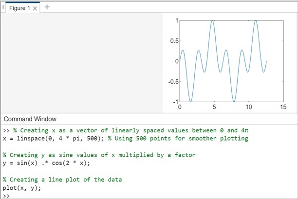
Example 1: Create Line Plot
% Creating x as a vector of linearly spaced values between 0 and 4
x = linspace(0, 4 * pi, 500); % Using 500 points for smoother plotting

% Creating y as sine values of x multiplied by a factor
y = sin(x) .* cos(2 * x);

% Creating a line plot of the data
plot(x, y);
In this example, the 'y' values are computed as the sine of 'x' multiplied by the cosine of twice 'x'. Adjusting the mathematical function helps in creating different patterns or variations for the line plot.
When you execute the same in matlab command window the output is −
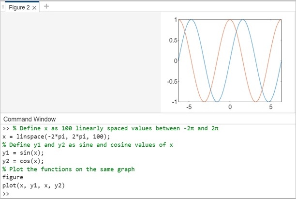
Example 2: Plotting Multiple Lines
Refer to the below code to plot multiple lines using Matlab. This code will plot the graphs of sine, cosine functions, each with a different line on the same plot.
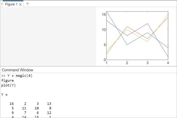
Example 3: Create Line Plot From Matrix
Assign the 4-by-4 matrix generated by the magic function to the variable Y.
Y = magic(4)
Now create a 2D line plot using the matrix Y as shown below −
Y = magic(4)
figure
plot(Y)
When you execute the same in matlab command window the output is −
Example 4: Styling for 2-D line graph.
In this example will plot line graph with markers as shown below −
x = linspace(0, 10);
y = sin(x);
plot(x, y, '-o', 'MarkerIndices', 1:5:length(y))
In this code −
- plot(x, y, '-o') generates a line plot with markers where −
- '-' specifies a solid line connecting points.
- 'o' specifies circular markers.
- 'MarkerIndices', 1:5:length(y) specifies the indices at which markers should appear.
- 1:5:length(y) generates marker indices every 5 data points (starting from index 1).
When you execute the code in matlab command window the output is −
