- Ruby - Home
- Ruby - Overview
- Ruby - Environment Setup
- Ruby - Syntax
- Ruby - Classes and Objects
- Ruby - Variables
- Ruby - Operators
- Ruby - Comments
- Ruby - IF...ELSE
- Ruby - Loops
- Ruby - Methods
- Ruby - Blocks
- Ruby - Modules
- Ruby - Strings
- Ruby - Arrays
- Ruby - Hashes
- Ruby - Date & Time
- Ruby - Ranges
- Ruby - Iterators
- Ruby - File I/O
- Ruby - Exceptions
- Ruby - Object Oriented
- Ruby - Regular Expressions
- Ruby - Database Access
- Ruby - Web Applications
- Ruby - Sending Email
- Ruby - Socket Programming
- Ruby - Ruby/XML, XSLT
- Ruby - Web Services
- Ruby - Tk Guide
- Ruby - Ruby/LDAP Tutorial
- Ruby - Multithreading
- Ruby - Built-in Functions
- Ruby - Predefined Variables
- Ruby - Predefined Constants
- Ruby - Associated Tools
- Ruby Useful Resources
- Ruby - Quick Guide
- Ruby - Cheatsheet
- Ruby - Useful Resources
- Ruby - Discussion
- Ruby - Ruby on Rails Tutorial
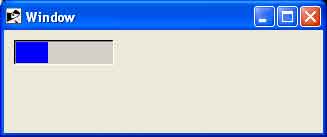
Ruby/TK - ProgressBar Widget
Description
A ProgressBar provides a widget, which will show a graphical representation of a value, given maximum and minimum reference values.
Syntax
Here is a simple syntax to create this widget −
Tk::ProgressBar.new(root) {
   .....Standard Options....
   .....Widget-specific Options....
}
Standard Options
- borderwidth
- highlightthickness
- padx
- pady
- relief
- troughcolor
These options have been described in the previous chapter.
Widget Specific Options
| Sr.No. | Options & Description |
|---|---|
| 1 | anchor => String This can be used to position the start point of the bar. Default is 'w' (horizontal bar starting from the left). A vertical bar can be configured by using either 's' or 'n'. |
| 2 | blocks => Integer This controls the number of blocks to be used to construct the progress bar. The default is to break the bar into 10 blocks. |
| 3 | colors => String Controls the colors to be used for different positions of the progress bar. |
| 4 | from => Integer This sets the lower limit of the progress bar. If the bar is set to a value below the lower limit no bar will be displayed. Defaults to 0. |
| 5 | gap => Integer This is the spacing (in pixels) between each block. Defaults to 1. Use 0 to get a continuous bar. |
| 6 | length => Integer Specifies the desired long dimension of the ProgressBar in screen units. |
| 7 | resolution => Integer A real value specifying the resolution for the scale. If this value is greater than zero, then the scale's value will always be rounded to an even multiple of this value, as will tick marks and the endpoints of the scale. Defaults to 1. |
| 8 | to => Integer This sets the upper limit of the progress bar. If a value is specified (for example, using the value method) that lies above this value the full progress bar will be displayed. Defaults to 100. |
| 9 | variable => Variable Specifies the reference to a scalar variable to link to the ProgressBar. Whenever the value of the variable changes, the ProgressBar will update to reflect this value. |
| 10 | value => Integer The can be used to set the current position of the progress bar when used in conjunction with the standard |
| 11 | width => Integer Specifies the desired narrow dimension of the ProgressBar in screen units |
Manipulating Progress Bar
You can use value(?value?) method along with ProgressBar instance to get current value of the ProgressBar. If value is given, the value of the ProgressBar is set.
Examples
require 'tk'
require 'tkextlib/bwidget'

root = TkRoot.new
root.title = "Window"

progressBar = Tk::BWidget::ProgressBar.new(root)

variable = TkVariable.new
progressBar.variable = variable

variable.value = 33

progressBar.maximum = 100
progressBar.place('height' => 25, 'width'  => 100, 'x'      => 10, 'y'      => 10)

Tk.mainloop
This will produce the following result −