- Ruby - Home
- Ruby - Overview
- Ruby - Environment Setup
- Ruby - Syntax
- Ruby - Classes and Objects
- Ruby - Variables
- Ruby - Operators
- Ruby - Comments
- Ruby - IF...ELSE
- Ruby - Loops
- Ruby - Methods
- Ruby - Blocks
- Ruby - Modules
- Ruby - Strings
- Ruby - Arrays
- Ruby - Hashes
- Ruby - Date & Time
- Ruby - Ranges
- Ruby - Iterators
- Ruby - File I/O
- Ruby - Exceptions
- Ruby - Object Oriented
- Ruby - Regular Expressions
- Ruby - Database Access
- Ruby - Web Applications
- Ruby - Sending Email
- Ruby - Socket Programming
- Ruby - Ruby/XML, XSLT
- Ruby - Web Services
- Ruby - Tk Guide
- Ruby - Ruby/LDAP Tutorial
- Ruby - Multithreading
- Ruby - Built-in Functions
- Ruby - Predefined Variables
- Ruby - Predefined Constants
- Ruby - Associated Tools
- Ruby Useful Resources
- Ruby - Quick Guide
- Ruby - Cheatsheet
- Ruby - Useful Resources
- Ruby - Discussion
- Ruby - Ruby on Rails Tutorial
Ruby/TK - Button Widget
Description
A button is very much designed for the user to interact with, and in particular, press to perform some action. A button is a widget that displays a textual string, bitmap or image. If text is displayed, it must all be in a single font, but it can occupy multiple lines on the screen.
A button can display itself in either of three different ways, according to the state option. It can be made to appear raised, sunken, or flat and it can be made to flash.
Syntax
Here is a simple syntax to create this widget −
TkButton.new(root) {
   .....Standard Options....
   .....Widget-specific Options....
}
Standard Options
- activebackground
- activeforeground
- anchor
- background
- bitmap
- borderwidth
- cursor
- disabledforeground
- font
- foreground
- highlightbackground
- highlightcolor
- highlightthickness
- image
- justify
- padx
- pady
- relief
- repeatdelay
- repeatinterval
- takefocus
- text
- textvariable
- underline
- wraplength
These options have been described in the previous chapter.
Widget Specific Options
| Sr.No. | Options & Description |
|---|---|
| 1 | command => String Specifies a Ruby command to associate with the button. This command is typically invoked when mouse button 1 is released over the button window. Here you can associate a Ruby method to be executed against mouse click. I have done it in the example given below. |
| 2 | compound => String Specifies whether the button should display both an image and text, and if so, where the image should be placed relative to the text. Valid values for this option are bottom, center, left, none, right and top. The default value is none, meaning that the button will display either an image or text, depending on the values of the image and bitmap options. |
| 3. | height => Integer
Specifies a desired height for the button. |
| 4 | state => String Specifies one of three states for the button: normal, active, or disabled. In normal state the button is displayed using the foreground and background options. The active state is typically used when the pointer is over the button. In active state the button is displayed using the activeforeground and activebackground options. Disabled state means that the button should be insensitive: |
| 5 | width => Integer Specifies a desired width for the button. |
Event Bindings
Ruby/Tk automatically creates class bindings for buttons that give them the following default behavior −
A button activates whenever the mouse passes over it and deactivates whenever the mouse leaves the button.
A button's relief is changed to sunken whenever mouse button 1 is pressed over the button, and the relief is restored to its original value when button 1 is later released.
If mouse button 1 is pressed over a button and later released over the button, the button is invoked. However, if the mouse is not over the button when button 1 is released, then no invocation occurs.
When a button has the input focus, the space key causes the button to be invoked.
If the button's state is disabled then none of the above actions occur: the button is completely non-responsive.
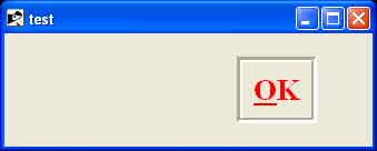
Examples
require 'tk'

def myproc
   puts "The user says OK."
   exit
end

root = TkRoot.new
btn_OK = TkButton.new(root) do
   text "OK"
   borderwidth 5
   underline 0
   state "normal"
   cursor "watch"
   font TkFont.new('times 20 bold')
   foreground  "red"
   activebackground "blue"
   relief      "groove"
   command (proc {myproc})
   pack("side" => "right",  "padx"=> "50", "pady"=> "10")
end
Tk.mainloop
This will produce the following result if you will click over this button then ruby method myproc would be executed.