
 Data Structure
 Networking
 RDBMS
RDBMS Operating System
 Java
Java MS Excel
 iOS
iOS HTML
HTML CSS
CSS Android
 Python
 C Programming
 C++
C++ C#
C# MongoDB
 MySQL
MySQL Javascript
 PHP
PHP
- Selected Reading
- UPSC IAS Exams Notes
- Developer's Best Practices
- Questions and Answers
- Effective Resume Writing
- HR Interview Questions
- Computer Glossary
- Who is Who
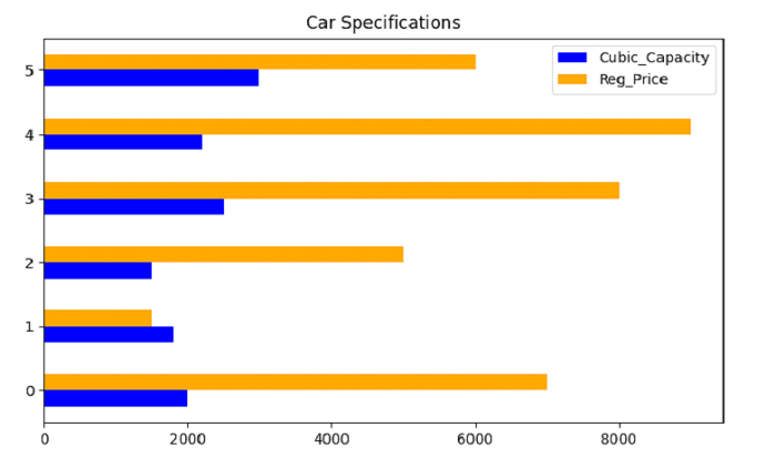
Python Pandas - Plot a Grouped Horizontal Bar Chart will all the columns
For a grouped Horizontal Bar Chart with all the columns, create a Bar Chart using the barh() and do not set the a and y values.
At first, import the required libraries −
import pandas as pd
import matplotlib.pyplot as plt
Create a DataFrame with 3 columns −
dataFrame = pd.DataFrame({"Car": ['Bentley', 'Lexus', 'BMW', 'Mustang', 'Mercedes', 'Jaguar'],"Cubic_Capacity": [2000, 1800, 1500, 2500, 2200, 3000],"Reg_Price": [7000, 1500, 5000, 8000, 9000, 6000],
})
Plotting grouped Horizontal Bar Chart with all the columns −
dataFrame.plot.barh(title='Car Specifications', color=("blue", "orange"))
Example
Following is the complete code −
import pandas as pd
import matplotlib.pyplot as plt

# creating dataframe
dataFrame = pd.DataFrame({"Car": ['Bentley', 'Lexus', 'BMW', 'Mustang', 'Mercedes', 'Jaguar'],"Cubic_Capacity": [2000, 1800, 1500, 2500, 2200, 3000],"Reg_Price": [7000, 1500, 5000, 8000, 9000, 6000],
})

# plotting grouped Horizontal Bar Chart with all the columns
dataFrame.plot.barh(title='Car Specifications', color=("blue", "orange"))

# display the plotted Horizontal Bar Chart
plt.show()
Output
This will produce the following output −

Updated on: 2021-09-28T11:25:34+05:30
1K+ Views

Advertisements