
Article Categories
- All Categories
-
 Data Structure
-
 Networking
-
 RDBMS
RDBMS
-
 Operating System
-
 Java
Java
-
 MS Excel
-
 iOS
iOS
-
 HTML
HTML
-
 CSS
CSS
-
 Android
-
 Python
-
 C Programming
-
 C++
C++
-
 C#
C#
-
 MongoDB
-
 MySQL
MySQL
-
 Javascript
-
 PHP
PHP
Selected Reading
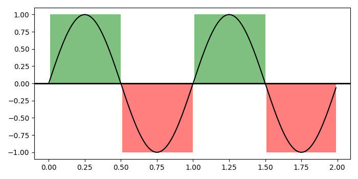
Make logically shading region for a curve in matplotlib
To make logically shading region for a curve in matplotlib, we can take the following steps
Steps
Set the figure size and adjust the padding between and around the subplots.
Create t, s1 and s2 data points using numpy.
Create a figure and a set of subplots.
Plot t and s1 data points; add a horizontal line across the axis.
Create a collection of horizontal bars spanning *yrange* with a sequence of xranges.
Add a '~.Collection' to the axes' collections; return the collection.
To display the figure, use Show() method.
Example
import numpy as np
import matplotlib.pyplot as plt
import matplotlib.collections as collections

plt.rcParams["figure.figsize"] = [7.00, 3.50]
plt.rcParams["figure.autolayout"] = True

t = np.arange(0.0, 2, 0.01)
s1 = np.sin(2 * np.pi * t)
s2 = 1.2 * np.sin(4 * np.pi * t)

fig, ax = plt.subplots()

ax.plot(t, s1, color='black')
ax.axhline(0, color='black', lw=2)

collection = collections.BrokenBarHCollection.span_where(t, ymin=0, ymax=1,
   where=s1 > 0, facecolor='green', alpha=0.5
)
ax.add_collection(collection)

collection = collections.BrokenBarHCollection.span_where( t, ymin=-1, ymax=0,
   where=s1 < 0, facecolor='red', alpha=0.5
)
ax.add_collection(collection)

plt.show()
Output
It will produce the following output −

Updated on: 2021-10-19T08:25:07+05:30
236 Views

Advertisements