
Article Categories
- All Categories
-
 Data Structure
-
 Networking
-
 RDBMS
RDBMS
-
 Operating System
-
 Java
Java
-
 MS Excel
-
 iOS
iOS
-
 HTML
HTML
-
 CSS
CSS
-
 Android
-
 Python
-
 C Programming
-
 C++
C++
-
 C#
C#
-
 MongoDB
-
 MySQL
MySQL
-
 Javascript
-
 PHP
PHP
-
 Economics & Finance
Selected Reading
How to visualize two categorical variables together in R?
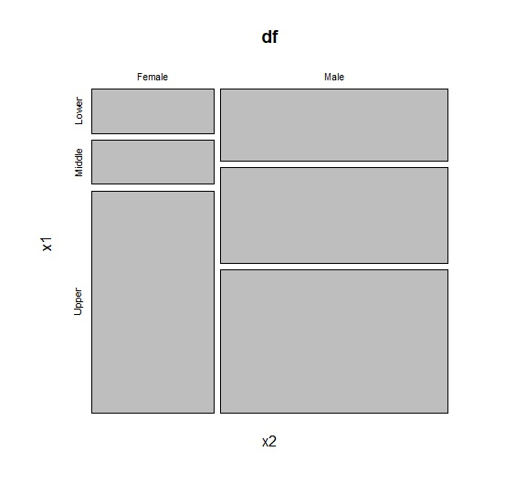
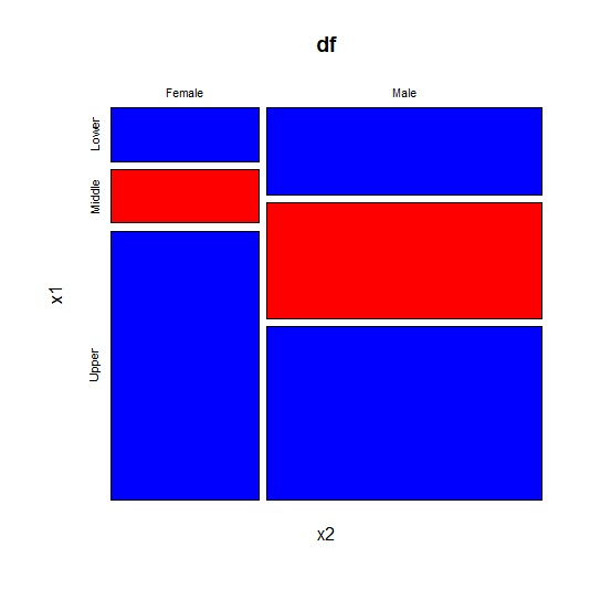
The categorical variables can be easily visualized with the help of mosaic plot. In a mosaic plot, we can have one or more categorical variables and the plot is created based on the frequency of each category in the variables. To create a mosaic plot in base R, we can use mosaicplot function. The categories that have higher frequencies are displayed by a bigger size box and the categories that have less frequency are displayed by smaller size box.
Consider the below data frame −
Example
x1<-sample(c("Lower","Middle","Upper"),20,replace=TRUE)
x2<-sample(c("Male","Female"),20,replace=TRUE)
df<-data.frame(x1,x2)
df
Output
     x1     x2
1  Lower  Female
2  Upper  Male
3  Upper  Male
4  Lower  Male
5  Lower  Female
6  Middle Female
7  Middle Female
8  Middle Female
9  Upper  Female
10 Middle Female
11 Lower  Female
12 Lower  Male
13 Middle Male
14 Lower  Male
15 Upper  Female
16 Upper  Female
17 Upper  Male
18 Upper  Male
19 Middle Male
20 Middle Female
Creating mosaic plot for the above data −
Example
mosaicplot(x2~x1,data=df)
Output
Example
mosaicplot(x2~x1,data=df,col=c("Blue","Red"))
Output

Updated on: 2026-03-11T22:50:52+05:30
5K+ Views

Advertisements