
Article Categories
- All Categories
-
 Data Structure
-
 Networking
-
 RDBMS
RDBMS
-
 Operating System
-
 Java
Java
-
 MS Excel
-
 iOS
iOS
-
 HTML
HTML
-
 CSS
CSS
-
 Android
-
 Python
-
 C Programming
-
 C++
C++
-
 C#
C#
-
 MongoDB
-
 MySQL
MySQL
-
 Javascript
-
 PHP
PHP
How to use TextField Component in Material UI?
The Material UI library provides various react components, and TextField is one of them. We can use the TextField component to take user input and use it inside the form.
Whatever operation we can perform with the HTML input field, we can also perform with the TextField component. For example, we can use events and attributes with the TextField component, which we can use with the normal input field component. The main benefit of using the TextField component is its well-designed design.
Users can execute the below command in the project directory to install the Material UI library.
npm install @mui/material @emotion/react @emotion/styled
Syntax
Users can follow the syntax below to use the TextField component in the Material UI library.
<TextField
   value = {text}
   label = "Enter label text"
   onChange = {(e) => {

      // call function to handle the input
   }}
/>
In the above syntax, ?text? is variable, and we have to bind it as a value of the TextField. Also, whenever the user changes the value of the TextField, we can execute any function using the onChange() event.
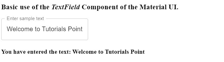
Example 1 (Basic use of the TextField Component)
In the example below, we will learn how to use the TextField component. We have imported the ?TextField? component from the Material UI library. After that, we have used it inside the App() component.
Also, we have bound the ?text? variable as a value of the ?TextField? component. We have given the label to the component. Furthermore, we have used the ?onChange? event with the ?TextField? component to set the text variable's value whenever the user changes the input field's value.
import React, { useState } from "react";
import { TextField } from "@mui/material";
const App = () => {
   const [text, setText] = useState("");
   return (
      <div>
         <h3>
            {" "}
            Basic use of the <i> TextField </i> Component of the Material UI.{" "}
         </h3>
         <TextField
            value = {text}
            label = "Enter sample text"
            onChange = {(e) => {
               setText(e.target.value);
            }}
         />
         <h4> You have entered the text: {text} </h4>
      </div>
   );
};
export default App;
Output
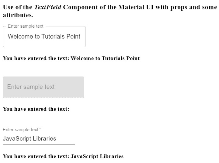
Example 2 (Using Various Attributes with the TextField Component)
In this example, we have created three different inputs using the TextField component. Also, all three inputs are different variants of the TextField component. The first is outlined variant, the second is filled, and the third is standard.
Also, we have used the ?disabled? attribute with the TextField component as we use it with the normal input field. Users can see that the second text field is disabled. We have used the ?required? attribute with the third TextField component. So, whenever users hover over the empty text field, it will show an error message.
import React, { useState } from "react";
import { TextField } from "@mui/material";
const App = () => {
   const [text1, setText1] = useState("");
   const [text2, setText2] = useState("");
   const [text3, setText3] = useState("");
   return (
      <div>
         <h3>
            {" "}
            Use of the <i> TextField </i> Component of the Material UI with props and some attributes. {" "}
         </h3>
         <TextField
            value = {text1}
            label = "Enter sample text"
            variant = "outlined"
            onChange = {(e) => {
               setText1(e.target.value);
            }}
         />
         <br></br>
         <h4> You have entered the text: {text1} </h4>
         <br></br>
         <TextField
            value = {text2}
            label = "Enter sample text"
            variant = "filled"
            disabled
            onChange = {(e) => {
               setText2(e.target.value);
            }}
         />
         <br></br>
         <h4> You have entered the text: {text2} </h4>
         <br></br>
         <TextField
            value = {text3}
            label = "Enter sample text"
            variant = "standard"
            required
            onChange = {(e) => {
               setText3(e.target.value);
            }}
         />
         <br></br>
         <h4> You have entered the text: {text3} </h4>
      </div>
   );
};
export default App;
Output
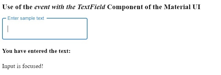
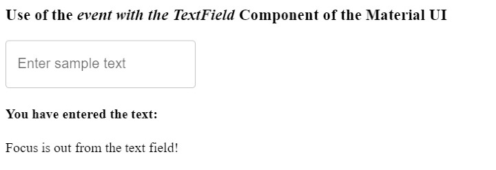
Example 3 (Using Events with the TextField Component)
Whatever events we can use with the HTML input field, we can also use them with the TextField component. In the example below, we have used the ?onBlur?, and ?onFocus? events with the TextField component.
Users can observe in the output that the code shows a different message whenever they focus and defocus the input field.
import React, { useState } from "react";
import { TextField } from "@mui/material";
const App = () => {
   const [text1, setText1] = useState("");
   const [message, setMessage] = useState("");
   return (
      <div>
         <h3>
            {" "}
            Use of the <i> event with the TextField </i> Component of the Material UI {" "}
         </h3>
         <TextField
            value = {text1}
            label = "Enter sample text"
            variant = "outlined"
            onChange = {(e) => {
               setText1(e.target.value);
            }}
            onBlur = {() => {
               setMessage("Focus is out from the text field!");
            }}
            onFocus = {() => {
               setMessage("Input is focused!");
            }}
         />
         <br></br>
         <h4> You have entered the text: {text1} </h4>
         <p> {message} </p>
      </div>
   );
};
export default App;
Output
When you click the input field -
When you are out of the input filed -
We learned to use the TextField component of the Material UI via different examples in this tutorial. We have also learned to use the attributes and events with the TextField component. Also, there are different variants of the TextField component, and users can use any according to their requirements.

4K+ Views
