
Article Categories
- All Categories
-
 Data Structure
-
 Networking
-
 RDBMS
RDBMS
-
 Operating System
-
 Java
Java
-
 MS Excel
-
 iOS
iOS
-
 HTML
HTML
-
 CSS
CSS
-
 Android
-
 Python
-
 C Programming
-
 C++
C++
-
 C#
C#
-
 MongoDB
-
 MySQL
MySQL
-
 Javascript
-
 PHP
PHP
How to use Fab Component in Material UI?
The fab component is a short form of the floating action button. You may have seen the floating action button in many Android applications at the bottom right corner. However, it's not fixed that you need to add the floating action button at the bottom right corner, but it is the most used place.
Users can use the Fab component of Material UI to create floating action buttons with different icons.
To start with the Material UI, execute the below command in the terminal in the React project directory.
npm install @mui/material @emotion/react @emotion/styled
Syntax
Users can follow the syntax below to use the Fab component of Material UI.
<Fab aria-label="edit icon">
   // add icon here
</Fab>
In the above syntax, we need to add the icon or text between the opening and closing of the Fab component.
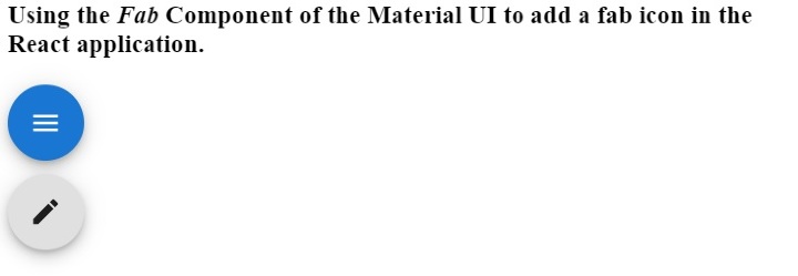
Example
We have imported the Fab component from the Material UI library in the example below. After that, we added the different icons inside the Fab component. In the output, users can observe that the first floating action button contains the menu icon, and the second floating action button contains the edit icon.
import React from "react";
import Fab from "@mui/material/Fab";
import EditIcon from "@mui/icons-material/Edit";
import MenuIcon from "@mui/icons-material/Menu";
const App = () => {
   return (
      <div>
         <h3>
            {" "}
            Using the <i> Fab </i> Component of the Material UI to add a fab icon in the React application. {" "}
         </h3>
         <div>
            <Fab color = "primary" aria-label = "menu icon">
               <MenuIcon />
            </Fab>
         </div>
         <div style = {{marginTop: "10px"}}>
            <Fab aria-label = "edit icon">
               <EditIcon />
            </Fab>
         </div>
      </div>
   );
};
export default App;
Output
Example
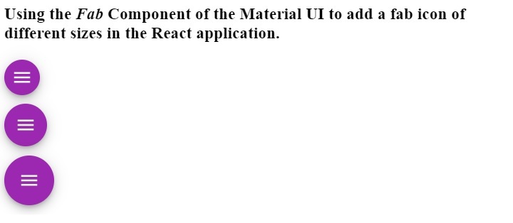
In the example below, we have created different floating action buttons of different sizes. We have used the ?size? prop to change the size of the floating action button. Users can see the size of the floating action button in the output when we pass the ?small?, ?medium?, and ?default? as a size prop value.
Also, we have passed the color as a prop of the Fab component to change the background color of the Fab component.
import React from "react";
import Fab from "@mui/material/Fab";
import MenuIcon from "@mui/icons-material/Menu";
const App = () => {
   return (
      <div>
         <h3>
            {" "}
            Using the <i> Fab </i> Component of the Material UI to add a fab icon of different sizes in the React application. {" "}
         </h3>
         <div>
            <Fab color = "secondary" size = "small" aria-label = "add icon">
               <MenuIcon />
            </Fab>
         </div>
         <div style = {{ marginTop: "10px" }}>
            <Fab color = "secondary" size = "medium" aria-label = "menu icon">
               <MenuIcon />
            </Fab>
         </div>
         <div style = {{ marginTop: "10px" }}>
            <Fab color = "secondary" aria-label = "menu icon">
               <MenuIcon />
            </Fab>
         </div>
      </div>
   );
};
export default App;
Output
Users learned to use the Fab component of Material UI. While making the App responsive, the floating action button is very useful for mobile devices. For example, we can show the menu in the navbar in desktop apps, but for the mobile version, we can show the straight menu when the user clicks the floating action button.
Here, we have added only icons as the content of the Fab component, but we can also add text. Also, users can change the style of the Fab component by passing the style as a prop.

813 Views
