
 Data Structure
 Networking
 RDBMS
RDBMS Operating System
 Java
Java MS Excel
 iOS
iOS HTML
HTML CSS
CSS Android
 Python
 C Programming
 C++
C++ C#
C# MongoDB
 MySQL
MySQL Javascript
 PHP
PHP
- Selected Reading
- UPSC IAS Exams Notes
- Developer's Best Practices
- Questions and Answers
- Effective Resume Writing
- HR Interview Questions
- Computer Glossary
- Who is Who
How to use Checkboxes in ReactJS?
The checkbox allows users to select multiple values in the form. Also, it is useful to take the Boolean response from the users. For example, an Instagram-like button is a kind of checkbox. When users like the post, it shows the filled icon; Otherwise, it shows the border icon.
Here, we will learn to handle single and multiple checkboxes in ReactJS. First, we will create the custom checkboxes and then learn to use the checkbox component of Material UI.
Create a Custom Checkbox Component in ReactJS
We can use the normal HTML input to create a checkbox in ReactJS. We can add the onChange event as a prop to handle the checkbox value.
Syntax
Users can follow the syntax below to use the checkbox in ReactJS.
function handleChange(e) {
   setChecked(e.target.checked);
}
<input value="test" type="checkbox" onChange={handleChange} />
In the above syntax, we invoke the handleChange() function whenever the user checks and unchecks the checkbox.
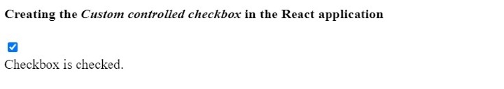
Example
In the example below, we have created the checkbox using the <input> element. In the handleChange() function, we set the boolean value of the checkbox into the checked variable.
We show the message in the output based on the true and false values of the checked variable.
import React from "react";
const App = () => {
   const [checked, setChecked] = React.useState(false);
   function handleChange(e) {
      setChecked(e.target.checked);
   }
   return (
      <div>
         <h4>
            {" "}
            Creating the <i> Custom controlled checkbox </i> in the React application {" "}
         </h4>
         <input value = "test" type = "checkbox" onChange = {handleChange} />
         <br></br>
         {checked ? (
            <div> Checkbox is checked. </div>
         ) : (
            <div> Checkbox is not checked. </div>
         )}
      </div>
   );
};
export default App;
Output
Example
In the example below, we have created multiple checkboxes using the <input> element. Whenever the user checks or uncheck any checkbox, it invokes the handleChage() function.
In the handleChange() function, we check if the checkbox is checked and add the checkbox value to the allChecked array. If the checkbox is unchecked, we remove the checkbox value from the allChecked array.
import React from "react";
const App = () => {
   const [allchecked, setAllChecked] = React.useState([]);
   function handleChange(e) {
      if (e.target.checked) {
         setAllChecked([...allchecked, e.target.value]);
      } else {
         setAllChecked(allchecked.filter((item) => item !== e.target.value));
      }
   }
   return (
      <div>
         <h4>
            {" "}
            Creating the {" "}
            <i>
               {" "}
               Custom controlled checkbox and handling the multiple checkboxes
               {" "}
            </i>{" "} in the React application {" "}
         </h4>
         <div>
            <input value = "One" type = "checkbox" onChange = {handleChange} />
            <span> One </span>
         </div>
         <div>
            <input value = "Two" type = "checkbox" onChange = {handleChange} />
            <span> Two </span>
         </div>
         <div>
            <input value = "Three" type = "checkbox" onChange = {handleChange} />
            <span> Three </span>
         </div>
         <div>
            <input value = "Four" type = "checkbox" onChange = {handleChange} />
            <span> Four </span>
         </div>
         <div>
            <input value = "Five" type = "checkbox" onChange = {handleChange} />
            <span> Five </span>
         </div>
         <div>The all checked values are {allchecked.join(" , ")}</div>
      </div>
   );
};
export default App;
Output

Use Material UI's Checkbox Component in ReactJS
The Material UI provides the Checkbox component, and we can import it into the react application and use it directly.
Use the below command to install the Material UI library in the React project.
npm install @mui/material @emotion/react @emotion/styled
Syntax
Users can follow the syntax below to use the Checkbox component of Material UI.
<FormControlLabel control = {<Checkbox />} label = "Checkbox" />
In the above syntax, we have added the Checkbox as a value of the ?control' prop.
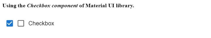
Example
In the example below, we have used the checkbox component of Material UI. Users can check and uncheck the checkbox in the output.
We used the ForControlLabel component to add a label to the checkbox. In the output, users can observe that we have added the ?checkbox' label.
import React from "react";
import Checkbox from "@mui/material/Checkbox";
import FormControlLabel from "@mui/material/FormControlLabel";
const App = () => {
   return (
      <div>
         <h4>
            Using the <i> Checkbox component </i> of Material UI library. {" "}
         </h4>
         <Checkbox defaultChecked />
         <FormControlLabel control = {<Checkbox />} label = "Checkbox" />
      </div>
   );
};
export default App;
Output
Example
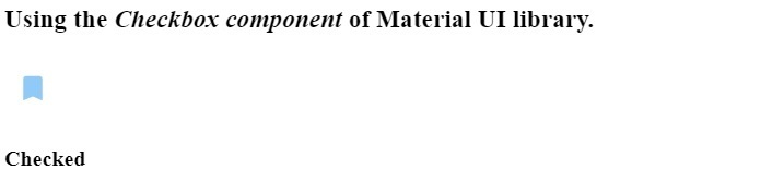
In the example below, we have customized the Checkbox component of the Material UI. We have changed the color of the first checkbox. Also, added the custom icon for the second checkbox. Whenever the user checks, it shows the filled icon; whenever the user unchecks the checkbox, it shows the icon with the border.
import React from "react";
import Checkbox from "@mui/material/Checkbox";
import BookmarkBorderIcon from "@mui/icons-material/BookmarkBorder";
import BookmarkIcon from "@mui/icons-material/Bookmark";
import { green, blue } from "@mui/material/colors";
const App = () => {
   const [isChecked, setChecked] = React.useState(false);
   function handleChange(event) {
      setChecked(event.target.checked);
   }
   return (
      <div>
         <h3>
            Using the <i> Checkbox component </i> of Material UI library. {" "}
         </h3>
         <Checkbox
            Icon = {<BookmarkBorderIcon />}
            checkedIcon = {<BookmarkIcon />}
            onChange = {handleChange}
            sx = {{
               color: green[500],
               "&.Mui-checked": {
                  color: blue[200],
               },
            }}
         />
            {isChecked ? <h4> Checked </h4> : <h4> Not Checked </h4>}
      </div>
   );
};
export default App;
Output
Users learned to use the checkboxes in ReactJS. In the first approach, users learned to handle the multiple checkboxes in ReactJS. In the second approach, we learned to use the Checkbox component of Material UI. Furthermore, we can customize the Checkbox component of Material UI by changing the style and icons.

27K+ Views
