
 Data Structure
 Networking
 RDBMS
RDBMS Operating System
 Java
Java MS Excel
 iOS
iOS HTML
HTML CSS
CSS Android
 Python
 C Programming
 C++
C++ C#
C# MongoDB
 MySQL
MySQL Javascript
 PHP
PHP
- Selected Reading
- UPSC IAS Exams Notes
- Developer's Best Practices
- Questions and Answers
- Effective Resume Writing
- HR Interview Questions
- Computer Glossary
- Who is Who
How to use Box Component in Material UI?
As the Box name suggests, it allows users to add the box of different dimensions on the web page. Users can also add any custom HTML content inside the Box component. Also, users can style the box by passing the style as props.
To use the Box component of Material UI, users need to run the below command in the terminal to install the Material library.
npm install @mui/material @emotion/react @emotion/styled
Syntax
Users should follow the syntax below to use the Box component of the Material UI library.
<Box> Content of the Box. </Box>
Users can see how to add content inside the Box component in the above syntax.
Example 1
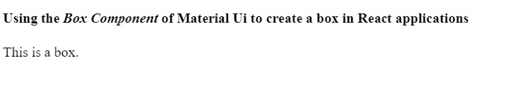
In the example below, we have imported the Box component from Material Ui. After that, we have used the Box component inside the App component and added some text components inside the Box component.
import React from "react";
import Box from "@mui/material/Box";

function App() {
   return (
      <div>
         <h2>
            Using the <i> Box Component </i> of Material Ui to create a box in React
            applications. {" "}
         </h2>
         <Box> This is a box. </Box>
      </div>
   );
}

export default App;
Output
Example 2
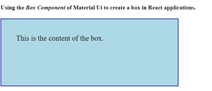
In the first example, the Box component is not properly visible. So, in the example below, we have added some style using the ?sx' prop to the Box component.
We have set the dimensions of the box. Also, we have added the background color and border to the box element. In the output, users can observe the box.
import React from "react";
import Box from "@mui/material/Box";

function App() {
   return (
      <div>
         <h4>
            Using the <i> Box Component </i> of Material Ui to create a box in React
            applications. {" "}
         </h4>
         <Box
            sx = {{
               width: 400,
               height: 100,
               backgroundColor: "lightblue",
               border: "2px solid blue",
               padding: 5,
               fontSize: 20,
            }}
            >
            This is the content of the box.
         </Box>
      </div>
   );
}

export default App;
Output
Users learned to use the box component of Material UI in this tutorial. Users can style the box component using the different CSS rules as we have done in the second example.

1K+ Views
