
 Data Structure
 Networking
 RDBMS
RDBMS Operating System
 Java
Java MS Excel
 iOS
iOS HTML
HTML CSS
CSS Android
 Python
 C Programming
 C++
C++ C#
C# MongoDB
 MySQL
MySQL Javascript
 PHP
PHP
- Selected Reading
- UPSC IAS Exams Notes
- Developer's Best Practices
- Questions and Answers
- Effective Resume Writing
- HR Interview Questions
- Computer Glossary
- Who is Who
How to show LinearProgress in ReactJS?
The linear progress bar is often used to show download and upload percentages in the application. We can show the upload or downloaded completion percentage using the linear progress bar. Also, it improves the UX of the application as it shows progress with animation.
In this tutorial, we will learn to show linear progress using the Material UI progress bar and custom progress bar.
Use the Material UI to show the LinearProgress bar in ReactJS
Users can use the below command in the React application to install the Material UI library.
npm install @mui/material @emotion/react @emotion/styled
After installing the Material UI library, users need to import the LinearProgress component from it and use it in the application.
Syntax
Users can follow the syntax below to use the LinearProgress component of the Material UI library to show a linear progress bar.
<LinearProgress />
Example
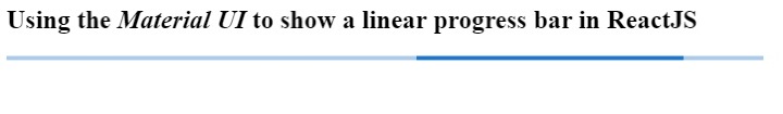
We have imported the LinearProgress component from the material UI library in the example below. After that, we used it in the App() component.
Users can observe that the output shows a continuously animating progress bar.
import * as React from "react";
import Box from "@mui/material/Box";
import LinearProgress from "@mui/material/LinearProgress";
export default function App() {
   return (
      <div style = {{width:"700px"}}>
         <h2>
            {" "}
            Using the <i> Material UI </i> to show a linear progress bar in ReactJS
         </h2>
         <Box sx = {{ width: "100%" }}>
            <LinearProgress />
         </Box>
      </div>
   );
}
Output
Example
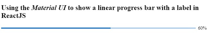
In the example below, we show the label with linear progress. We are showing the completion percentage on the label. We have used the determinate as a value of variant props which shows progress based on percentage.
To update the percentage of the progress bar, we used the useEffect() hooks. In the hook, we set the timer using the setInterval() method. It increases the progress by 10 after every 500 milliseconds. We used the setPercantage() function, which takes the callback function with previous progress as a parameter to update progress.
import * as React from "react";
import LinearProgress from "@mui/material/LinearProgress";
import Box from "@mui/material/Box";
export default function App() {
   const [currentPercentage, setPercentage] = React.useState(10);
   React.useEffect(() => {
      const timer = setInterval(() => {
         setPercentage((prevProgress) =>
            prevProgress >= 100 ? 10 : prevProgress + 10
         );
      }, 500);
      return () => {
         clearInterval(timer);
      };
   }, []);
   return (
      <div style = {{ width: "700px" }}>
         <h2>
            {" "}
            Using the <i> Material UI </i> to show a linear progress bar with a label in ReactJS
         </h2>
         <Box sx = {{ display: "flex", alignItems: "center" }}>
            <Box sx = {{ width: "100%", mr: 1 }}>
               <LinearProgress variant="determinate" value={currentPercentage}/>
            </Box>
            {`${Math.round(currentPercentage)}%`}
         </Box>
      </div>
   );
}
Output
Create a custom LinerProgress bar in ReactJS
We can create the linear progress bar using HTML and CSS. After that, we can use React hooks to make them animated as progress percentage updates.
Syntax
Users can follow the syntax below to create the custom progress bar and update its progress.
<div className = "mainDiv">
   <div className = "childDiv" style = {{ width: `${progress}%` }}>
      <span> </span>
   </div>
</div>
In the above syntax, we have added a width property in style to change the progress.
Example
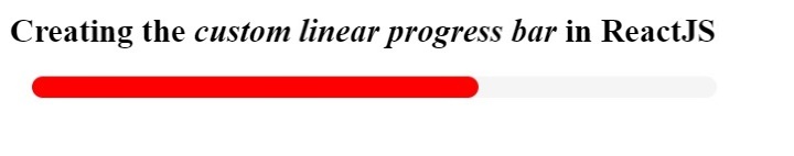
In the example below, we have implemented the custom linear progress bar.
Filename - App.js
In the below file, we have added HTML to create a progress bar, and we changed the progress bar's width based on the progress state's value. We get the current progress value in the parameter of the setProgress function's callback function, and we add any random value between 1 to 10 to the current progress value.
Also, we set the progress to 1 if progress goes above 1.
import * as React from "react";
import "./App.css";
export default function App() {
   const [progress, setProgress] = React.useState(10);
   React.useEffect(() => {
      const timer = setInterval(() => {
         setProgress((currentProgress) =>
            currentProgress >= 100 ? 1 : currentProgress + Math.random() * 10
         );
      }, 800);
      return () => {
         clearInterval(timer);
      };
   }, []);
   return (
      <div style = {{ width: "700px" }}>
         <h2>
            {" "}
            Creating the <i> custom linear progress bar </i> in ReactJS
         </h2>
         <div className = "mainDiv">
            <div className = "childDiv" style = {{ width: `${progress}%` }}>
               <span> </span>
            </div>
         </div>
      </div>
   );
}
Filename - App.css
In the below file, we have implemented some CSS to create a linear progress bar.
.mainDiv {
   height: 1rem;
   width: 500px;
   background-color: whitesmoke;
   border-radius: 12px;
   margin: 1rem;
}
.childDiv {
   height: 100%;
   background-color: red;
   border-radius: 12px;
   text-align: left;
}
Output
In this tutorial, we learned to create linear progress in ReactJS. We learned to use the Material UI library to create a linear progress bar. Also, we can change the variants of the progress bar while using a linear progress bar.
Also, we have created the custom progress bar using HTML and CSS. Users should use the custom linear progress bar to customize according to requirements.

2K+ Views
