
 Data Structure
 Networking
 RDBMS
RDBMS Operating System
 Java
Java MS Excel
 iOS
iOS HTML
HTML CSS
CSS Android
 Python
 C Programming
 C++
C++ C#
C# MongoDB
 MySQL
MySQL Javascript
 PHP
PHP
- Selected Reading
- UPSC IAS Exams Notes
- Developer's Best Practices
- Questions and Answers
- Effective Resume Writing
- HR Interview Questions
- Computer Glossary
- Who is Who
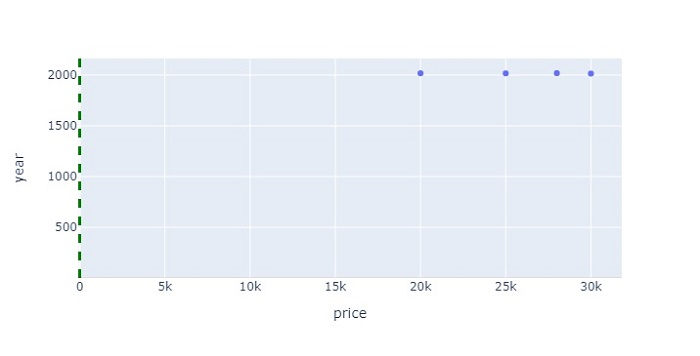
How to shade a chart above a specific Y value in Python Plotly?
Plotly is an open-source plotting library in Python that can generate several different types of charts. Python users can use Plotly to generate different types of charts including scientific charts, 3D graphs, statistical charts, financial charts, etc.
In this tutorial, we will show how you can use Plotly to shade a chart above a specific Y value.
Here, we will use the plotly.express module to create a plot.
Then, we will use the add_vline() method to create a line with green color and set its width.
To set the line color and opacity values, we will use the add_hrect() method.
Follow the steps given below to shade a chart above a specific Y value.
Step 1
Import the plotly.express module and alias as px.
import plotly.express as px
Step 2
Import the Pandas module and alias as pd.
import pandas as pd
Step 3
Create a dataframe with the following values.
data = {
   'model':['moto','sony','samsung','redmi'],
   'price':[20000,25000,30000,28000],
   'year':[2018,2017,2015,2019]
}
df = pd.DataFrame(data)
Step 4
Use the px.scatter() method to create a scatter plot with the X and Y values.
fig = px.scatter(df, x=df['price'], y=df['year'])
Step 5
Use the method add_vline() to set the line width, dash and color properties.
fig.add_vline(x=2.5,
   line_width=3,
   line_dash="dash",
   line_color="green")
Step 6
Use the add_hrect() method to set the Y-axis values, line width and fill line color as "red".
fig.add_hrect(y0=0.9, y1=2.6,
   line_width=0,
   fillcolor="red",
   opacity=0.2)
Example
The complete code to shade a chart above a specific Y value is as follows ?
import plotly.express as px
import pandas as pd
data = {
   'model':['moto','sony','samsung','redmi'],
   'price':[20000,25000,30000,28000],
   'year':[2018,2017,2015,2019]
}

df = pd.DataFrame(data)
fig = px.scatter(df, x=df['price'], y=df['year'])
fig.add_vline(x=2.5,
   line_width=3,
   line_dash="dash",
   line_color="green")

fig.add_hrect(y0=0.9, y1=2.6,
   line_width=0,
   fillcolor="red",
   opacity=0.7)

fig.update_layout(width=716, height=365)
fig.show()
Output
It will show the following output on the browser ?
Similarly, you can try creating different types of graphs as images.

628 Views
