
 Data Structure
 Networking
 RDBMS
RDBMS Operating System
 Java
Java MS Excel
 iOS
iOS HTML
HTML CSS
CSS Android
 Python
 C Programming
 C++
C++ C#
C# MongoDB
 MySQL
MySQL Javascript
 PHP
PHP
- Selected Reading
- UPSC IAS Exams Notes
- Developer's Best Practices
- Questions and Answers
- Effective Resume Writing
- HR Interview Questions
- Computer Glossary
- Who is Who
How to remove option bar from ggplotly using R?
R is a programming language for statistical computing and graphics. ggplotly() is a function that is used to convert a static plot to an interactive web-based version. ggplotly() returns a Plotly object. In this tutorial, we will see how to remove the option bar from ggplotly using R.
Here, we will use the aes() function that is used for aesthetic mapping between visual cue and a variable. It contains the following arguments: position (X and Y axes), color, fill, shape, line type, and size.
To remove the option bar from ggplotly, we will set "config(displayModeBar = FALSE)".
Follow the steps given below to remove option bar from ggplolty using R.
Step 1
Make sure you have the following packages installed in R.
install.packages('ggplot2')
install.packages('plotly')
install.packages('readr')
Step 2
Load the installed libraries.
library(readr)
library(ggplot2)
library(plotly)
Step 3
Create a dataset by importing an external CSV file. Keep the CSV file in your project directory or provide its full path in the following command ?
students_data <- read_csv("students_data.csv")
Step 4
Create a ggplot using the following arguments ?
tplot = ggplot(students_data) + geom_histogram(mapping = aes(x = language), color = 'blue', fill = 'lightblue', bins = 15)
Step 5
To remove the option bar, set "displayModeBar = FALSE" as follows ?
ggplotly(tplot) %>% config(displayModeBar = FALSE)
Example
The complete code to remove option bar from ggploty using R as follows ?
install.packages('ggplot2')
install.packages('plotly')
install.packages('readr')

library(readr)
library(ggplot2)
library(plotly)

students_data <- read_csv("students_data.csv")

tplot = ggplot(students_data) + geom_histogram(mapping = aes(x=language), color='blue', fill='lightblue', bins=15)

ggplotly(tplot) %>% config(displayModeBar = FALSE)
Output
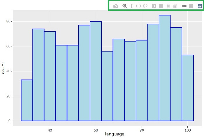
It will produce the following output on the browser ?
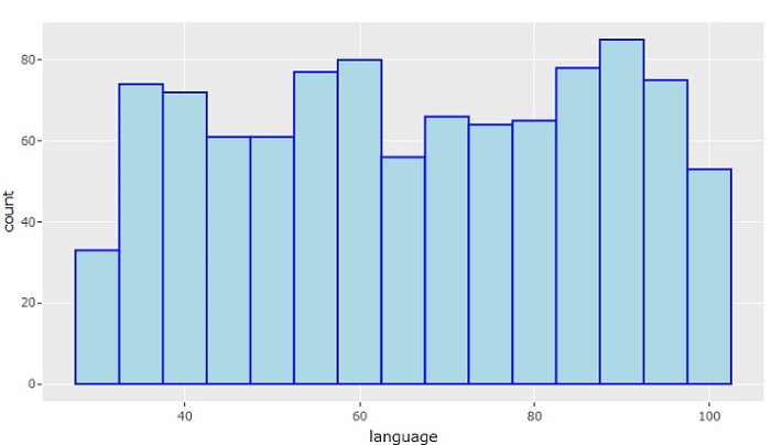
On the browser, you won't get to see the ModeBar (the control options) that usually appear at the top-right corner of the chart.
Now, let's set "displayModeBar = TRUE" to see the difference in the output ?
ggplotly(tplot) %>% config(displayModeBar = TRUE)
It will show the chart along with the ModeBar.

592 Views
